


Arek Dvornechuck
Branding Expert


LG Electronics has refreshed its brand identity and launched a new global campaign under the theme “Life’s Good”, done by renowned agency Wolff Olins.
This rebrand is aiming to inspire optimism and convey the company's commitment to creating products that improve people's lives.
As a branding expert, I'm always fascinated by major rebrands from large multinational corporations like LG, and this one caught my attention.
In this news article, we’ll analyze the key elements of LG’s rebrand and what they mean for the company’s future.
LG has animated its longstanding face logo in a series of subtle yet clever behaviors that add a sense of dimensionality—this includes scrolling, loading, winking, and more.
The animation manages to avoid being overly cute or cringe-worthy.
Instead, it instills a sophisticated personality into the iconic LG face.
This shows that even classic brand icons can be revitalized through thoughtful animation.
LG has introduced a brighter shade of red, complemented by the original maroon “heritage red.”

This new vibrant red represents passion, innovation, and boldness.
Along with energetic gradients and photography styles, the red overhaul gives LG a more lively, youthful aesthetic compared to its former corporate look.
Central to the redesign is a new custom typeface, LG EI, that embodies the philosophy of “Emotionally Intelligent Design.”
This means blending logic and innovation with humanity and warmth.
The font’s geometric forms represent technology, while its soft rounded edges symbolize emotion.
The typeface neatly encapsulates LG’s goal to be both logically and magically designed.
A series of abstract shapes derived from LG product silhouettes appear throughout the visual identity.

The shapes are understated yet add depth to the system when used on backgrounds, photos, and videos.
This shows how abstract references to a brand's products can be seamlessly integrated into a visual identity.
When done subtly, it creates a sense of cohesion without being too literal.
LG introduced two new illustrated characters, Joy and Rider, designed to appeal to younger demographics.
The lively, optimistic characters were hand-drawn by a South Korean artist in a 3D style.
LG is smartly expanding its brand appeal through characters that embody its playful, hopeful spirit.
The 3D approach gives them a modern, technology-forward feel that resonates with youth.
The iconic “Life’s Good” tagline was redrawn in a bold, prominent serif font that exudes personality and presence.

According to LG, the period at the end conveys confidence and sincerity.
While the tagline has high visual impact, it may lack connection to the logo itself.
However, with enough exposure over time, the two elements could become more cohesive in consumers’ minds.
LG unveiled this new brand identity through a major global campaign spotlighting “Life’s Good” on billboards and events worldwide (including New York).
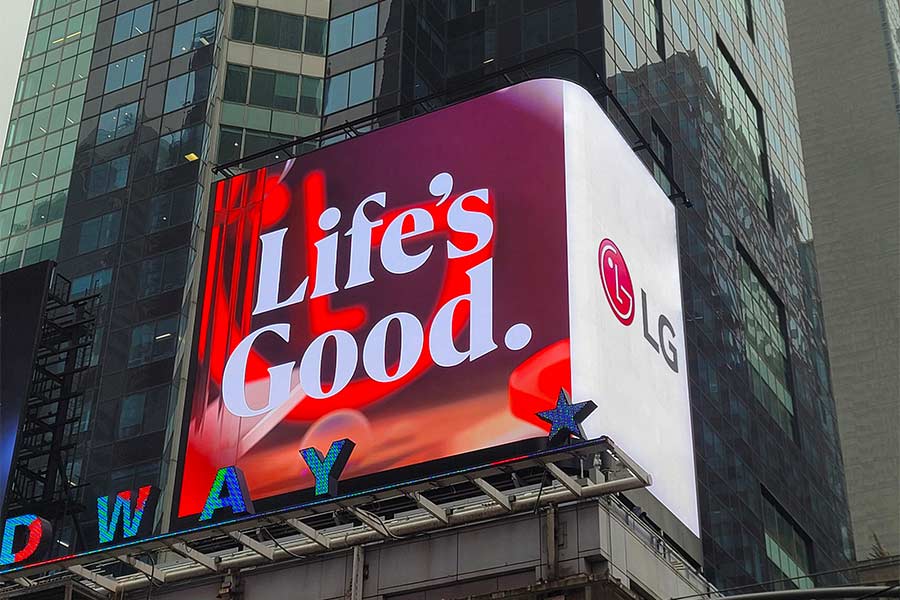
The campaign aims to spread optimism and reinforce LG’s belief that “Life’s Good” even during uncertain times.
I think that the dynamic aesthetics and activations evangelize the tagline very effectively.
At its core, LG’s rebrand aims to put more personality and warmth into the company’s technological image.
The playful animations, illustrations, typeface, and campaign all speak to this mission.
For brands in highly technical industries, conveying humanity through design is key to connecting with consumers.
LG’s emotive rebrand exemplifies this well.
Overall, I believe that the LG’s extensive rebrand succeeds in revitalizing the company’s visual identity and communicating its “Life’s Good” philosophy.
From the subtle animated behaviors to the vibrant colors and campaign, the new aesthetics feel fresh, dynamic, and distinctly LG.
Most impressively, LG managed to evolve the brand dramatically without losing equity in its iconic face logo.
The rebrand remains recognizably LG while breathing new energy into the brand.
For a major multinational corporation, this is an impressive design achievement.
In my opinion, the rebrand is a win for LG, setting the stage for a more lively, contemporary brand image moving forward.
I’m excited to see how LG builds on this foundation in the years to come.