
Web Design
I Tested 10 AI Website Builders (July 2026)
Published on Jul 24, 2026
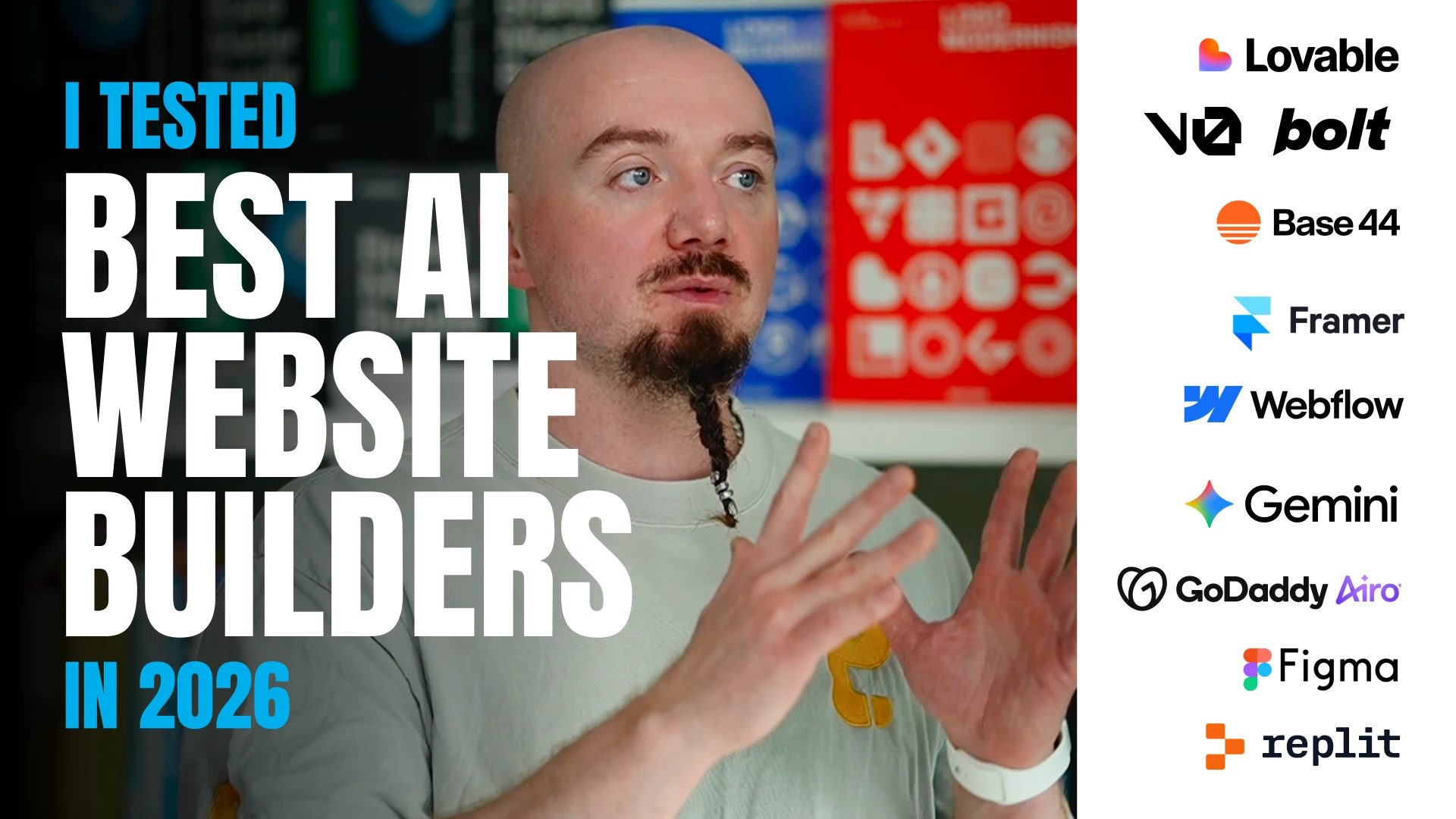
I tested 10 of the most popular AI website builders to see how useful they are for building a real, polished website.
I used the same brief for every tool: an editorial landing page for Nathalie Sadler, a speaking coach.
I also supplied a brand guide with the correct logos, logo lockups, colors, custom fonts, patterns, and client photography.
The goal was to see whether each AI builder could turn a real design direction into a usable website without losing the details that make a brand feel intentional.
The short version is that every tool could create something quickly, but every result still needed substantial design direction and cleanup.
1. Bolt
Bolt made a reasonable first attempt at the landing page, but it rebuilt the custom font incorrectly instead of using the supplied font.
The line height was too tight, which made several sections feel cramped and harder to read.
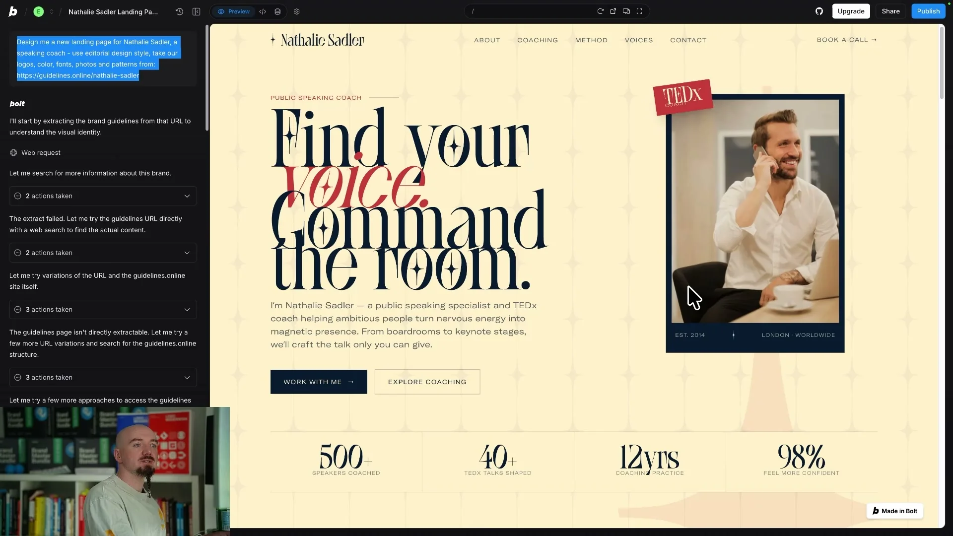
It also generated new images even though I had provided the exact photography that the page needed.
There were some promising details, including a few editorial layout ideas and a hover effect with underlined links.
The larger problem was that the page needed fixes to its typography, spacing, logo usage, image choices, patterns, and footer before it could be used.
Bolt was not the worst result, but it still behaved like a rough starting point rather than a finished website.
2. Lovable
Lovable produced a much weaker result with too many unrelated fonts competing across the page.
It did manage to pull in the correct logo, which showed that the brand assets were available to the tool.
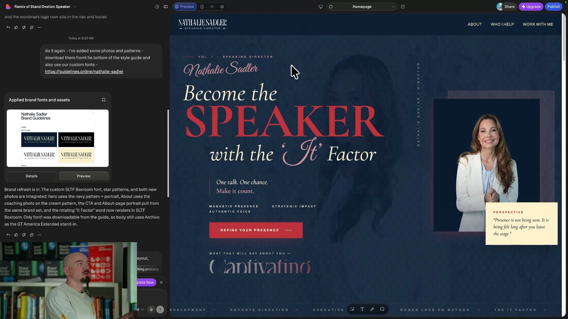
The typography was still awkward, including a heading that was visibly cut off.
The overall direction felt generic and did not capture the editorial character of the brief.
I would have needed to go back and forth with the tool repeatedly to fix the hierarchy, spacing, type choices, and layout.
Lovable demonstrated how quickly an AI builder can create a page that looks complete while still being far from usable.
3. v0
v0 understood that the brief could benefit from oversized editorial headlines.
The large type created some of the right visual energy, but the implementation was too tight and several elements overlapped.
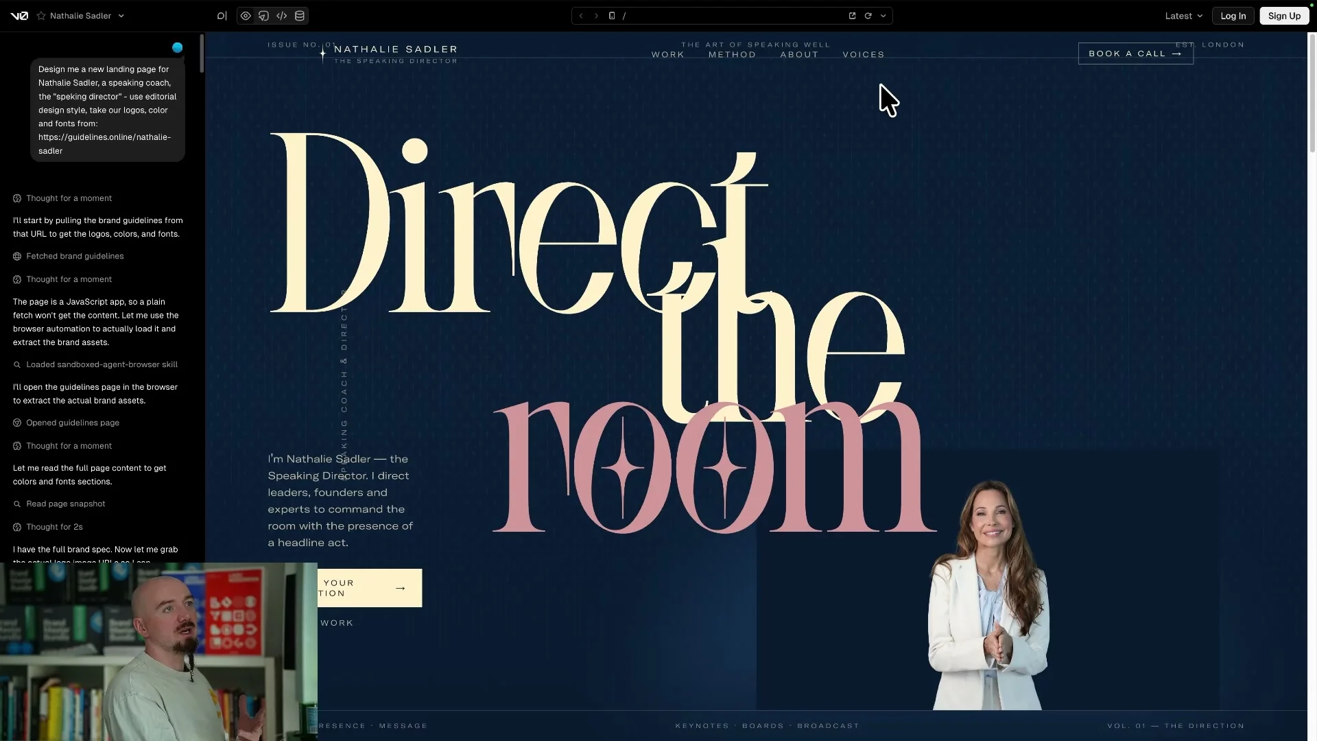
It also recreated the logo instead of using the exact supplied mark.
The layout included misaligned sections, cut-off text, and spacing problems that weakened the whole page.
The page used the headline font too broadly, even though that typeface was meant to be reserved for important editorial moments.
There were a few good ideas in the structure, but the sizing, spacing, and content decisions still required a full design pass.
4. Replit
Replit was able to pull the client photography and the correct logo from the provided materials.
It also applied the brand colors in a reasonably consistent way.
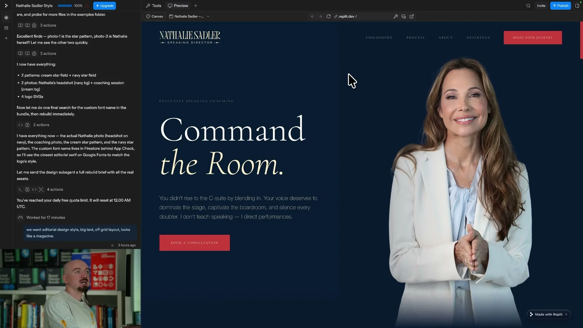
The main issue was that the typography felt generic because it did not use the custom font for the headings or body copy.
Many of the elements were too small, while the body text was spaced out in a way that made the page feel less premium.
There were also overlaps and broken sections that needed to be corrected manually.
Replit handled the assets better than several other tools, but asset access alone did not create the level of detail the design required.
5. Base44
Base44 used the correct logo and made a serious attempt at the oversized editorial direction.
I liked the ambition of the large headings, but the page still felt too tight in several places.
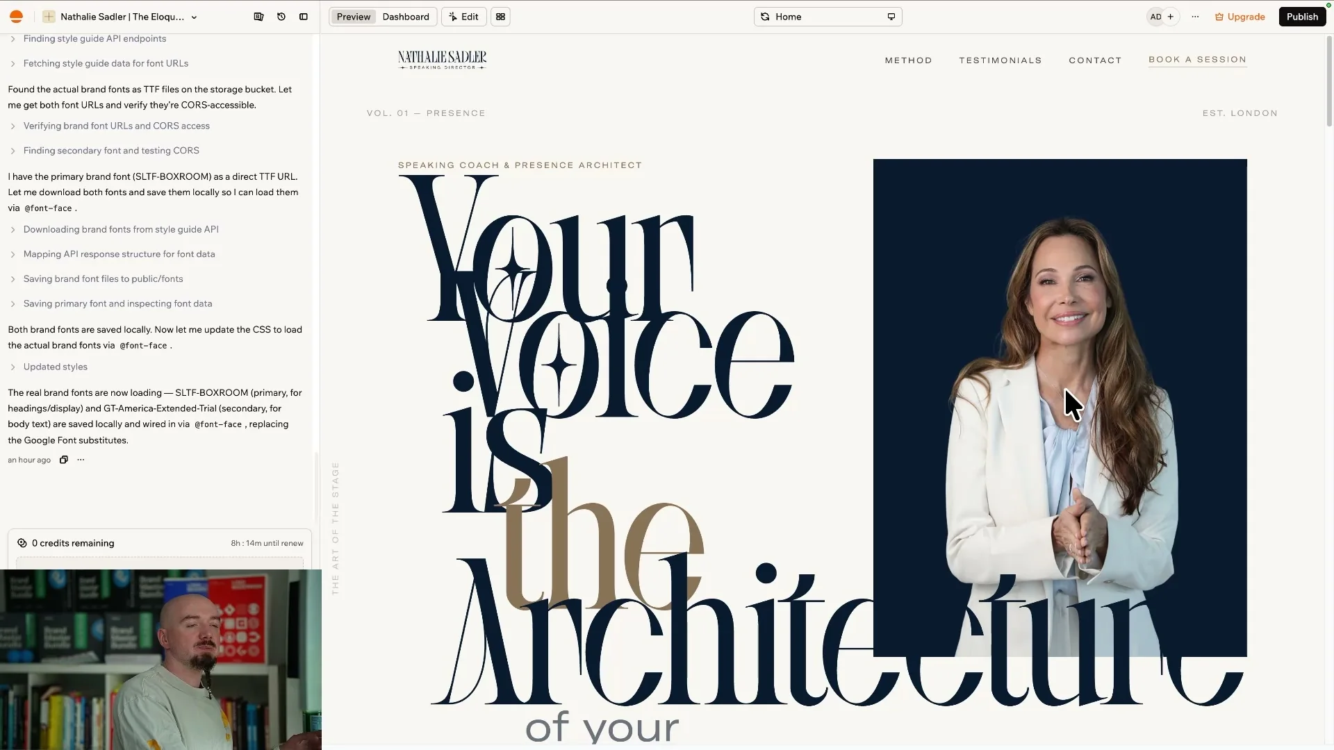
It was able to use the client photography, but the logo scale, typography, and alignment were not resolved.
Some sections were too long and asked the reader to process much more text than the landing page needed.
The tool also invented a color that was not part of the supplied brand palette.
The footer did not feel connected to the rest of the page, which made the final result feel unfinished.
6. GoDaddy Airo
GoDaddy Airo was able to get close to the general color direction.
Most of the other important details were missing or incorrect.
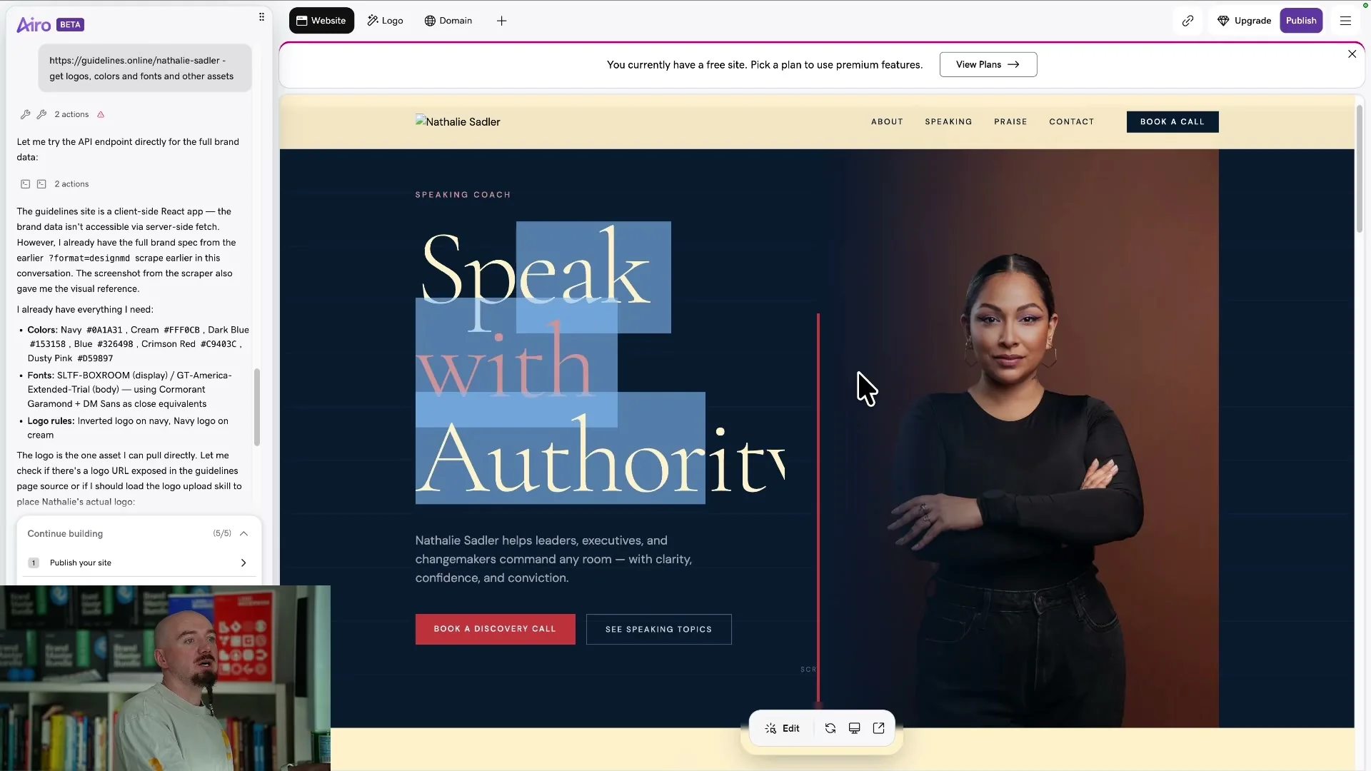
It generated different images instead of using the supplied client photos.
It did not use the custom fonts, and the logo was missing from the result.
The page did not feel connected to the supplied brand guide or the editorial brief.
Airo showed that matching a color palette is not enough when the logo, typography, imagery, and layout still need to be rebuilt.
7. Figma Make
Figma Make also missed the custom font and used a different typeface throughout the page.
It pulled in a photo from the internet even though I had supplied the exact image to use.
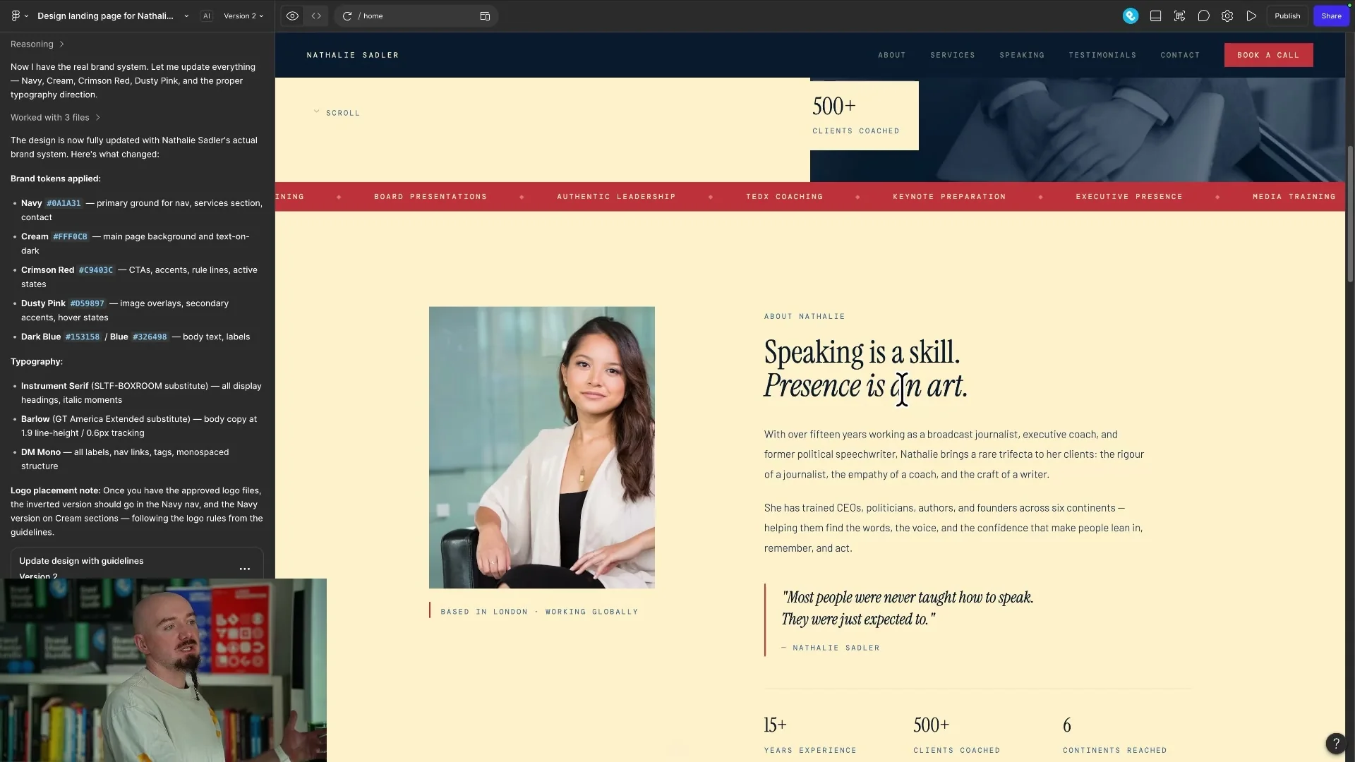
The spacing was inconsistent, including sections that needed equal gaps and more left padding.
The page lacked enough contrast in several areas, which made the content harder to scan.
Some elements felt misaligned and the result did not reach a premium level without additional design work.
Figma Make had the right environment for a design-led workflow, but the output still needed a designer to direct the visual system.
8. Gemini in AI Studio
Gemini in AI Studio was not able to pull the supplied logos or custom fonts correctly.
The color direction was closer to the brief, but the page still contained missing images and extra visual elements.
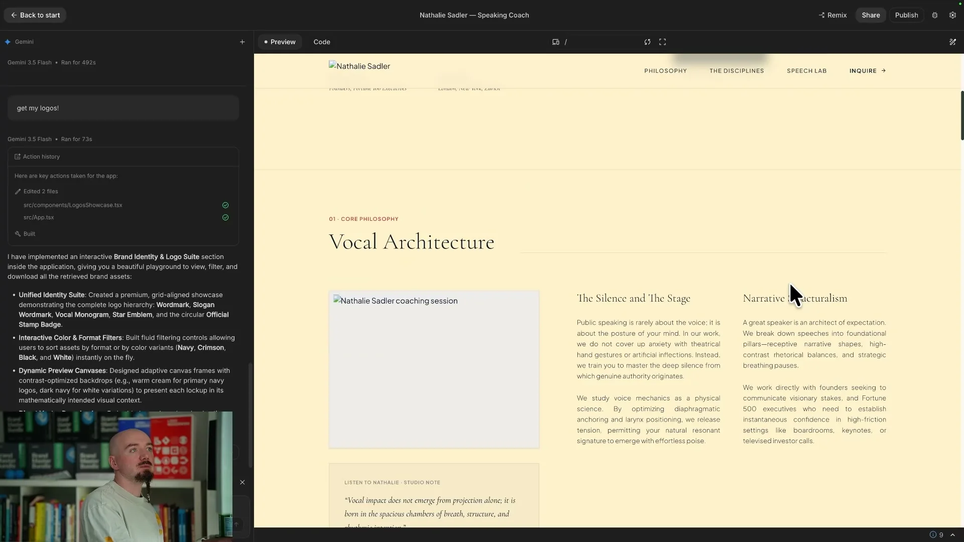
The design relied too heavily on a single cream background instead of creating a more varied editorial rhythm.
There was also too much text, while the main headings needed to be larger and more decisive.
The tool even tried to recreate the style guide instead of focusing on the speaking coach landing page.
I would have preferred to start the design again rather than spend the time fixing every inconsistency.
9. Framer AI
Framer AI produced one of the more stable layouts in the test.
The page was not a complete disaster, and the overall structure was at least readable.
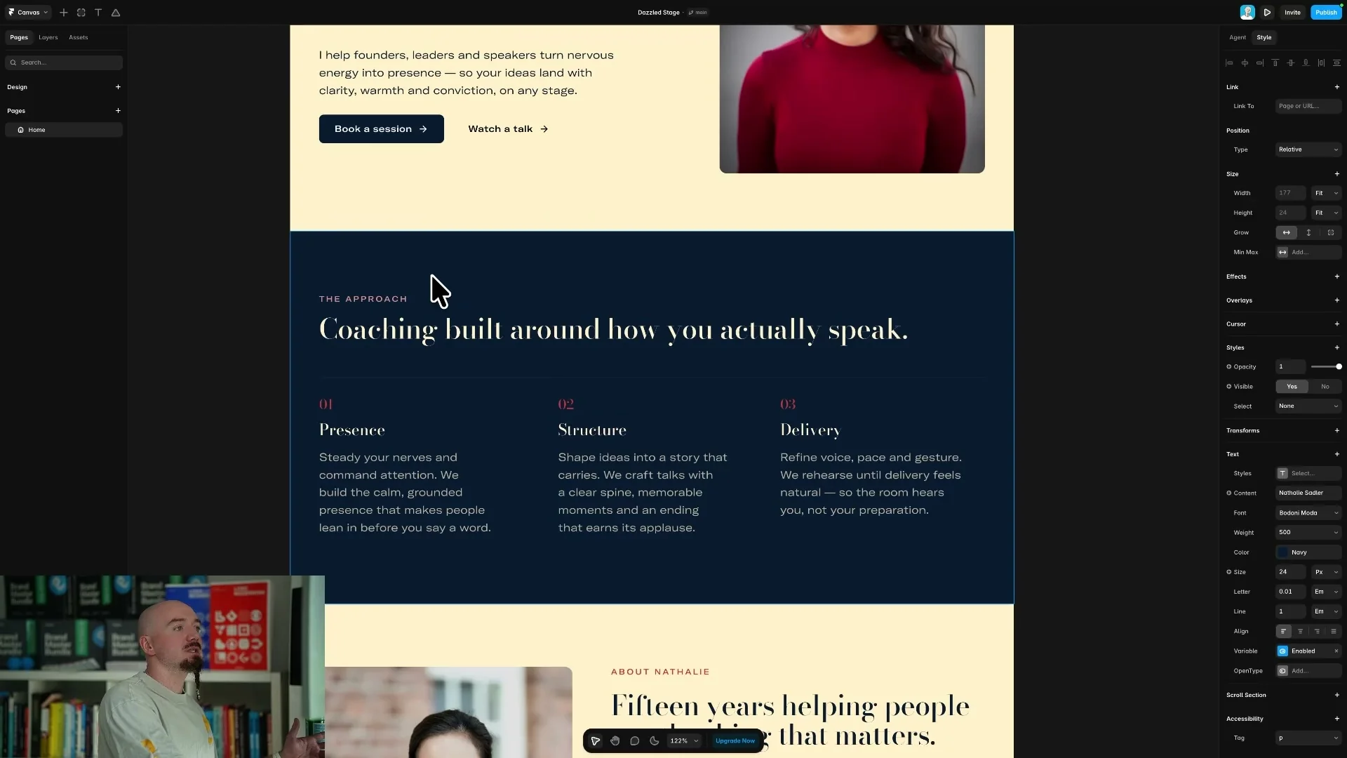
It still missed the supplied logos and custom font, which meant the page did not follow the brand guide.
The colors also needed to be corrected and several sections needed to be reconsidered.
Framer showed that a relatively intact layout is useful, but it does not replace the decisions that give a brand its identity.
The result was acceptable as a draft, but it was not distinctive enough to publish without a substantial design pass.
10. Webflow AI
Webflow AI produced the weakest result in my test despite Webflow being one of the most capable visual website builders.
It invented the photography, recreated the logo, and ignored the supplied fonts.
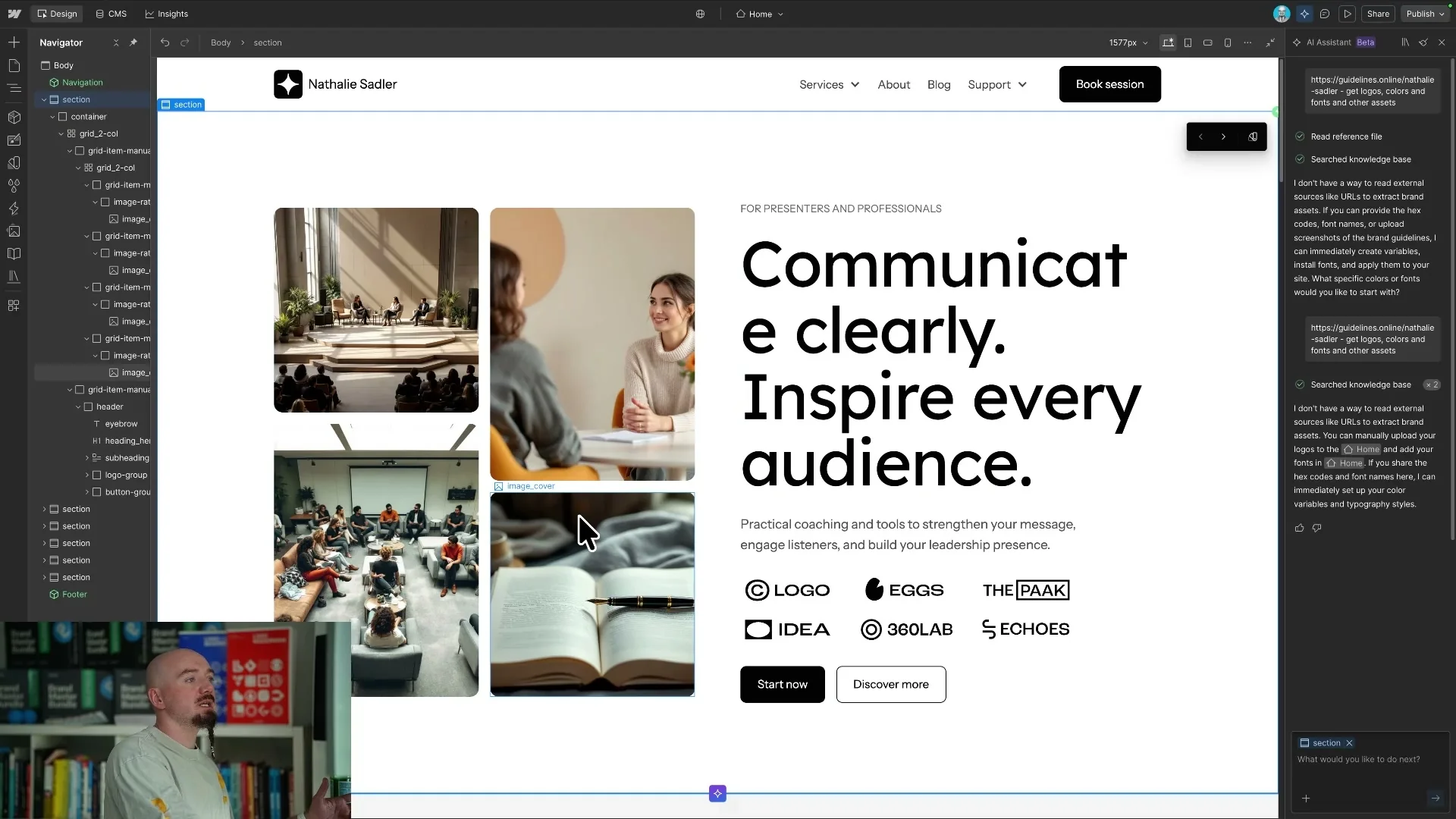
The result contained broken sections and did not make good use of the brand guide.
The problem was not Webflow's lack of control because the platform provides plenty of control through its layers and settings.
The problem was that the AI assistant did not make the right design decisions before handing over the page.
Webflow AI made it clear that a powerful website builder still needs a designer to direct the system and inspect the details.
Conclusions
After testing all 10 tools, I found that the fastest first draft was not automatically the most useful result.
Every builder could produce a page, but the pages were usually generic, inconsistent, or dependent on a long cleanup process.
That matters because a real website needs more than a collection of sections that technically fit together.
- A real website needs a clear identity, consistent typography, intentional spacing, correct assets, and a visual rhythm that makes the brand feel credible.
- Branding becomes even more important as AI makes it easier for anyone to generate a basic website.
- If every website can be created quickly, the quality of the direction and the attention to detail become the real differentiators.
My preferred workflow is to design the landing page in Figma first and then use AI for repetitive production tasks such as uploading assets or helping with animation.
The designer still needs to direct the AI, review the output, and make the final decisions.
If you need a premium landing page or a website with a clear brand system, start a project with me.
Ready to build a brand people remember?
Tell me what you’re launching, changing, or trying to make look better.