
Logo Design
54 Best Investment Firm Logos for Design Inspiration
Published on Aug 27, 2026

Investment firms sell judgment before they sell a product, so their identities must communicate trust, focus, and staying power to founders, limited partners, and management teams making high-stakes decisions.
What makes a good investment firm logo?
Private equity brands often signal continuity and operational discipline, while venture capital identities have more room for speed, technology, and founder culture, but both need a recognizable wordmark or one ownable device that works across decks, reports, websites, events, and portfolio announcements.
I reviewed 54 private equity, venture capital, and alternative-investment identities across six groups, linking each firm to its official website and focusing on practical visual lessons rather than investment performance.
54 investment firm logo examples
The six boards below collect 54 private equity, venture capital, and alternative-investment identities in one consistent format.
Each example is evaluated for its visible design decisions rather than ranked by assets, returns, or investment performance.
01 — Recognizable investment firm identities
This opening group mixes private equity and venture capital on purpose, using recognizable anchor brands to make the subject immediately legible before the article moves into more specialized firms.
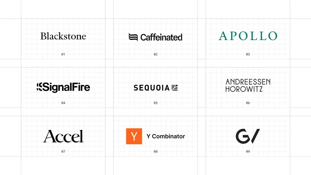
This is a visual comparison, not a ranking of firms or investment performance.
Look at how each mark manages name recognition, compact applications, and consistency across an identity system.
01 Blackstone
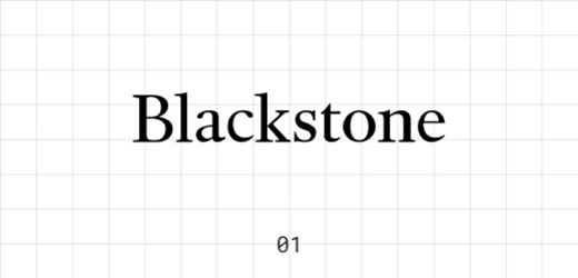
Blackstone is a global alternative asset manager whose platform includes private equity, real estate, credit, and other strategies. The identity has to carry enormous scale without looking like a consumer bank.
Its black serif wordmark is direct, formal, and almost editorial.
The restrained typography lets the name do all the work, which is an effective choice for a firm that already has substantial recognition.
02 Caffeinated
Caffeinated is a venture firm backing technology companies. Its name gives the brand an unusual amount of personality in a category filled with surnames and geographic references.
The compact symbol and heavy sans-serif wordmark create energy without startup clutter.
It feels fast and contemporary, while the black-and-white execution keeps it credible.
03 Apollo
Apollo is a global alternative asset manager investing across credit, equity, and real assets. Its identity needs to work across a broad institutional platform rather than a single fund.
The widely spaced green capitals create a calm, premium presence.
A classical name paired with disciplined typography gives the firm authority without using a crest, column, or other literal financial symbol.
04 SignalFire
SignalFire describes itself as a venture firm built like a technology company, with data, AI, and portfolio support at the center of its model. That positioning gives the identity permission to feel more active than a traditional fund.
The repeating signal motif makes the wordmark look as if it is transmitting.
This motion built into a static logo is a useful example of aligning the mark with the firm’s operating idea.
05 Sequoia Capital
Sequoia Capital is a venture firm that partners with founders across company-building stages. Its name and tree reference bring history and longevity into an industry obsessed with the next thing.
The bold uppercase wordmark and compact tree symbol feel established but not old-fashioned.
The identity balances institutional weight with the clarity expected from a technology investor.
06 Andreessen Horowitz
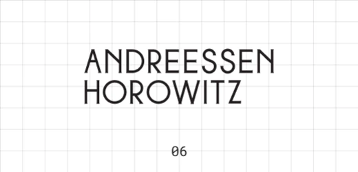
Andreessen Horowitz, also known as a16z, is a venture capital firm investing across technology categories and company stages. The full name remains a major part of the brand even though the shorthand is widely used.
The stacked condensed wordmark solves a difficult naming problem with confidence.
Its tall, architectural block feels distinctive at large scale and stays recognizable without adding a separate icon.
07 Accel
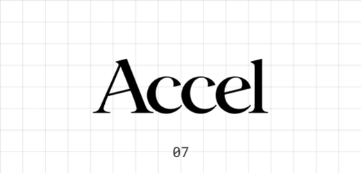
Accel is a global venture capital firm that works with technology companies from early stages through growth. The brand needs to feel equally credible beside a new founder and a mature portfolio company.
Its high-contrast serif wordmark is elegant, compact, and unusually expressive for venture capital.
The sharp, fashion-like letterforms give the firm a memorable personality without sacrificing seriousness.
08 Y Combinator
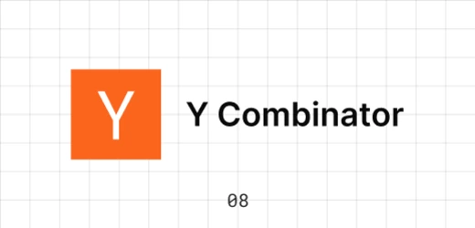
Y Combinator is a startup accelerator and seed investor rather than a conventional venture fund. Its inclusion matters because it is one of the most recognizable institutions in the startup funding ecosystem.
The orange square and single white “Y” function like a digital product icon, while the plain wordmark keeps the lockup practical.
It is a lesson in building recognition through repetition and simplicity.
09 GV
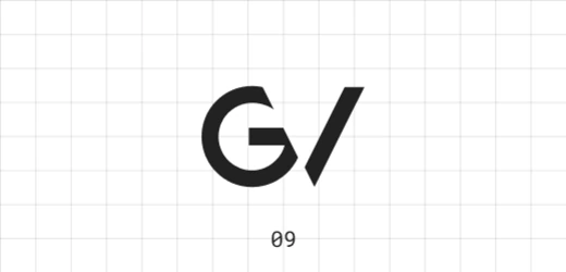
GV is an Alphabet-backed venture capital firm investing across fields including enterprise technology, consumer products, and life sciences. The short name demands a mark that can carry meaning with very little text.
The geometric monogram turns two letters into a compact optical form.
Its compressed, symbol-like construction works particularly well in small digital placements where longer investment-firm names struggle.
02 — Global private equity and alternative-investment logos
These firms operate across large, complex investment platforms, so their identities generally favor structure, authority, and repeatability across business lines.
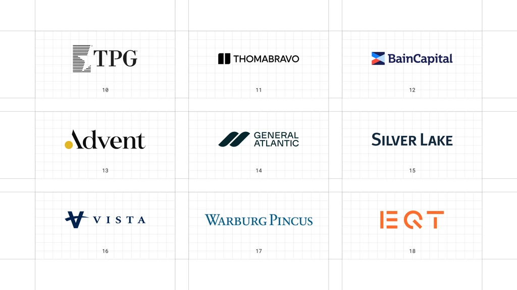
This is a visual comparison, not a ranking of firms or investment performance.
Look at how each mark manages name recognition, compact applications, and consistency across an identity system.
10 TPG
TPG is a global alternative asset management firm with investment strategies across private equity, growth, impact, credit, and real estate. The brand therefore needs a system that can stretch across multiple platforms.
The horizontal-line symbol creates texture and forward movement beside a traditional serif name.
This contrast between structure and heritage makes the lockup feel institutional without becoming static.
11 Thoma Bravo
Thoma Bravo is a private equity firm focused on software and technology-enabled businesses. The logo reflects a specialist investor that wants to look focused rather than broad.
The two solid vertical shapes establish a compact device beside an all-caps wordmark.
Its controlled modular geometry feels appropriate for a firm associated with software and operational discipline.
12 Bain Capital
Bain Capital is a private investment firm with strategies spanning private equity, credit, venture, real estate, and other asset classes. A recognizable masterbrand helps connect those different activities.
The folded red-and-blue symbol adds depth and direction to a sturdy wordmark.
It is more expressive than a typical finance monogram, yet the compact flag-like shape remains easy to apply across the system.
13 Advent International
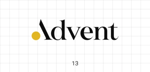
Advent International is a global private equity investor working across regions and sectors. Its identity combines the tone of an established institution with a more individual typographic voice.
The large black wordmark is interrupted by a small yellow circle, producing a simple but memorable visual event.
That single point of color gives the brand ownership without weakening its authority.
14 General Atlantic
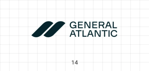
General Atlantic is a global growth investor that partners with companies across sectors and regions. The identity has to signal scale while retaining the optimism associated with growth.
The two slanted teal forms suggest connection and forward movement.
Paired with a compact uppercase name, the mark creates a modern global lockup that feels active but disciplined.
15 Silver Lake
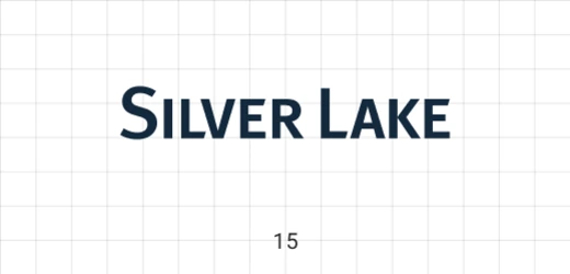
Silver Lake is a global technology investment firm. The name is distinctive enough that the identity can stay typographic rather than explain the technology focus literally.
Its broad uppercase wordmark uses measured spacing and a deep blue tone to establish quiet confidence.
The simplicity also gives the firm room to build recognition through typography alone.
16 Vista Equity Partners
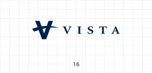
Vista Equity Partners invests in enterprise software, data, and technology-enabled organizations. Its logo needs to feel systematic and durable across a large portfolio.
The angular “V” has the weight of an institutional monogram, while the spaced serif wordmark adds formality.
The result is a strong symbol-and-name hierarchy that performs well in sponsorship and corporate contexts.
17 Warburg Pincus
Warburg Pincus is a global growth investor with a long history of partnering with companies across sectors. The identity leans into that continuity rather than chasing current venture-brand conventions.
Its blue serif wordmark is traditional, readable, and carefully proportioned.
The unembellished two-name signature communicates permanence and lets reputation accumulate around a stable visual asset.
18 EQT
EQT is a global investment organization active across private capital and real assets. Its identity takes a much more graphic route than most large alternative-investment firms.
The custom orange letterforms use cuts, mirrored shapes, and strong negative space.
This proprietary geometric wordmark is unmistakable at a distance and shows that an institutional brand can still be bold.
03 — Specialist and middle-market private equity logos
This group shows how specialist and middle-market firms can create distinction even when the overall tone remains conservative.
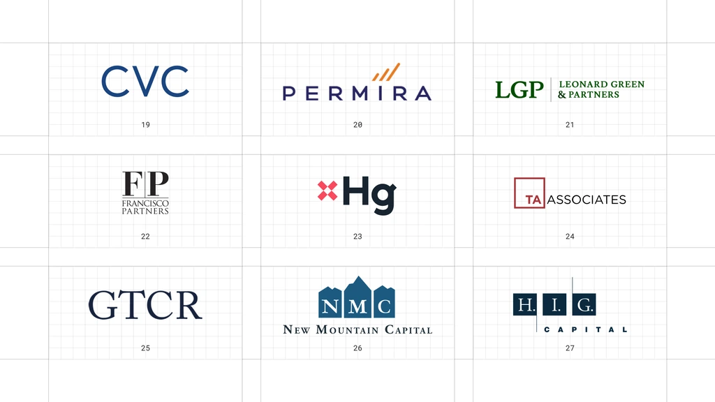
This is a visual comparison, not a ranking of firms or investment performance.
Look at how each mark manages name recognition, compact applications, and consistency across an identity system.
19 CVC
CVC is a global alternative investment manager with strategies that include private equity, credit, and infrastructure. Its short name allows the firm to use a simple wordmark at substantial scale.
The rounded blue capitals feel open and contemporary.
Subtle differences in the letter construction create a recognizable three-letter silhouette without requiring an additional symbol.
20 Permira
Permira is a global investment firm active in private equity, growth equity, and credit. Its identity combines a formal name with a small visual cue that suggests progress.
The wide-spaced navy capitals are paired with ascending orange strokes.
That small upward accent introduces energy while keeping the overall lockup measured and institutional.
21 Leonard Green & Partners
Leonard Green & Partners is a private equity firm investing in established companies. The identity uses its initials to make a long partnership name easier to recognize.
The large green “LGP” anchors a compact full-name lockup.
This initials-first hierarchy is practical for long firm names, although it depends on careful sizing so the descriptor remains legible.
22 Francisco Partners
Francisco Partners is a technology-focused private equity firm. Its identity is notably traditional relative to many of the software companies in which a technology investor may participate.
The stacked “FP” monogram and serif name create an established advisory tone.
It signals stewardship and experience rather than borrowing the visual language of a startup.
23 Hg
Hg is an investor focused on software and services businesses. Its short name gives the brand room to use a bold, highly compact signature.
The dark lowercase letters are paired with a bright red modular symbol.
The large, dense two-character wordmark is direct and digital-friendly, while the red device adds a recognizable point of difference.
24 TA Associates
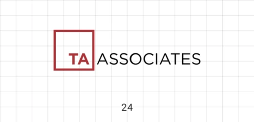
TA Associates is a global growth private equity firm. Its abbreviated name is supported by a descriptor that makes the category clear to audiences unfamiliar with the initials.
The red outlined square creates a precise container for “TA,” while the black wordmark extends horizontally.
This framed monogram feels orderly and easy to deploy across reports, events, and portfolio materials.
25 GTCR
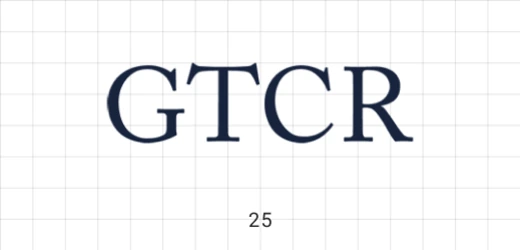
GTCR is a private equity firm that partners with management leaders and companies across several core sectors. The brand relies entirely on a short, established name.
The navy serif capitals have a formal, legalistic confidence.
With no icon competing for attention, the four-letter wordmark becomes the complete identity and benefits from generous clear space.
26 New Mountain Capital
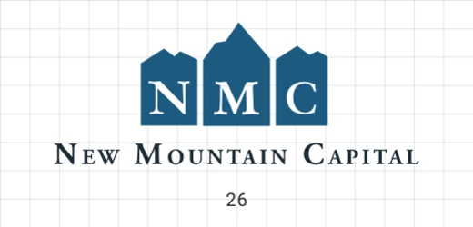
New Mountain Capital is an alternative investment manager pursuing growth-oriented strategies. The mountain reference gives the identity a natural visual metaphor for scale and progress.
Three blue peaks contain the initials above the full name.
The literal mountain construction is more illustrative than most logos in this list, but its symmetry and limited palette keep it professional.
27 H.I.G. Capital
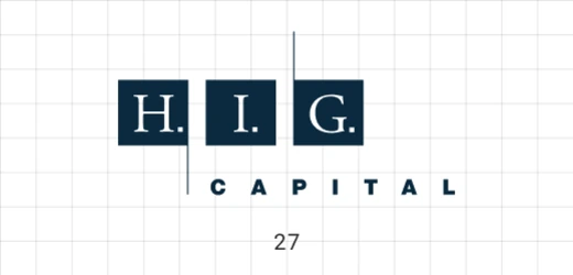
H.I.G. Capital is a global alternative investment firm focused on the middle market. Its identity has to accommodate a broad platform while retaining a recognizable parent mark.
The initials sit inside a row of architectural blocks, with “Capital” spaced beneath.
This structured emblem feels established and controlled, though the detailed lockup requires enough size to remain readable.
04 — Established venture capital logos
These established venture firms use more varied typography and symbols, but their strongest identities still prioritize clarity and long-term recognition.
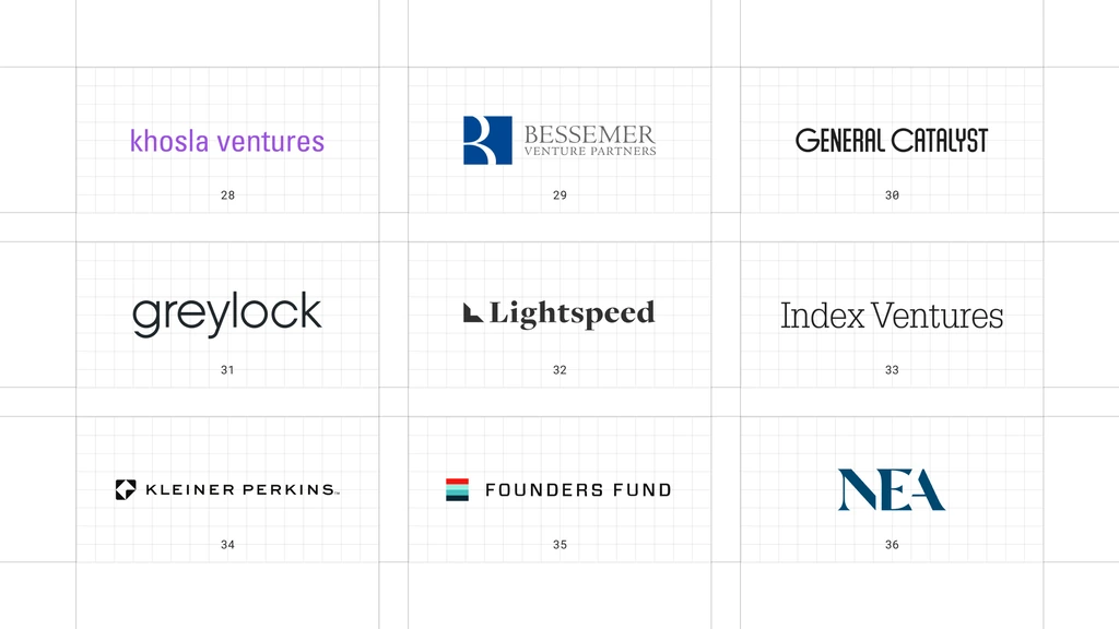
This is a visual comparison, not a ranking of firms or investment performance.
Look at how each mark manages name recognition, compact applications, and consistency across an identity system.
28 Khosla Ventures
Khosla Ventures is a venture capital firm backing technology-driven companies across multiple sectors. Its identity is unexpectedly informal for a fund associated with ambitious science and technology.
The lowercase purple wordmark feels approachable and direct.
Its plainspoken typographic style puts the founder relationship ahead of institutional ceremony.
29 Bessemer Venture Partners
Bessemer Venture Partners is a venture capital firm investing from early stages through growth. The identity combines a recognizable initial with the full partnership name.
The blue “B” is carved from bold geometric fields, while the descriptor uses a compact serif.
This symbol-plus-editorial pairing gives the firm both digital recognition and institutional depth.
30 General Catalyst
General Catalyst describes itself as a global investment and transformation company. Its positioning extends beyond conventional venture capital, so the identity benefits from a broad, confident tone.
The condensed uppercase wordmark feels energetic without relying on a separate icon.
Its compressed horizontal rhythm is recognizable and leaves the name as the central brand asset.
31 Greylock
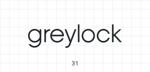
Greylock is a venture capital firm focused on early-stage company building. The brand’s longevity is expressed through a simple wordmark rather than an overt heritage treatment.
Rounded lowercase letters make the name feel conversational and technology-native.
The soft geometric construction is approachable, but controlled enough to remain credible with founders and institutions.
32 Lightspeed
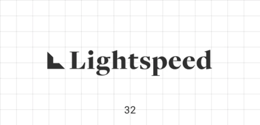
Lightspeed is a multi-stage venture capital firm investing across enterprise, consumer, health, and financial technology. The name naturally suggests movement, which the logo translates into a compact visual gesture.
The small angled symbol precedes a serif wordmark, creating speed through asymmetry.
The mark is distinctive without turning the identity into a literal lightning bolt.
33 Index Ventures
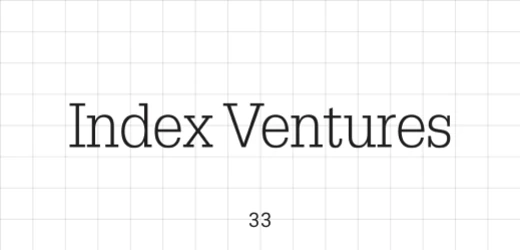
Index Ventures is a venture capital firm partnering with technology companies from seed through growth. The full name is kept prominent rather than reduced to a monogram.
The narrow serif wordmark feels editorial and European, with enough character to stand alone.
Its type-led restraint is a reminder that a venture identity does not have to look like a software interface.
34 Kleiner Perkins
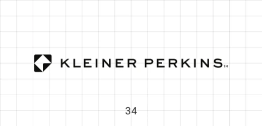
Kleiner Perkins is a venture capital firm with a long history of backing technology and life-sciences companies. Its identity balances that history with a compact contemporary symbol.
The small geometric mark and widely spaced uppercase name create a precise, engineered lockup.
The symbol adds ownership, while the full wordmark preserves recognition.
35 Founders Fund
Founders Fund is a venture capital firm investing in technology companies across stages. The identity places founders explicitly at the center of the name and avoids the look of a traditional financial institution.
The compact striped symbol and bold spaced wordmark feel modern and self-contained.
Its horizontal digital signature works cleanly in presentations, portfolio pages, and social placements.
36 NEA
NEA, or New Enterprise Associates, is a global venture capital firm investing across technology and healthcare. The abbreviation is the primary public-facing brand.
The sharp blue serif letters give the short name substance and authority.
The dramatic triangular “A” creates a recognizable ending and prevents the acronym from feeling generic.
05 — Technology and growth venture logos
These technology and growth investors sit closer to software and founder culture, with bolder color, more geometric construction, and more varied wordmarks.
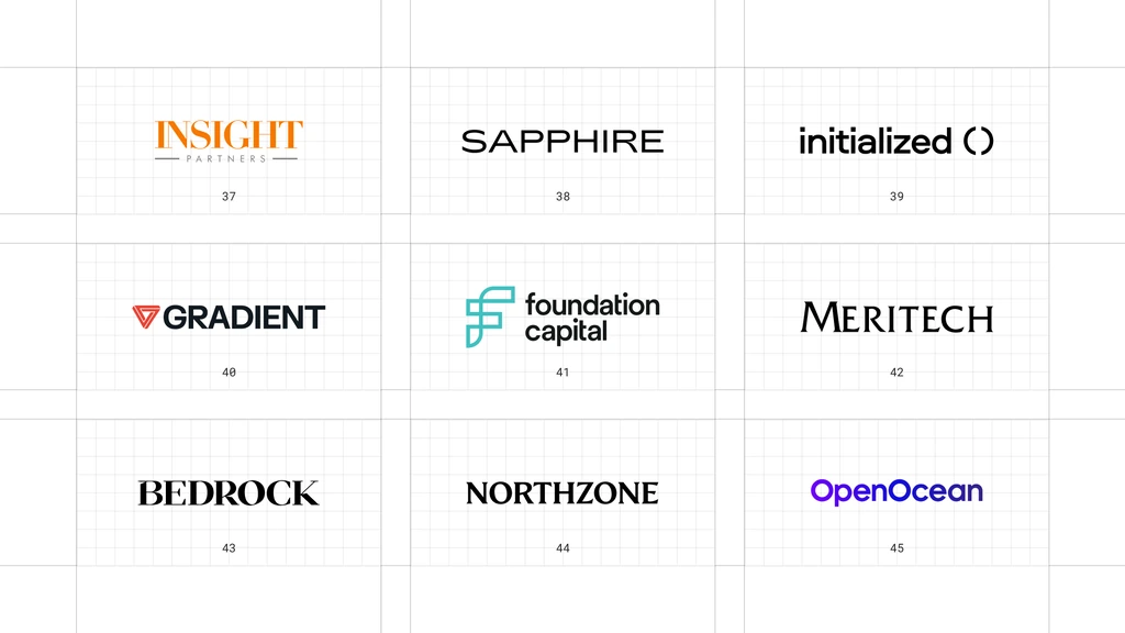
This is a visual comparison, not a ranking of firms or investment performance.
Look at how each mark manages name recognition, compact applications, and consistency across an identity system.
37 Insight Partners
Insight Partners is a global software investor working with growth-stage technology companies. Its identity needs to feel comfortable beside the modern product brands in its portfolio.
The orange serif wordmark is underlined by a fine horizontal rule, with the descriptor held below.
This warm editorial signature stands apart from the blue sans-serif defaults common in enterprise investing.
38 Sapphire Ventures
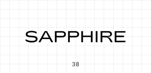
Sapphire Ventures is a venture capital firm focused on scaling technology companies. The gemstone name gives the brand a built-in association with value and clarity.
The extended black wordmark uses customized angles and spacing rather than a literal gem icon.
Its sleek all-caps construction feels polished, modern, and easy to place beside portfolio-company brands.
39 Initialized Capital
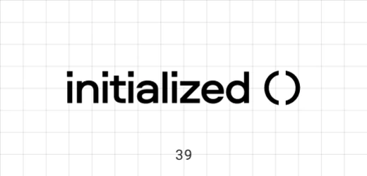
Initialized Capital is an early-stage venture capital firm. The name comes from a programming concept, giving the identity a natural connection to technical founders.
The lowercase wordmark is paired with a circular cursor-like symbol.
This code-adjacent visual cue makes the identity relevant to software without using an obvious bracket or terminal icon.
40 Gradient Ventures
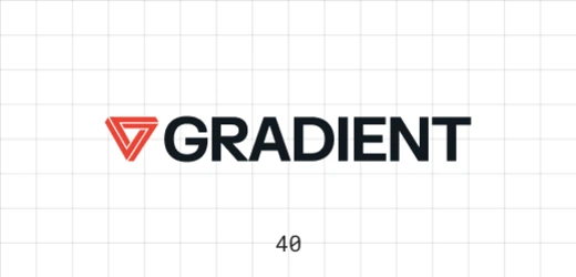
Gradient Ventures is a venture fund focused on AI companies. Its name and positioning make transformation, iteration, and technical progress natural themes for the identity.
The red nested triangle produces depth through a simple line construction.
Paired with a bold wordmark, the layered geometric symbol feels technical and recognizable at small sizes.
41 Foundation Capital
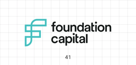
Foundation Capital is a venture capital firm backing early-stage companies. The name suggests a stable base, while the visual identity gives that idea a more contemporary expression.
The interlocking turquoise “F” shape resembles a modular framework.
Its open, constructive geometry gives the firm a useful symbol without relying on a literal building foundation.
42 Meritech Capital
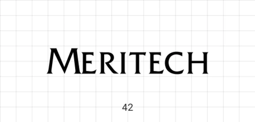
Meritech Capital is a venture firm focused on growth-stage technology companies. Its identity is stripped back to a single name with no explanatory icon.
The black serif wordmark uses distinctive angled forms and an unusually broad stance.
This confident typographic silhouette feels established while remaining relevant to technology companies.
43 Bedrock
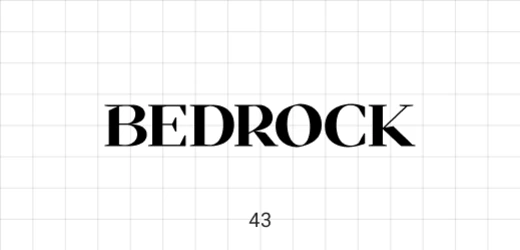
Bedrock is a venture capital firm investing in technology companies. The name already communicates foundation and durability, so the logo can remain direct.
The bold black serif wordmark is compact and slightly unconventional in its proportions.
Its weight and compression give the short name impact without adding a rock or landscape symbol.
44 Northzone
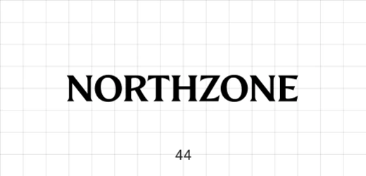
Northzone is a multi-stage venture capital firm partnering with technology founders. Its name carries a geographic flavor, but the identity avoids maps, arrows, and compass symbols.
The black serif capitals form a dense, stable wordmark.
This deliberately non-literal approach gives the brand a mature voice and leaves room for the broader visual system to carry expression.
45 OpenOcean
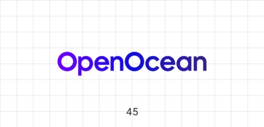
OpenOcean is an early-stage venture capital firm focused on data, software, and AI-driven companies. The name suggests breadth and exploration rather than a narrow financial category.
The electric blue-and-purple wordmark uses rounded, tightly joined forms.
Its bright digital color makes the firm feel native to software while the simple construction keeps it legible.
06 — Emerging and international venture capital logos
The final group includes smaller, specialized, and international firms, showing that a distinctive identity is not reserved for the largest funds.
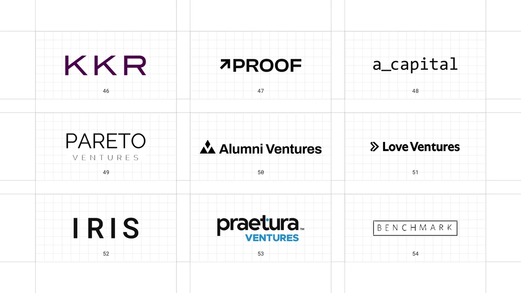
This is a visual comparison, not a ranking of firms or investment performance.
Look at how each mark manages name recognition, compact applications, and consistency across an identity system.
46 KKR
KKR is a global investment firm active across private equity, credit, infrastructure, real estate, and other strategies. It appears here as a recognizable institutional counterpoint to the smaller venture brands around it.
The customized purple capitals are paired with a vertical anniversary device in the current lockup.
The short, highly recognizable acronym carries the identity, while the limited color palette keeps it premium.
47 PROOF
PROOF is a growth-stage venture capital firm. The name is unusually assertive for an investor and gives the brand a strong verbal premise.
The upward arrow is integrated directly into the bold black wordmark.
This embedded growth signal is literal, but concise enough to feel like part of the typography rather than a separate stock icon.
48 A.Capital
A.Capital is a venture capital firm investing in technology companies. The short name is expressed with a deliberately minimal, almost code-like treatment.
The lowercase wordmark uses an underscore and monospaced rhythm.
Its technical typographic voice feels designed for digital contexts and clearly differentiates the firm from traditional asset managers.
49 Pareto
Pareto is a venture firm backing early-stage founders. The name references the Pareto principle, giving the brand an implicit idea of focus and outsized outcomes.
The clean uppercase wordmark and widely spaced “Ventures” descriptor create a measured two-level hierarchy.
The identity feels polished without overexplaining the mathematical reference.
50 Alumni Ventures
Alumni Ventures is a venture capital firm that gives accredited individual investors access to diversified venture portfolios. Its community model is central to the brand’s distinction.
The triangular group symbol suggests a network or collective beside a bold wordmark.
This community-oriented emblem supports the firm’s positioning while remaining clear in a corporate setting.
51 Love Ventures
Love Ventures is a UK early-stage venture capital firm. The name is warmer and more human than most financial brands, which creates an immediate point of difference.
The double-chevron symbol adds forward movement without using a heart.
The unexpectedly direct name paired with a restrained black lockup gives the brand personality without sentimentality.
52 IRIS
IRIS is a European venture and growth investor focused on technology companies. Its short name supports a bold, highly legible identity across markets.
The wide black capitals use pronounced spacing and no separate symbol.
This minimal four-letter signature feels confident, international, and flexible enough to sit alongside many different portfolio brands.
53 Praetura Ventures
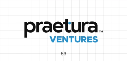
Praetura Ventures was a UK venture capital firm that merged with Par Equity to become PXN Ventures. The official Praetura site now documents that transition, so this entry treats the displayed logo as a recent predecessor identity rather than a current standalone firm.
The lowercase black wordmark uses a small blue accent, while “Ventures” appears below in bright capitals.
This two-tone naming hierarchy made the category clear without weakening the primary name.
54 Benchmark
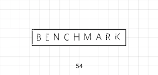
Benchmark is a venture capital firm known for an early-stage, partnership-led model. Its identity avoids the large, polished technology-fund aesthetic entirely.
The narrow serif letters sit inside a simple rectangular border like a stamped label.
This deliberately modest wordmark is memorable because it feels restrained, human, and almost anti-corporate.
What these 54 examples reveal
Typography carries most of the trust
Many investment identities lead with the firm name, making type selection, spacing, proportion, and hierarchy central to recognition.
Restraint still needs a point of view
A quiet palette can feel credible, but one distinctive letterform, symbol, color, or composition keeps the identity from disappearing into the category.
The logo must work inside a system
Investment brands appear across websites, pitch decks, reports, portfolio announcements, events, and social channels, so flexibility matters as much as the primary lockup.
A practical investment-firm design checklist
- Is the full name readable at website-navigation and presentation-footer sizes?
- Does the identity match the firm's actual strategy, stage, and founder experience?
- Can the mark work in one color on white and dark backgrounds?
- Is there one element people can recognize without reading every letter?
- Does the logo avoid generic charts, columns, globes, and upward arrows unless the execution is genuinely ownable?
- Can the system scale across funds, strategies, events, reports, and portfolio announcements?
- Will the identity still feel credible after the current visual trend passes?
Need help with branding?
If your investment firm has outgrown a generic wordmark or template website, I can help turn its positioning into a more credible, recognizable identity.
View my branding and website case studies to see how I approach strategy, identity, and digital design.
If you are launching a firm or improving an existing brand, book a call and tell me what you are building, changing, or trying to make look better.
Ready to build a brand people remember?
Tell me what you’re launching, changing, or trying to make look better.