

Savory
An editorial identity for a Brooklyn real estate team
- Visual identity
- Logo design
- Motion
- Brand guidelines
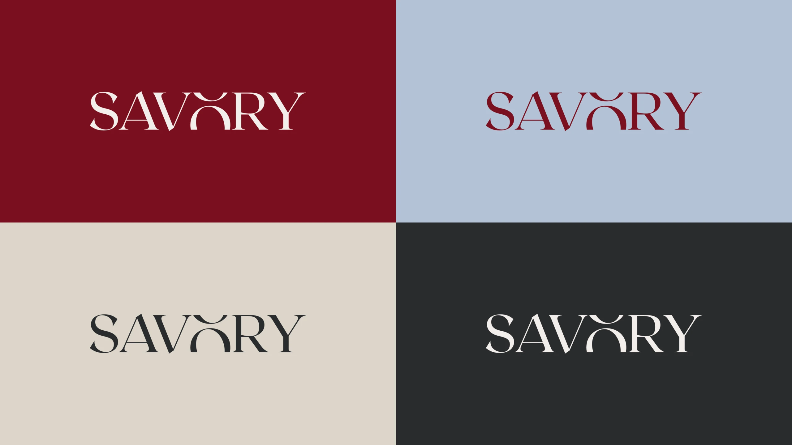
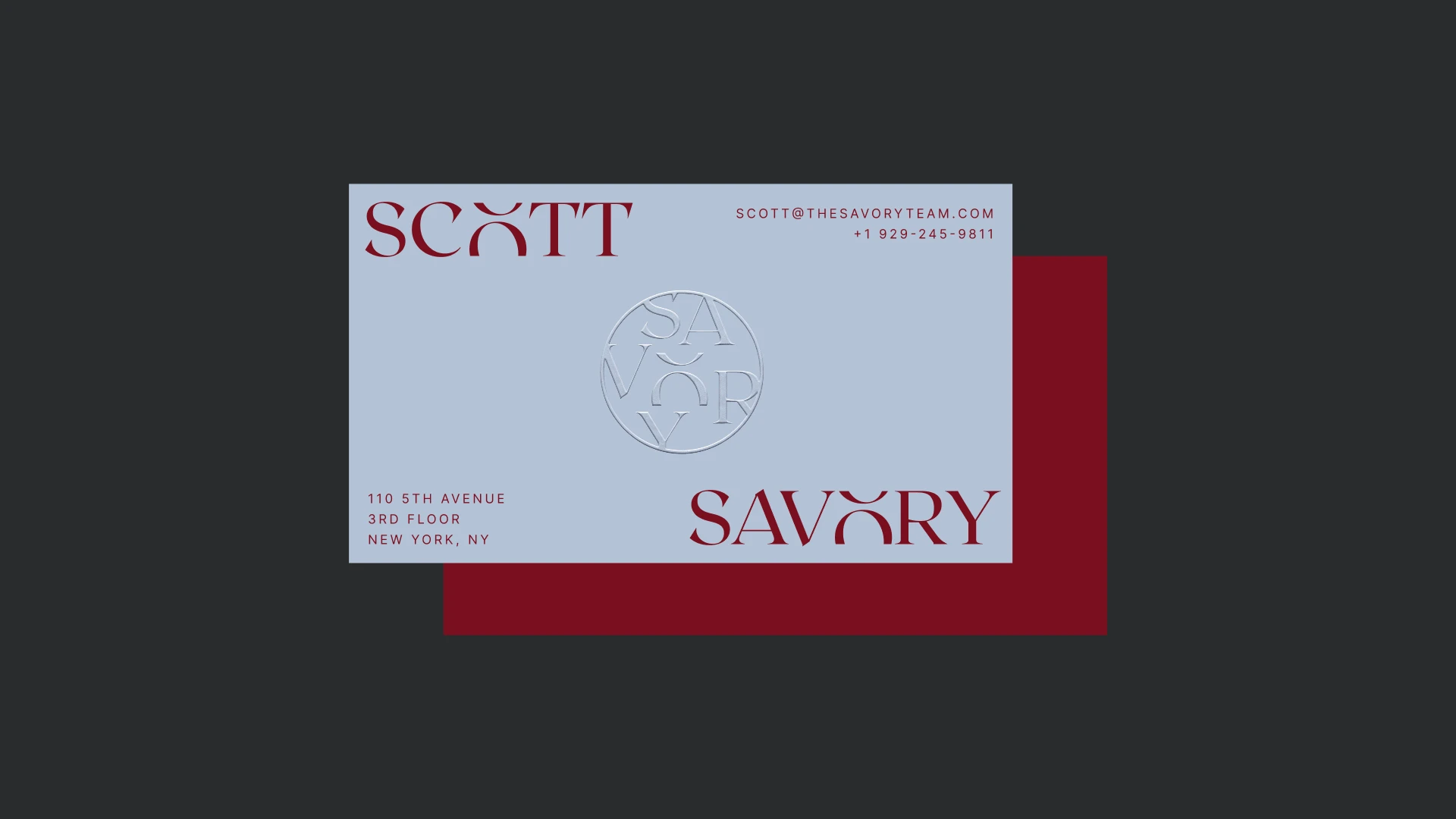
The Savory Team is a Brooklyn real estate team at Compass. After six months of design explorations that never felt right, they came to us for a fresh start. We created a premium identity built around a distinctive wordmark, with a wax seal, refined typography, and a warm color palette.
An editorial foundation
Roxborough CF capitals give SAVORY its distinctive voice, paired with PP Editorial Old Italic. Wax Red anchors the palette, balanced by Off-white, Asphalt, Cream, and Sky Blue. Together, color and typography bring the same refined character to every touchpoint.
One letter out of place
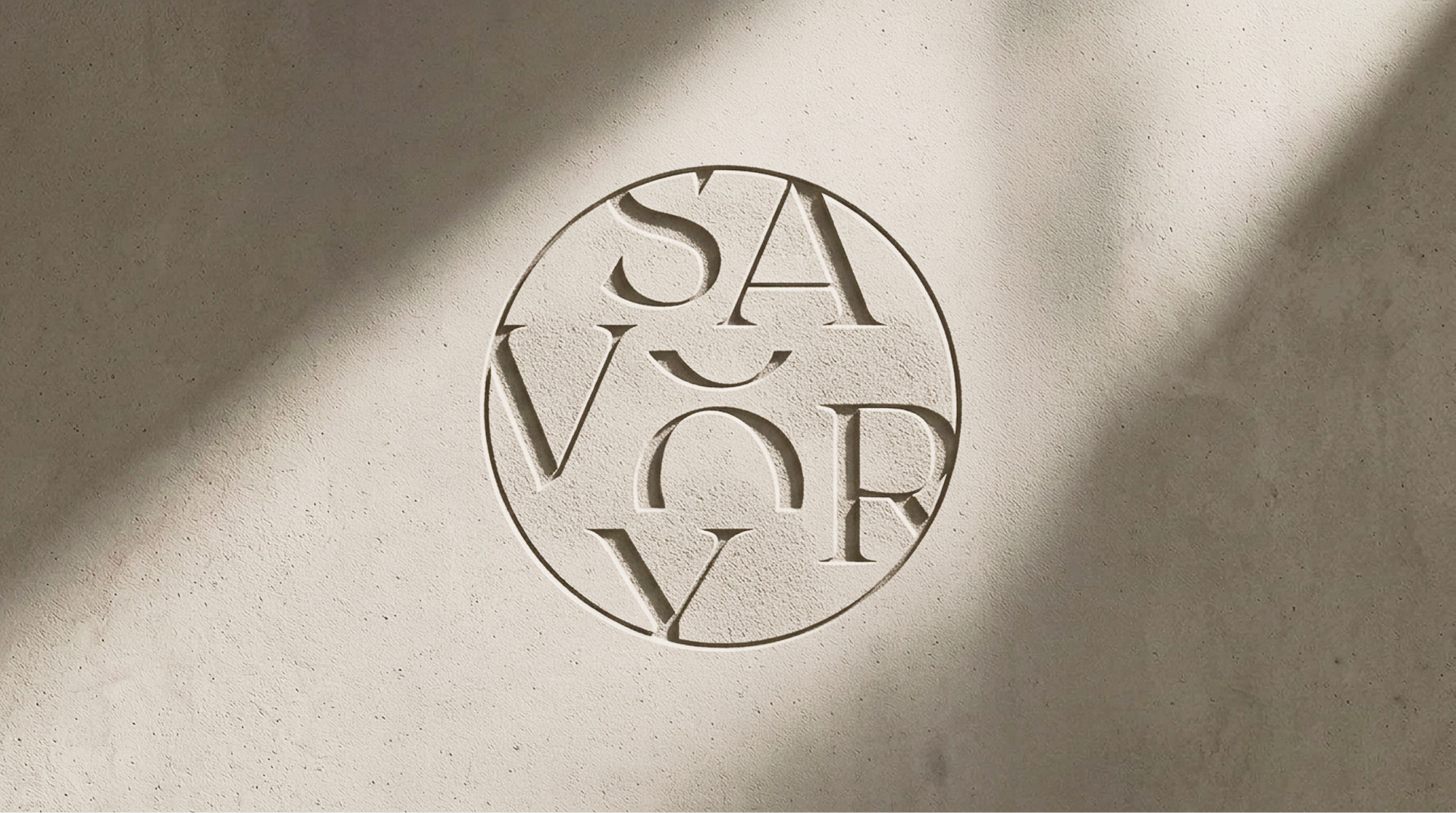
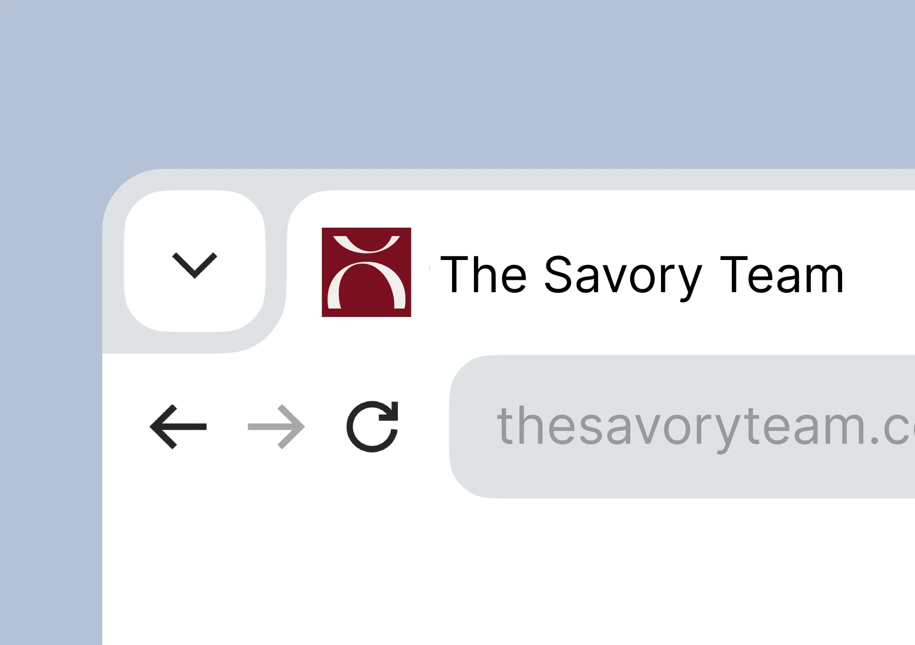
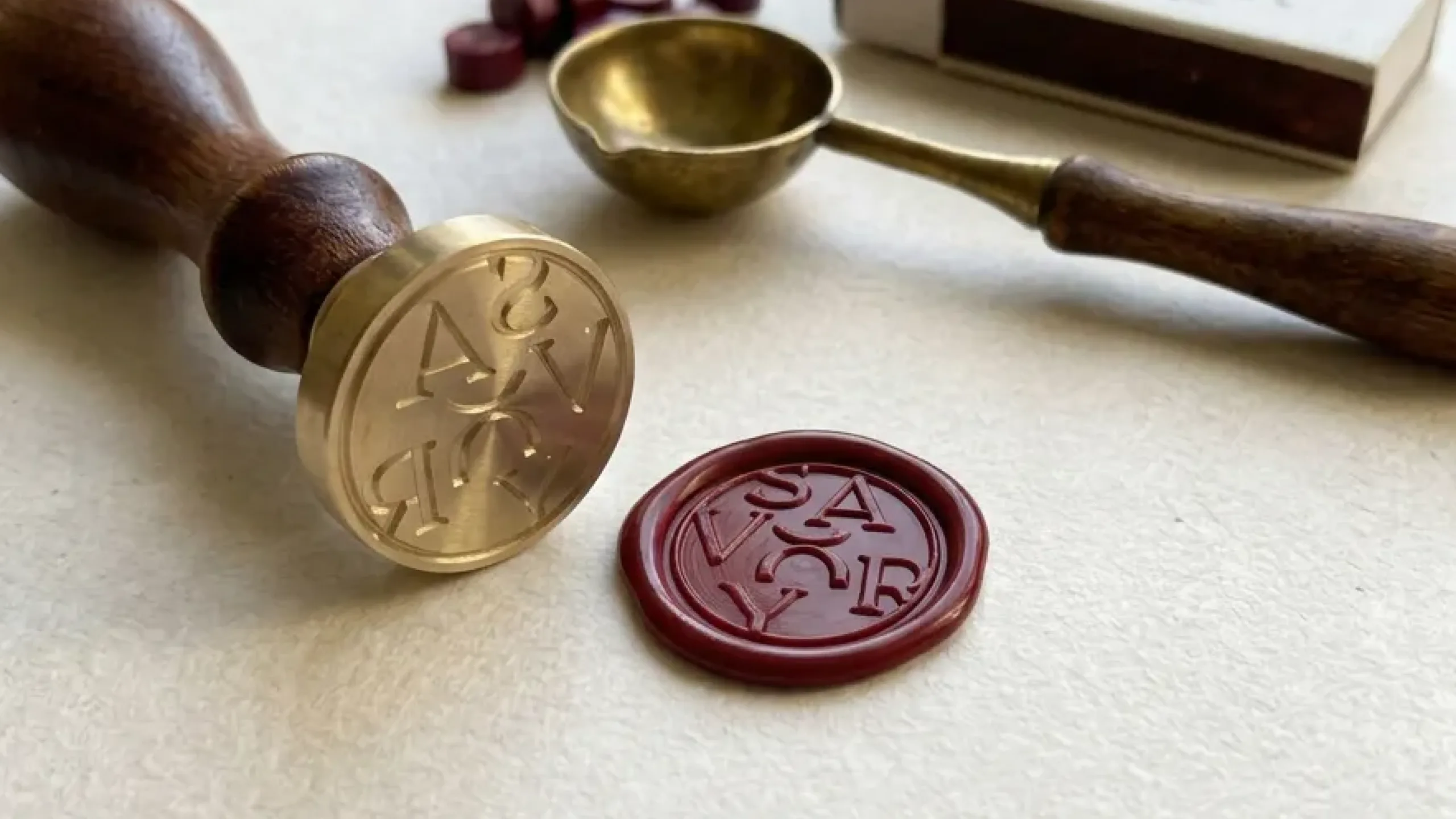
The split O gives a classic wordmark an unexpected rhythm. In motion, the letters roll into place before the O settles on its split. On its own, it suggests a figure with raised arms: the moment a client finds their place. The wordmark and circular seal carry that idea across digital details and physical objects.
A place in the everyday
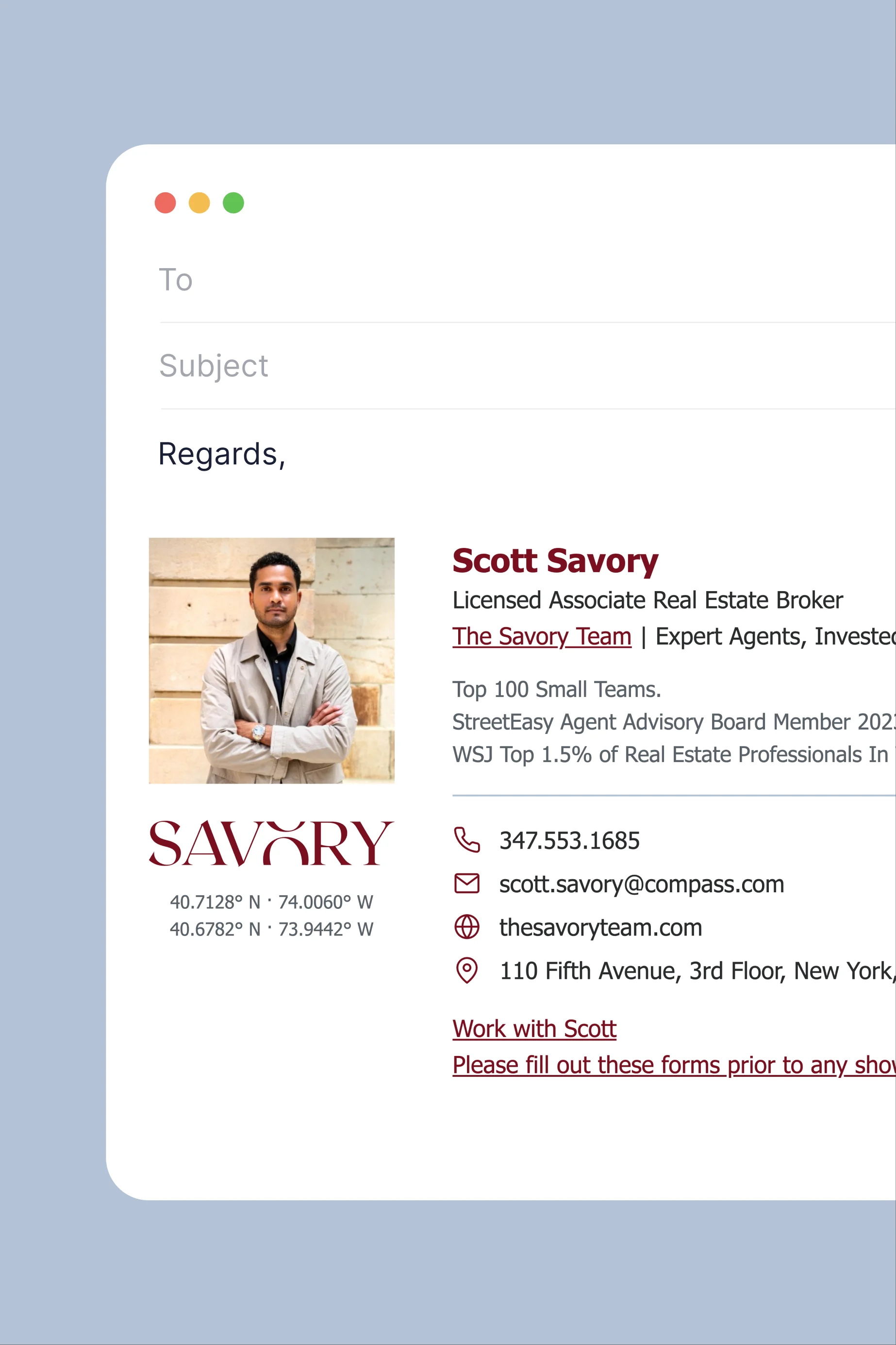
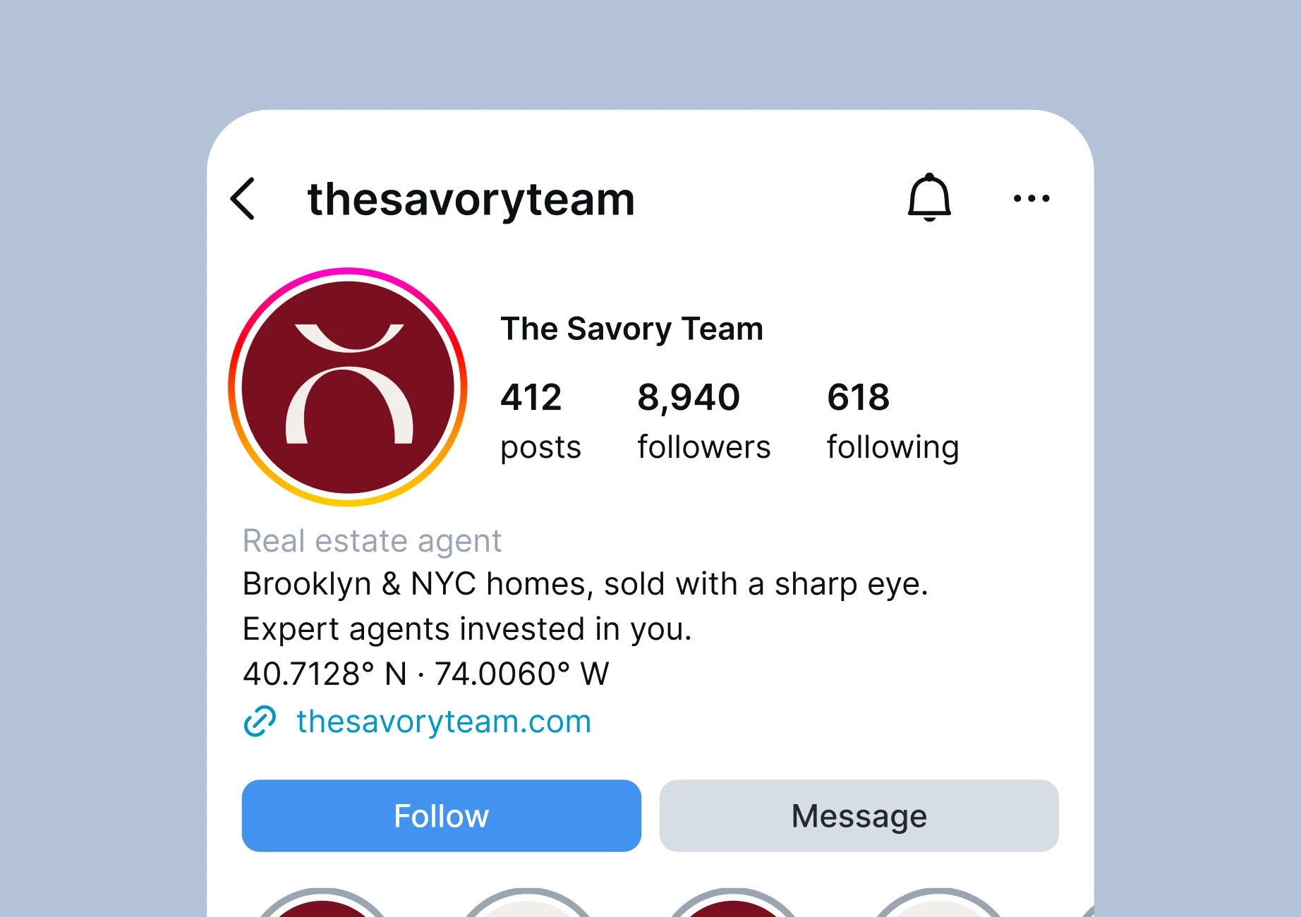
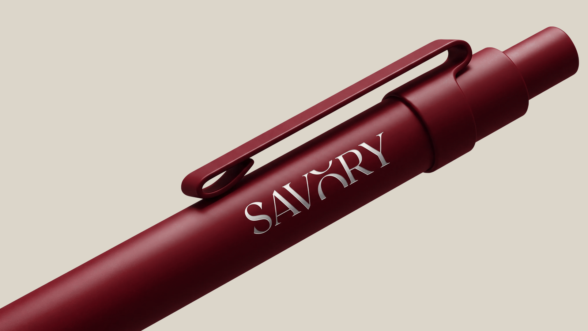
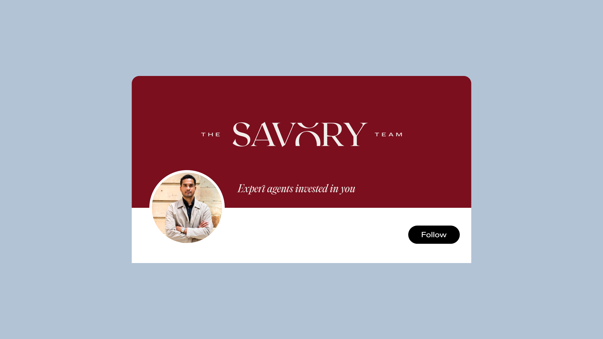
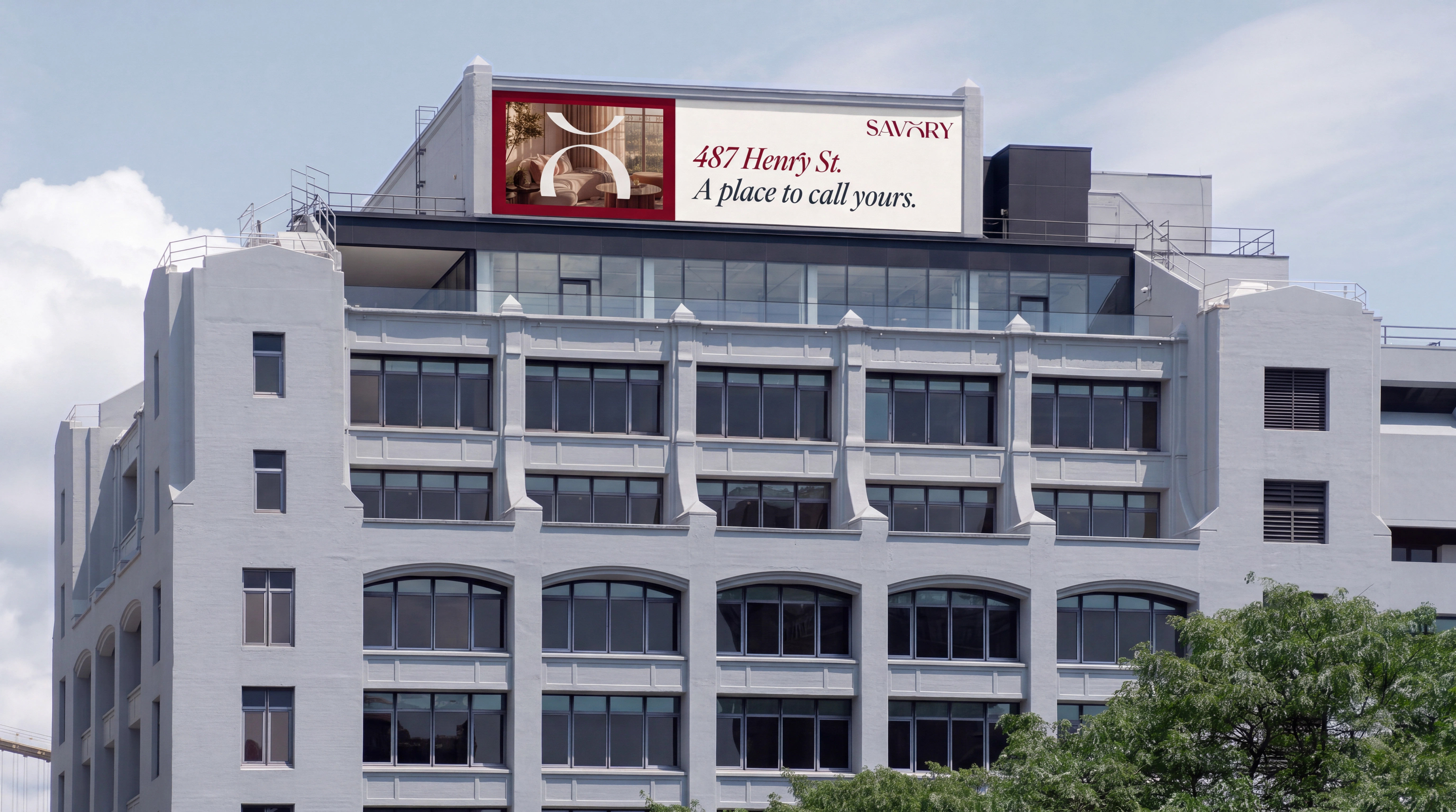
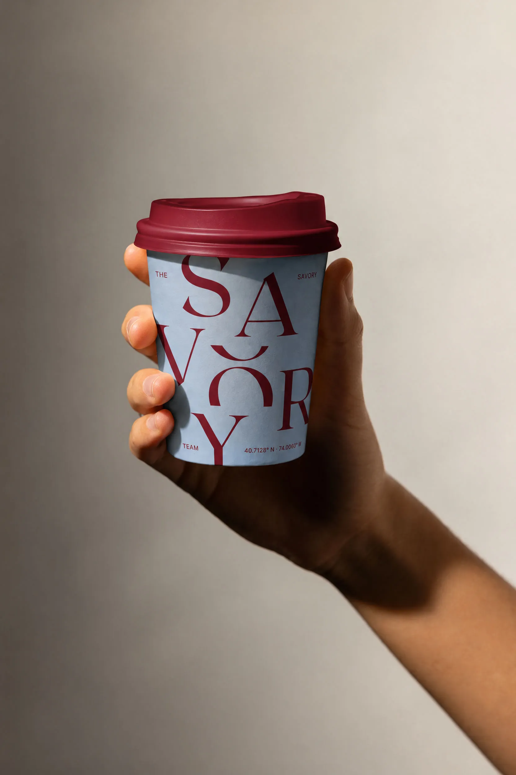
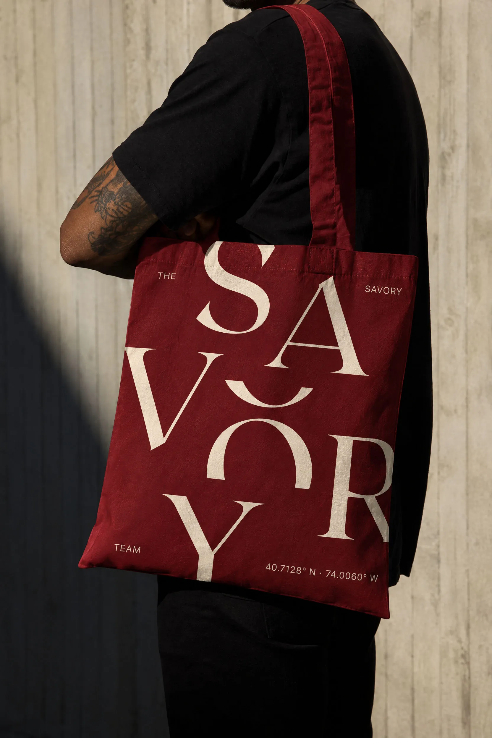
From a rooftop billboard to social posts, the identity pairs editorial typography with warm color and a clear message. New York coordinates connect the applications to the team’s home, while the wordmark and seal bring the system to cups, totes, and a wax stamp.




Next project
Airport Executive
A sophisticated identity for a London chauffeur service built around discreet travel

Next project
Periti Digital
A precise identity for a pan-European HubSpot consultancy built for clarity