
Web Design
14 Best SaaS Website Examples in 2026
Published on Jul 24, 2026
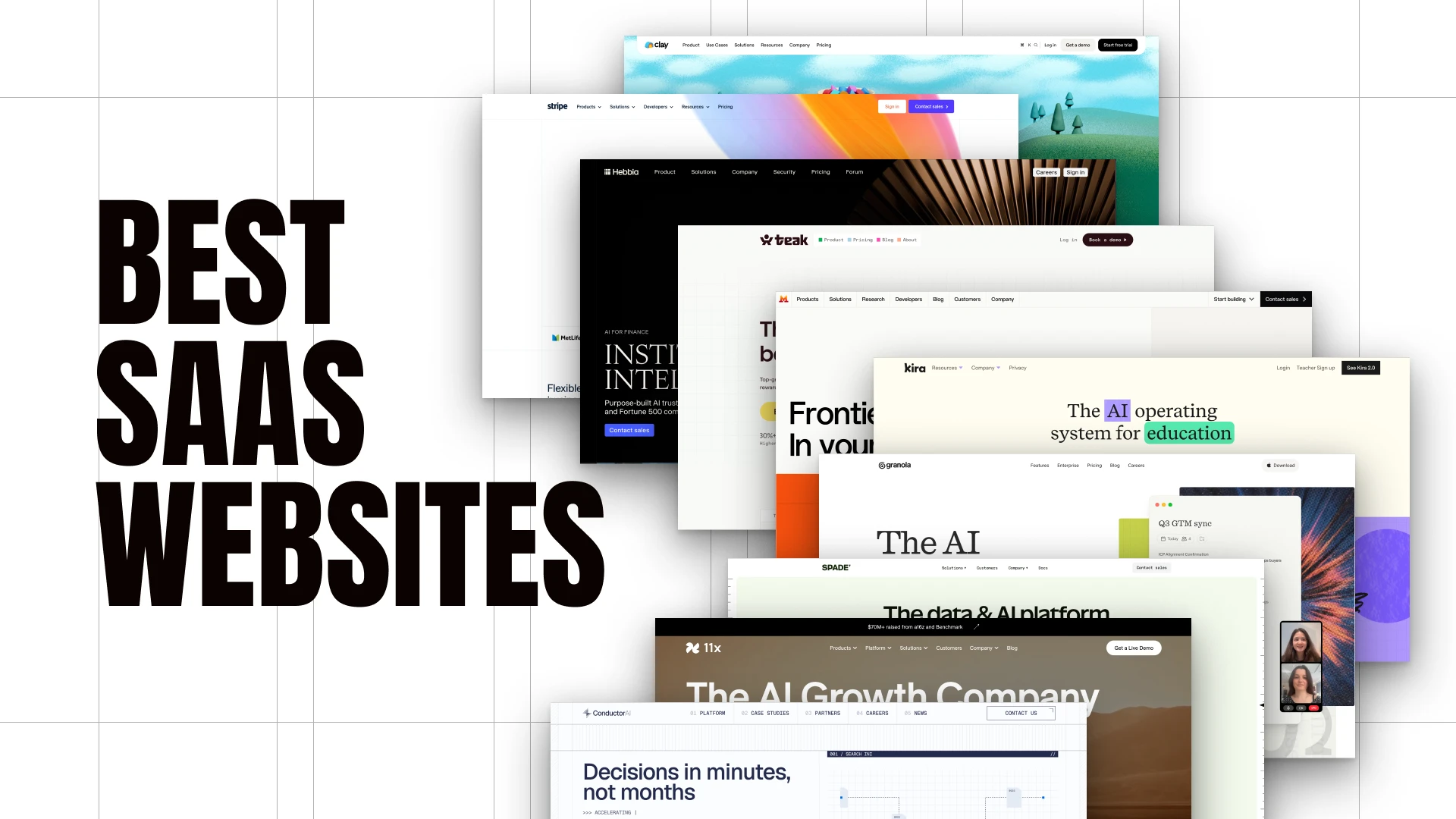
I looked through 14 SaaS websites that feel genuinely different from the usual product-shot-on-a-gradient template.
The strongest ones do not simply add more animation or more sections.
They take one visual idea and repeat it through the hero, product UI, motion, backgrounds, and footer.
That is what makes a SaaS website feel like a real brand.
1. Clay
Clay has a very unusual look because the name itself becomes the design direction.
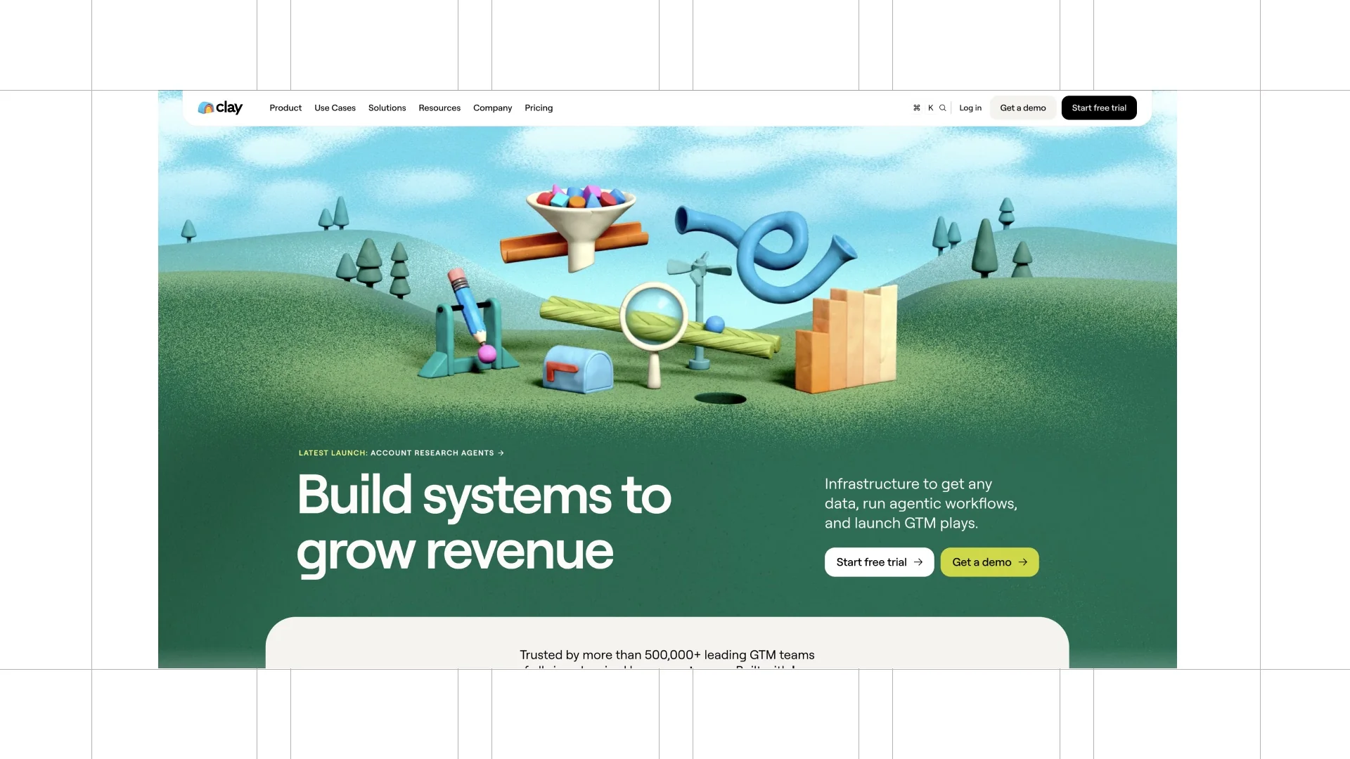
The clay-like looped motion, rounded corners, soft gradients, coloured pills, and bento layouts all belong to the same world.
The product is still easy to understand, but the experience is much more memorable than a standard AI landing page.
The visual language does real work.
2. Stripe
Stripe is a strong example of a complex product presented with real clarity.
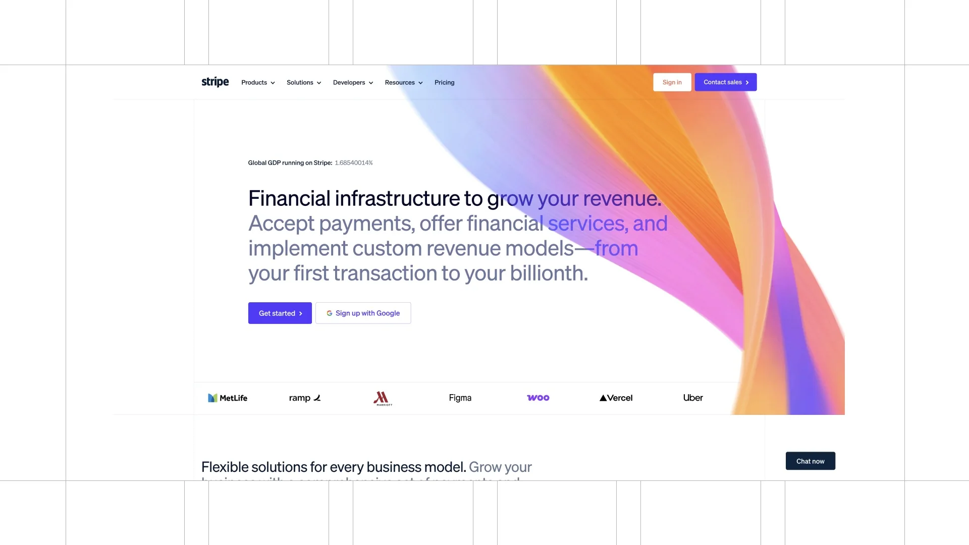
The gradient ribbon, sharp contrast, grids, noise, and clean type make the site feel precise without becoming cold.
Small hover movements and interactive product moments add polish, but the core job is still helping people understand the platform.
The dark integration section works because it is still part of the same system.
3. Teak
Teak uses a cream background, a grid, unusual type, and geometric shapes to create a very distinct point of view.
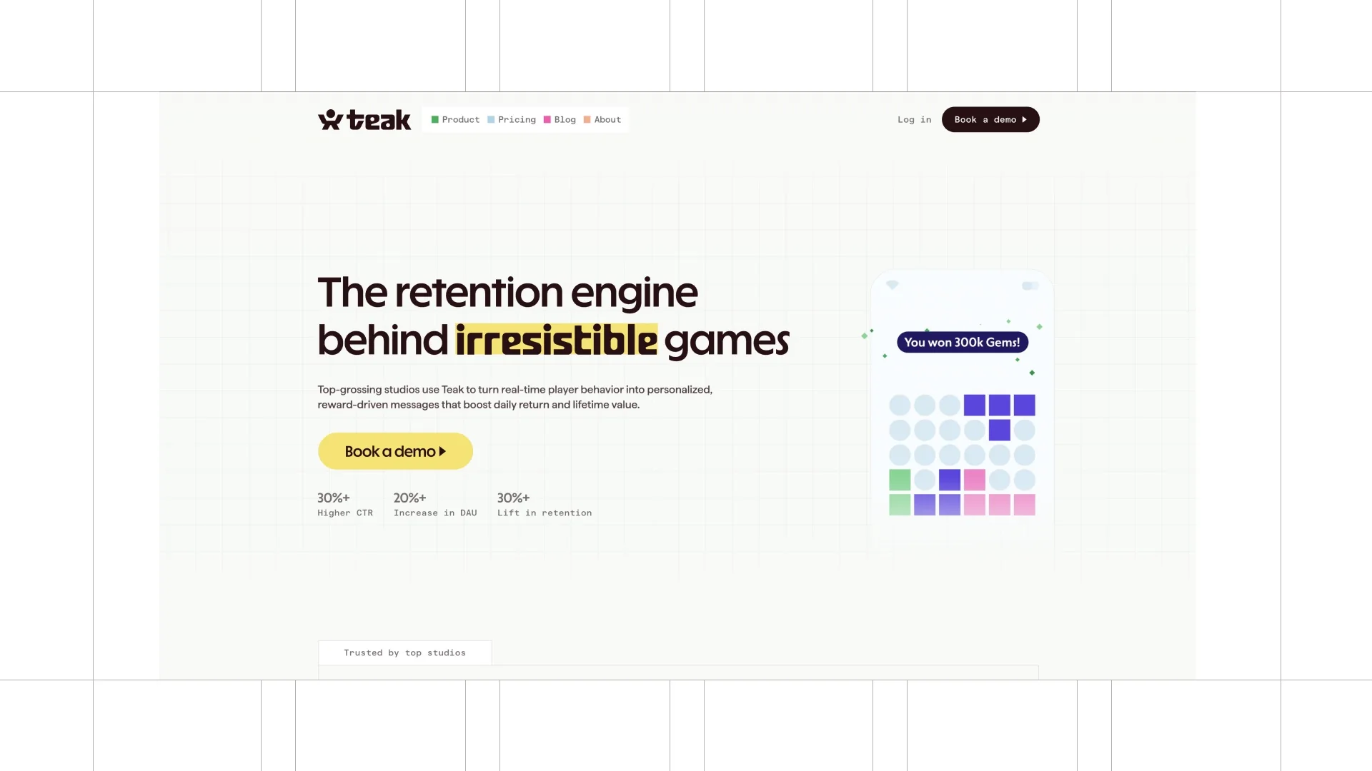
The shapes show up in the logo language, backgrounds, hover states, abstract illustrations, and small animations.
That repetition is why the design feels complete rather than decorated.
A simple shape can become a whole brand system when you use it consistently.
4. Hebbia
Hebbia takes a more sophisticated route with a serif headline, dark UI, full-screen video, and a rotating 3D hero element.
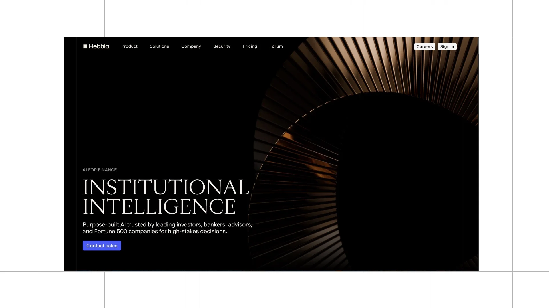
It does not rely on constant movement to feel premium.
The 3D icons, backgrounds, and typography all support the same direction.
5. Mistral AI
Mistral AI stands out because it leans fully into pixel art.
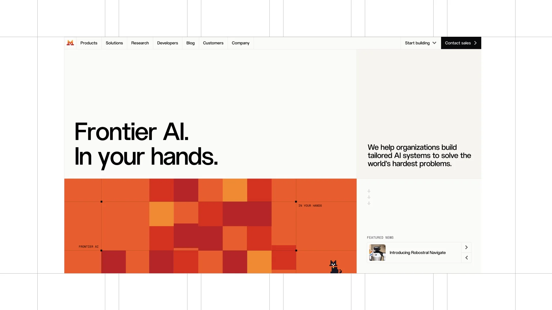
The pixel icons, warm yellow-to-orange-to-red colours, custom backgrounds, and unusual movement are all connected to the identity.
Once you have a recognisable system like that, you can create many graphics without losing the brand.
6. Kira
Kira makes the product clearer by highlighting key words in brand colours.
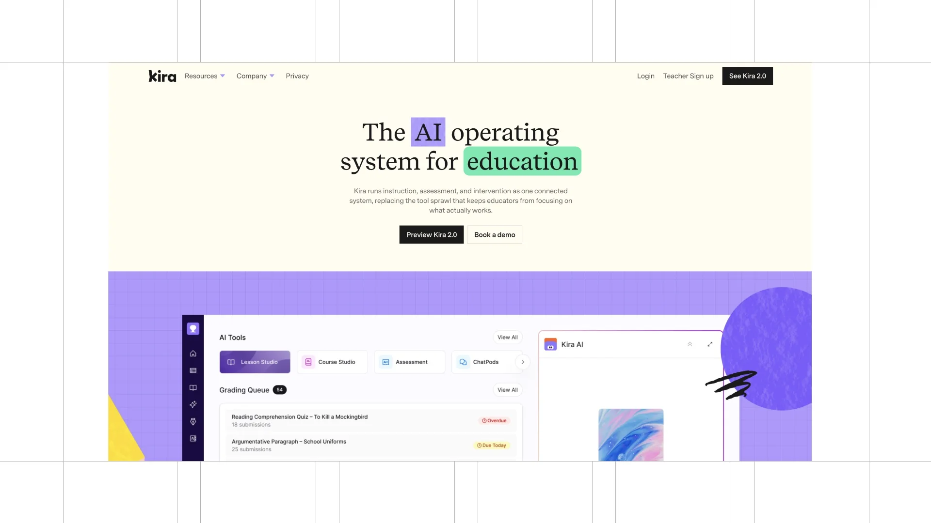
The scribbles, texture, grid, mascot, and branded icons make the interface feel more creative than a generic SaaS page.
The mascot and background treatment keep returning, so the product never feels separated from the identity.
7. Granola
Granola has a more organic feel because of its slab serif, hand-drawn graphics, photography, and subtle UI motion.
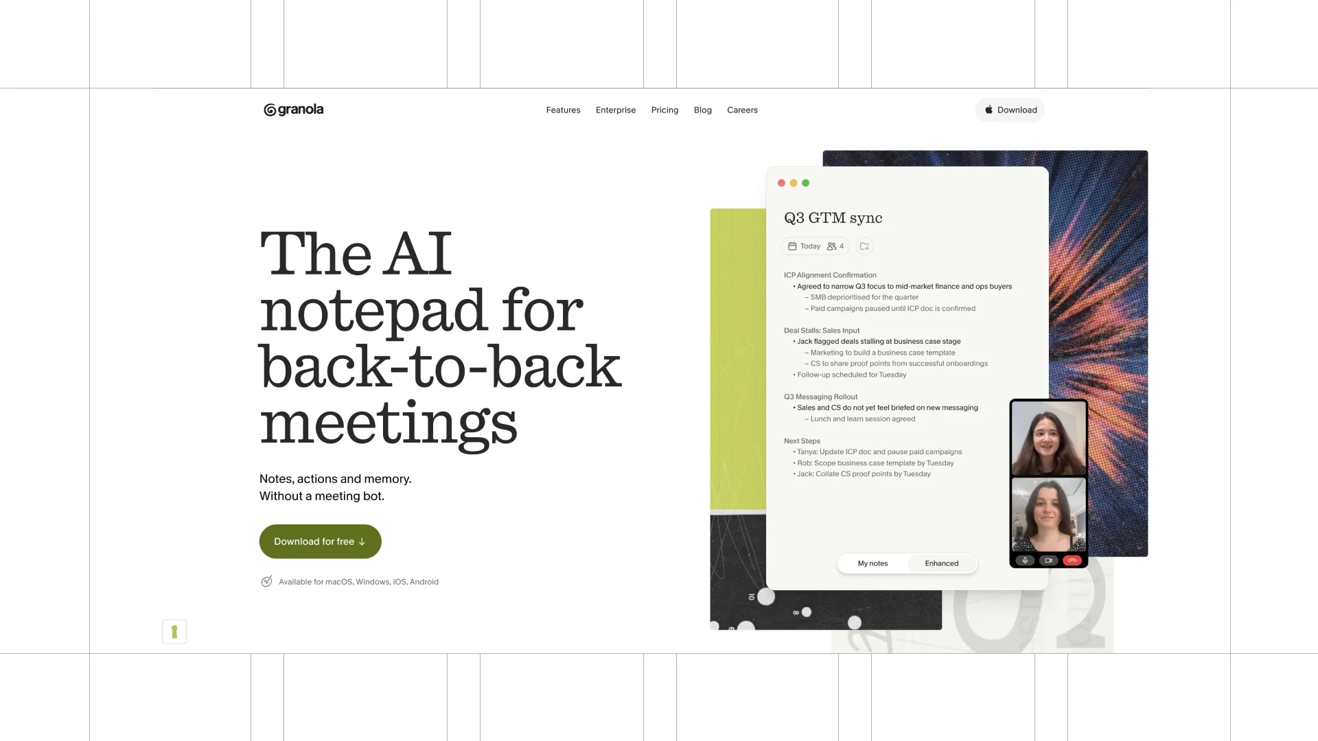
It remains easy to read and easy to understand, but it has far more personality than a typical AI product page.
Photography or custom graphics can make a SaaS website feel distinctive when they are part of the brand system.
8. Spade
Spade uses a clean monoline aesthetic with a floating 3D element and a high-contrast interface.
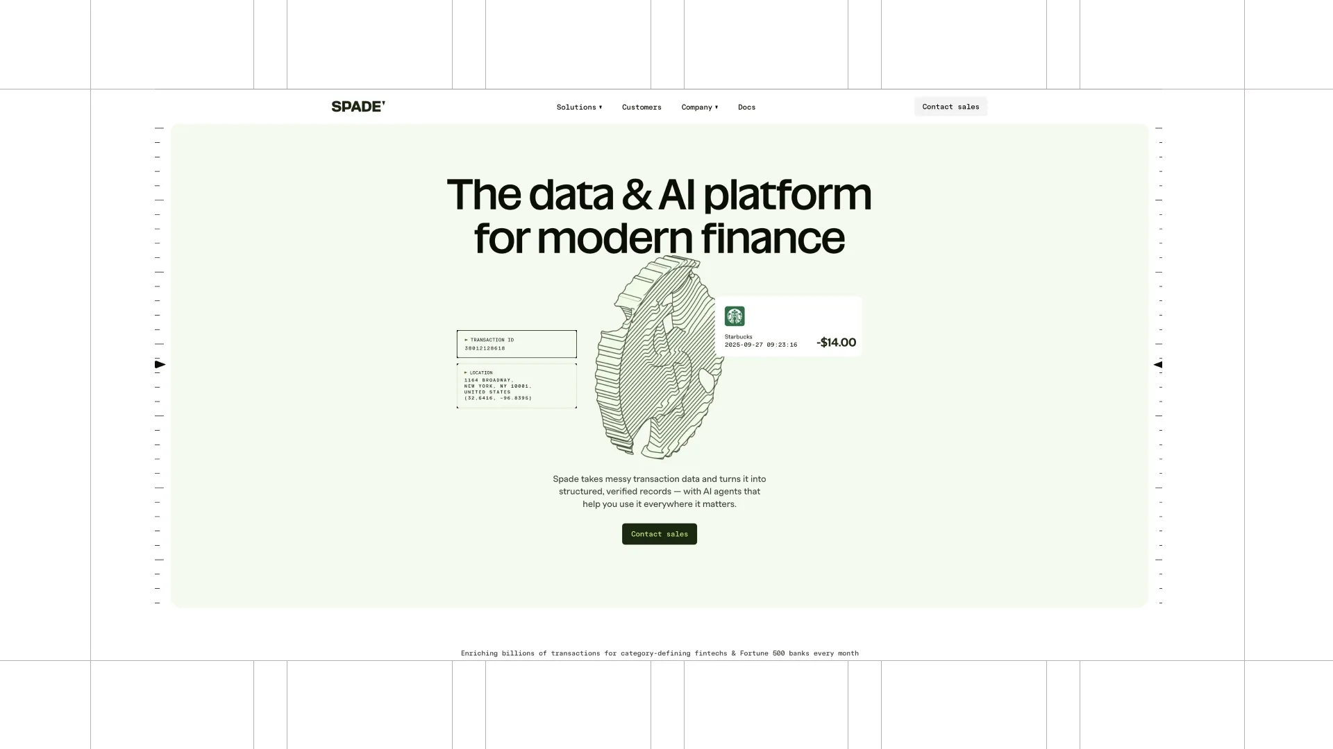
The on-scroll UI movement draws attention to the right product details instead of moving just for decoration.
The same visual treatment comes back through different sections, which makes the experience feel intentional.
9. Intercom
Intercom shows that product screenshots do not always need to sit on a flat colour.
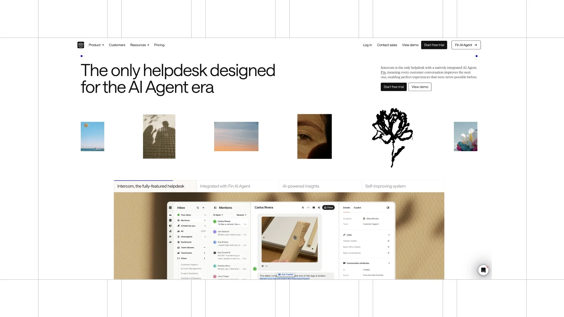
Its artsy custom backgrounds make the interface feel more branded and more interesting.
That is a simple technique, but it can make a product page feel much more considered.
10. Amigo
Amigo is very clean and spacious, but it still has a point of view.
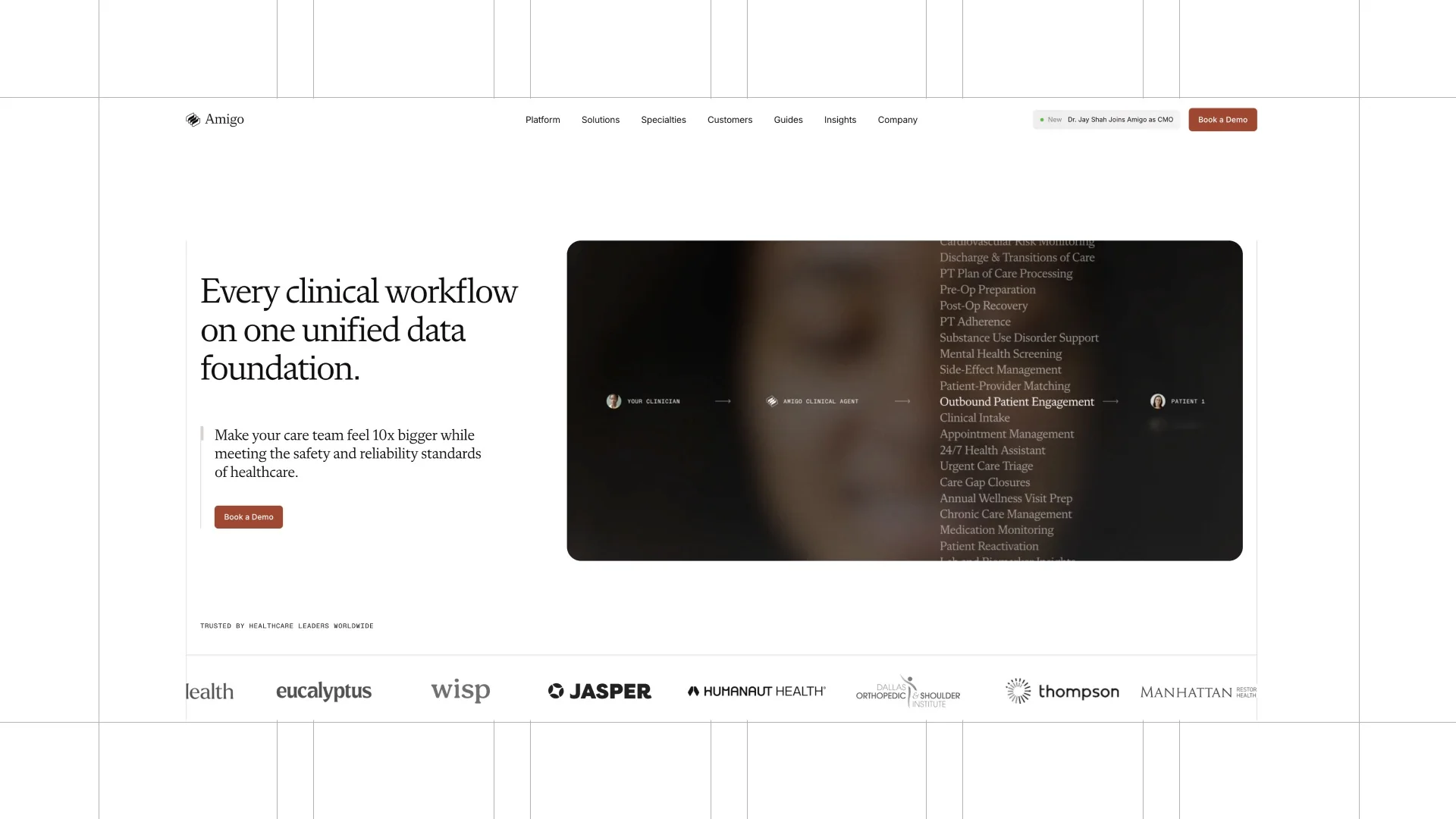
Blur, light gradients, moving text, and a 3D graphic add character without creating visual noise.
Premium does not mean busy.
11. 11x
11x uses photography and video in a way that gives the site a cinematic feel.
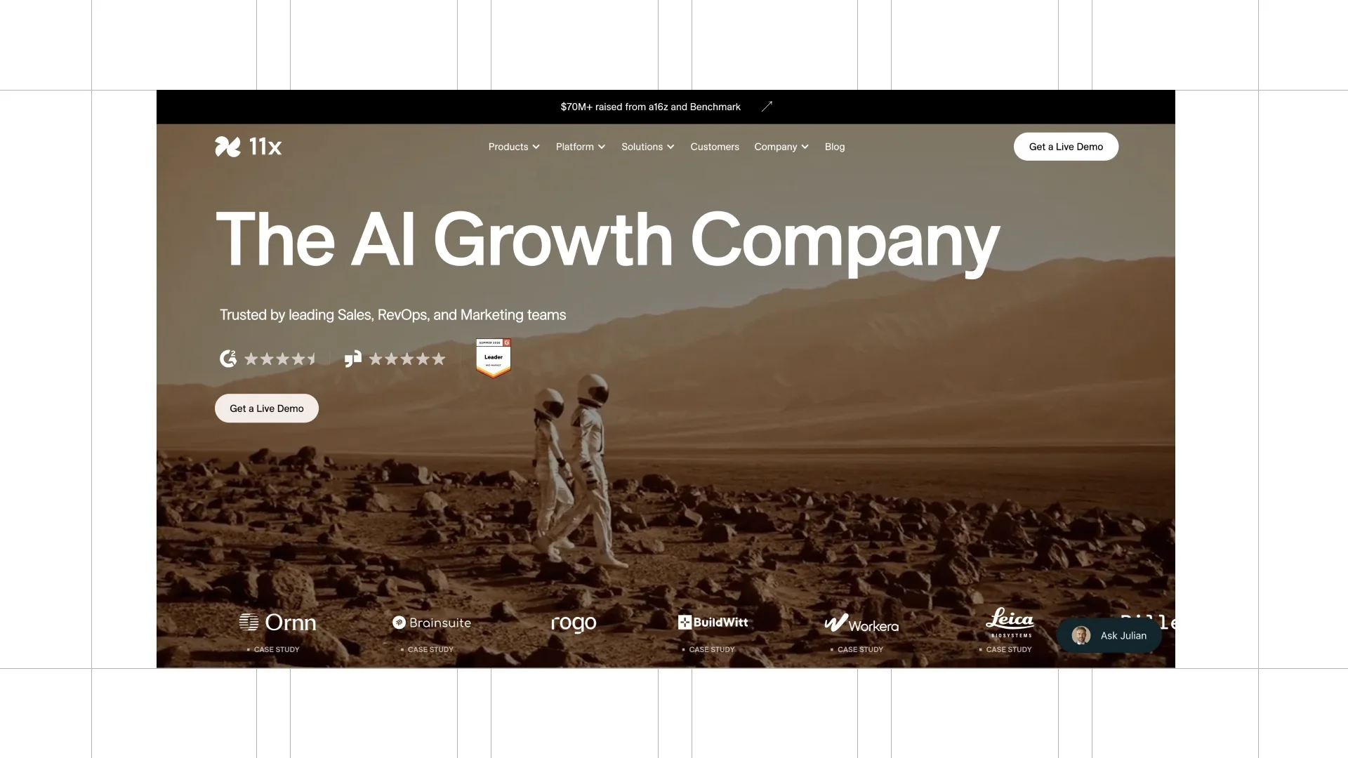
The abstract UI, fine lines, notes, bento grids, and flipping cards add depth while the layout stays clean.
It is a good example of how a SaaS website can feel different without becoming hard to use.
12. Conductor AI
Conductor AI uses a grid and a utilitarian interface language that fits its product.
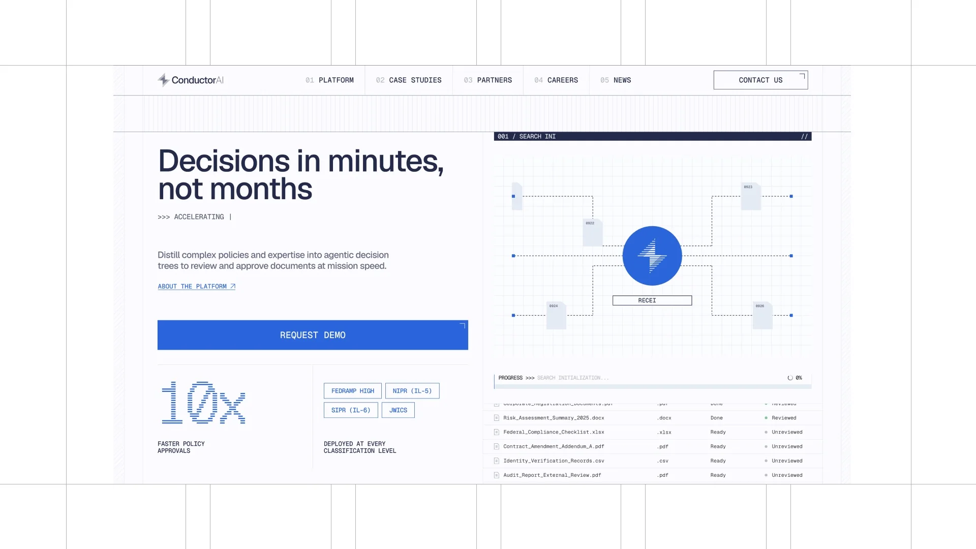
The structure, search patterns, and information density are not hidden behind the marketing site.
They become part of the visual identity.
What these SaaS websites have in common
Before adding another section, animation, or gradient, ask one question: what visual idea does your product own?
If it disappears below the hero, it is decoration.
If it survives in the UI, imagery, motion, layouts, and details, it is branding.
If you need a SaaS website that looks as distinctive as the product you are building, start a project with me.
Building a SaaS or AI startup?
I design and build startup websites that explain the product fast and turn visitors into demos.