
Logo Design
25 Best Wellness Branding Examples in 2026
Published on Oct 24, 2026
Wellness businesses have a lot more to offer than a relaxing room.
They also need a brand identity that helps people understand the experience before they book.
As a branding designer in New York, I’ve reviewed 25 real service businesses, from bathhouses and spas to Pilates studios, recovery clubs and a wellness retreat.
I’m looking at the details that make each identity recognizable: wordmarks, symbols, typography, color and physical applications.
If you’re opening a wellness business or planning a rebrand, these examples can help you think about how you want it to look and feel.
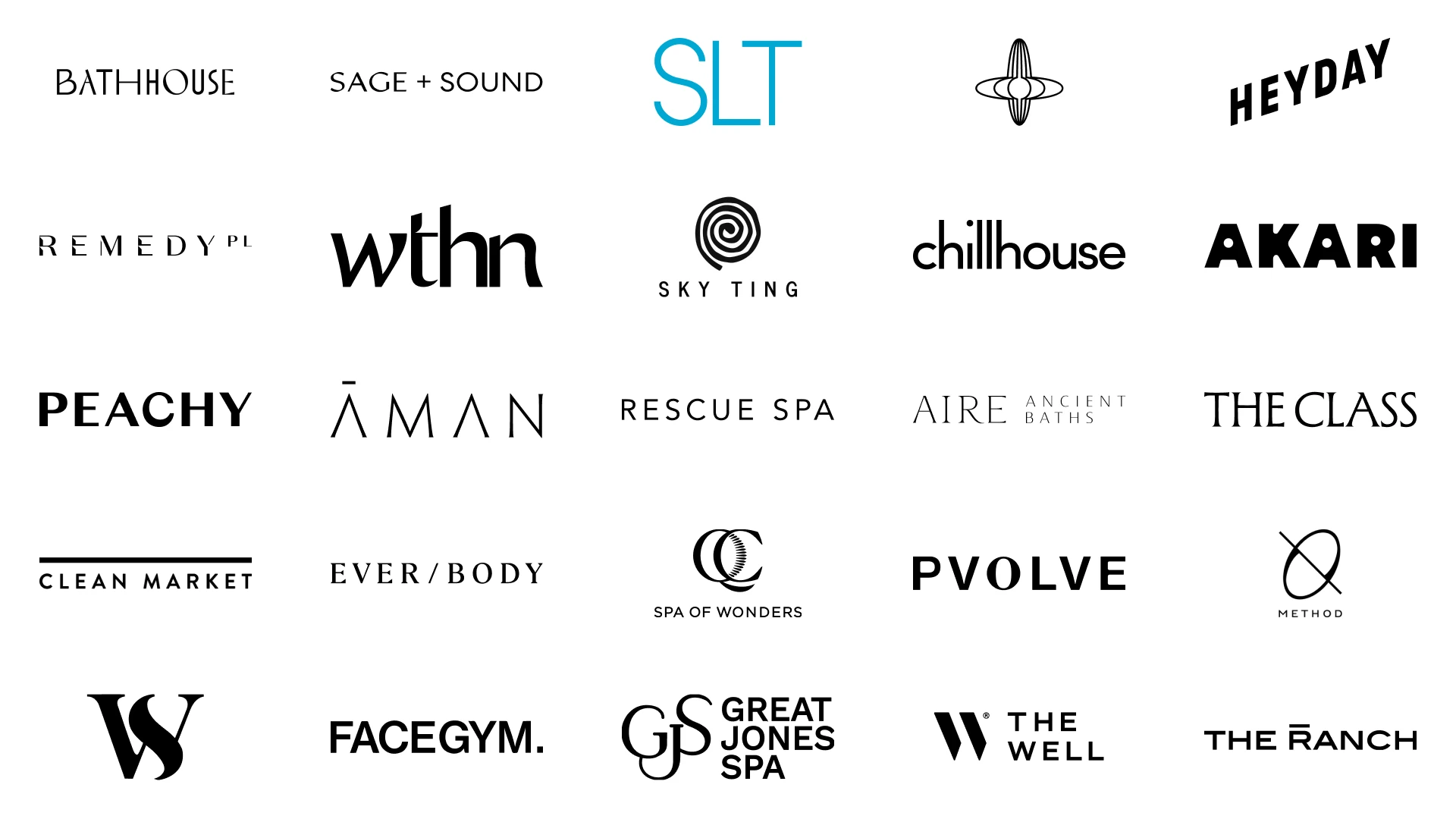
25 wellness branding examples
- Bathhouse
- Sage + Sound
- SLT
- Othership
- Heyday
- Remedy Place
- WTHN
- SKY TING
- Chillhouse
- Akari Sauna House
- Peachy
- Aman New York
- Rescue Spa
- AIRE Ancient Baths
- The Class
- Clean Market
- Ever/Body
- QC Spa New York
- Pvolve
- ORA
- WORLD SPA
- FaceGym
- Great Jones Spa
- THE WELL
- The Ranch
1. Bathhouse
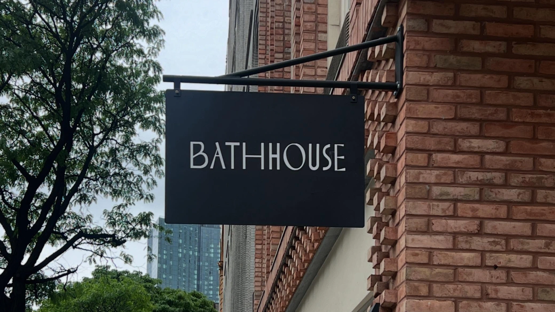
Bathhouse is a modern bathhouse with thermal pools, saunas, massage and body scrubs at locations including Flatiron and Williamsburg.
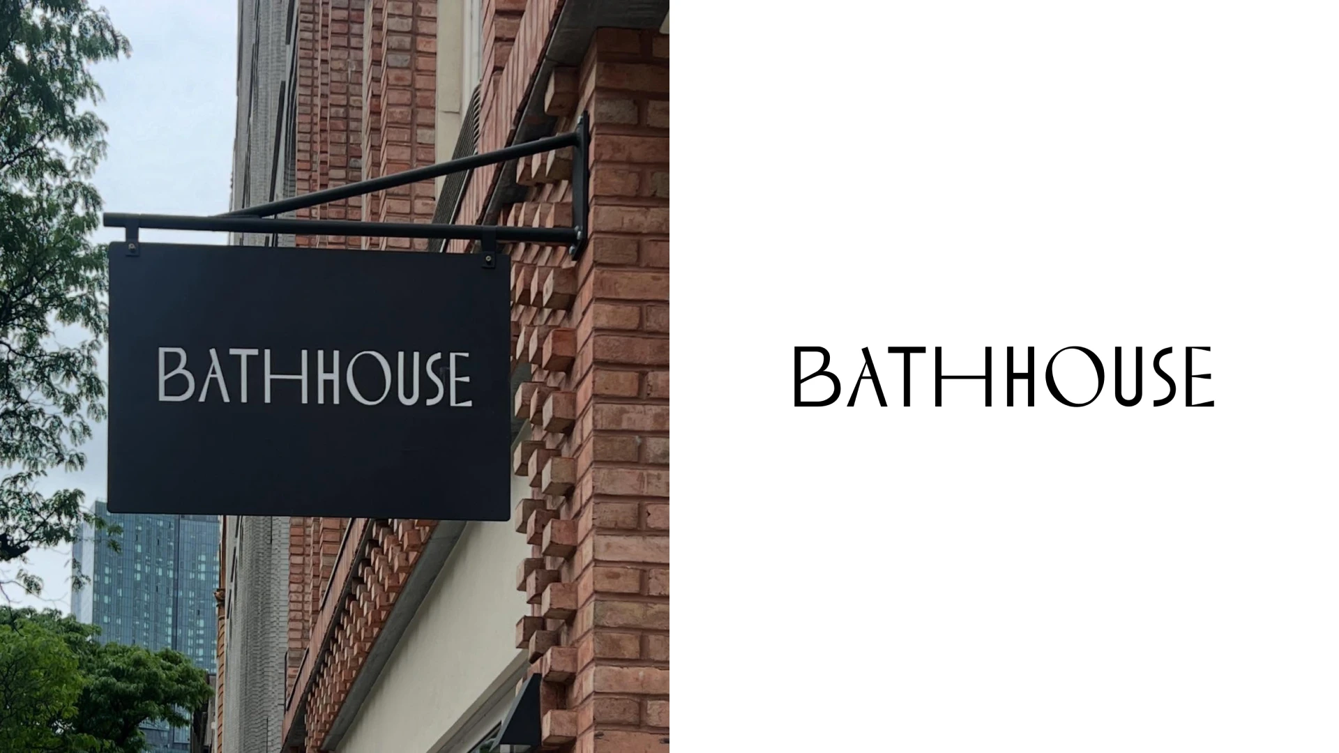
Bathhouse Atlantic storefront sign, Brooklyn. Photo: Atlantic Avenue Local Development Corporation / @atlanticavebk. Image source.
Bathhouse is my favorite, and sauna and cold plunge are part of my routine at least twice a week.
I like how the wordmark gets so much character from changes in letter width.
The broad B and O sit beside much narrower letters, while the first H stretches horizontally across the end of BATH.
That contrast between wide and condensed proportions makes a simple name feel designed rather than just typed.
The angular A and E add another sharp detail, without needing a separate water droplet or wellness symbol.
Against warm timber and dark interiors, the white lettering feels architectural and a little unexpected.
It is useful inspiration for a bathhouse or recovery studio that wants modern branding with personality, without adding more visual clutter.
2. Sage + Sound
Sage + Sound is a wellness destination at 1481 Third Avenue on Manhattan’s Upper East Side, offering treatments, meditation, sound experiences and movement.
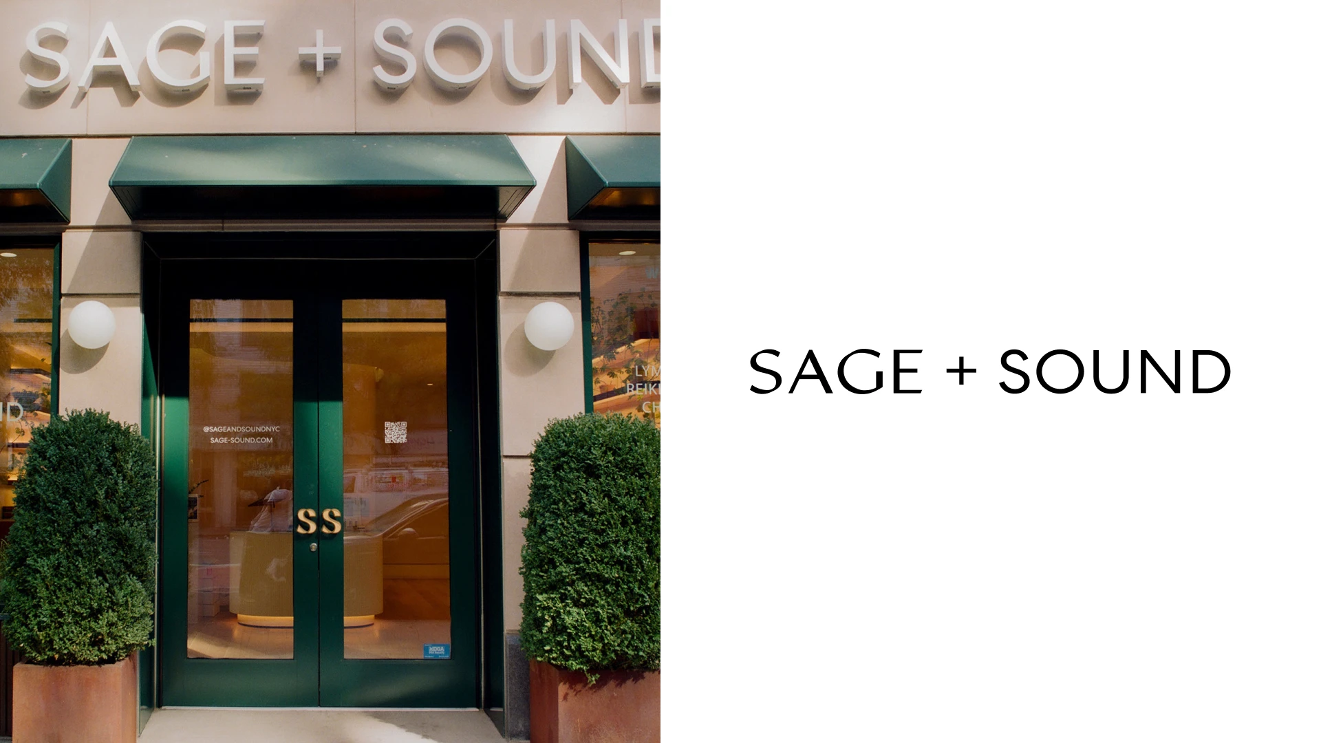
Sage + Sound storefront, Upper East Side. Photo: Sage + Sound / Departures. Image source.
I like the balance between the straightforward sans-serif wordmark and the softer world around it.
The plus sign is small, but it gives the name a natural connecting device for a business with several kinds of services.
Earthy green, warm neutrals and skin-focused photography create a calm look and feel without making every touchpoint beige.
The lettering stays clean while the materials and imagery carry more of the warmth.
That is a useful division of labor when your business needs to feel both welcoming and carefully considered.
The Working Assembly documents the brand’s visual and verbal system, photography and website.
View the documented design work.
3. SLT
SLT offers reformer-based strength training classes at studios across New York, including Flatiron, NoHo, Tribeca and Brooklyn.
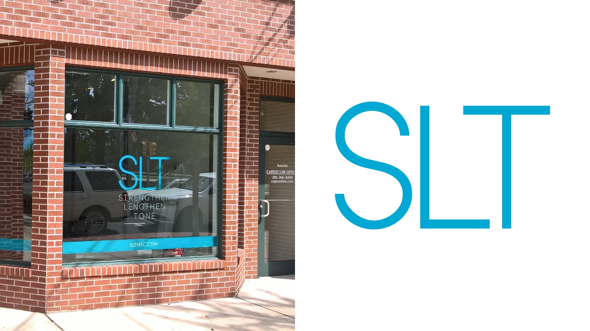
Archival SLT storefront window graphics; photograph location not identified by the source. Photo: Prestone Printing. Image source.
SLT keeps the identity focused on three tall, lightweight sans-serif letters.
I like the contrast between the open curves of the S and the straight verticals of the L and T.
The bright cyan blue gives a very simple wordmark a clear visual signature.
On the studio window, the same color connects the logo with a horizontal band and the website address.
The expanded name, Strengthen Lengthen Tone, explains what the initials stand for without crowding the main mark.
For a movement studio, the useful lesson is to give a short name enough scale, space and color contrast to hold its own on the street.
4. Othership
Othership offers guided sauna, ice bath and breathwork experiences, with its Flatiron location at 23 West 20th Street.
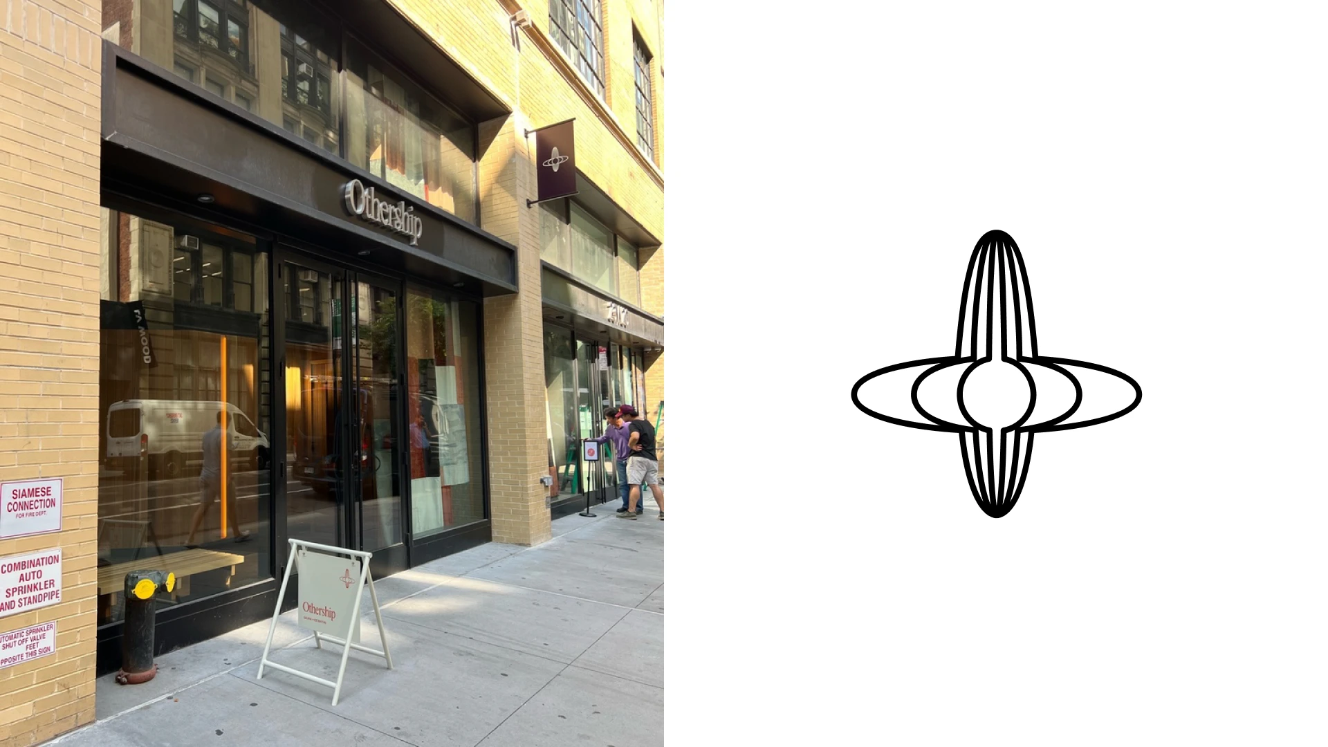
Othership Flatiron storefront and sidewalk sign. Photo: Signs and Mirrors. Image source.
The first thing I notice is the orbital symbol, with fine loops crossing around a central point.
Its repeated curves have a sense of movement that suits a brand built around shared thermal experiences.
I like the tension between that delicate line work and the expressive serif typography used in the wider identity.
Purple, warm orange and brighter accents give Othership a more social, energetic character than the usual pale spa palette.
The warm lighting and richly colored interiors make that visual world feel consistent.
If you want a wellness business to feel like a place to belong, this is an interesting alternative to quiet luxury.
5. Heyday
Heyday is a facial-studio brand with several New York shops, including its Flatiron location at 1 West 19th Street.
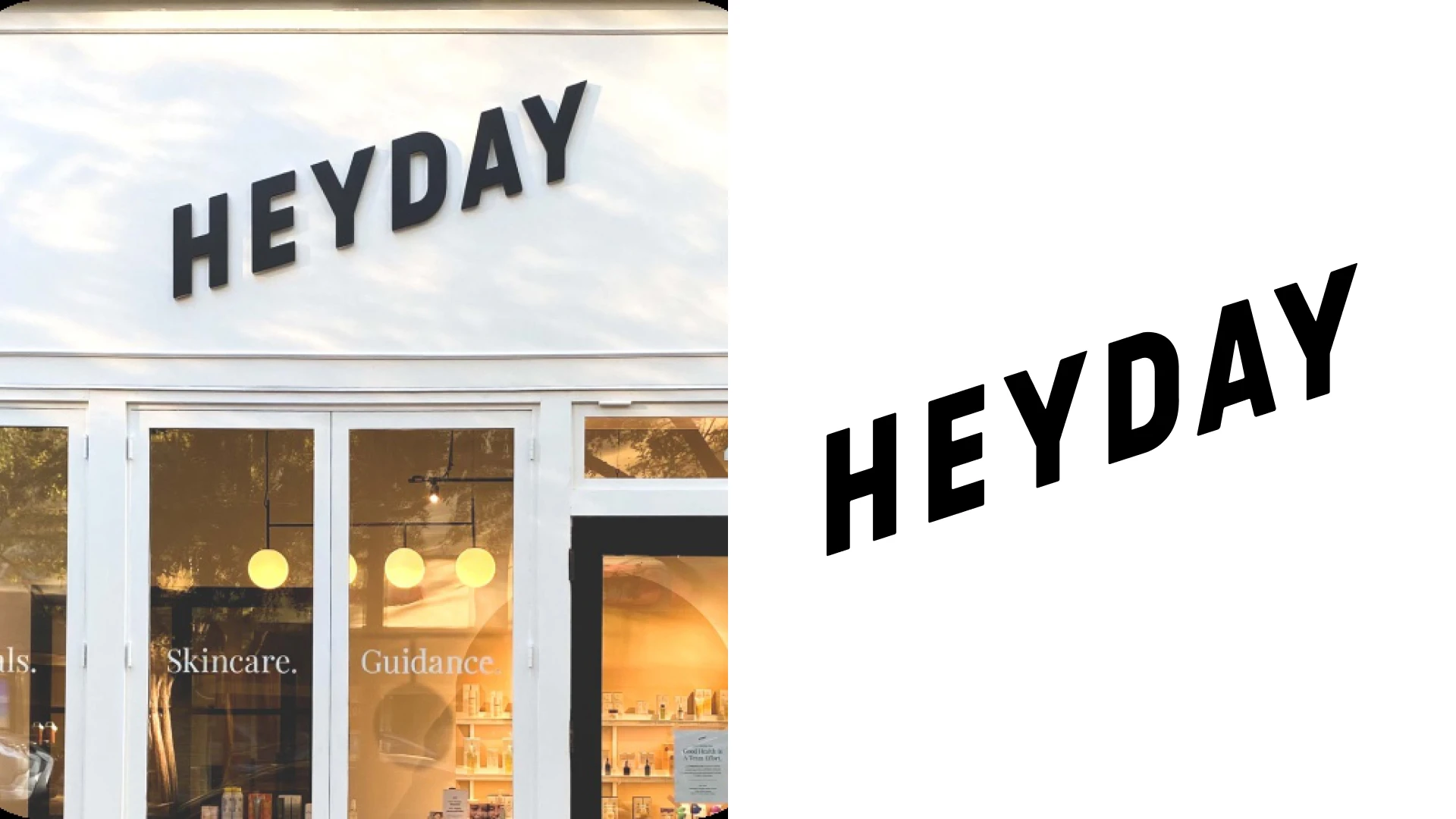
Heyday storefront. Photo: Heyday. Image source.
Heyday takes a more upbeat route to skincare branding.
The compact uppercase wordmark has a lively silhouette, with a slight upward feeling that suits the name.
I like how the deep blue gives the identity structure while yellow and lighter blue make it feel open and approachable.
The current website also uses big, direct headlines instead of making the customer decode an elaborate wellness story.
That clear hierarchy matters when someone is comparing treatments or booking a first facial.
It is useful inspiration for a studio that wants to look expert, accessible and easy to return to.
6. Remedy Place
Remedy Place is a social wellness club with New York locations in Flatiron and SoHo, offering recovery services such as sauna, guided ice baths and red light.
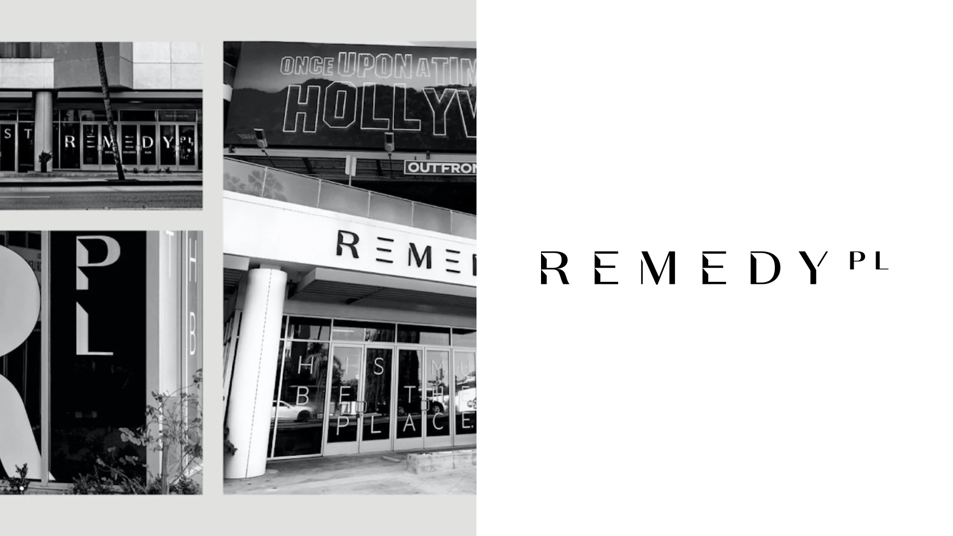
Archival Remedy Place storefronts, West Hollywood. Photo: Zero Studios. Image source.
Remedy Place has a much darker and more restrained visual tone.
The long wordmark uses generous spacing, which gives the name room to breathe rather than packing it into a badge.
I like how the quiet typography sits beside rich timber, stone and curved architectural forms.
The contrast is mostly between materials, light and shadow, rather than several competing brand colors.
That creates a private-club look and feel, even though the offer includes a wide range of recovery services.
Adrian Gilling’s identity case study credits Zero Studios as the agency.
For a premium recovery business, the useful lesson is to let the environment support the identity instead of making the logo do everything.
View the documented design work.
7. WTHN
WTHN offers acupuncture, facial acupuncture and cupping at studios across New York, including Flatiron, NoHo and Williamsburg.
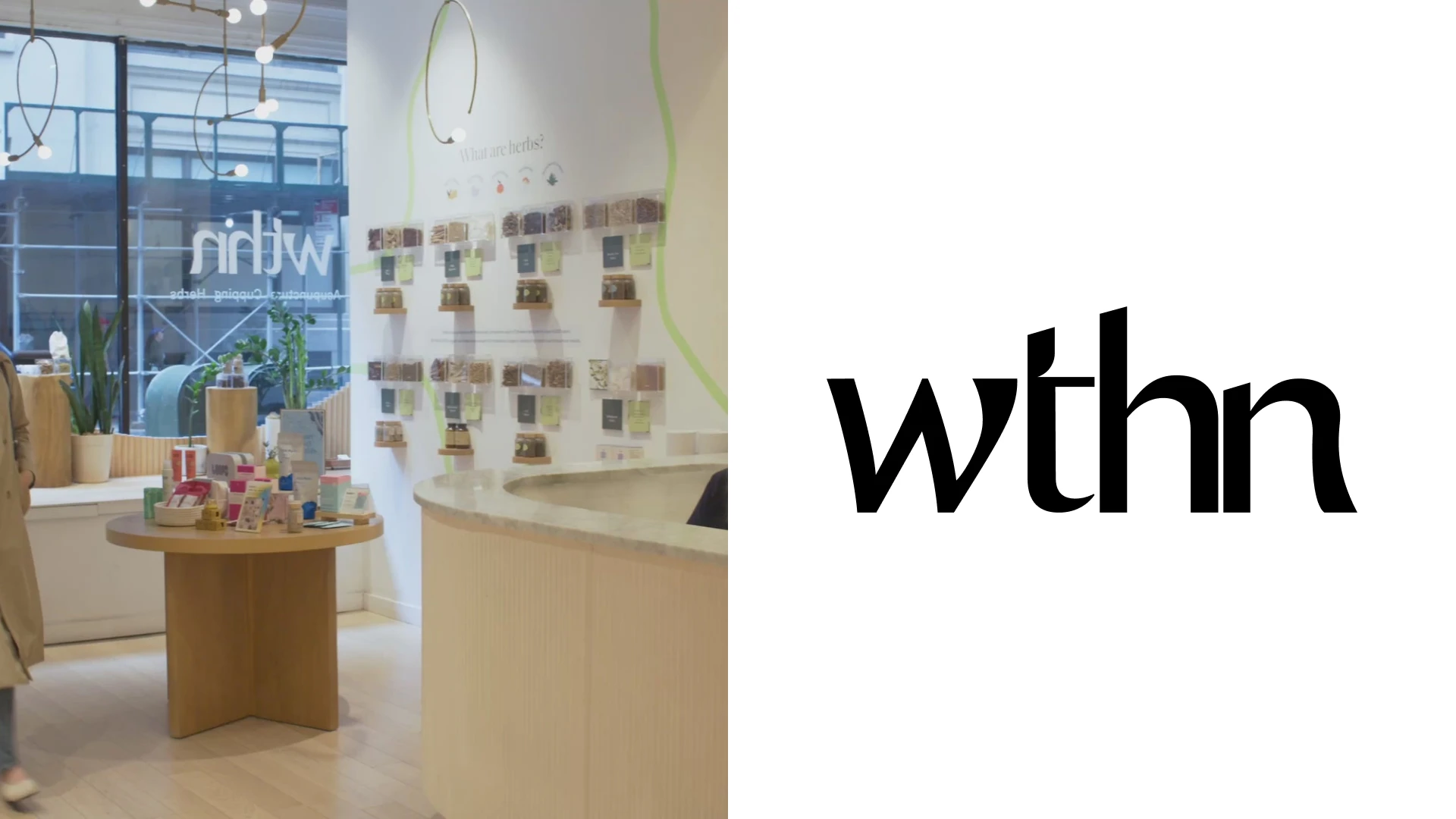
WTHN studio reception. Photo: Official brand / original design portfolio. Image source.
WTHN is a good example of a short name becoming a distinctive lowercase wordmark.
The expressive serif letterforms make the four letters read as one distinctive shape.
I like how the softer curves of the lettering sit with deep green, natural textures and sharper yellow-green accents.
Brand-wise, that combination feels contemporary without stripping away the warmth of a hands-on treatment business.
The wordmark also has enough presence to work on the wall and on a practitioner’s uniform.
Unspoken Agreement documents identity and art-direction work for the brand.
The takeaway is to give a short name a memorable typographic shape before adding another symbol.
View the documented design work.
8. SKY TING
SKY TING is a New York yoga studio at 324 Lafayette Street in NoHo, with classes, courses and retreats.
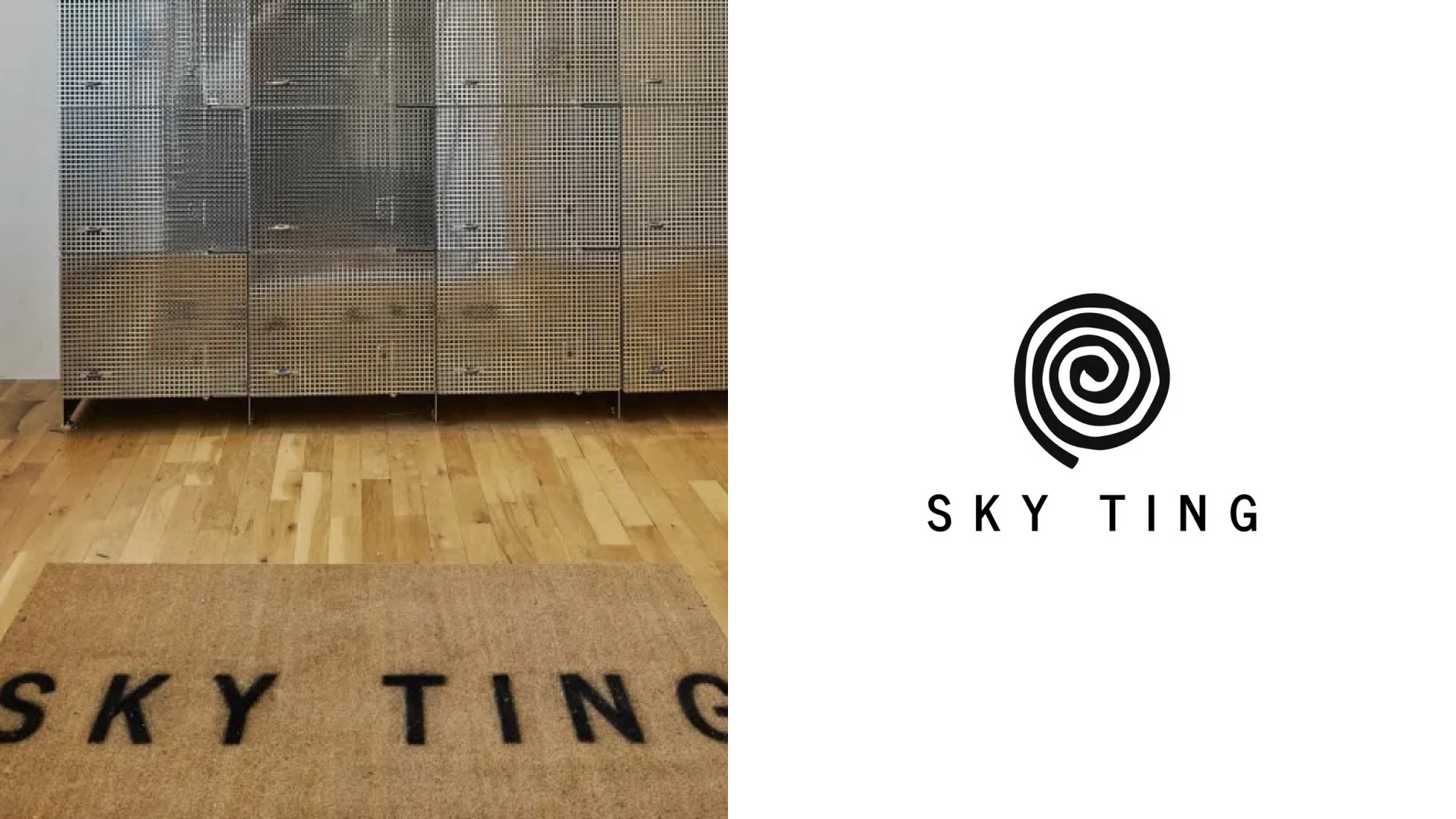
SKY TING NoHo entrance mat; selected spiral-and-wordmark logo shown at right. Photo: The Fit Guide. Image source.
I like the contrast between the hand-drawn spiral and the clean, widely spaced uppercase wordmark.
The uneven black line gives the symbol a human quality, while the lettering keeps the name calm and legible.
It is a simple combination, but the difference in character makes both elements more interesting.
The spiral can stand on its own, while the full lockup gives the studio a clear signature.
In the application photograph, the studio name appears on the entrance mat; the spiral version at right is the selected identity shown for comparison.
For a yoga business, the useful lesson is to balance an expressive symbol with restrained typography rather than making every element equally decorative.
9. Chillhouse
Chillhouse is a self-care and nail-studio brand with a SoHo flagship at 75 Varick Street.
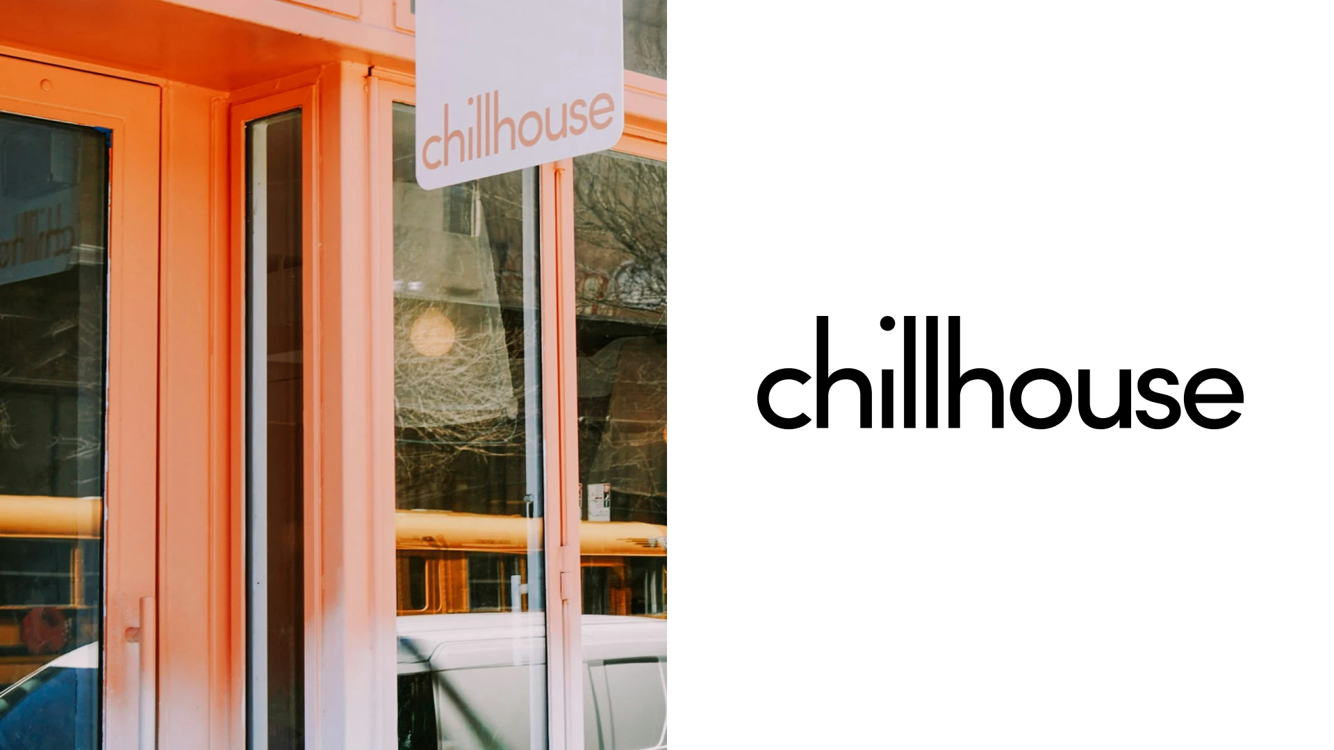
Archival Chillhouse storefront at its earlier Essex Street location. Photo: Official brand / original design portfolio. Image source.
Chillhouse makes a strong case for letting a wellness brand be playful.
The lowercase wordmark is relaxed and easy to recognize, while the wider system allows more variation in typography and color.
I like the warm pastels and rounded forms because they give the real space a clear connection to the graphic identity.
The branded window and printed pieces show how the same personality can work at different scales.
Combo documents the visual identity, retail direction and website.
This is useful inspiration if you want your self-care business to feel social and expressive, rather than hushed or formal.
View the documented design work.
10. Akari Sauna House
Akari Sauna House is a membership-based neighborhood sauna with locations in Williamsburg, Greenpoint and the Lower East Side.
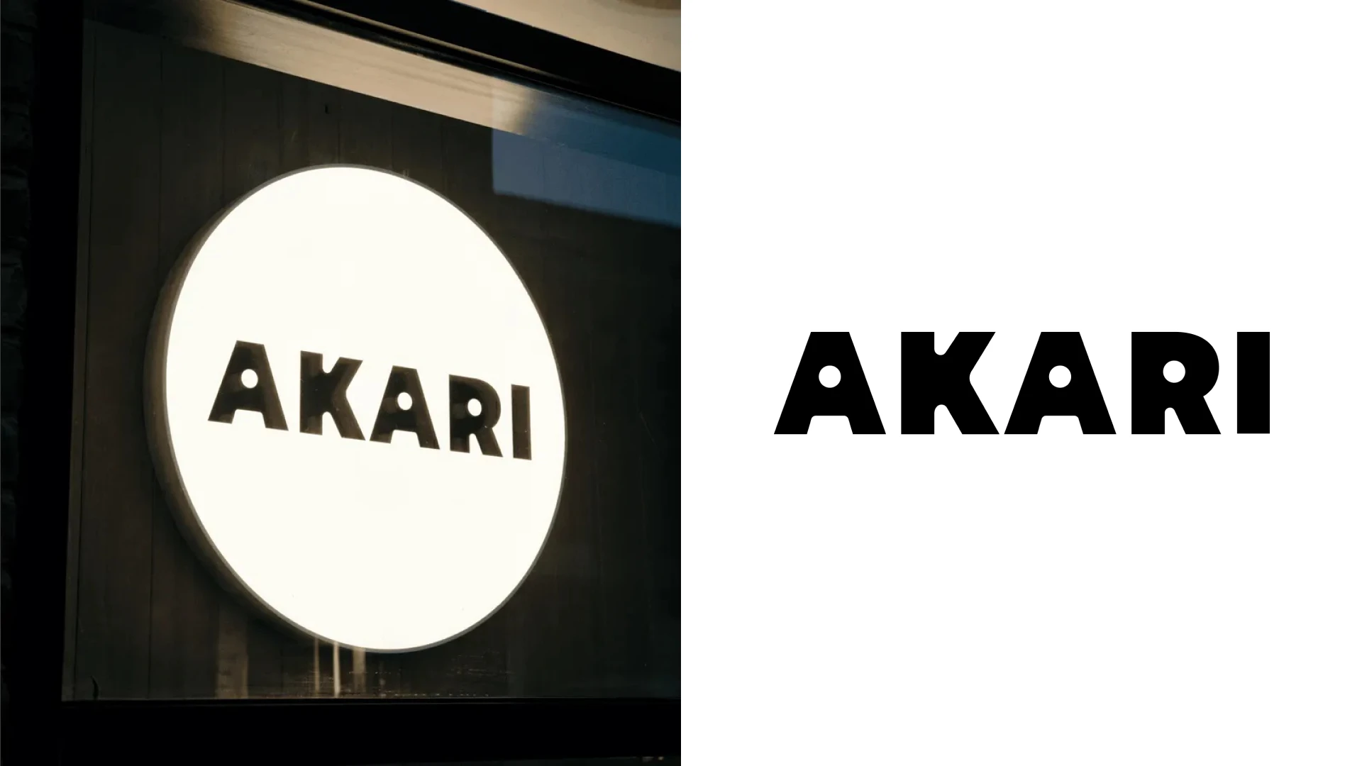
Akari illuminated sign. Photo: Official brand / original design portfolio. Image source.
Akari has one of the more characterful wordmarks in this selection.
The heavy, uneven letter shapes feel friendly and tactile, especially when they appear on a round illuminated sign.
I like the contrast between that bold mark and the quieter typography used for practical information.
The Japanese-language mark adds another layer of identity alongside the Latin name.
It gives the system more range without requiring every application to carry the same long lockup.
Slope’s founder documents the studio’s brand, website and art-direction work.
For a neighborhood sauna, this is a useful example of feeling distinctive and personal without looking overdesigned.
11. Peachy
Peachy is a wrinkle-treatment studio brand with New York locations including West SoHo, NoHo and Williamsburg.
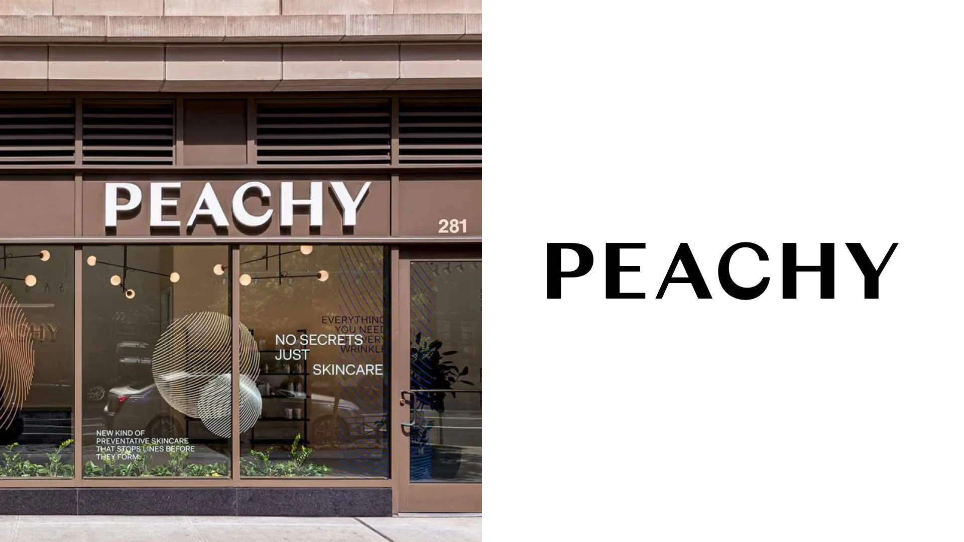
Peachy West SoHo storefront. Photo: Official brand / original design portfolio. Image source.
Peachy starts with a friendly name and keeps the main wordmark very direct.
The uppercase lettering has enough weight to read clearly above a storefront or reception desk.
I like how peach tones, warm light and soft interior shapes take some of the formality out of a clinical service.
The logo itself does not need to become cute to make the business feel approachable.
That distinction is useful for a medical-aesthetics brand that still needs clarity and confidence.
The Working Assembly documents campaign strategy, art direction and photography for Peachy.
It is a good reminder that the name, space and imagery can create warmth around a simple typographic mark.
View the documented design work.
12. Aman New York
Aman New York operates a spa and wellness destination within its Midtown hotel at 730 Fifth Avenue, with treatments, private Spa Houses, a pool, and movement and fitness facilities.
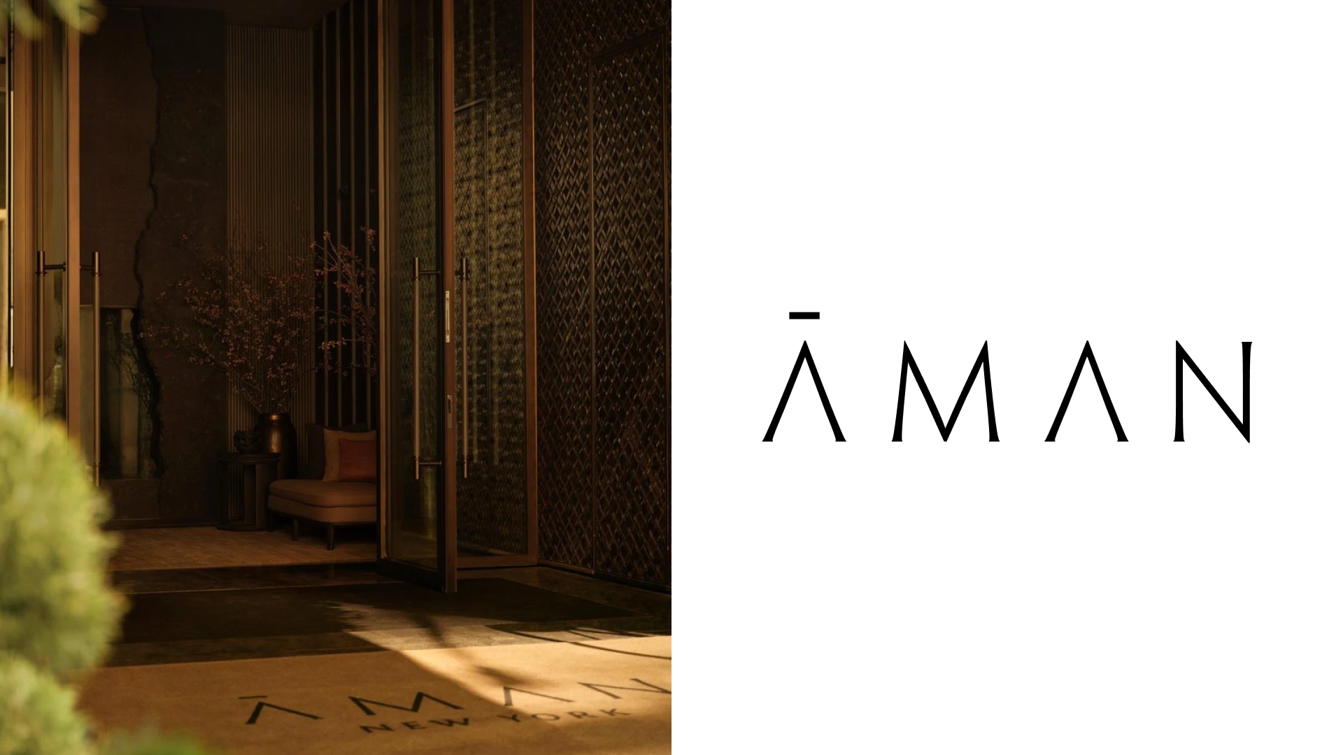
Aman New York entrance with its name physically applied to the mat; the hotel operates the spa featured here. Photo: Aman New York / official gallery. Image source.
Aman takes a deliberately restrained approach to luxury branding.
I like the fine, tapered strokes and the generous space between the letters.
The small horizontal mark above the first A gives the wordmark a distinctive detail without adding a separate emblem.
On the entrance mat, the name sits comfortably within the larger architectural setting.
That same balance of proportion, spacing and quiet materials suits the spa’s presentation.
For a premium wellness business, the useful lesson is to make a few details feel intentional instead of filling every surface with decoration.
13. Rescue Spa
Rescue Spa is a full-service day spa offering facials and other beauty treatments at 29 East 19th Street in Flatiron.
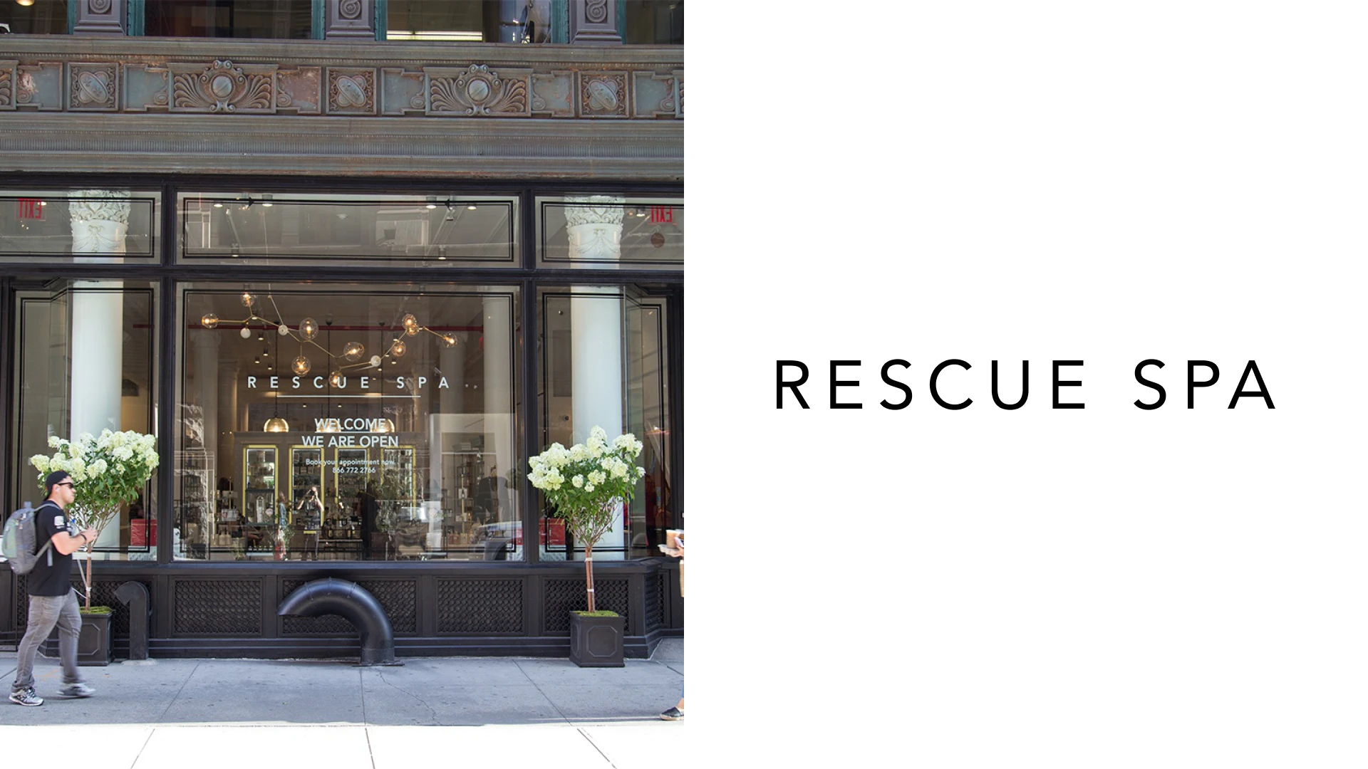
Archival Rescue Spa NYC storefront, photographed in 2017. Photo: The Glass Magazine. Image source.
Rescue Spa uses a very restrained uppercase wordmark.
The open spacing gives the name a composed, premium feel without a decorative crest or complicated emblem.
I like the contrast between that simple typography and the brighter, more detailed retail environment.
The identity can sit quietly while the interior, service menu and products provide the visual richness.
That feels appropriate for a business where people are looking for individual expertise and care.
It is useful inspiration if you want your spa to communicate understated luxury through consistency rather than ornament.
14. AIRE Ancient Baths
AIRE Ancient Baths offers thermal bathing and massage experiences in Tribeca at 88 Franklin Street and on the Upper East Side at 305 East 61st Street.
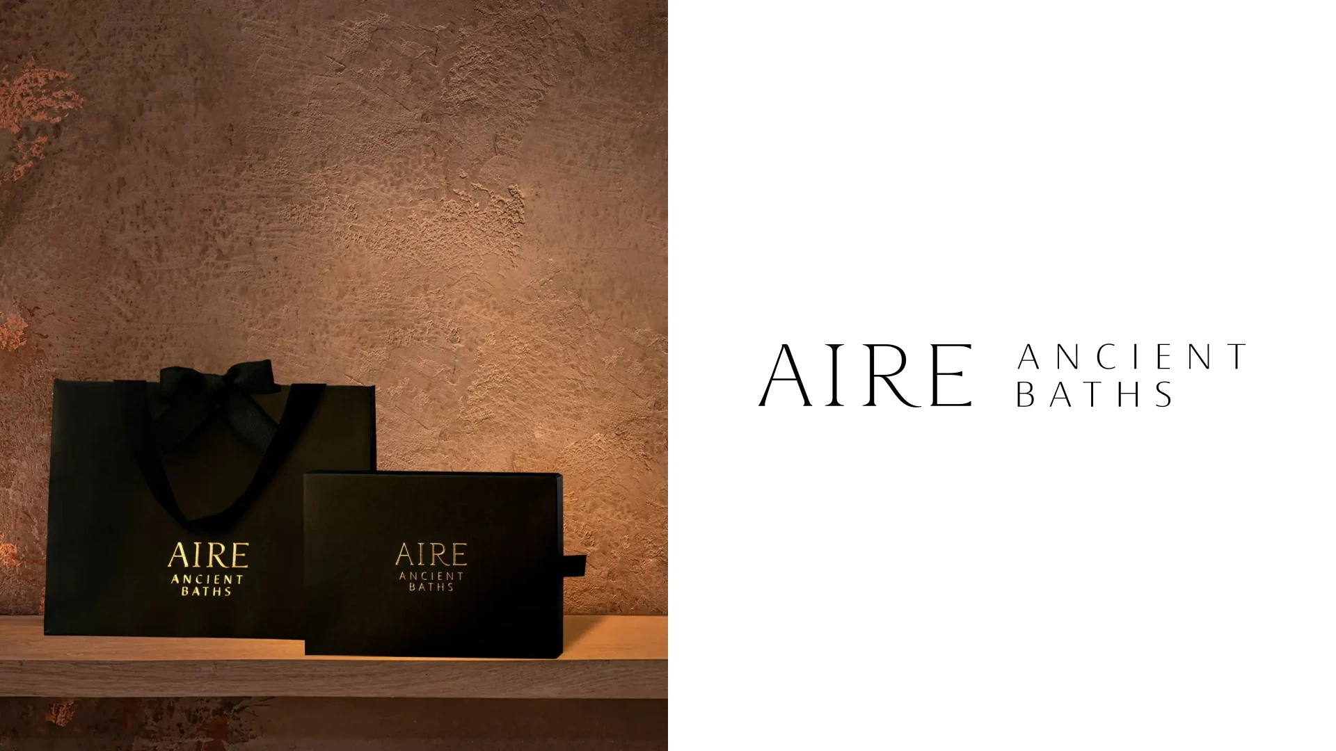
AIRE branded gift bag and box. Photo: AIRE Ancient Baths. Image source.
AIRE combines a short name with a strong sense of atmosphere.
I like the thin serif capitals in AIRE beside the lighter, widely spaced ANCIENT BATHS descriptor.
The contrast between a controlled typographic system and an older building makes the experience feel considered.
This is a quieter kind of luxury than polished gold or a highly decorative crest.
The gold lettering on dark packaging carries that same restrained atmosphere into a small physical object.
For a thermal spa, the useful lesson is to build contrast between the mark and the surroundings while keeping the overall mood consistent.
View the documented design work.
15. The Class
The Class is a somatic movement practice combining exercise, breath and music, with a Tribeca studio at 22 Park Place.
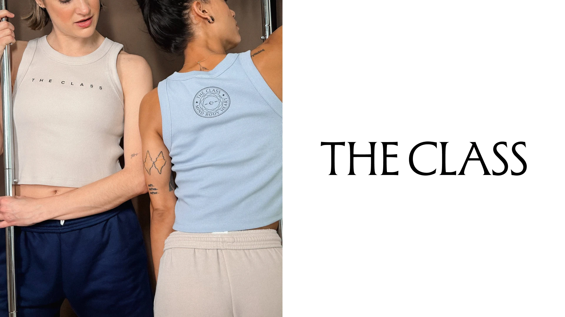
The Class branding printed on apparel. Photo: The Class. Image source.
A name as simple as The Class needs a clear visual voice.
I like the restraint of the name-led identity beside much more expressive photographs of the practice.
The typography gives the communication a stable starting point while movement and human expression carry the emotion.
That balance is useful for a service that is harder to explain with one familiar category label.
The brand does not need an illustration of a person exercising to show what kind of experience it offers.
If you are building a mind-body practice, this is useful inspiration for letting photography and typography do different jobs.
16. Clean Market
Clean Market offers functional wellness services including IV therapy, infrared sauna and lymphatic drainage, with several New York locations.
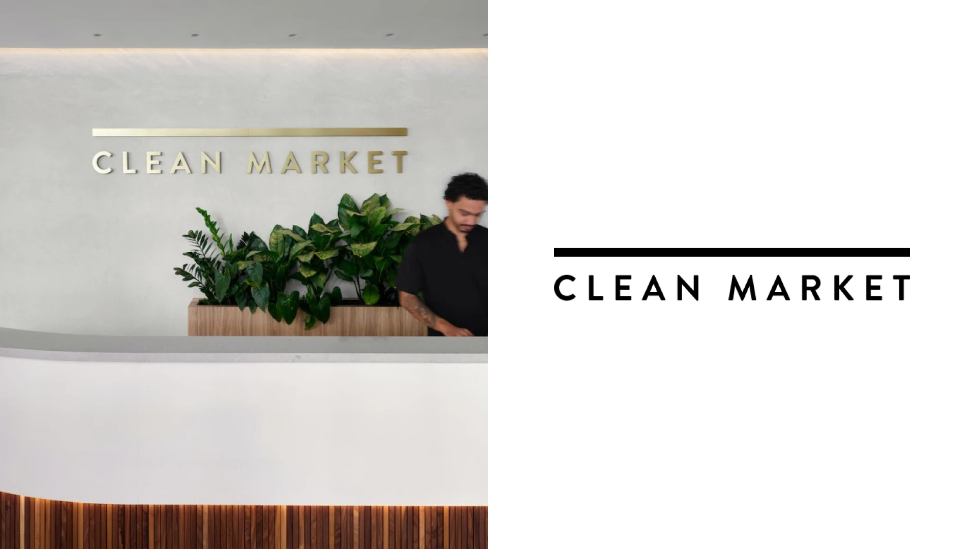
Clean Market reception wall. Photo: Official brand / original design portfolio. Image source.
Clean Market’s identity is crisp and deliberately organized.
The uppercase wordmark and thin horizontal rule give the name a clear graphic frame.
I like how that straightforward structure can support a menu with several unfamiliar treatment names.
The restrained typography makes it easier for the service information to stay prominent.
Paperwhite documents the visual identity, packaging and digital system.
For a business combining different wellness services, the useful idea is clear hierarchy: one recognizable brand, then a simple way to understand the choices.
17. Ever/Body
Ever/Body is a cosmetic-dermatology business offering injectables, skin treatments and body services at New York locations including SoHo and Flatiron.
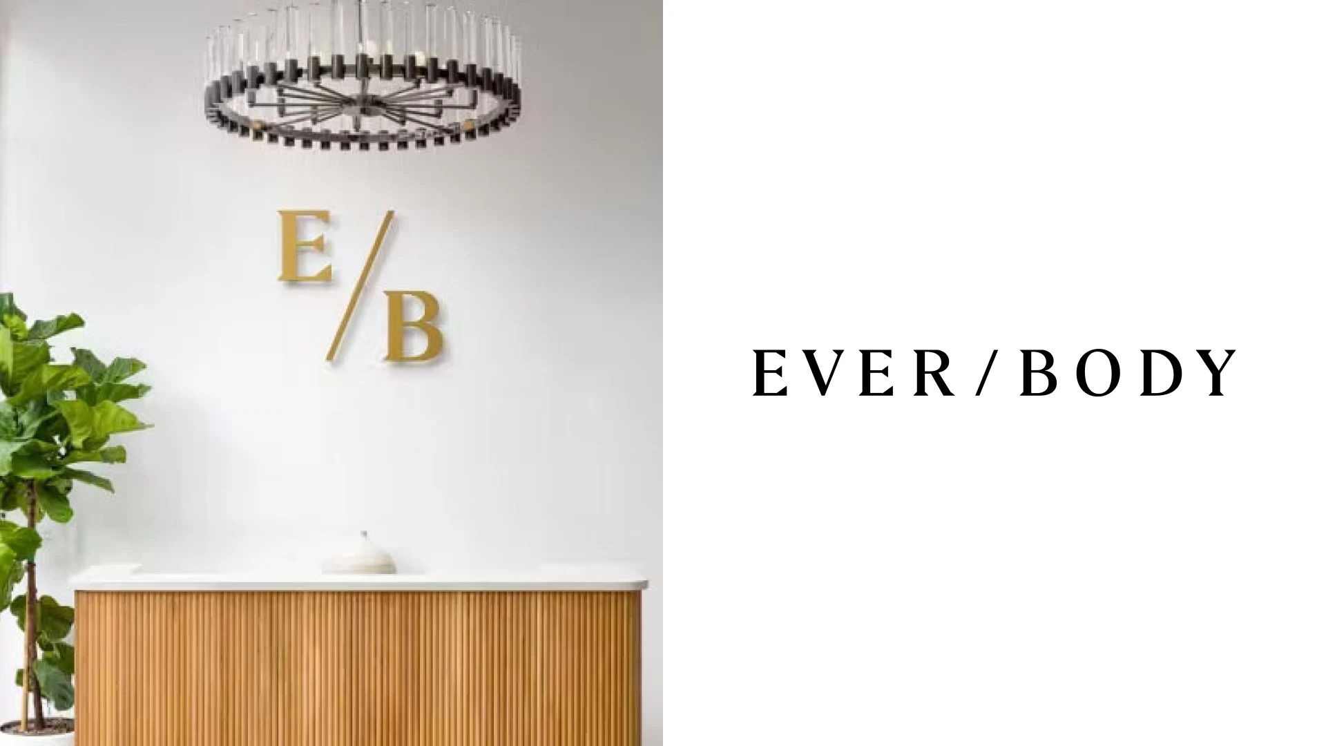
Ever/Body E/B monogram at reception. Photo: Official brand / original design portfolio. Image source.
The slash is a small detail, but it gives Ever/Body’s name a recognizable rhythm.
I like the high-contrast serif lettering because it brings an editorial, fashion-oriented quality to a medical-aesthetics business.
The thin and thick strokes feel more expressive than a generic clinic-style sans serif.
At the same time, the spacious layout and controlled palette keep the presentation composed.
Cactus documents naming, identity and the design of the physical experience.
It is useful inspiration if you want a clinical service to feel premium and personal, while keeping the information clear.
View the documented design work.
18. QC Spa New York
QC Spa New York is a destination spa on Governors Island, with thermal pools, saunas, relaxation spaces and massage.
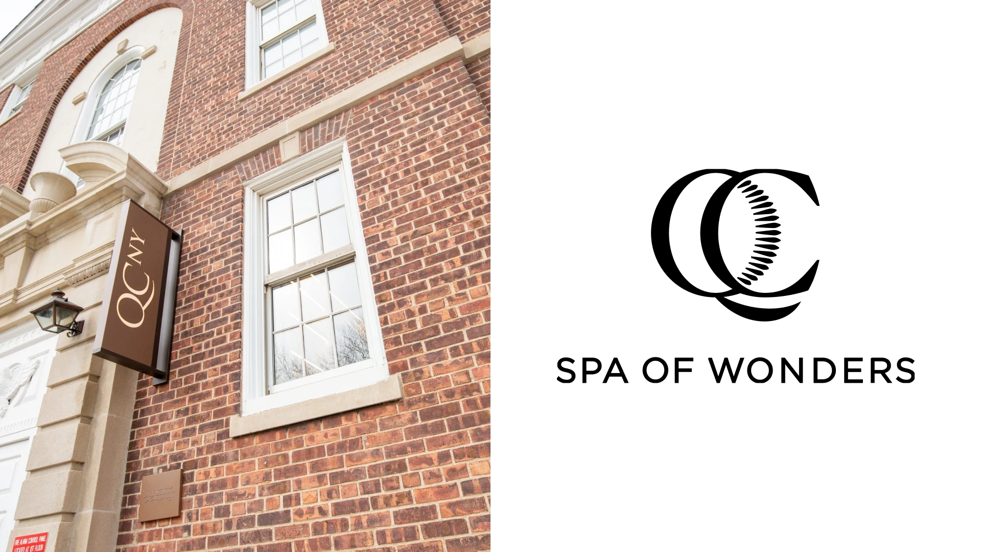
Archival QC NY entrance sign; current QC Spa of Wonders identity at right. Photo: Business Insider. Image source.
QC uses the initials as a compact monogram, with Spa of Wonders set underneath.
I like the relationship between the interlocking curves and the small warm-colored accent inside the mark.
The symbol gives the group a recognizable shorthand, while the location line can change for different destinations.
That is a practical form of brand architecture for a business with several properties.
The current identity is documented in QC’s own press material and Robilant’s project portfolio.
For a growing spa business, this is useful inspiration for designing a master identity that can accommodate new locations.
View the documented design work.
19. Pvolve
Pvolve offers functional movement and resistance-training classes at its SoHo studio at 415 West Broadway, Floor 2.
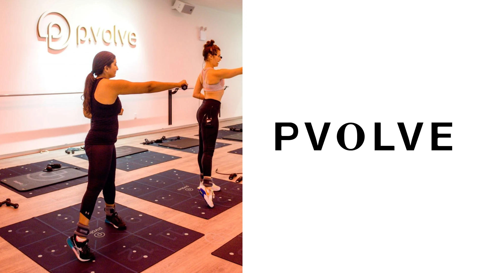
Archival P.volve class photograph; current PVOLVE wordmark at right. Photo: Twinspirational. Image source.
Pvolve’s current uppercase wordmark feels compact and confident.
I like how the restrained identity leaves room for movement, equipment and instructors to explain the offer.
The visual system uses more control than the loud graphics often associated with a hard-training gym.
That creates a useful connection between fitness and a broader sense of wellbeing.
PA Consulting documents digital and product work, while referring separately to the language developed by Pvolve’s brand team.
For a movement business, the lesson is to choose a visual tone that matches the method, rather than borrowing the same high-energy gym look as everyone else.
20. ORA
ORA is an acupuncture and wellness practice with locations in NoHo and the Upper East Side, combining acupuncture with red light and meditation.
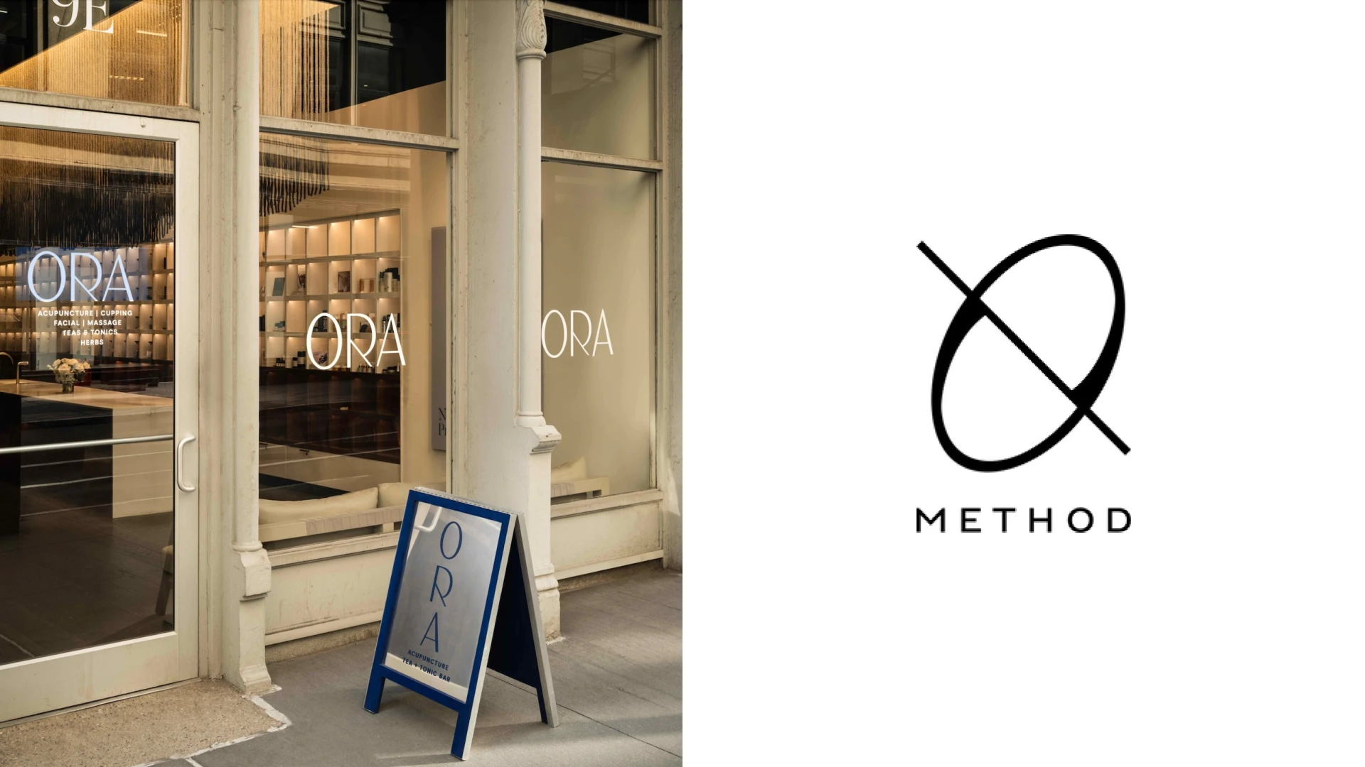
ORA storefront and sidewalk sign. Photo: ORA. Image source.
ORA’s looping symbol gives the brand a softer, more fluid starting point than a purely typographic identity.
I like the fine lines against the deep blue background, with cream creating a warm contrast.
The mark feels light, while the interior photography brings in more texture and depth.
That combination creates a considered, hospitality-like look and feel around an acupuncture practice.
Rockwell Group documents the spaces and a medicinal-flower pattern used in the brand environment.
This is useful inspiration for a treatment business that wants to feel calm and distinctive without relying on a familiar lotus symbol.
21. WORLD SPA
WORLD SPA is a large bathing and wellness destination at 1571 McDonald Avenue in Brooklyn, with pools, saunas, banyas, hammams and treatments.
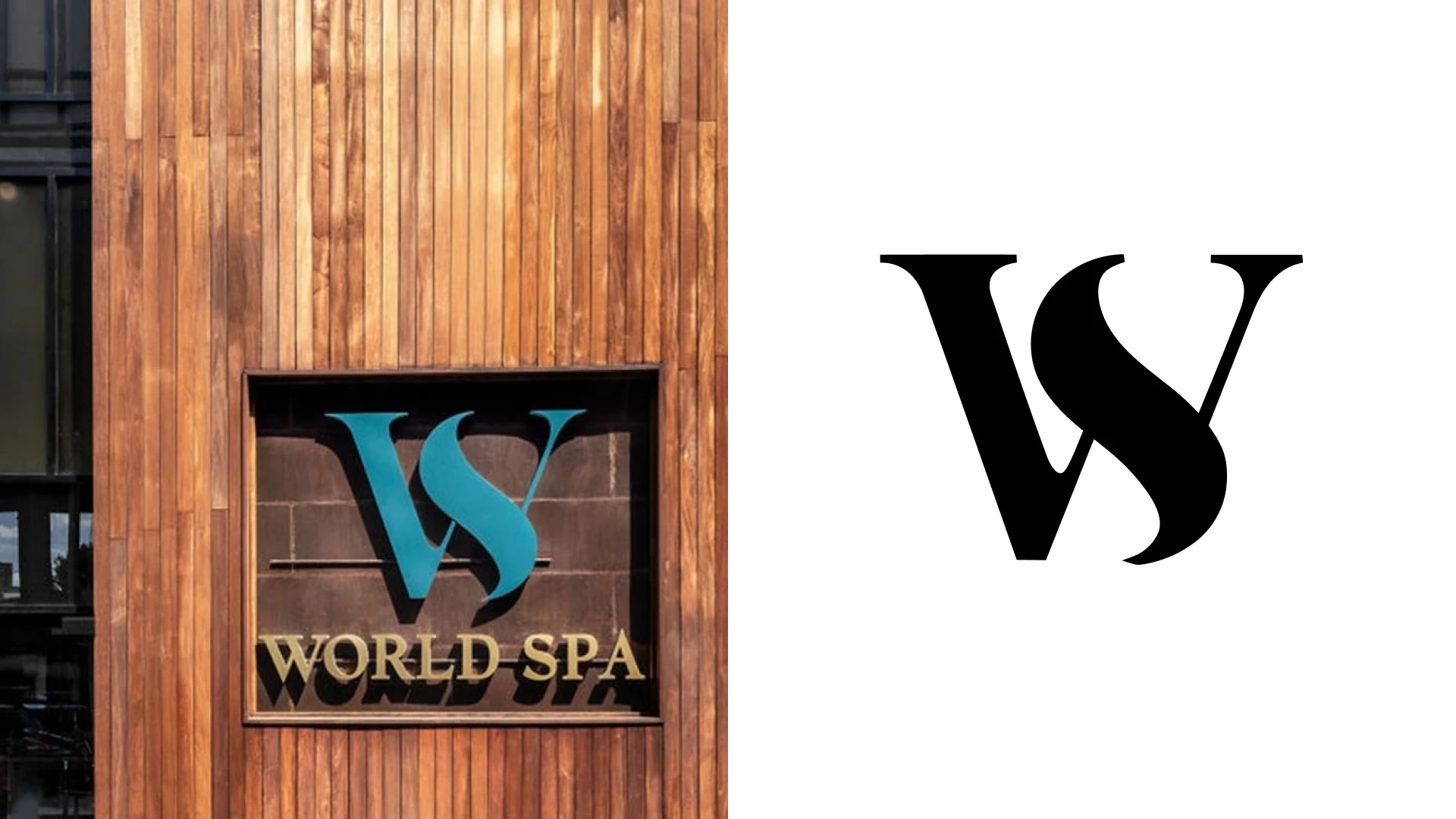
WORLD SPA exterior sign. Photo: WORLD SPA / Travelzoo. Image source.
WORLD SPA takes a more theatrical direction than many of the smaller studios here.
The compact interlocking letterforms and gold-toned details sit within a world of rich materials and dramatic lighting.
I like how the restrained mark can remain recognizable even when the surroundings become more elaborate.
The contrast between the clean graphic identity and the different bathing rooms gives the experience visual variety.
That approach suits a destination with several kinds of spaces under one roof.
For a larger wellness venue, this is useful inspiration for keeping the master brand simple while allowing the environment to be expressive.
22. FaceGym
FaceGym offers facial workouts and manual treatments at New York locations including the Upper East Side and Nordstrom.
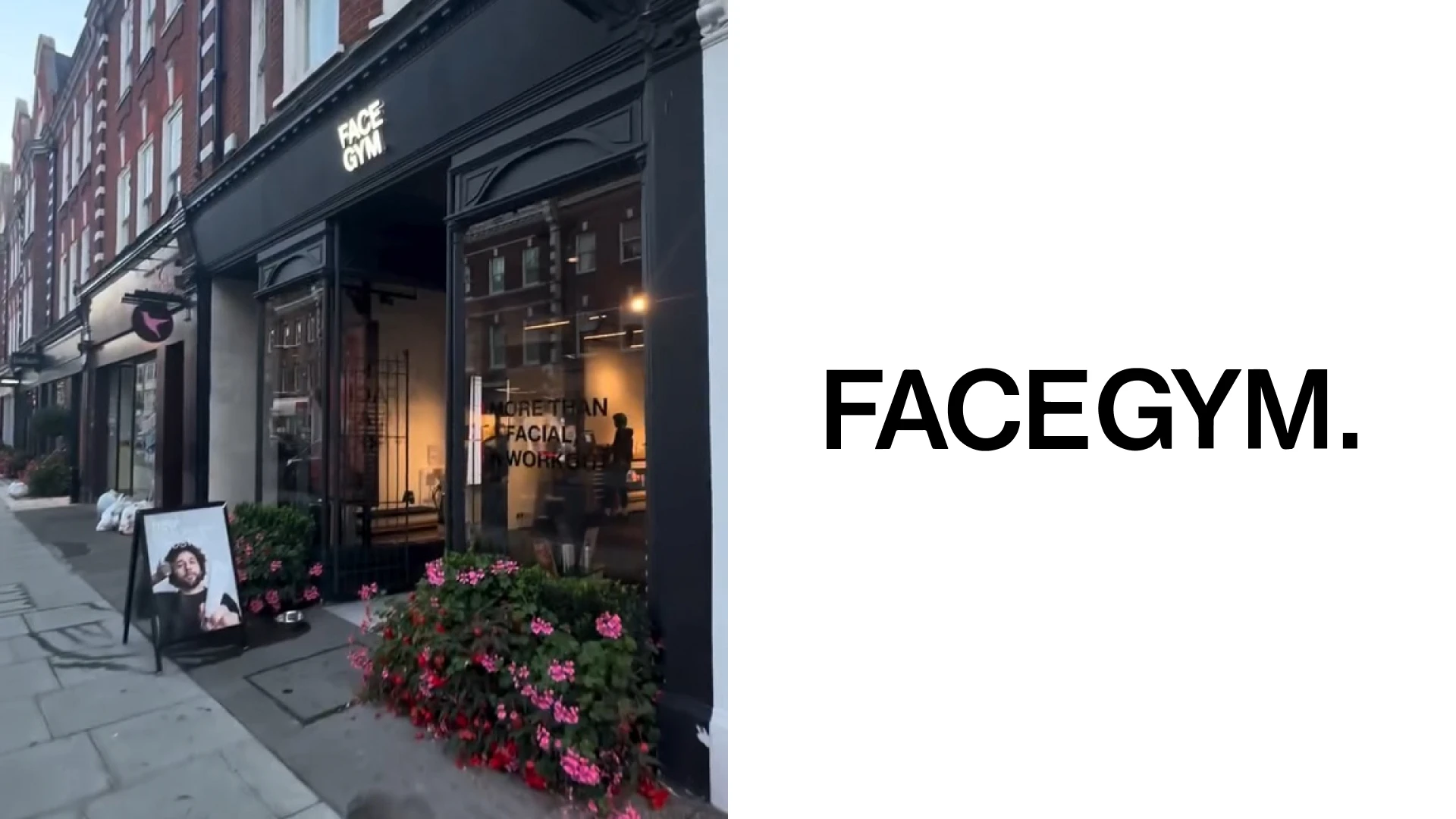
FaceGym Upper East Side sidewalk sign. Photo: Signs and Mirrors. Image source.
FaceGym’s name is already doing a lot of positioning work.
The bold sans-serif wordmark supports that directness, with the energy of a fitness brand rather than a conventional facial salon.
I like how the workout vocabulary carries through to the way the service is presented.
The typography is strong enough to work on a sign and still read clearly at a small size in a booking interface.
That makes the identity feel practical as well as distinctive.
For a business offering a less familiar service, the useful lesson is to make the name, visual language and offer reinforce one another.
23. Great Jones Spa
Great Jones Spa is a NoHo day spa at 29 Great Jones Street, offering massage, skin treatments and a water lounge.
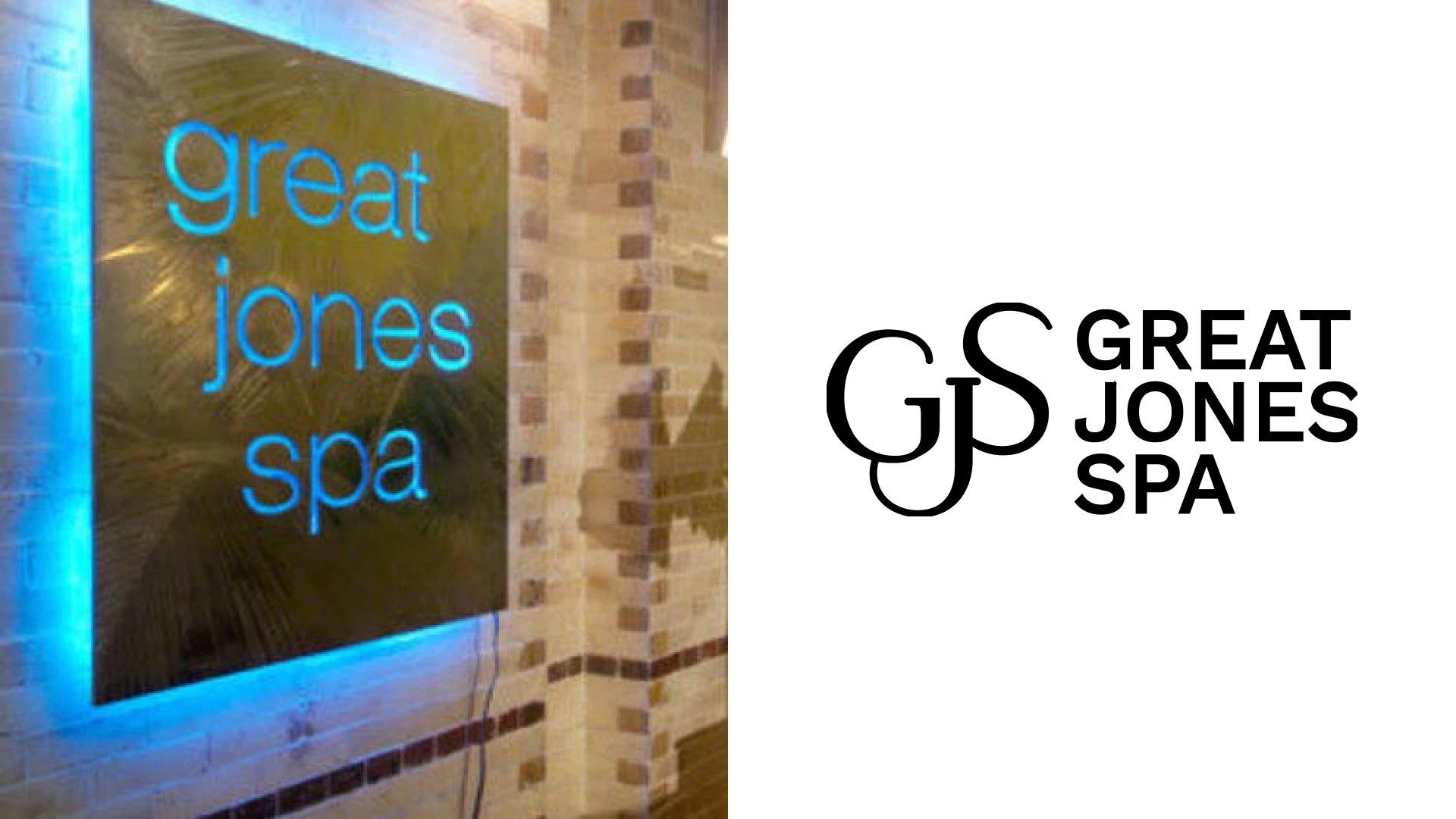
Archival Great Jones Spa wall sign; current GJS identity at right. Photo: Time Out. Image source.
Great Jones Spa offers a different route to a more established spa look.
The interlocking letterform monogram gives the name a compact signature, while the warmer palette adds a softer tone.
I like the contrast between the fine lettering and the geometry of the tiled water lounge.
The presentation feels more traditional than a social wellness club, but it is still easy to read.
That is useful inspiration if your business is built around a calm neighborhood retreat rather than a high-energy group experience.
The lesson is to choose the right degree of formality for the customers and the setting.
24. THE WELL
THE WELL is a New York-founded integrated wellness brand that combines treatments, movement and hospitality in its wider international portfolio.
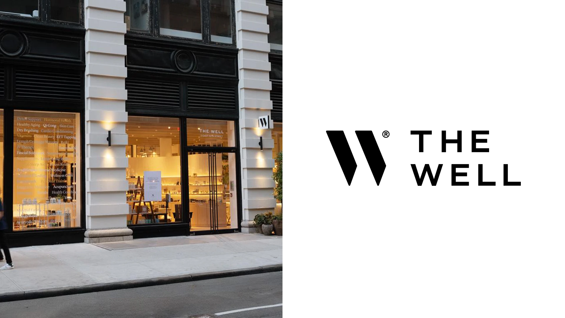
Former THE WELL storefront in New York, shown as an archival application. Photo: RTL real-estate listing of former THE WELL premises. Image source.
THE WELL pairs a strong W emblem with a much smaller typographic lockup.
I like that difference in scale because it gives the brand both a compact symbol and a readable name.
The emblem has enough presence to sit on physical objects without needing a large block of text.
Natural materials and quiet typography create a coherent setting for a varied wellness offer.
Major Studio documents the refreshed identity, strategy, website and packaging system.
For a multi-service business, this is useful inspiration for building recognition across touchpoints without making every application identical.
View the documented design work.
25. The Ranch
The Ranch offers residential wellness programs in Malibu and New York’s Hudson Valley, where its retreat is in Sloatsburg.
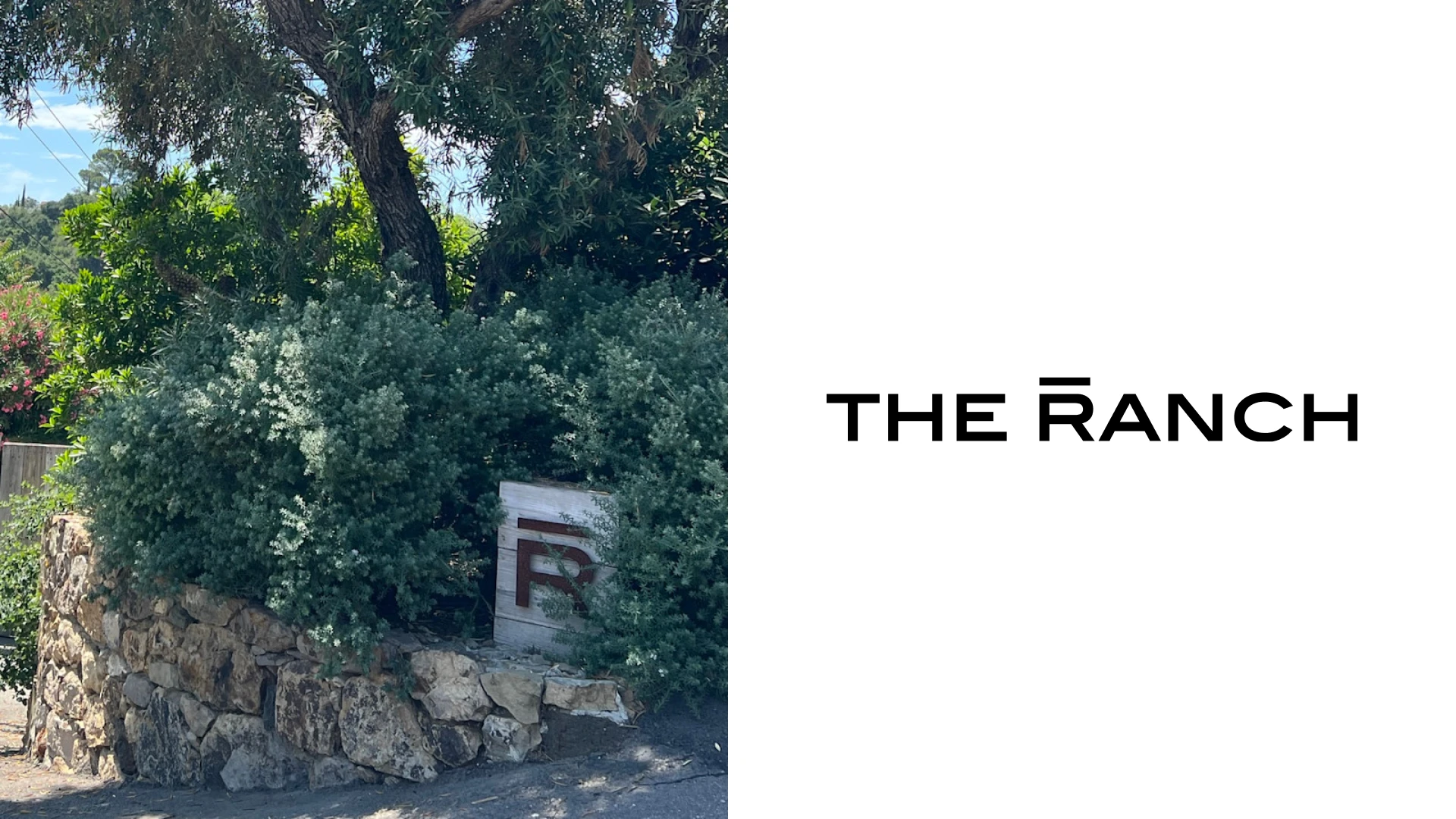
The Ranch Malibu entrance with the R monogram mounted on its stone wall; current wordmark at right. Photo: Chanda Daly / Fora Travel. Image source.
The Ranch is the retreat example in this selection, with a New York property outside the city.
I like the simplicity of the wordmark beside the landscape and the physical setting.
The presentation leaves plenty of room for the experience to feel slower and more spacious.
That restraint is useful when the place itself already has a strong visual character.
The identity does not need several nature symbols to establish a connection with the outdoors.
For a retreat business, it is useful inspiration for using space, proportion and photography to create a premium look and feel.
What makes wellness branding work?
The strongest identities here take a clear position.
Some feel social and energetic, while others are quiet, clinical or deliberately luxurious.
Choose the character that fits your business, then carry it through the logo, space, service menu and website.
A beautiful symbol is only one part of that system.
I would also test whether the name reads clearly on the door, whether the colors work on a phone, and whether a new customer can understand the offer.
Need a new logo or identity for your wellness brand?
I’m Arek Dvornechuck, a New York-based branding designer with over 20 years of experience.
I help businesses turn a clear idea into a distinctive logo, identity system and website.
You work directly with me, from the early design decisions to the final files.
A scoped one-week identity or rebrand costs $3,000 total, covering the logo system, colors, typography and practical guidelines.
Website design and development are scoped separately, with the total agreed before work begins.
Explore my branding work and website design service, or schedule a call to discuss your wellness business.
Brand names and logos belong to their respective owners; the businesses featured here are independent editorial examples.
Ready to build a brand people remember?
Tell me what you’re launching, changing, or trying to make look better.