
Branding
Why Every AI Startup Looks the Same (And How to Break the Uniform)
Published on Sep 21, 2026
Open a Product Hunt AI tab.
Or a Demo Day grid.
Tape over the logos.
You are looking at one company, repeated.
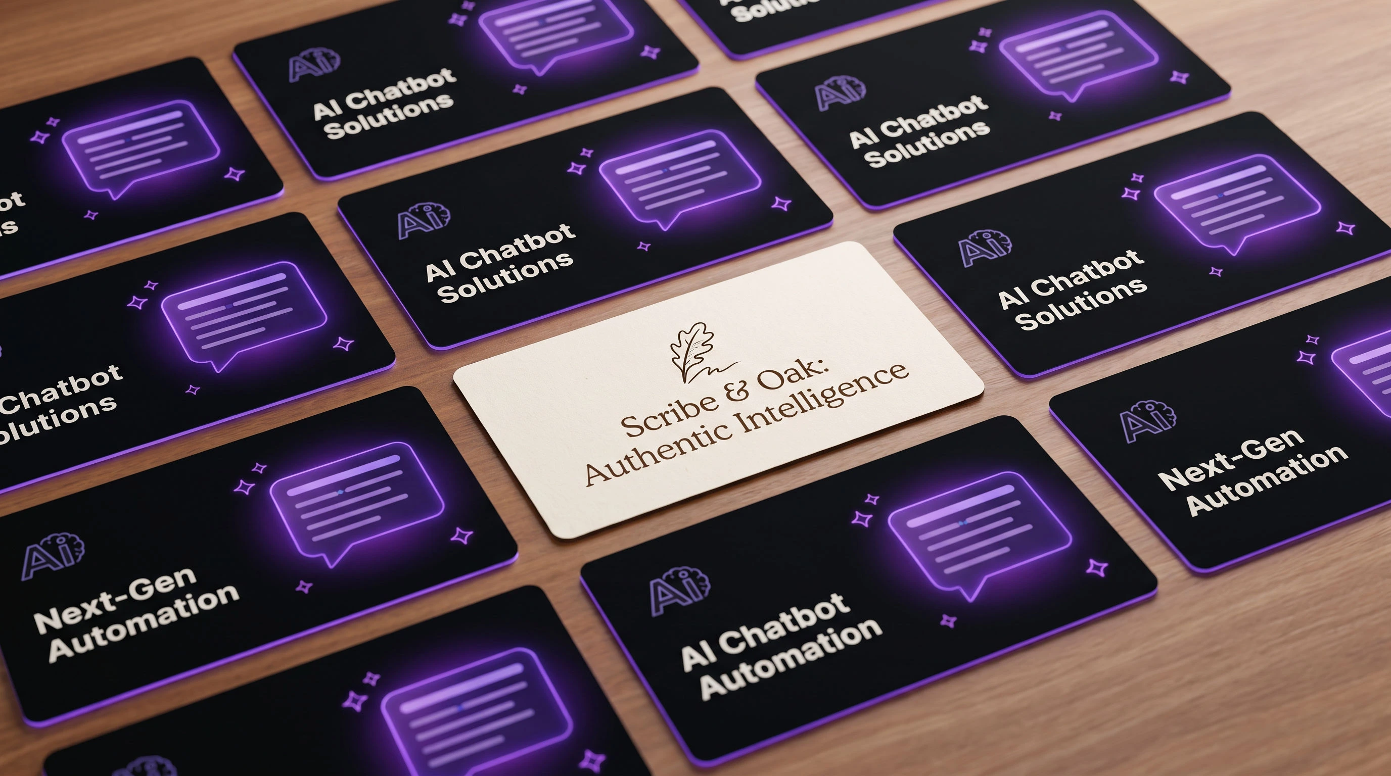
Same near-black hero. Same purple glow. Same sparkle. Same Inter or Geist. Same bento grid. Same "Your AI copilot for X" headline.
This is not a coincidence, and it is not just bad taste.
The AI look has become a category uniform — and uniforms are designed to make people look the same.
If you are branding an AI product, that is the problem you have to solve.
This piece is the diagnostic and the playbook.
For the gallery of breakouts, see 9 Best AI Company Branding Examples in 2026.
The 2026 AI uniform
You can spot the uniform in under a second.
Near-black backgrounds around `#0A0A0A`.
A soft purple or indigo gradient bloom behind the product.
Sparkle or star icons standing in for "intelligence."
Type set in Inter, Geist, or a near-clone.
Bento-box feature grids.
A chat window as the hero.
A headline that starts with "The AI copilot / agent / assistant for…"
A `-ly` or `-ify` name that could belong to any of twelve peers.
None of these choices are illegal.
Together they erase recall.
That is the real cost.
Five forces that produced the uniform
1. Shared reference brands
Linear. Vercel. OpenAI.
Those products taught a generation of founders what "serious software" looks like in 2024–2026.
When everyone studies the same three references, everyone graduates with the same thesis.
2. Shared component kits
shadcn/ui. Tailwind defaults. Framer AI templates.
Kits are leverage.
They are also a style sheet for sameness.
If your site is assembled from the same blocks as your competitor's site, your brand is already half-merged with theirs.
3. AI designing AI
Founders ask image models and UI generators for "modern AI landing page."
The models average the genre.
You get the mean of every dark glow landing page they have seen.
4. Speed bias
Ship the waitlist page this week.
Borrow the look that "reads as AI."
Worry about identity later.
Later rarely comes.
5. Category signaling
Looking like the category feels safe.
Buyers in infrastructure often treat the uniform as a trust cue — "these people speak our dialect."
That works for peer signaling.
It fails when you need to be remembered after the tab is closed.
What sameness costs
Visual appeal judgments form fast.
Lindgaard and colleagues found that people can rate a web page's visual appeal after exposures as short as 50 milliseconds (Behaviour & Information Technology, 2006).
If your first frame looks like everyone else's first frame, you do not get a second chance at distinctiveness in the feed.
Sameness also feeds wrapper suspicion.
If the brand looks generic, buyers assume the product is a thin shell on someone else's model.
Then price becomes the only axis left.
And in a scroll of identical cards, you are invisible even when you are better.
Breakouts brand outcome worlds, not model stacks
The companies people remember did not brand "AI."
They branded a world the buyer already understands.
Anthropic chose warmth — clay, butterflies, principles like intelligent and unvarnished — before the product fully landed in public consciousness.
Perplexity feels like a newsroom and an answer engine, not a chat novelty.
ElevenLabs sounds like voice and performance, not a dashboard skin.
Midjourney and Runway feel like studios — art and film — not purple glow SaaS.
Granola went the other way from the uniform: handwriting energy and acid lime as category-opposite cues, with a system behind the mark, not a one-off logo (Horizon on the Granola rebrand).
Different worlds.
Same lesson.
Brand the outcome your user lives in. Do not brand the stack you rent.
That is also the through-line in our AI company branding examples.
An 8-move playbook to break the uniform
1. Run a color audit
Screenshot twenty competitor heroes.
If they collapse into black plus purple, you do not get to use black plus purple unless you have another signature that overpowers it.
2. Make type a decision, not a default
Inter and Geist are fine tools.
They are weak identity.
Pick a typeface (or pairing) that could not be swapped onto a peer's site without anyone noticing.
3. Show the output, not the chat chrome
If your product produces docs, video, voice, code, or research, put that artifact in the hero.
A chat window is a commodity UI.
Output is the proof.
4. Kill the sparkle
Sparkles became the emoji for "model inside."
When everyone uses them, they mean nothing.
5. Own one motion signature
One transition, one hover, one load state that people can feel with the sound off.
Motion is underused distinctive territory.
6. Borrow from an adjacent physical world
Notebook. Lab. Newsroom. Workshop. Score. Instrument.
Physical metaphors give you color, material, and photography that software kits do not ship by default.
7. Write specific copy
"AI copilot for sales" is a category sentence.
Name the job, the user, and the outcome in language only you would use.
8. Consider light mode as a strategy
Not because light is morally better.
Because the feed is dark.
Contrast is a brand asset when the category forgot it.
"Are you a template?" checklist
Score yourself honestly.
- Dark hero near black?
- Purple / indigo glow?
- Sparkle or star as the smart icon?
- Inter or Geist as the voice of the brand?
- Bento feature grid as the default layout?
- Chat UI as the hero?
- Copilot / agent / assistant headline pattern?
- `-ly` / `-ify` name with no other verbal system?
Four or more checks means you are wearing the uniform.
Zero checks does not mean you are distinctive.
It means you cleared the floor so a real system can stand.
When the uniform is OK
Matching the look can be rational.
Pre-PMF exploration, when you are testing whether anyone wants the job done at all.
Infrastructure buyers who treat the uniform as peer signaling.
Internal tools that will never live in a consumer feed.
Just do not confuse temporary camouflage with a brand.
This is blanding with a GPU
Call it AI slop, the Linear clone look, or Demo Day wallpaper — founders already have the words for the same problem.
Fashion and DTC already lived through blanding — the year when everyone looked premium by looking identical.
AI is replaying it with dark mode and glow.
In Building Brand Assets, the point from Jenni Romaniuk's work is simple: if competitors all use the same cue, it is not a distinctive brand asset.
It is furniture.
And when assets get cheap — templates, generators, kits — distinctiveness gets expensive.
That is the same lesson as the long arc in The History of Branding: marks only matter when they can be told apart.
FAQ
Is the AI aesthetic always wrong?
No.
It is wrong when it is your only strategy for trust.
Should we rebrand before product-market fit?
Not into a 40-page brand book.
Yes into a few non-negotiable cues — color, type, verbal pattern, one proof visual — so learning does not erase memory.
What if our buyers expect the uniform?
Meet them halfway on structure.
Break them on signature.
Same information architecture. Different world.
How is this different from your AI branding examples post?
That article is the gallery.
This one is the diagnosis and the checklist.
Break the uniform on purpose
If your landing page could swap logos with a competitor and nobody would notice, you do not have a brand problem later.
You have one now.
Brand for the outcome world your customer already lives in — not for the model stack everyone else is renting.
Want help pressure-testing the cues — and shipping something that does not look like every other AI card on Product Hunt?
That is what the $3,000 Brand Sprint is for: one week, core identity, direct with a senior designer — not an agency junior stack.
Also useful next reads: Brand positioning, AI company branding examples, and Should you rebrand?.
Ready to build a brand people remember?
Tell me what you’re launching, changing, or trying to make look better.