


Arek Dvornechuck
Branding Expert


9 Best AI Company Branding Examples in 2026
.webp)


.webp)


If you’re branding an AI company, this article is for you.
Because here, I’ll examine a range of AI logo design styles — from OpenAI’s ultra‑minimalism, to Gemini’s spark icon, to Mistral AI retro pixel‑art aesthetic — and everything in between.
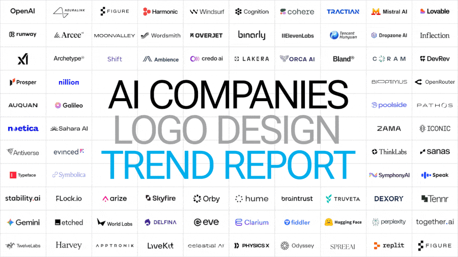
And I've analyze over 100 AI companis—big names, as well as startups in various verticals.

By the end, you’ll have a clearer idea of which direction to take when developing your own identity.
So let’s dive right in.
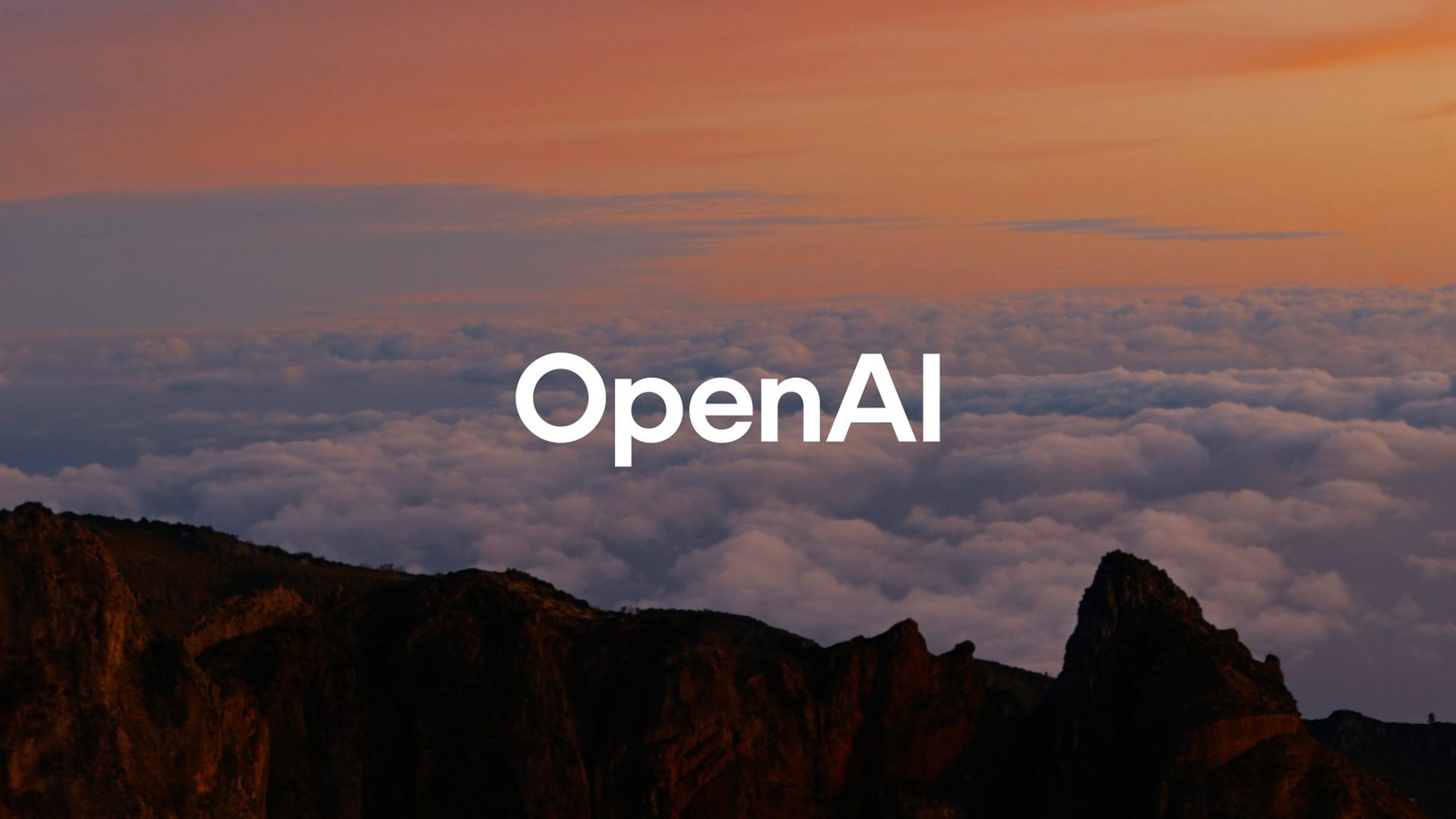
OpenAI's new identity revolves around what they call “the point” — a black circle symbolizing the origin of a ChatGPT response.
The logo itself is just a wordmark set in OpenAI Sans, a custom geometric sans‑serif by ABC Dinamo.
It’s extremely legible, restrained, and corporate.
The overall system is ultra‑minimal: clean grids, white space, and deliberate precision.
They still use the “bloom” symbol, but now separate from the wordmark.
Everything feels cohesive, functional, and modular — much like Uber’s rebrand a few years ago.
Motion work by Studio Dumbar brings it to life with an “emotive point” animation and soft watercolor‑like gradients seen in ChatGPT’s voice interface.
It’s understated but smart — the kind of corporate modernism that’s become a template for the AI industry.
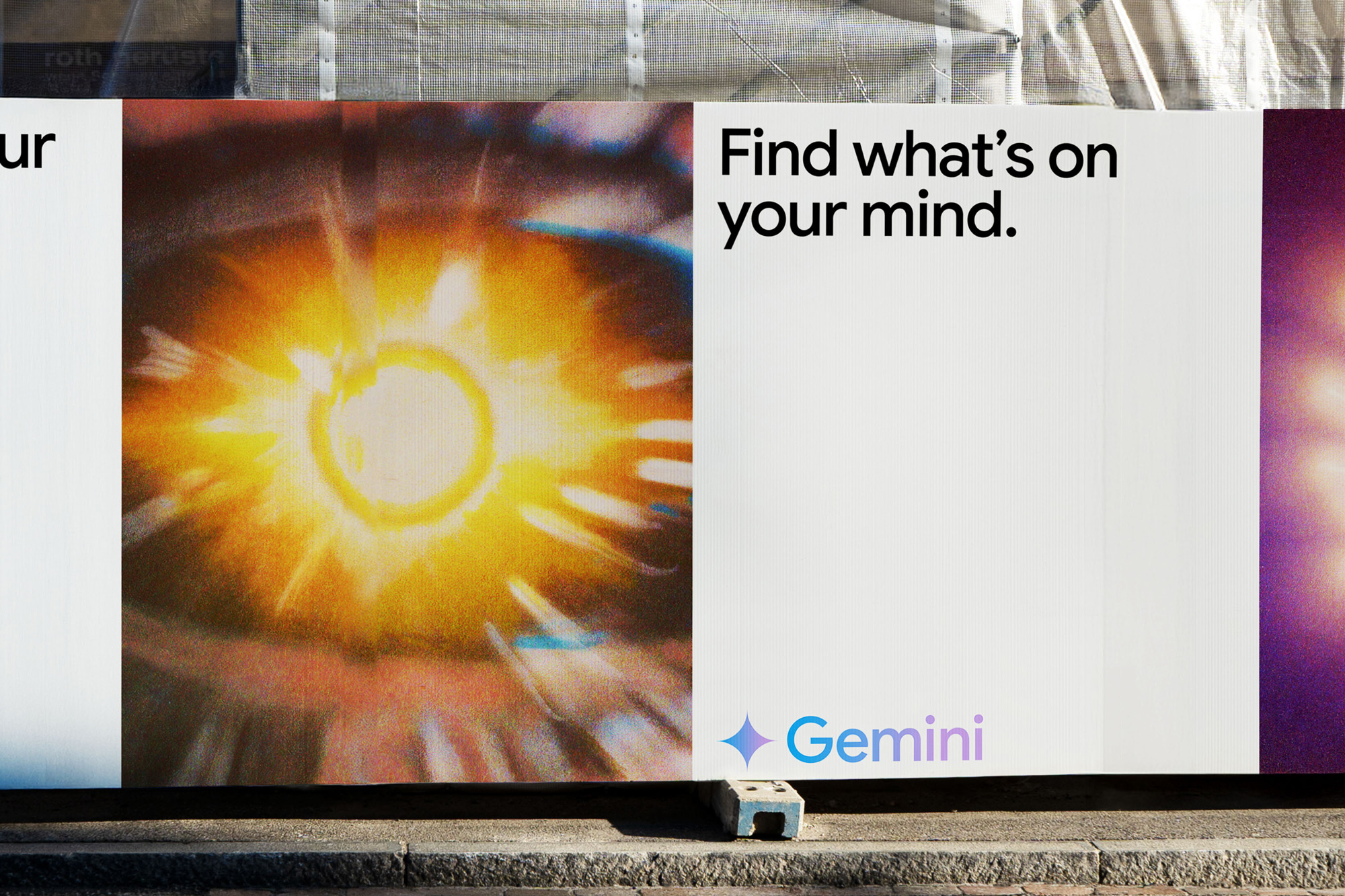
Gemini—Case Study by Porto Rocha
Gemini, Google’s AI model, reintroduced the spark icon — the symbol of inspiration and connection.
The mark is balanced, elegant, and surrounded by vibrant gradients that give it a slightly magical, futuristic feel.
The spark acts as a visual metaphor for “illumination,” while the gradients tie back to Google’s product ecosystem.
It’s clean, optimistic, and safe — perhaps too safe — but fitting for a mainstream tech brand.
Perplexity—Case Study by Smith&Diction
Perplexity’s logo revolves around an asterisk symbol, representing both a spark and an open book.
The idea combines discovery and knowledge — visualized as intersecting windows.
Their type choice, FK Display, adds sophistication through subtle ink traps and distinctive details.
The lowercase p feels friendly and intentional, referencing the way we type casually into search bars.
It’s minimal, refined, and conceptually strong — one of the smarter identities in the AI space.
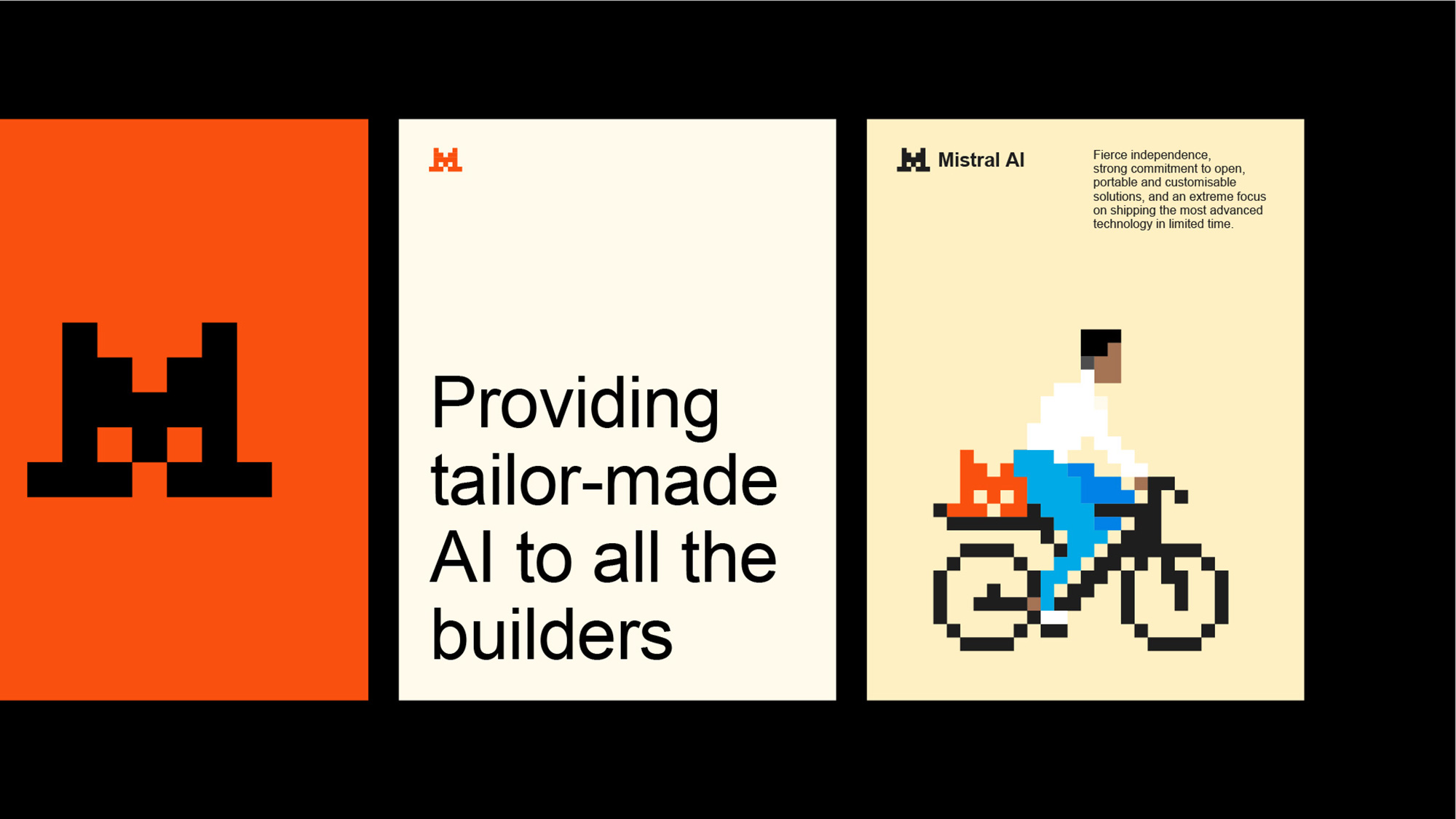
Mistral AI—Designed by Sylvain Boyer Studio (no case-study).
Mistral’s logo is a pixelated, striped “M” — a nod to early computing and retro graphics.
Hidden within the icon is a cat’s face, a clever reference to AI’s early image‑training datasets.
Once you see it, you can’t unsee it — a bit like the arrow in the FedEx logo.
Bright colors and motion give it energy, while the pixel‑art aesthetic adds playfulness and nostalgia.
It’s not as polished as OpenAI or Gemini, but it has personality — something many AI brands lack.
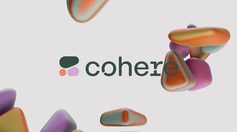
Cohere—Case study by Pentagram
Cohere stands out with an organic, biology‑inspired identity based on cell‑like forms and the concept of “new nature.”
The logo’s fluid geometry, combined with a custom typeface featuring subtle cuts and curves, makes it feel alive.
It’s both technical and human.
The color palette is soft and sophisticated, and the morphing 3D forms echo the brand’s message: connection, adaptation, and intelligence.
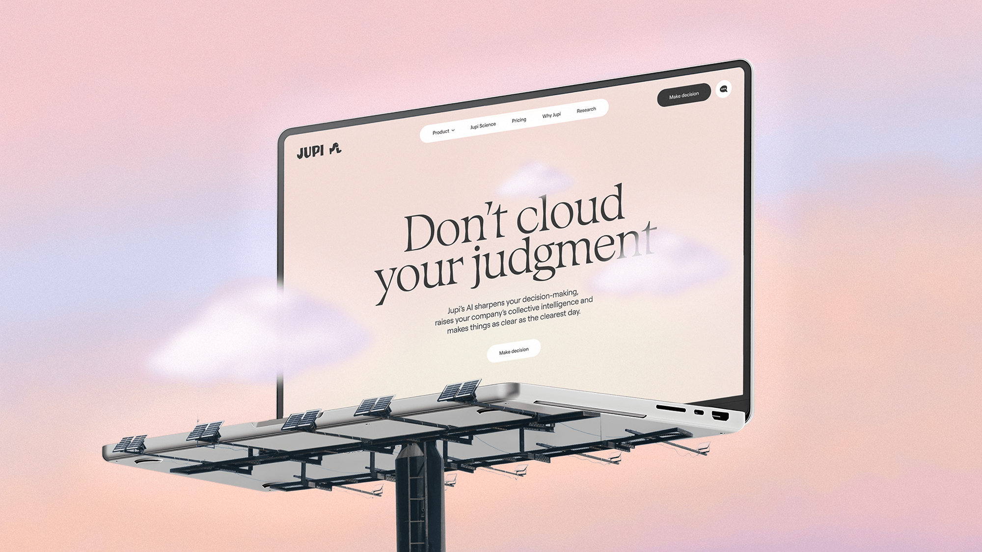
Jupi—Case Study by How&How
Jupi breaks the mold completely.
Its blocky, jagged wordmark looks hand‑cut — raw, tactile, imperfect.
Beside it stands a small mascot, modeled after The Thinker.
This design embraces imperfection and humanity, with surrealist illustrations by Daniel Liévano and a rough serif typeface.
It’s a reminder that creativity and curiosity can still define AI branding — not just geometry and gradients.
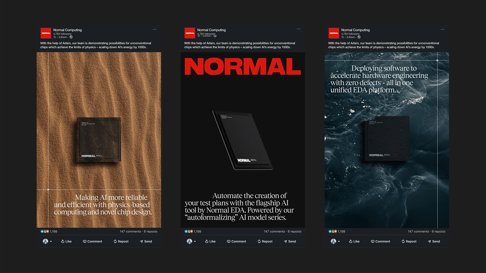
Normal Computing—Case Study by Company Policy
Normal Computing uses a bold, all‑caps sans‑serif wordmark in red, with subtle pixel details referencing circuitry.
It blends editorial aesthetics with tech precision — gradients, blurs, and motion create a dynamic, “in‑progress” look.
The mix of serif and sans‑serif typography adds tension, while animated diagrams reinforce a sense of structure and clarity.
It’s confident, experimental, and undeniably distinct.
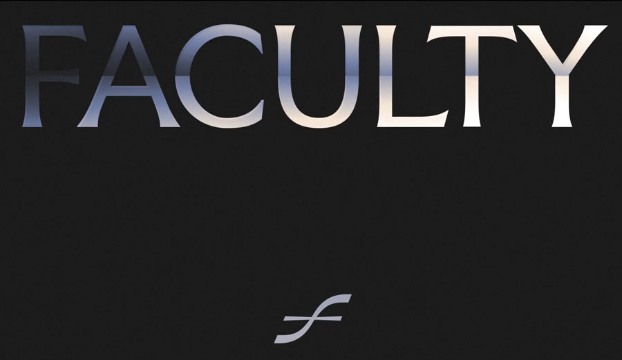
Faculty—Case study by Koto
Faculty’s brand takes an academic approach.
The logo uses an elegant, chiseled serif in all caps, accompanied by a symmetrical monogram “F” that reads the same upside down — an ambigram.
Their custom Faculty Glyphic font draws from London’s Albertus typeface, connecting the brand to its academic roots.
A threshold gradient symbolizes progress and transition — from research to real‑world application.
It’s sophisticated, intellectual, and uniquely British.
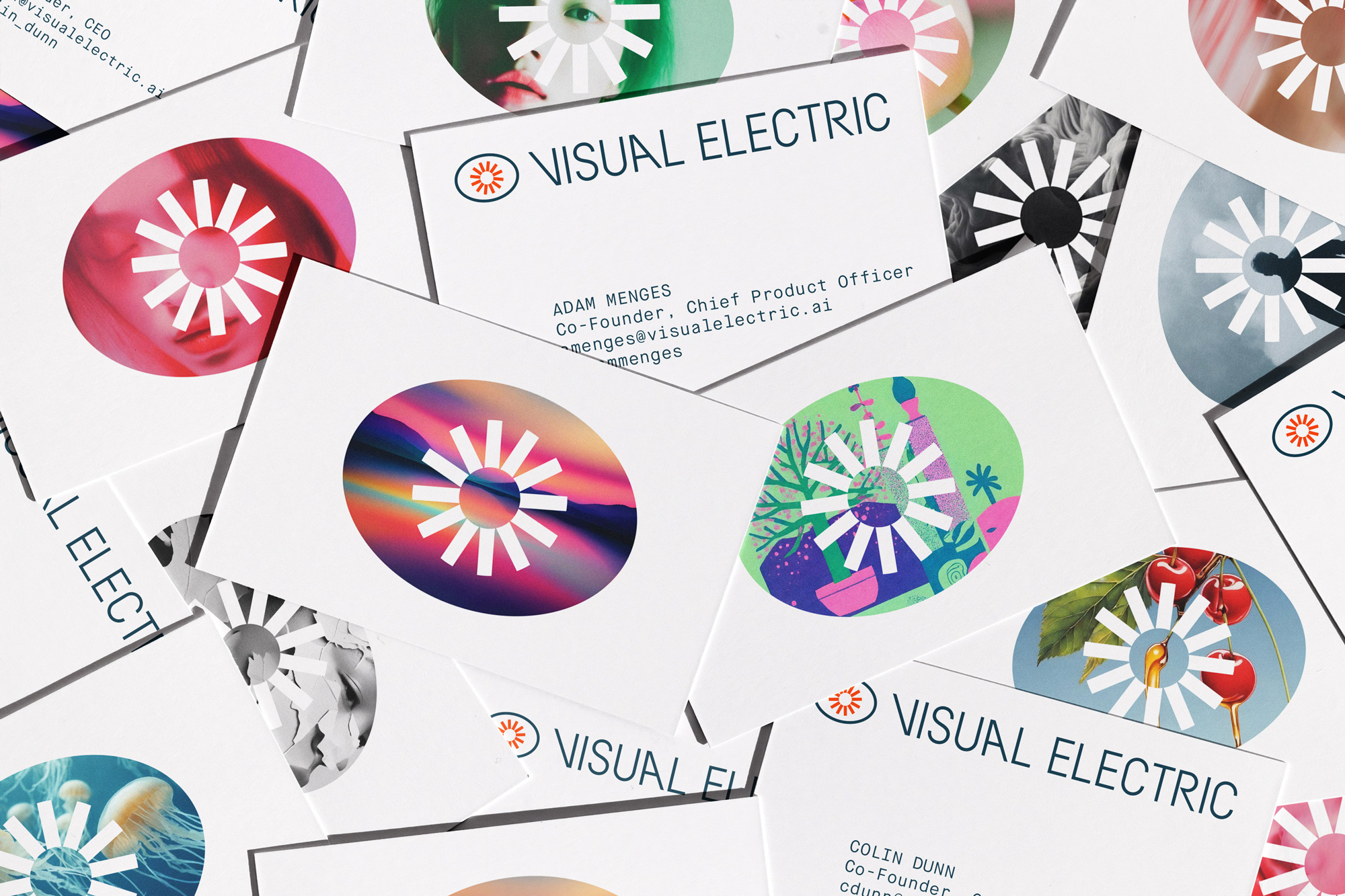
Visual Electric—Case Study by Manual
Visual Electric, an AI image‑generation tool, brings a mid‑century modern flavor.
Its blinking eye icon nods to perception and creation — the core of generative AI.
The custom typeface, inspired by circuit symbols, feels both engineered and playful.
Motion plays a big role here — smooth blinks, shifting shapes, and modular icons make it feel alive.
It’s one of the few AI identities that manages to be fun without losing credibility.
So, what’s the takeaway?
Across all these identities, a few clear trends emerge:
If you’re branding an AI company, the challenge isn’t just to look modern — it’s to sound human and feel distinctive.
Design with intention, not imitation.
Besides the 9 brands mentioned above, I've also analyzed over 100+ other AI startups.
Download my full report for free—just subscribe to my blog and you'll get the PDF in email.
Find the subscribe form in the sidebar.
If you have any problem with that, shoot me an email.
Let’s work together to create a brand identity that truly reflects your technology — modern, distinctive, and built to stand out in the AI space.
See my recent work and Book a call to discuss your project today.
As an Amazon Associate, I earn from qualifying purchases.


I'm a branding expert and graphic designer based in NY. I specialize in the development of brands: brand strategy, identity & web design. Need help with your project?—Get in touch