
Blog
Logo Design
45 Best Restaurant Logos Explained by a Brand Designer [2026]
Published on Nov 22, 2026
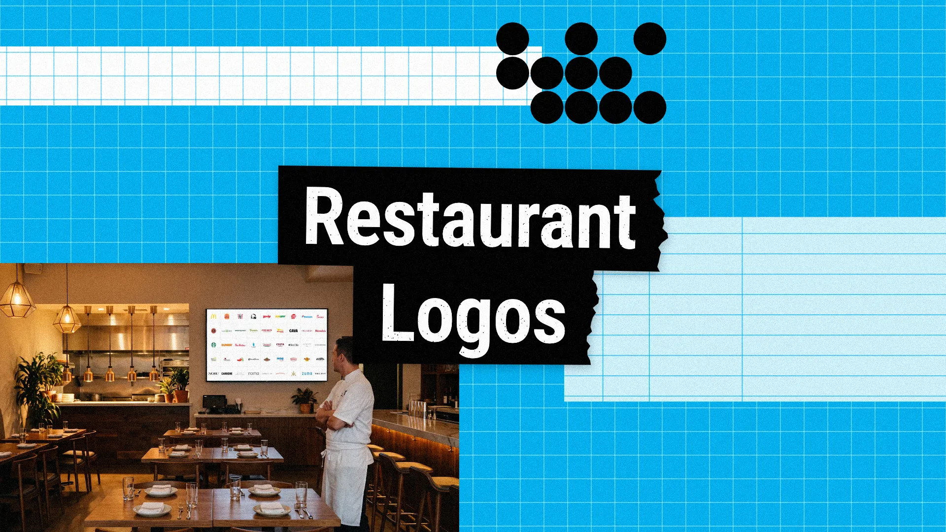
A restaurant logo has to work on a storefront sign, a menu, a coffee cup, a delivery bag, and a tiny app icon, and it has to make people hungry or curious in a second. The best restaurant logos are simple, warm, and full of personality, and they tell you what kind of experience to expect, from a quick burger to a tasting menu.
What makes a good restaurant logo?
The right price signal: fast food logos use bold colours and friendly shapes, while fine dining restaurants use thin type, lots of white space, and almost no colour.
A symbol that works everywhere: the McDonald's arches, the Starbucks siren, and the Chipotle pepper work on cups, bags, signs, and app icons without the name.
A story about the food or the founder: many restaurant logos use the founder's name or face, like KFC and Wendy's, or a simple visual pun, like the Domino's tile and the Applebee's apple.
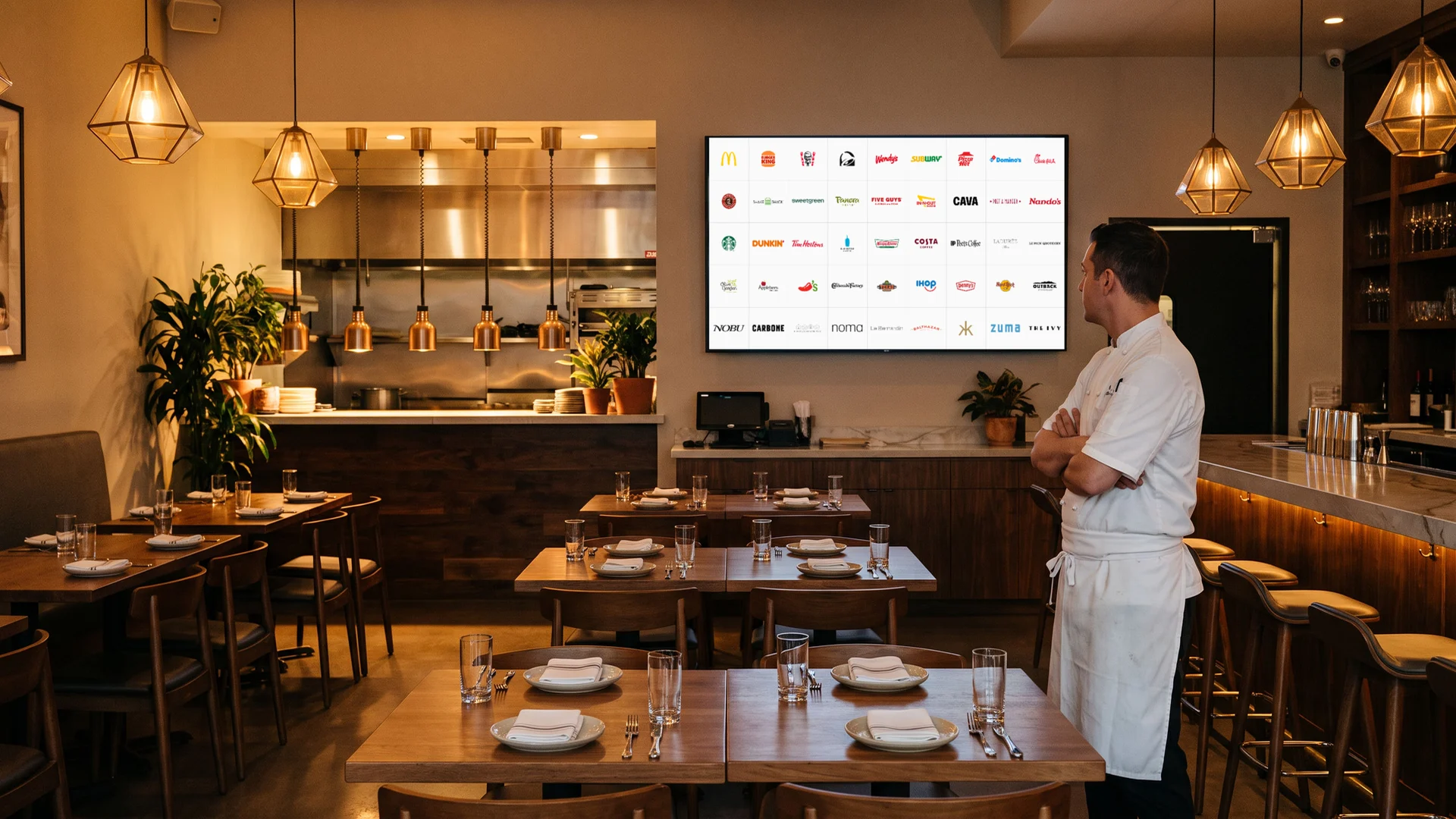
Below are 45 restaurant logos in five groups: fast food icons, fast casual restaurants, coffee shops and bakeries, casual dining chains, and fine dining restaurants. Each logo has a slide with my handwritten notes and a short explanation. If you are opening a restaurant, see my branding checklist and my guides to brand slogans and logo colours.
45 restaurant logos
The boards below show all 45 restaurant logos in one consistent format, grouped into fast food, fast casual, coffee and bakeries, casual dining, and fine dining.
Each logo is reviewed for its design decisions, not for the food, size, or popularity of the restaurant.
01 — Fast food icons
The biggest fast food brands have some of the most recognised logos in the world, built on bold colour, simple symbols, and friendly type.
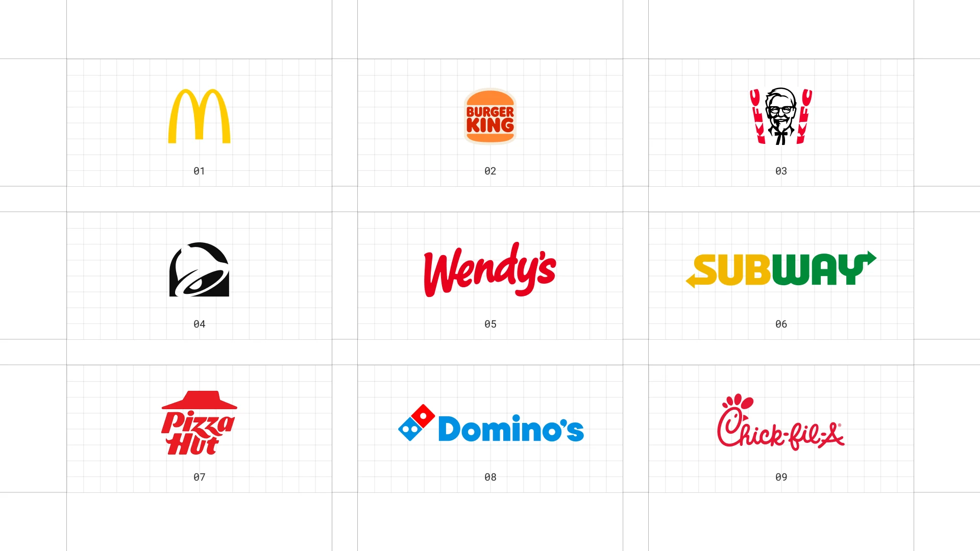
This is a visual comparison of restaurant logos, not a ranking of restaurants.
Look at how each logo uses type, colour, and one symbol to signal its price point and personality.
01 McDonald's
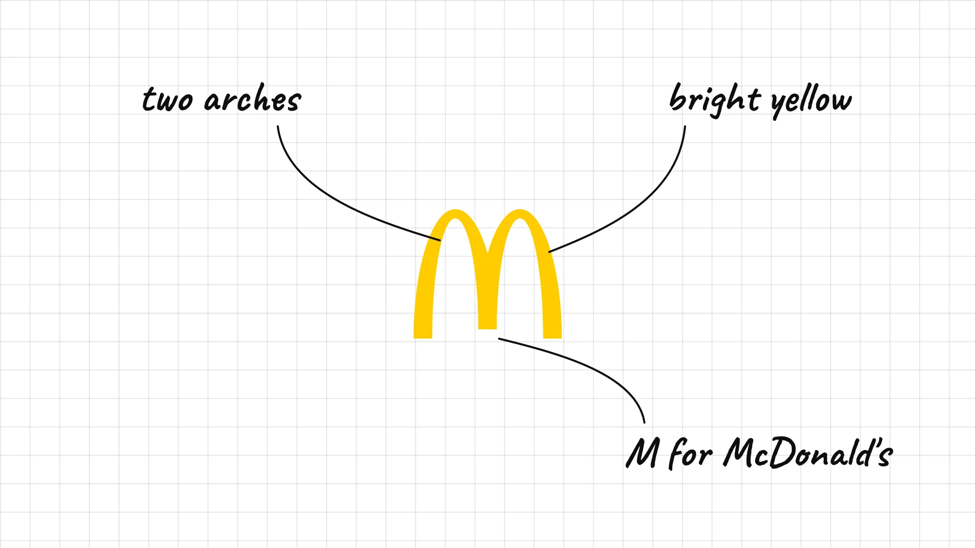
McDonald's Richard and Maurice McDonald opened their first restaurant in San Bernardino, California, in 1940.
The Golden Arches began as real arches on the early restaurant buildings before becoming the M.
Bright yellow is visible from the highway and works as a symbol in every country.
02 Burger King
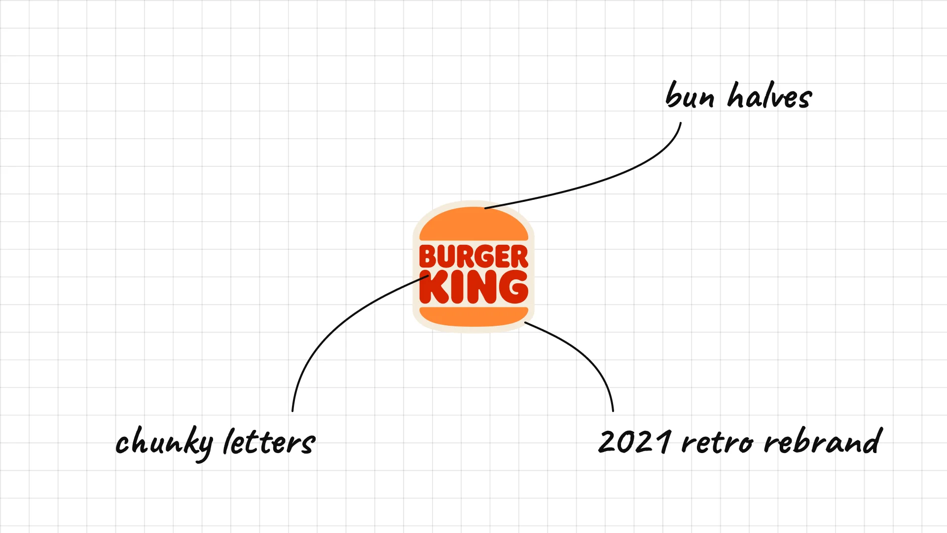
Burger King was founded in Florida in the 1950s, and its 2021 rebrand brought back the bun logo from 1969.
The name sits between two bun halves, so the logo literally looks like a burger.
Chunky, rounded letters make the brand feel warm and nostalgic.
03 KFC
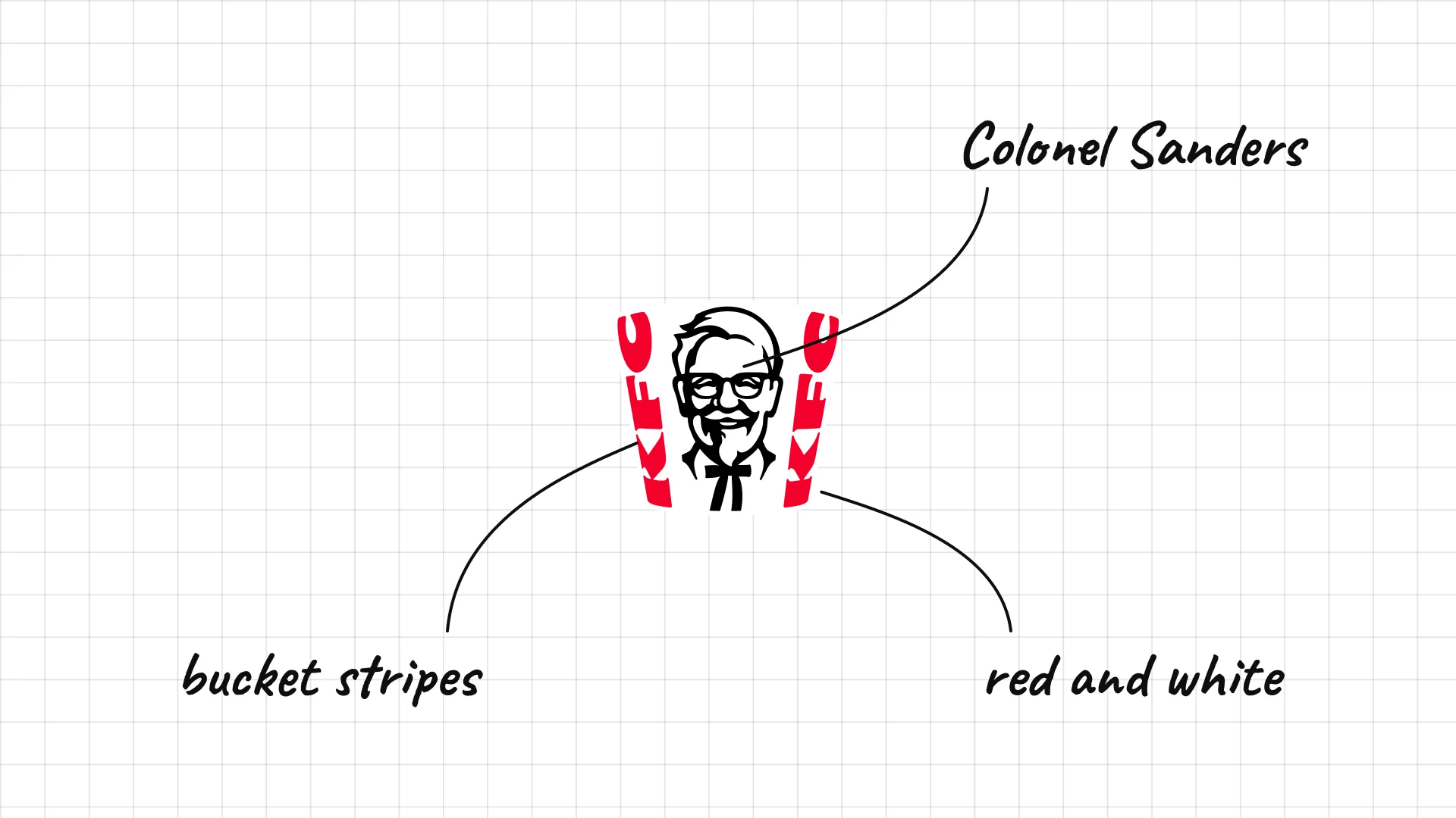
KFC Colonel Harland Sanders began selling fried chicken in Corbin, Kentucky, and the first KFC franchise opened in 1952.
The illustrated Colonel Sanders is one of the most famous founder portraits in branding.
Red and white stripes recall the brand's famous chicken bucket.
04 Taco Bell
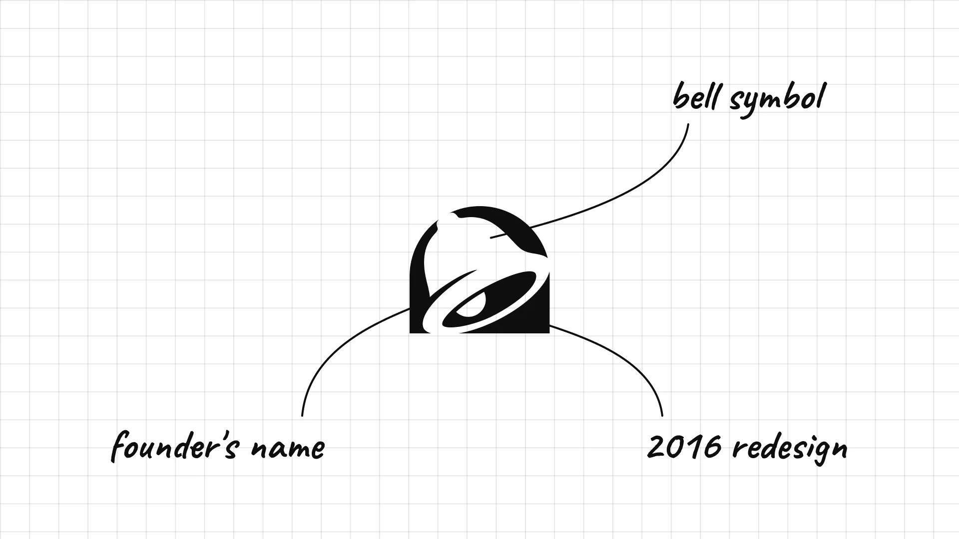
Taco Bell Glen Bell opened the first Taco Bell in Downey, California, in 1962.
The bell symbol is a pun on the founder's name.
The 2016 redesign simplified the bell into a flat, modern icon.
05 Wendy's
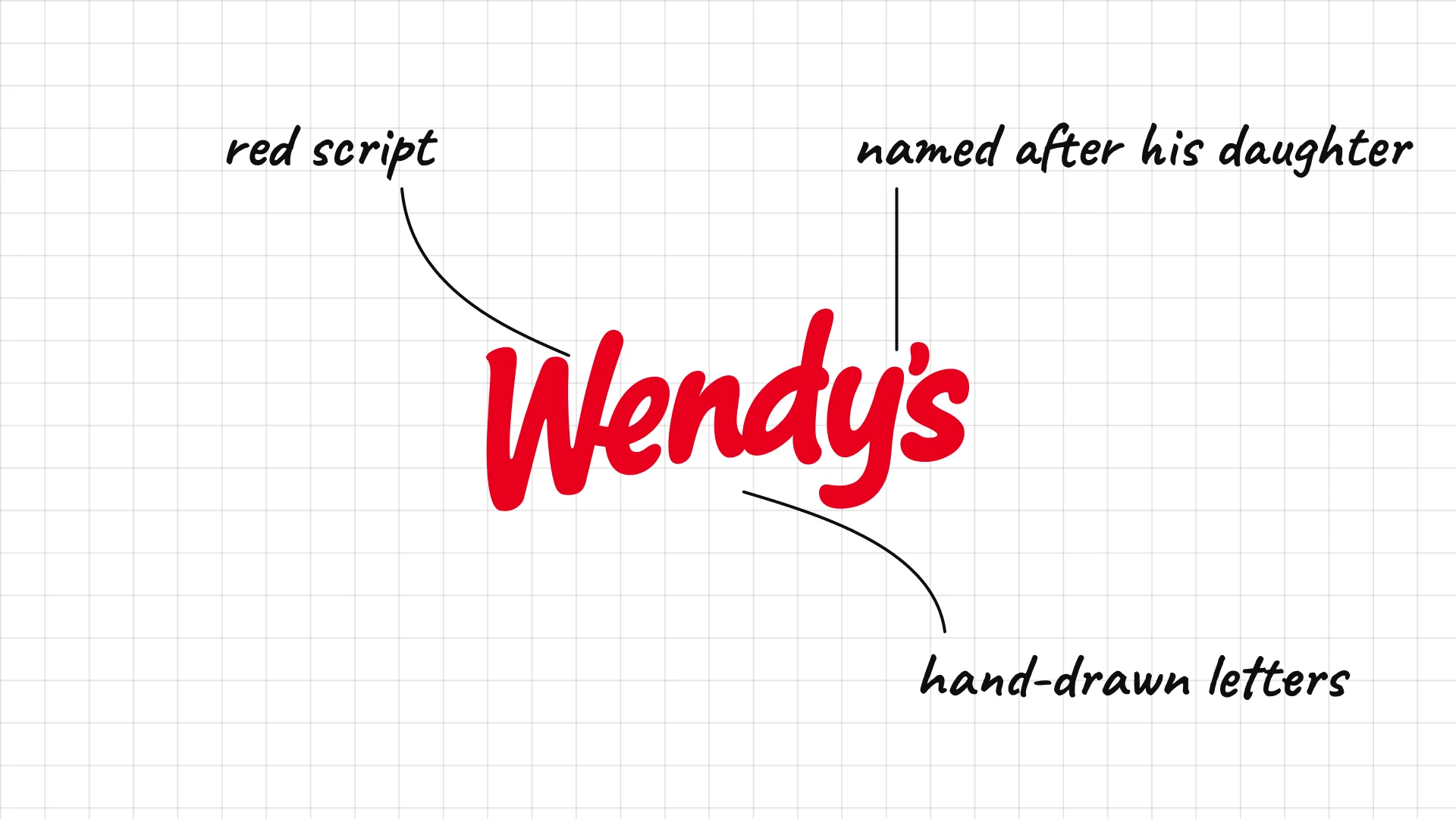
Wendy's Dave Thomas opened the first Wendy's in Columbus, Ohio, in 1969 and named it after his daughter.
The red script looks hand-drawn, which makes the brand feel homemade.
The 2013 redesign kept the friendly script but made it cleaner and bolder.
06 Subway
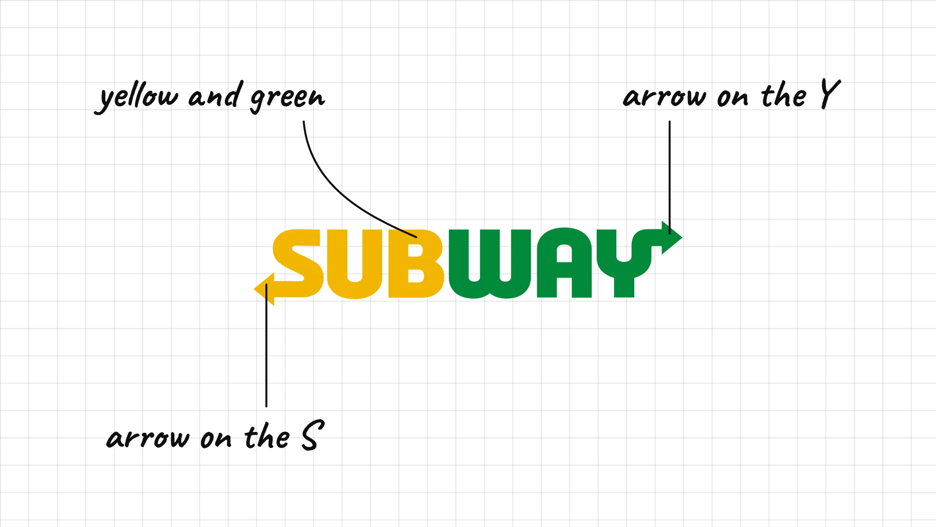
Subway Fred DeLuca and Peter Buck opened the first Subway in Bridgeport, Connecticut, in 1965.
Arrows on the S and Y suggest movement, like entering and leaving a subway station.
Yellow and green make the brand look fresh and fast.
07 Pizza Hut
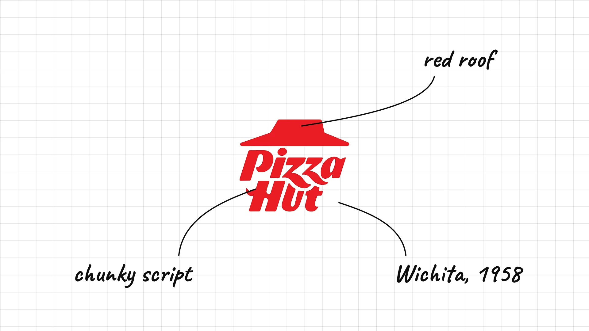
Pizza Hut Dan and Frank Carney opened the first Pizza Hut in Wichita, Kansas, in 1958.
The red roof recalls the distinctive roofs of the original restaurants.
The chunky script is playful and recognizable.
08 Domino's
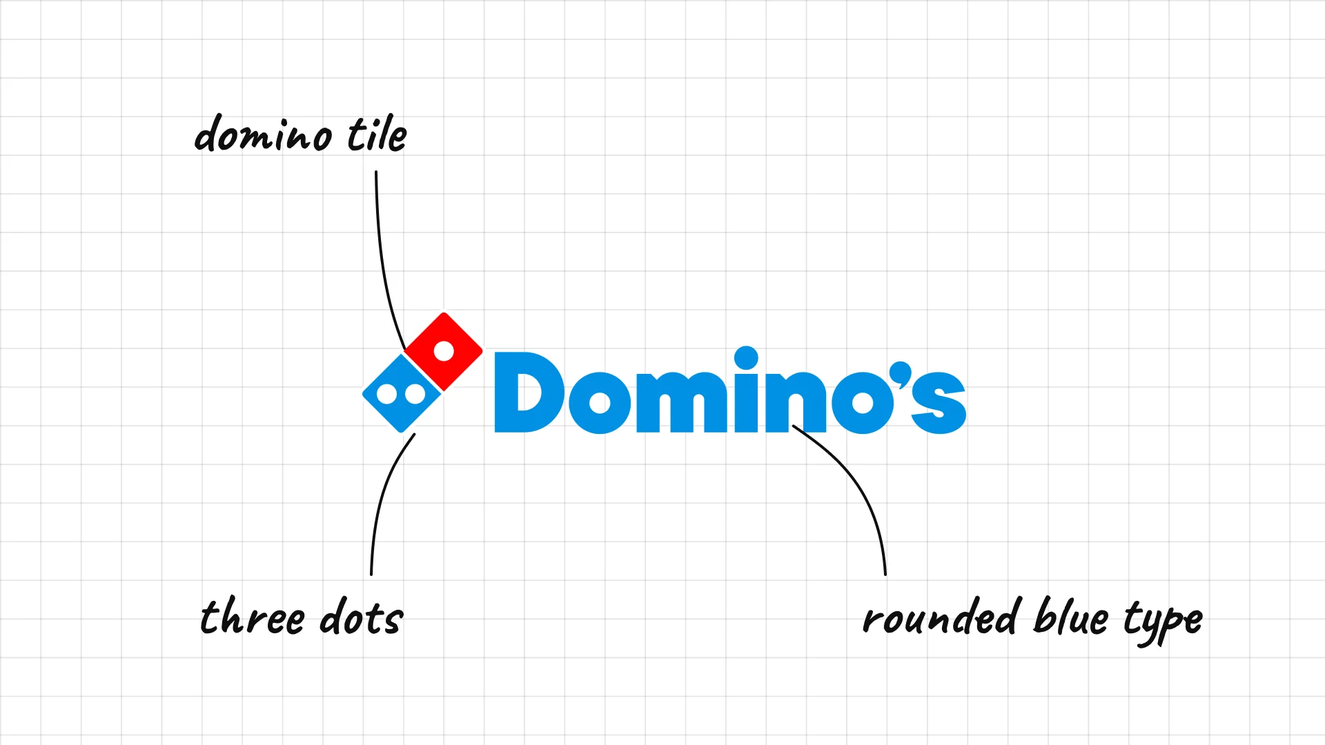
Domino's Tom and James Monaghan bought a pizzeria in Ypsilanti, Michigan, in 1960, which became Domino's.
The domino tile is a visual pun on the name.
Its three dots originally stood for the company's first three stores.
09 Chick-fil-A
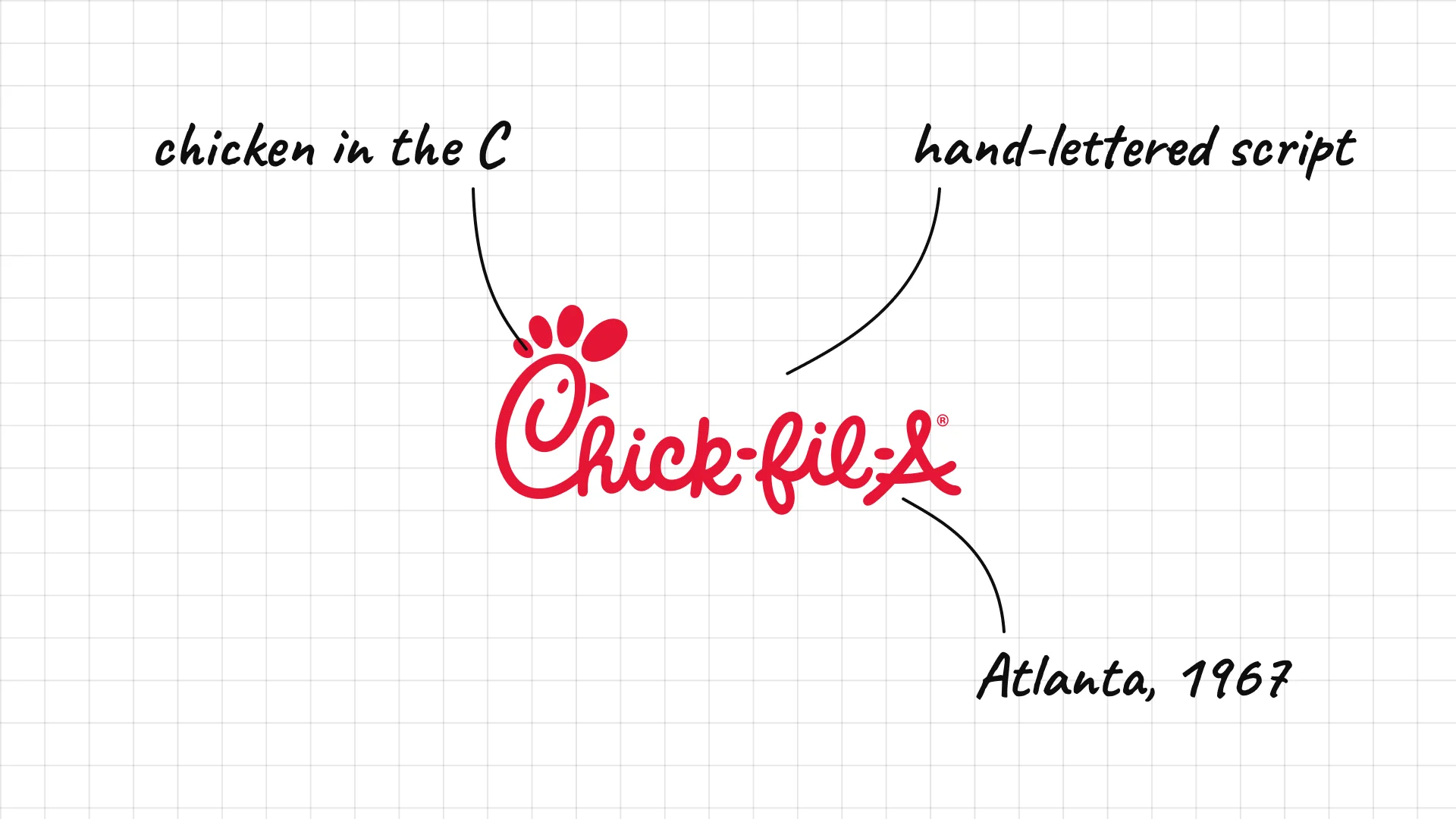
Chick-fil-A S. Truett Cathy opened the first Chick-fil-A restaurant in an Atlanta shopping mall in 1967.
The C is drawn as a chicken's head, a clever hidden detail.
The hand-lettered script feels friendly and Southern.
02 — Fast casual restaurants
Fast casual restaurants look more modern and premium than fast food, with cleaner type, natural colours, and simple icons.
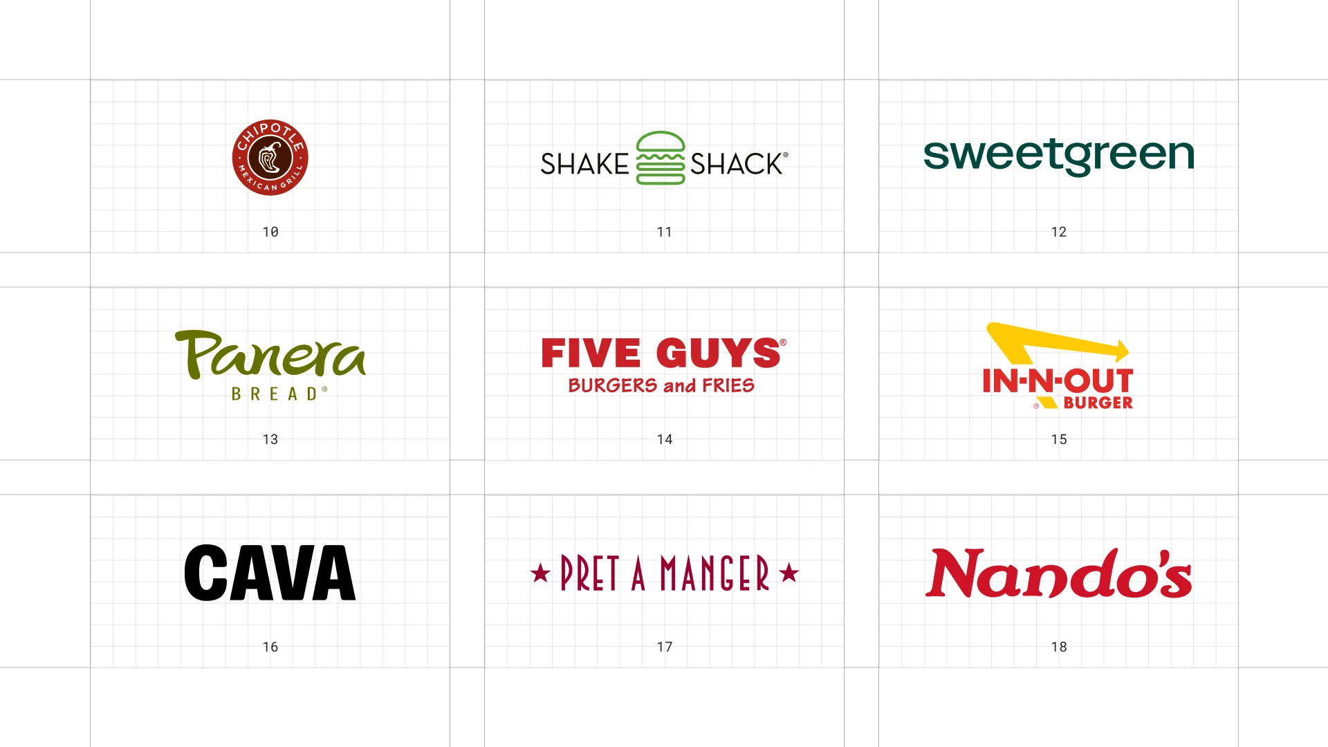
This is a visual comparison of restaurant logos, not a ranking of restaurants.
Look at how each logo uses type, colour, and one symbol to signal its price point and personality.
10 Chipotle
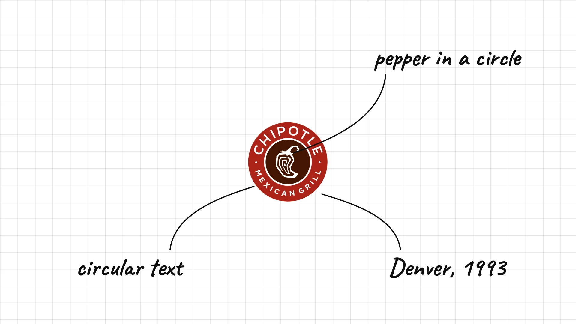
Chipotle Steve Ells opened the first Chipotle in Denver in 1993.
A chipotle pepper sits inside a circular stamp, like a seal of quality.
The round badge works on bags, cups, and burrito foil.
11 Shake Shack
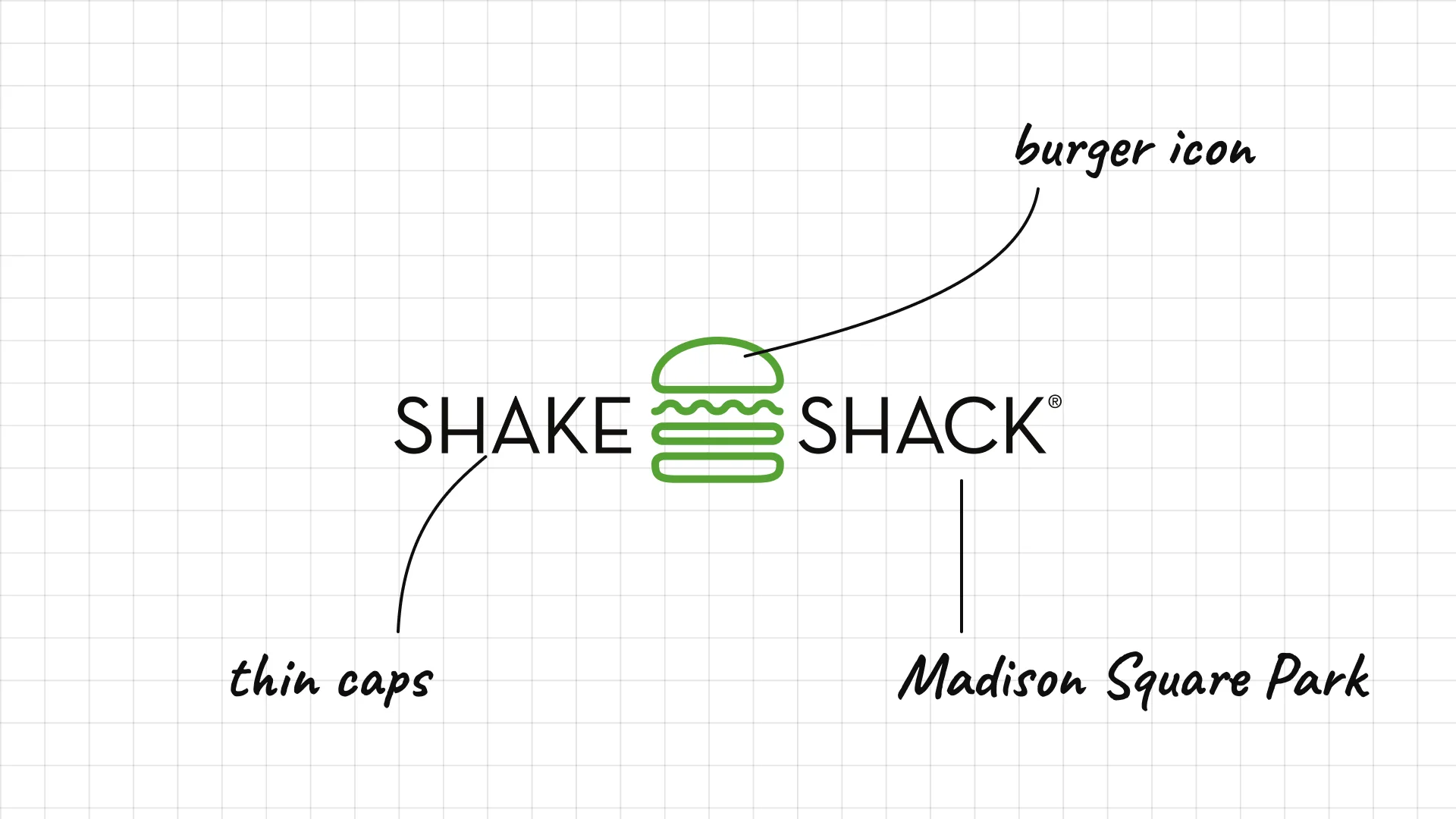
Shake Shack Danny Meyer's Shake Shack started as a hot dog cart in Madison Square Park, New York, in 2001.
A simple burger icon sits between the two words.
Thin, spaced capitals make the fast food brand feel more upscale.
12 Sweetgreen
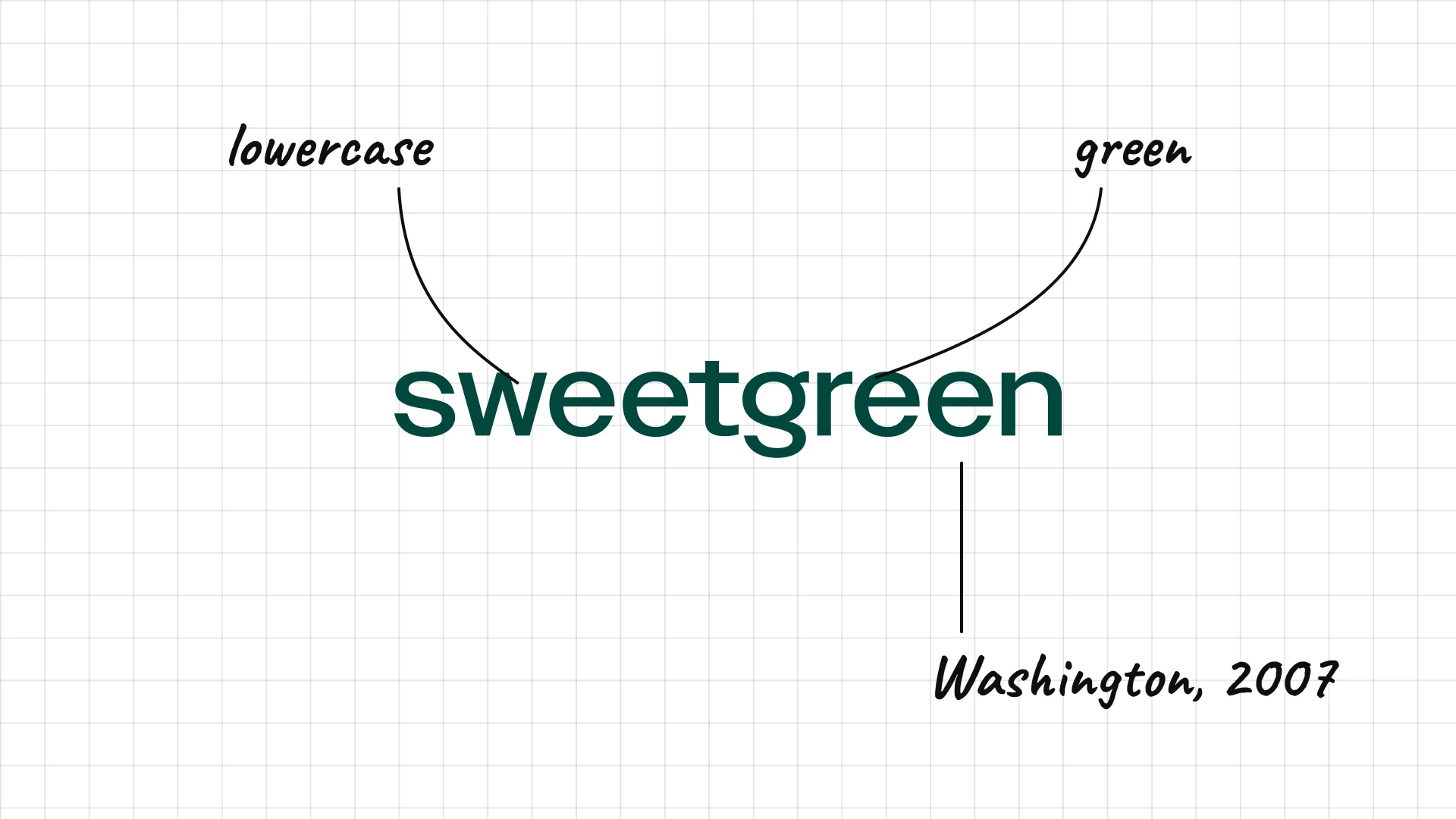
Sweetgreen Three Georgetown graduates founded Sweetgreen in Washington, D.C., in 2007.
Lowercase letters make the salad brand feel relaxed and approachable.
The dark green colour signals fresh, healthy food.
13 Panera Bread
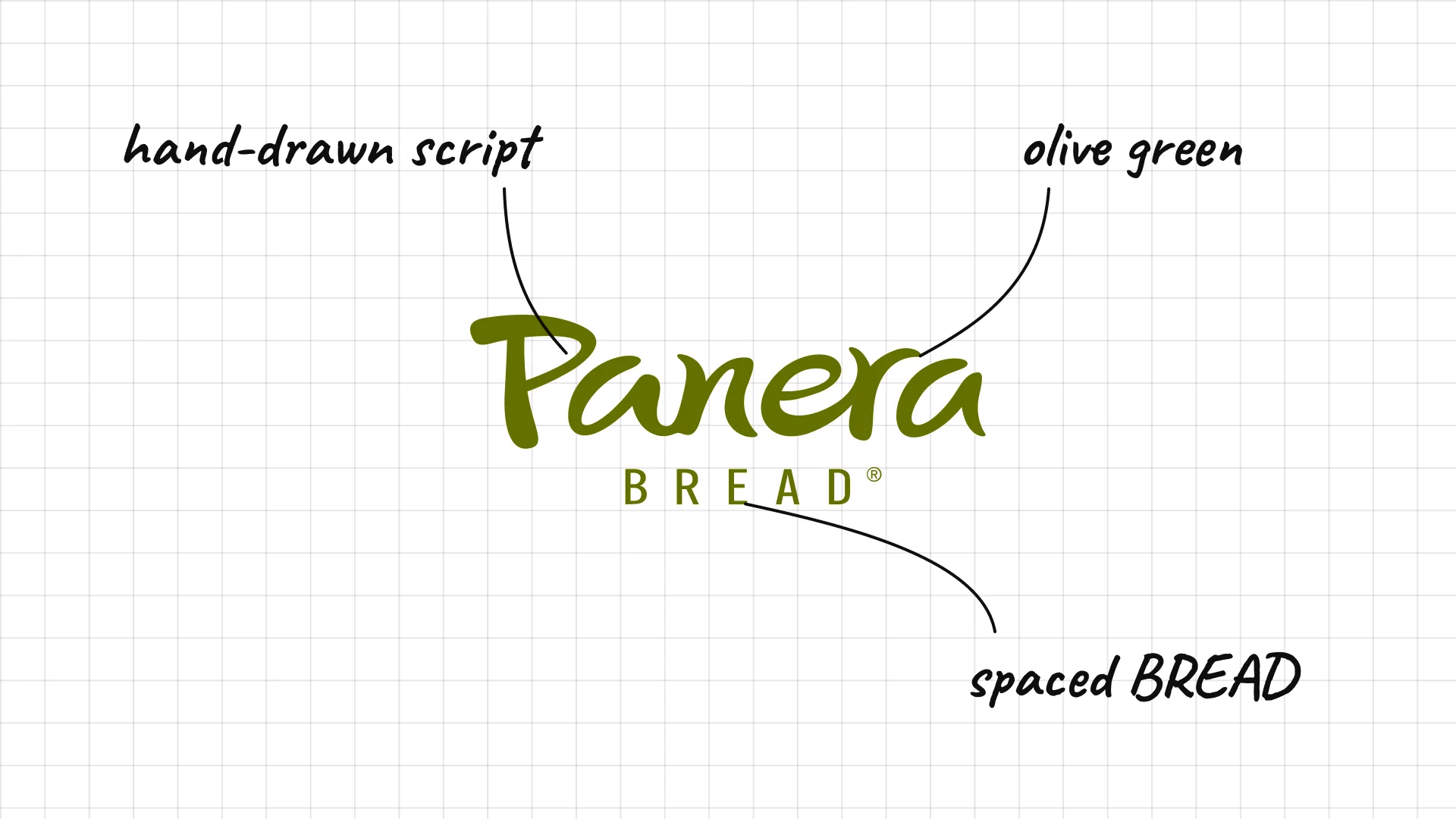
Panera Bread Panera grew out of the St. Louis Bread Company, founded in 1987.
The hand-drawn script gives the bakery-cafe a warm, artisan feel.
Widely spaced BREAD underneath tells you what the brand is about.
14 Five Guys
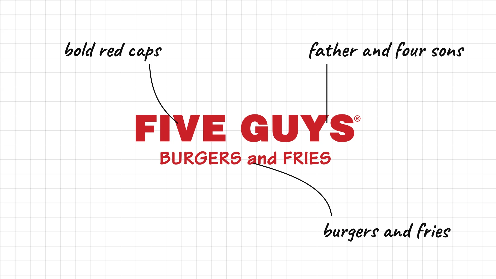
Five Guys Jerry Murrell and his four sons opened the first Five Guys in Arlington, Virginia, in 1986.
Bold red capitals look like a classic diner sign.
"Burgers and Fries" underneath keeps the menu simple and clear.
15 In-N-Out Burger
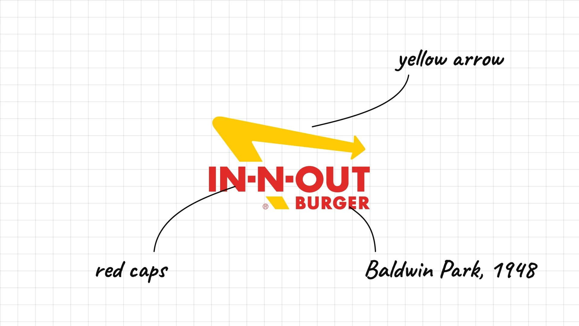
In-N-Out Burger Harry and Esther Snyder opened the first In-N-Out in Baldwin Park, California, in 1948.
The yellow arrow comes from the brand's early drive-thru signs.
Red capitals and the arrow give the logo a 1950s roadside feel.
16 Cava
Cava began as a restaurant in Rockville, Maryland, in 2006 and opened its first fast-casual location in 2011.
Heavy, tight capitals make the short name bold and modern.
The simple wordmark lets the Mediterranean food and colours do the talking.
17 Pret A Manger
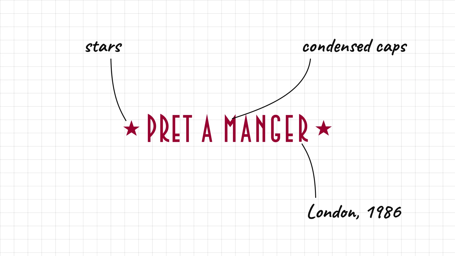
Pret A Manger Sinclair Beecham and Julian Metcalfe opened the first Pret in London in 1986.
The stars on each side make the logo look like a classic shop sign.
Condensed capitals keep the French name compact and easy to read.
18 Nando's
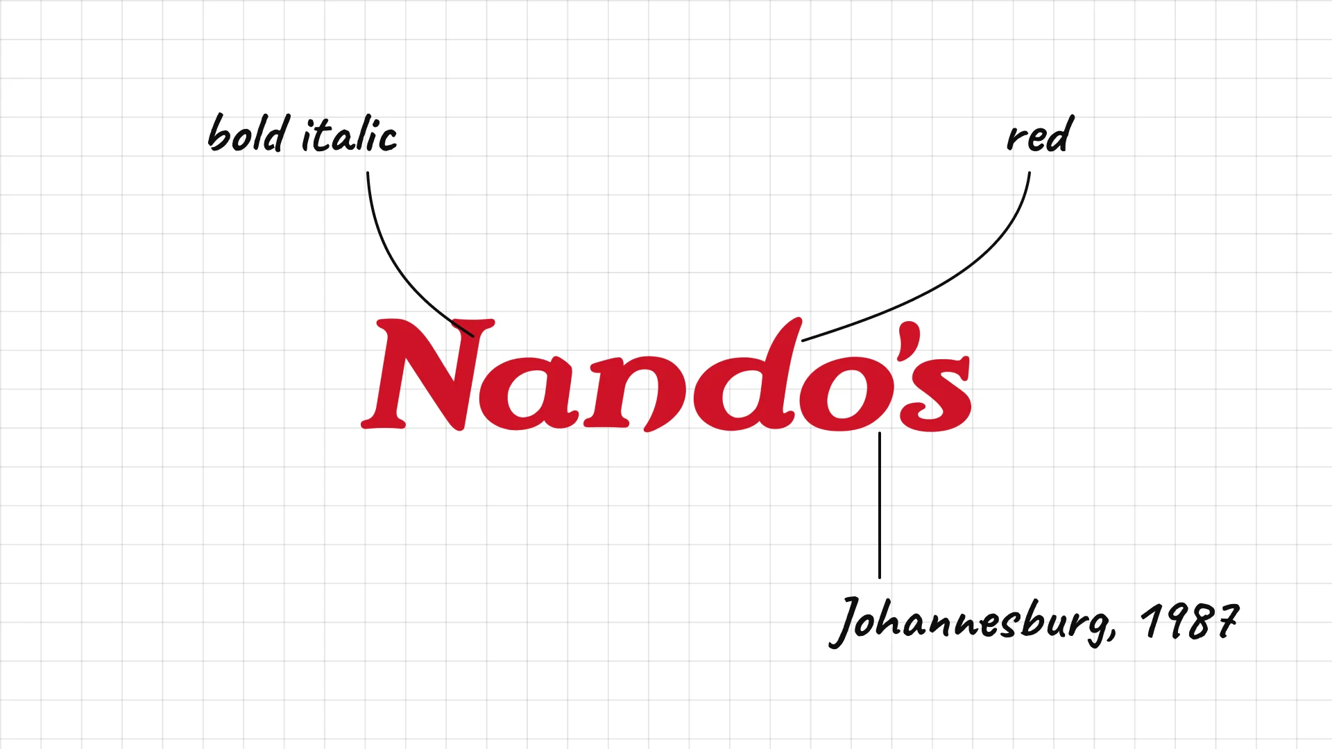
Nando's was founded in Johannesburg, South Africa, in 1987.
Bold, slanted letters feel energetic and spicy, like the peri-peri chicken.
The bright red makes the brand stand out on the high street.
03 — Coffee shops and bakeries
Coffee shops and bakeries live on cups, bags, and boxes, so their logos are compact, warm, and easy to stamp or print.
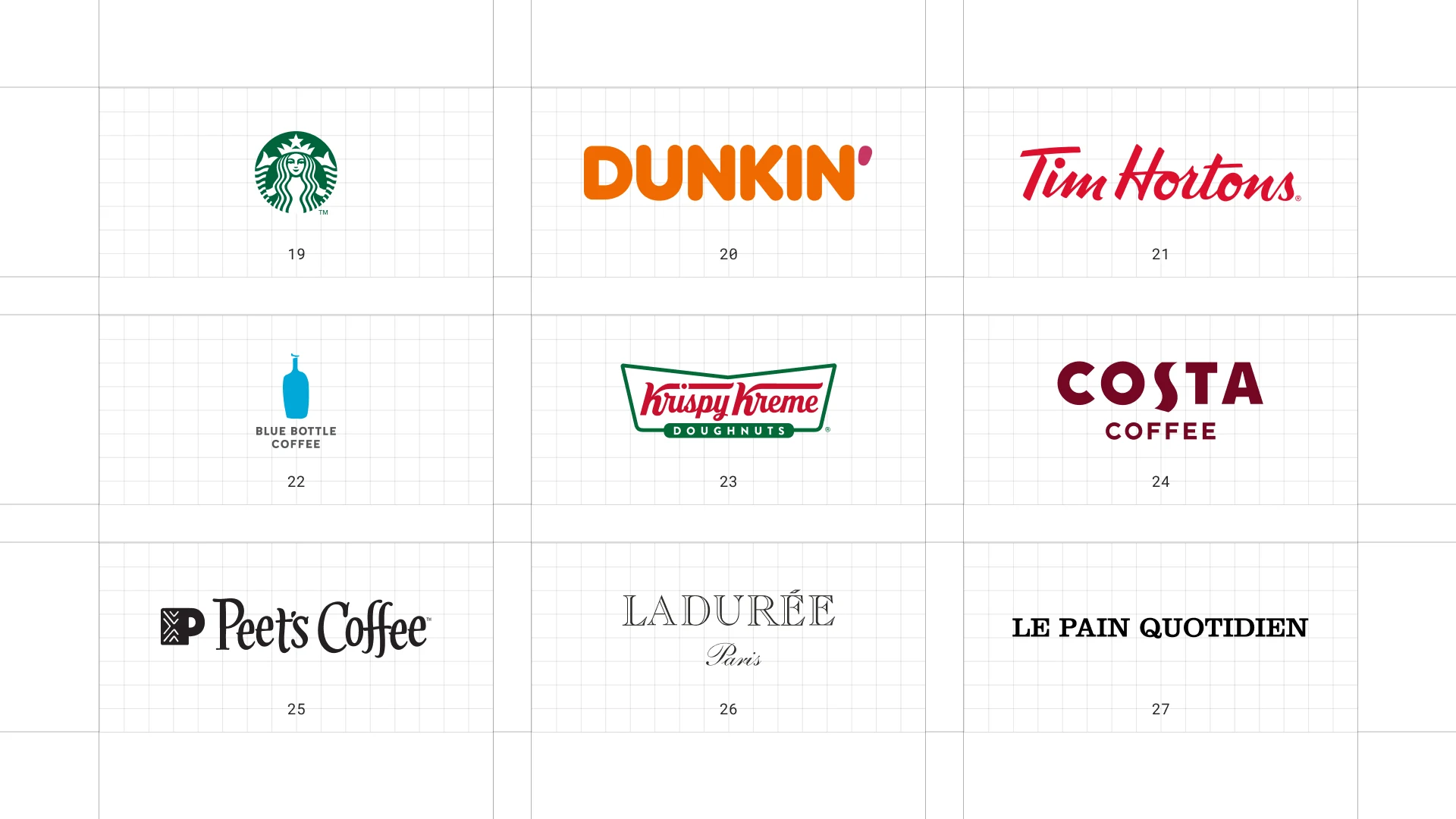
This is a visual comparison of restaurant logos, not a ranking of restaurants.
Look at how each logo uses type, colour, and one symbol to signal its price point and personality.
19 Starbucks
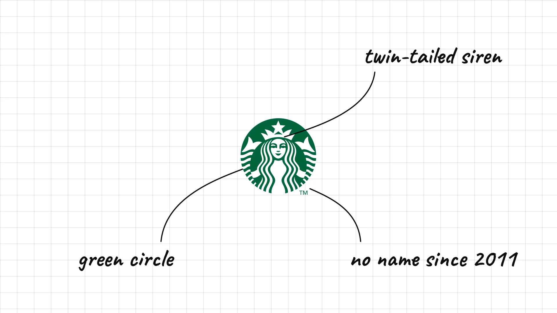
Starbucks opened its first store in Seattle's Pike Place Market in 1971.
The twin-tailed siren comes from an old Norse woodcut and links coffee to the sea.
Since 2011 the logo has no name, because the siren alone is recognized everywhere.
20 Dunkin'
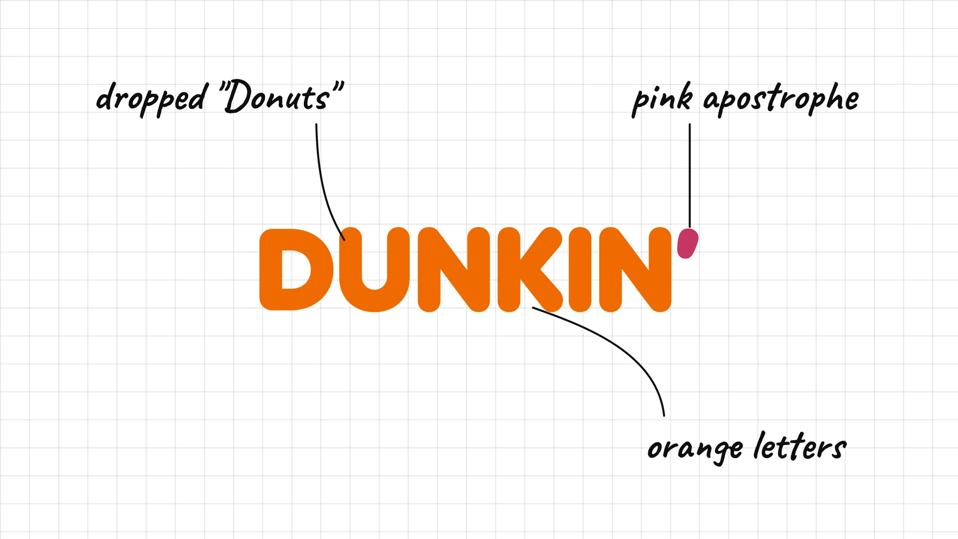
Dunkin' Bill Rosenberg opened the first Dunkin' Donuts in Quincy, Massachusetts, in 1950, and the brand dropped "Donuts" in 2019.
The rounded, heavy letters keep the classic Dunkin' feel.
The pink apostrophe is all that remains of the old pink and orange donut logo.
21 Tim Hortons
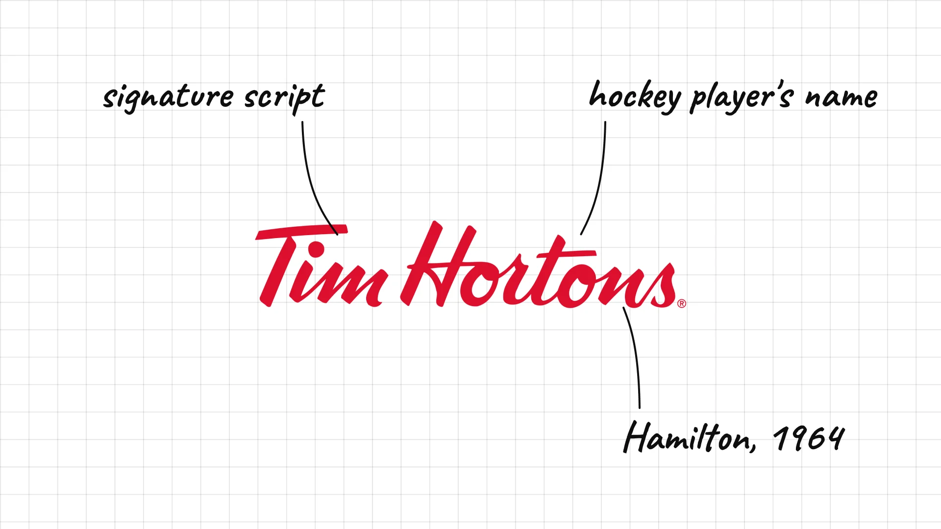
Tim Hortons Hockey player Tim Horton opened the first Tim Hortons in Hamilton, Ontario, in 1964.
The red signature script makes the brand feel personal and Canadian.
The founder's name is still the logo, decades after his death.
22 Blue Bottle Coffee
Blue Bottle Coffee James Freeman founded Blue Bottle Coffee in Oakland, California, in 2002.
A simple blue bottle icon is all the brand needs, like a minimalist label.
Tiny capitals underneath keep the logo quiet and refined.
23 Krispy Kreme
Krispy Kreme Vernon Rudolph opened Krispy Kreme in Winston-Salem, North Carolina, in 1937.
The bowtie-shaped badge looks like a vintage diner sign.
Red script on green and white makes the logo nostalgic and cheerful.
24 Costa Coffee
Costa Coffee Sergio and Bruno Costa founded Costa Coffee in London in 1971.
Bold capitals in a deep coffee red make the name strong and warm.
The S is shaped like a coffee bean, a simple link to the product.
25 Peet's Coffee
Peet's Coffee Alfred Peet opened the first Peet's Coffee in Berkeley, California, in 1966.
A square P icon works as a stamp on bags and cups.
The condensed serif wordmark has a classic, roastery feel.
26 Ladurée
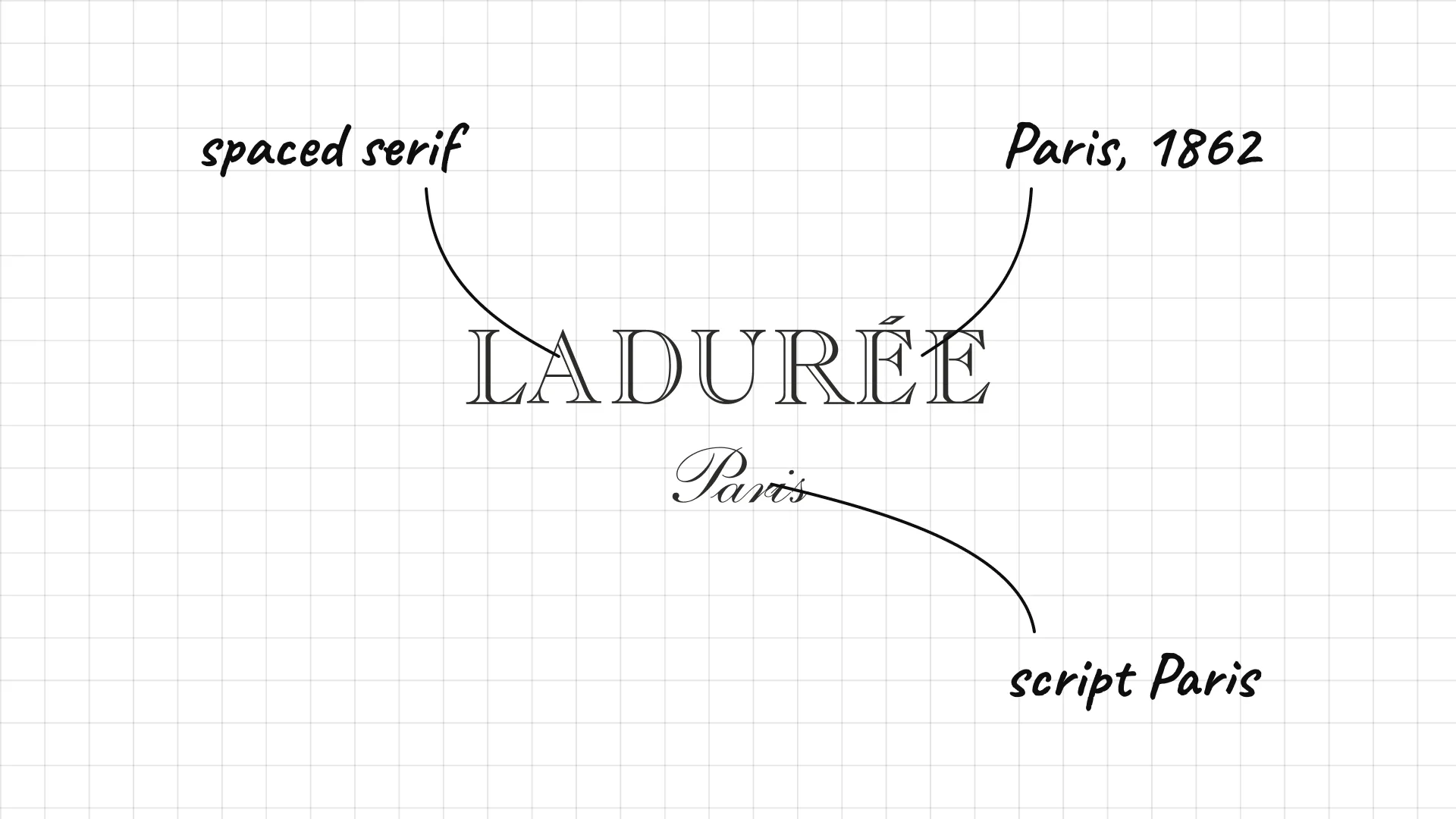
Ladurée Louis-Ernest Ladurée opened his bakery in Paris in 1862, and the house is famous for its macarons.
Thin, spaced serif capitals feel elegant and Parisian.
The small script "Paris" underneath adds a handwritten, romantic touch.
27 Le Pain Quotidien
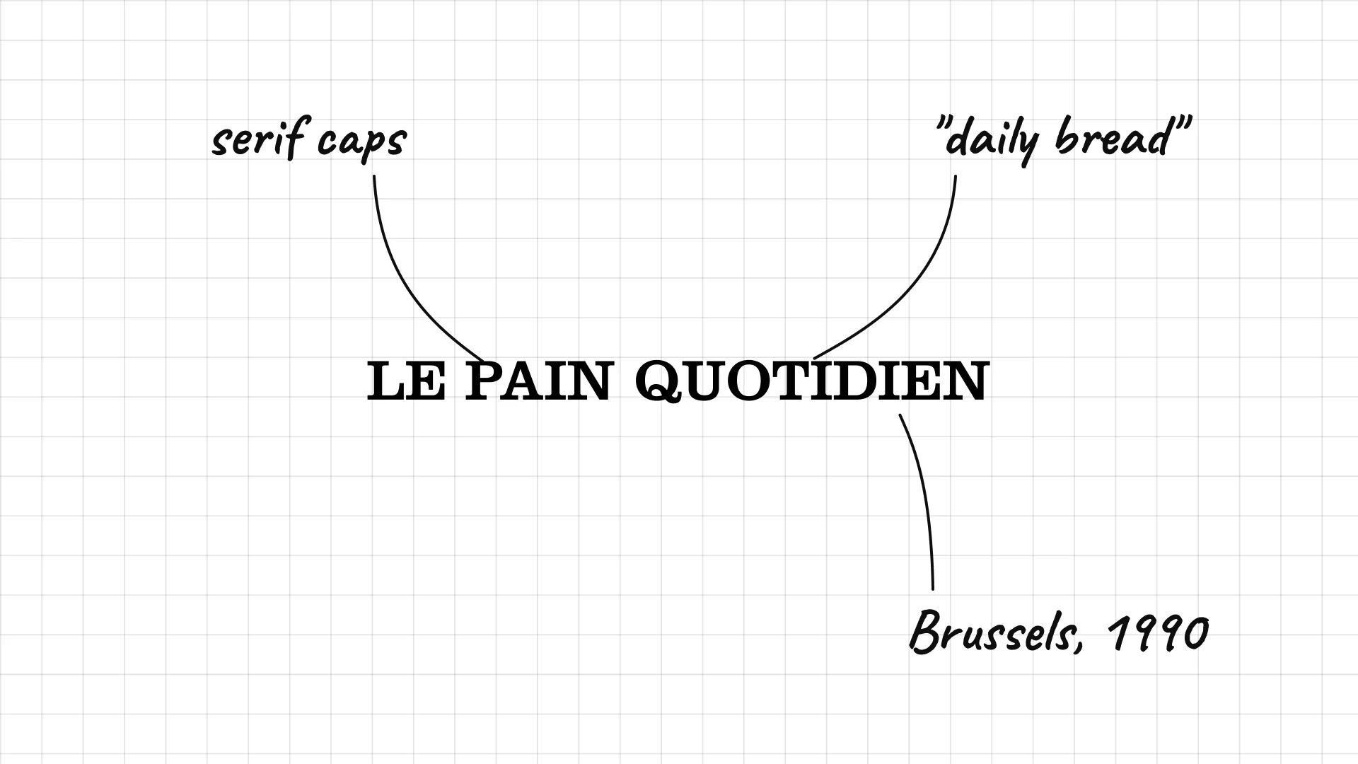
Le Pain Quotidien Chef Alain Coumont opened the first Le Pain Quotidien in Brussels in 1990.
Serif capitals give the bakery a classic, European feel.
The name means "daily bread", which tells the whole brand story.
04 — Casual dining chains
Casual dining chains want to feel like a neighbourhood restaurant, so they use scripts, illustrations, and badge shapes.
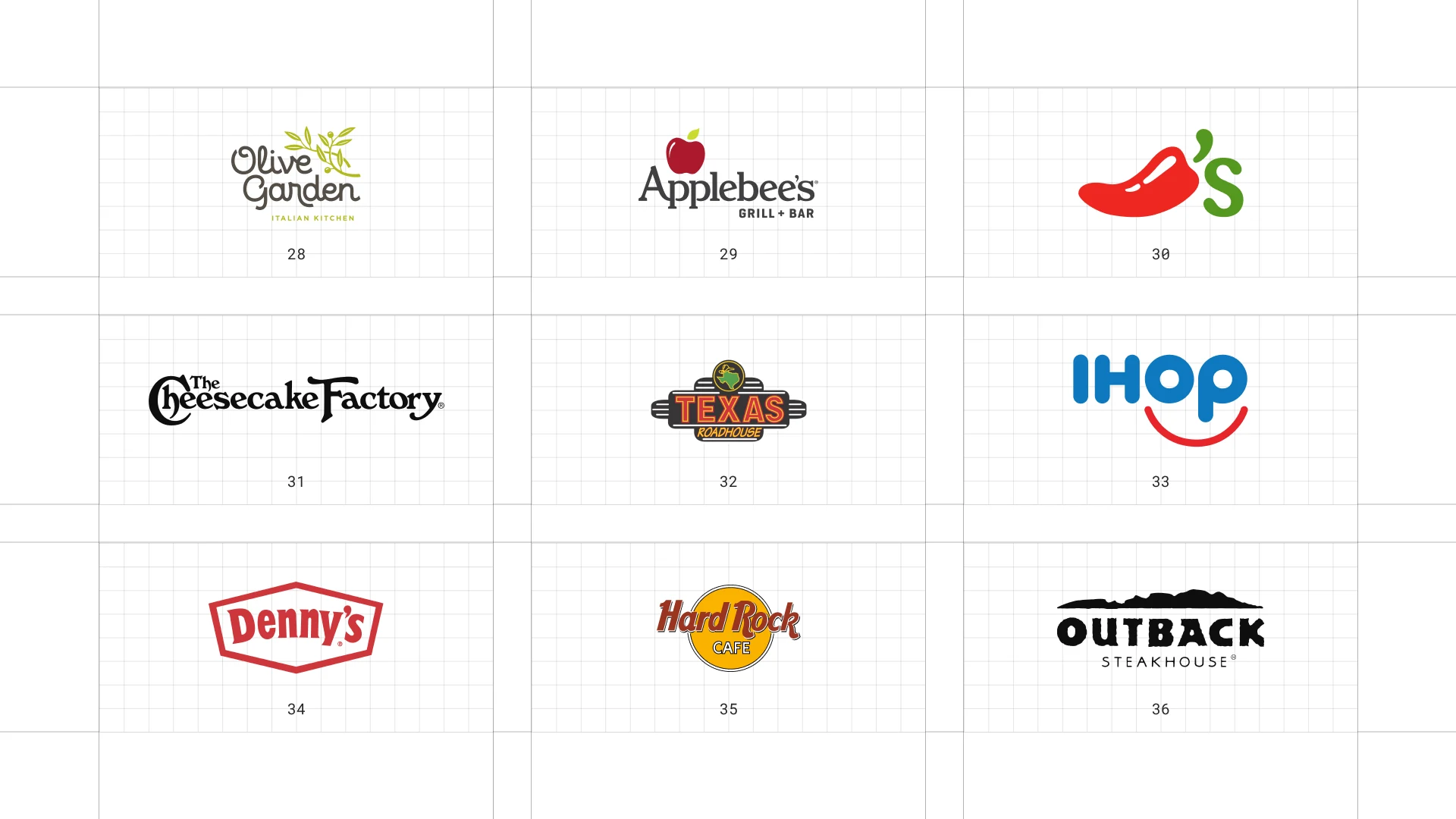
This is a visual comparison of restaurant logos, not a ranking of restaurants.
Look at how each logo uses type, colour, and one symbol to signal its price point and personality.
28 Olive Garden
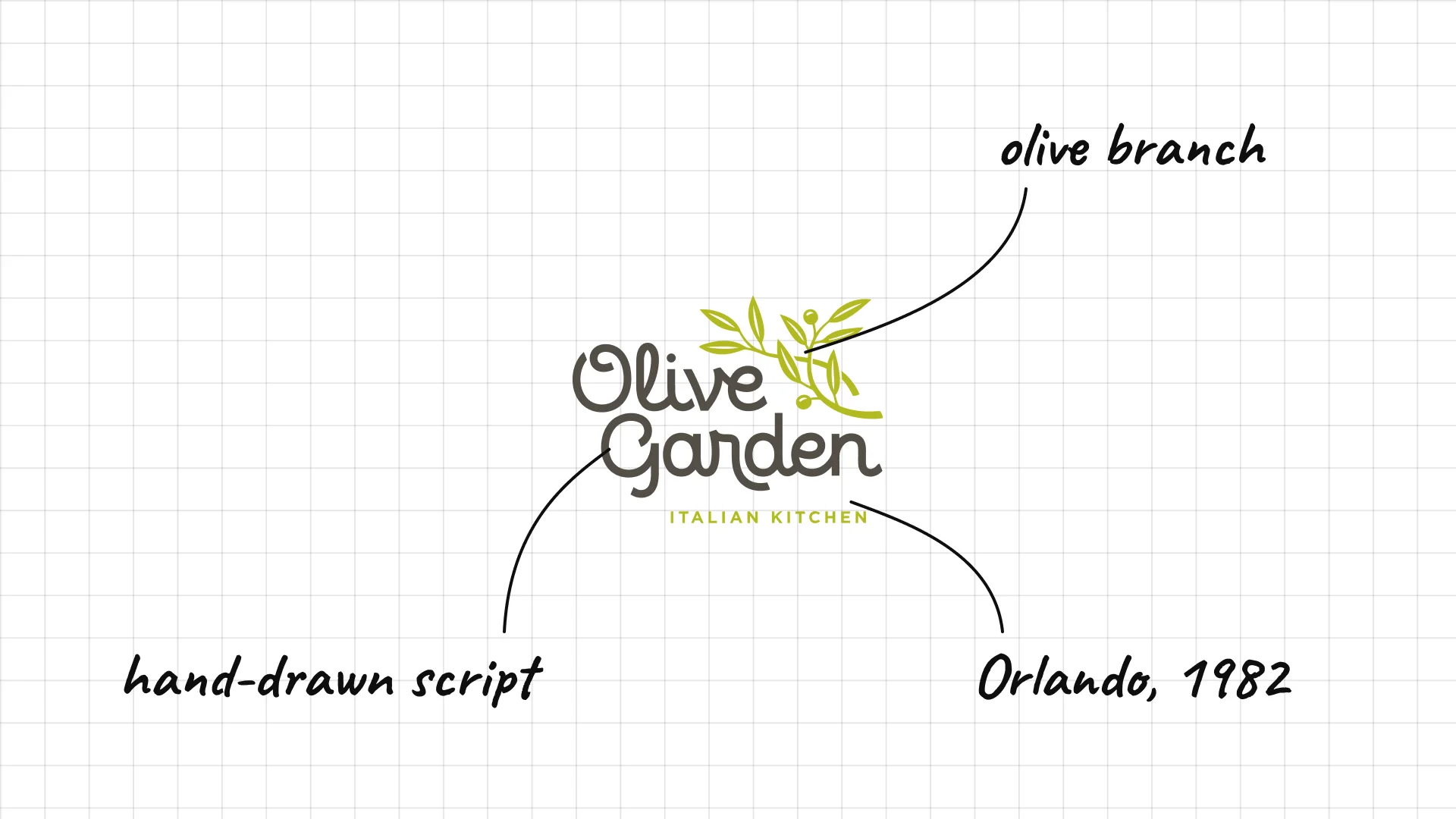
Olive Garden The first Olive Garden opened in Orlando, Florida, in 1982.
An olive branch next to the script suggests Italian countryside cooking.
The soft, hand-drawn script makes the chain feel homey.
29 Applebee's
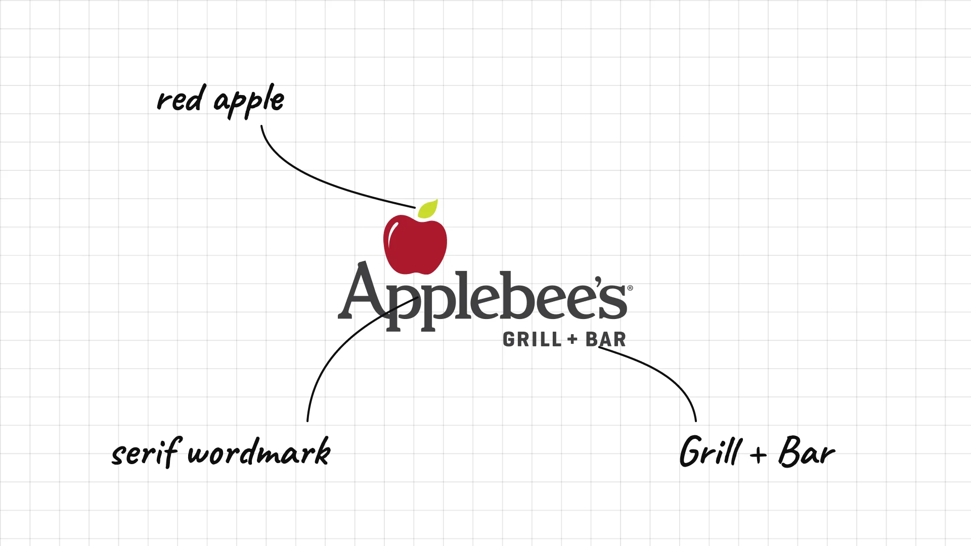
Applebee's began as T.J. Applebee's in Decatur, Georgia, in 1980.
The red apple above the name is a simple pun on the brand.
A classic serif wordmark and "Grill + Bar" line keep it neighbourly.
30 Chili's
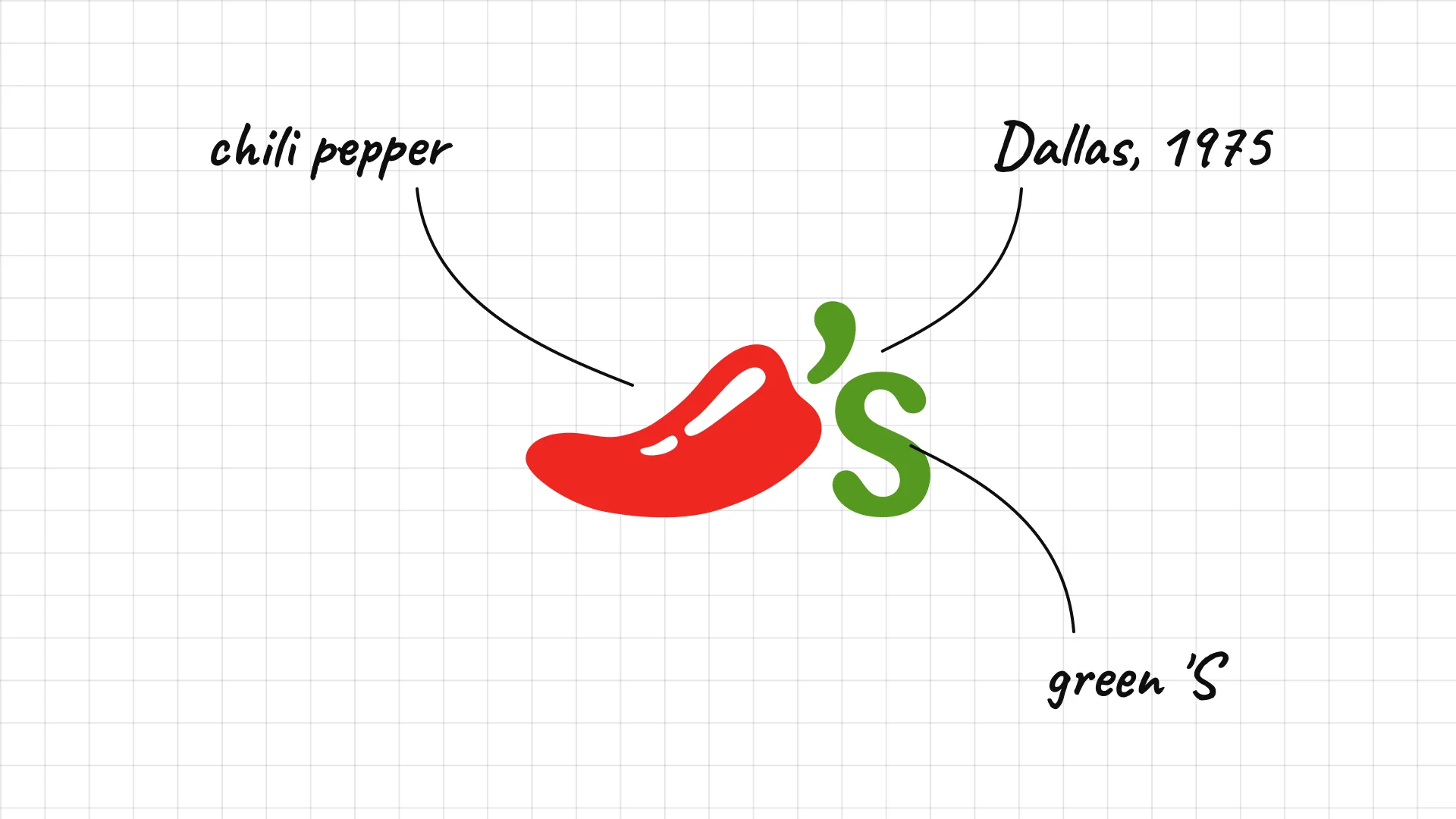
Chili's Larry Lavine opened the first Chili's in Dallas in 1975.
The red chili pepper is the whole logo, a bold and simple symbol.
A green S in the shape of the stem finishes the name.
31 The Cheesecake Factory
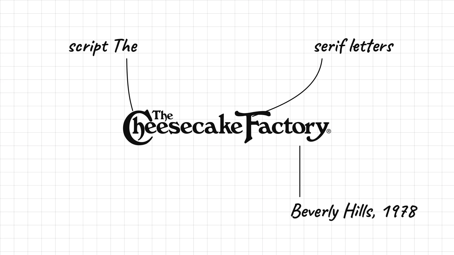
The Cheesecake Factory The first Cheesecake Factory restaurant opened in Beverly Hills in 1978.
A small script "The" tucks into the large C, a classic signage detail.
The flowing serif letters give a big chain an old-fashioned, bakery feel.
32 Texas Roadhouse
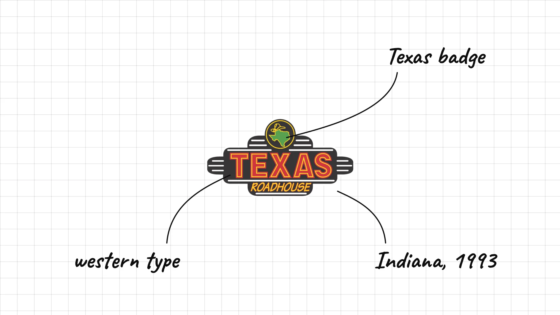
Texas Roadhouse Kent Taylor opened the first Texas Roadhouse in Clarksville, Indiana, in 1993.
The badge looks like a western sign or a belt buckle.
Western-style letters and the Texas shape signal steaks and country music.
33 IHOP
IHOP opened as the International House of Pancakes in Toluca Lake, Los Angeles, in 1958.
The 2015 logo turns the O and P into a smiling face.
Rounded, friendly letters in blue make the brand feel cheerful.
34 Denny's
Denny's started as Danny's Donuts in Lakewood, California, in 1953.
The red script sits in a sign shape, like a roadside diner.
The logo has barely changed in decades, which helps recognition on highways.
35 Hard Rock Cafe
Hard Rock Cafe Isaac Tigrett and Peter Morton opened the first Hard Rock Cafe in London in 1971.
The script on a round badge looks like a band patch or a vintage pin.
The logo is famous as merchandise, sold on t-shirts in every city.
36 Outback Steakhouse
Outback Steakhouse opened in Tampa, Florida, in 1988, with an Australian theme.
A silhouette of the Australian landscape sits above the name.
Heavy, wide capitals feel rugged, like the outback itself.
05 — Fine dining and iconic restaurants
Fine dining restaurants use quiet, refined logos that feel more like fashion houses than food brands.
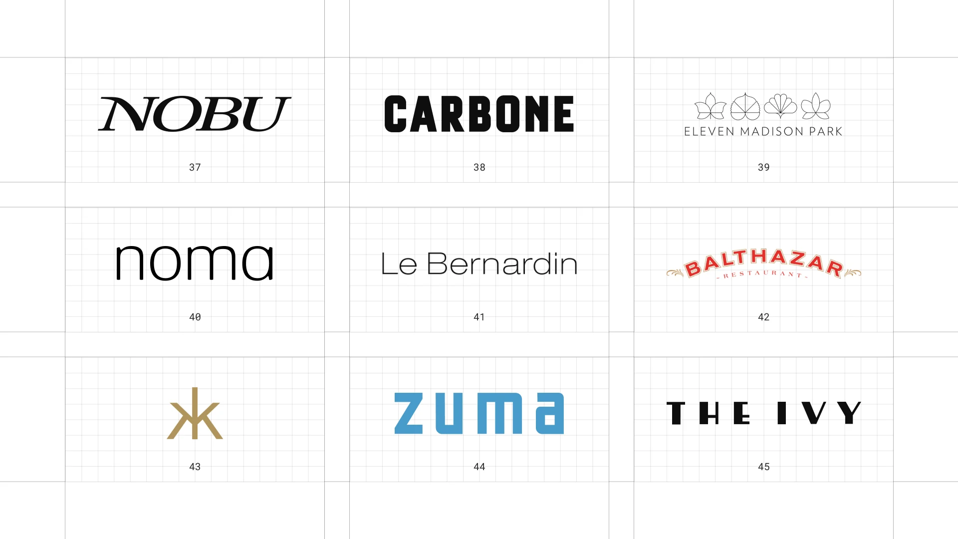
This is a visual comparison of restaurant logos, not a ranking of restaurants.
Look at how each logo uses type, colour, and one symbol to signal its price point and personality.
37 Nobu
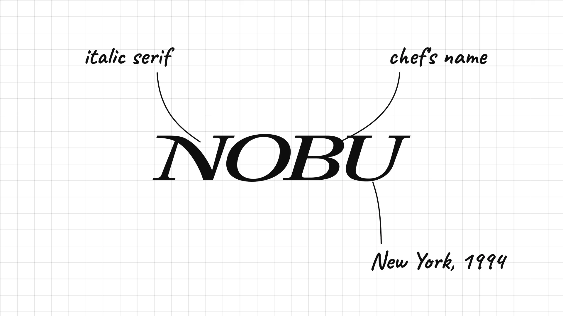
Nobu Chef Nobu Matsuhisa and Robert De Niro opened Nobu New York in 1994.
Italic serif capitals give the chef's name a stylish, editorial look.
The short name now covers restaurants and hotels worldwide.
38 Carbone
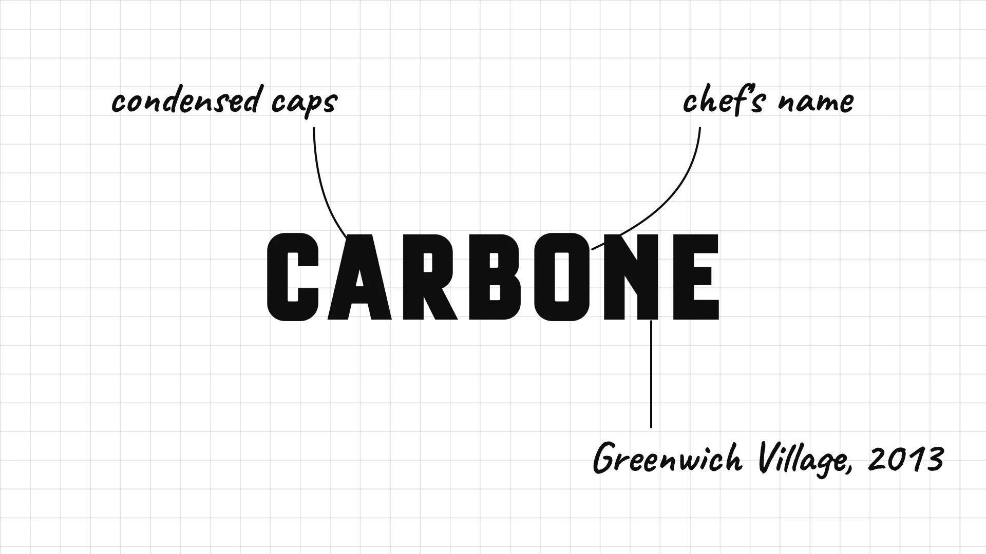
Carbone Mario Carbone, Rich Torrisi, and Jeff Zalaznick opened Carbone in Greenwich Village in 2013.
Condensed capitals look like a classic New York Italian restaurant sign.
The chef's surname alone carries the brand.
39 Eleven Madison Park
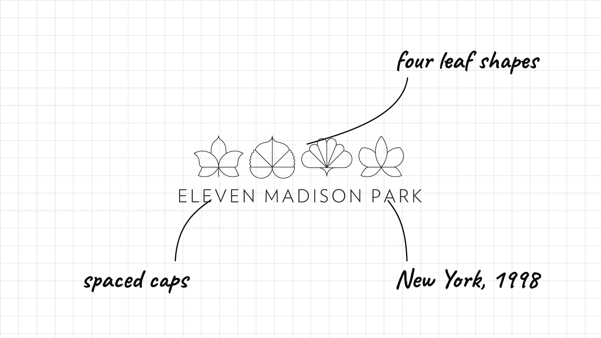
Eleven Madison Park opened in New York in 1998 and is led by chef Daniel Humm.
Four leaf-like shapes above the name add a delicate, botanical detail.
Widely spaced capitals keep the long name calm and refined.
40 Noma
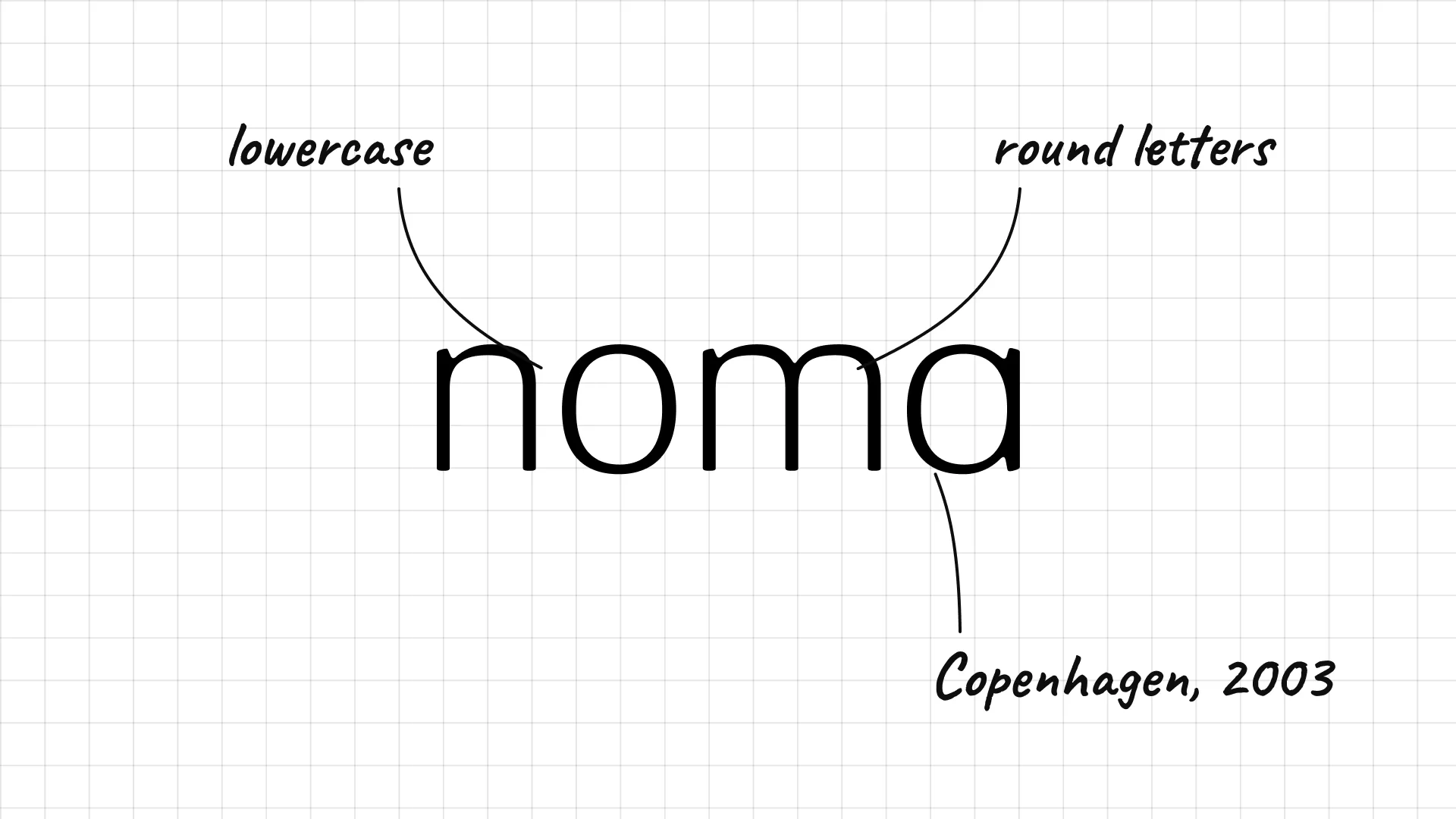
Noma René Redzepi opened Noma in Copenhagen in 2003.
Round lowercase letters make the world-famous restaurant feel humble and natural.
The name combines the Danish words for Nordic and food.
41 Le Bernardin
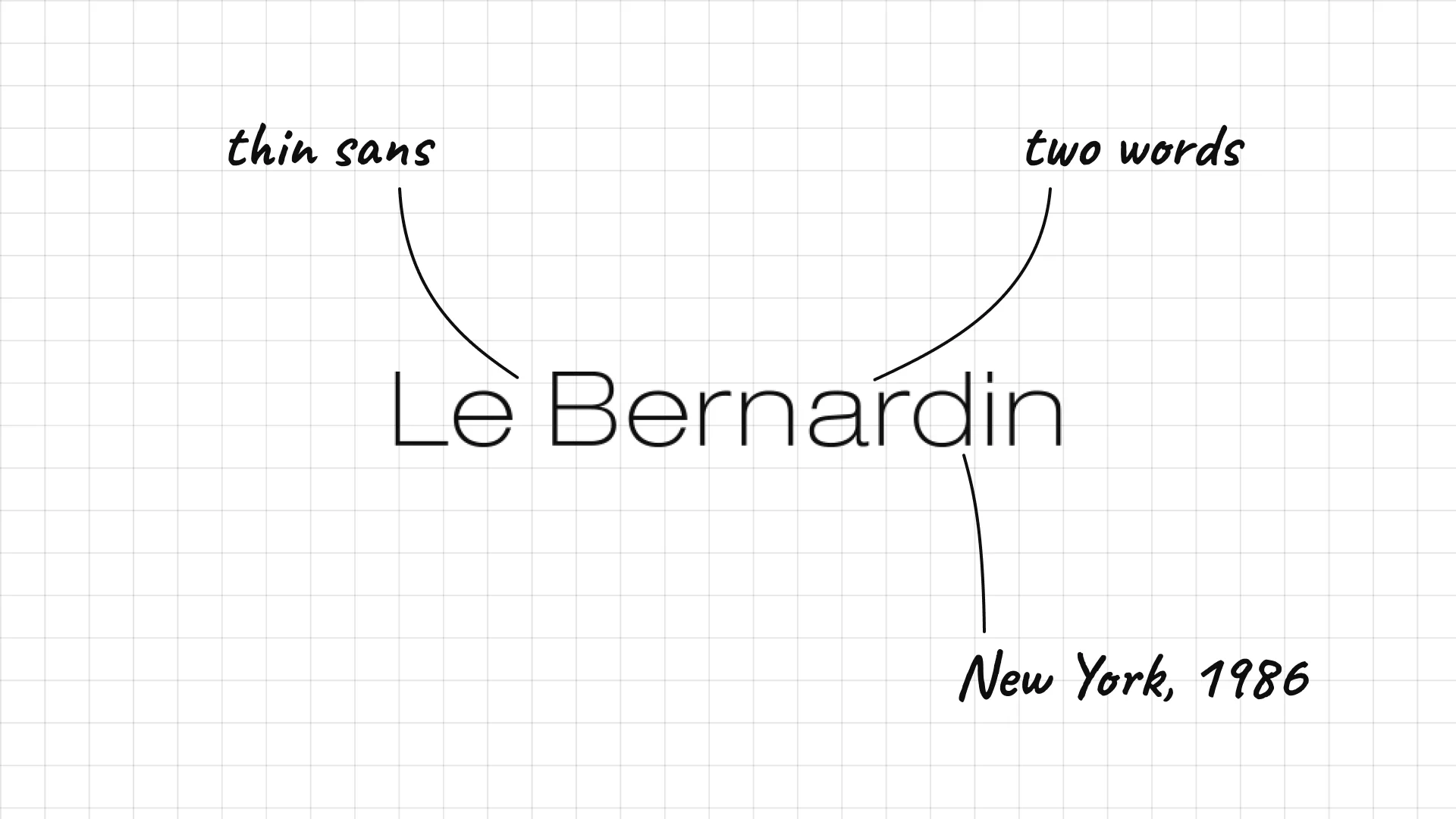
Le Bernardin Gilbert and Maguy Le Coze opened Le Bernardin in Paris in 1972 and moved it to New York in 1986.
A thin, light sans serif feels calm and refined, like the seafood menu.
The simple wordmark suits a restaurant known for restraint.
42 Balthazar
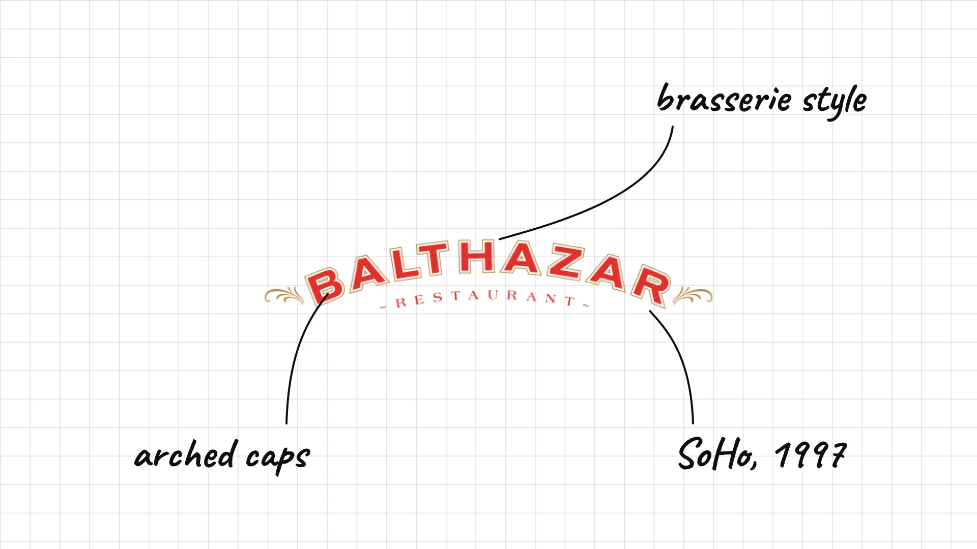
Balthazar Keith McNally opened Balthazar in SoHo, New York, in 1997.
Arched capitals look like the lettering on a Parisian brasserie window.
A small "Restaurant" line and flourishes add old-world charm.
43 Hakkasan
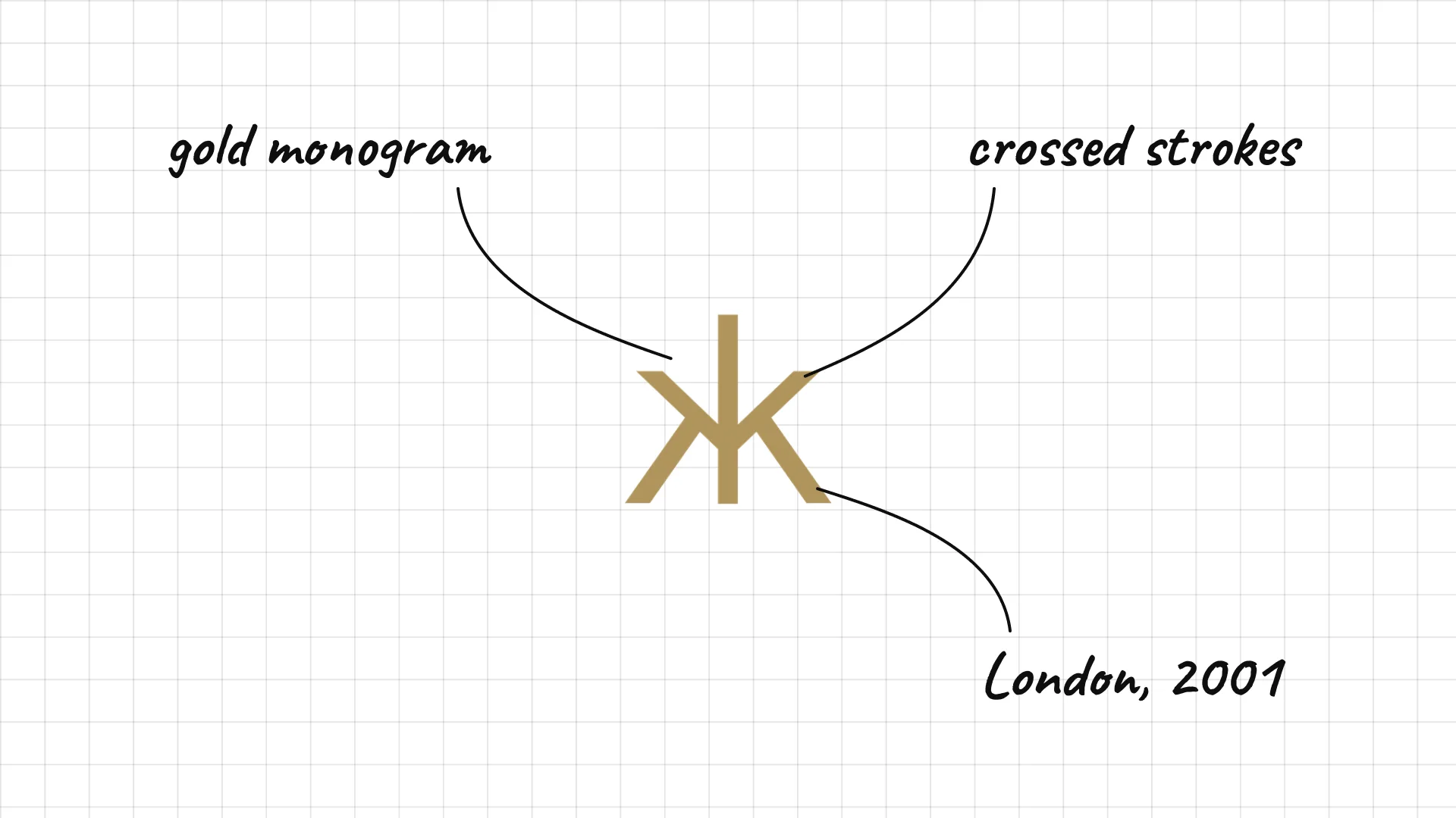
Hakkasan Alan Yau opened the first Hakkasan in London in 2001.
The gold monogram is made of crossed strokes, like calligraphy or chopsticks.
The mark works alone on menus, doors, and tableware.
44 Zuma
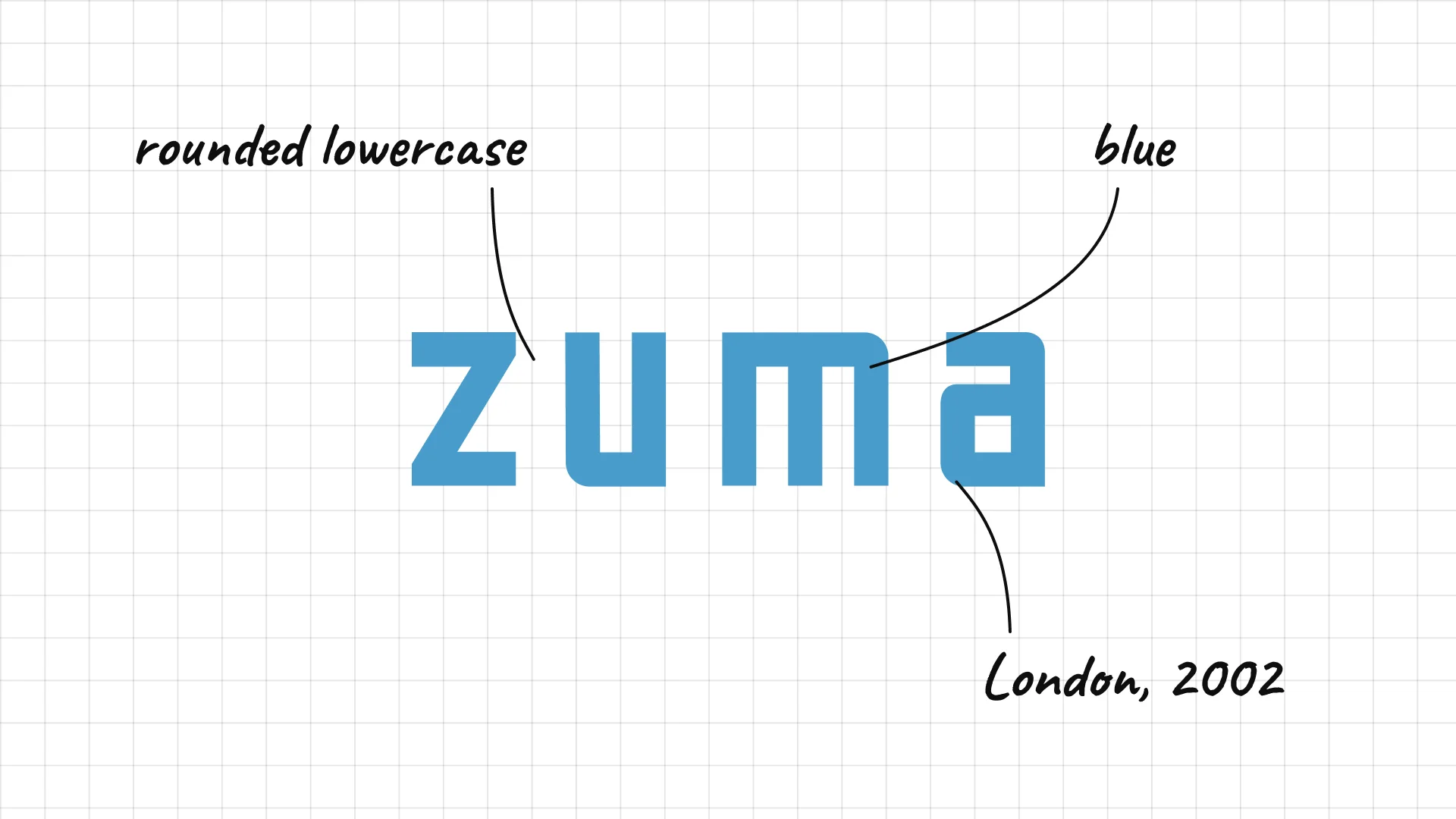
Zuma Rainer Becker opened the first Zuma in London's Knightsbridge in 2002.
Rounded lowercase letters give the Japanese restaurant a modern, relaxed feel.
The short name works well on signage in cities around the world.
45 The Ivy
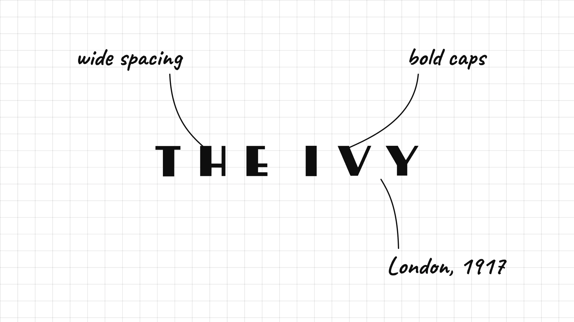
The Ivy opened in London's West End in 1917 and became a famous theatre-district restaurant.
Bold, very widely spaced capitals look like a sign above a theatre.
The short name feels classic and confident.
What these 45 examples reveal
Red and yellow mean fast food
McDonald's, Burger King, KFC, Wendy's, Pizza Hut, and In-N-Out all use red, yellow, or orange, colours that stand out on highways and feel energetic.
Founders and puns make logos memorable
KFC shows Colonel Sanders, Wendy's is named after the founder's daughter, and Domino's, Applebee's, and Taco Bell use simple visual puns.
Coffee brands rely on one symbol
Starbucks, Blue Bottle, and Peet's work as small icons on cups, which is why Starbucks dropped its name from the logo in 2011.
Fine dining whispers
Noma, Le Bernardin, Eleven Madison Park, and The Ivy use thin or simple type with no colour, which signals quality and restraint.
A practical checklist for a restaurant logo
- Does the logo signal the right price point, from quick service to fine dining?
- Does it work on a storefront sign, a menu, a cup, and a delivery app icon?
- Is there a simple symbol or monogram that can stand alone on packaging?
- Does the colour fit the food and the experience?
- Will it still work in one colour, printed on a napkin, bag, or stamp?
Opening or rebranding a restaurant?
I design brand identities for restaurants, cafes, and hospitality brands, from logos and menus to signage, packaging, and websites.
See my past work and schedule a call to discuss your project.
Frequently asked questions
What makes a good restaurant logo?
A good restaurant logo is simple, memorable, and matches the price point and personality of the restaurant. It works on signs, menus, cups, bags, and delivery apps, and it often has a symbol that can stand alone, like the McDonald's arches or the Starbucks siren.
What colours are best for a restaurant logo?
Fast food brands use red, yellow, and orange because they are energetic and visible from far away. Healthy and fresh brands like Sweetgreen use green, coffee brands often use warm or dark tones, and fine dining restaurants usually stick to black and white.
What are the most famous restaurant logos?
The most famous restaurant logos include McDonald's, Starbucks, KFC, Burger King, Subway, Domino's, Pizza Hut, Taco Bell, Wendy's, and Dunkin'. Most of them use a strong symbol, bold colour, or the founder's name.
Should a restaurant logo include food?
Not always. A simple food symbol can work, like the Chipotle pepper or the Shake Shack burger, but many of the best restaurant logos use a name, a monogram, or an abstract symbol instead. Fine dining restaurants rarely show food in their logos.
How much does a restaurant logo cost?
A professional restaurant logo and brand identity usually costs from a few thousand dollars for a small independent restaurant to much more for a chain with menus, signage, packaging, and a website. The cost depends on the scope and the number of applications.
Ready to build a brand people remember?
Tell me what you’re launching, changing, or trying to make look better.