Spark Studios

A bold identity for an AI-native marketing studio

  • Brand strategy
  • Visual identity
  • Motion
  • Web design

Spark Studios is an AI-native marketing studio in the UAE. Its identity brings a spark of light into a bold wordmark and carries it across three divisions, digital experiences, and social content. A black-and-ivory foundation gives green, purple, and orange room to stand out.
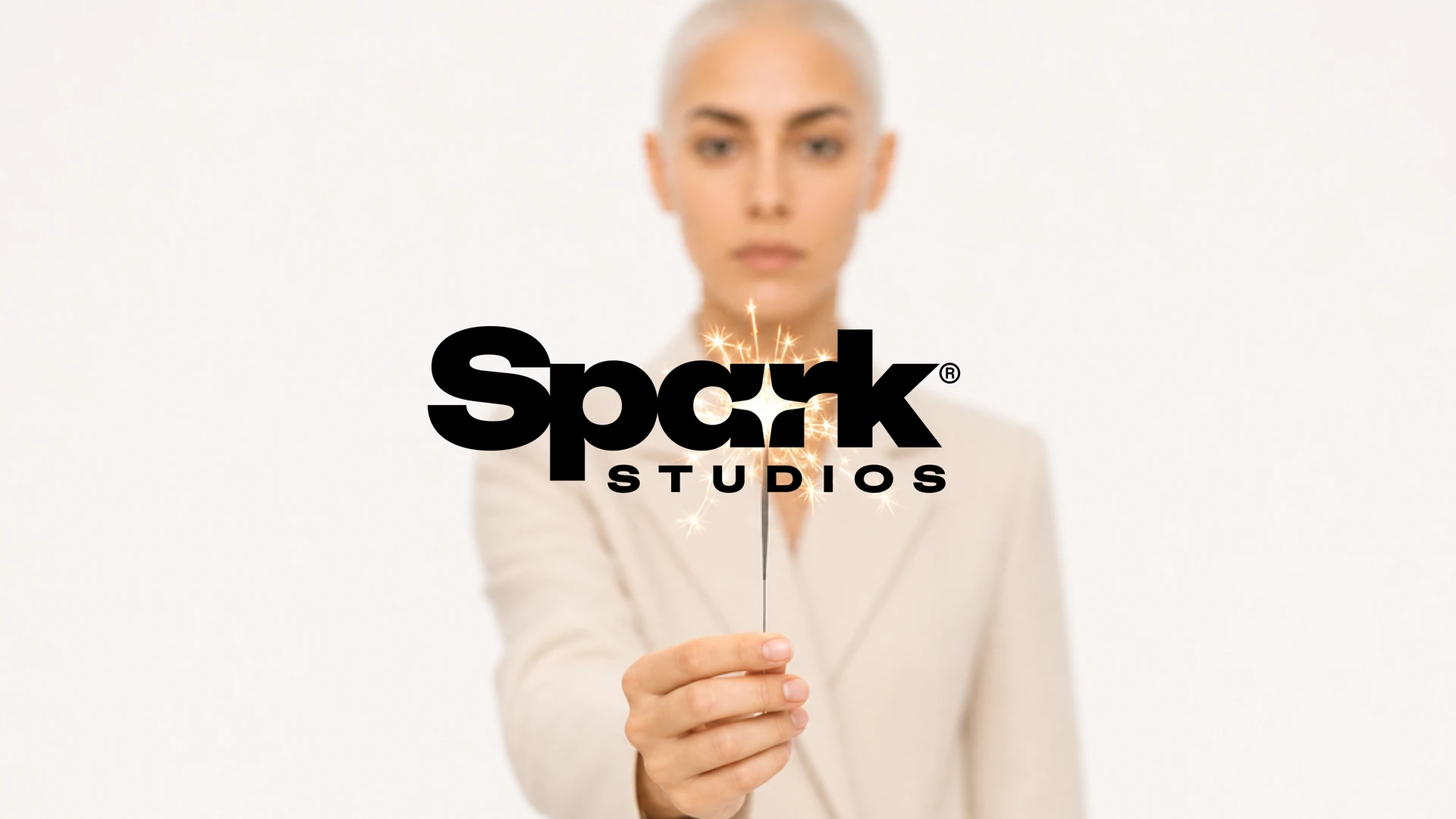
Spark Studios wordmark over a woman holding a sparkler
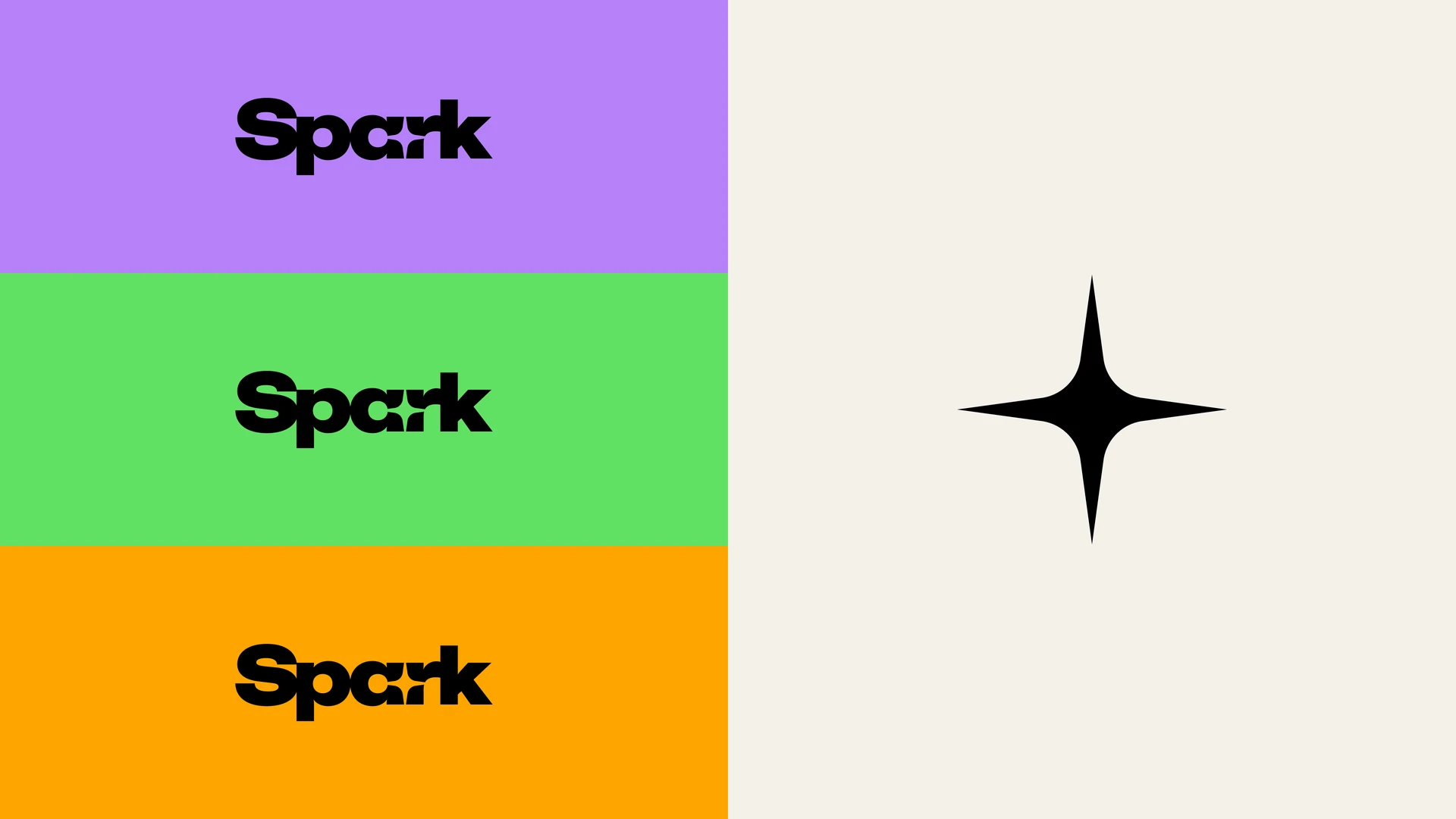
Spark wordmark in purple, green, and orange alongside the spark symbol

A spark inside the name

The bold wordmark gives Spark a distinctive signature. A four-point spark sits in the negative space of the a, while the mark can also appear on its own.
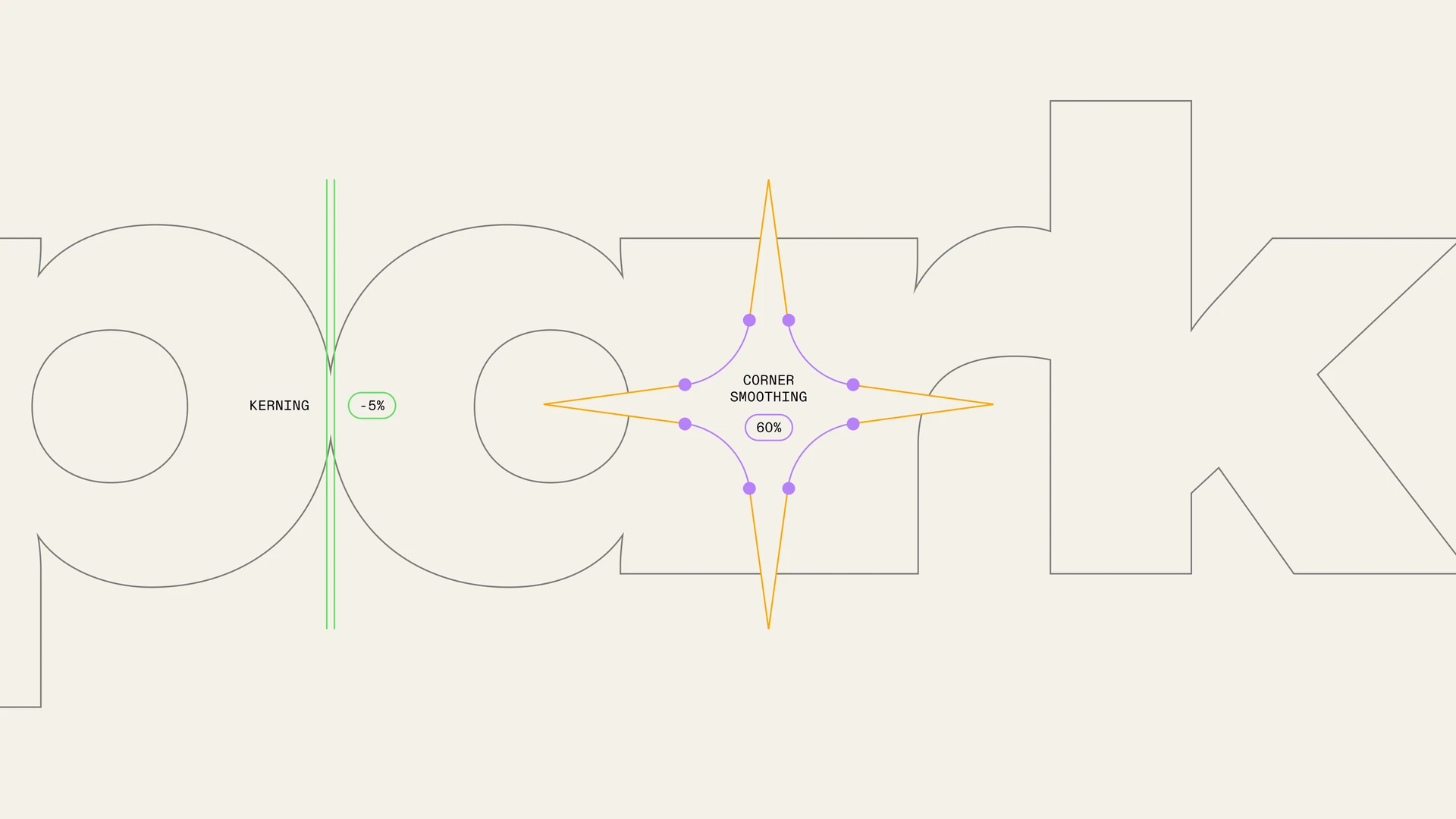
Spark wordmark construction showing the negative-space spark and spacing
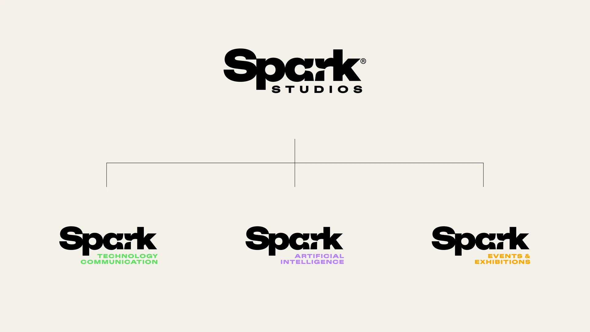
Spark Studios brand architecture and three division wordmarks

One studio, three divisions

The Spark identity connects Technology Communication, Artificial Intelligence, and Events & Exhibitions. Each division has its own accent: green, purple, and orange respectively.
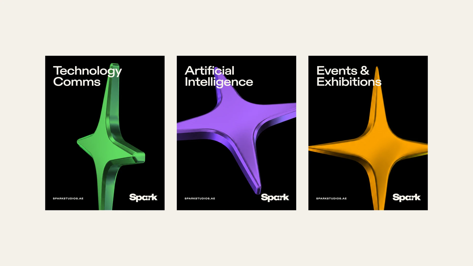
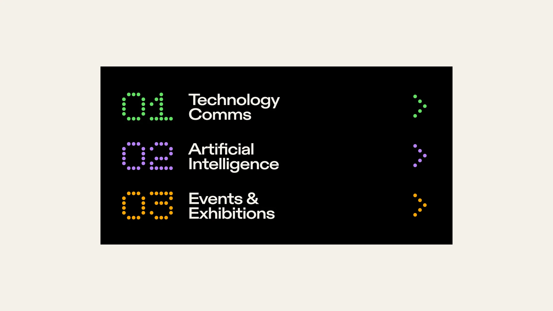
Three Spark division cards featuring green, purple, and orange dimensional sparks
Spark division menu with dotted numerals and colored arrows

Color, type, and light

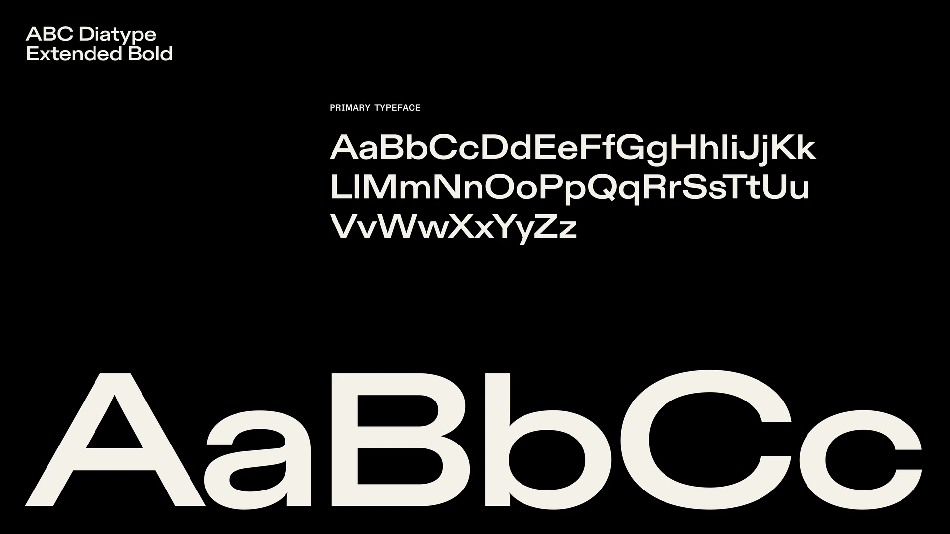
Black and off-white anchor the system, while the three accents add energy. ABC Diatype Extended Bold gives the identity its distinctive typographic voice, and photography brings a human dimension to the work.
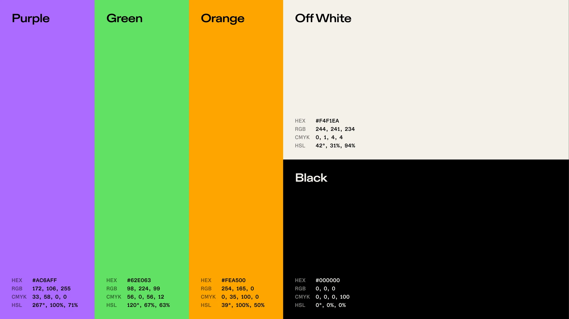
Spark palette with purple, green, orange, off-white, and black
ABC Diatype Extended Bold type specimen on black
Portrait of a woman wrapped in purple, green, and orange light trails
Close-up of an eye seen through bands of purple and orange prismatic light

Spark in everyday life

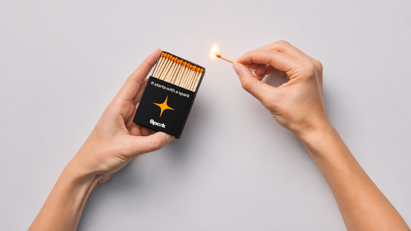
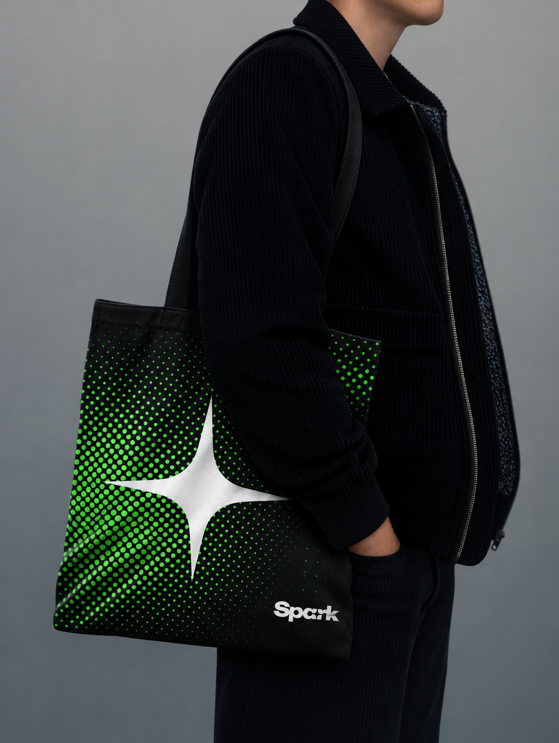
The spark can carry the identity beyond the screen. These concept mockups explore the identity on a cap, tote bag, and matchbox.
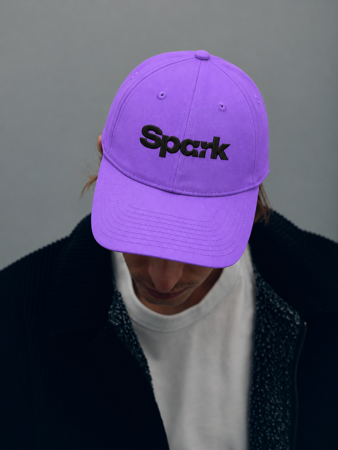
Concept mockup of a purple cap with a black embroidered Spark wordmark
Concept mockup of a black tote bag with green halftone dots and a white spark
Concept mockup of a black Spark matchbox with orange match heads

From the website to social

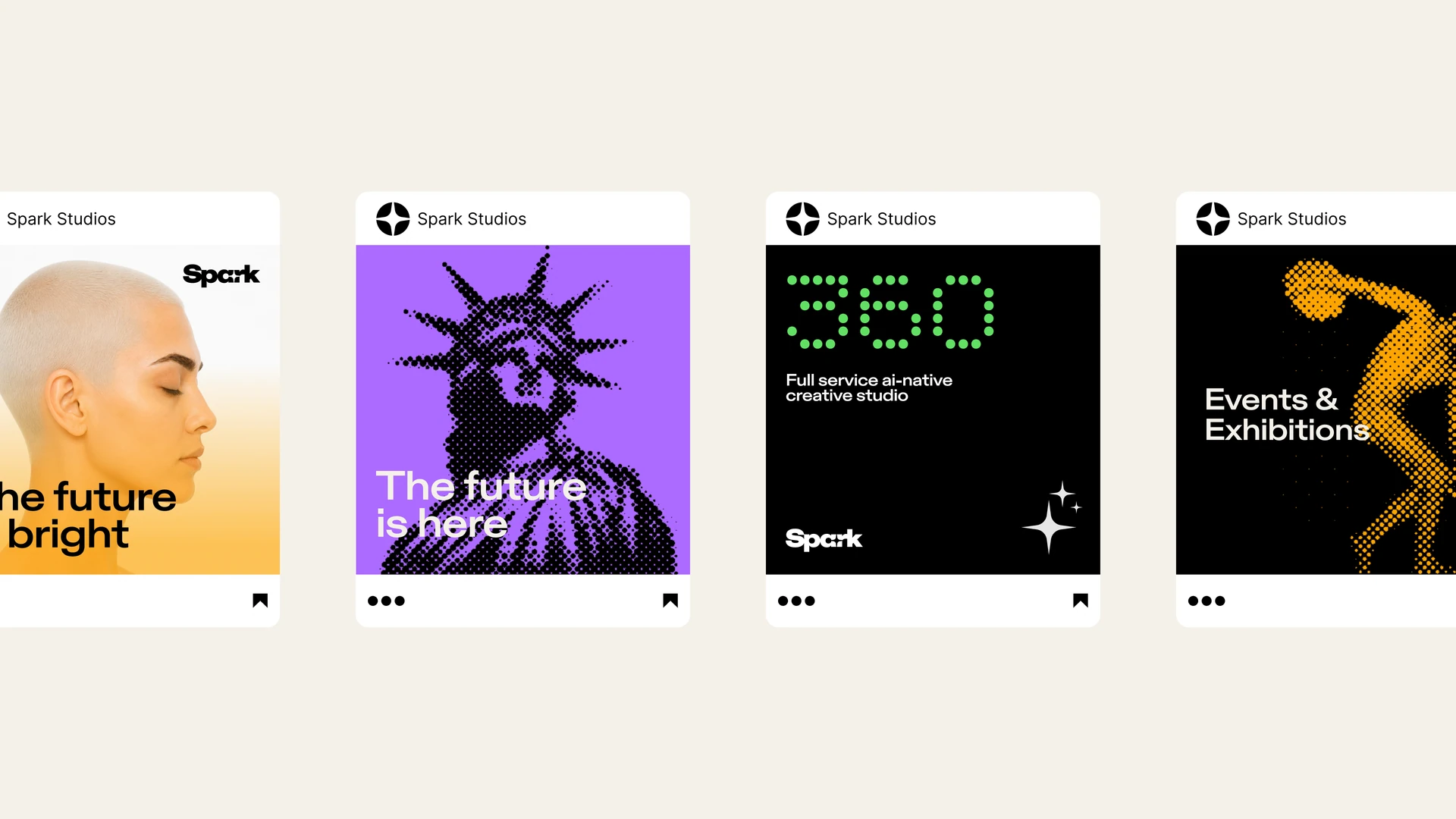
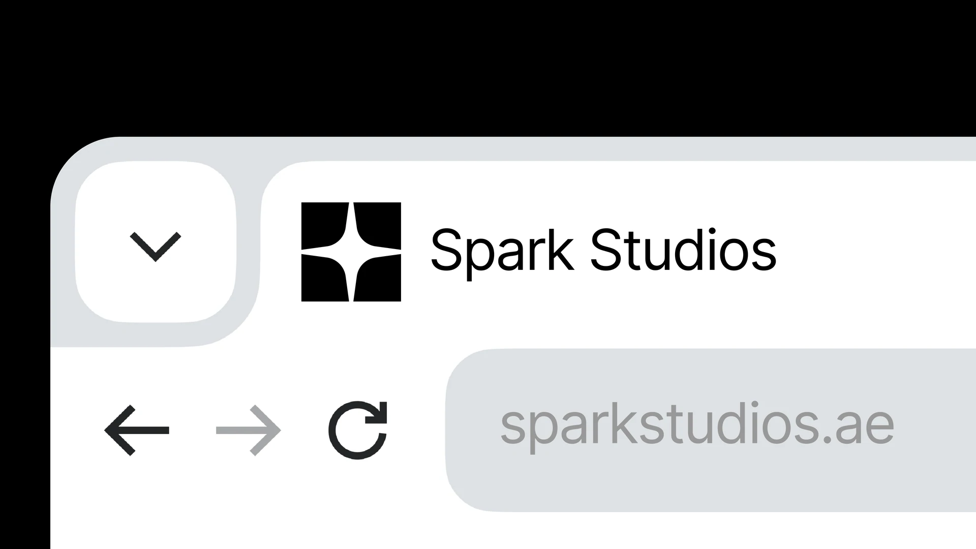
The identity moves from a compact browser icon to a full website and social profiles, using the wordmark, spark, and colors to connect each touchpoint.
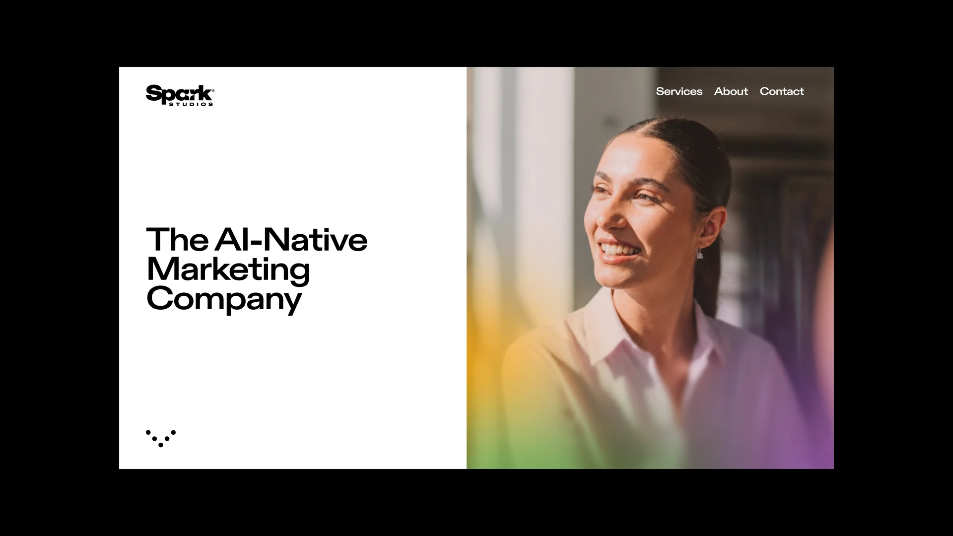
Spark Studios website concept with a portrait and the headline The AI-Native Marketing Company
Spark favicon in a browser tab
Spark Studios LinkedIn profile and banner
A row of Spark Studios social posts
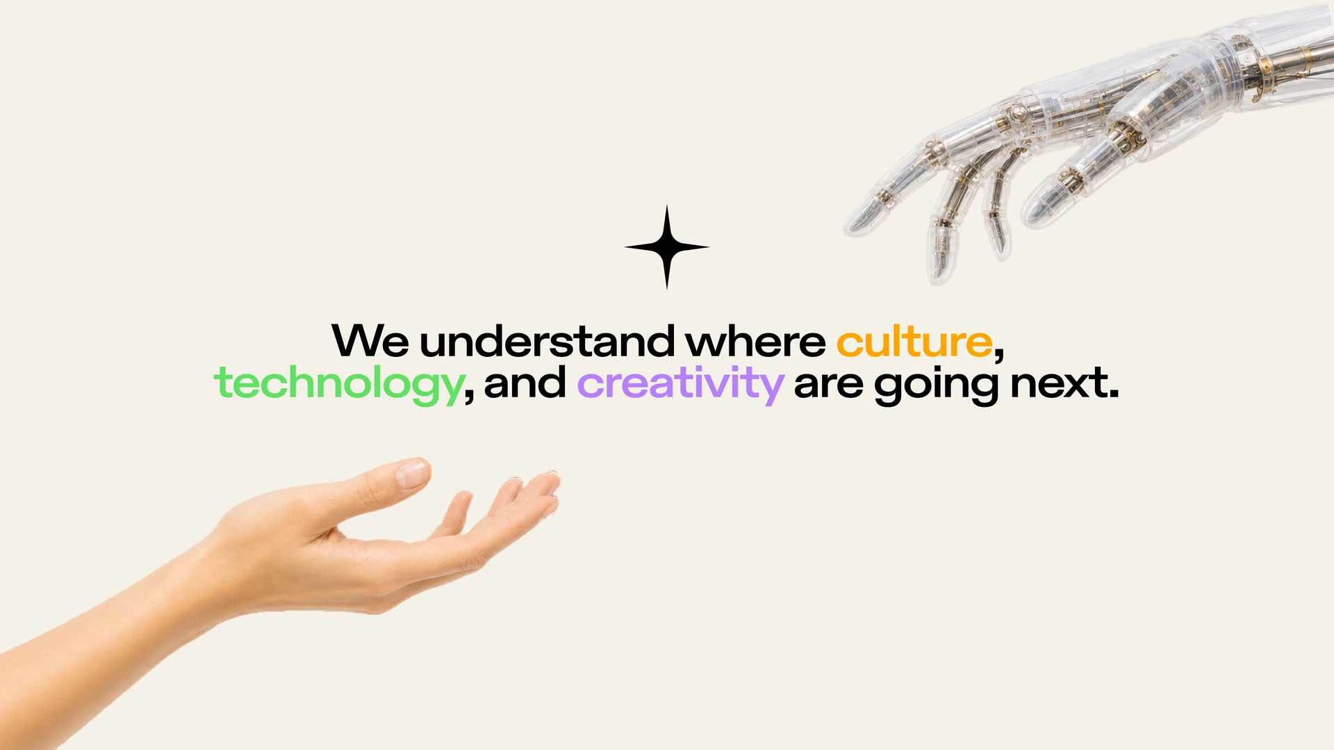
Spark presentation slide about culture, technology, and creativity
Orbio brand identity

Next project

Orbio

A Greco-Roman brand evolution for tokenized AI inference

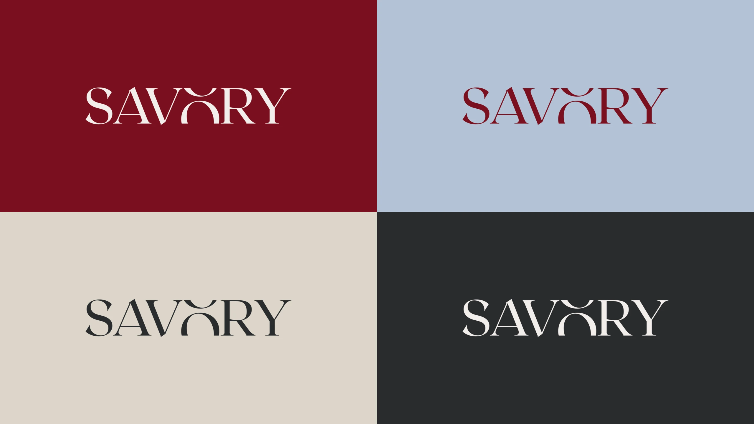
SAVORY wordmark in four colorways: cream on wax red, wax red on blue, charcoal on cream, and cream on charcoal

Next project

Savory

An editorial identity for a Brooklyn real estate team

NextDimension logo system

Next project

NextDim AI

A futuristic brand identity for AI-powered healthcare, beyond the clinical

Fox Berman logo system

Next project

Fox Berman

A modern brand identity for a boutique law firm with Caribbean character

Elevate logo system

Next project

Elevate

A progressive SaaS identity for a Shopify testing platform built around growth

Aero color system

Next project

Aero

A clinical identity for breath-analysis technology built around precision

Brevidee logo system

Next project

Brevidee

A playful identity for a video-editing platform built for schools

Wingnut logo system

Next project

Wingnut

A refined identity for a digital agency serving high-end interiors

Ventur logo system

Next project

Ventur

A vibrant identity for an AI travel planner built around discovery

Airport Executive logo system

Next project

Airport Executive

A sophisticated identity for a London chauffeur service built around discreet travel
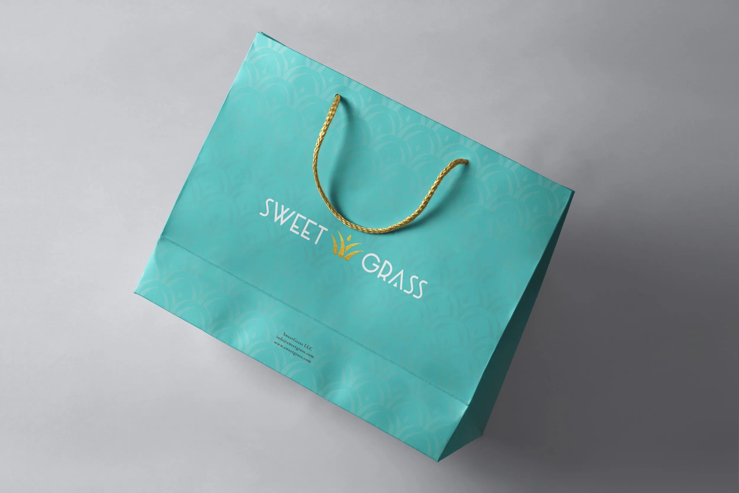
SweetGrass cannabis packaging

Next project

SweetGrass

A refined identity for a Southern cannabis dispensary rooted in luxury

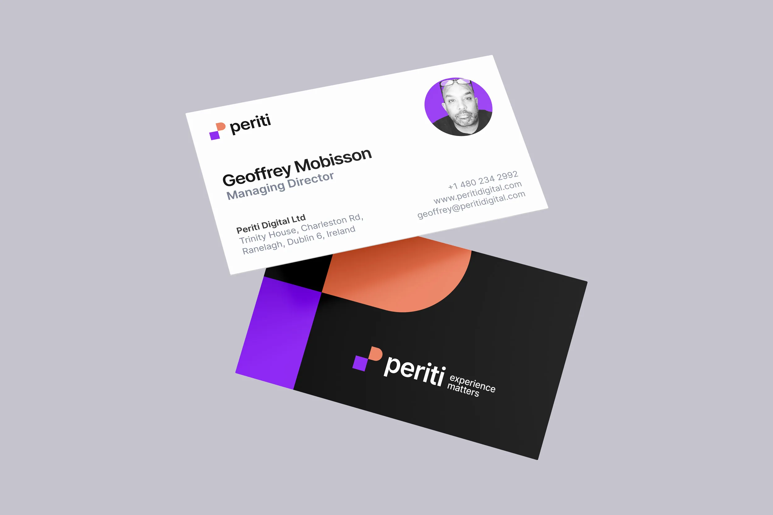
Periti Digital business cards

Next project

Periti Digital

A precise identity for a pan-European HubSpot consultancy built for clarity
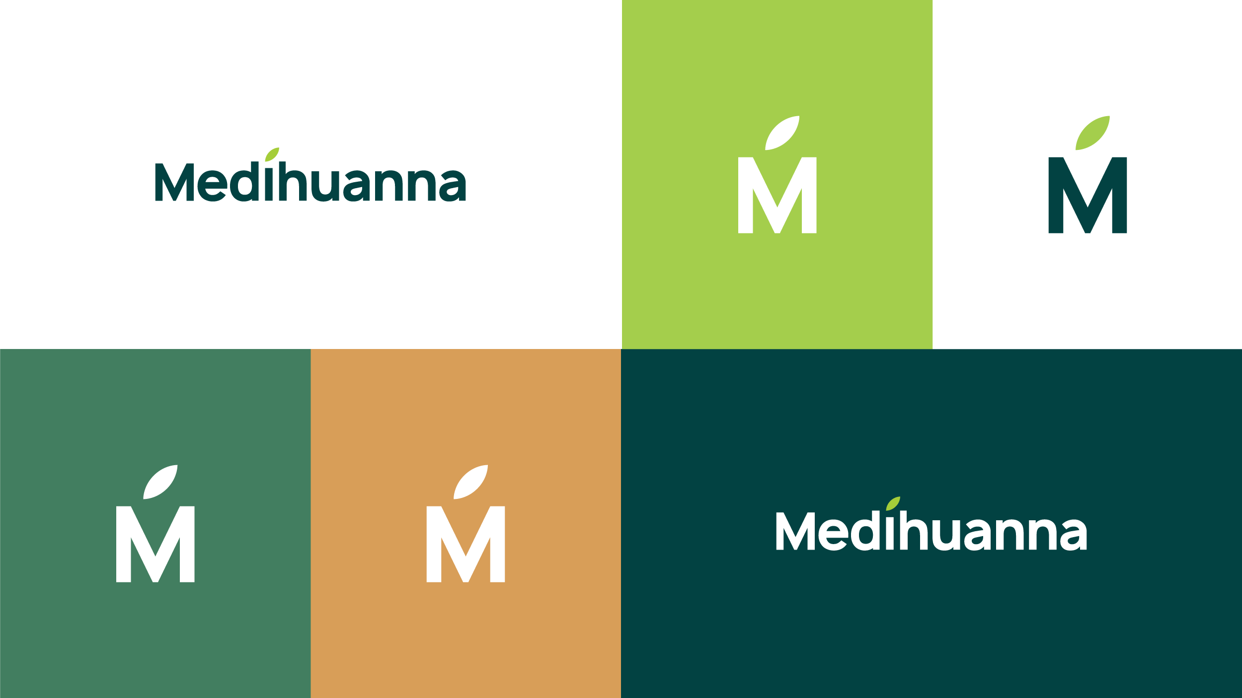
Medihuanna logo system

Next project

Medihuanna

A trusted identity for medicinal cannabis education built around clarity

SAVORY wordmark in four colorways: cream on wax red, wax red on blue, charcoal on cream, and cream on charcoal

Next project

Savory

An editorial identity for a Brooklyn real estate team

View all case studies

Ready to build a brand people remember?

Tell me what you’re launching, changing, or trying to make look better.