
Your designer presents three logo directions, your cofounder prefers one, your marketing lead prefers another, and someone asks to see ten more.
The project now needs a clear decision process as much as another design round.
Choosing a logo means deciding which direction best represents your business, reaches the people you want to attract, and works across the places they encounter you.
Here is how I recommend leadership teams make that decision without turning every preference into a revision.
1. Agree on the job before judging the design
Before opening the presentation, write down what the new identity needs to accomplish.
For an established company, that might mean looking credible to larger buyers while retaining recognition among existing customers.
For a funded startup, it might mean presenting a complex product with the confidence and clarity its sales conversations already have.
Choose three priorities and explain what each means in your business.
- Audience: Who must recognize themselves in this brand?
- Positioning: What should distinguish you from the alternatives?
- Use: Where must the identity work every day?
“Professional” is too broad to guide a decision until you explain whether you mean established, technically precise, approachable, or something else.
If the team cannot agree on those priorities, resolve the logo brief before commissioning more concepts.
2. Name one person who makes the final call
Invite the people whose knowledge improves the decision, then identify one accountable approver.
The founder may own the positioning, marketing may understand applications, and sales may know what prospects misunderstand.
Those perspectives deserve a hearing without giving every contributor an independent veto.
Confirm who collects feedback, who resolves conflicting requests, and when the decision is due.
For a board-led organization, use the approval process your organization actually requires and name the person responsible for bringing a clear recommendation to that group.
Ask participants to record their observations before discussing them together so the first enthusiastic reaction does not become the entire conversation.
3. Evaluate the direction in context
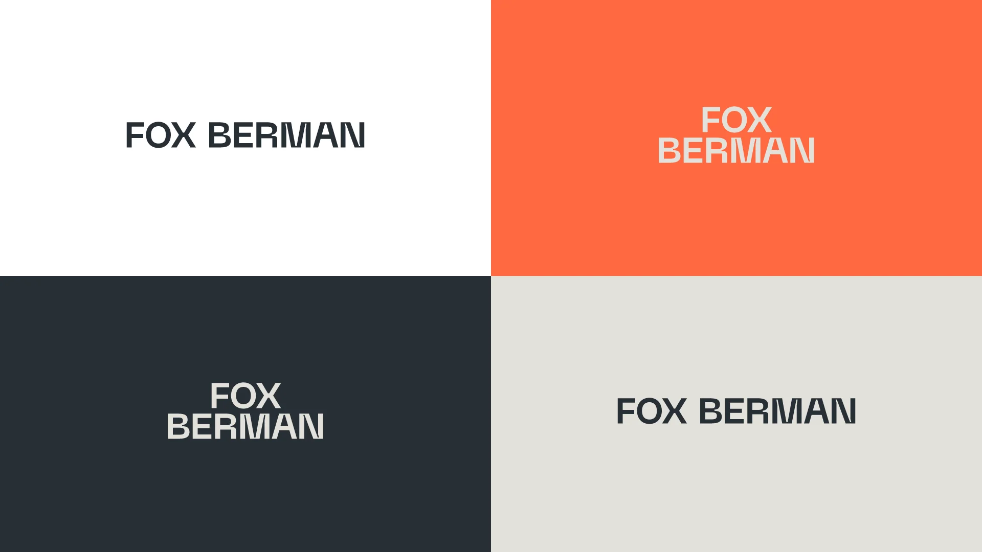
For Fox Berman, our identity combines a custom wordmark with a vivid orange palette for a boutique law firm in Sint Maarten.
Looking at that work only through the question “Do law firms usually use orange?” would miss the relationship between legal authority and the firm's Caribbean character.
A more useful question is whether the complete direction expresses the business you are trying to build.
Ask the designer to explain the connection between the brief and the choices, including what each option emphasizes or gives up.
You should understand the rationale without needing to agree with every aesthetic decision immediately.
Review the Fox Berman case study to see how the same identity carries into a website, business cards, signage, and other materials.
4. Test the applications you will actually use
A large logo centered on a presentation slide tells you less than seeing it in your everyday materials.
Request a small set of realistic applications using comparable layouts for each direction.
- Your website header at a realistic desktop and mobile size.
- A proposal cover or sales presentation your team would send.
- A small profile image or product icon, if you use one.
- A physical application that matters, such as signage or packaging.
Compare like with like so elaborate mockups do not make one concept appear stronger simply because it received a better presentation.
Read the company name at the intended size, consider long and short arrangements, and examine a single-color version when that is relevant to your materials.
For Elevate, the logo belongs to a wider identity for a Shopify-native A/B testing platform.
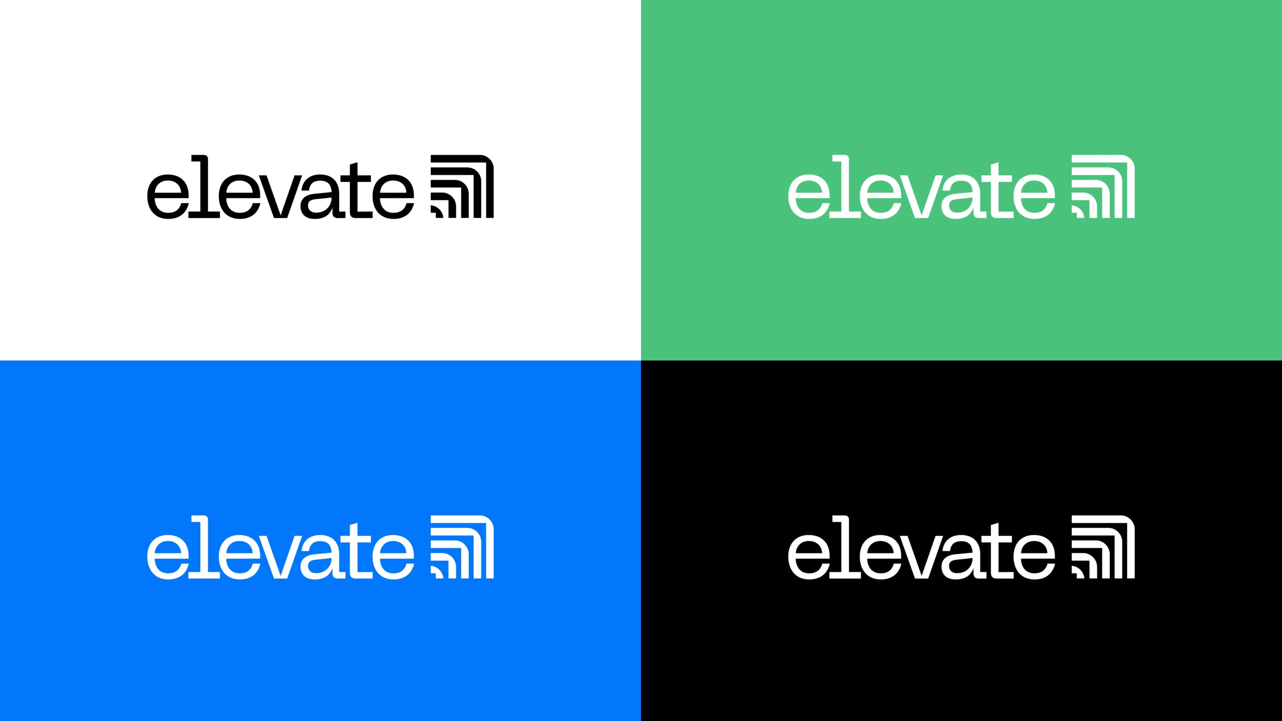
The useful review question is how that mark and wordmark support a coherent product brand, including the icon system and website design.
5. Separate evidence from preference
Personal reactions can uncover a useful concern, but the team needs to explain what the reaction means.
“I dislike thin lettering” is a preference, while “the company name becomes difficult to read in this mobile header” identifies a problem the designer can examine.
“It looks like another company” deserves a specific example and a discussion of the actual resemblance.
Ask reviewers to label each comment as a business concern, an application problem, a question, or a personal preference.
This does not eliminate judgment; it makes the basis for that judgment visible.
If you seek customer feedback, ask relevant people what they understand and notice in a realistic context rather than treating a popularity poll as the final decision.
6. Send one consolidated revision brief
After the review, collect the comments into one message that states the selected direction and the changes you want explored.
Resolve contradictions internally instead of forwarding an email chain in which one person asks for more restraint and another asks for more energy.
Useful feedback describes the observation, its connection to the brief, and the outcome you need.
Example feedback: “Direction B feels closest to our positioning, but the name loses clarity in the mobile header, so please explore an adjustment that improves readability while retaining its character.”
A less useful instruction would be “Combine the icon from A, lettering from B, and colors from C” without explaining why those elements should work together.
Let the designer solve the stated problem, and agree on what the next presentation should demonstrate.
7. Know when you need a revision or a new direction
A revision refines a direction that already answers the brief.
Adjusting spacing, testing a color, or improving a small-size version may belong in that category.
Changing the intended audience, rejecting the underlying idea, or deciding the company must express a different position calls for a broader conversation.
Do not disguise a changed brief as a small revision.
Ask what must be reconsidered and how that affects scope, timing, and the next decision.
If you are still deciding how much of the existing identity should change, our logo redesign examples show different degrees of visual change.
A practical logo approval checklist
Before approving the direction, confirm these points in writing.
- The chosen direction answers the agreed audience and positioning priorities.
- The company name is clear in the applications you reviewed.
- Important variations have been demonstrated.
- Material concerns have been resolved or assigned a clear next step.
- The authorized decision-maker has approved the same version everyone reviewed.
- The remaining refinement, final files, and rollout responsibilities are understood.
Record the approved version and any outstanding production tasks so a later conversation does not quietly reopen the entire direction.
You do not need every stakeholder to have the same favorite color to make a sound decision.
You need a shared brief, credible work, useful feedback, and someone prepared to approve the direction that best serves the business.
Need help getting your identity approved?
For concept development and refinement with a clear approval process, see my logo design service.
I work with leadership teams on brand strategy, visual identity, and websites, connecting the creative direction to the decisions the business needs to make.
Book a call to discuss your project, who needs to approve it, and what a clear path from brief to launch could look like.
Ready to build a brand people remember?
Tell me what you’re launching, changing, or trying to make look better.