
Logo Design
How to Redesign a Logo: 17 Before & After Examples
Published on Oct 28, 2026
Are you looking to fix your logo, rebrand your company, or completely redesign your logo? You've come to the right place.
In this guide, we'll explore the reasons to consider a logo redesign, the steps involved, and best practices to ensure your new logo effectively represents your brand.
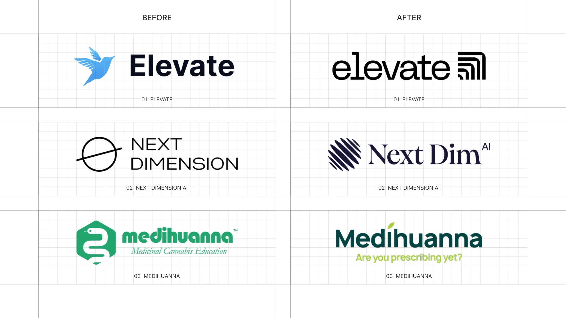
During my career as a graphic designer, I’ve led numerous logo redesign projects for my clients, here are some of them:
So I thought It’d be a great idea to use them as examples to explain my process of redesigning a logo.
Why Redesign a Logo?
Logo redesigns are often necessary when a brand undergoes major changes.
Whether you're aiming for a fresh look, aligning with new market trends, or addressing issues with your current logo's functionality, a redesign can breathe new life into your brand image.
Here are some common reasons to consider redesigning your logo:
- Brand Evolution: As companies grow and evolve, their logos should reflect these changes.
- Outdated Design: Design trends change over time, and an outdated logo can make a brand feel old-fashioned.
- Poor Versatility: Logos that don’t work across digital and physical media can hinder brand consistency.
- Audience Shift: If your target market changes, your logo should appeal to that new audience.
Steps to Redesign Your Logo
Redesigning a logo is a strategic process. Here are the essential steps involved:
- Analyze Your Current Logo: Identify what aspects of the logo are working and what needs to be fixed.
- Research Your Audience and Market: A logo should resonate with your target market and align with current industry standards.
- Define Your Brand's Core Message: A strong logo reflects your brand’s mission, values, and personality.
- Sketch and Explore Ideas: Experiment with different design elements, colors, and typography.
- Create Mockups and Test: Visualize your logo across various formats like business cards, websites, and social media.
- Get Feedback: Gather feedback from both stakeholders and your target audience.
- Finalize and Launch: Choose the best version and launch your rebranded logo.
PS. I also created a video of the same title—check it out my YouTube channel.
So without further ado, let’s look at some examples.
1. Logo Refresh
A logo refresh improves the execution while preserving the recognizable idea and existing brand equity.
This route makes sense when the concept is still strategically correct, but the typography, spacing, color, proportions, or reproduction quality need attention.
The goal is not to make change for its own sake; it is to make the existing identity clearer, more consistent, and easier to use.
2. Brand Redesign
A full brand redesign starts from a deeper strategic question: does the current logo still represent the business the company has become?
When the answer is no, preserving the old form can create more confusion than recognition.
A redesign may introduce a new concept, name treatment, symbol, palette, and visual system, but every choice should still come from the brand strategy rather than personal taste.
3. Reasons for Change
There are several reasons why a company may choose to redesign their logo.
One common reason is that the existing logo is outdated and no longer reflects the brand.
This can be due to the passage of time, or it may be that the logo was created cheaply and is now in need of an update.
Another reason for redesigning a logo is that the business has changed, whether it has evolved or is now focusing on a specific niche.
A third reason is that the company may be growing and needs a proper brand architecture to reflect its new size and scope.
Other reasons for redesigning a logo include issues with trademarking, reputation damage, or a desire to reposition the company in the market.
4. What to Keep and What to Change
The most important redesign decision is determining which elements carry real brand equity and which elements only create friction.
Evaluate the logo as a system
- Concept: Does the central idea still express the company’s positioning?
- Typography: Are the letterforms, spacing, weight, and hierarchy distinctive and legible?
- Color: Does the palette work in print, digital products, accessibility contexts, and one-color applications?
- Proportion: Do the symbol, wordmark, and descriptor remain balanced at different sizes?
- Composition: Can the identity adapt to horizontal, stacked, social, favicon, and signage formats?
Keep what audiences recognize and what still supports the strategy; change what prevents the identity from working clearly and consistently.
5. Logo Refresh vs. Rebrand
Choose a refresh when the existing idea still fits the brand and the main problems are visual execution or usability.
Choose a full redesign when the business, audience, positioning, reputation, or name has changed enough that the old identity communicates the wrong story.
In either case, test the logo in real contexts before launch and document the final system in clear brand guidelines.
17 Logo Redesigns: Before and After
These are real redesigns from my archive, ranging from careful refinements to complete identity changes.
For each example, compare the original problem with the final design and look at the specific choices that improved clarity, distinction, and usability.
01 — Airport Executive
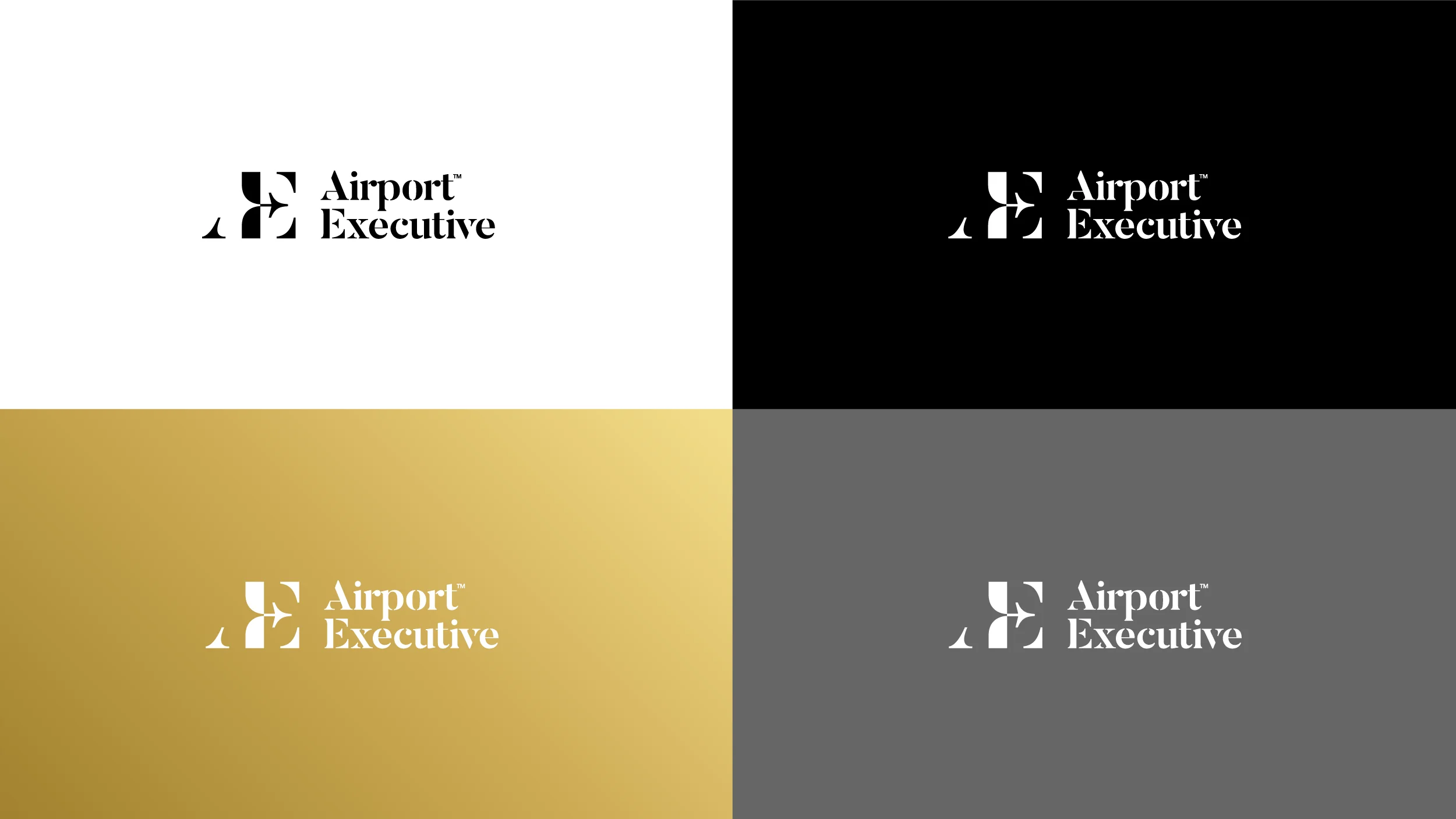
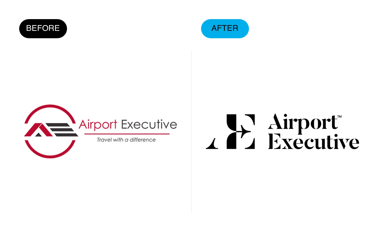
Airport Executive needed to move beyond a complicated travel emblem and become a more confident premium transportation brand.
What changed
- Replaced the busy circular badge with a distinctive AE monogram.
- Changed the visual tone from generic travel graphics to premium editorial typography.
- Created a compact mark that works better on vehicles, digital interfaces, and small touchpoints.
02 — AMI
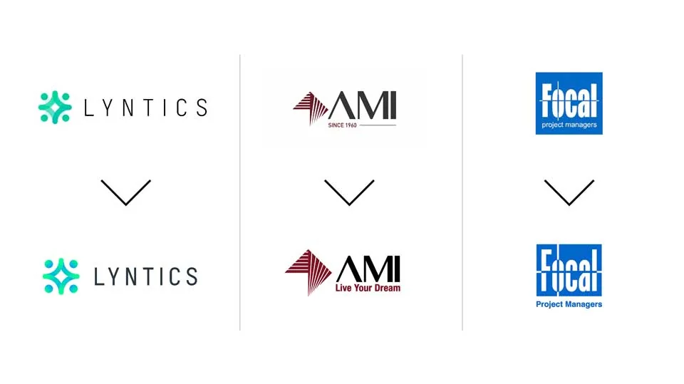
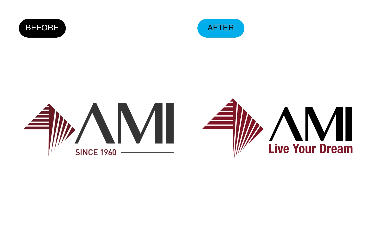
AMI was a careful refresh rather than a complete reset, preserving the recognizable striped symbol while improving the wordmark and hierarchy.
What changed
- Retained the established symbol and core burgundy color.
- Improved the typography, spacing, and relationship between symbol and name.
- Added a clearer tagline lockup without weakening the primary mark.
03 — CCL
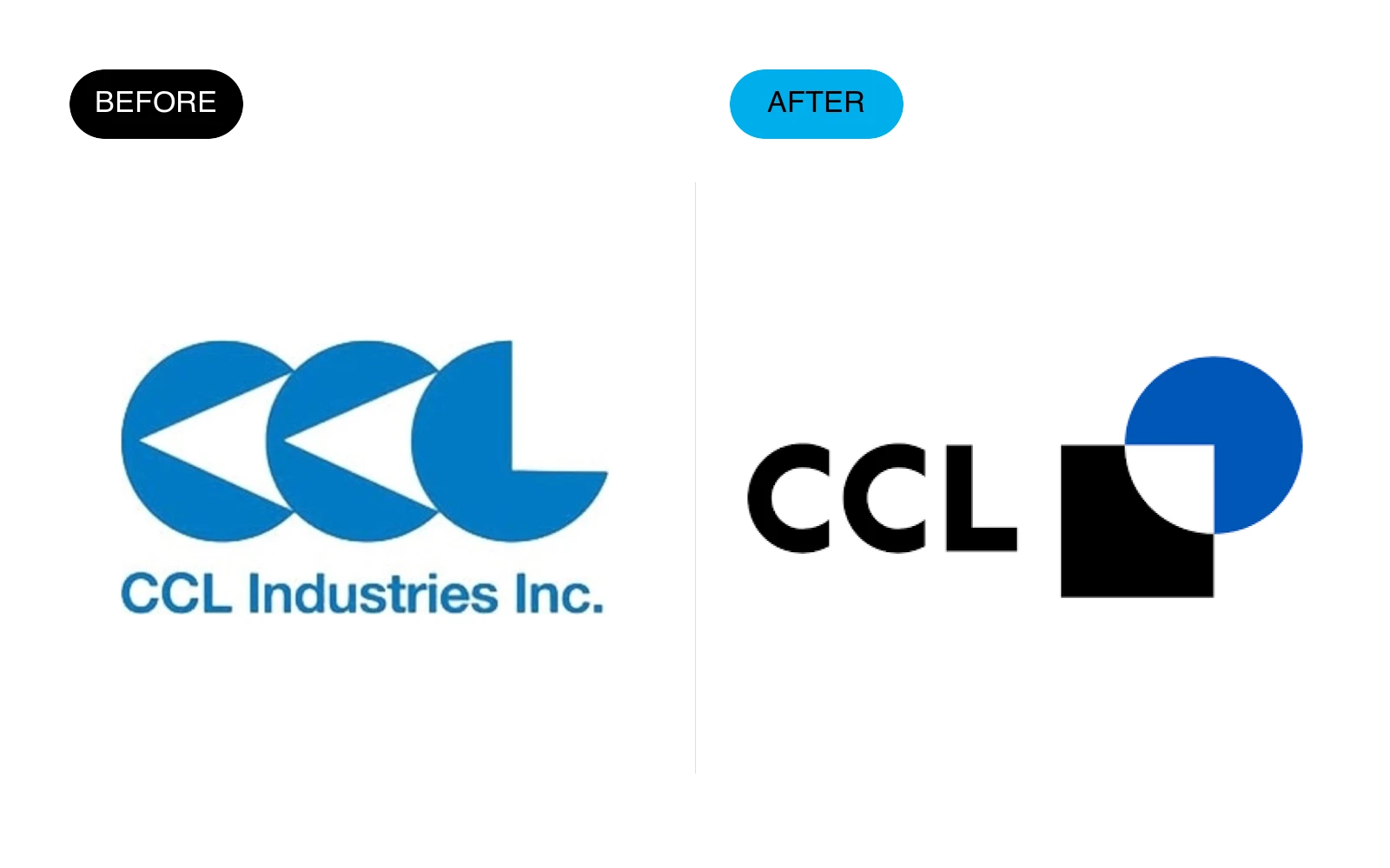
CCL moved from a dated literal wave-like construction to a simpler geometric identity with stronger digital presence.
This identity was designed by me while I was working at Chermayeff & Geismar & Haviv.
What changed
- Reduced three similar shapes into a more ownable modular system.
- Introduced a crisp black-and-blue palette with stronger contrast.
- Built a compact logo that remains recognizable at small sizes.
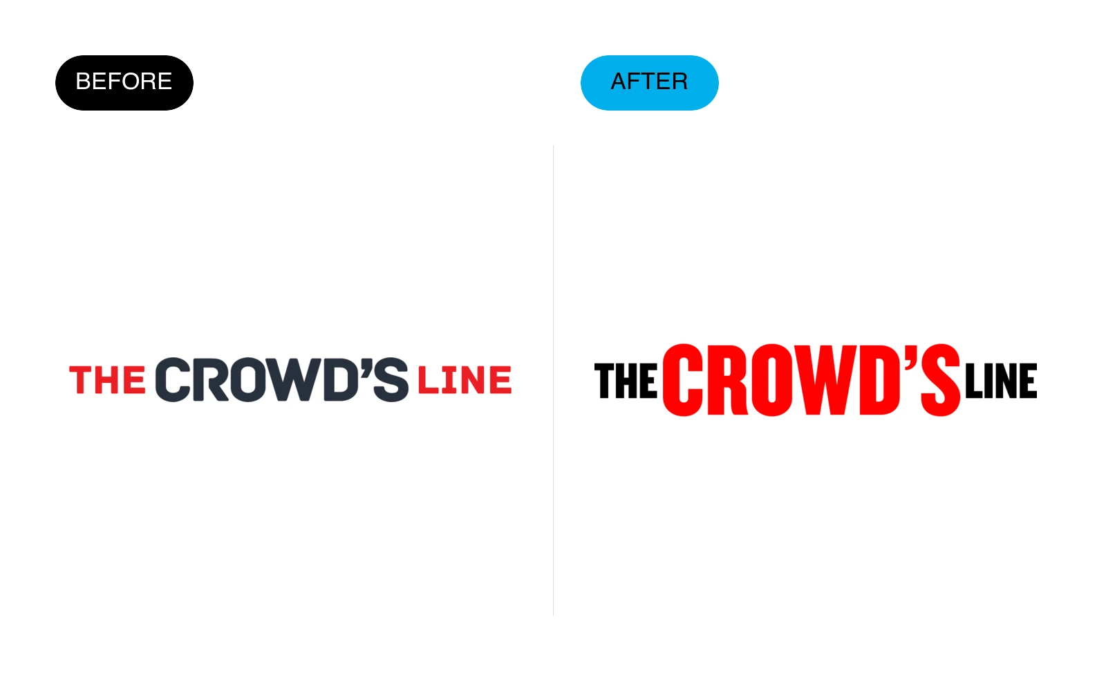
04 — The Crowd’s Line
The Crowd’s Line already had a strong name, so the redesign focused on making the typography more energetic and immediate.
What changed
- Preserved the red, black, and white brand equity.
- Strengthened the typographic hierarchy around the word Crowd’s.
- Removed inconsistent spacing and created a tighter, more memorable wordmark.
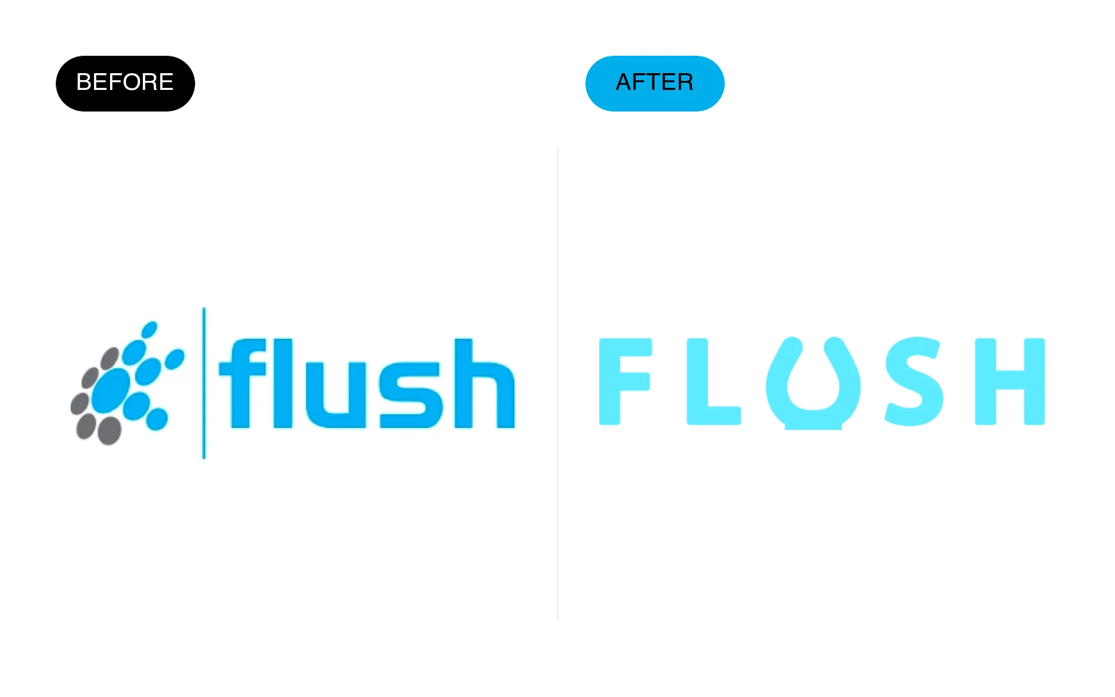
05 — Flush
Flush was simplified from a symbol-plus-wordmark arrangement into a more distinctive custom wordmark.
What changed
- Removed the generic cluster icon that competed with the name.
- Created custom letterforms with a fluid visual detail inside the U.
- Brightened the palette and improved legibility across digital applications.
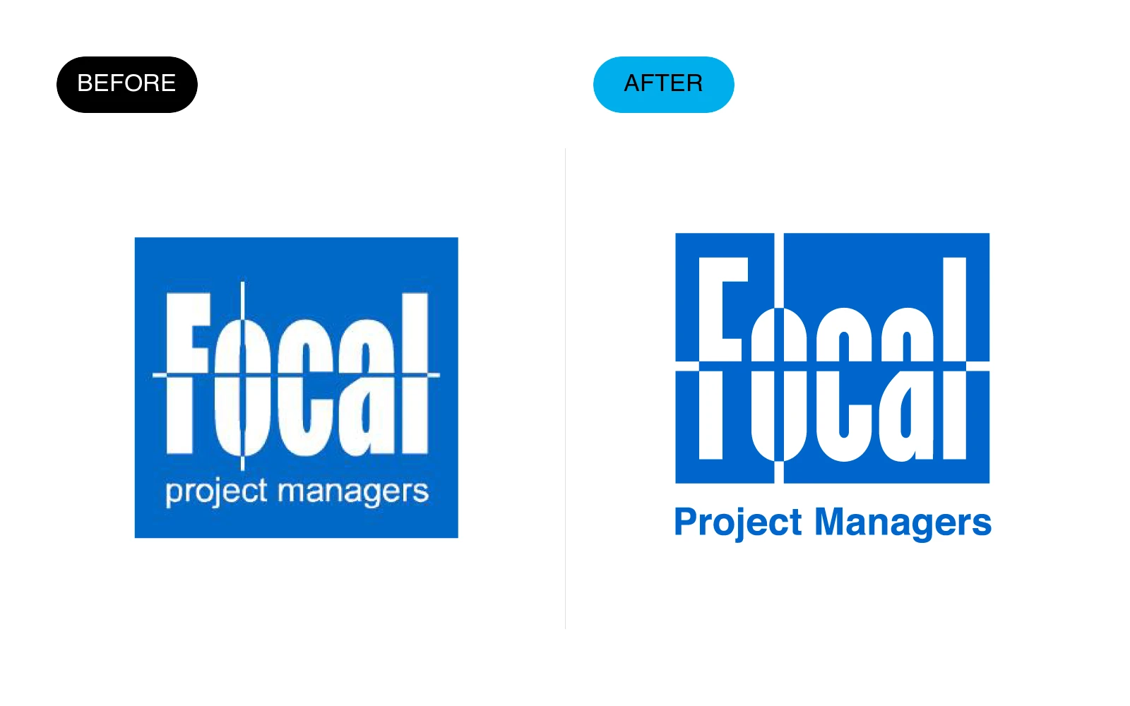
06 — Focal Project Managers
Focal is an example of fixing execution while preserving the original idea and architectural character.
What changed
- Kept the stacked, structural letter concept.
- Corrected proportions, alignment, line weight, and negative space.
- Made the descriptor clearer and the overall lockup more balanced.
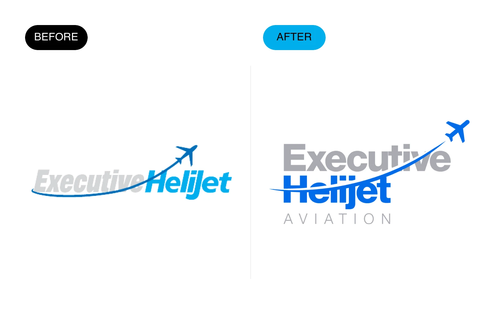
07 — Executive Helijet Aviation
Executive Helijet needed a cleaner aviation identity that could communicate speed without relying on dated effects.
What changed
- Simplified the italic wordmark and removed unnecessary visual noise.
- Integrated the aircraft motif more deliberately into the composition.
- Added a cleaner descriptor and more controlled blue palette.
08 — Lyntics
Lyntics is a restrained refresh where small changes improved polish, balance, and recognition.
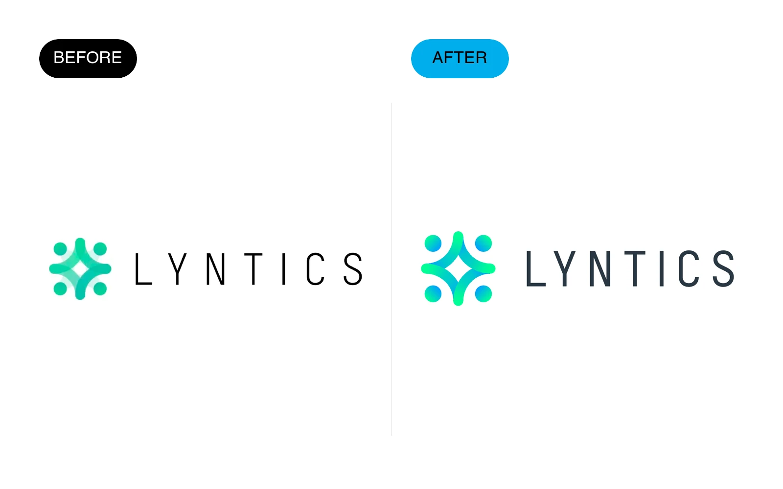
What changed
- Refined the four-part symbol into a cleaner, more symmetrical form.
- Improved letter spacing and weight in the wordmark.
- Updated the color relationship for a brighter, more contemporary feel.
09 — Medihuanna
Medihuanna required a full repositioning away from a generic medical-cannabis badge toward a credible, contemporary healthcare identity.
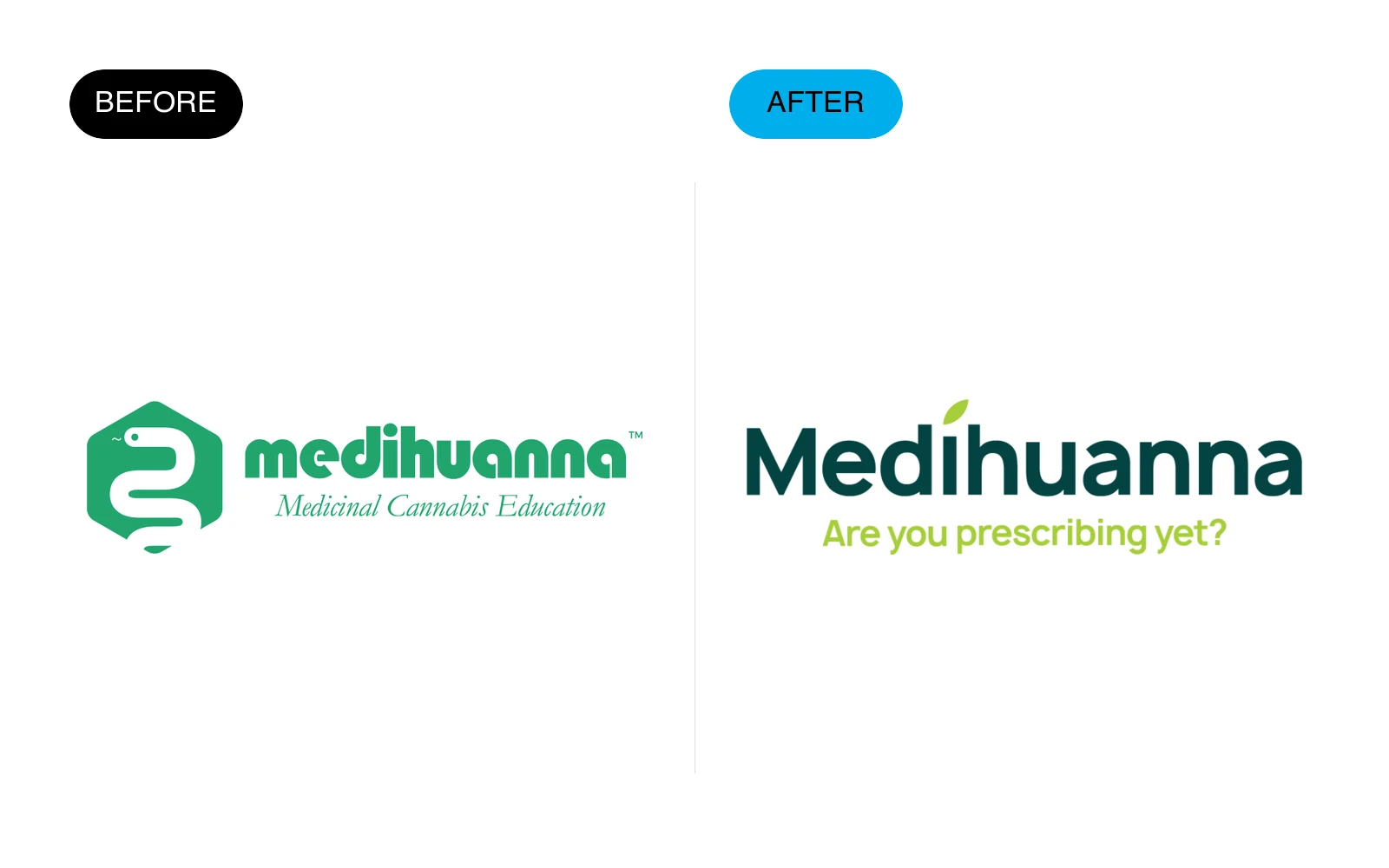
What changed
- Removed the literal snake-and-cannabis symbol.
- Introduced a clean custom wordmark with a subtle leaf reference.
- Shifted from an institutional badge to a flexible identity designed for education and digital use.
10 — Periti
Periti’s redesign replaced a software-style app icon with a simpler identity that better supports a modern consultancy.
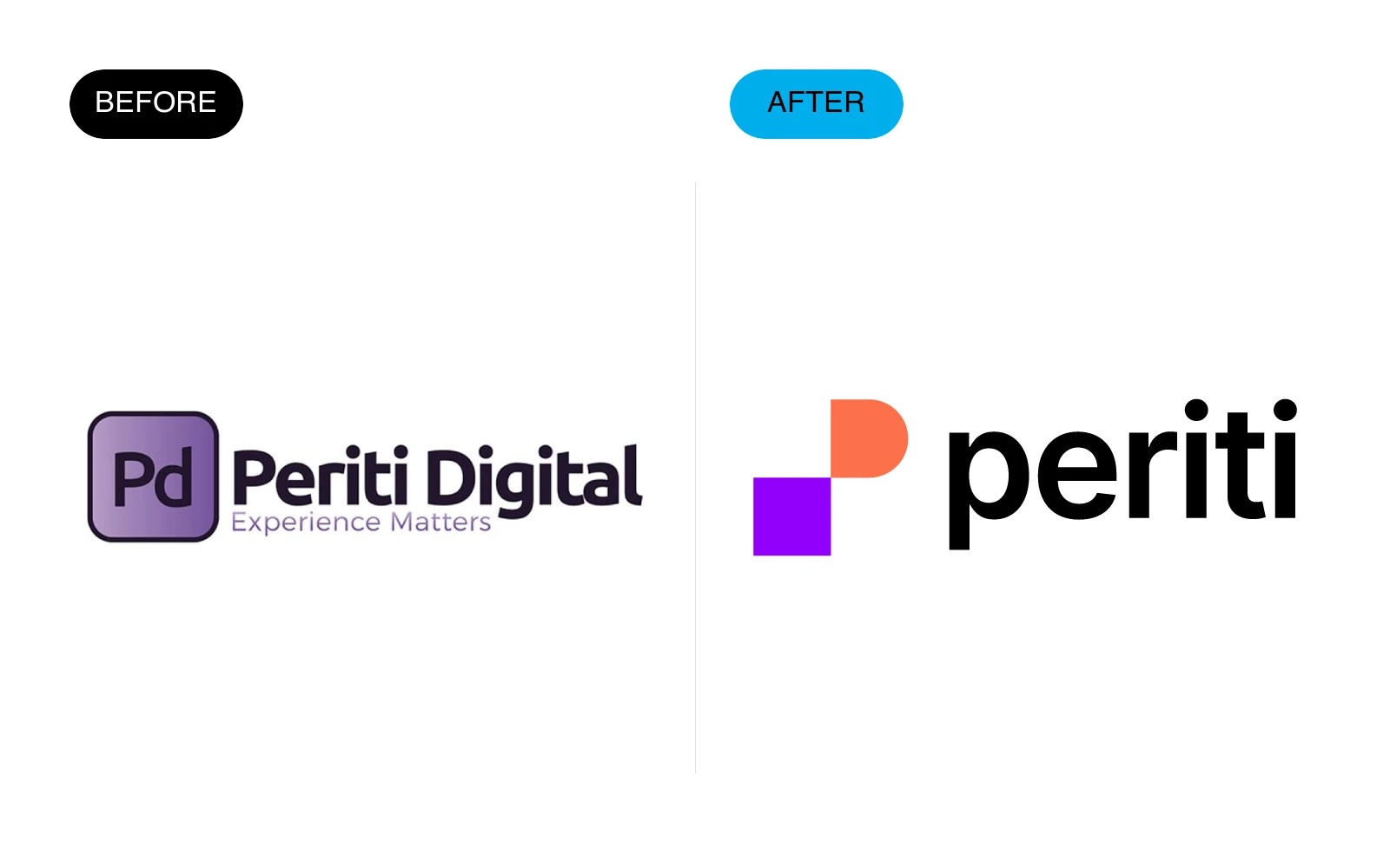
What changed
- Removed the boxed PD monogram and generic gradient treatment.
- Created a distinctive two-shape symbol with a stronger silhouette.
- Simplified the name and typography so the identity feels more confident and scalable.
11 — Pro Basket
Pro Basket needed a more disciplined sports identity that would work as well on a uniform as it does online.
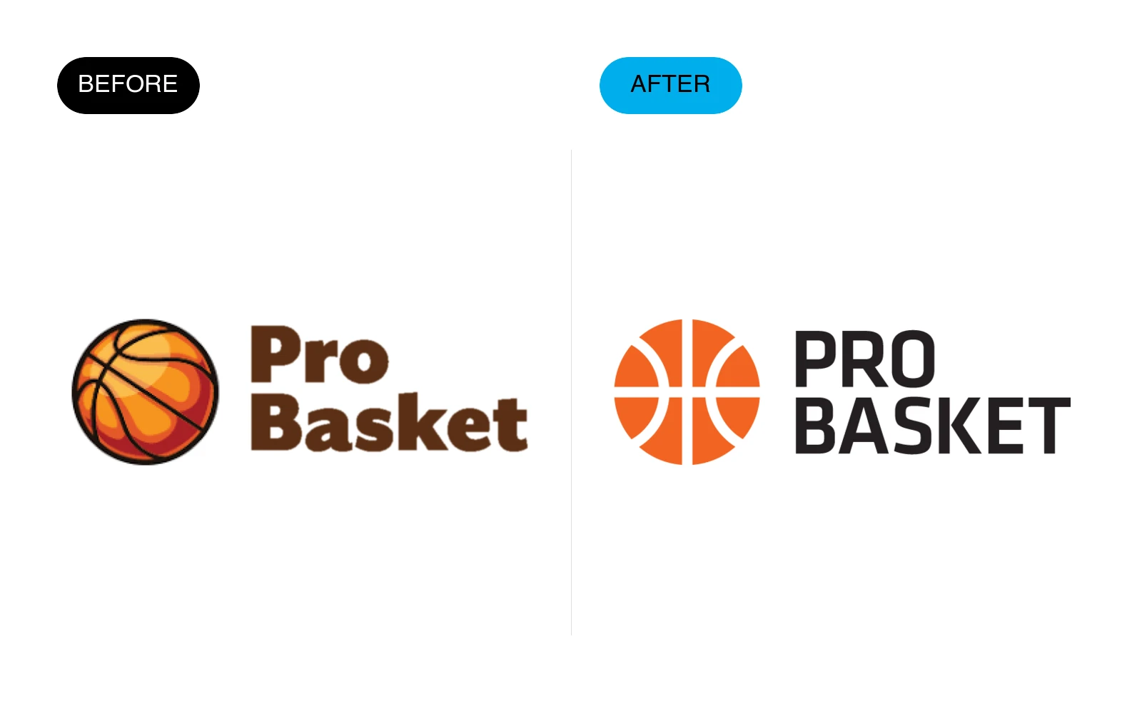
What changed
- Simplified the illustrated basketball and reduced unnecessary detail.
- Built a bolder uppercase wordmark with better rhythm.
- Unified the symbol and typography through a single orange-and-black system.
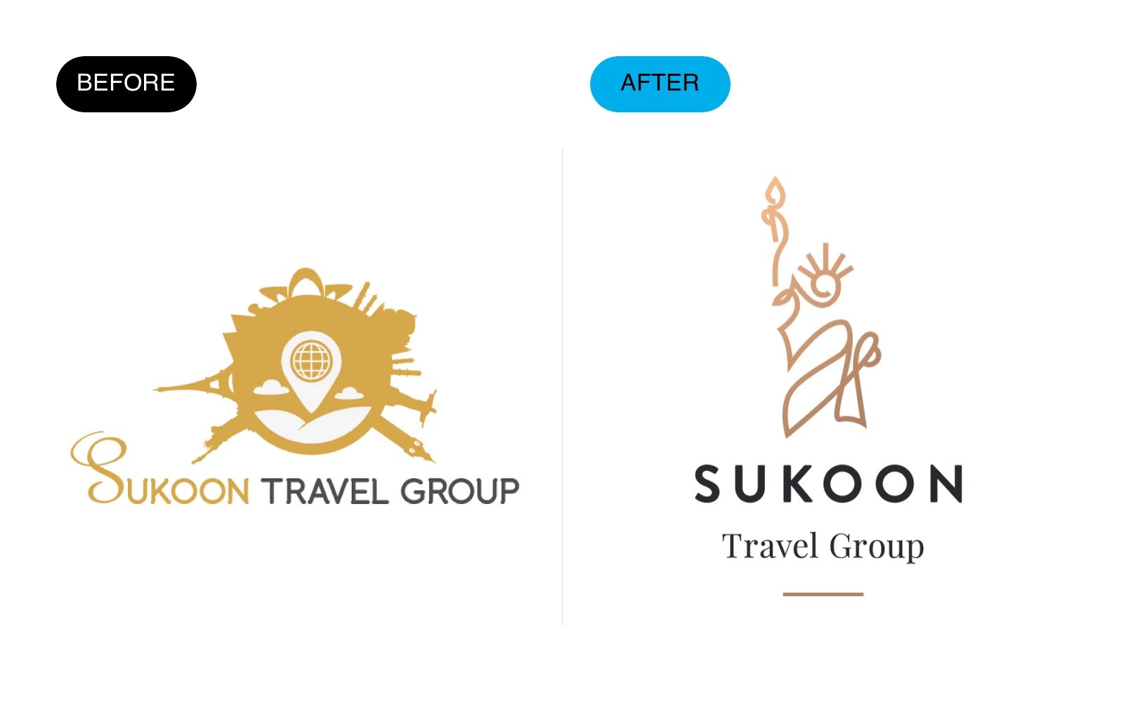
12 — Sukoon Travel Group
Sukoon shifted from a decorative travel crest to a refined hospitality identity with a more distinctive cultural character.
What changed
- Replaced the crowded landscape emblem with a focused line-art symbol.
- Introduced a more elegant typographic hierarchy.
- Created a warmer, quieter palette that supports a premium travel experience.
13 — SweetGrass
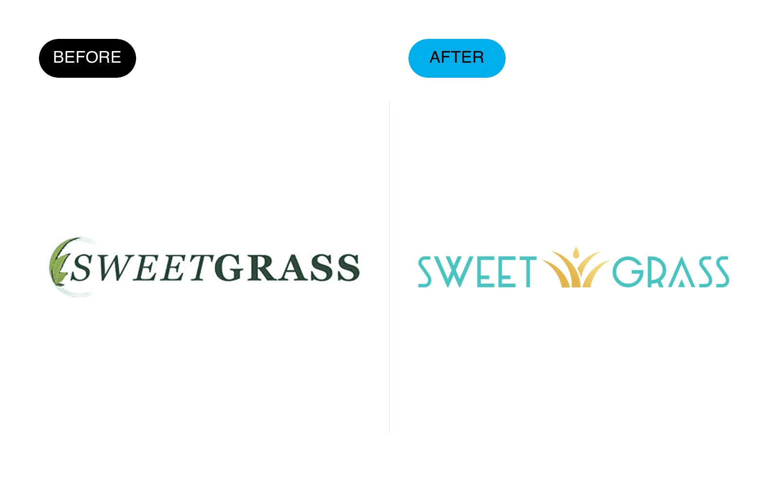
SweetGrass evolved from a conventional dispensary wordmark into a brighter, more ownable retail identity.
What changed
- Removed the leaf-in-letter cliché and dated italic typography.
- Created an Art Deco-inspired wordmark with a distinctive sunburst detail.
- Introduced a turquoise-and-gold palette that feels premium without becoming clinical.
14 — Syncron
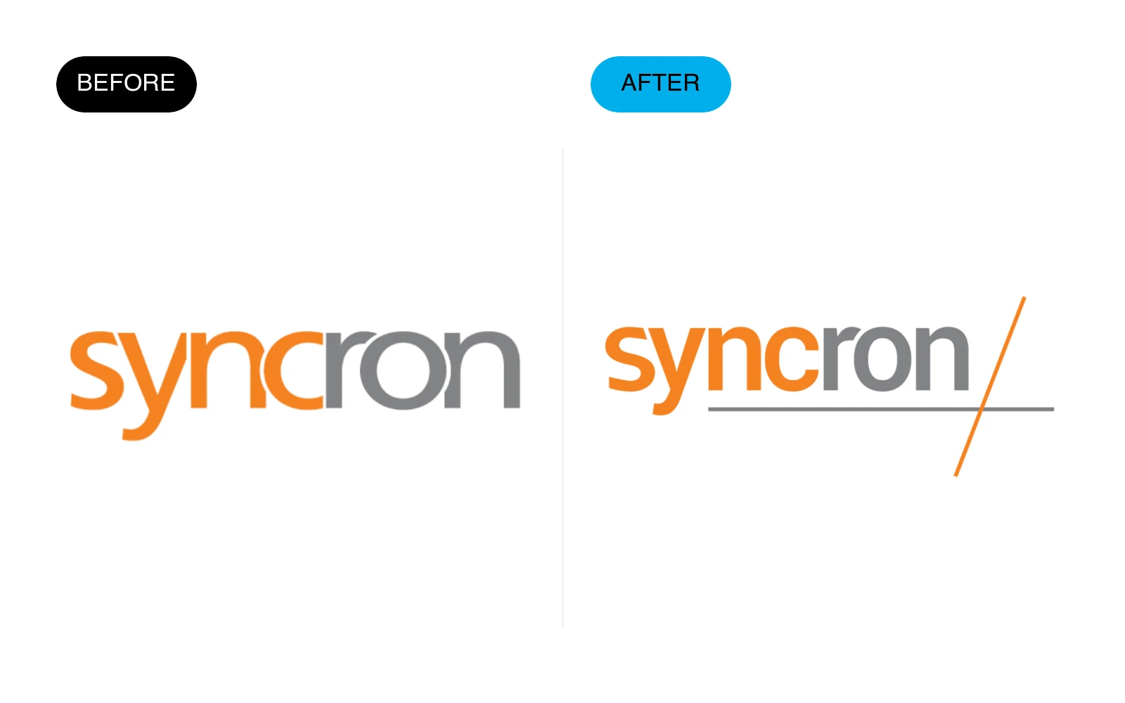
Syncron retained its recognizable orange wordmark while gaining a more structured and versatile signature.
What changed
- Preserved the name and core orange equity.
- Refined letterforms and spacing for better legibility.
- Added a precise graphic accent that gives the wordmark a stronger endpoint and system logic.
15 — Vessels of Glory
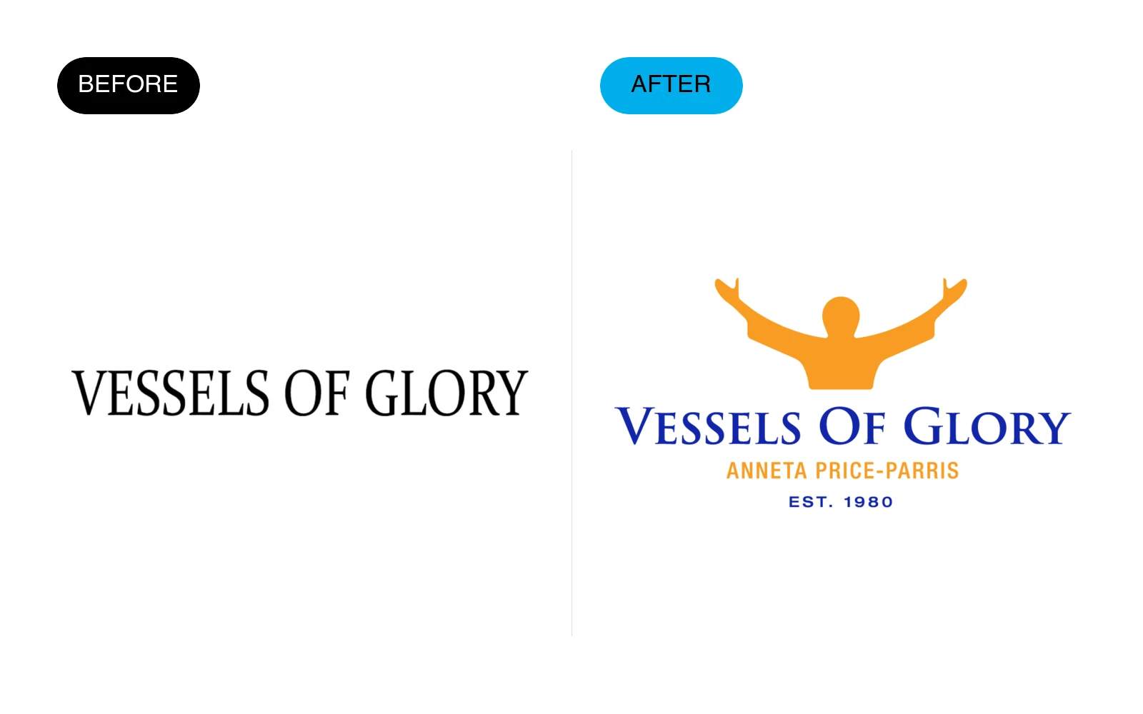
Vessels of Glory moved from a generic fashion wordmark to a more expressive identity aligned with its faith-driven apparel story.
What changed
- Replaced the plain serif wordmark with a symbolic human-centered composition.
- Introduced a distinctive orange-and-blue palette.
- Added a clear descriptor while preserving a strong standalone name treatment.
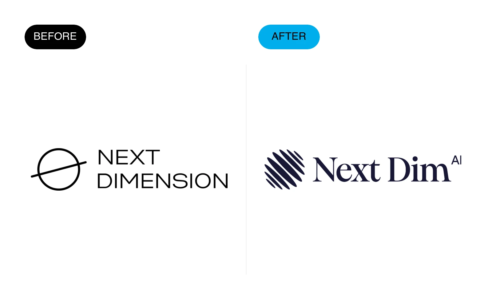
16 — NextDim AI
NextDim AI moved from a literal space-themed logo to a more distinctive identity for an AI operating system built for specialty medical practices.
What changed
- Replaced the generic orbit symbol with a more ownable dimensional mark.
- Simplified the long stacked name into a sharper, more confident signature.
- Created a flexible identity that works across healthcare technology, motion, and digital products.
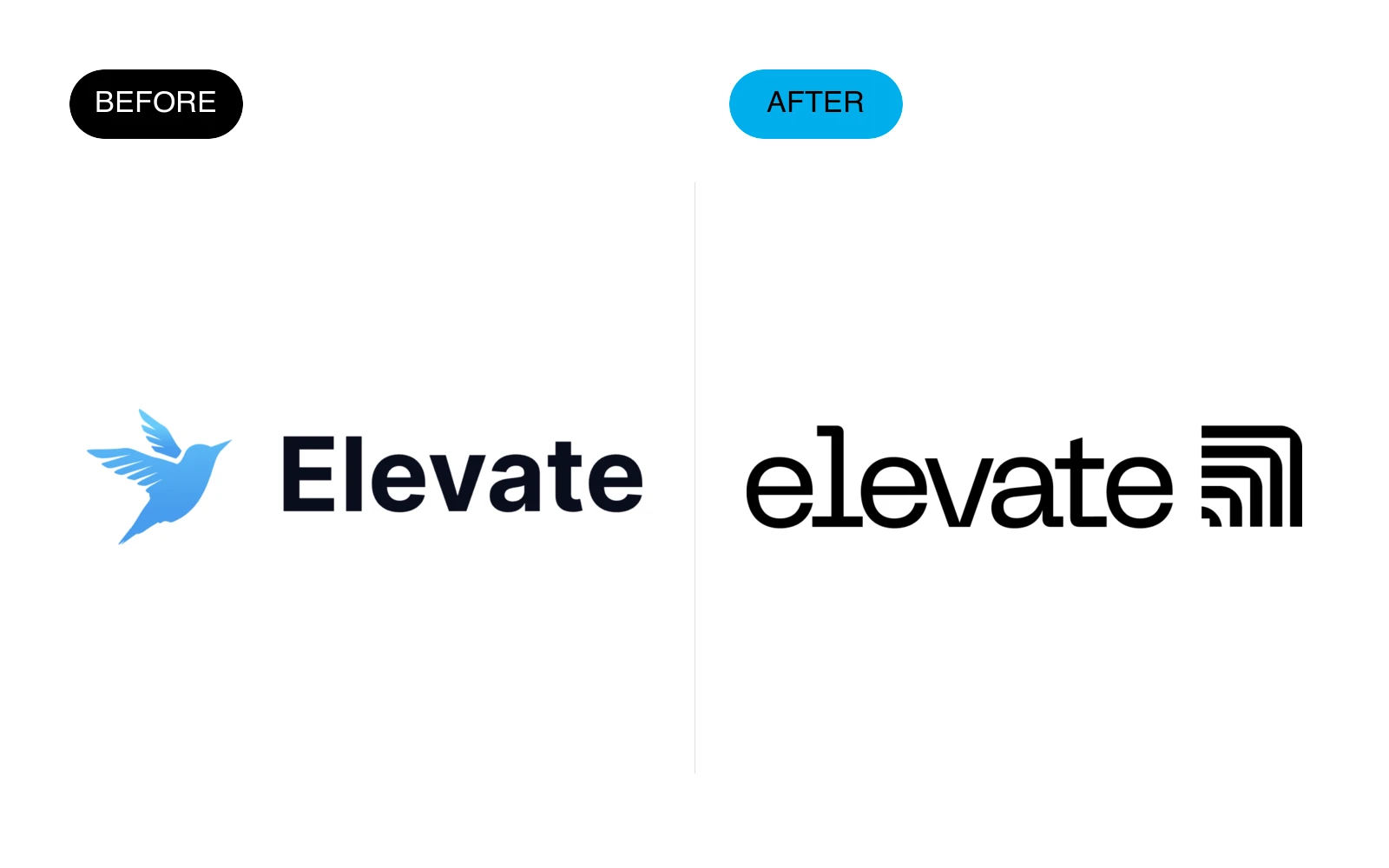
17 — Elevate
Elevate evolved from a generic bird-and-wordmark combination into a progressive identity designed for a Shopify experimentation platform.
What changed
- Removed the literal bird symbol and generic SaaS typography.
- Created a bespoke wordmark with a compact upward-moving growth mark.
- Built a more ownable identity that communicates experimentation, momentum, and measurable progress.
Conclusion
In conclusion, redesigning a company logo can be a crucial step in maintaining a strong brand and staying competitive in the marketplace.
There are two main types of redesigns: logo refreshes and brand redesigns.
The decision to redesign a logo may be driven by a variety of factors, including the need to modernize an outdated logo, changes in the business, or the desire to better communicate the brand.
By carefully considering the goals and needs of the company (brand strategy), businesses can successfully redesign their logos and continue to thrive.
Frequently Asked Questions about Logo Redesign
What is the cost of redesigning a logo?
Logo redesign costs vary widely depending on the complexity, designer expertise, and project scope.
A focused logo refresh may be a smaller engagement, while a strategic identity redesign can require a substantially larger investment.
Larger companies with complex requirements may spend more to get a brand-aligned logo.
How long does a logo redesign take?
A logo redesign typically takes anywhere from 2 to 6 weeks. Factors affecting the timeline include research, concept development, revisions, and feedback rounds.
Make sure to allocate enough time for a thorough and polished result.
Those are general planning ranges; at Ebaq Design, the scoped identity refresh or rebrand is delivered in one week, guaranteed, for $3,000 total, with the scope agreed at kickoff and website work planned separately.
Should I completely change my logo or just update it?
This depends on your brand goals. Minor updates (often called a logo refresh) can modernize your logo without losing brand recognition.
A complete redesign, however, may be necessary for rebranding a company that has significantly evolved.
Best Practices for Logo Redesigns
When rebranding a logo, remember these key principles:
- Keep it Simple: Simple logos are memorable and versatile across various media.
- Think Long-Term: Avoid design trends that will quickly date your logo. Aim for timeless elements.
- Prioritize Versatility: Your logo should work well in black and white, on mobile devices, and in large formats.
- Ensure Brand Consistency: The logo should be cohesive with other brand elements, such as color schemes and typography.
Need Help Redesigning Your Logo?
At Ebaq Design, I refine existing logos and create new identities, working directly with you on what to keep and what to change.
If your identity needs the kind of improvements shown here, explore my logo refinement service: a scoped one-week identity sprint for $3,000 total, with colors, typography, guidelines and revisions included.
Also check out my other article where I walk you though my logo design process step-by-step.
Ready to build a brand people remember?
Tell me what you’re launching, changing, or trying to make look better.