
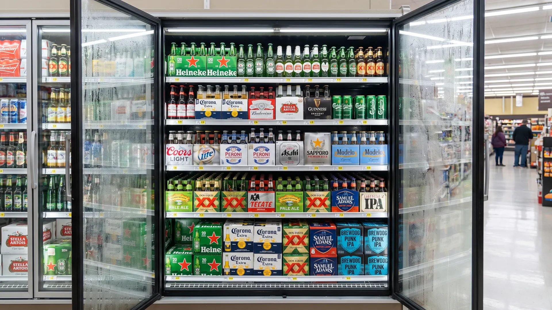
A beer logo has to work on a bottle label, a can, a bottle cap, a tap handle, a glass, and a sign above a bar, and it has to stand out on a crowded shelf in a second. The best beer logos are bold, full of heritage or personality, and easy to spot from across a room.
What makes a good beer logo?
A clear story of origin: many of the biggest beer brands use crests, seals, founding dates, and city names, like Stella Artois, Pilsner Urquell, Paulaner, and Beck's, because heritage builds trust.
A symbol that works on a tap handle: the Heineken star, the Guinness harp, the Corona crown, and the Dos Equis XX can be recognised even when the name is too small to read.
Personality for craft beer: independent breweries use playful mascots, hand-drawn type, and simple wordmarks that let colourful can art do the talking.
Below are 45 beer logos in five groups: global beer icons, European brewing classics, Asian and Latin American beers, American craft breweries, and design-led independent breweries. Each logo has a slide with my handwritten notes and a short explanation. If you are launching a drinks brand, see my branding checklist and my guides to logo colours and logo fonts. For hospitality brands, see my restaurant logos and hotel logos.
45 beer logos
The boards below show all 45 beer logos in one consistent format, grouped into global icons, European classics, Asian and Latin American beers, American craft breweries, and independent breweries.
Each logo is reviewed for its design decisions, not for the taste, size, or popularity of the beer.
01 — Global beer icons
The world's biggest beer brands have logos that work in every bar on the planet, built on strong symbols like stars, crowns, harps, and bowties.
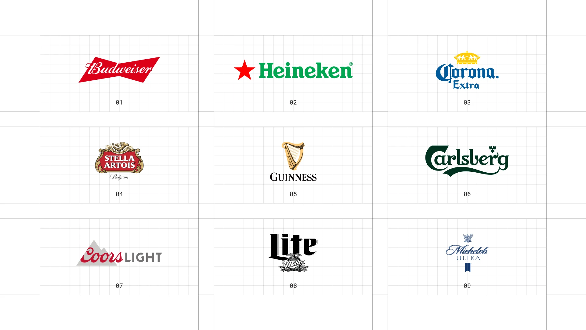
This is a visual comparison of beer logos, not a ranking of beers.
Look at how each logo uses type, colour, and one symbol to signal heritage, fun, or craft.
01 Budweiser
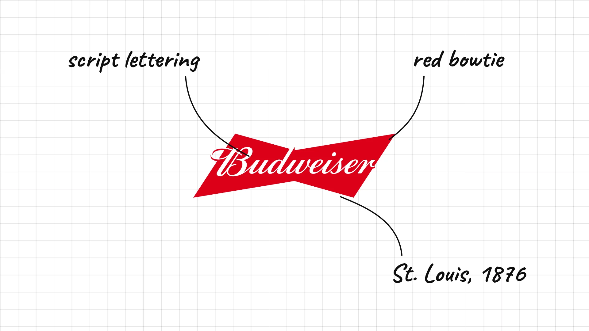
Budweiser Anheuser-Busch introduced Budweiser in St. Louis in 1876.
The script lettering comes straight from the classic bottle label.
The red bowtie shape gives the brand a symbol that works even without words.
02 Heineken
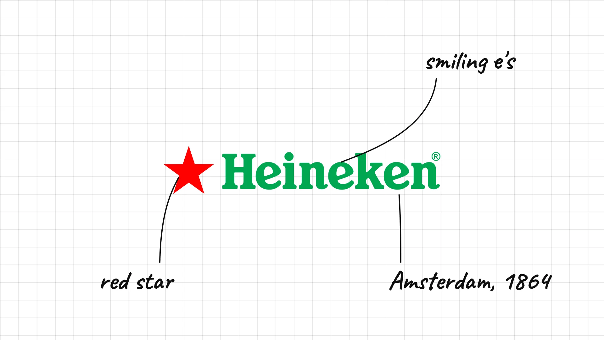
Heineken Gerard Adriaan Heineken bought the Haystack brewery in Amsterdam in 1864.
The lowercase "e" letters are tilted back, which is often described as making the logo look like it is smiling.
The red star and green colour are recognised in bars all over the world.
03 Corona
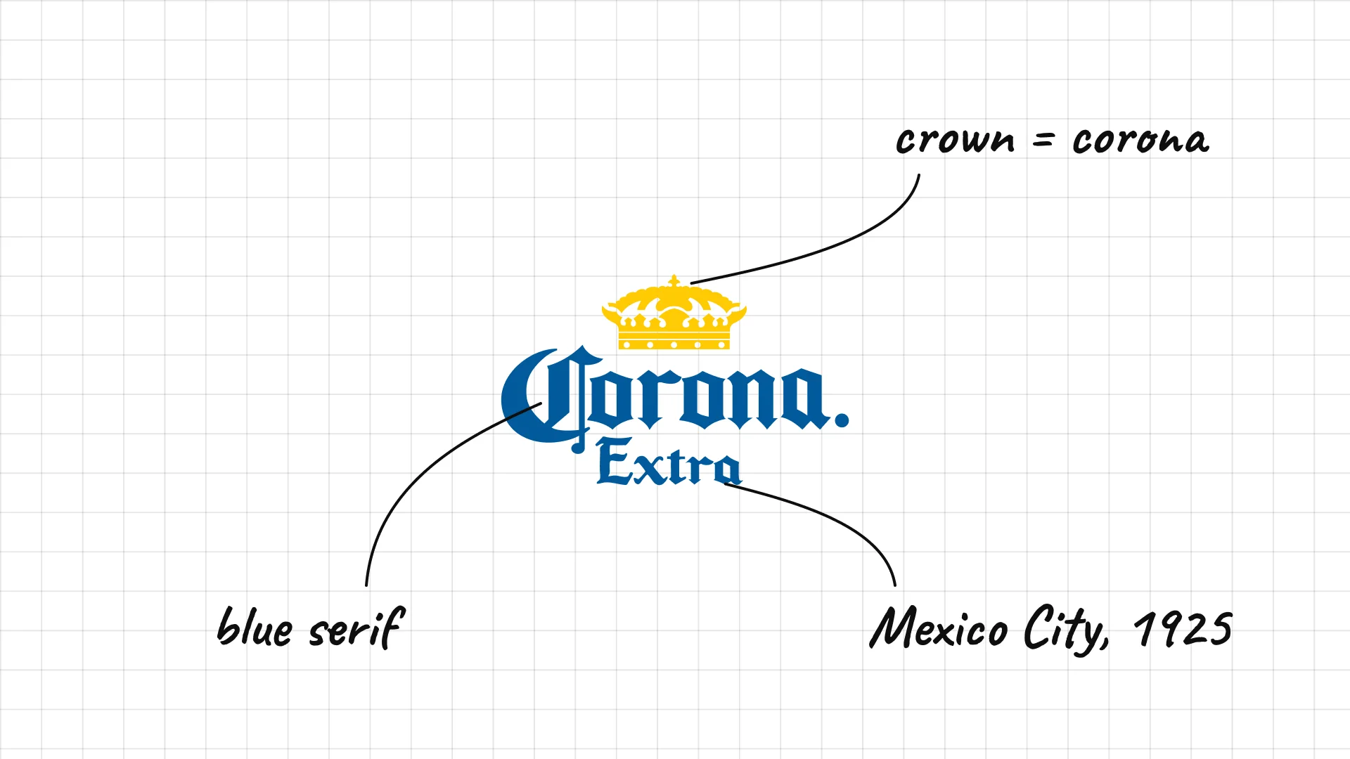
Corona Cervecería Modelo launched Corona in Mexico City in 1925.
The crown is a direct picture of the name, which means crown in Spanish.
Blue lettering and a gold crown make the label feel sunny and relaxed, like the beach ads.
04 Stella Artois
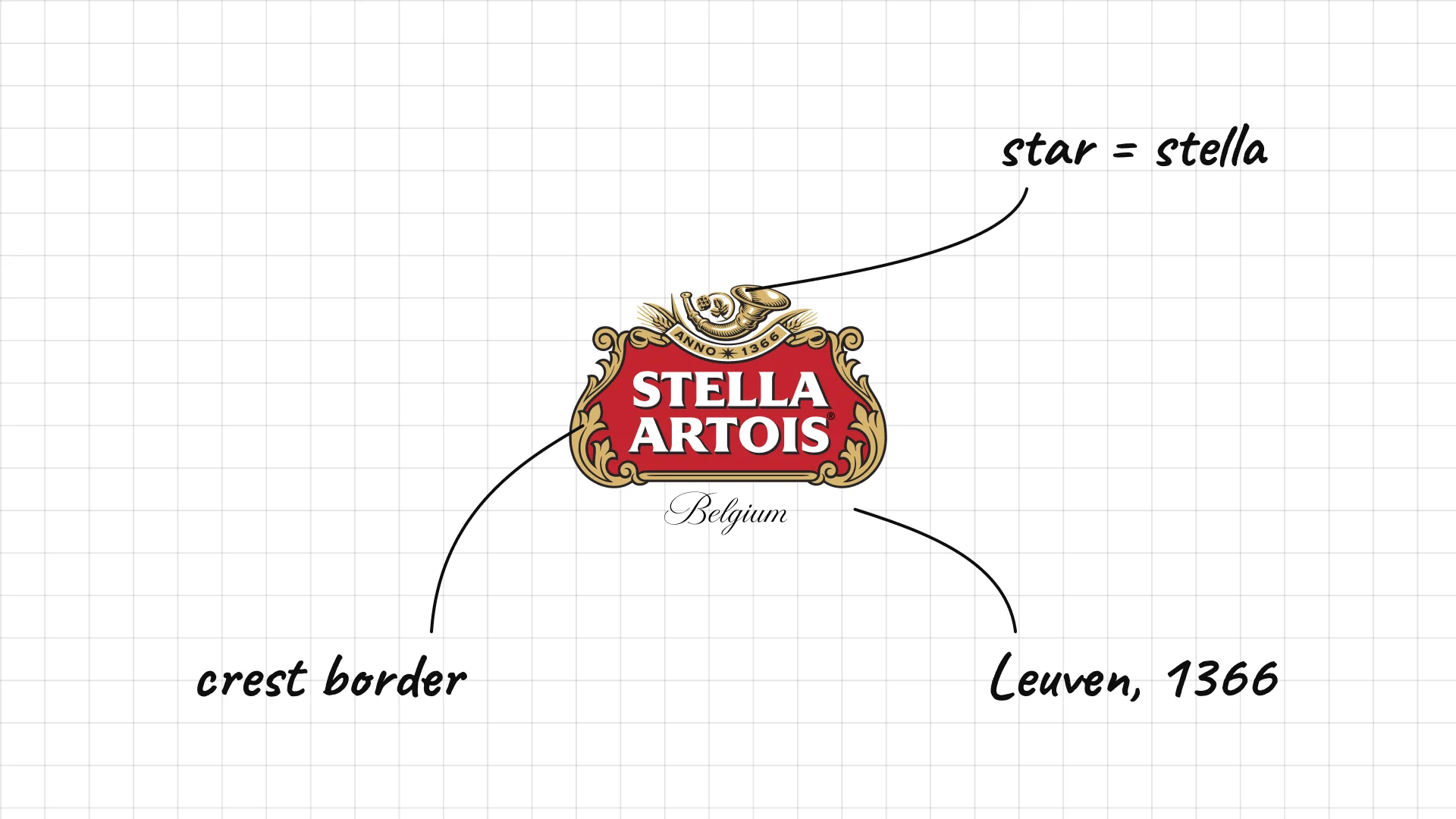
Stella Artois was first brewed as a Christmas beer in Leuven, Belgium, in 1926, and the brewery traces its roots to 1366.
The star in the name (Stella means star in Latin) sits above the wordmark like a seal.
The ornate border and the 1366 date make it look like an old European crest.
05 Guinness
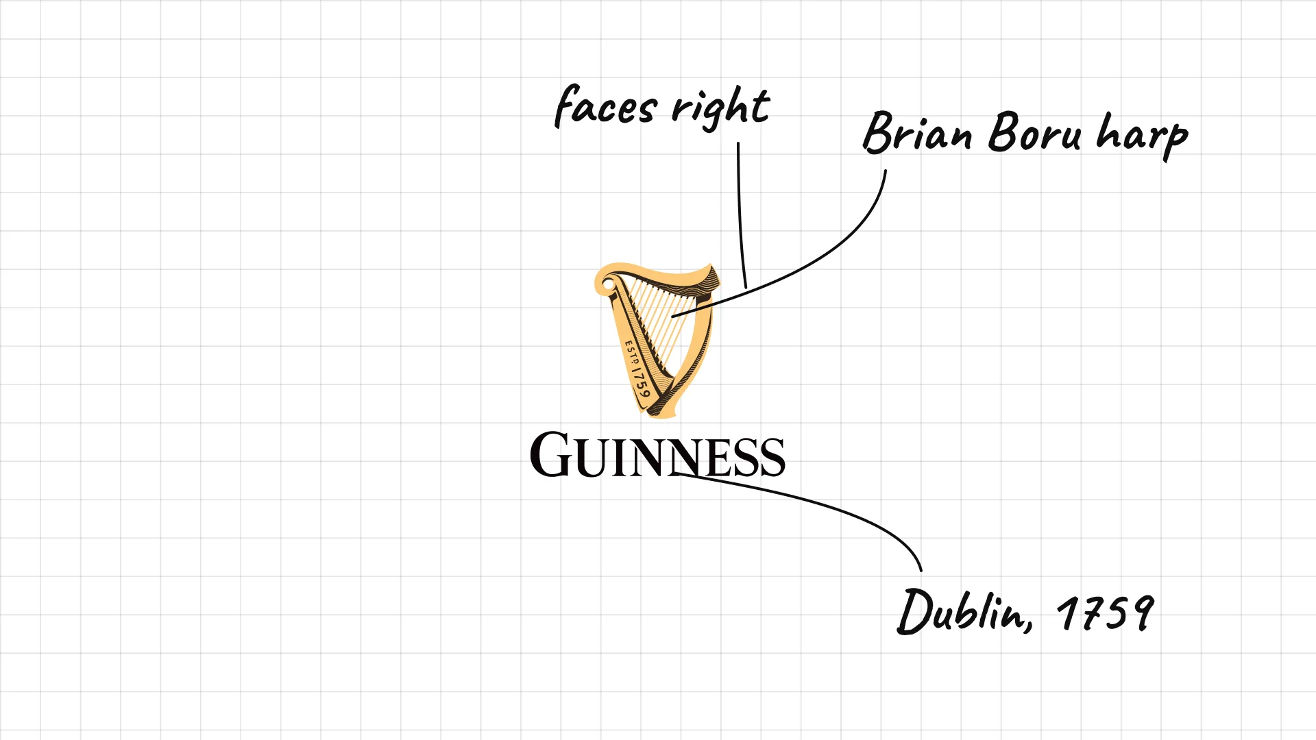
Guinness Arthur Guinness signed a 9,000-year lease on the St. James's Gate brewery in Dublin in 1759.
The harp is based on the medieval Brian Boru harp and was registered as a trademark in 1876.
The harp faces right, the opposite way from the harp on the Irish state seal.
06 Carlsberg
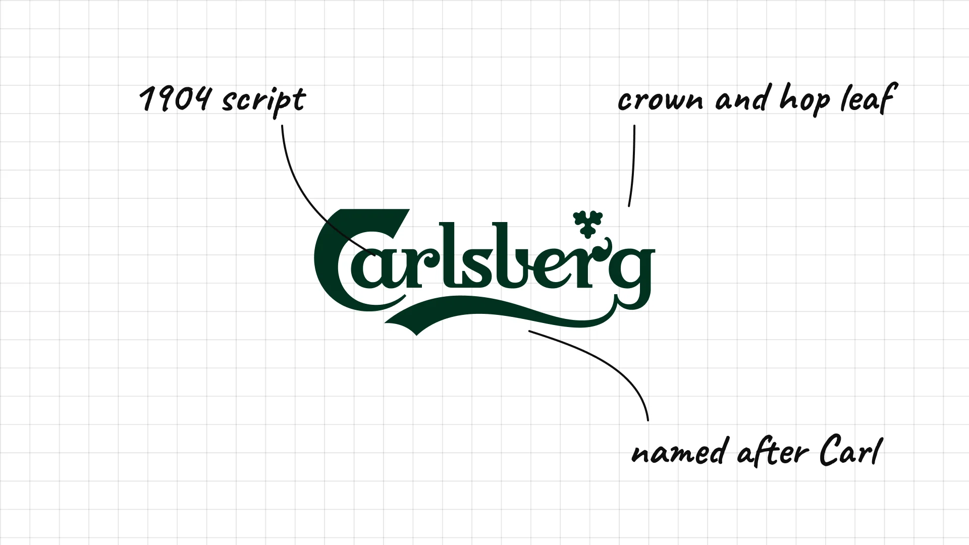
Carlsberg J.C. Jacobsen founded Carlsberg in Copenhagen in 1847 and named it after his son Carl.
The flowing script was drawn in 1904 by the architect Thorvald Bindesbøll.
A small crown and hop leaf sit above the name.
07 Coors Light
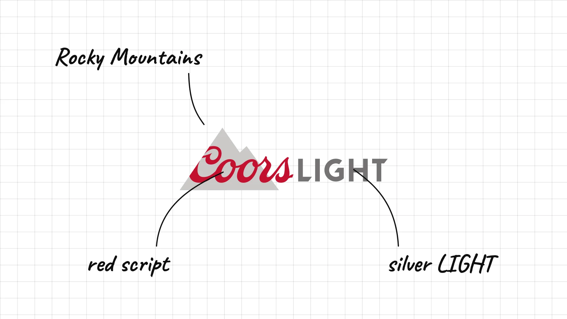
Coors Light Adolph Coors founded his brewery in Golden, Colorado, in 1873, and Coors Light launched in 1978.
Mountains in the logo point to the Rocky Mountains and the idea of cold, fresh water.
Red Coors script over a silver LIGHT keeps the classic family name in front.
08 Miller Lite
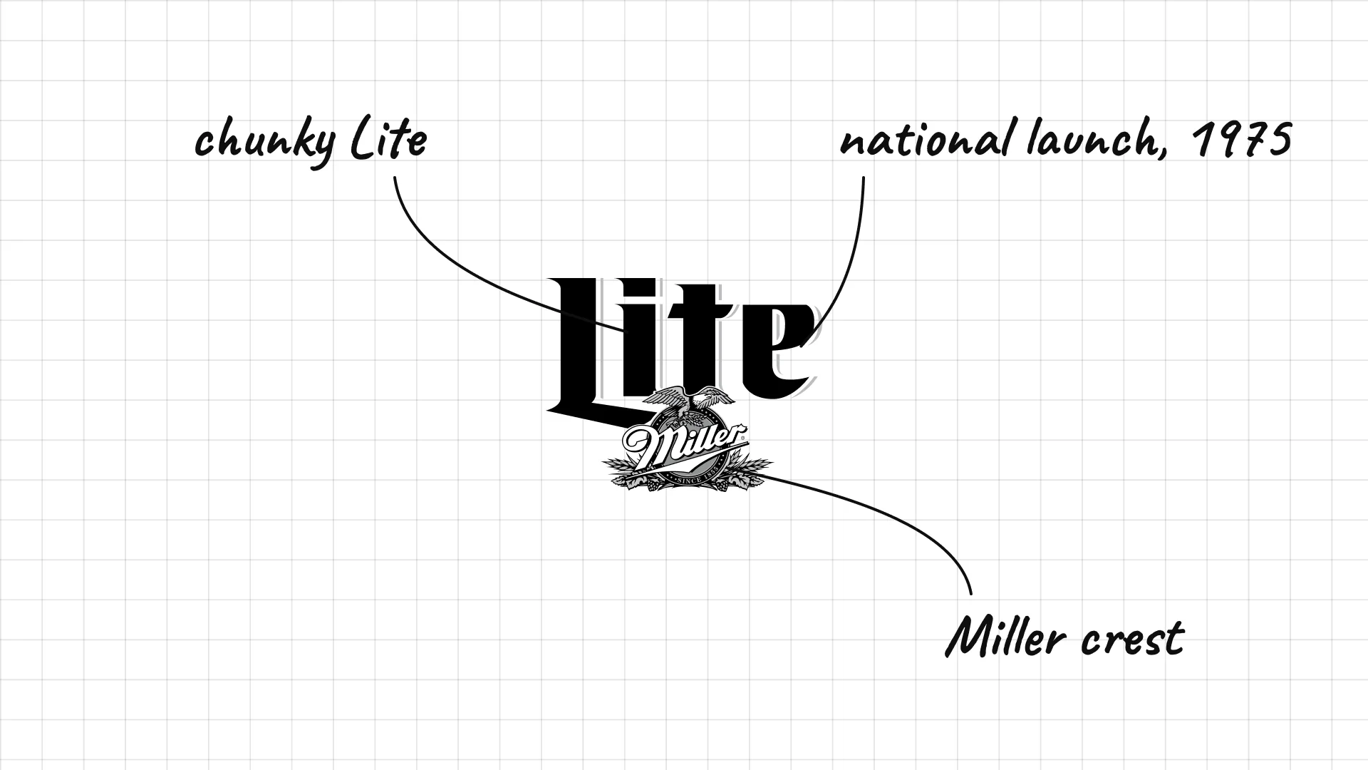
Miller Lite launched nationally in 1975, one of the first successful light beers in the US.
The retro wordmark brought back the brand's original 1970s look in 2014.
The small Miller crest under the word Lite keeps the link to the parent brewery.
09 Michelob Ultra
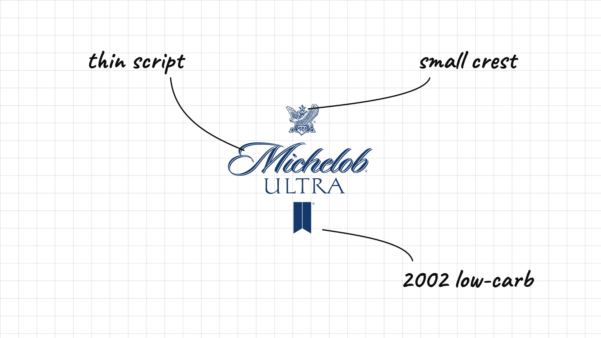
Michelob Ultra Anheuser-Busch launched Michelob Ultra in 2002 as a low-carb beer.
The thin, spaced capitals feel sporty and clean, like a fitness brand.
A small crest above the Michelob script keeps the link to the older parent brand.
02 — European brewing classics
European breweries lean on centuries of history, with crests, seals, monks, and founding dates that make the beer feel authentic.
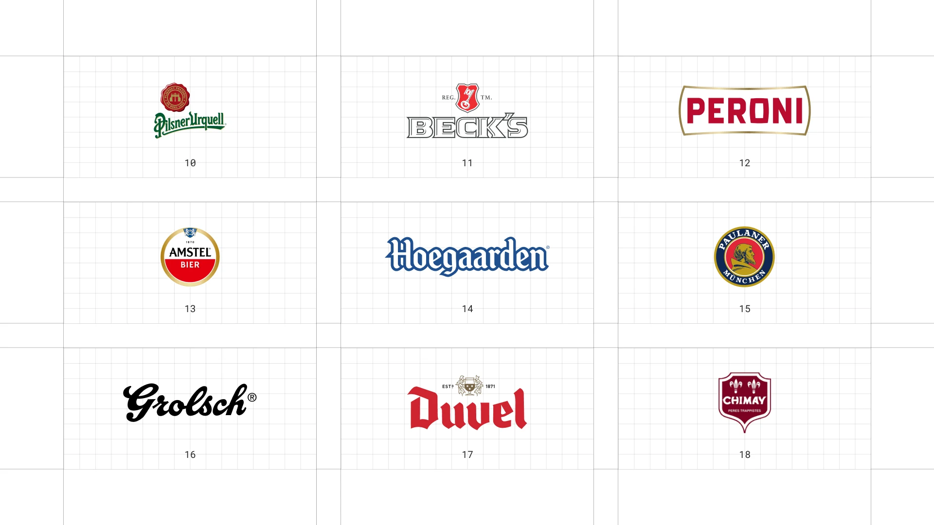
This is a visual comparison of beer logos, not a ranking of beers.
Look at how each logo uses type, colour, and one symbol to signal heritage, fun, or craft.
10 Pilsner Urquell
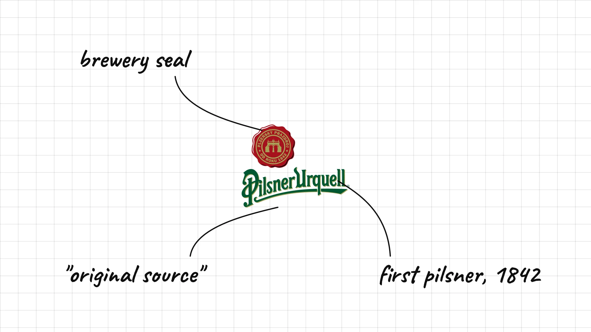
Pilsner Urquell was first brewed in Plzeň, in today's Czech Republic, in 1842, and it was the first golden pilsner.
The seal with the brewery gate shows the building where pilsner was invented.
Urquell means "original source" in German, so the name itself is a claim to be first.
11 Beck's
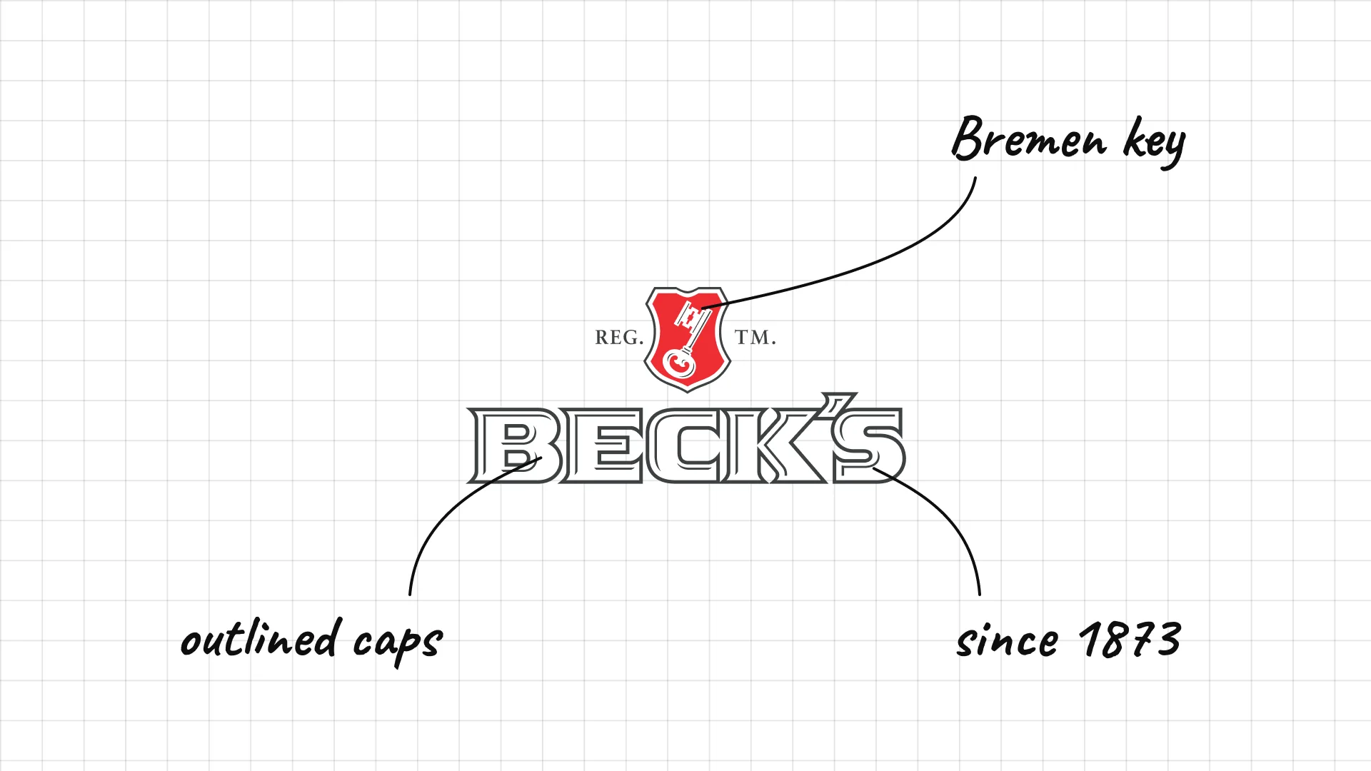
Beck's Heinrich Beck and partners founded the Beck's brewery in Bremen, Germany, in 1873.
The key comes from the coat of arms of Bremen.
The white, red and green label makes the bottle easy to spot from across a bar.
12 Peroni
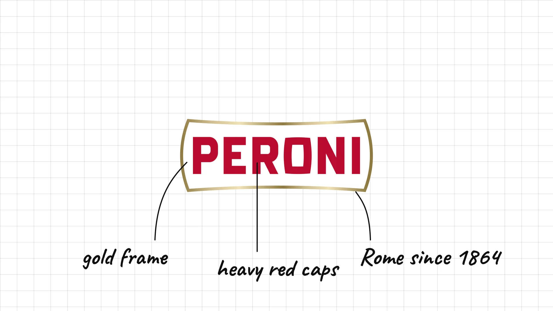
Peroni Francesco Peroni started brewing in Vigevano, Italy, in 1846 and moved the brewery to Rome in 1864.
Heavy red capitals inside a gold frame look like a classic Italian label.
Its export lager, Nastro Azzurro, means "blue ribbon".
13 Amstel
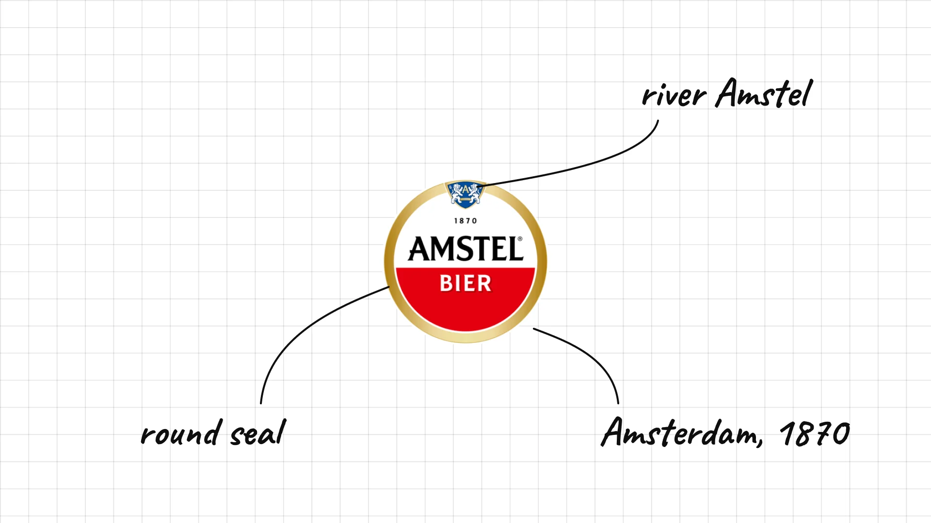
Amstel was founded in Amsterdam in 1870 and named after the river Amstel.
Bold red capitals on a white field are simple and easy to read.
The coat-of-arms style badge suggests a long Dutch brewing tradition.
14 Hoegaarden
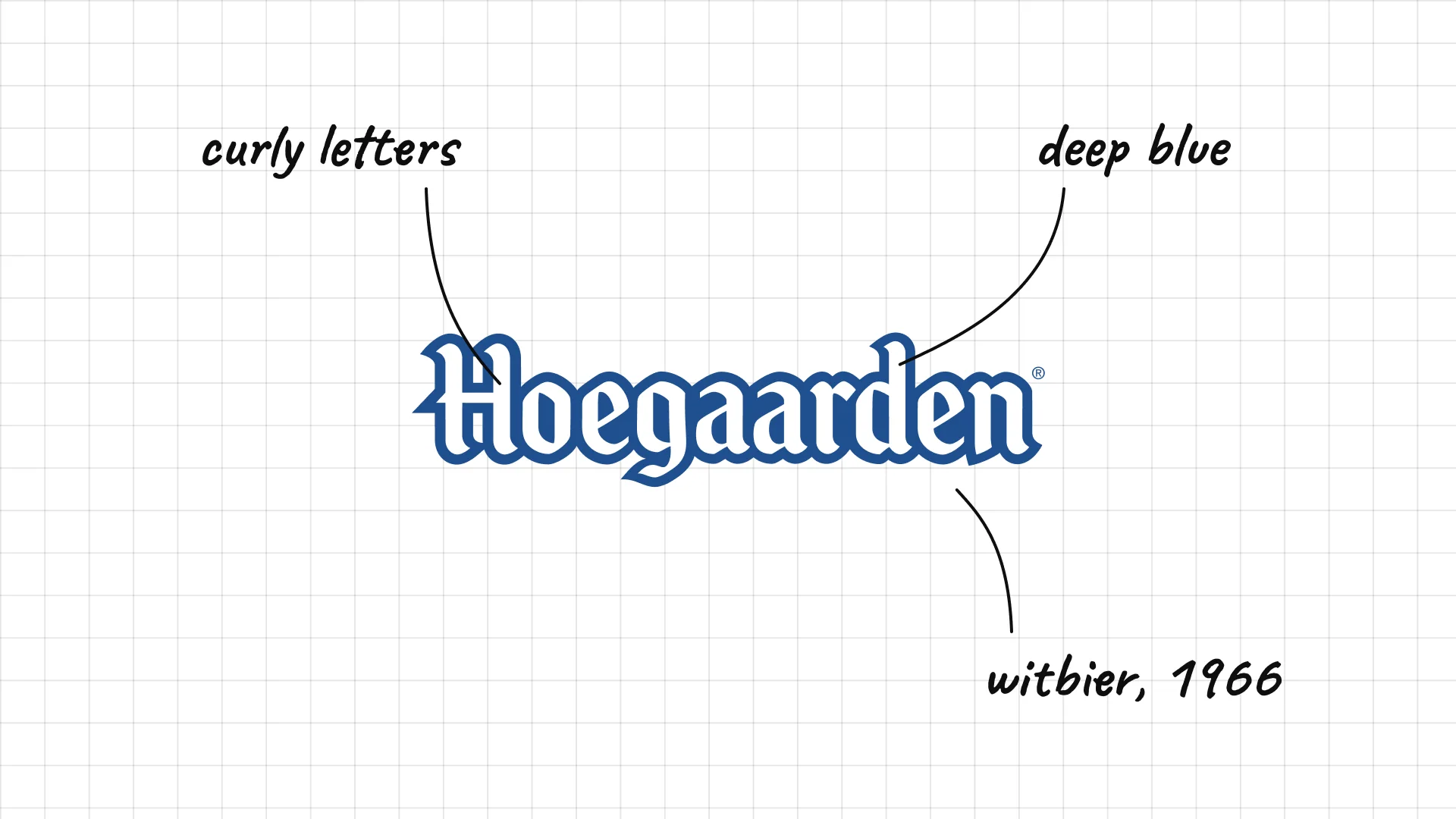
Hoegaarden Pierre Celis revived Belgian witbier in the village of Hoegaarden in 1966.
Heavy, curly lettering looks hand-painted, like an old village sign.
The deep blue colour matches the brand's cloudy white beer and its blue glassware.
15 Paulaner
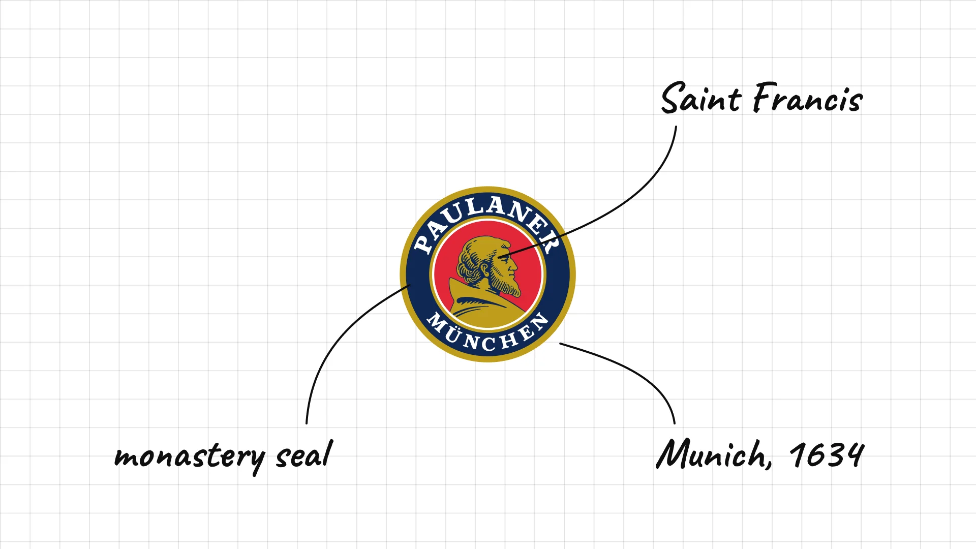
Paulaner traces its history to the monks of the Neudeck ob der Au monastery in Munich in 1634.
The portrait shows Saint Francis of Paola, the founder of the monks' order.
The circular badge looks like a monastery seal, which tells the origin story at a glance.
16 Grolsch
Grolsch dates its brewing to 1615 in Groenlo, in the Netherlands.
The bouncy script reads like a signature, which makes the brand feel personal.
The brand is equally famous for its swing-top bottle, which the logo often appears on.
17 Duvel
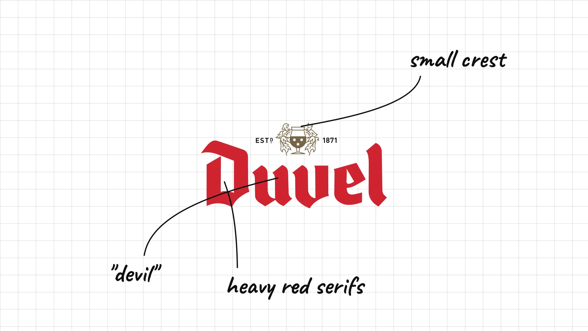
Duvel The Moortgat family brewery in Belgium has made Duvel since the 1920s; the name means "devil" in local dialect.
Heavy red letters with sharp serifs look bold, a hint at how strong the beer is.
The name is a joke about the strength of the beer, and the logo leans into it with confident type.
18 Chimay
Chimay Trappist monks at Scourmont Abbey in Chimay, Belgium, have brewed beer since 1862.
The logo shows the abbey's coat of arms, so the monks' authority is built into it.
Serif capitals and a red seal look like an official mark of origin.
03 — Asian and Latin American beers
Asian and Latin American beer logos use national symbols, mythical animals, and bold type to stand for their home country around the world.
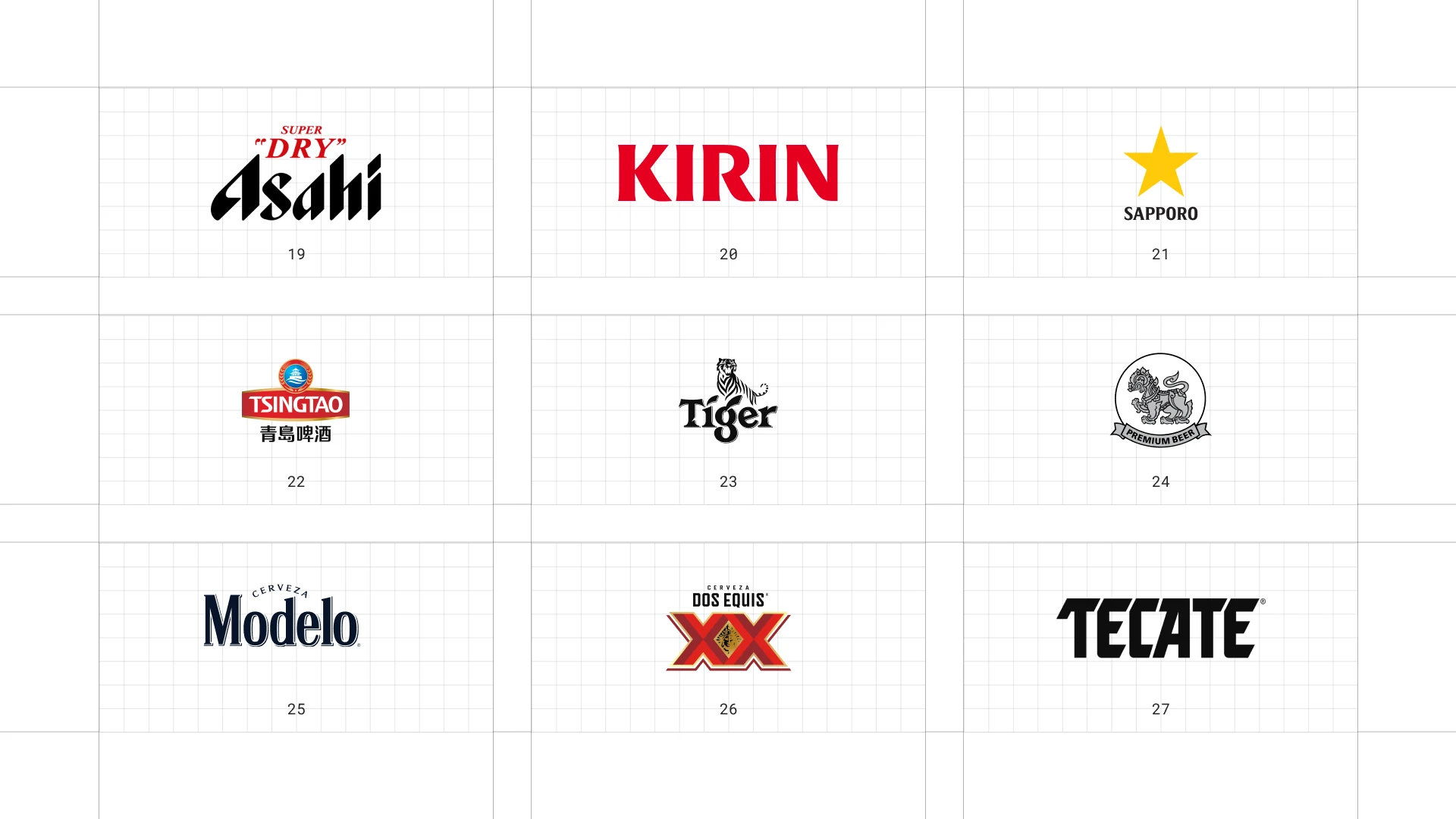
This is a visual comparison of beer logos, not a ranking of beers.
Look at how each logo uses type, colour, and one symbol to signal heritage, fun, or craft.
19 Asahi
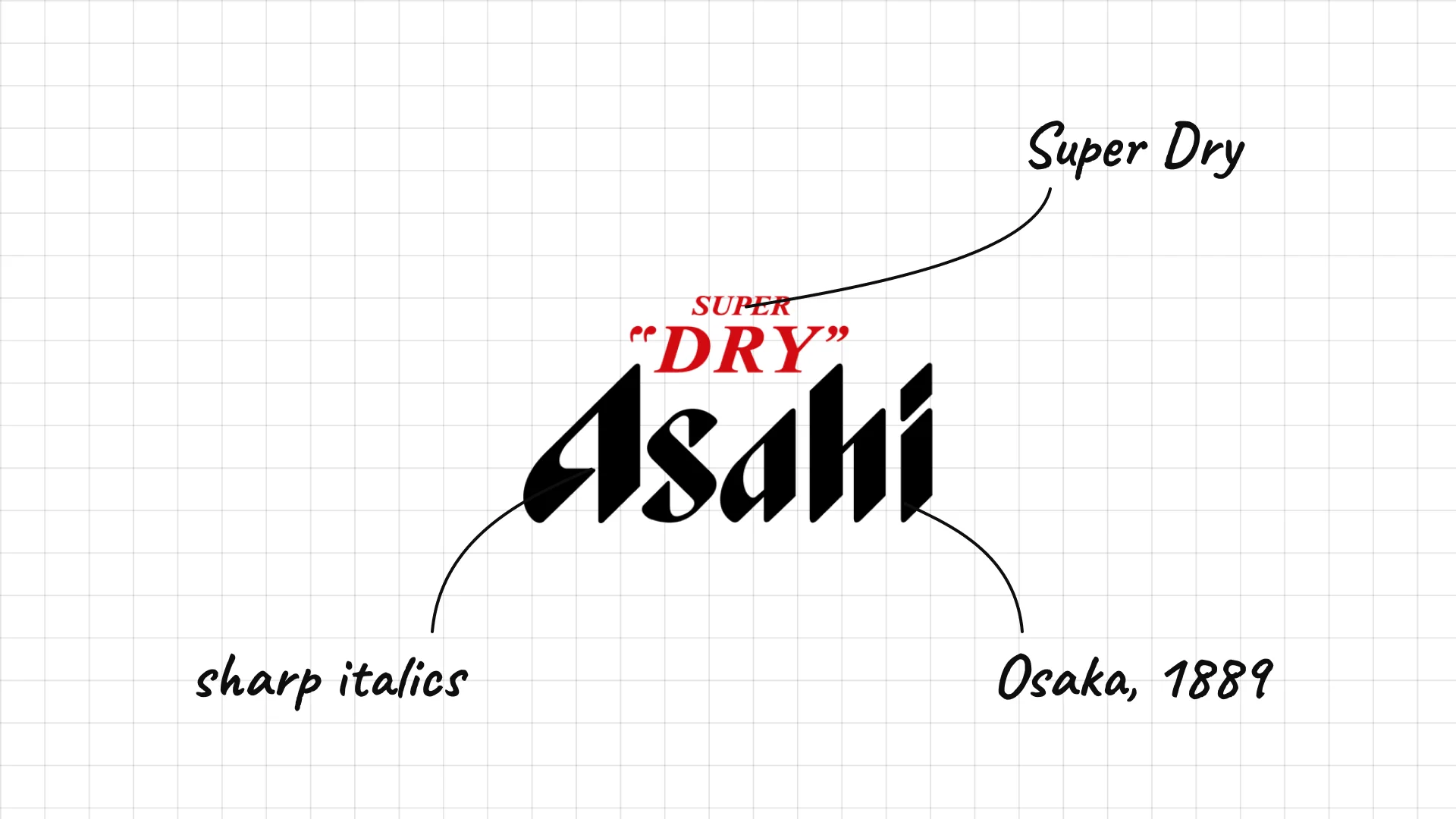
Asahi traces its history to the Osaka Beer Company, founded in 1889, and Asahi Super Dry launched in 1987.
Sharp, slanted capitals look fast and crisp, like the "dry" taste the brand promises.
The silver and black colours of Super Dry feel modern and Japanese.
20 Kirin
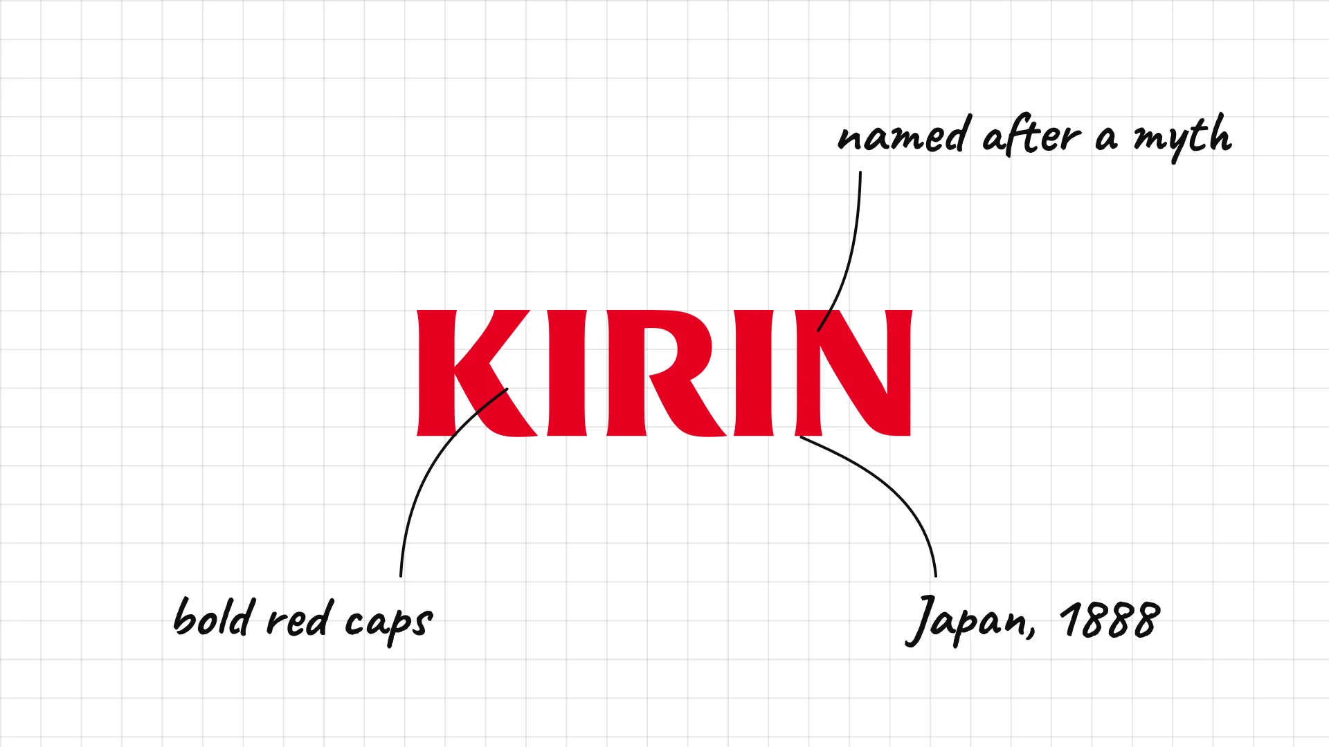
Kirin beer was first sold in Japan in 1888.
Bold red capitals keep the company name simple and strong.
On the beer labels the brand also uses the kirin, a mythical creature with katakana characters hidden in its mane.
21 Sapporo
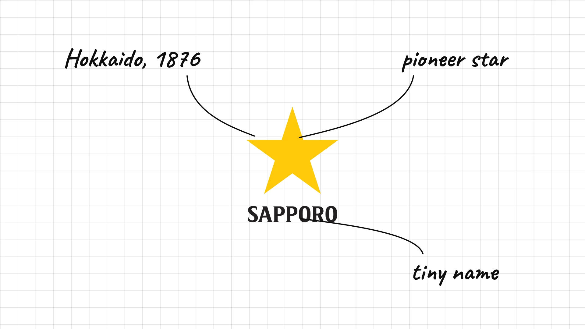
Sapporo beer was first brewed in Sapporo, Japan, in 1876.
The star comes from the pioneer star of Hokkaido, the island where Sapporo is.
The star is large and the name small, so the symbol does most of the work.
22 Tsingtao
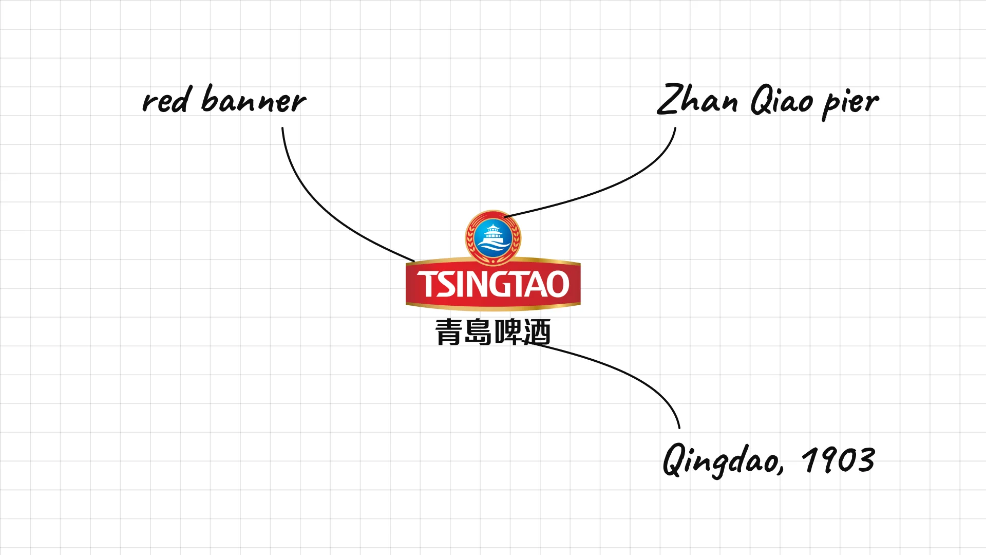
Tsingtao German and British settlers founded the Tsingtao brewery in Qingdao, China, in 1903.
The badge shows the Zhan Qiao pier, a famous landmark in Qingdao.
The green colour and the old spelling of the city name tell you where the beer comes from.
23 Tiger
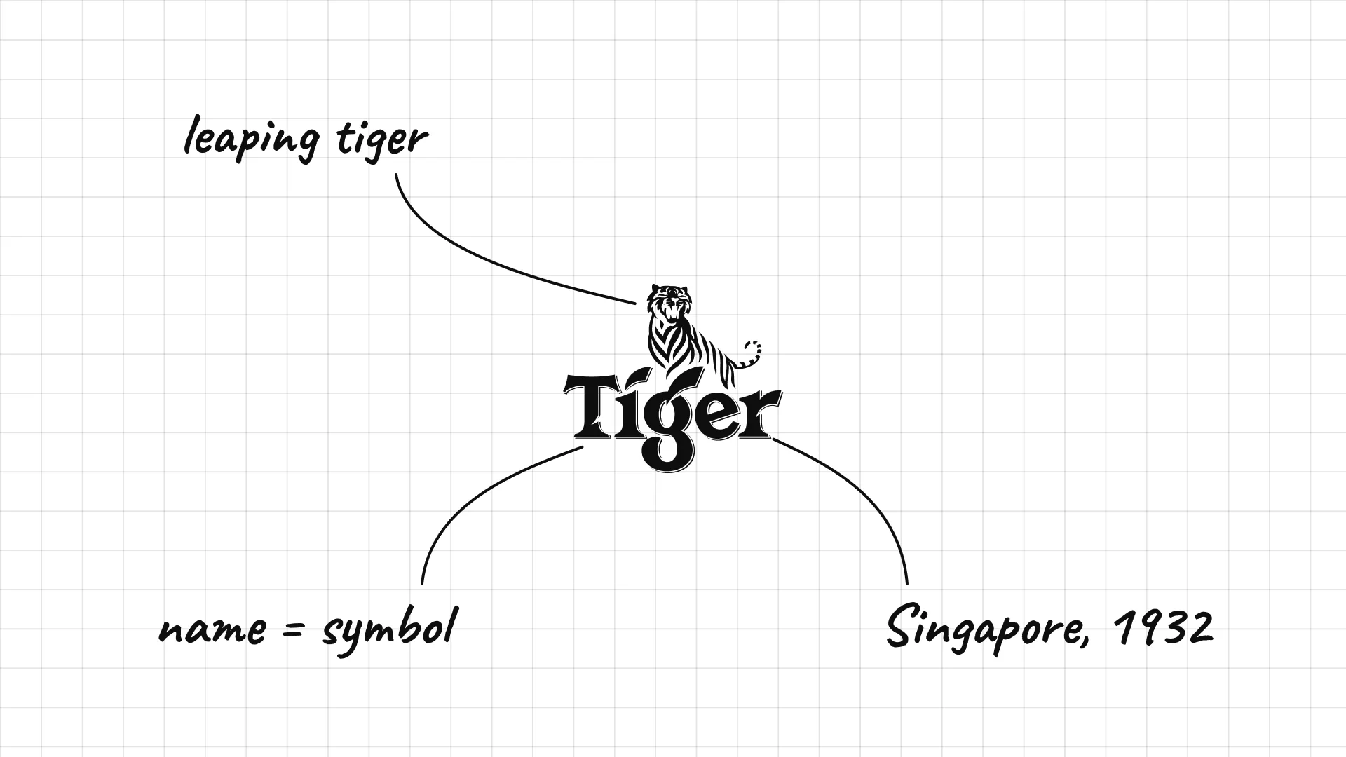
Tiger beer was first brewed in Singapore in 1932.
The tiger symbol is a direct picture of the name.
The tiger leaps over the letters, so the symbol and the name form one lockup.
24 Singha
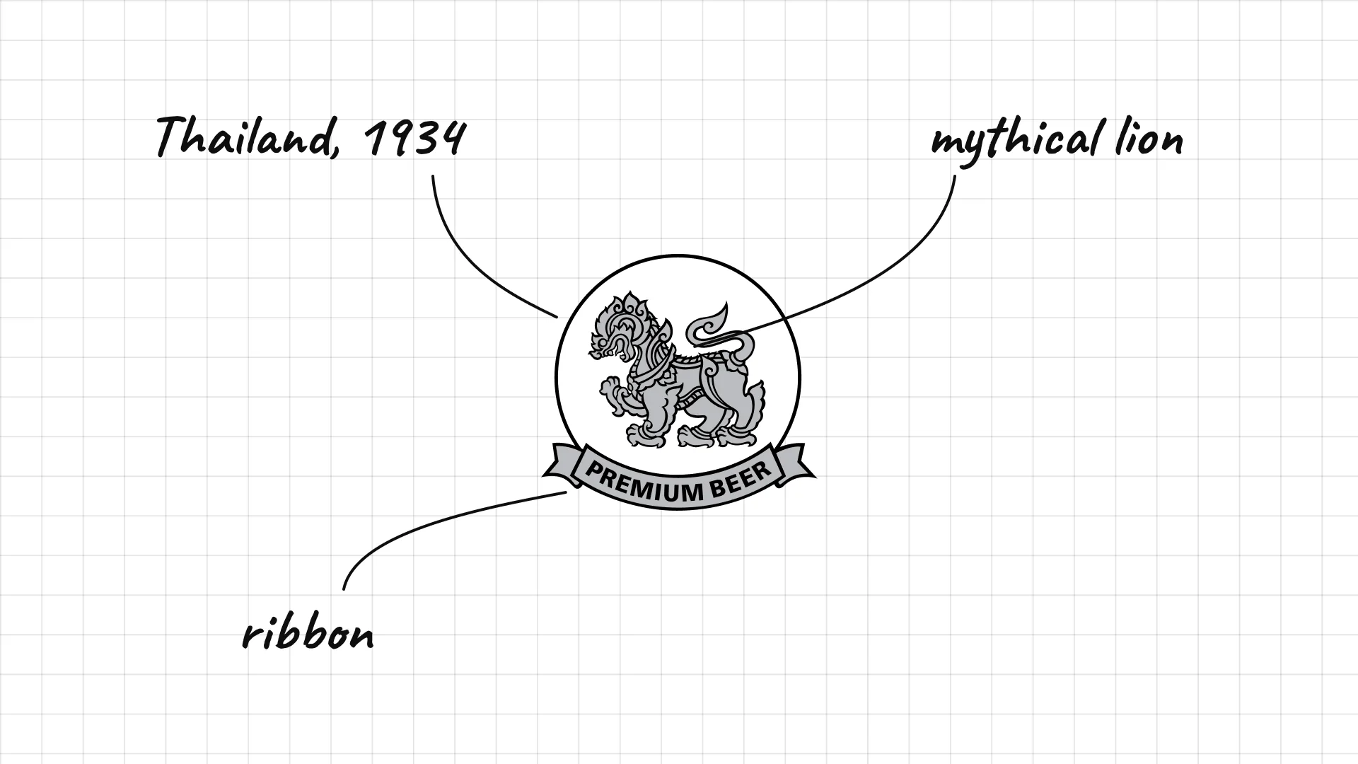
Singha Boon Rawd Brewery launched Singha in Thailand in 1934.
The lion is the Singha, a lion from Thai and Hindu mythology.
The lion sits in a round seal with a ribbon, like an official emblem.
25 Modelo
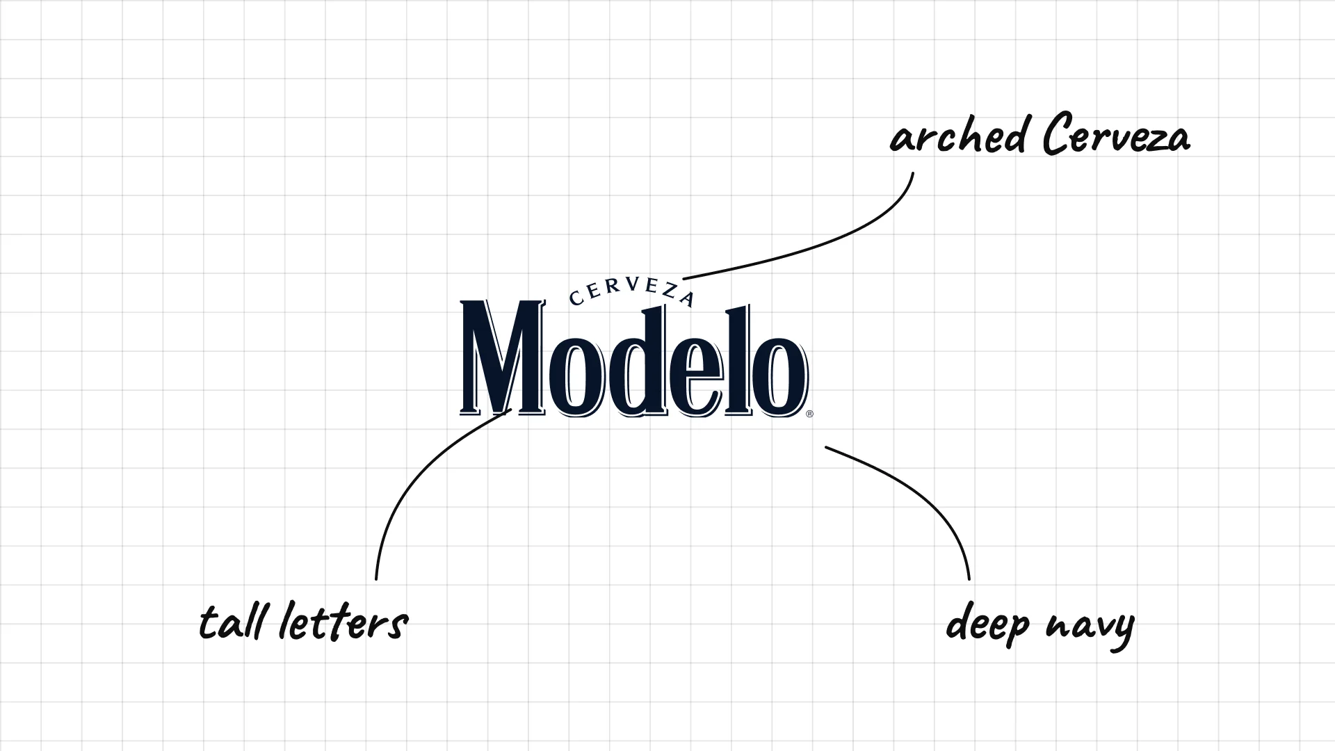
Modelo Cervecería Modelo was founded in Mexico City in 1925, and Modelo Especial launched the same year.
Tall, condensed letters with a small arched "Cerveza" above look like a classic label.
Deep navy makes a mass-market beer feel premium.
26 Dos Equis
Dos Equis German brewer Wilhelm Hasse created Dos Equis in Mexico in 1897.
The two X letters were meant to celebrate the start of the 20th century.
The simple XX symbol works alone on bottle caps and tap handles.
27 Tecate
Tecate was first brewed in the town of Tecate, Baja California, in 1944.
The heavy, condensed capitals are one of the boldest wordmarks in beer.
The wide, flat letters stay readable on red cans from across a room.
04 — American craft breweries
The American craft beer movement brought illustrated mascots, landscapes, and badges that feel independent and local.
This is a visual comparison of beer logos, not a ranking of beers.
Look at how each logo uses type, colour, and one symbol to signal heritage, fun, or craft.
28 Sierra Nevada
Sierra Nevada Ken Grossman founded Sierra Nevada in Chico, California, in 1980.
The mountain scene shows the Sierra Nevada range the brewery is named after.
The illustrated landscape feels outdoorsy and natural, a big part of the brand's craft image.
29 Samuel Adams
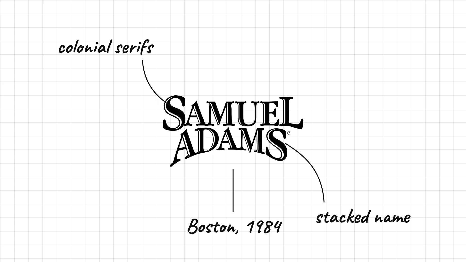
Samuel Adams Jim Koch founded the Boston Beer Company in 1984 and named the beer after the patriot Samuel Adams.
Old-style serif capitals look like 18th-century printing.
The stacked name puts the revolutionary patriot himself at the centre of the brand.
30 Lagunitas
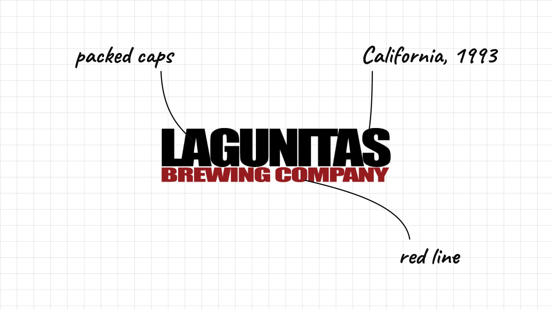
Lagunitas Tony Magee founded Lagunitas in Lagunitas, California, in 1993.
Heavy, tightly packed capitals look like an old handbill.
The smaller BREWING COMPANY line underneath adds a pop of red.
31 Dogfish Head
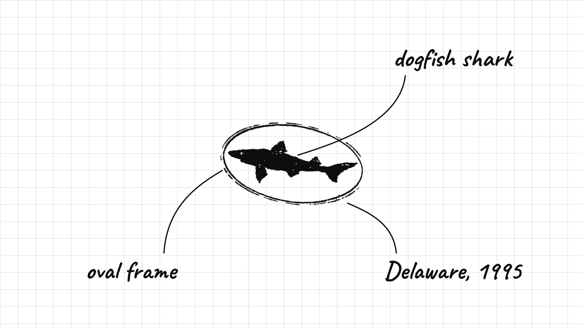
Dogfish Head Sam Calagione opened Dogfish Head in Rehoboth Beach, Delaware, in 1995.
The dogfish shark is a playful picture of the name.
Bold, chunky letters match the brewery's experimental, offbeat beers.
32 Stone Brewing
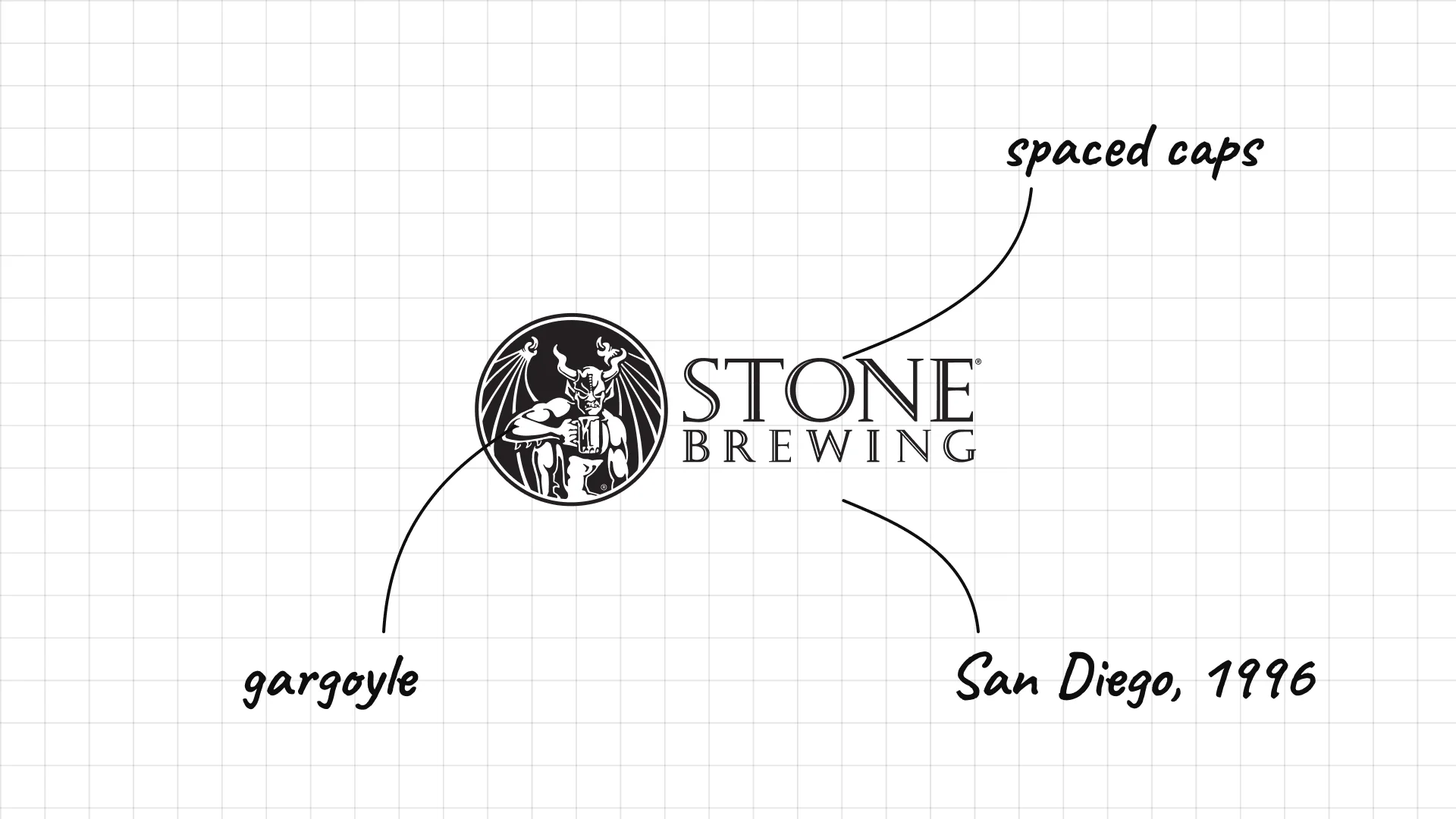
Stone Brewing Greg Koch and Steve Wagner founded Stone Brewing in San Diego in 1996.
The gargoyle is the brewery's guardian, said to keep bad spirits away from the beer.
The dark, aggressive style suits the brand's strong, hoppy beers.
33 New Belgium
New Belgium Jeff Lebesch and Kim Jordan founded New Belgium in Fort Collins, Colorado, in 1991.
The bicycle comes from the brewery's famous Fat Tire beer, named after a bike trip in Belgium.
The friendly, rounded style makes the brand feel approachable.
34 Goose Island
Goose Island John Hall opened Goose Island as a brewpub in Chicago in 1988.
The flying goose is a simple picture of the name, from an island in the Chicago River.
The badge shape looks like a classic brewery sign.
35 Brooklyn Brewery
Brooklyn Brewery Steve Hindy and Tom Potter founded Brooklyn Brewery in 1988, and Milton Glaser designed the logo.
The B inside a circle looks like the logo of a baseball team, which was Glaser's idea.
Glaser, who also created I ♥ NY, was paid partly in a share of the company.
36 Founders
Founders Mike Stevens and Dave Engbers founded Founders in Grand Rapids, Michigan, in 1997.
Hand-drawn script inside an oval looks like a classic beer label.
The brewery's slogan "Brewed for us" sits behind a plain, confident mark.
05 — Design-led independent breweries
A new wave of independent breweries treats beer like a design brand, with simple wordmarks and bold can art that changes with every release.
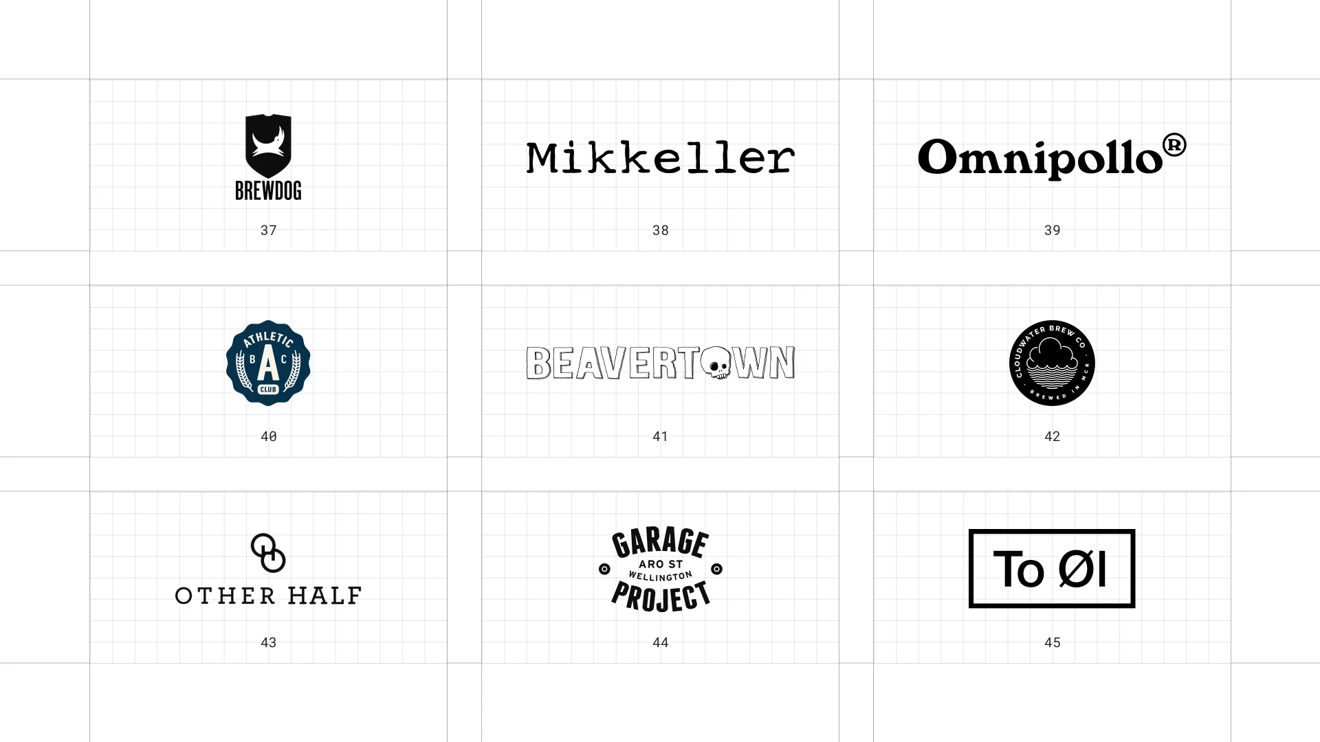
This is a visual comparison of beer logos, not a ranking of beers.
Look at how each logo uses type, colour, and one symbol to signal heritage, fun, or craft.
37 BrewDog
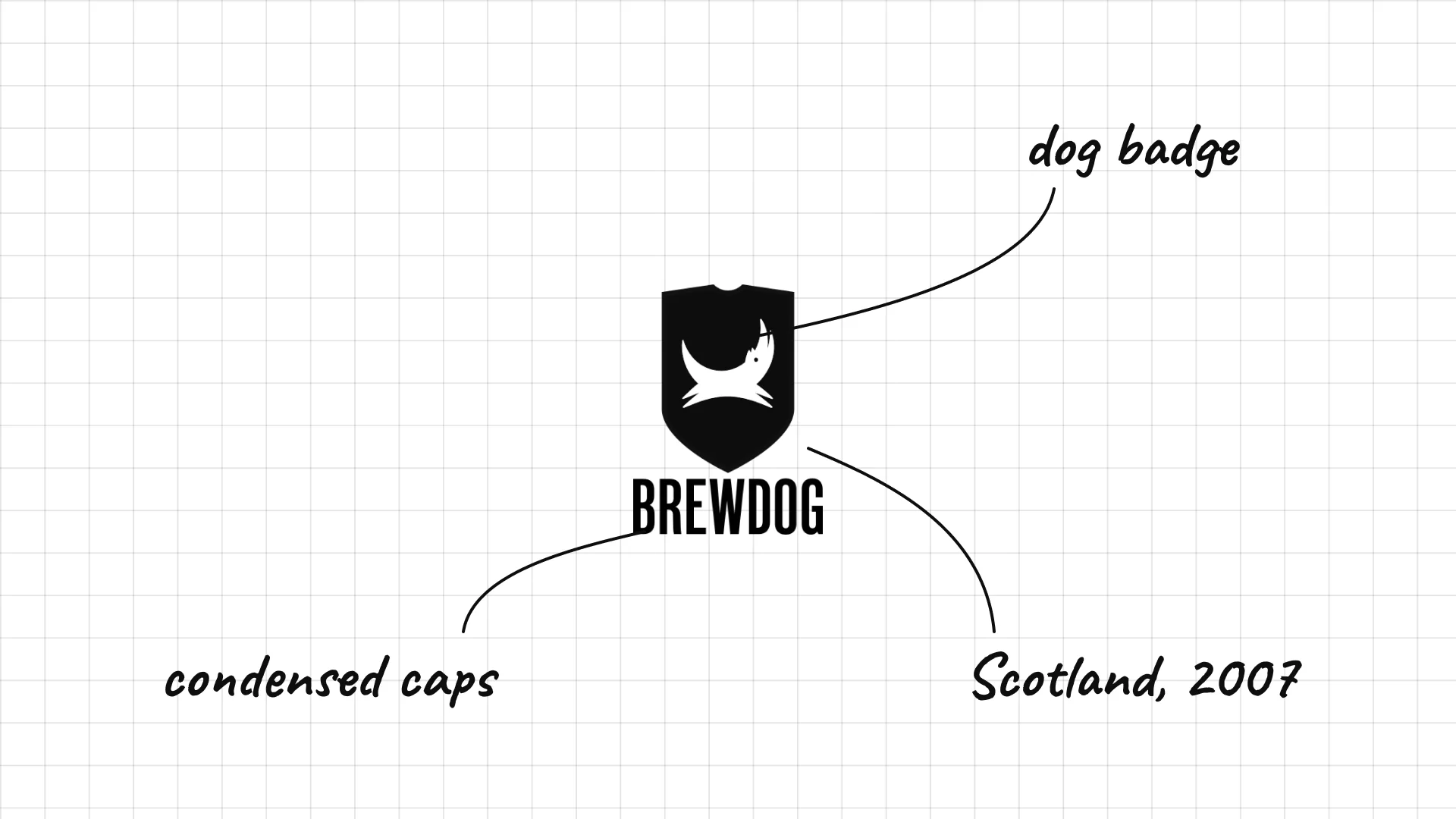
BrewDog James Watt and Martin Dickie founded BrewDog in Fraserburgh, Scotland, in 2007.
The wordmark is set in a heavy, stencil-like style that feels loud and rebellious.
The dog in the name and logo comes from the founders' dog, Bracken.
38 Mikkeller
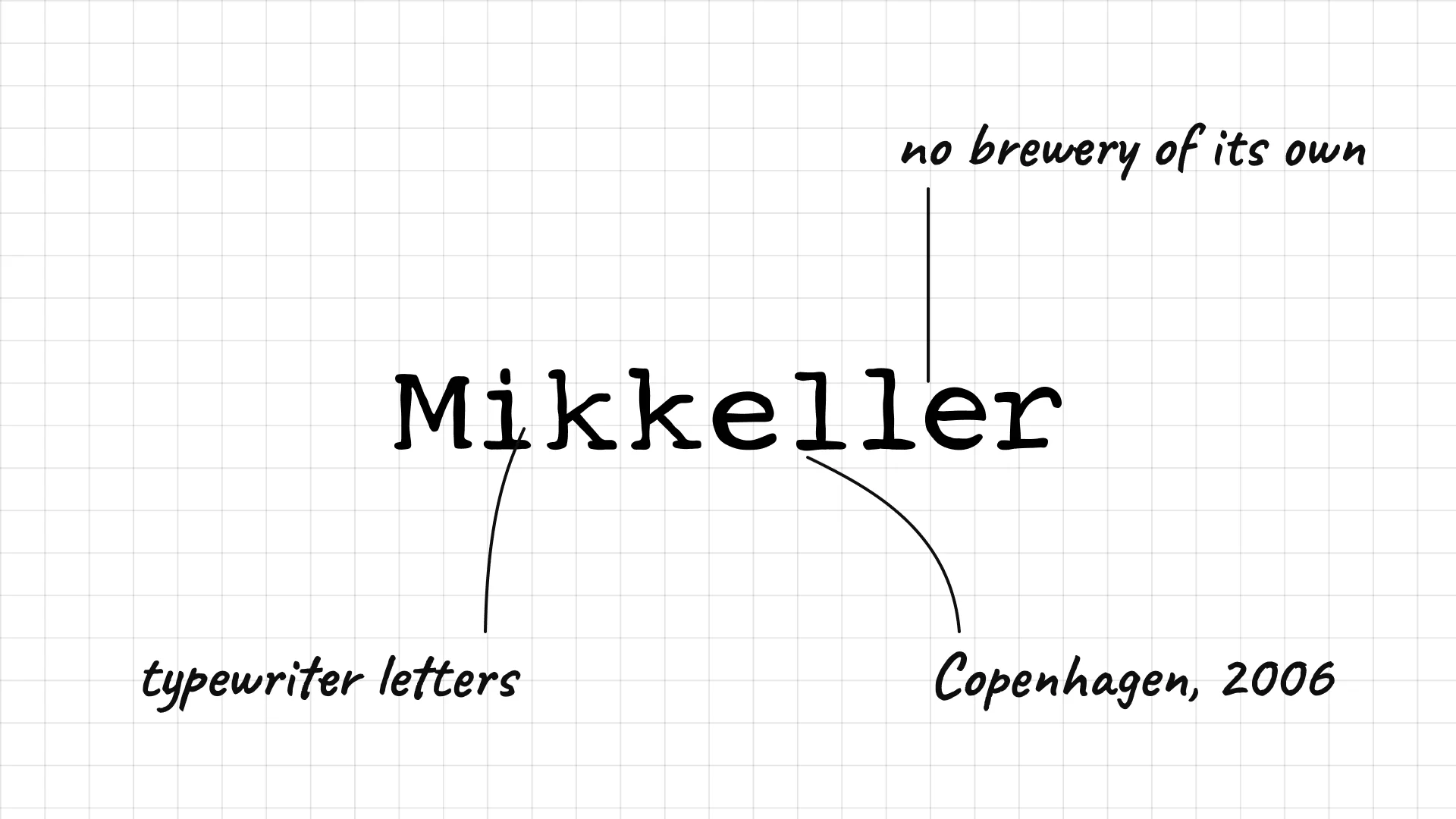
Mikkeller Mikkel Borg Bjergsø founded Mikkeller in Copenhagen in 2006 as a "gypsy" brewer without a brewery of his own.
The cartoon characters drawn by Keith Shore became as famous as the beer.
The simple logo lets the colourful label art do most of the work.
39 Omnipollo
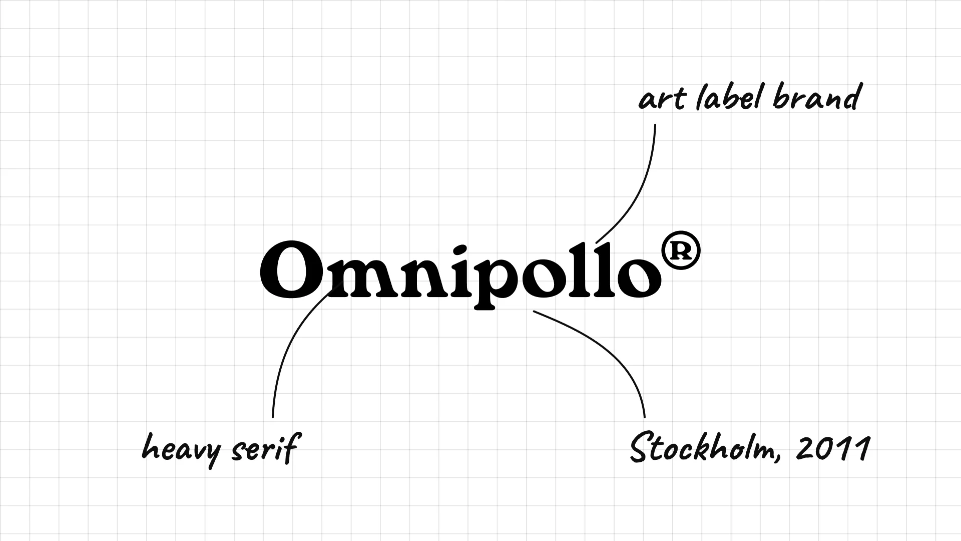
Omnipollo Brewer Henok Fentie and artist Karl Grandin founded Omnipollo in Stockholm in 2011.
The logo is minimal, because Grandin's surreal label art is the real brand.
The name sounds playful and international, matching the experimental beers.
40 Athletic Brewing
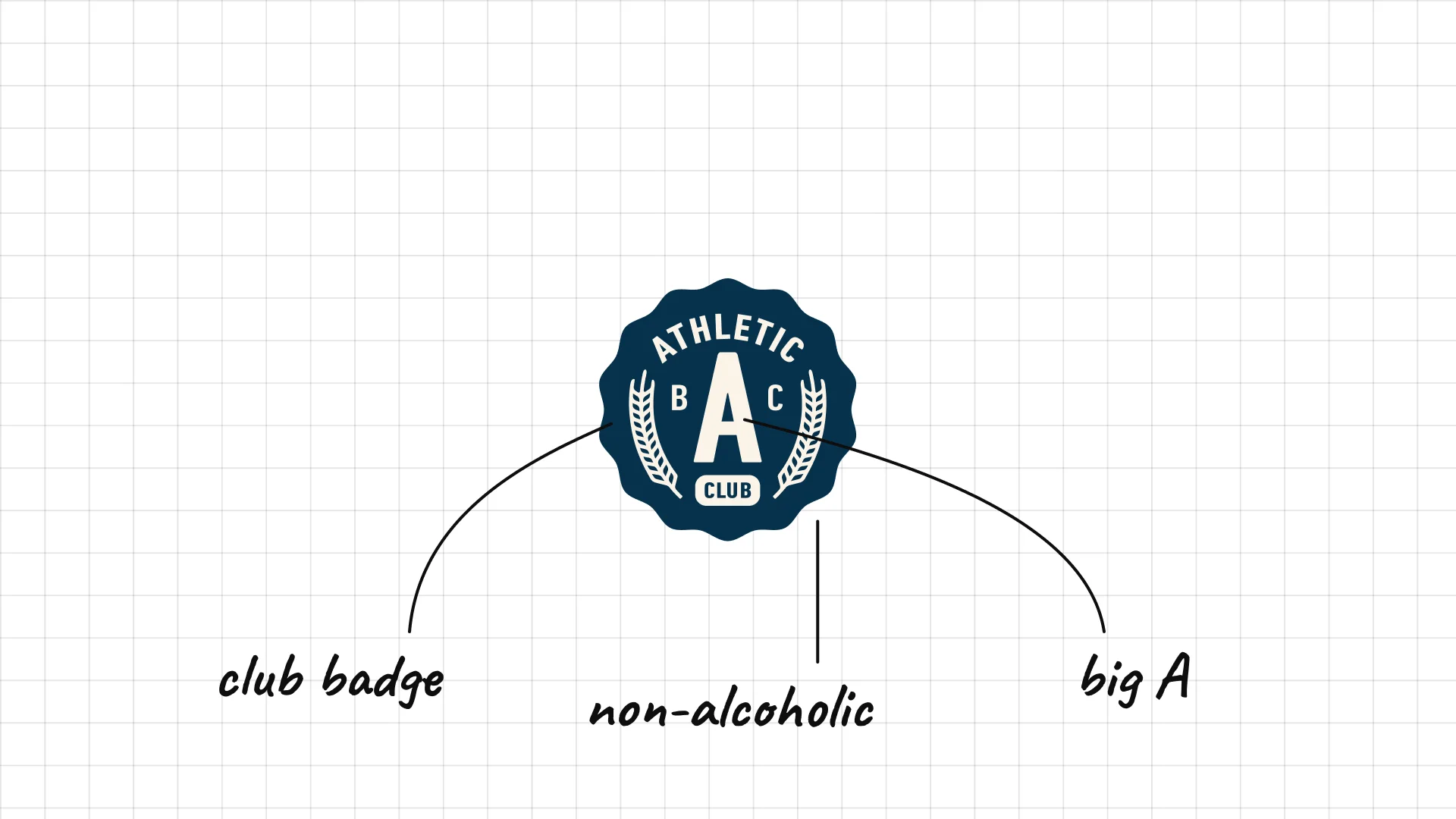
Athletic Brewing Bill Shufelt and John Walker founded Athletic Brewing in Connecticut in 2017 to make non-alcoholic craft beer.
The round club badge with an A looks like a sports team crest.
Clean lettering looks like an outdoor gear brand, not a typical beer label.
41 Beavertown
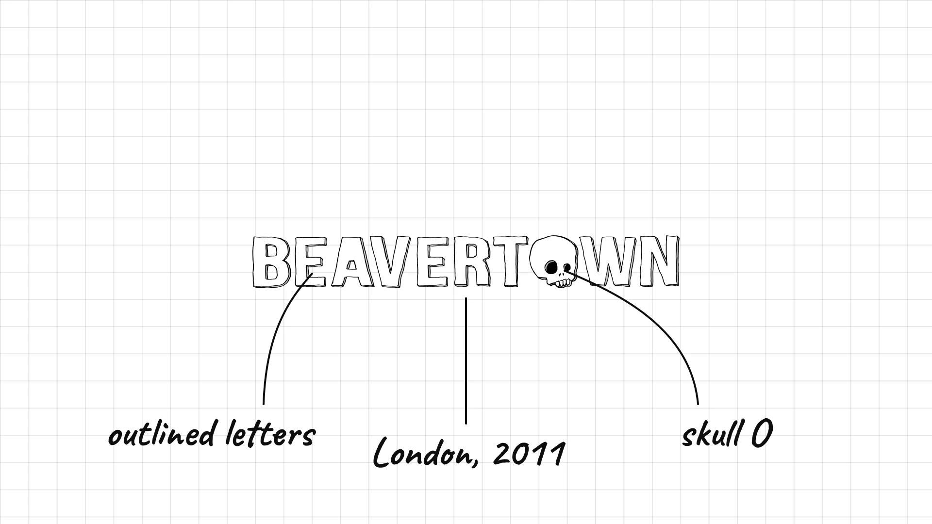
Beavertown Logan Plant founded Beavertown in London in 2011.
A skull replaces the O, adding a little punk to a friendly name.
Artist Nick Dwyer's colourful, cosmic label art made the brewery stand out in UK shops.
42 Cloudwater
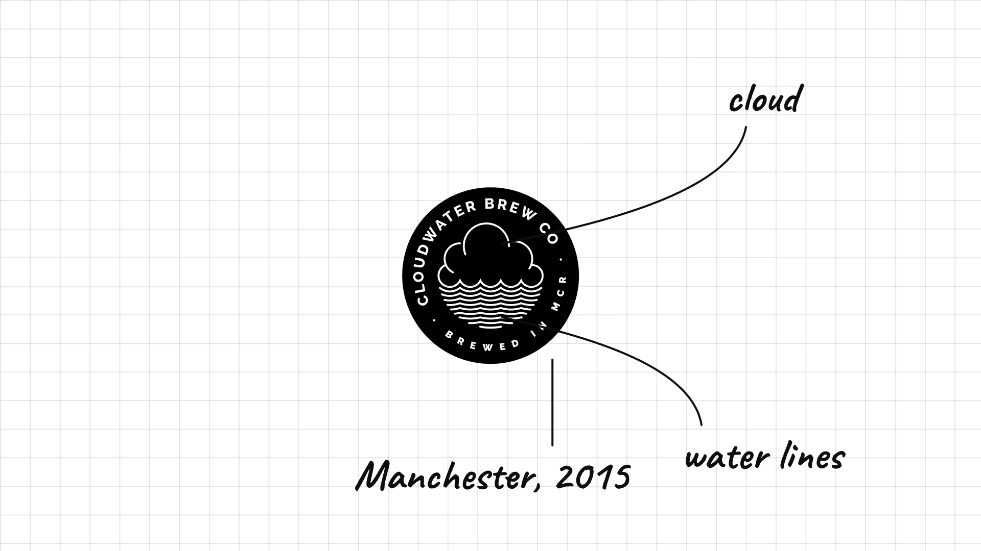
Cloudwater Paul Jones and James Campbell founded Cloudwater in Manchester in 2015.
A round badge with a cloud above water is a literal picture of the name.
The brand changes its can designs every season, so the simple badge has to stay constant.
43 Other Half
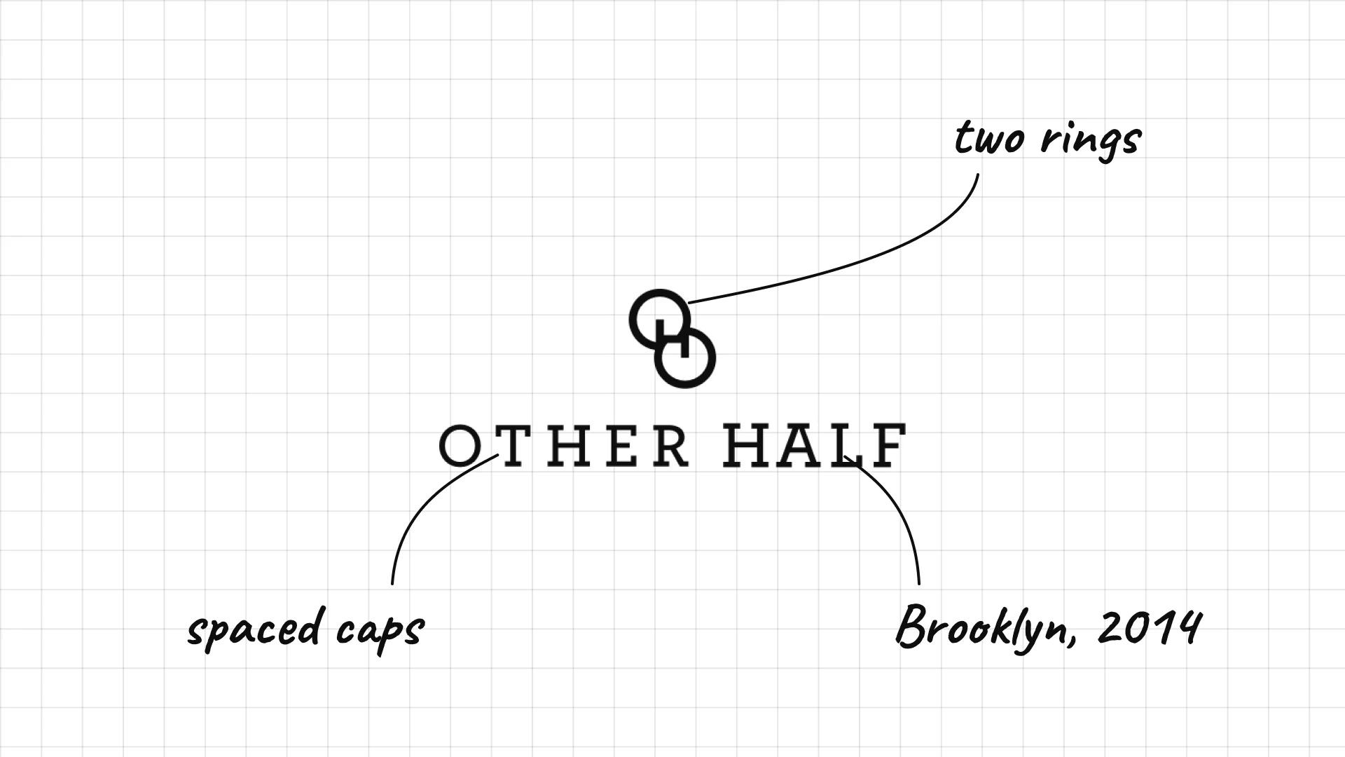
Other Half Sam Richardson, Matt Monahan and Andrew Burman opened Other Half in Brooklyn in 2014.
Two overlapping rings show two halves becoming one.
Widely spaced capitals feel calm and modern next to the brewery's loud can art.
44 Garage Project
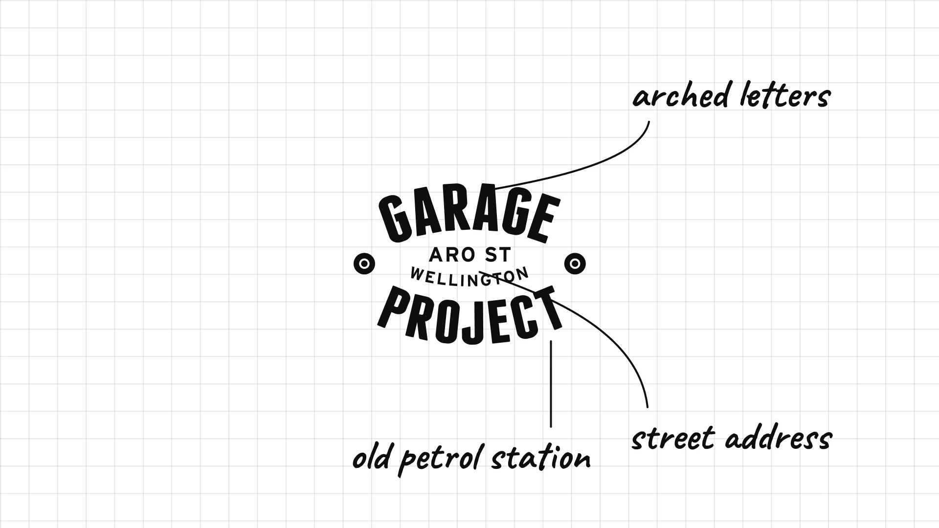
Garage Project started brewing in a former petrol station in Wellington, New Zealand, in 2011.
The arched lettering looks like an old workshop sign, complete with the Aro Street address.
The badge feels handmade, which suits a brewery known for strange experiments.
45 To Øl
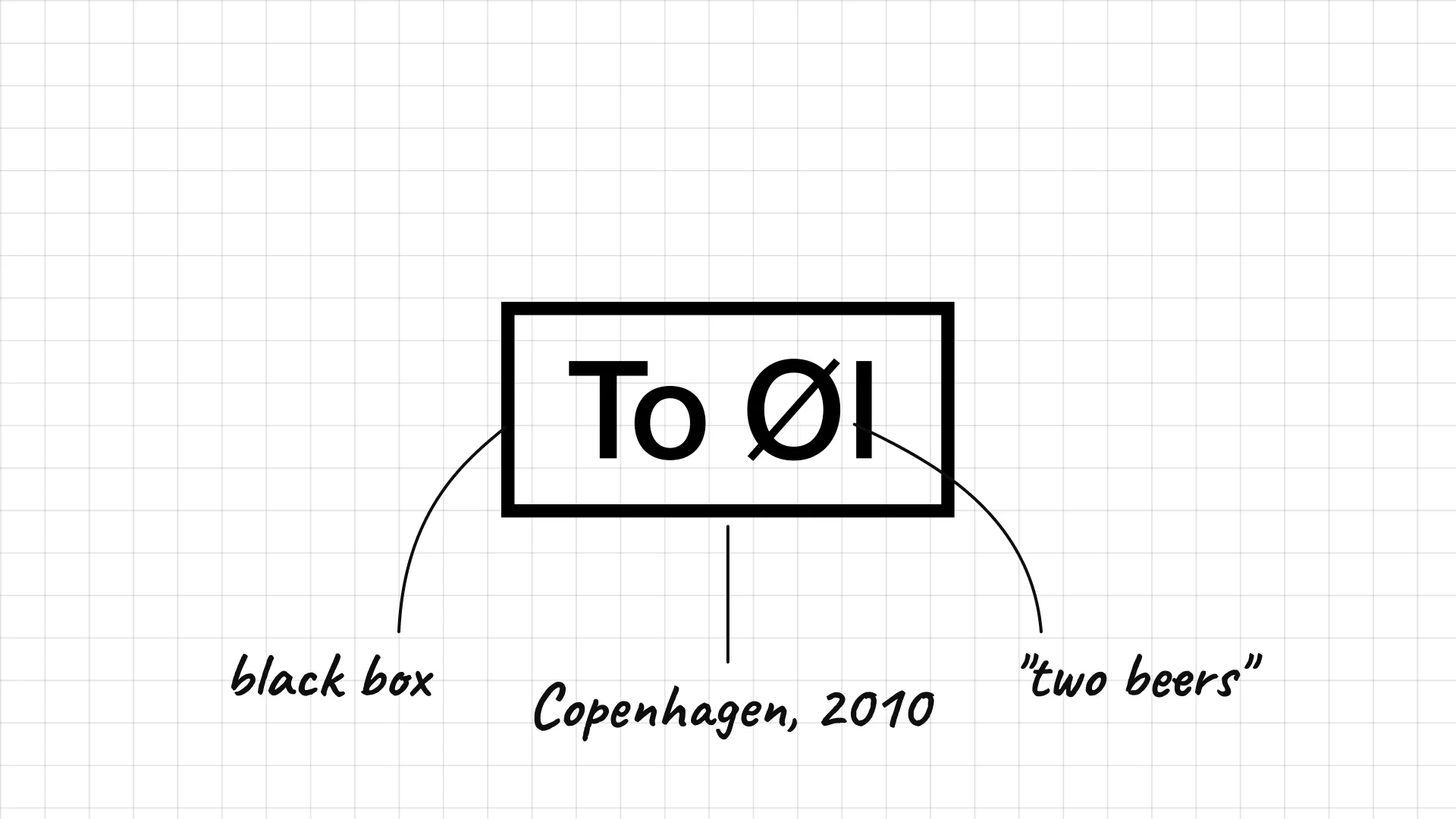
To Øl Tobias Emil Jensen and Tore Gynther founded To Øl in Copenhagen in 2010.
The name means "two beers" in Danish, and the logo puts the Ø front and centre.
The black box makes the logo look like a label or a stamp.
What these 45 examples reveal
Heritage sells beer
Stella Artois shows 1366, Pilsner Urquell, Paulaner, Chimay, and Beck's use seals and crests, and Guinness has used its harp since the 1860s, because age suggests quality.
One symbol does the heavy lifting
The Heineken star, the Corona crown, the Sapporo star, and the Dos Equis XX all work alone on bottle caps, tap handles, and glasses.
Craft beer loves mascots
Lagunitas has a dog, Stone a gargoyle, Dogfish Head a shark, Goose Island a goose, and BrewDog a dog badge, which makes small breweries feel personal.
Design-led breweries keep the logo quiet
Mikkeller, Omnipollo, Cloudwater, and Other Half use simple marks because their labels change with every beer, so the logo has to stay calm and constant.
A practical checklist for a beer logo
- Is the logo readable on a small can, a bottle cap, and a tap handle?
- Does it stand out on a crowded shelf next to dozens of other beers?
- Is there a symbol that can work alone on glasses, caps, and merchandise?
- Does it signal the right story, from centuries of heritage to modern craft?
- Will it still work in one colour, printed on a keg, a coaster, or a stamp?
Launching or rebranding a beer or drinks brand?
I design brand identities for food, drink, and hospitality brands, from logos and labels to packaging, signage, and websites.
See my past work and schedule a call to discuss your project.
Frequently asked questions
What makes a good beer logo?
A good beer logo is bold, readable at small sizes, and tells a clear story, whether that is centuries of heritage or a playful craft personality. It works on labels, cans, caps, tap handles, and glasses, and it often has a symbol that can stand alone, like the Heineken star or the Guinness harp.
What are the most famous beer logos?
The most famous beer logos include Budweiser, Heineken, Corona, Stella Artois, Guinness, Carlsberg, Coors Light, Miller Lite, Asahi, and Modelo. Most of them use a strong symbol, like a star, crown, harp, or bowtie, together with a distinctive wordmark.
Why do so many beer logos use crests and dates?
Crests, seals, and founding dates suggest tradition and quality. Brands like Stella Artois, Pilsner Urquell, Paulaner, and Chimay use them to show that their recipes and breweries have a long history.
How are craft beer logos different from big beer brands?
Craft beer logos are usually more playful and personal, with hand-drawn type, mascots, and local landmarks. Many design-led breweries keep the logo simple and put most of the creativity into colourful can art that changes with each beer.
How much does a beer logo cost?
A professional beer logo and brand identity usually costs from a few thousand dollars for a small brewery to much more for a brand with a full label system, packaging, merchandise, and a website. The cost depends on the scope and the number of products.
Ready to build a brand people remember?
Tell me what you’re launching, changing, or trying to make look better.