

Blog
Logo Design
45 Best Private Equity Logos Explained by a Brand Designer [2026]
Published on Nov 22, 2026
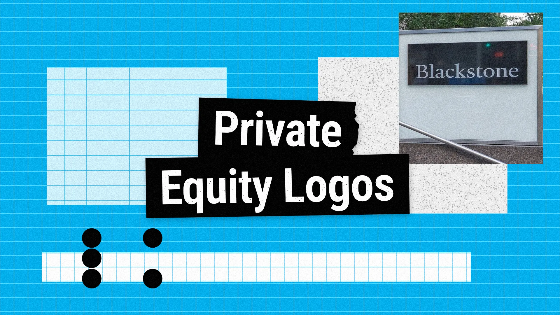
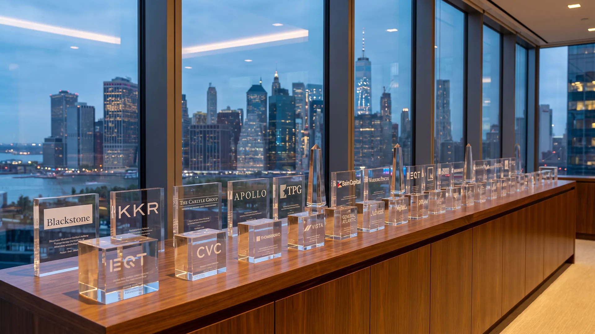
A private equity logo rarely appears on a shelf or a billboard. It lives on pitch books, fund documents, conference badges, deal announcements and the acrylic deal tombstones that sit in every partner's office. The best private equity logos are quiet, confident and trustworthy, because their real audience is investors, founders and management teams deciding who to trust with billions.
What makes a good private equity logo?
Trust before personality: most firms use serif type, navy and small capitals, borrowing the visual language of private banks and law firms.
Names that carry weight: founders' surnames (KKR, Hellman & Friedman, Warburg Pincus) and classical references (Apollo, Ares, Veritas, Cerberus) do most of the work, so symbols are often small or missing.
A clear specialism: technology investors like Thoma Bravo, Vista and Insight Partners look more like tech brands, while credit and infrastructure firms like Brookfield and Oaktree choose heavier, more solid shapes.
Below are 45 private equity logos in five groups: global giants, European and global buyout firms, technology and growth equity, classic American buyout firms, and credit, specialist and newer firms. Each logo has a slide with my handwritten notes and a short explanation. If you are building a financial brand, see my investment firm logos, bank logos and fintech logos, and my guide to logo colours.
45 private equity logos
The boards below show all 45 private equity logos in one consistent format, grouped into global giants, European buyout firms, technology and growth investors, classic American buyout firms, and credit and specialist firms.
Each logo is reviewed for its design decisions, not for the size, returns or reputation of the firm.
01 — Global private equity giants
The largest alternative asset managers use calm, confident wordmarks, often with no symbol at all, because their names already carry the weight.
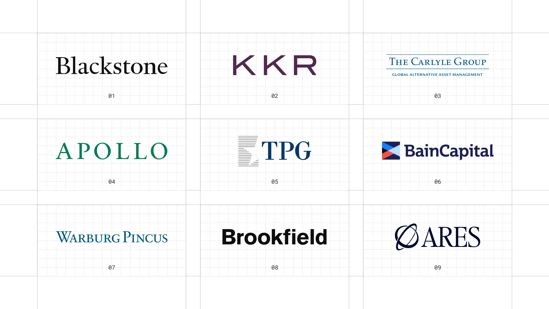
This is a visual comparison of private equity logos, not a ranking of firms.
Look at how each logo uses type, colour and one symbol to signal trust, scale or specialism.
01 Blackstone
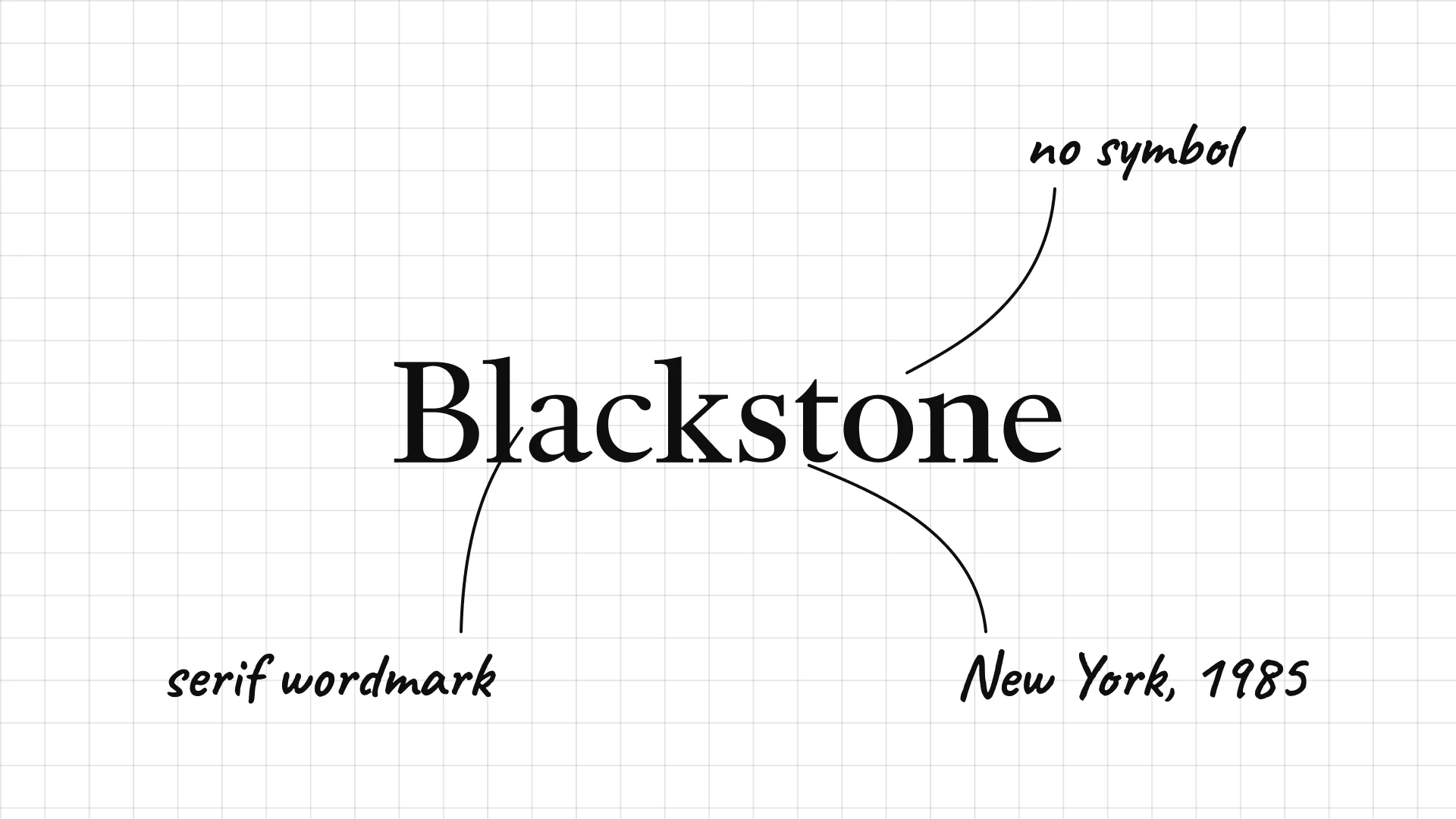
Blackstone Peter G. Peterson and Stephen Schwarzman founded Blackstone in New York in 1985.
A plain serif wordmark with no symbol feels like a law firm or a bank.
The name itself is a translation of both founders' surnames, so the logo can stay quiet.
02 KKR
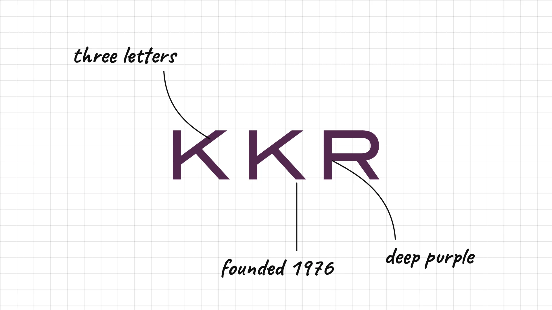
KKR Jerome Kohlberg, Henry Kravis and George Roberts founded KKR in 1976.
Three wide letters make the founders' initials the whole logo.
Deep purple instead of blue or black sets it apart from most finance logos.
03 The Carlyle Group
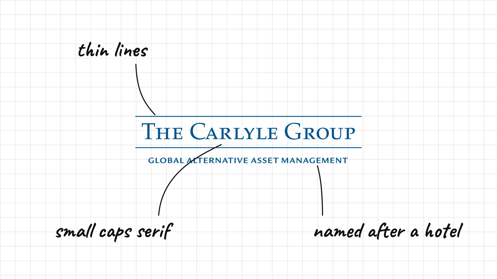
The Carlyle Group David Rubenstein, William Conway and Daniel D'Aniello founded Carlyle in Washington, D.C., in 1987, and named it after the Carlyle Hotel in New York.
Small-capital serif type looks like an old banking letterhead.
Two thin lines and a strapline frame the name like a certificate.
04 Apollo
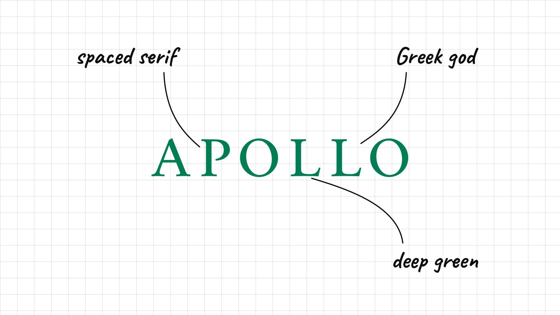
Apollo Leon Black, Josh Harris and Marc Rowan founded Apollo in 1990.
Widely spaced serif capitals feel classical, like the Greek god it is named after.
A deep green is unusual for finance and suggests money and growth.
05 TPG
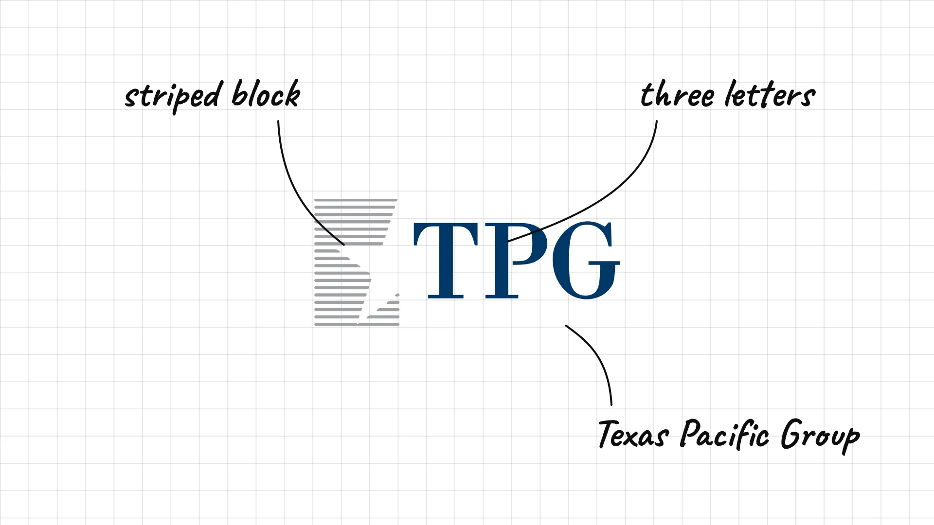
TPG David Bonderman and James Coulter founded the firm in 1992 as Texas Pacific Group.
A three-letter acronym replaced the original longer name.
A striped graphic block beside the letters adds movement to a plain wordmark.
06 Bain Capital
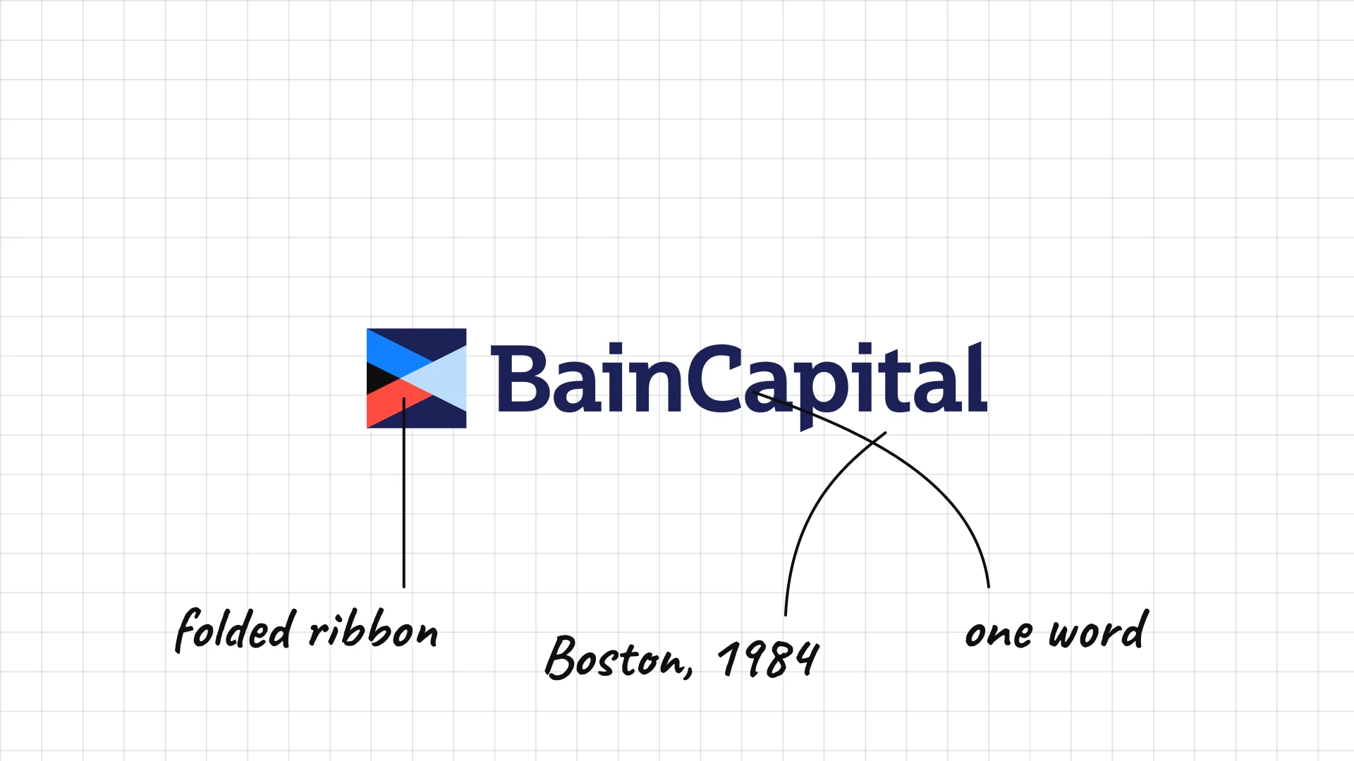
Bain Capital was founded in Boston in 1984 by partners from Bain & Company.
A blue and red mark looks like a folded flag or ribbon.
The name is written in one word with a capital C, a modern touch.
07 Warburg Pincus
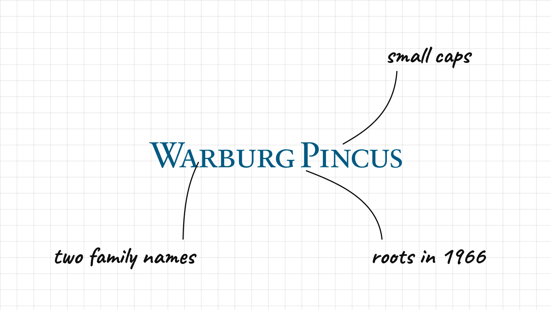
Warburg Pincus traces its roots to 1966, when E.M. Warburg and Lionel Pincus joined forces in New York.
Elegant small capitals link two family names with a classic serif.
Teal-blue ink feels calmer than the usual navy of finance.
08 Brookfield
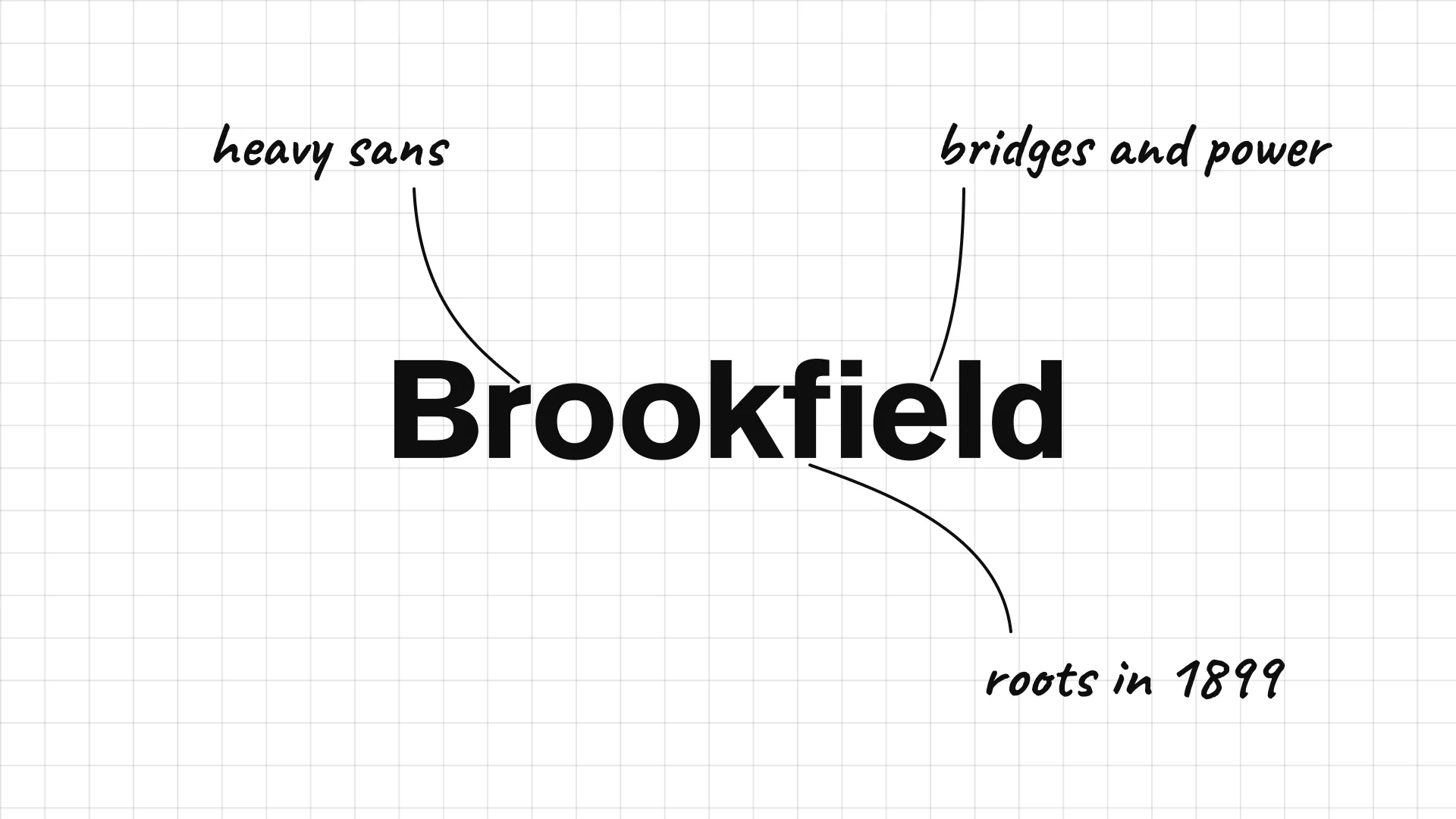
Brookfield traces its history to 1899 in Brazil, and is now a global investor in infrastructure, real estate and energy.
Heavy sans serif letters look strong and industrial.
The simple name suits a company that owns bridges, power and property.
09 Ares Management
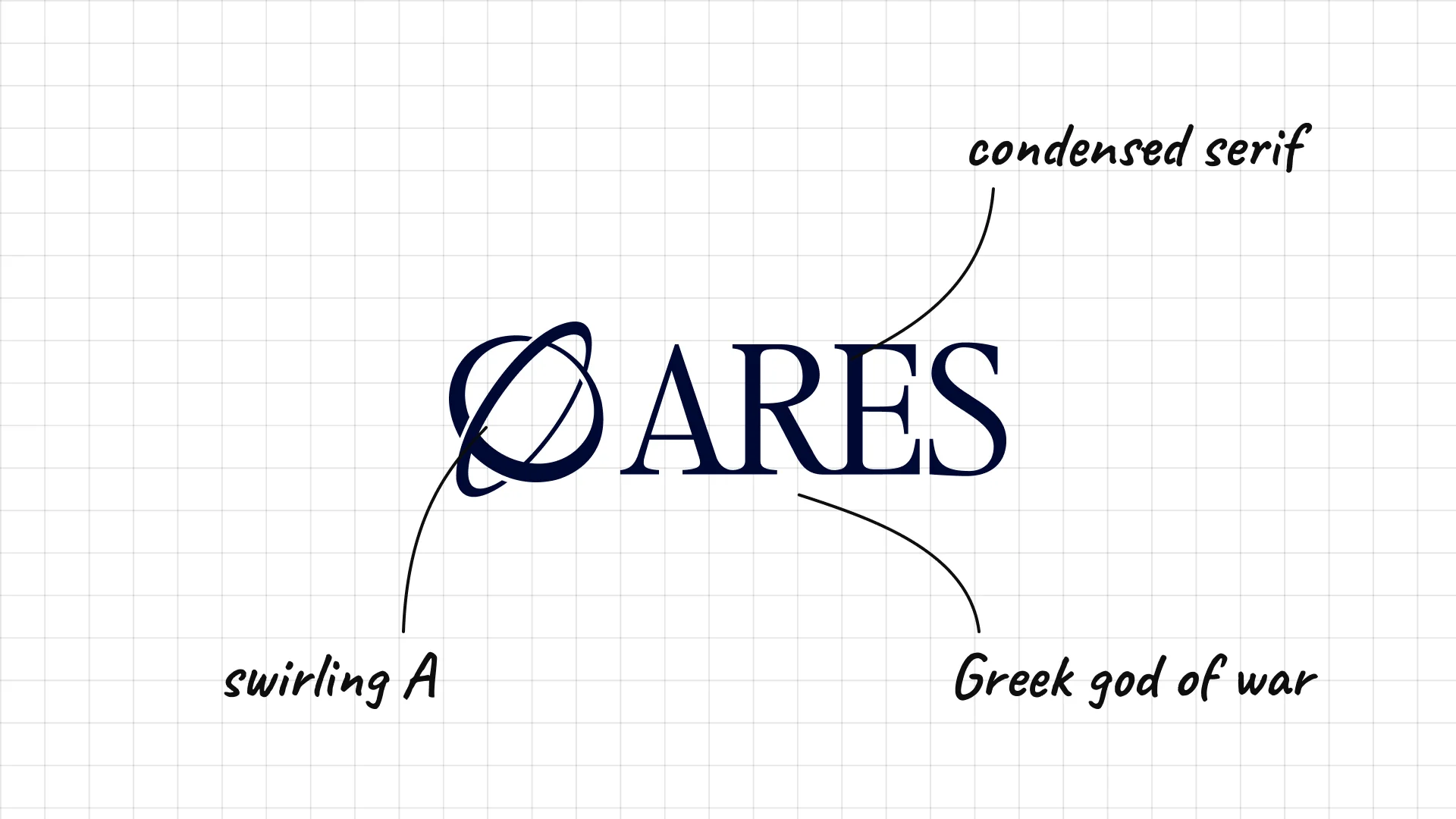
Ares Management Ares was founded in Los Angeles in 1997 and is named after the Greek god of war.
A swirling A on the left is a monogram with a touch of calligraphy.
The condensed serif feels modern and confident.
02 — European and global buyout firms
European buyout firms are more willing to use colour and graphic marks, from Cinven's teal block to Permira's orange flames.
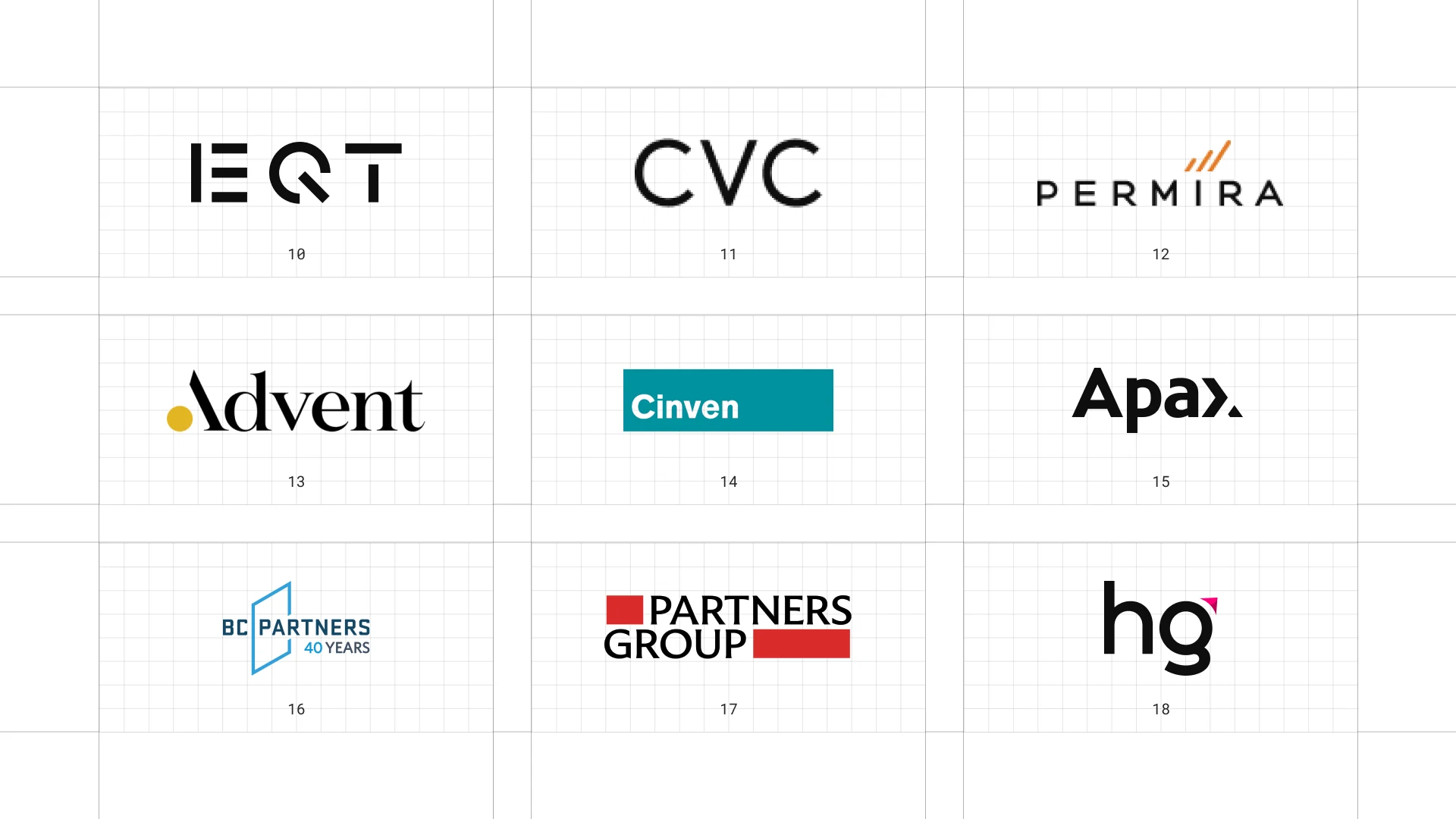
This is a visual comparison of private equity logos, not a ranking of firms.
Look at how each logo uses type, colour and one symbol to signal trust, scale or specialism.
10 EQT
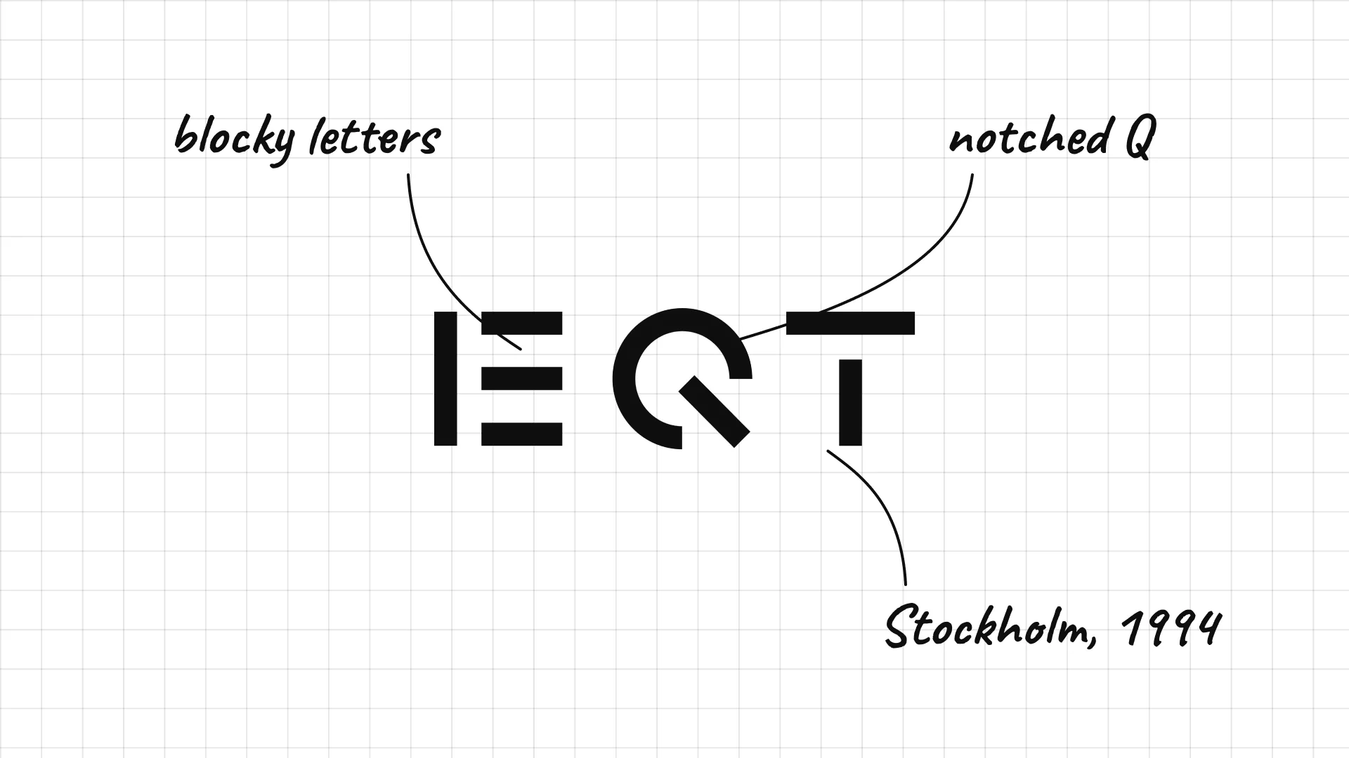
EQT was founded in Stockholm in 1994 with backing from Sweden's Wallenberg family.
Three blocky letters are drawn with sharp, geometric cuts.
The Q has a distinctive notch that makes a very short name memorable.
11 CVC
CVC began in 1981 as Citicorp Venture Capital and became independent in 1993.
Three thin capitals are almost a monogram.
A very light weight makes the firm feel calm and elite.
12 Permira
Permira was founded in London in 1985 and took its current name in 2001.
Widely spaced capitals feel airy and international.
Orange flames above the I give a small spark to a quiet wordmark.
13 Advent International
Advent International Peter Brooke founded Advent in Boston in 1984.
A yellow dot replaces the point of the A, a small, memorable detail.
A sharp serif gives the logo a classic, editorial look.
14 Cinven
Cinven was founded in London in 1977.
A solid teal block with white letters looks like a sign or a stamp.
The bright teal sets it apart from sober navy competitors.
15 Apax Partners
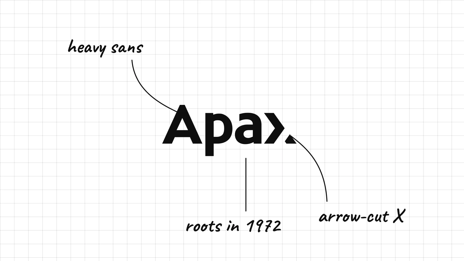
Apax Partners Apax traces its roots to 1972 and is based in London.
The X ends in a bold arrow-like cut, giving the logo direction.
A short name in heavy sans serif feels modern and direct.
16 BC Partners
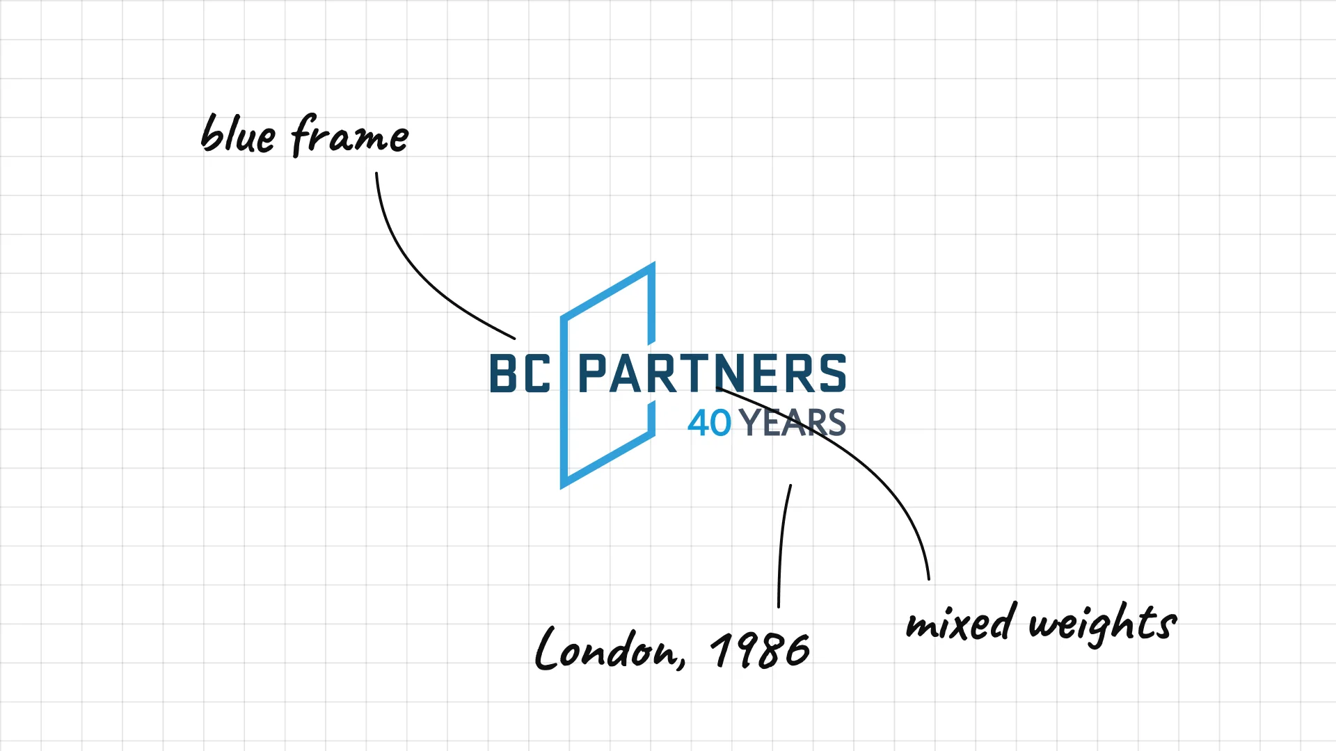
BC Partners was founded in London in 1986.
A blue diagonal frame holds the name like a window.
Mixed weights separate the initials from the word Partners.
17 Partners Group
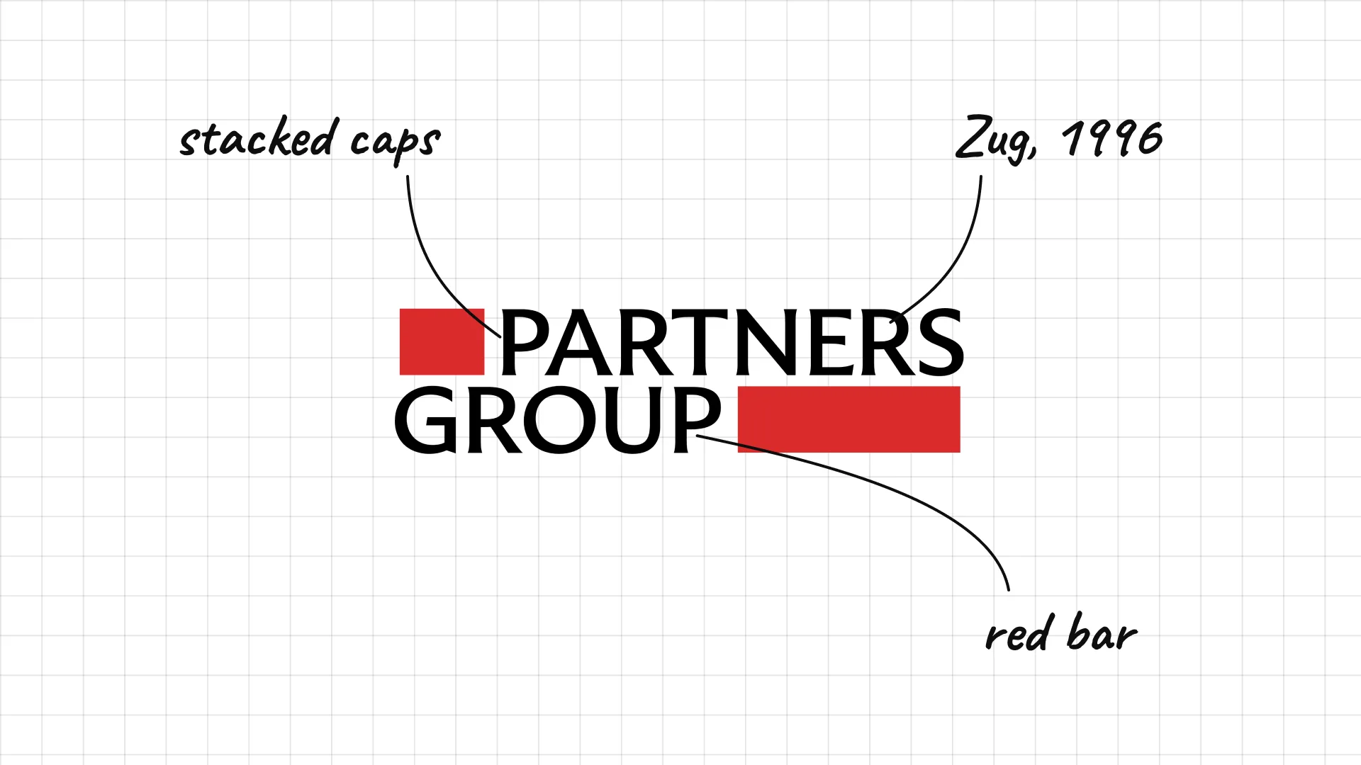
Partners Group was founded in Zug, Switzerland, in 1996.
A red bar sits behind the word Group, a simple graphic anchor.
Stacked capitals make a long name compact.
18 Hg
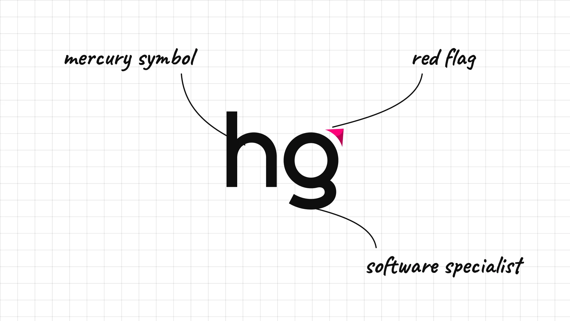
Hg is a London firm focused on software and services, with roots in Mercury Private Equity from the 1990s.
The two letters are the chemical symbol for mercury, a nod to its past.
A small red flag on the g adds one accent to a monochrome mark.
03 — Technology and growth equity
Technology investors look more like the software companies they back, with clean sans serifs, bold colour and modern monograms.
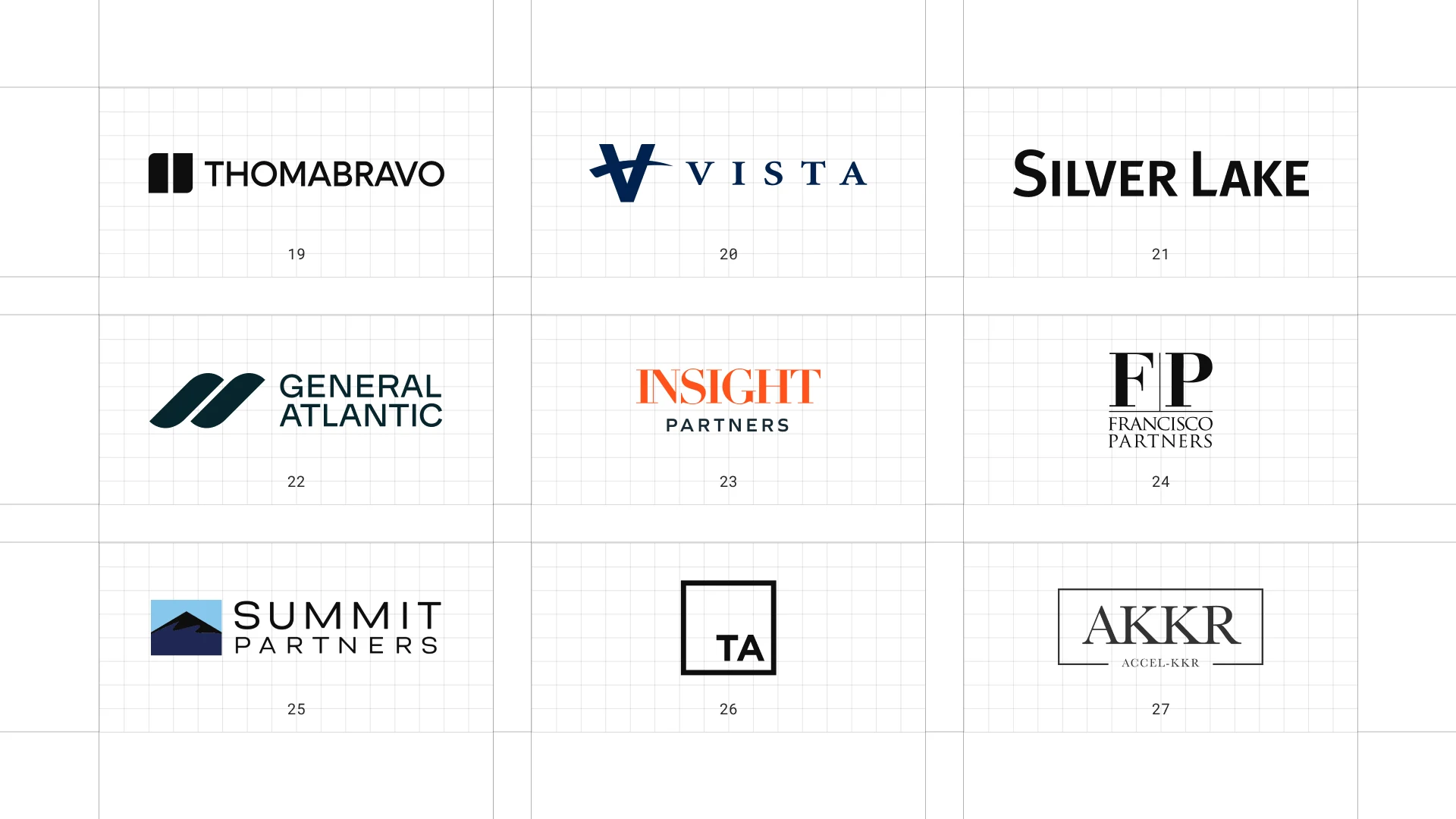
This is a visual comparison of private equity logos, not a ranking of firms.
Look at how each logo uses type, colour and one symbol to signal trust, scale or specialism.
19 Thoma Bravo
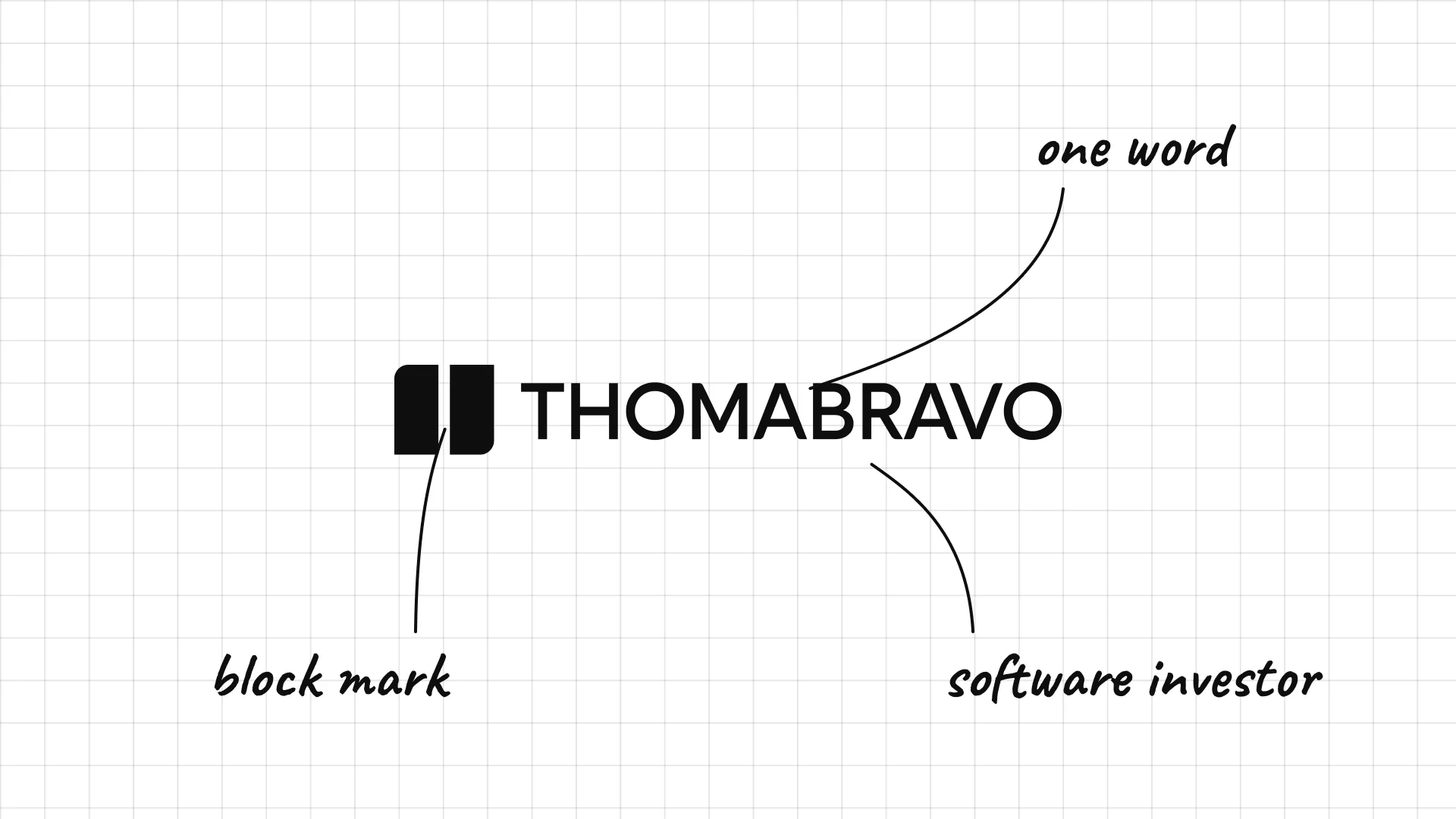
Thoma Bravo traces its roots to 1980 and focuses on software.
A bold block mark sits to the left of the name.
The two names are set as one word, which makes it feel like a tech brand.
20 Vista Equity Partners
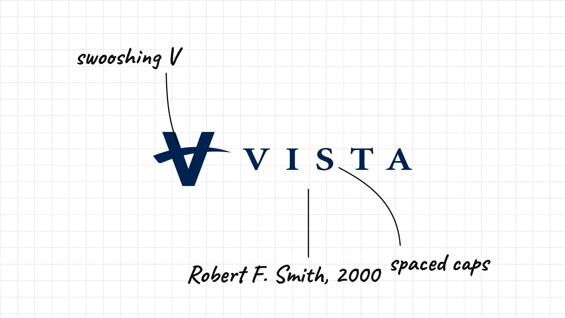
Vista Equity Partners Robert F. Smith founded Vista in 2000 to invest in enterprise software.
A V with a swoosh looks like a check mark or a bird in flight.
Very widely spaced capitals feel premium.
21 Silver Lake
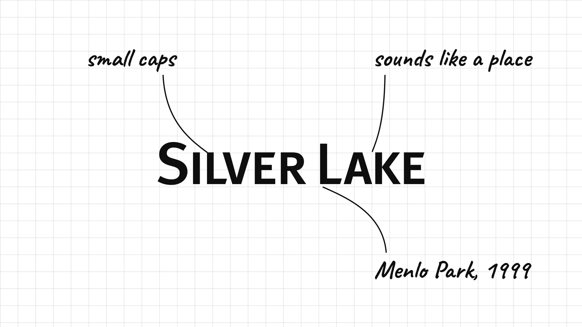
Silver Lake was founded in Menlo Park, California, in 1999 and focuses on technology.
Small capitals with a hint of tech feel modern but serious.
The two words make the firm sound like a place, not a financial company.
22 General Atlantic
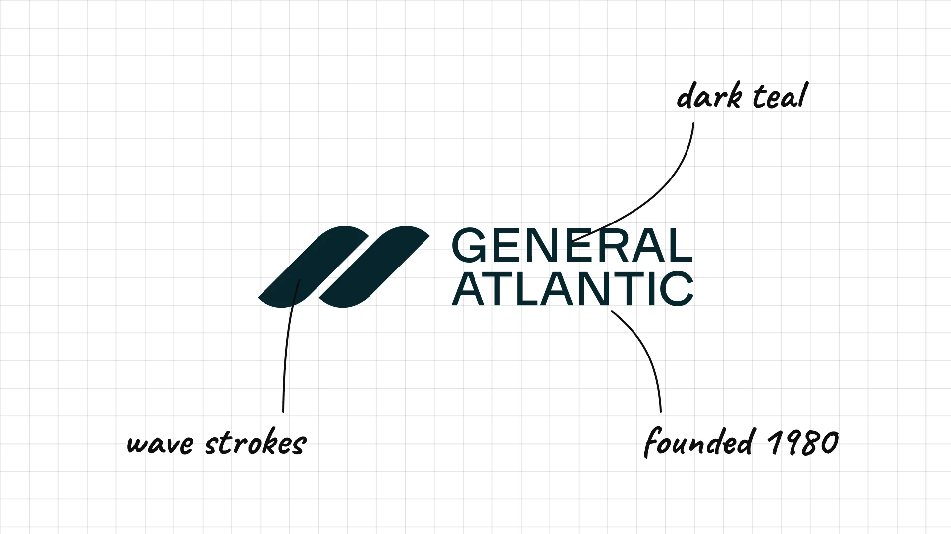
General Atlantic Charles Feeney founded General Atlantic in 1980.
Two stacked blocks and diagonal strokes look like waves.
Dark teal ties the name to the ocean in the middle of it.
23 Insight Partners
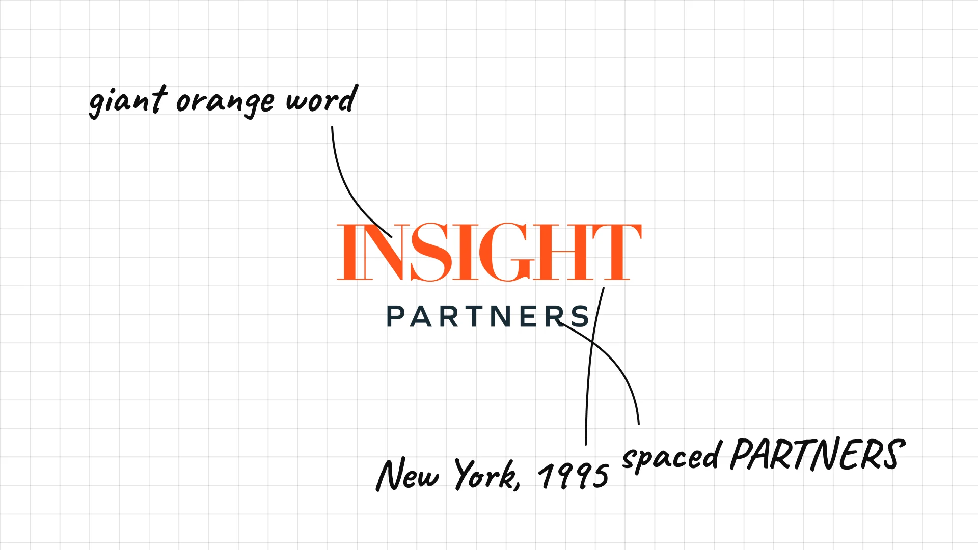
Insight Partners was founded in New York in 1995 and invests in software and growth companies.
The giant orange INSIGHT is the loudest wordmark in the group.
Small, widely spaced PARTNERS underneath balances the heavy word.
24 Francisco Partners
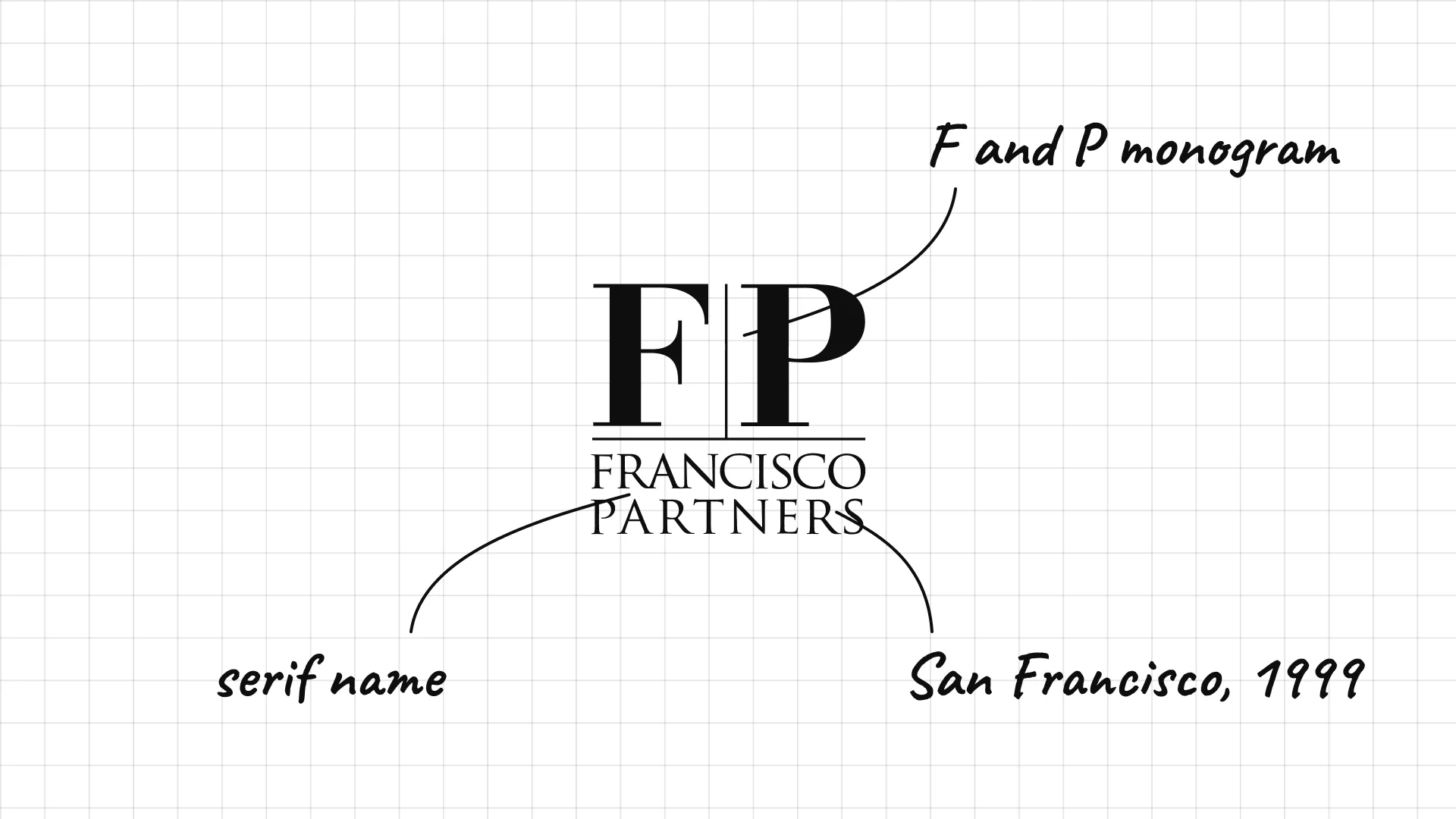
Francisco Partners was founded in San Francisco in 1999 and focuses on technology.
A stacked F and P monogram looks like a classic monogram stamp.
Serif type for the full name makes it feel established.
25 Summit Partners
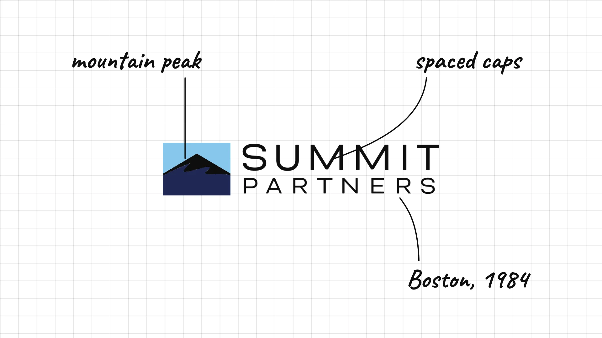
Summit Partners was founded in Boston in 1984 and invests in growth companies.
A mountain peak is a direct visual for the name Summit.
Spaced capitals keep the focus on the symbol.
26 TA Associates
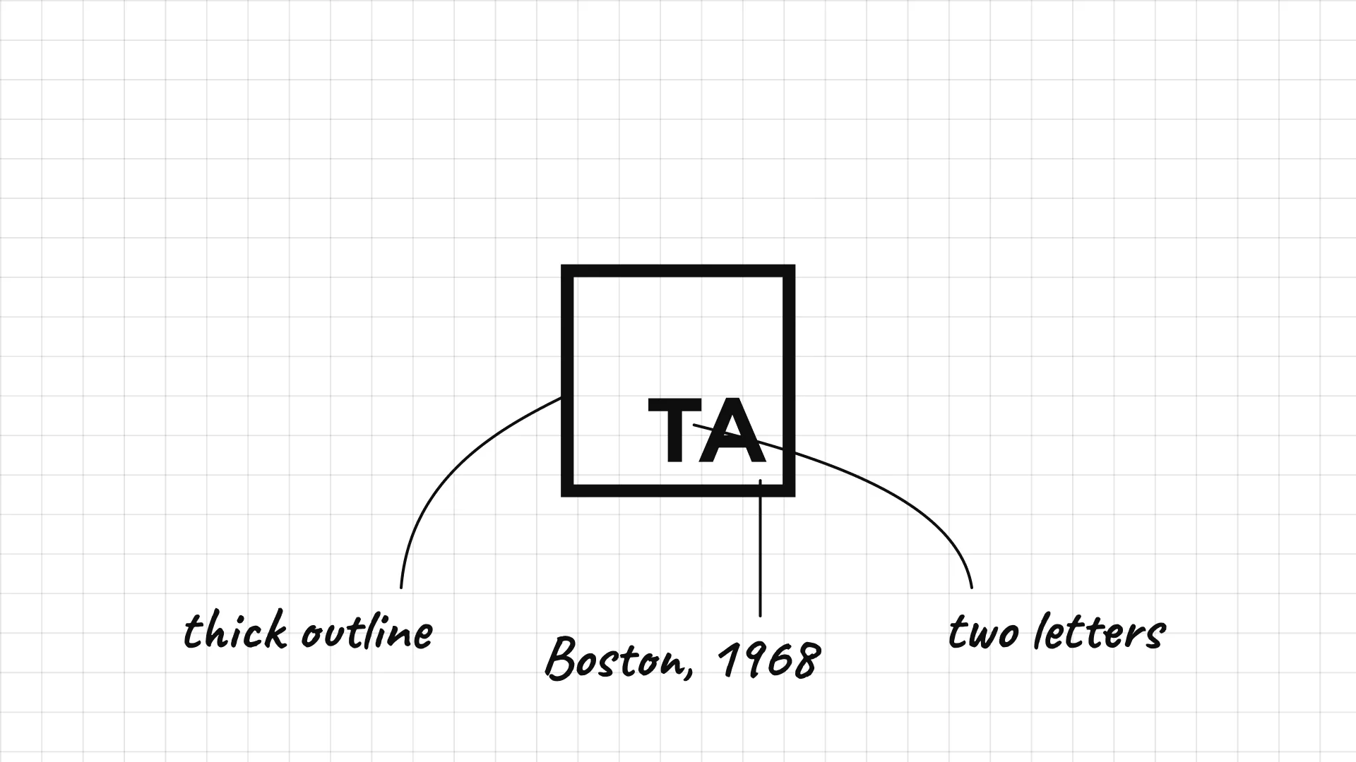
TA Associates was founded in Boston in 1968, one of the oldest private equity firms in the US.
Two letters in a square look like a monogram stamp.
A thick outline gives a very short name weight.
27 Accel-KKR
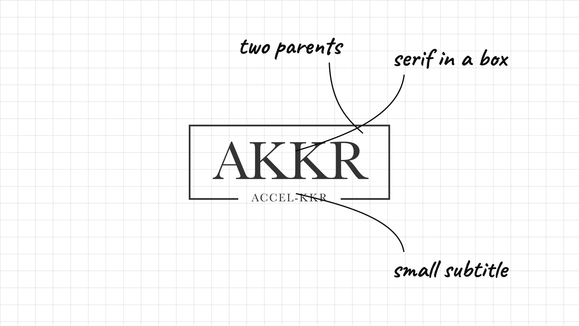
Accel-KKR was founded in 2000 as a software investor backed by Accel Partners and KKR.
Serif capitals in a box feel like a stock certificate.
A thin underline and small text show its dual parentage.
04 — Classic American buyout firms
America's classic buyout firms keep the look of a private bank or law partnership, with serif type, initials and navy blue.
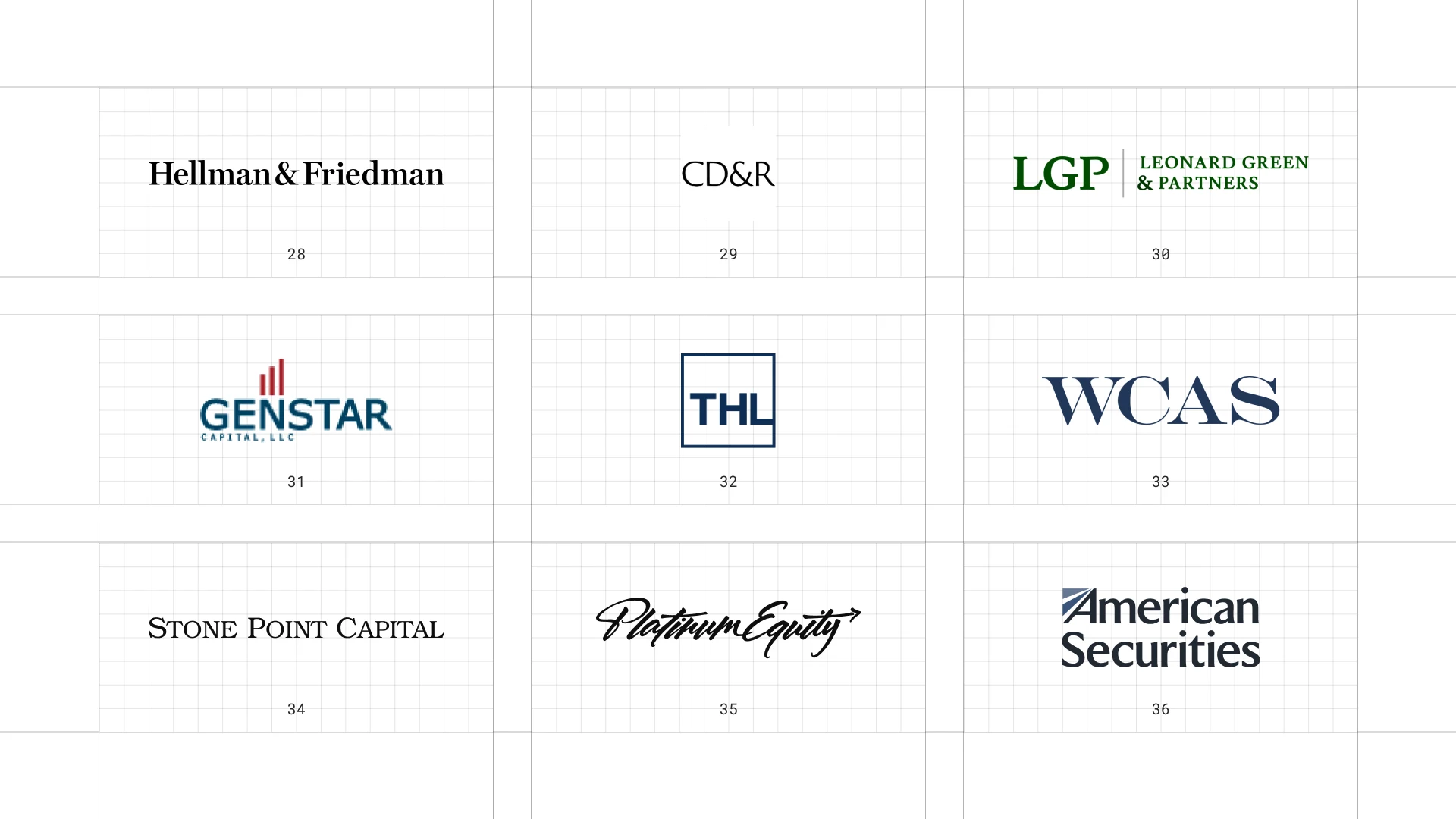
This is a visual comparison of private equity logos, not a ranking of firms.
Look at how each logo uses type, colour and one symbol to signal trust, scale or specialism.
28 Hellman & Friedman
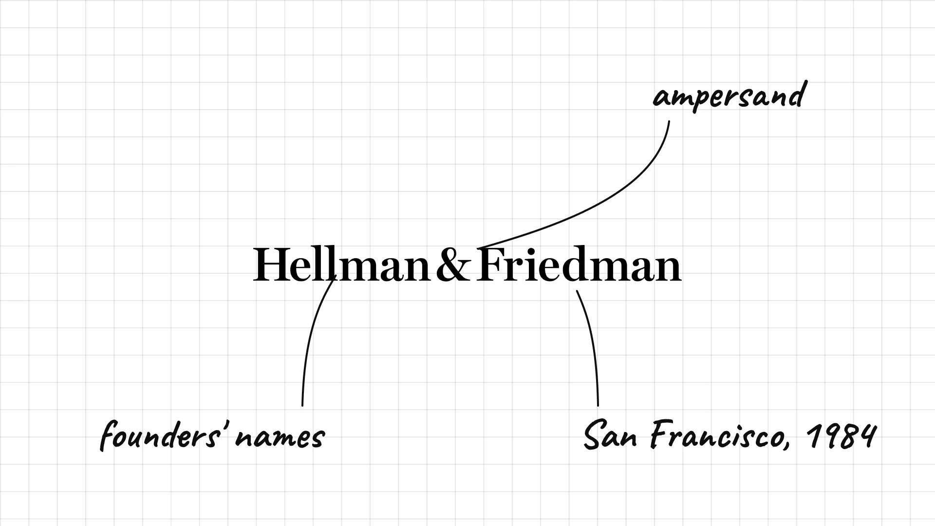
Hellman & Friedman was founded in San Francisco in 1984.
An ampersand joins the two founders' names in a clean serif.
The name is simply set, which suits a firm that avoids publicity.
29 Clayton, Dubilier & Rice
Clayton, Dubilier & Rice was founded in New York in 1978.
The initials are shortened to a compact CD&R mark.
The white box and simple serif feel like a law firm.
30 Leonard Green & Partners
Leonard Green & Partners was founded in Los Angeles in 1989.
A green LGP monogram anchors the name.
Green on white is unusual among private equity firms.
31 Genstar Capital
Genstar Capital was founded in San Francisco in 1988.
Red bars rise above the name like a small bar chart.
The blue wordmark and red chart are simple and symbolic.
32 Thomas H. Lee Partners
Thomas H. Lee Partners Thomas H. Lee founded the firm in Boston in 1974.
THL in a blue box is an initial stamp.
The thick outline makes a short mark feel solid.
33 Welsh, Carson, Anderson & Stowe
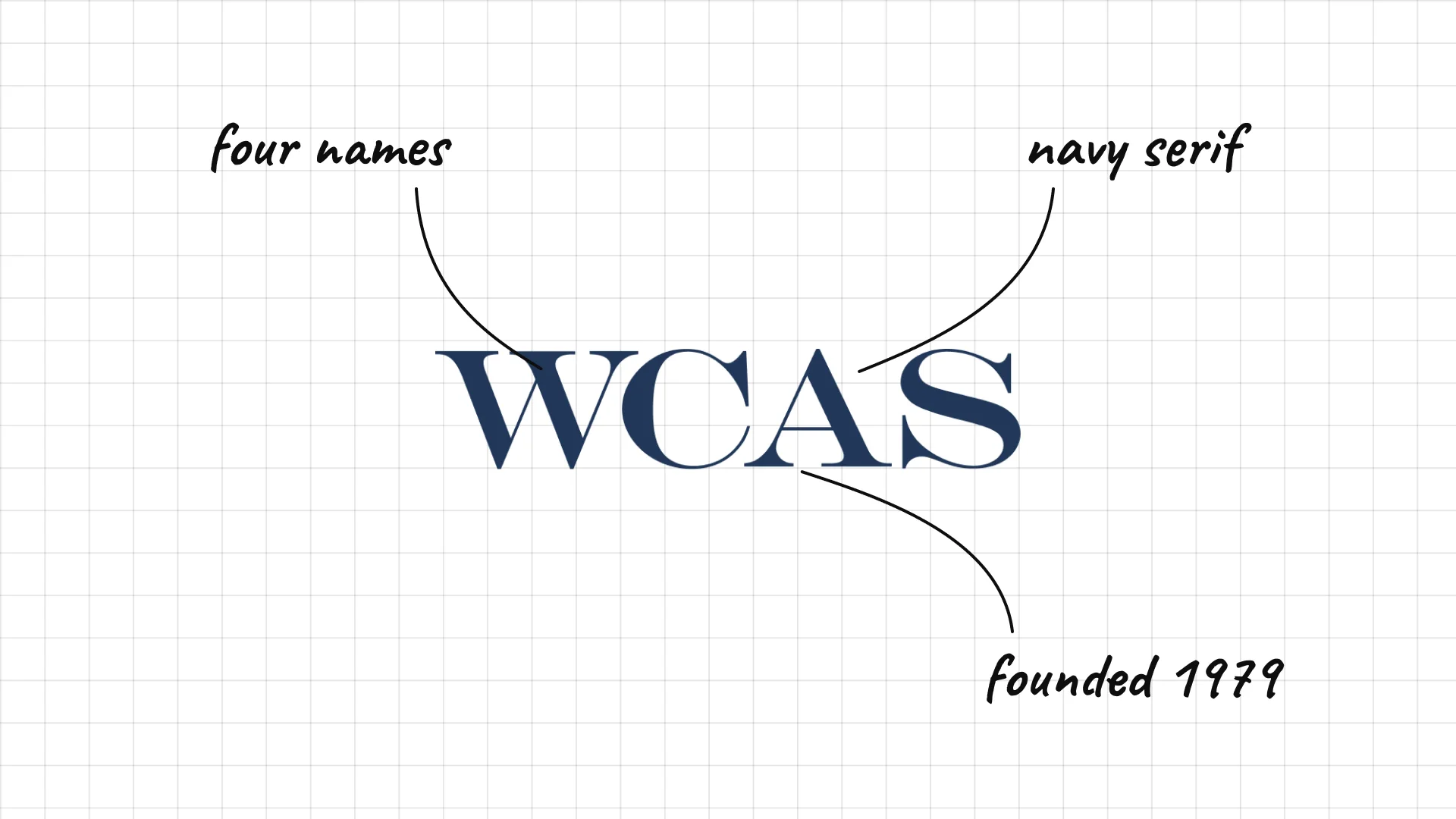
Welsh, Carson, Anderson & Stowe was founded in 1979 and focuses on healthcare and technology.
The long four-name partnership is shortened to WCAS.
Large navy serif capitals feel like an old-money bank.
34 Stone Point Capital
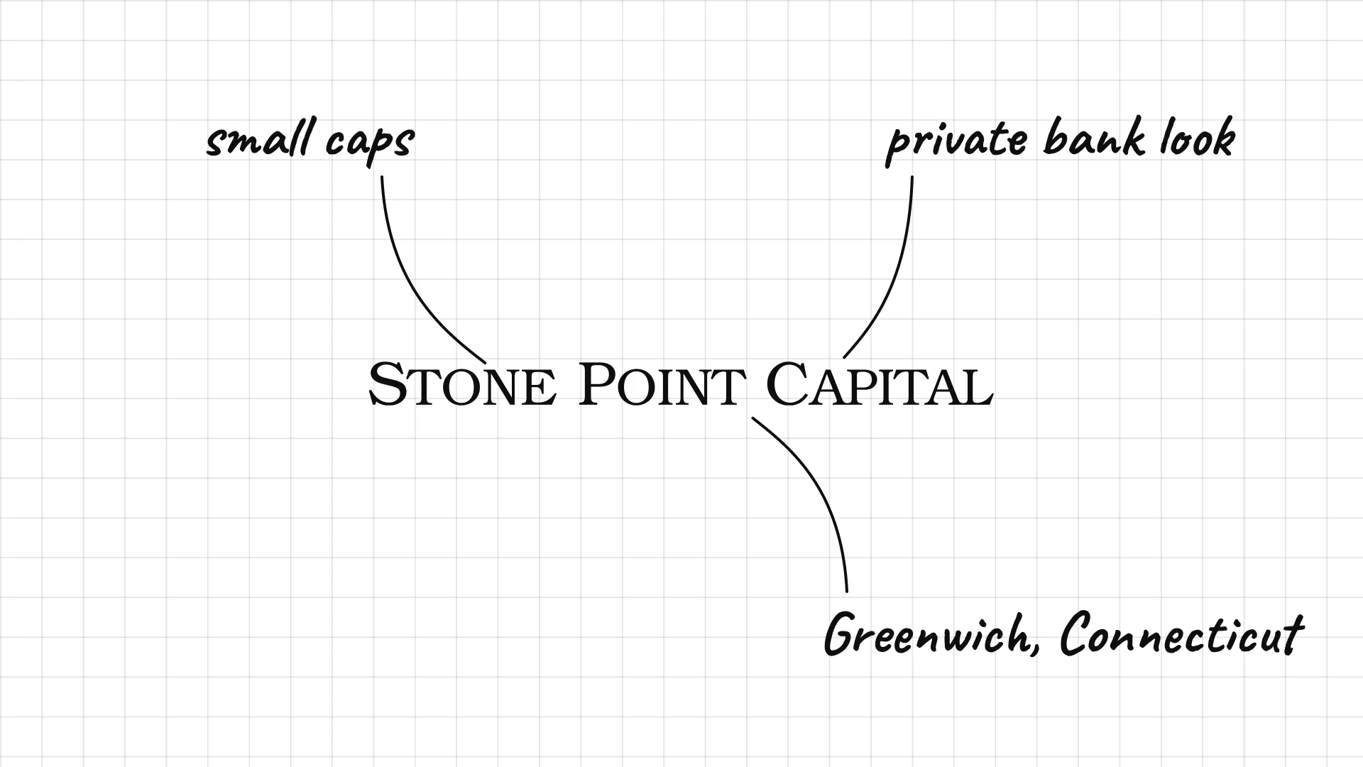
Stone Point Capital is based in Greenwich, Connecticut, and focuses on financial services.
Small capitals in a serif look like a private bank.
The name feels like a place, which is a sign of stability.
35 Platinum Equity
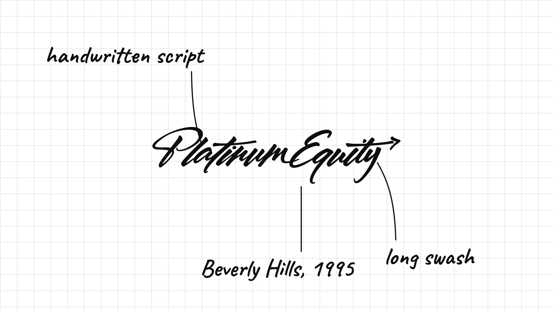
Platinum Equity Tom Gores founded Platinum Equity in Beverly Hills in 1995.
An energetic handwritten script is surprising for a buyout firm.
The long swash under the name looks like a signature.
36 American Securities
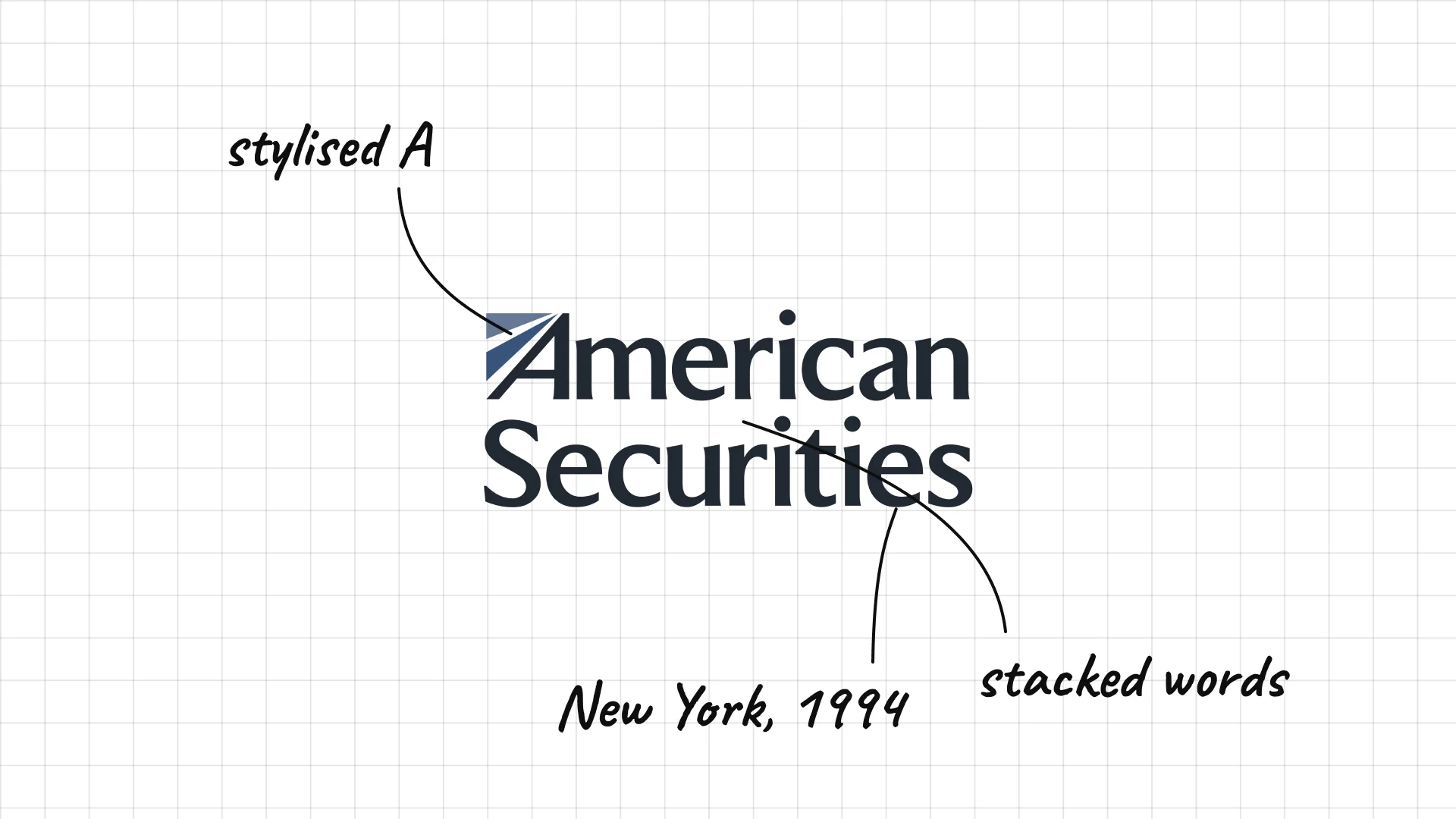
American Securities was founded in New York in 1994.
A stylised A with a diagonal stripe feels patriotic and fast.
Two words stacked give a long name a compact shape.
05 — Credit, specialist and newer firms
Credit, specialist and newer firms mix the two worlds, adding icons like owls, trees and cubes to otherwise quiet wordmarks.
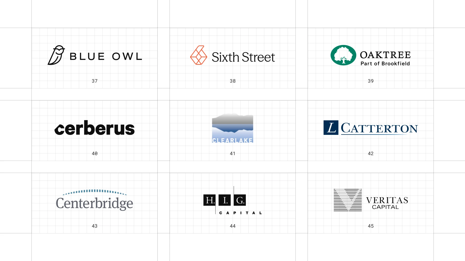
This is a visual comparison of private equity logos, not a ranking of firms.
Look at how each logo uses type, colour and one symbol to signal trust, scale or specialism.
37 Blue Owl
Blue Owl was created in 2021 through a merger of Owl Rock and Dyal Capital.
A small owl icon is a direct picture of the name.
Widely spaced capitals feel calm and modern.
38 Sixth Street
Sixth Street began in 2009 as the credit arm of TPG and became an independent firm in 2020.
A geometric cube icon sits next to the name.
The name feels like a New York address and not a finance brand.
39 Oaktree
Oaktree Howard Marks and colleagues founded Oaktree in Los Angeles in 1995.
A green tree icon is a literal picture of the name.
The small line "Part of Brookfield" shows its recent change of ownership.
40 Cerberus
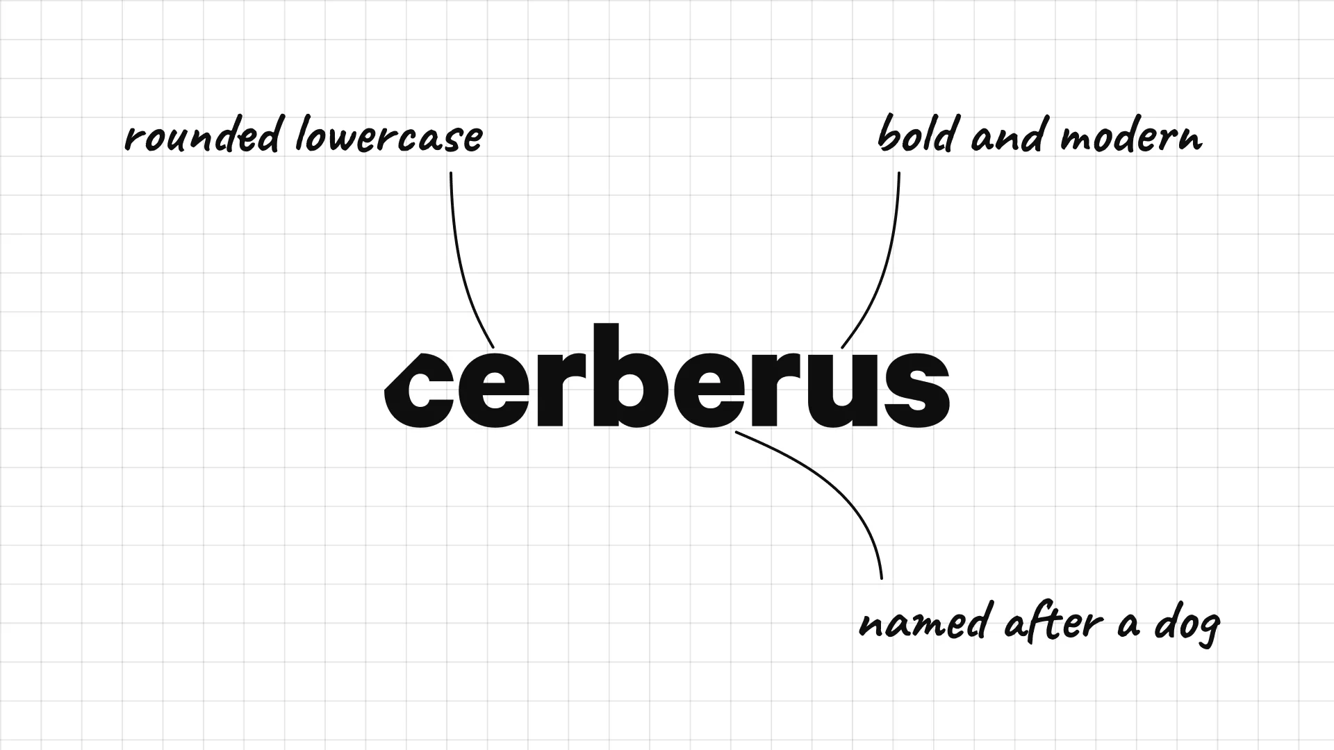
Cerberus Stephen Feinberg founded Cerberus in New York in 1992, named after the three-headed dog in Greek myth.
A heavy, rounded lowercase wordmark feels modern and bold.
The name is a myth reference, but the logo has no dog.
41 Clearlake Capital
Clearlake Capital was founded in Santa Monica, California, in 2006.
A mountain and lake image gives a literal picture of the name.
The pale blue gradient feels calm and clear.
42 L Catterton
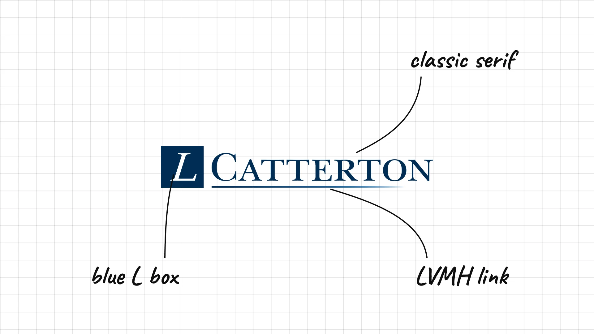
L Catterton was formed in 2016 when Catterton partnered with LVMH Group's L Capital.
A blue L in a box links to the LVMH family.
A classic serif Catterton feels like a fashion brand.
43 Centerbridge
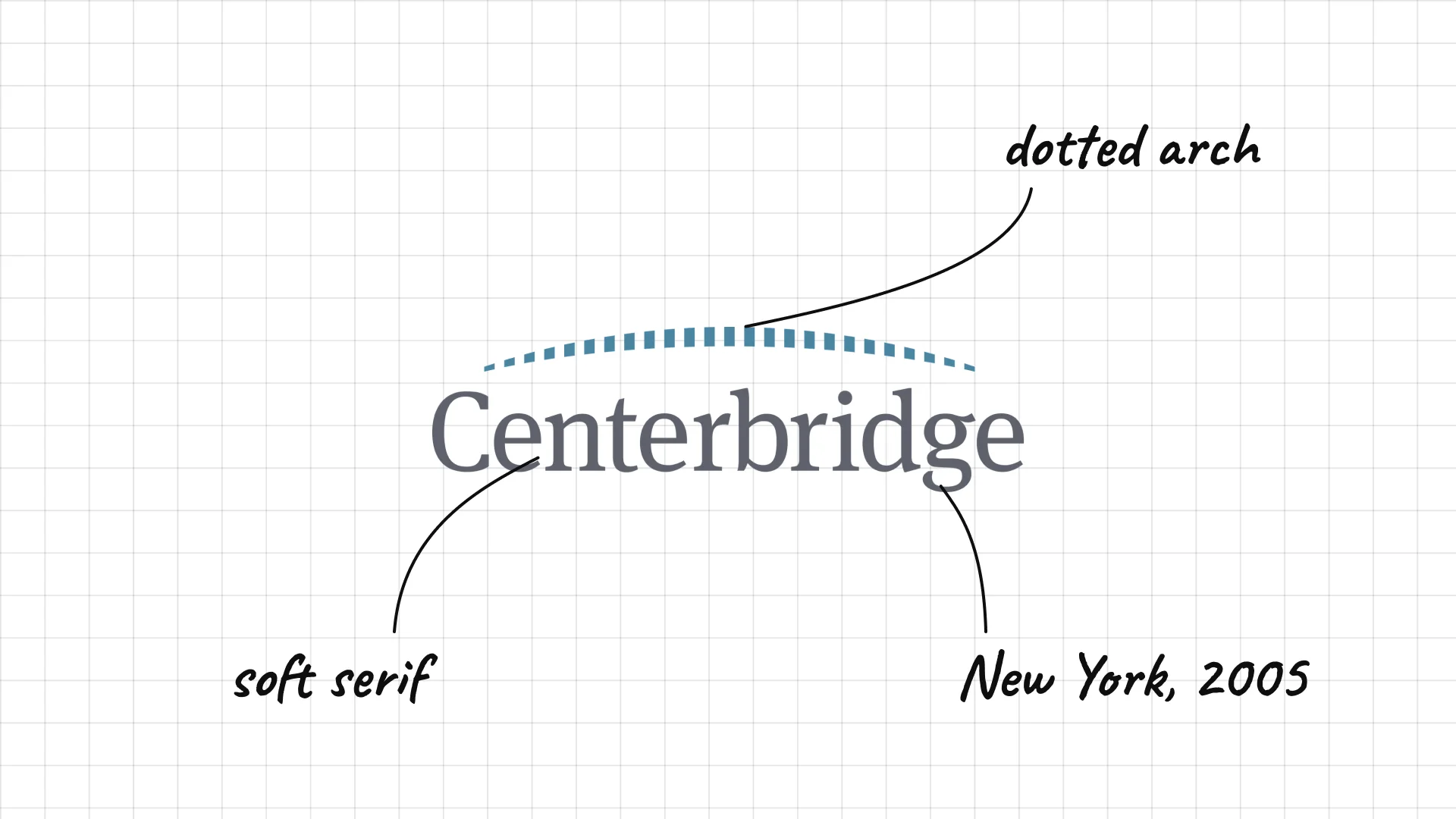
Centerbridge was founded in New York in 2005.
A dotted arch above the name looks like a bridge.
Soft grey serif letters feel calm and trustworthy.
44 H.I.G. Capital
H.I.G. Capital was founded in Miami in 1993.
The letters sit inside small boxes, like a row of initials.
A thin vertical line and spaced CAPITAL add a stylish touch.
45 Veritas Capital
Veritas Capital was founded in New York in 1992 and focuses on government technology.
A striped V mark stands for Veritas, which means truth in Latin.
Spaced capitals under a symbol feel like a university seal.
What these 45 examples reveal
Serif type means trust
Blackstone, Carlyle, Apollo, Warburg Pincus, Hellman & Friedman, WCAS and Stone Point all use serif or small-capital type that feels like a private bank.
Names do the heavy lifting
KKR, CD&R, TPG, THL and H.I.G. shorten long partnership names into initials, while Apollo, Ares, Veritas and Cerberus borrow from myth and Latin.
Tech investors look like tech brands
Thoma Bravo, Vista, Insight Partners and General Atlantic use modern sans serifs, bold colour and graphic marks.
Colour is a differentiator
KKR's purple, Apollo's green, Insight's orange and Cinven's teal stand out in a sector where almost everyone uses navy.
A practical checklist for a private equity logo
- Does it feel trustworthy and serious on a fund document or pitch book?
- Does it work small, on a deal tombstone, a press release or a conference badge?
- Does it signal your focus, from software to infrastructure?
- Does it stand out from the navy-and-serif look of competitors?
- Will it still work in one colour, engraved in acrylic or printed in black?
Launching or rebranding a private equity or investment firm?
I design brand identities for investment firms, from logos and pitch decks to websites and fund materials.
See my past work and schedule a call to discuss your project.
Cover photo: Blackstone by Ajay Suresh, CC BY 4.0, via Wikimedia Commons, cropped and used in a collage.
Frequently asked questions
What makes a good private equity logo?
A good private equity logo is calm, confident and trustworthy. It works on fund documents, pitch books, deal tombstones and websites, and it usually relies on strong typography rather than a complicated symbol.
What are the most famous private equity logos?
The most recognised private equity logos include Blackstone, KKR, The Carlyle Group, Apollo, TPG, Bain Capital, Warburg Pincus, EQT, Thoma Bravo and Silver Lake.
Why do so many private equity logos look like banks or law firms?
Private equity firms manage money for pension funds, endowments and wealthy families, so they borrow the serif type, navy colour and initials of banks and law firms to signal stability and trust.
Should a private equity firm use a symbol in its logo?
Many top firms use only a wordmark, but a simple symbol can help a newer or smaller firm stand out, as Blue Owl, Oaktree and Sixth Street show.
How much does a private equity logo cost?
A professional private equity brand identity usually costs from several thousand dollars for a new fund to much more for a firm that needs a full identity, website, pitch deck and fund materials.
Ready to build a brand people remember?
Tell me what you’re launching, changing, or trying to make look better.