

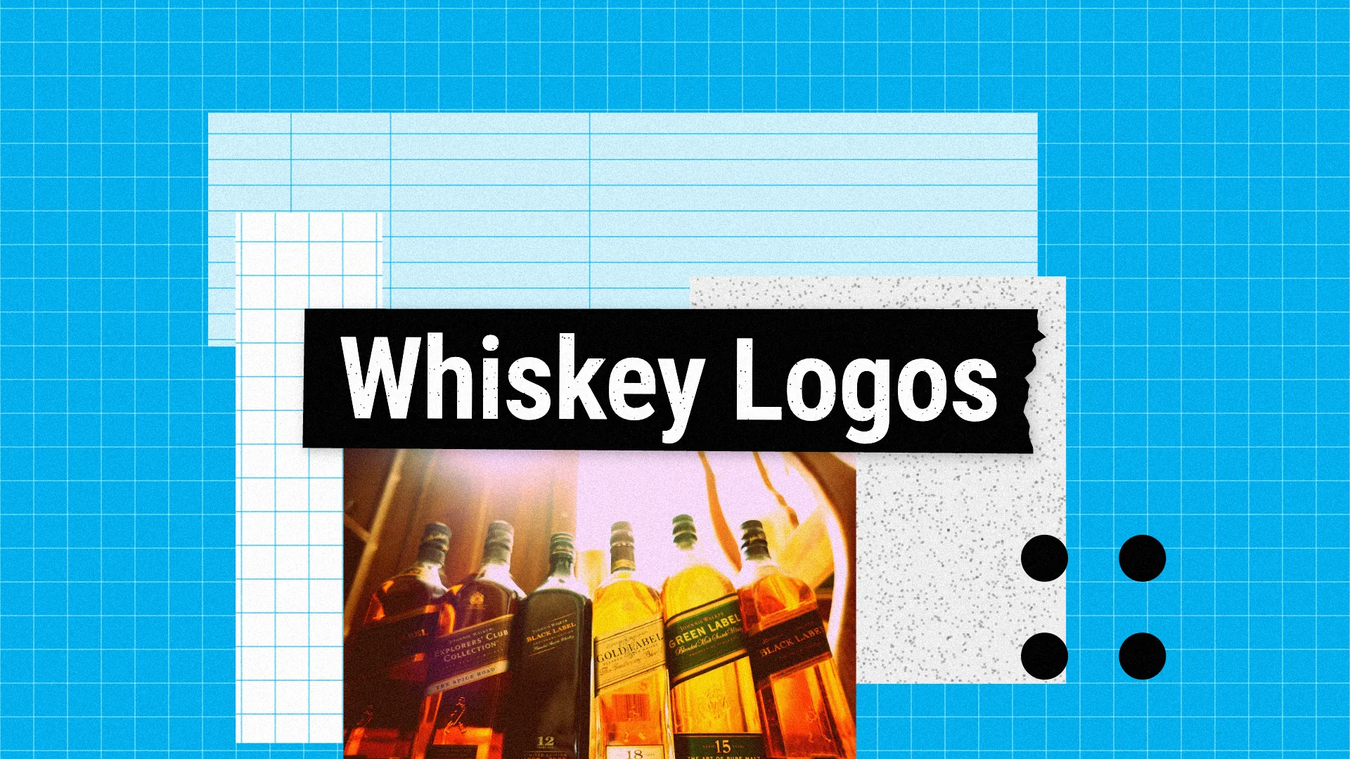
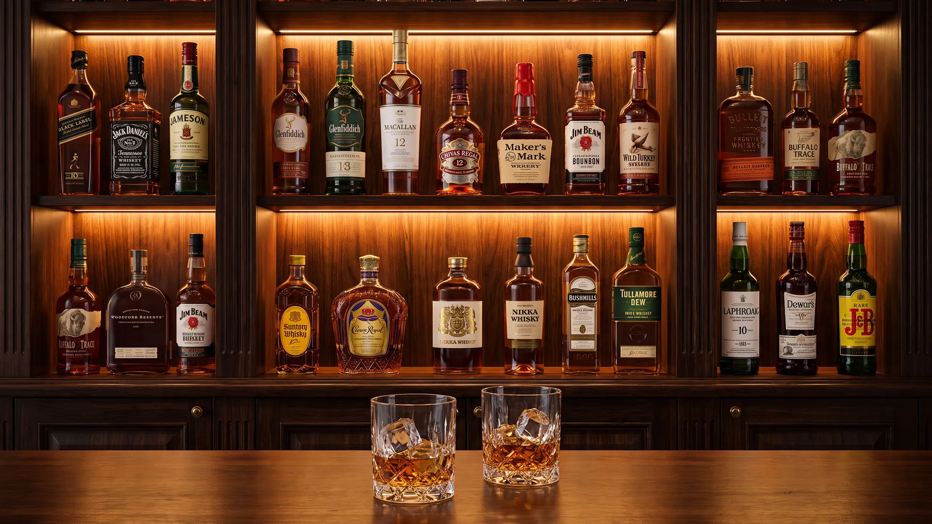
A whiskey logo has to look good on a bottle label, a bar shelf, a glass, a cask and a gift box, and it often has to promise decades or even centuries of tradition. The best whiskey logos are full of heritage, rich in detail, and instantly recognisable on a crowded back-bar.
What makes a good whiskey logo?
Heritage you can see: founding dates, crests, seals and founders' names, like Johnnie Walker, Jameson, Dewar's and Powers, tell you the whiskey has a long history.
A symbol that lives on the bottle: the Johnnie Walker Striding Man, the Maker's Mark wax seal, the Wild Turkey turkey and the Crown Royal crown work even when the name is too small to read.
A clear sense of place: many whiskey brands are named after valleys, rivers, towns and islands, like Glenfiddich, Laphroaig, Buffalo Trace and Bruichladdich, and their logos lean on that story.
Below are 45 whiskey logos in five groups: Scotch whisky icons, bourbon and American whiskey, Irish whiskey, Japanese and world whisky, and craft distilleries. Each logo has a slide with my handwritten notes and a short explanation. If you are launching a spirits brand, see my branding checklist and my guides to logo colours and logo fonts. For more drinks brands, see my beer logos.
45 whiskey logos
The boards below show all 45 whiskey logos in one consistent format, grouped into Scotch, bourbon and American whiskey, Irish whiskey, Japanese and world whisky, and craft distilleries.
Each logo is reviewed for its design decisions, not for the taste, age or price of the whiskey.
01 — Scotch whisky icons
Scotch logos are built on Gaelic place names, crests and founding dates, with serif type that feels centuries old.
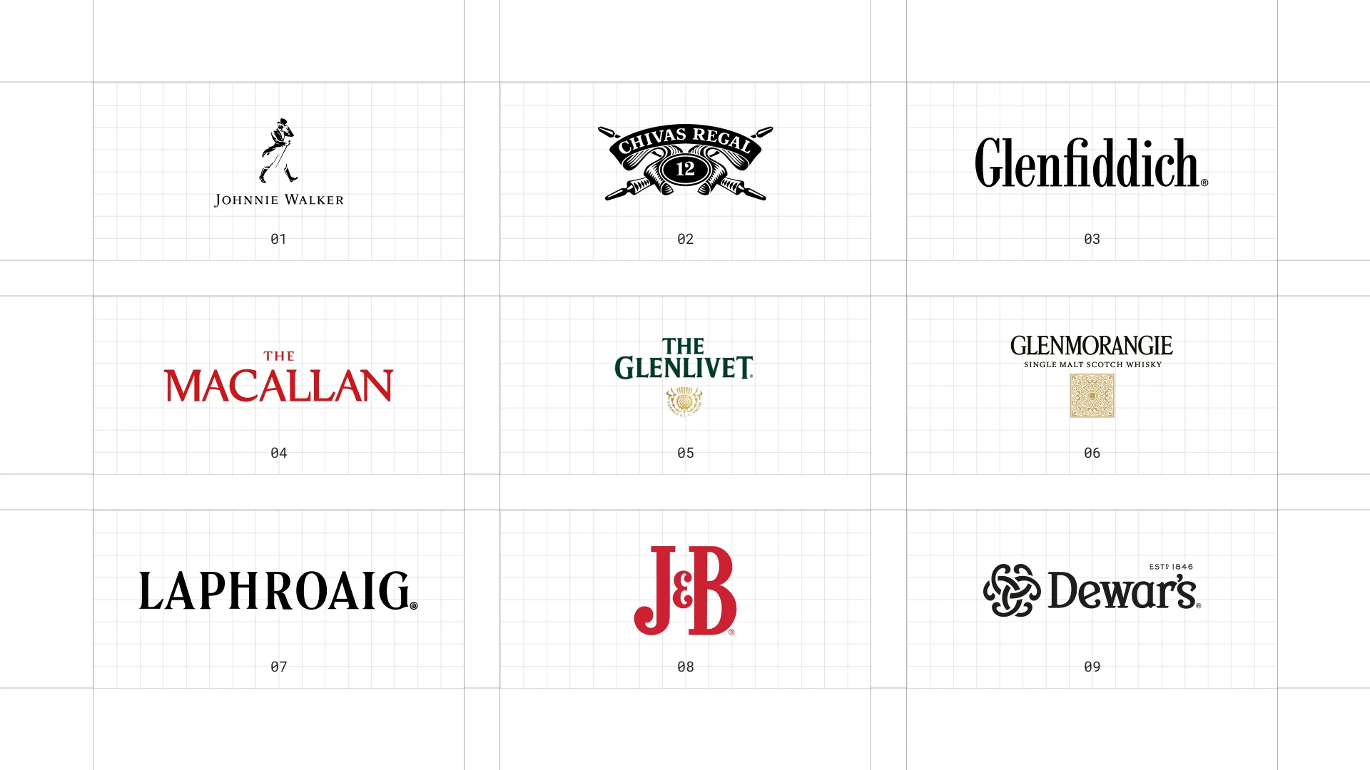
This is a visual comparison of whiskey logos, not a ranking of whiskies.
Look at how each logo uses type, colour and one symbol to signal heritage, place or craft.
01 Johnnie Walker
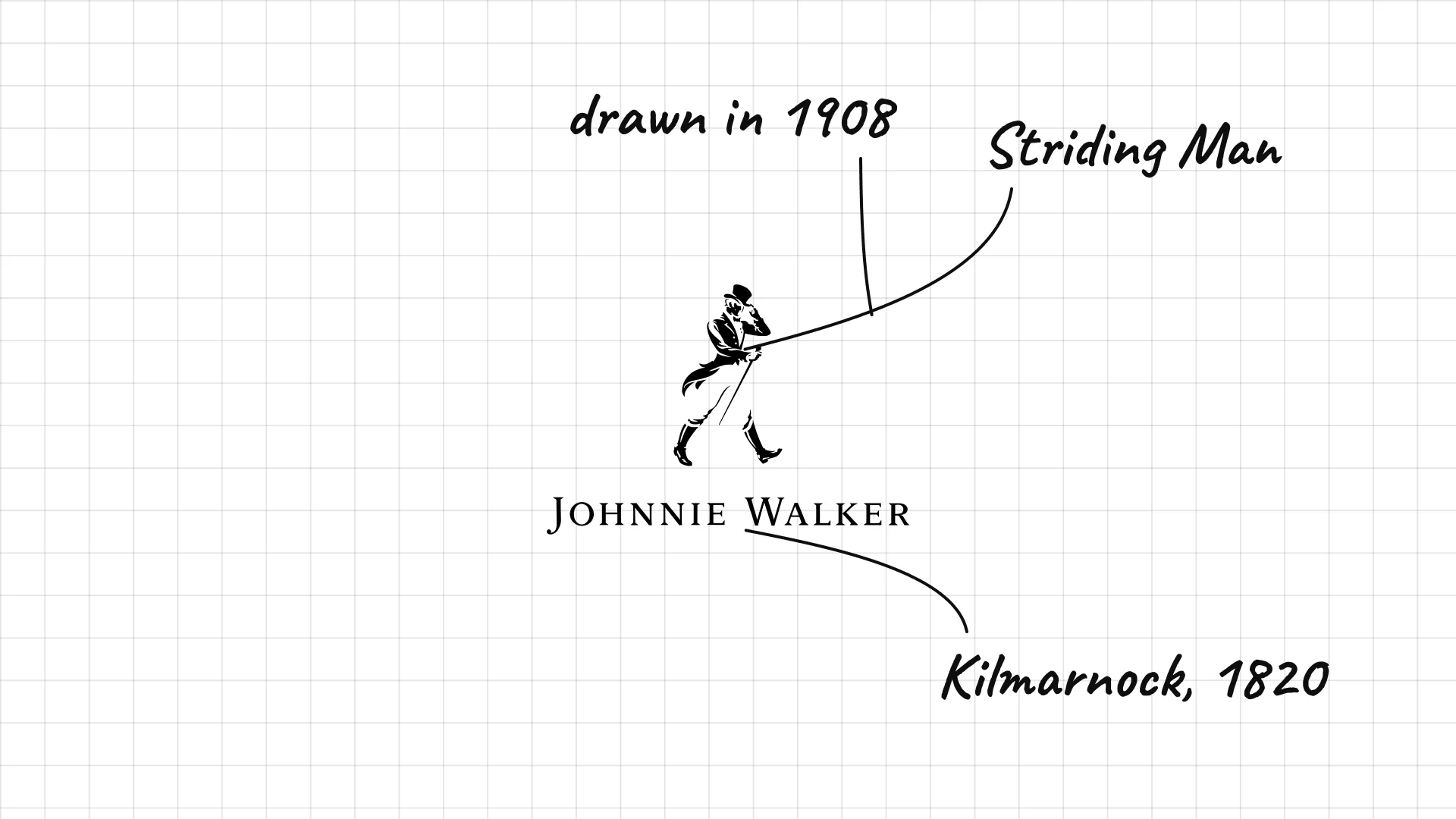
Johnnie Walker John Walker began selling whisky in his grocery shop in Kilmarnock, Scotland, in 1820.
The Striding Man was first drawn by the cartoonist Tom Browne in 1908 and has been walking ever since.
Thin, widely spaced small capitals keep the name quiet so the figure does the talking.
02 Chivas Regal
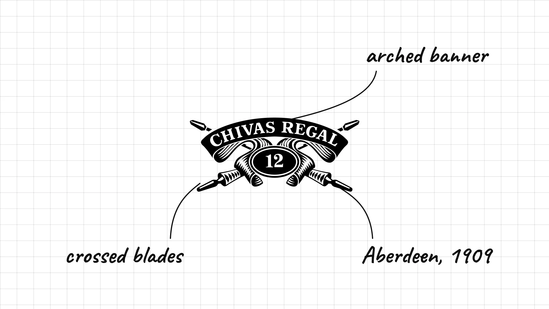
Chivas Regal Brothers James and John Chivas built their business in Aberdeen, and Chivas Regal was launched in 1909.
The arched banner and crossed blades look like a Scottish coat of arms.
The age statement sits in the centre of the crest, so quality is part of the mark.
03 Glenfiddich
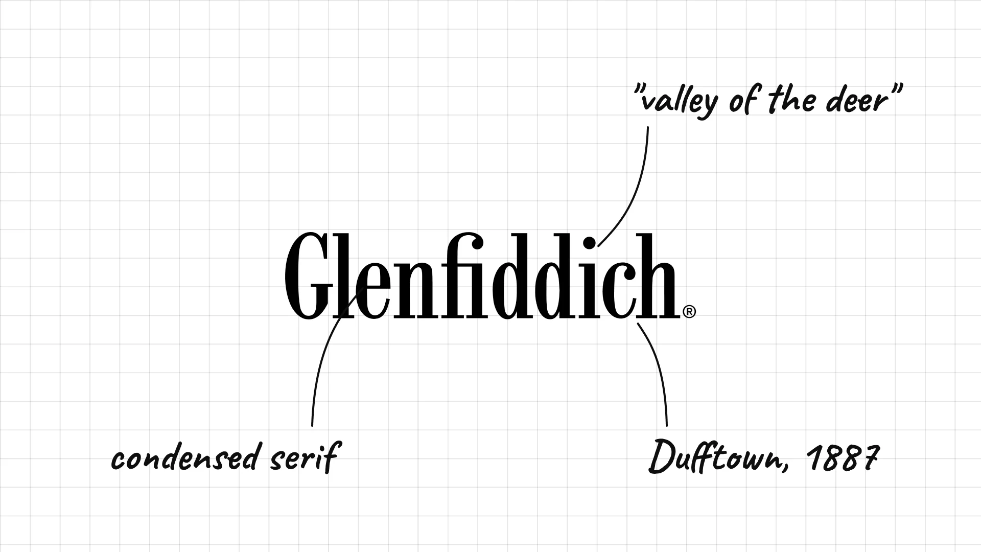
Glenfiddich William Grant and his children built the Glenfiddich distillery in Dufftown, and its first spirit ran on Christmas Day 1887.
A condensed serif wordmark looks classic, tall and confident.
The name means "valley of the deer" in Gaelic, which is why the brand also uses a stag.
04 The Macallan
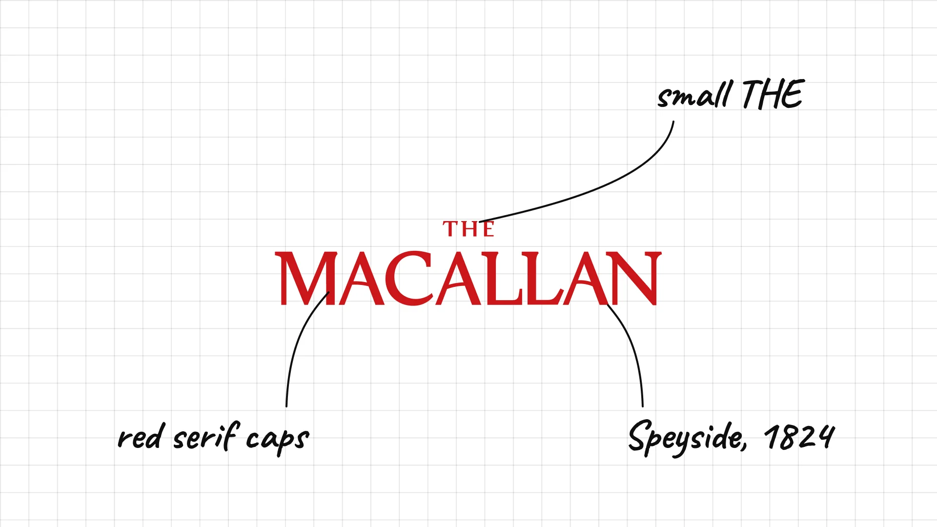
The Macallan was founded in 1824 at Easter Elchies in Speyside, one of the first licensed distilleries in Scotland.
Red classic serif capitals with a small "The" above feel formal and traditional.
The restrained type suits a whisky sold as a luxury collectible.
05 The Glenlivet
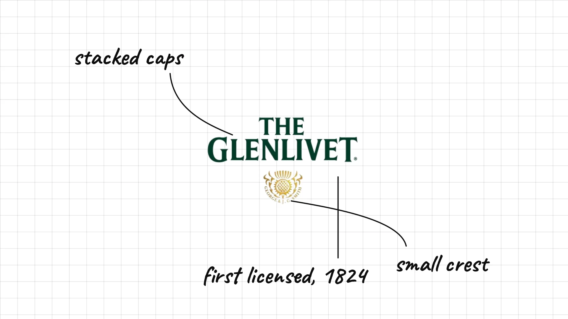
The Glenlivet George Smith founded The Glenlivet in 1824, the first legally licensed distillery in the Glenlivet parish.
Stacked green serif capitals echo the classic bottle label.
A small crest under the name adds a seal of tradition.
06 Glenmorangie
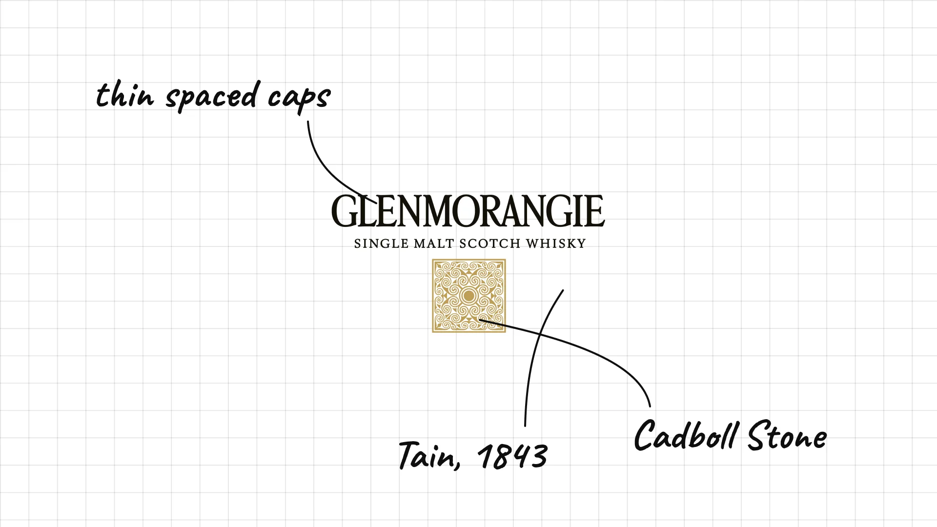
Glenmorangie was founded in Tain, in the Scottish Highlands, in 1843.
Thin, spaced capitals make the long Gaelic name feel light and elegant.
The gold emblem is based on the pattern of the Cadboll Stone, an ancient Pictish carving found nearby.
07 Laphroaig
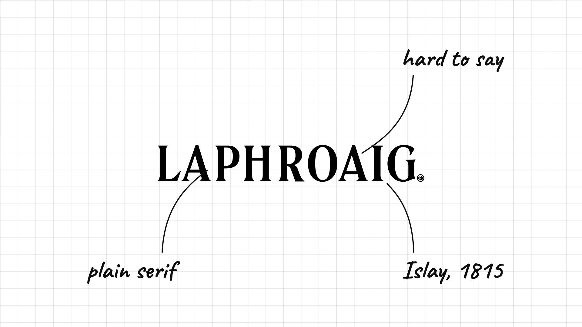
Laphroaig The Johnston brothers founded Laphroaig on the island of Islay in 1815.
Plain serif capitals let the famously hard-to-pronounce name stand on its own.
The simple mark suits a whisky known for one bold, smoky flavour.
08 J&B
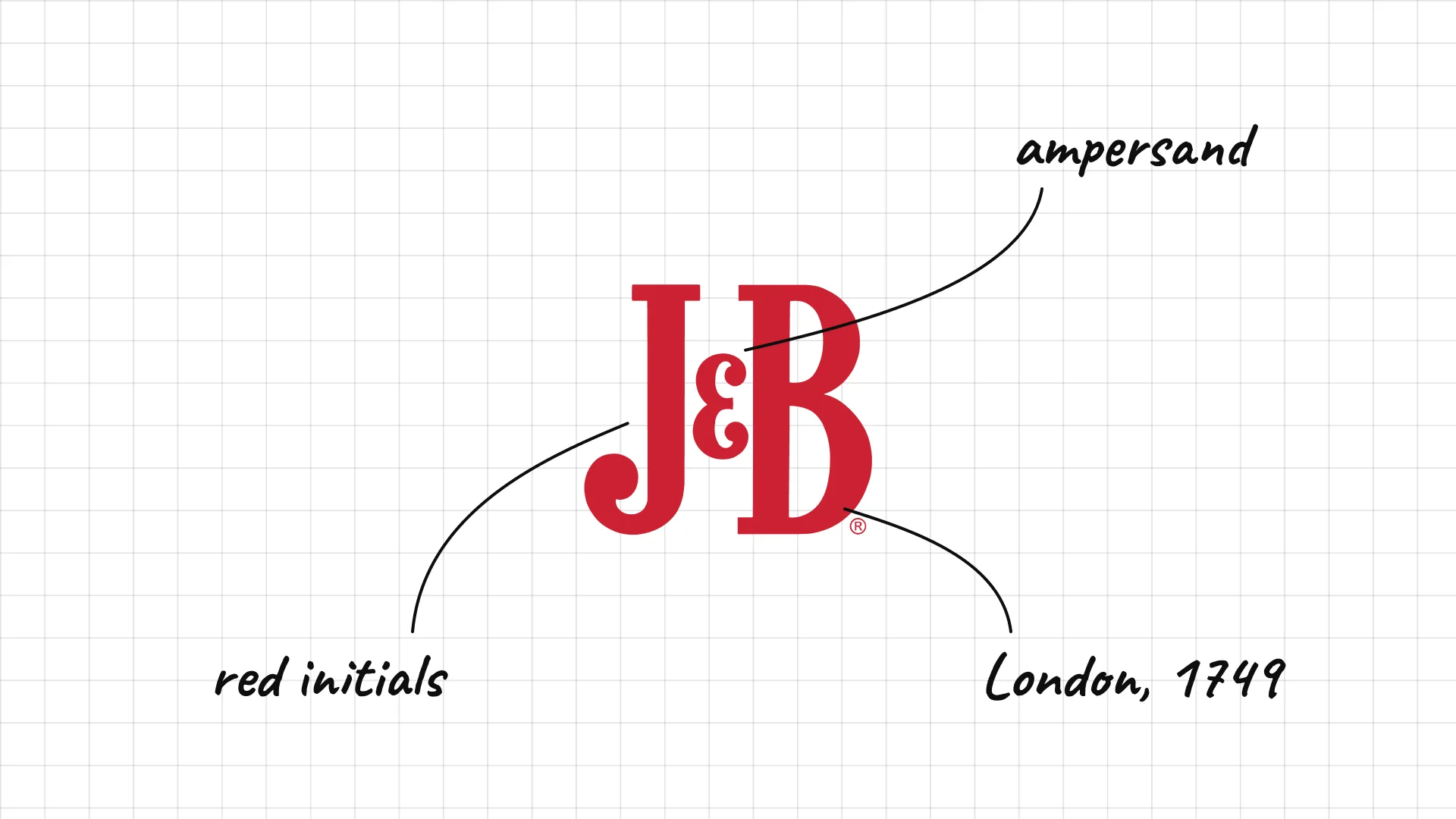
J&B Justerini & Brooks began as a wine merchant in London in 1749, and J&B Rare was launched in 1933.
Two red initials and an ampersand turn a long company name into a short, punchy mark.
The red type on the classic yellow label is one of the most recognisable on any bar shelf.
09 Dewar's
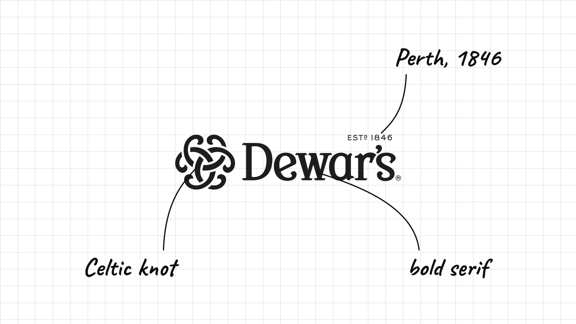
Dewar's John Dewar opened his wine and spirits shop in Perth, Scotland, in 1846.
A Celtic knot symbol gives the brand a simple Scottish icon.
A bold serif wordmark with the founding date keeps the heritage story clear.
02 — Bourbon and American whiskey
American whiskey logos borrow from the frontier: animals, signatures, stamps and heavy type that feels rugged and honest.
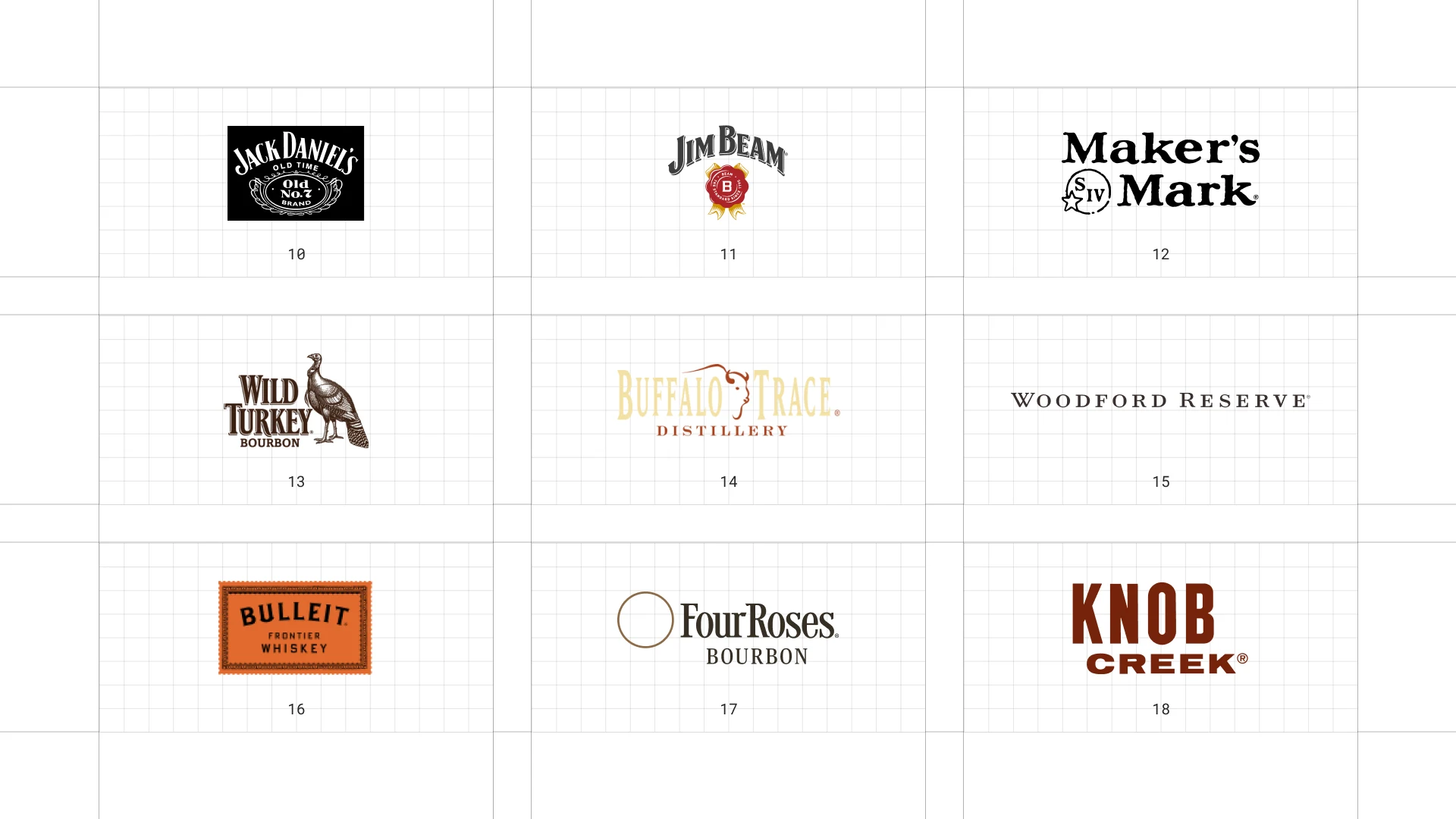
This is a visual comparison of whiskey logos, not a ranking of whiskies.
Look at how each logo uses type, colour and one symbol to signal heritage, place or craft.
10 Jack Daniel's
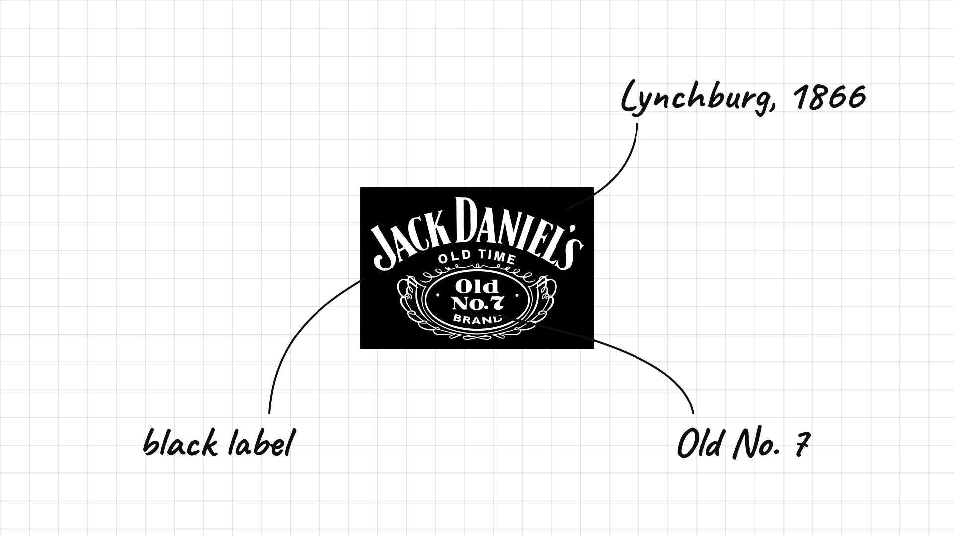
Jack Daniel's is made in Lynchburg, Tennessee, where the company dates its distillery to 1866.
The black label with ornate white lettering is one of the most famous whiskey labels in the world.
"Old No. 7" in the centre is a mystery the brand has never fully explained, which only adds to the story.
11 Jim Beam
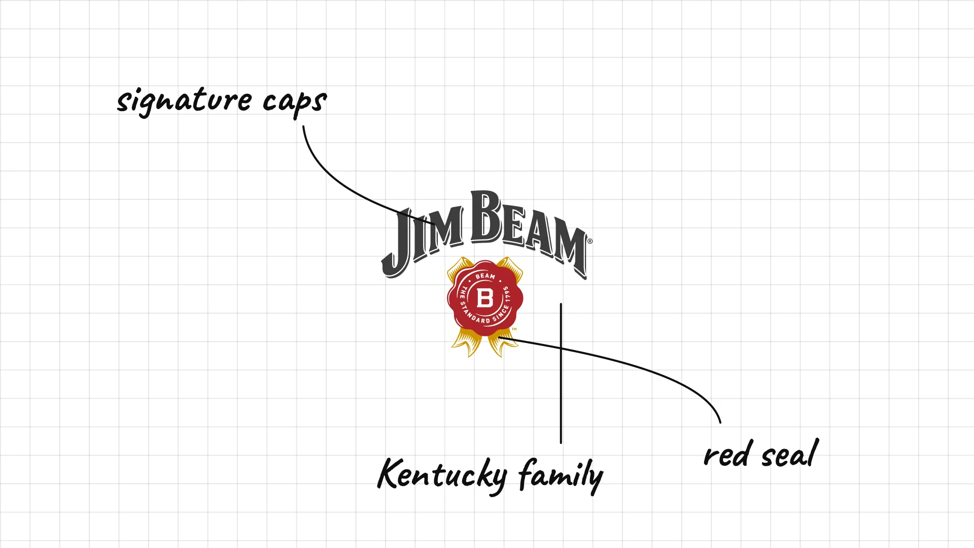
Jim Beam The Beam family has made bourbon in Kentucky since the 1790s, and the Jim Beam name was adopted after Prohibition.
The slanted capitals look like a signature, linking the bourbon to the family.
A red seal below adds a stamp of approval.
12 Maker's Mark
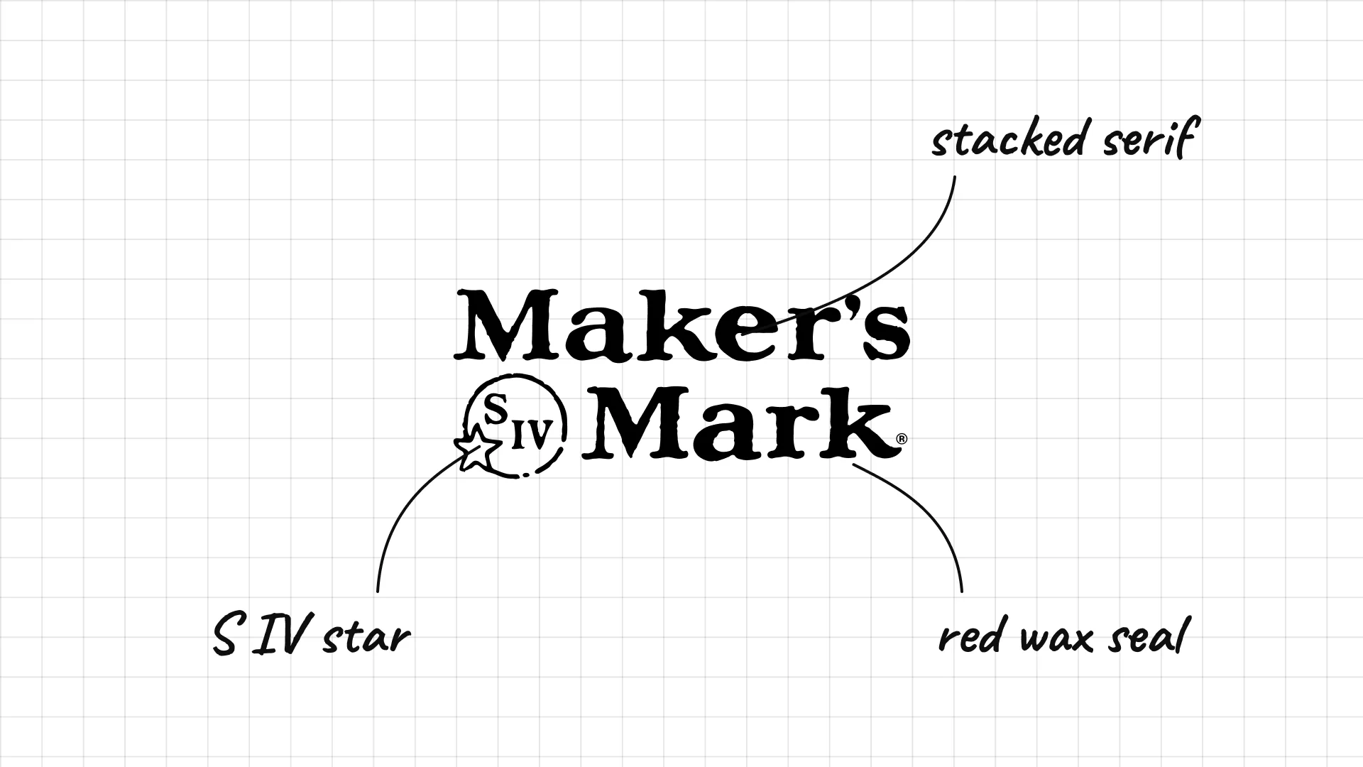
Maker's Mark Bill Samuels Sr. started Maker's Mark in Loretto, Kentucky, in the 1950s.
The small mark with S IV and a star stands for Samuels, fourth generation, and the family's Star Hill Farm.
The brand is just as famous for its red wax seal, created by Margie Samuels.
13 Wild Turkey
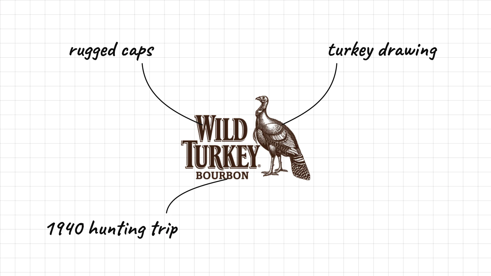
Wild Turkey The name comes from a 1940 turkey hunting trip, when a distillery executive brought bourbon for his friends.
The detailed turkey illustration is a literal picture of the name.
Heavy, rugged capitals match the brand's strong, high-proof bourbon.
14 Buffalo Trace
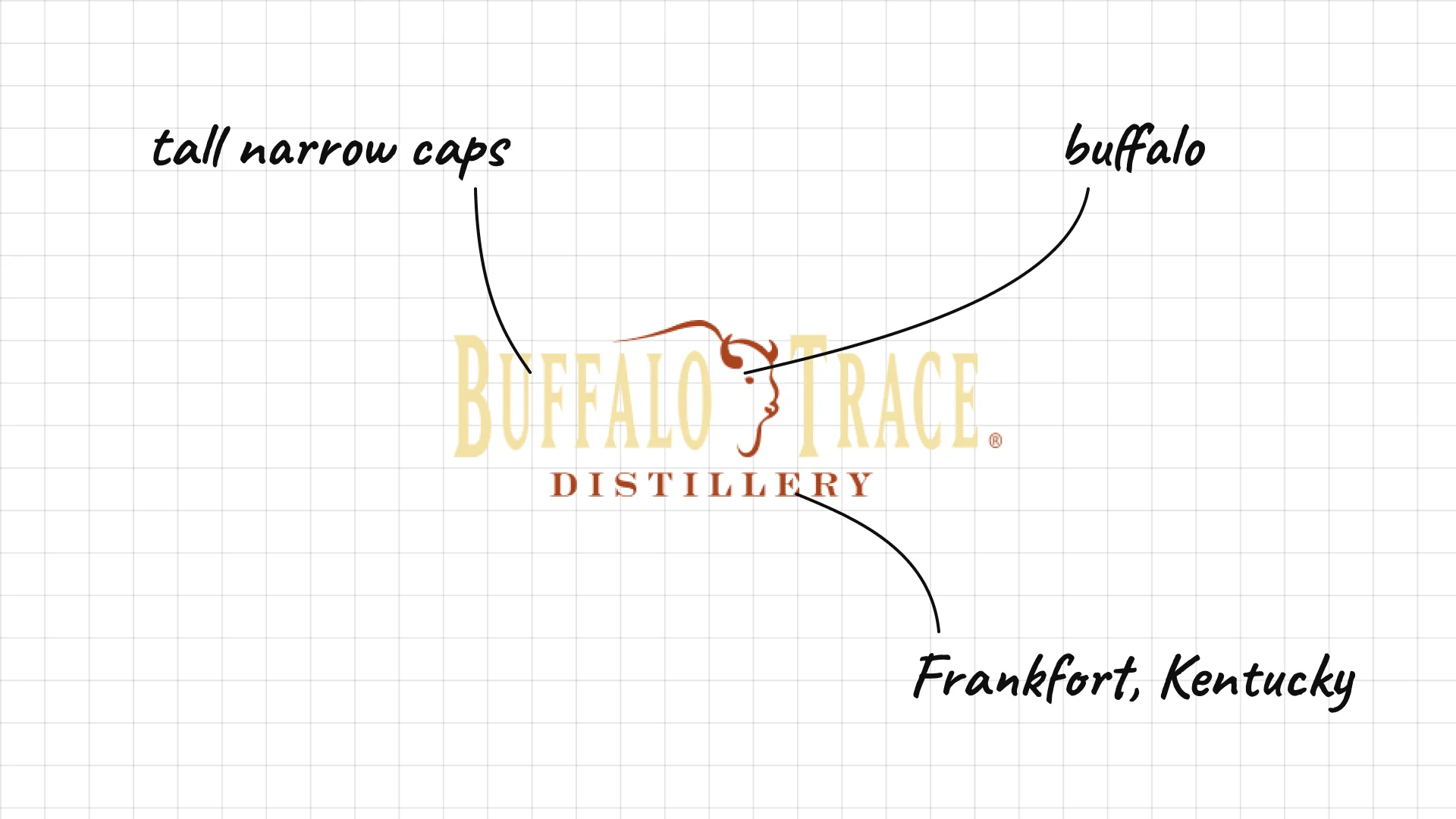
Buffalo Trace The distillery in Frankfort, Kentucky, is named after an old buffalo trail that crossed the Kentucky River there.
A buffalo silhouette sits between the two words, telling the name's story.
Tall, narrow capitals give the logo an old frontier feel.
15 Woodford Reserve
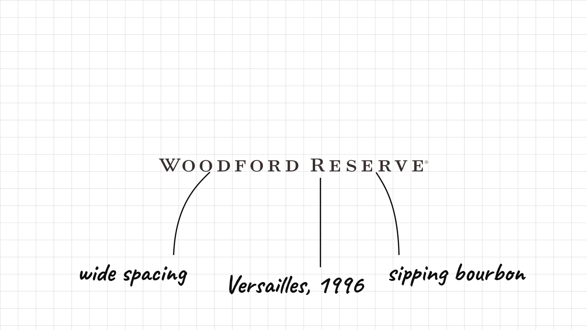
Woodford Reserve was launched in 1996 at a historic distillery in Versailles, Kentucky.
Very widely spaced capitals feel calm, refined and premium.
The quiet wordmark matches a bourbon positioned as a sipping whiskey.
16 Bulleit
Bulleit Tom Bulleit launched Bulleit Bourbon in 1987, inspired by a recipe from his ancestor Augustus Bulleit.
Heavy capitals inside a box look like an old frontier stamp.
The orange colour matches the bourbon and stands out on the shelf.
17 Four Roses
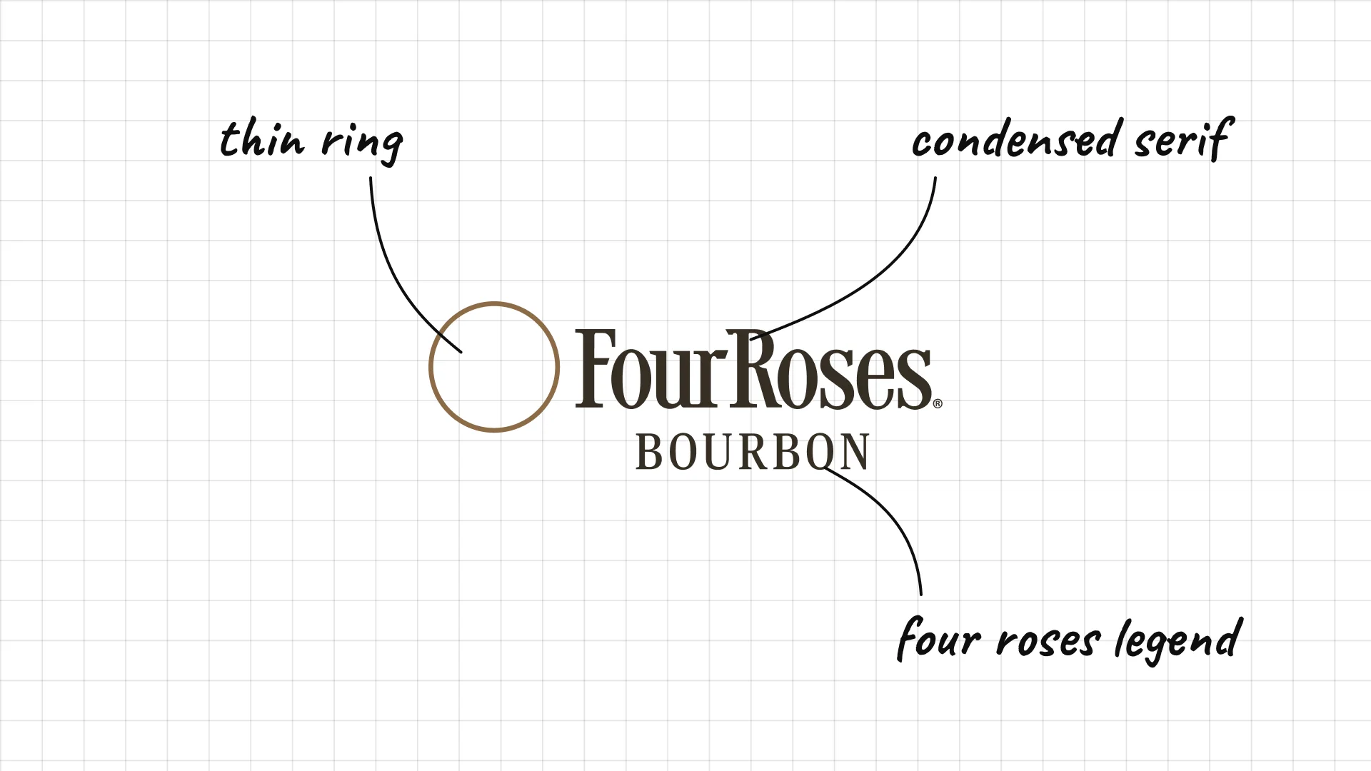
Four Roses has been a trademarked bourbon brand since the 1880s.
According to legend, the name comes from a corsage of four roses worn by the founder's sweetheart.
Elegant condensed type and a thin ring feel romantic rather than rugged.
18 Knob Creek
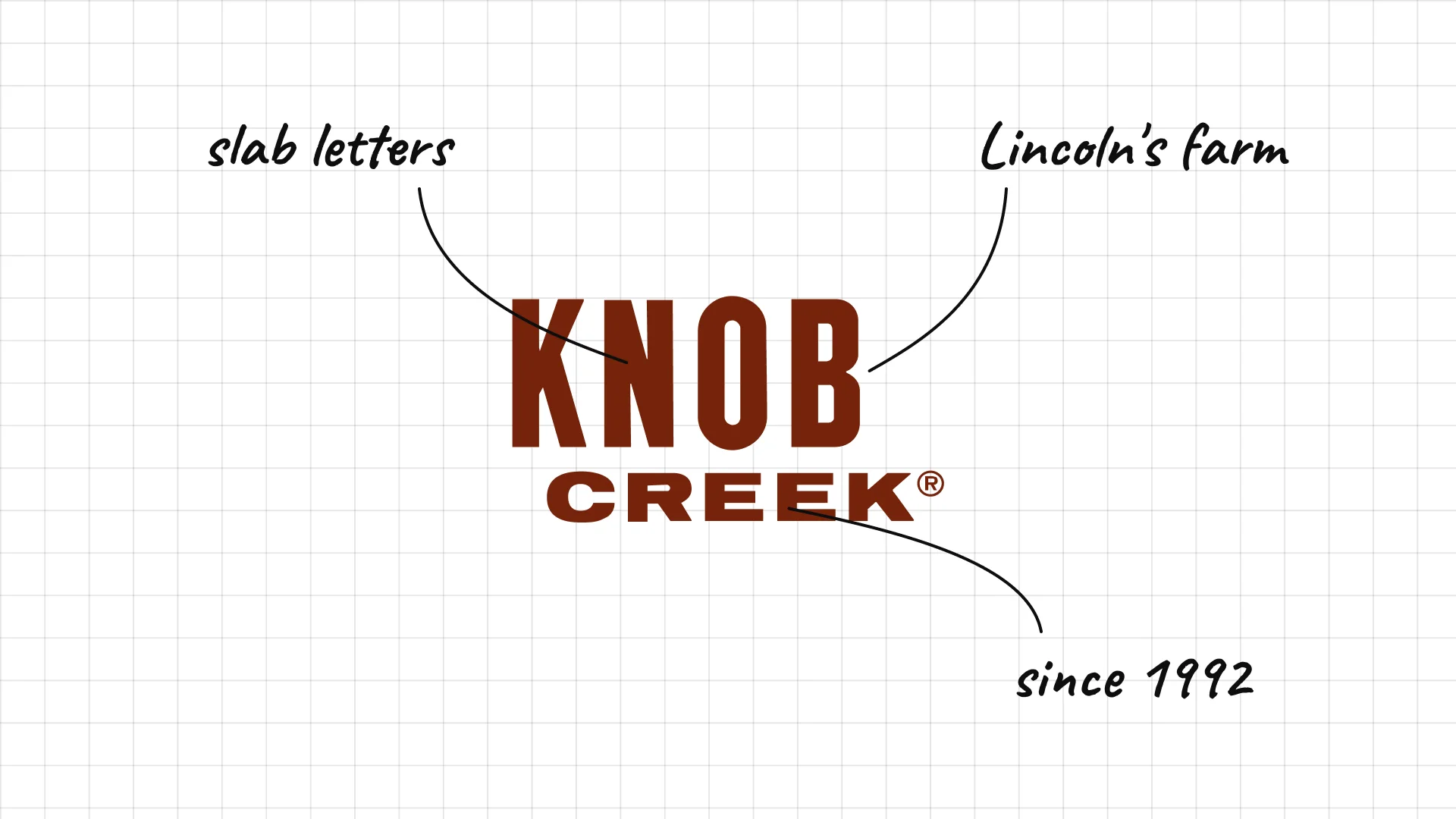
Knob Creek was introduced in 1992 and is named after the Kentucky farm where Abraham Lincoln lived as a boy.
Heavy slab letters look like an old newspaper headline.
The deep brown colour matches the label and the bourbon.
03 — Irish whiskey
Irish whiskey logos use family names, seals and green, often with dates that go back to the 1700s and 1800s.
This is a visual comparison of whiskey logos, not a ranking of whiskies.
Look at how each logo uses type, colour and one symbol to signal heritage, place or craft.
19 Jameson
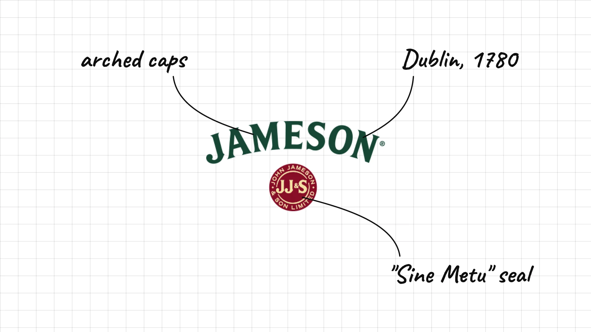
Jameson John Jameson took over the Bow Street distillery in Dublin in 1780.
Arched green capitals follow the shape of the classic label.
The red seal carries the family motto "Sine Metu", which means "without fear".
20 Bushmills
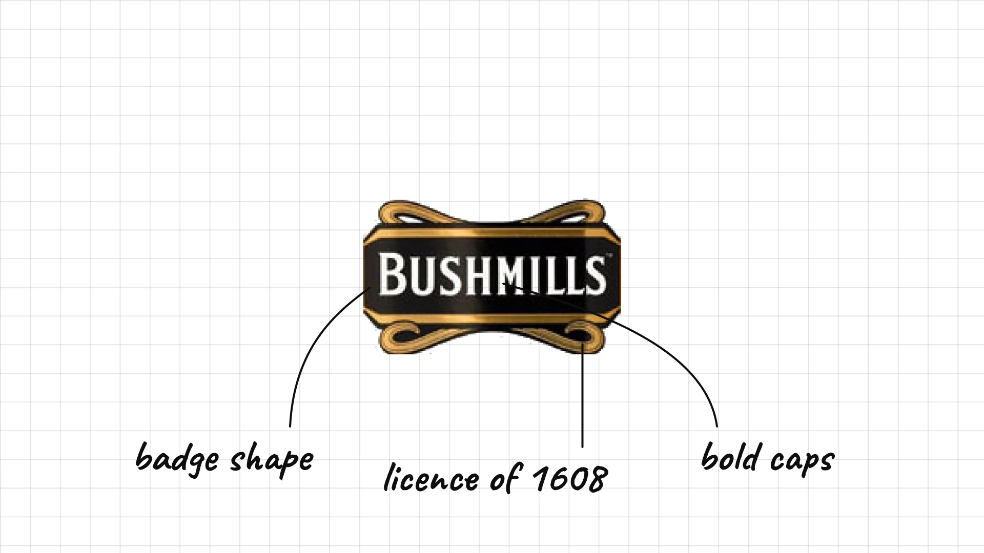
Bushmills in County Antrim traces its licence to distil back to 1608.
Bold capitals inside a curved badge look like an old shop sign.
The badge shape works as a label, a sign and a stamp.
21 Tullamore D.E.W.
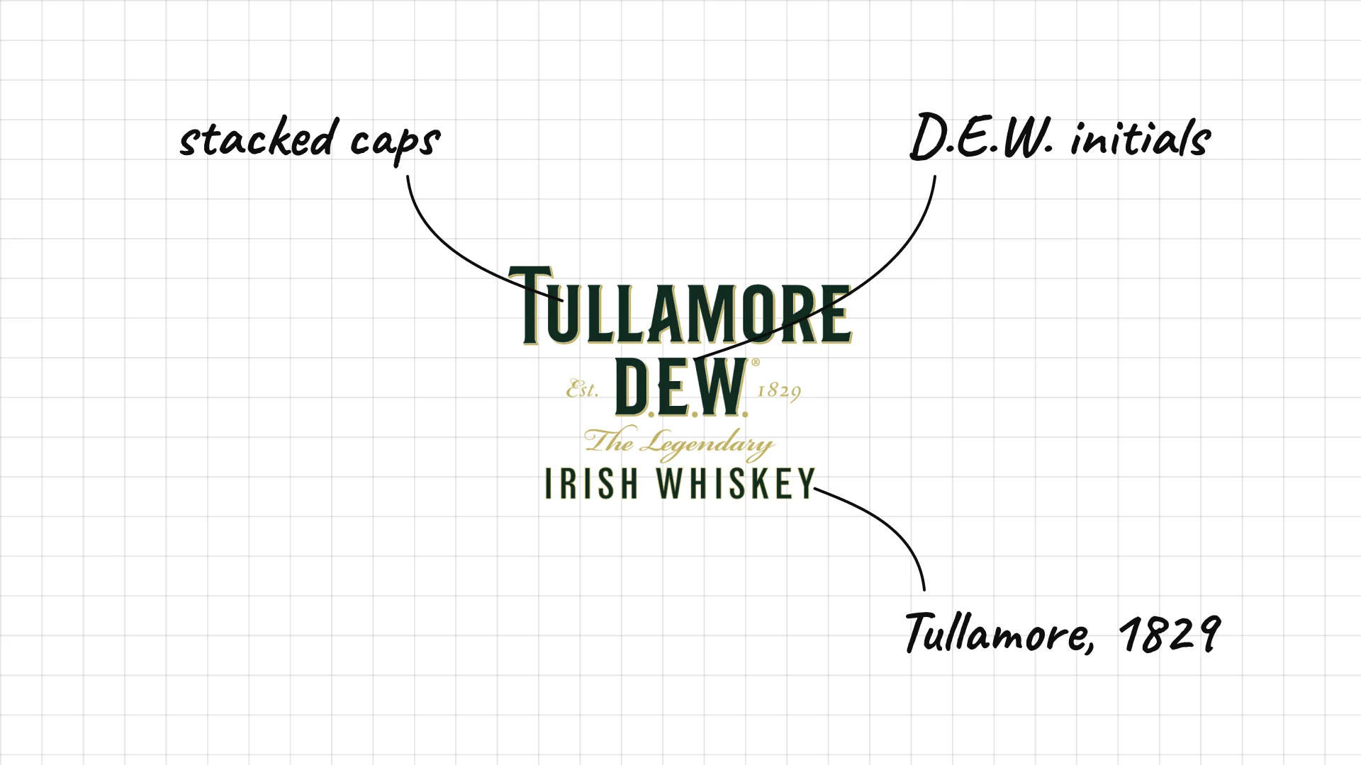
Tullamore D.E.W. comes from the town of Tullamore, and its name uses the initials of Daniel E. Williams.
Stacked serif capitals make the long name easy to read.
The initials D.E.W. turn a manager's name into a word that sounds fresh and light.
22 Redbreast
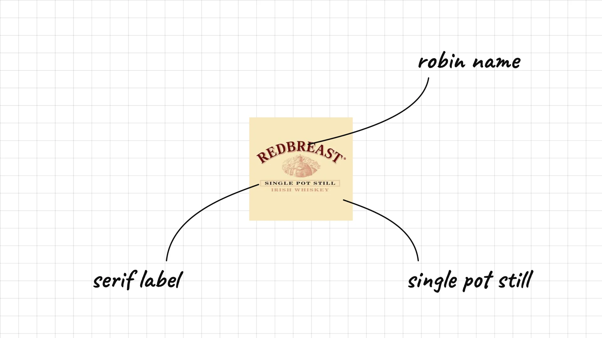
Redbreast was first sold by Gilbey's in the early 1900s and is now a famous Irish single pot still whiskey.
The name comes from the robin, which the brand still uses on its labels.
The classic serif lettering feels old-fashioned and warm.
23 Teeling
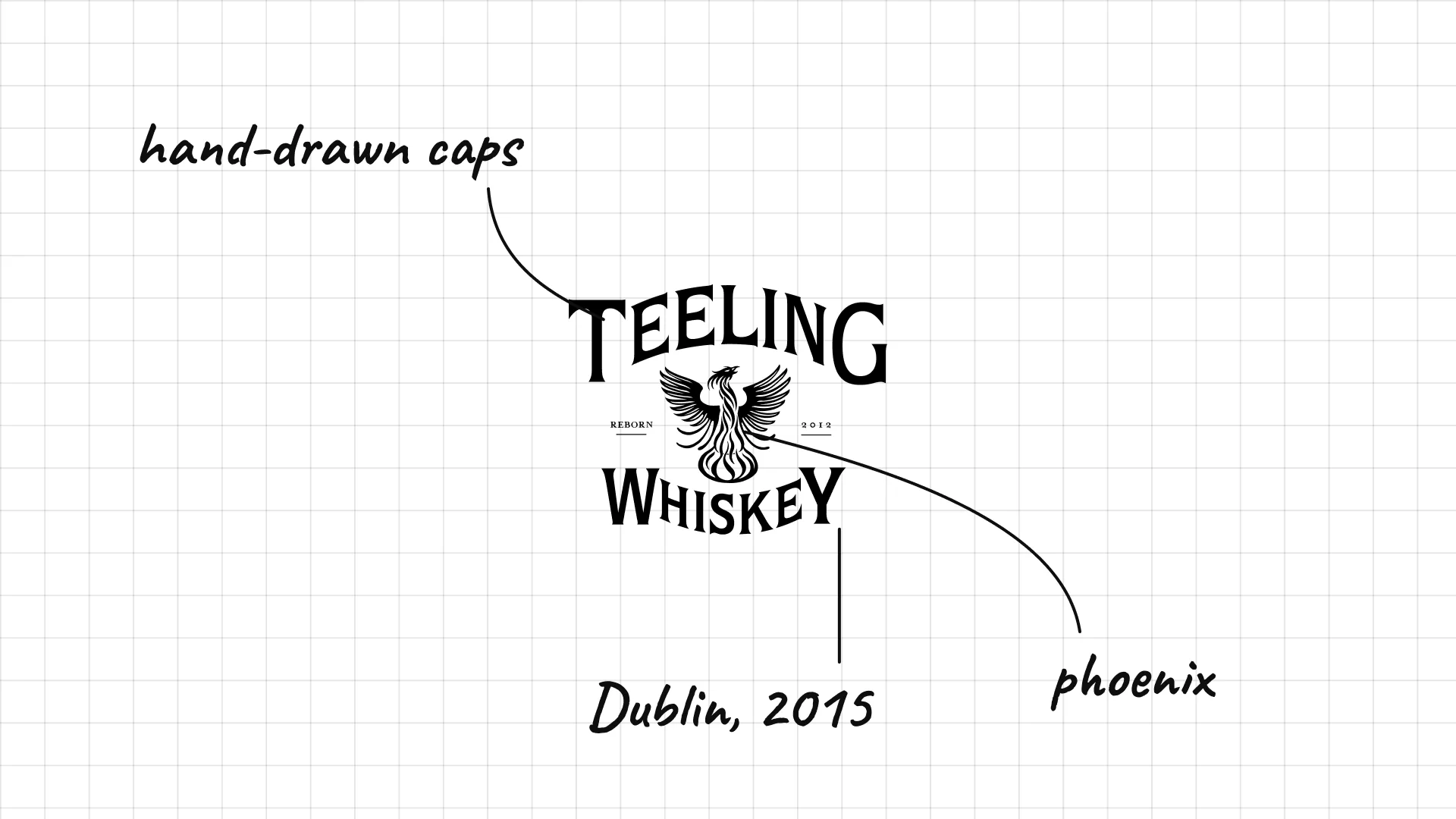
Teeling The Teeling Whiskey Distillery opened in Dublin in 2015, the first new distillery in the city in over a century.
The phoenix between the words stands for the rebirth of Dublin whiskey.
Hand-drawn capitals give the brand a modern craft feel.
24 Powers
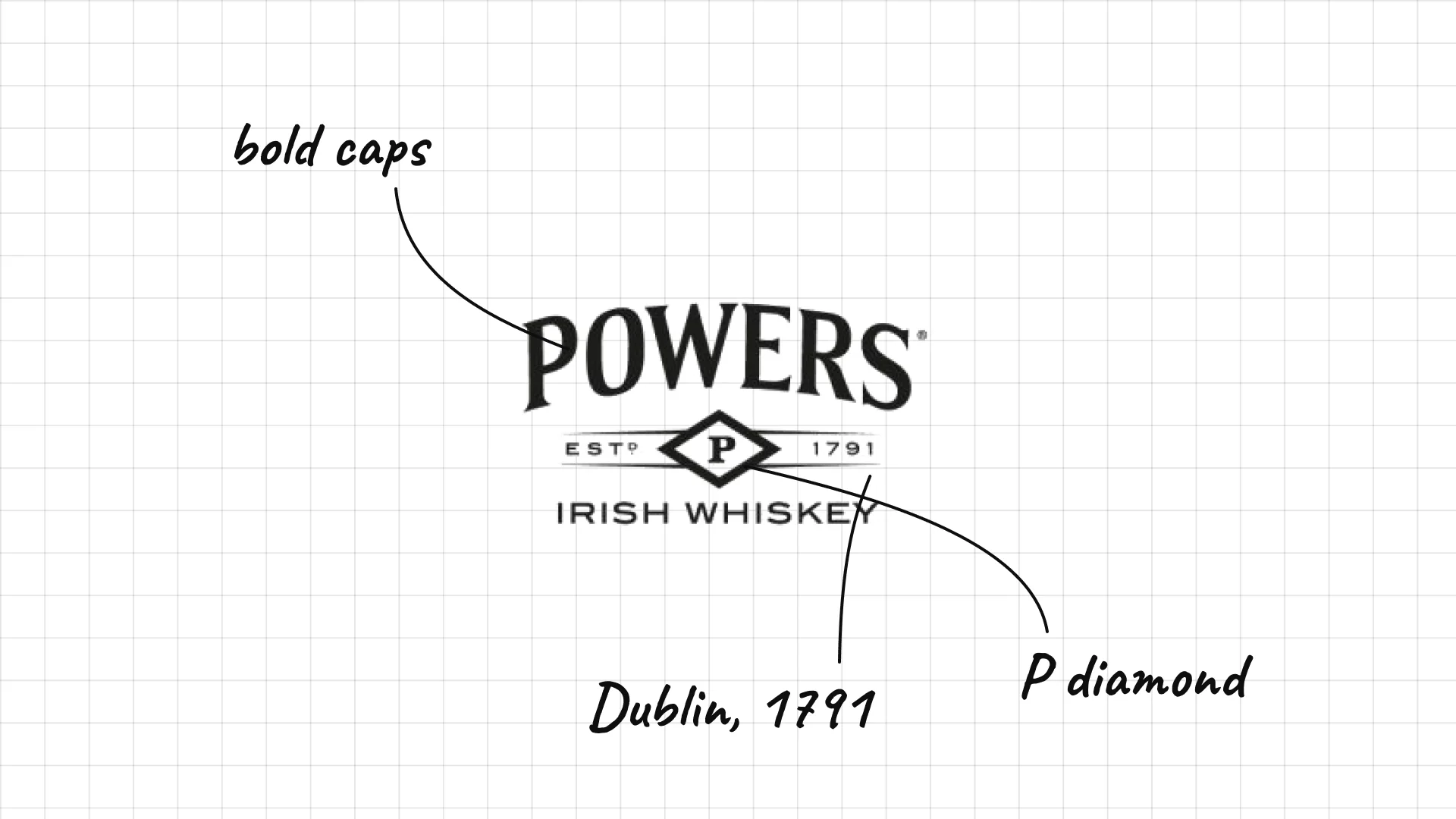
Powers James Power founded his distillery in Dublin in 1791.
A diamond with a P sits under the name like a seal.
The founding date is part of the logo, so heritage is built in.
25 Green Spot
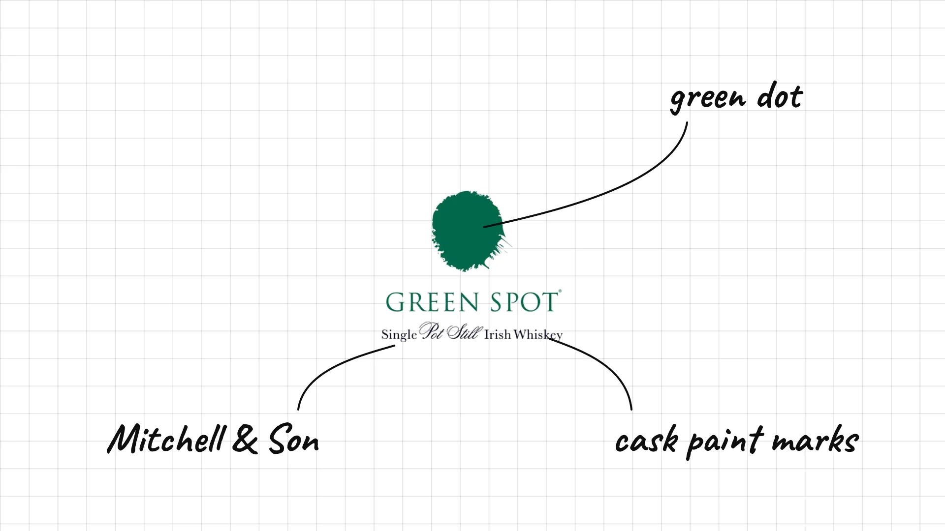
Green Spot was first sold by Mitchell & Son, a Dublin wine merchant, in the early 1900s.
The green dot is a literal picture of the name.
The name comes from the green paint marks the merchant put on its whiskey casks.
26 Slane
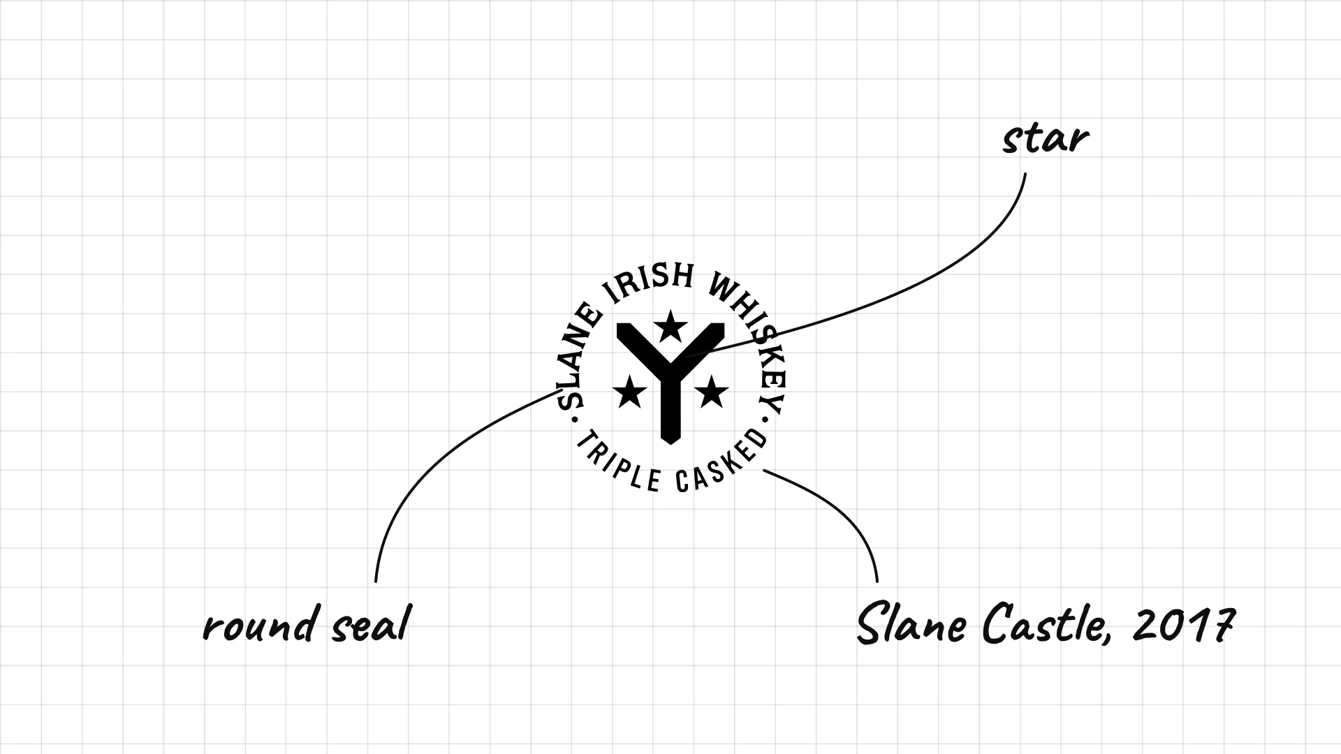
Slane The Conyngham family opened the Slane distillery on the grounds of Slane Castle in 2017.
The round seal with a star looks like a stamp of approval.
"Triple casked" in the seal tells you how the whiskey is made.
27 Roe & Co
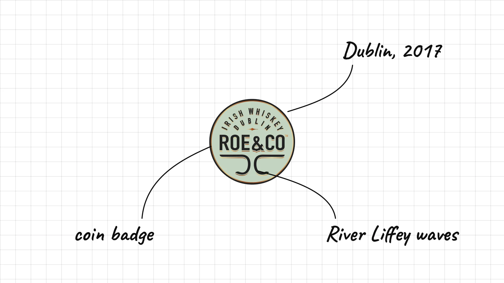
Roe & Co was launched in 2017 and is named after George Roe, a famous Dublin distiller of the 1800s.
The round badge with circular text looks like a vintage coin.
The waves under the name hint at the River Liffey near the distillery.
04 — Japanese and world whisky
Japanese and world whisky brands mix the heritage signals of Scotch with modern, clean type that reflects where they come from.
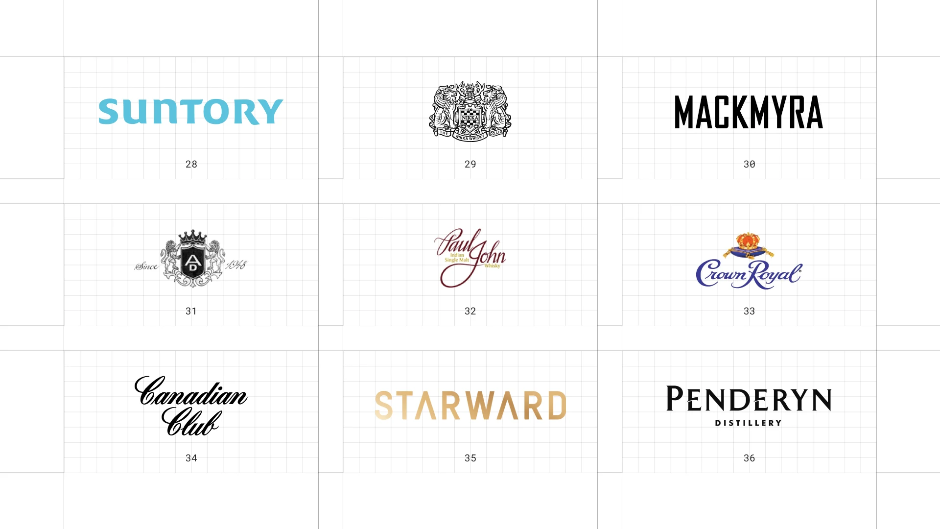
This is a visual comparison of whiskey logos, not a ranking of whiskies.
Look at how each logo uses type, colour and one symbol to signal heritage, place or craft.
28 Suntory
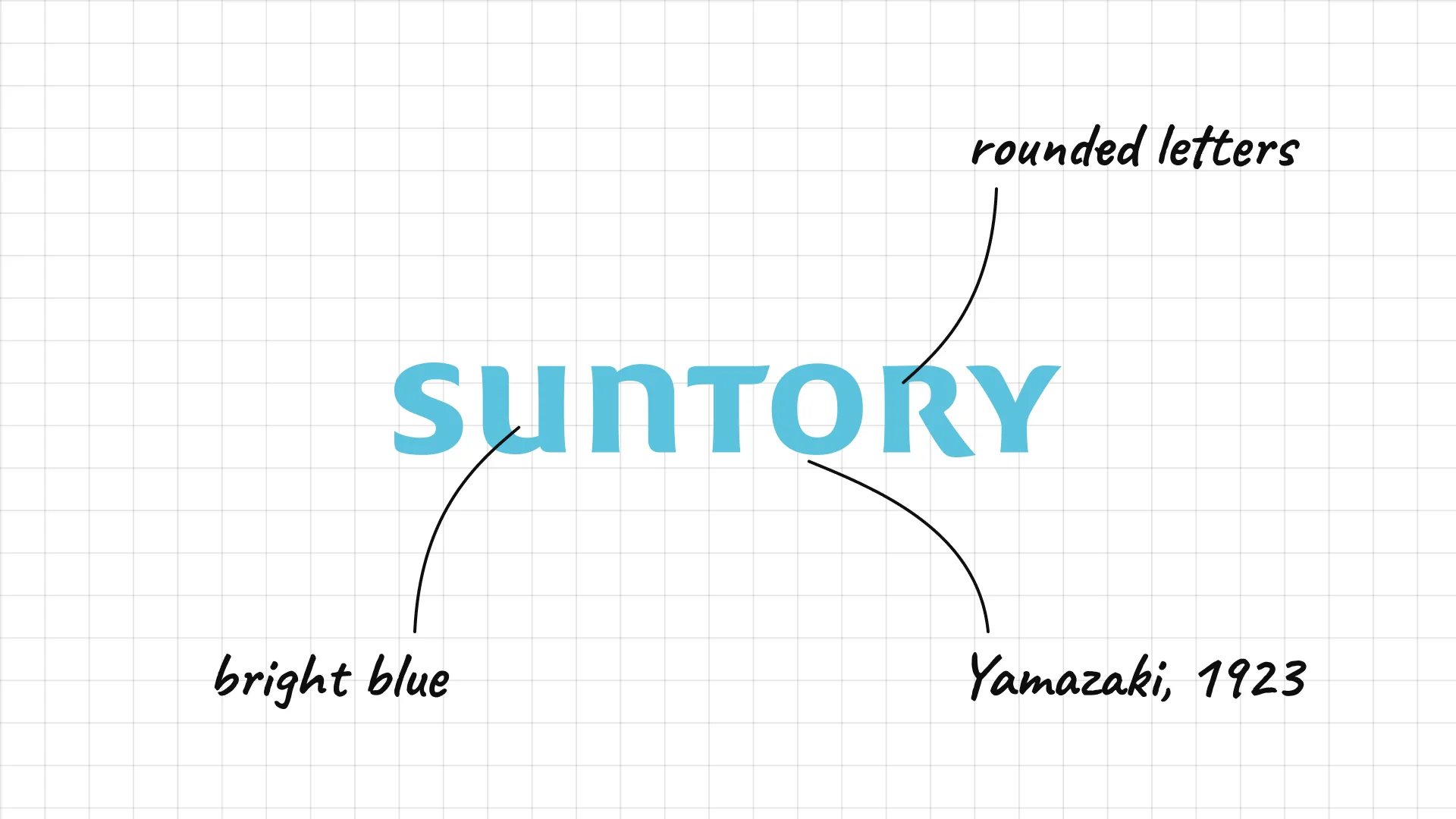
Suntory Shinjiro Torii founded the company in 1899 and opened Japan's first malt whisky distillery at Yamazaki in 1923.
Bright blue rounded letters make the brand feel fresh, like water.
The company logo is friendly and modern rather than traditional.
29 Nikka
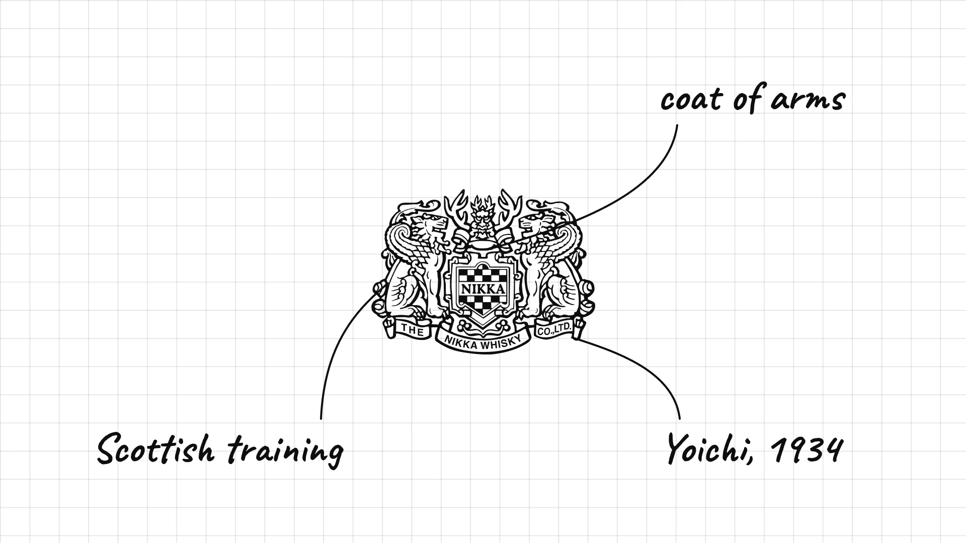
Nikka Masataka Taketsuru founded Nikka in 1934 at Yoichi, Hokkaido, after studying whisky making in Scotland.
The detailed crest looks like a European coat of arms, a nod to the founder's Scottish training.
The emblem appears on every bottle, so it works even without the name.
30 Mackmyra
Mackmyra was founded in 1999 by eight friends and became Sweden's first single malt distillery.
Heavy, condensed capitals feel strong and Scandinavian.
The bold black wordmark stands out among the ornate labels of traditional whisky.
31 Amrut
Amrut Distilleries was founded in Bangalore, India, in 1948.
The crest with a crown and the founding date looks like a royal seal.
Ornate details give an Indian whisky the same heritage signals as Scotch.
32 Paul John
Paul John John Distilleries in Goa, India, launched the Paul John single malts in 2012.
The flowing signature script makes the brand feel personal.
The founder's name in handwriting works like a personal guarantee.
33 Crown Royal
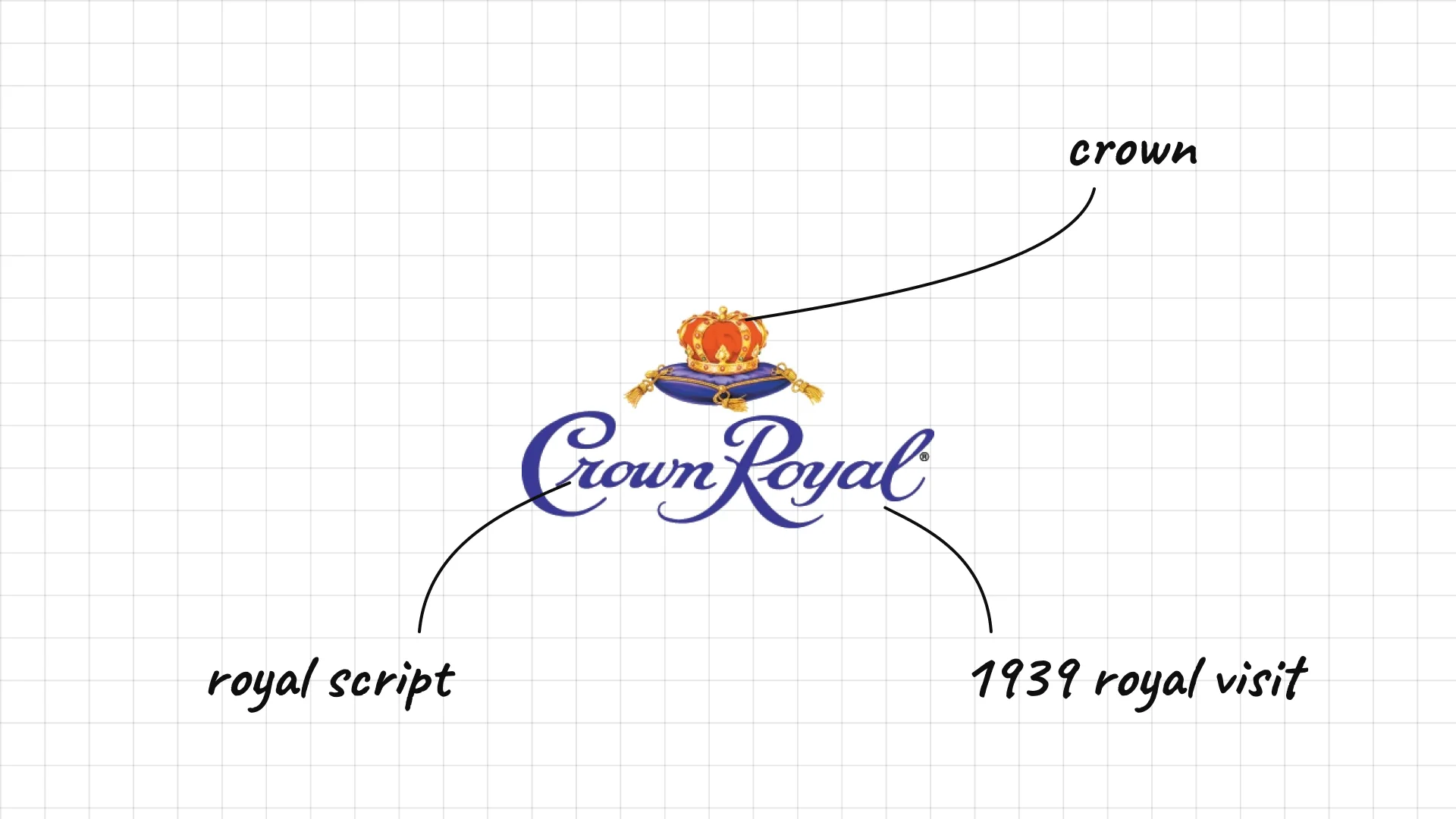
Crown Royal was created in 1939 for the royal visit of King George VI and Queen Elizabeth to Canada.
A crown above the script is a direct link to the royal story.
The flowing script and purple colour feel regal and celebratory.
34 Canadian Club
Canadian Club Hiram Walker founded Canadian Club in Walkerville, Ontario, in 1858.
The bold script looks like old hand lettering on a label.
Black script on its own keeps the logo classic and simple.
35 Starward
Starward David Vitale founded Starward in Melbourne, Australia, in 2007.
Widely spaced gold capitals feel modern and premium.
The clean wordmark sets the brand apart from traditional whisky crests.
36 Penderyn
Penderyn released its first whisky in 2004, the first Welsh whisky in about a century.
Widely spaced serif capitals feel elegant and calm.
The small "Distillery" line below keeps the focus on the name.
05 — Craft and design-led distilleries
A new wave of craft distilleries uses simpler, more modern logos, while still borrowing badges, dates and emblems from tradition.
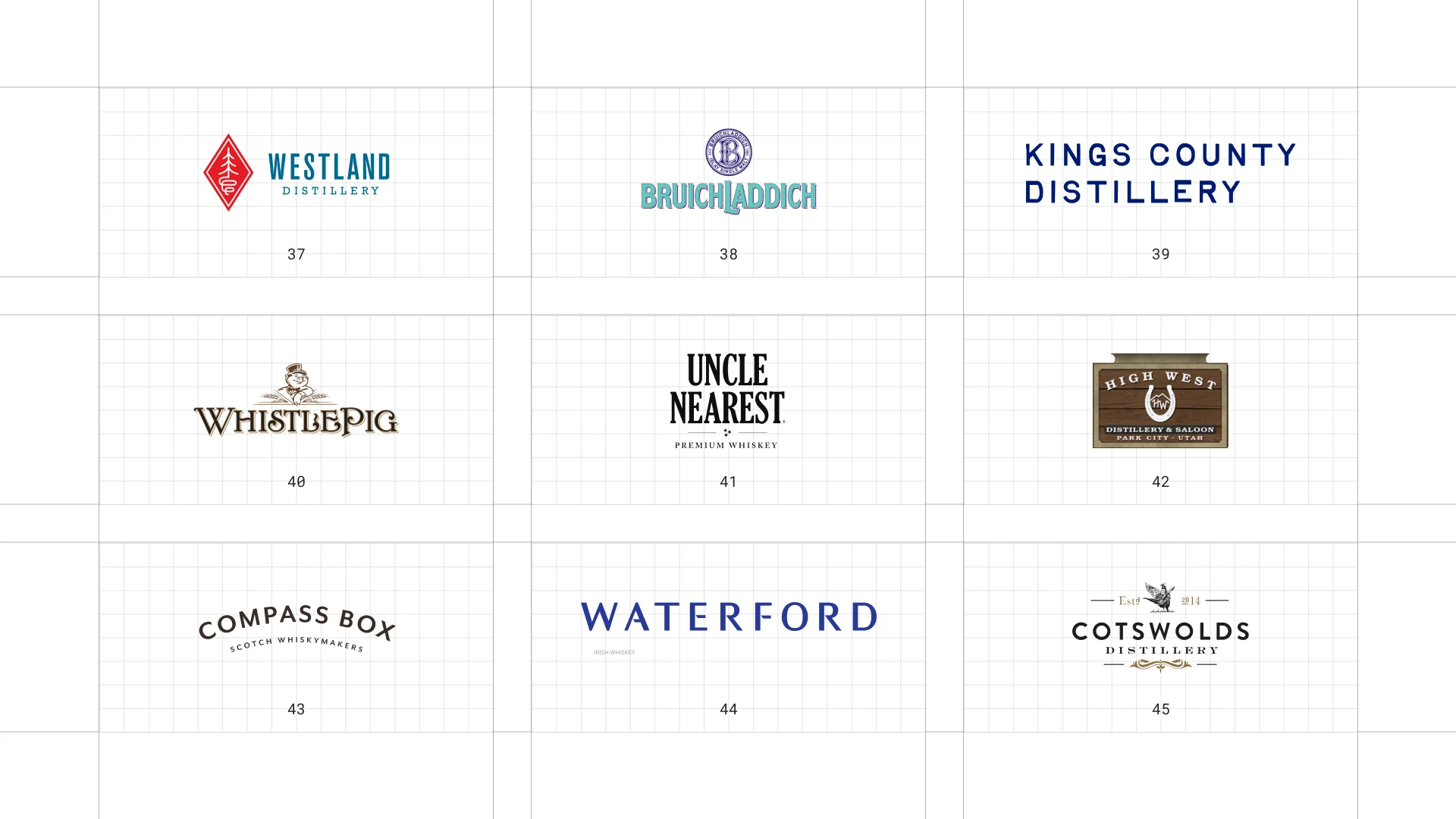
This is a visual comparison of whiskey logos, not a ranking of whiskies.
Look at how each logo uses type, colour and one symbol to signal heritage, place or craft.
37 Westland
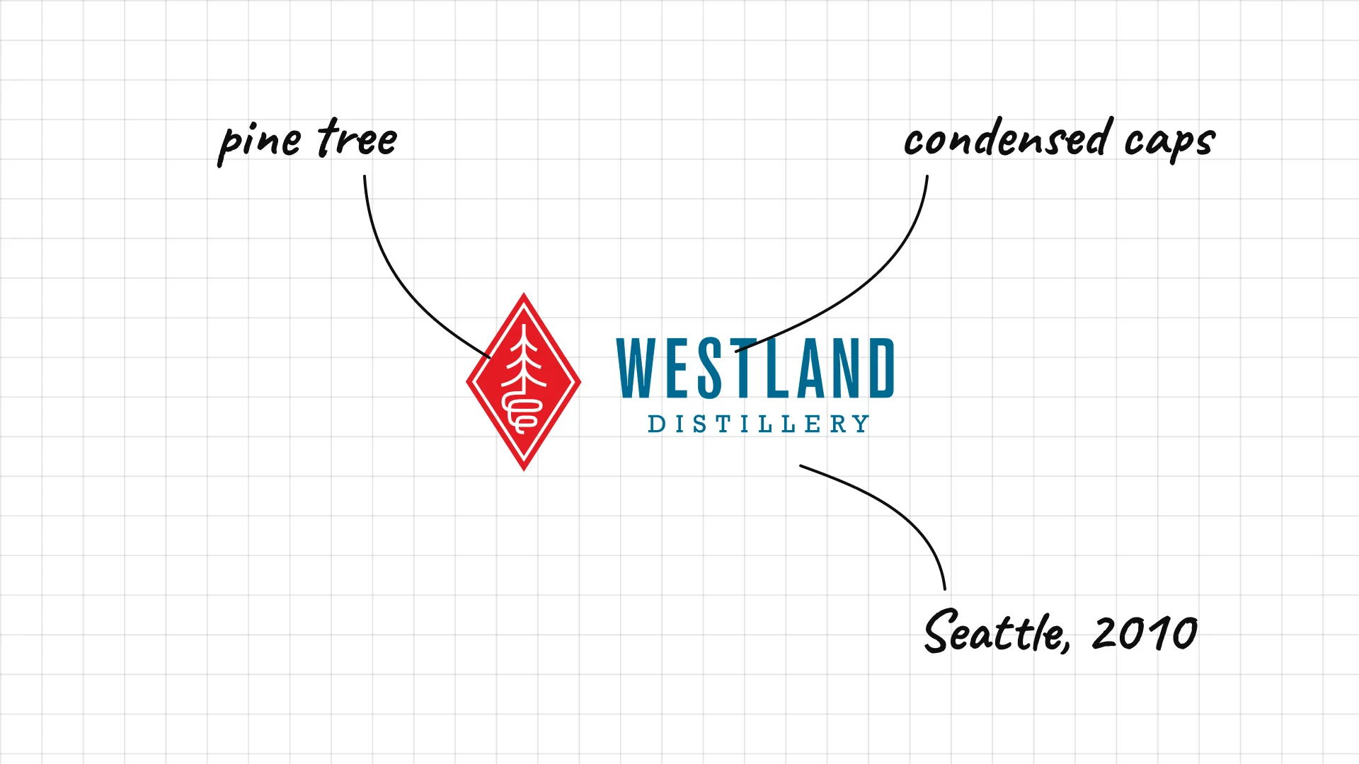
Westland was founded in Seattle in 2010 to make American single malt whiskey.
The red diamond with a tree points to the forests of the Pacific Northwest.
Condensed blue capitals feel crisp and modern.
38 Bruichladdich
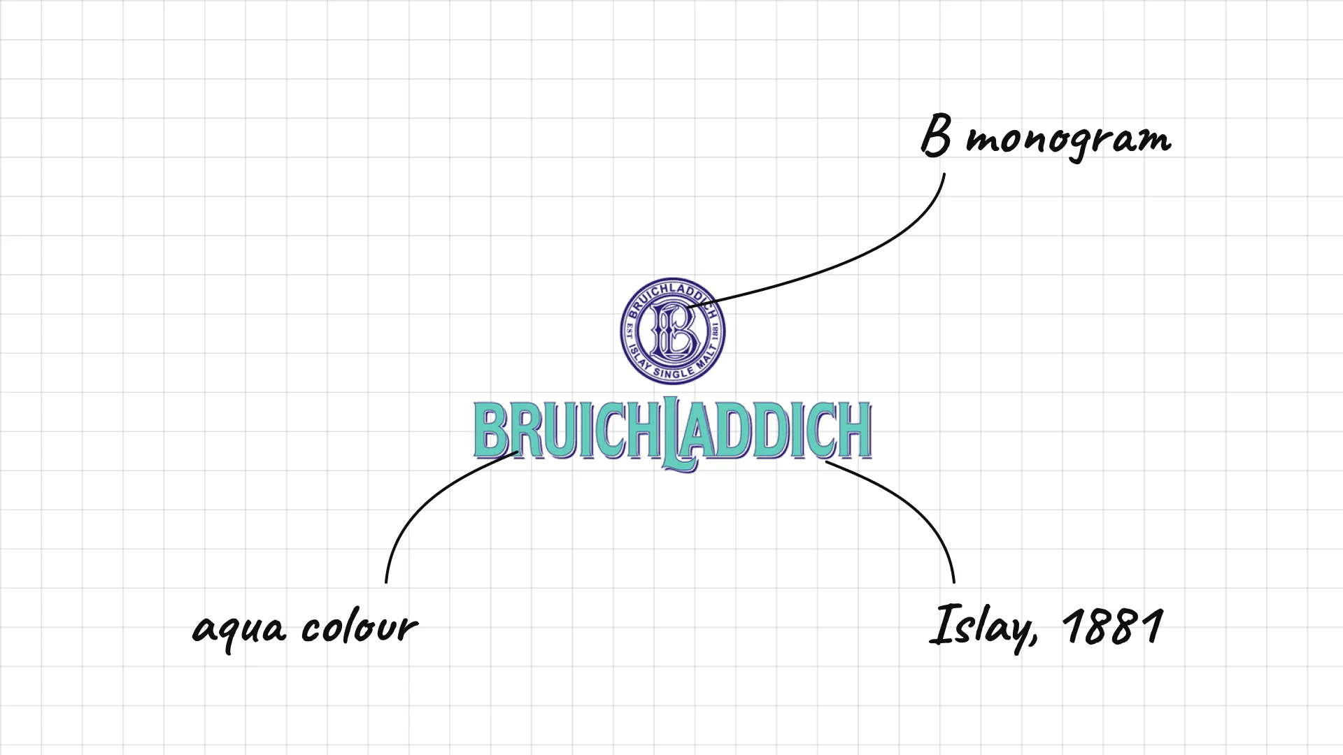
Bruichladdich was founded on Islay in 1881 and reopened in 2001 after being closed.
The round seal with a decorative B monogram looks Victorian.
The bright aqua colour is rare in Scotch and makes the brand instantly recognisable.
39 Kings County
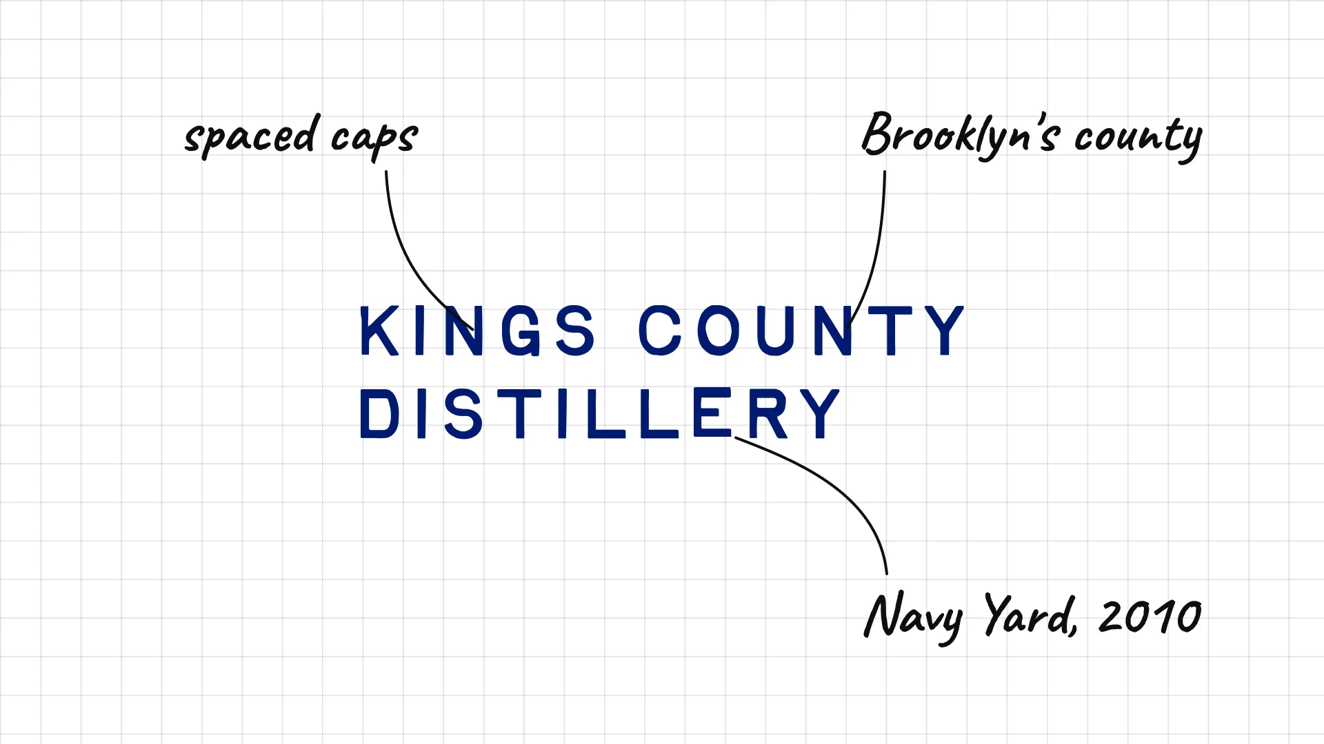
Kings County Distillery was founded in Brooklyn in 2010 and works from the Brooklyn Navy Yard.
Widely spaced blue capitals feel clean and modern.
The name uses Brooklyn's official county name, Kings County.
40 WhistlePig
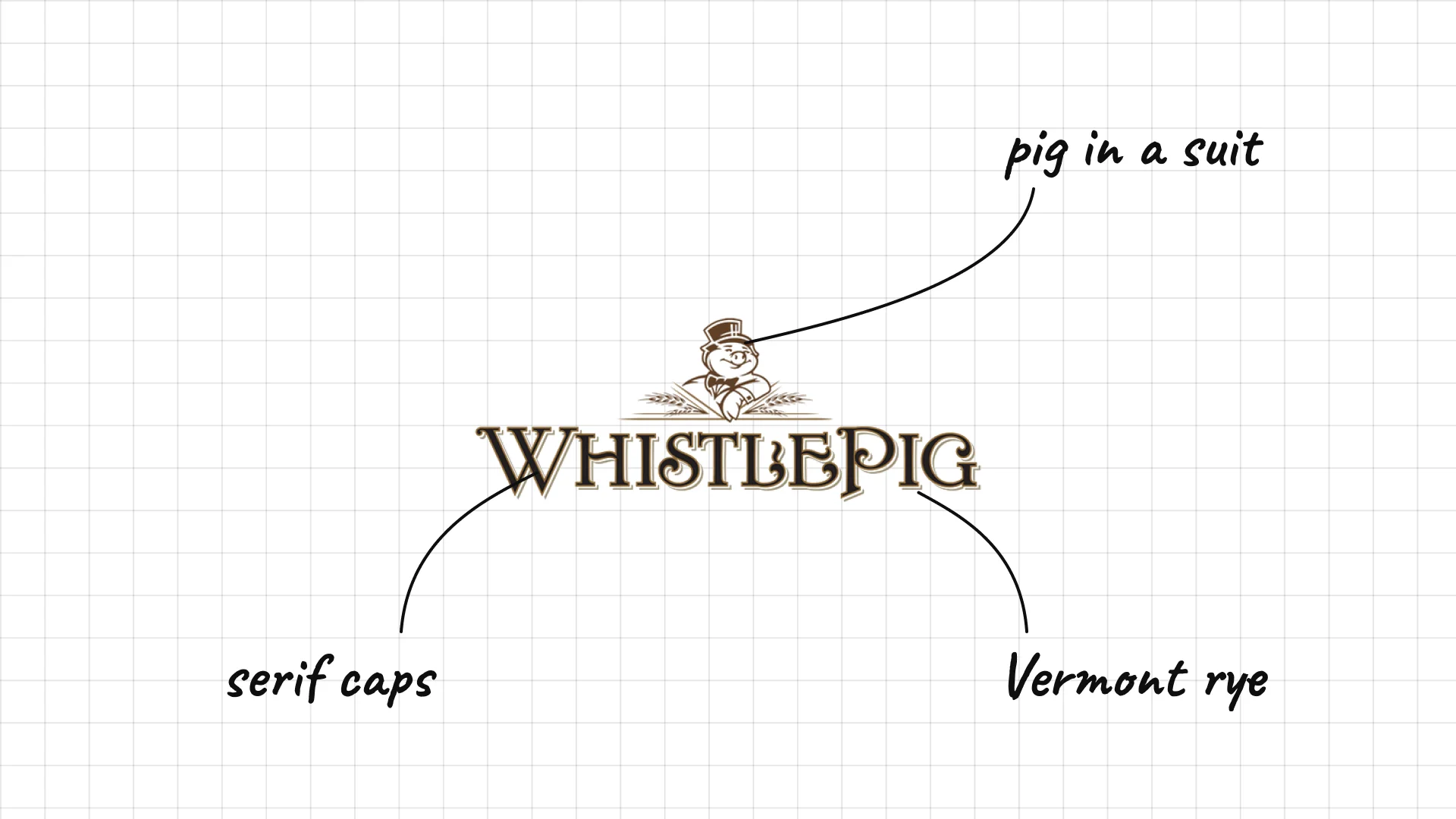
WhistlePig was founded on a farm in Shoreham, Vermont, in 2007 and is known for rye whiskey.
A pig in a suit is a playful mascot for a premium whiskey.
Old-style serif capitals balance the joke with a sense of tradition.
41 Uncle Nearest
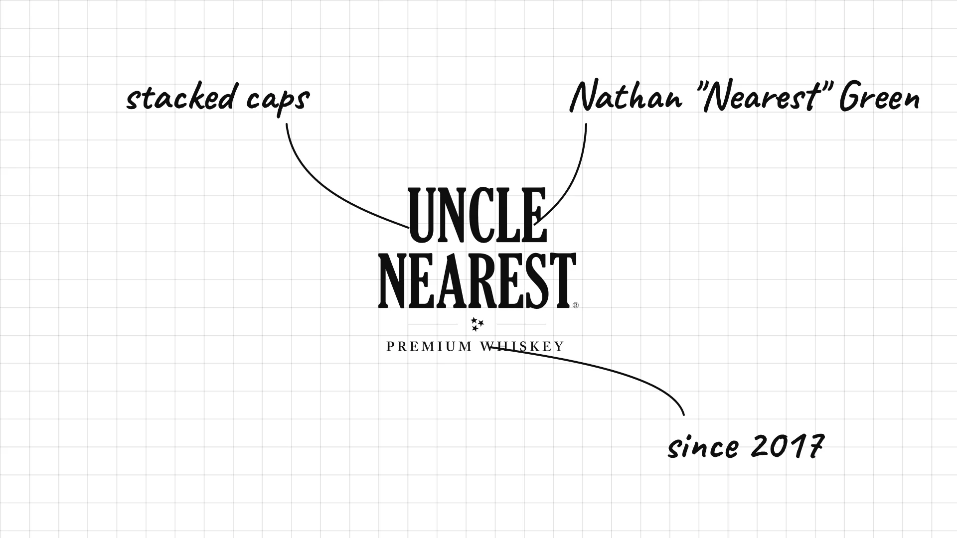
Uncle Nearest Fawn Weaver launched Uncle Nearest in 2017 to honour Nathan "Nearest" Green, who taught Jack Daniel to make whiskey.
Bold condensed capitals stack the name like a classic label.
The brand puts a forgotten master distiller's name front and centre.
42 High West
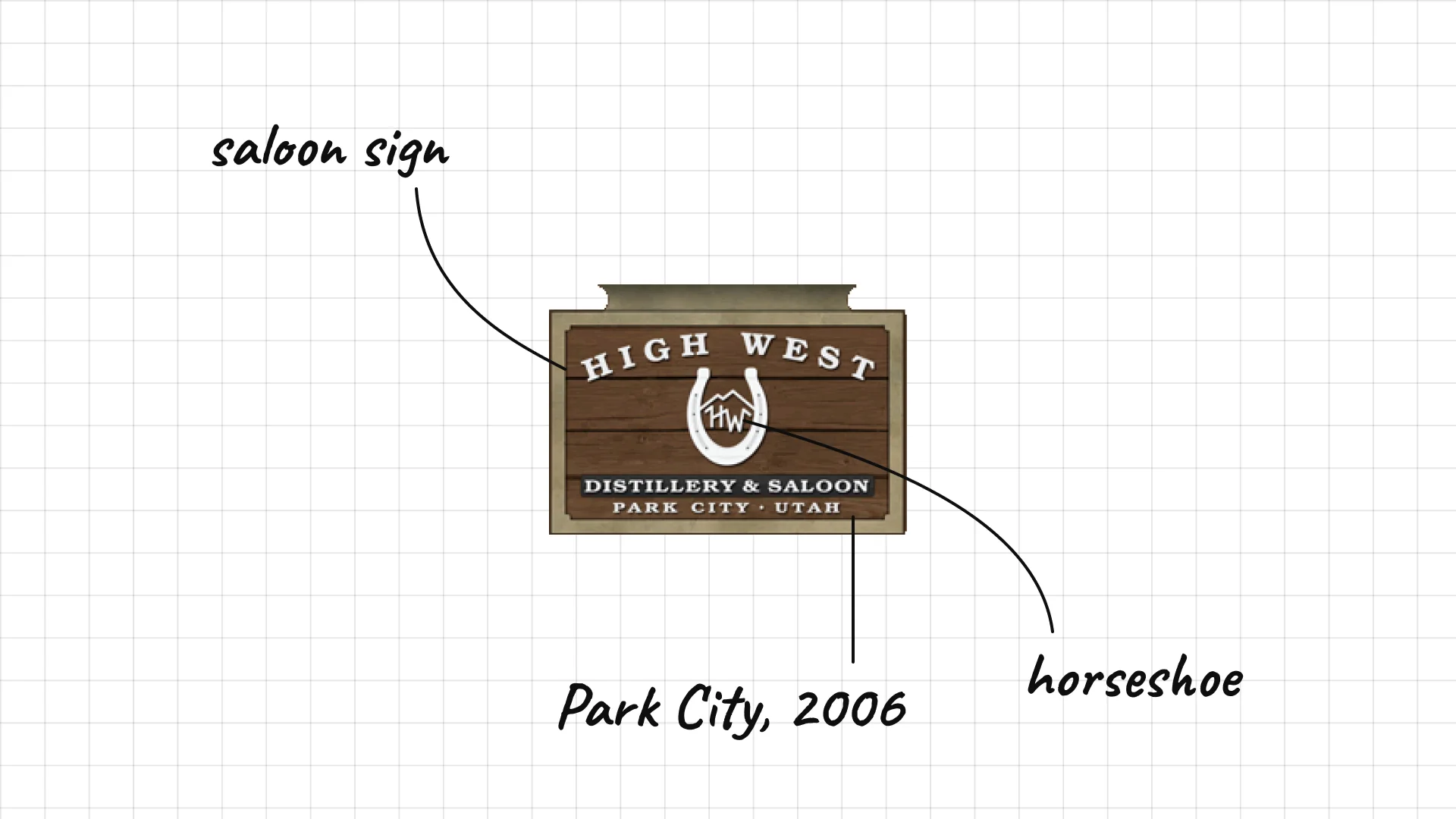
High West David Perkins founded High West in Park City, Utah, in 2006.
The horseshoe and arched type look like an old saloon sign.
"Distillery & Saloon" in the badge tells you about the brand's western roots.
43 Compass Box
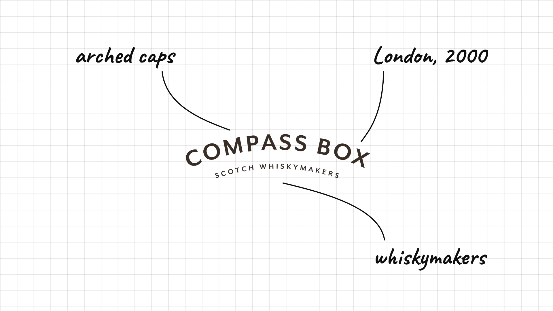
Compass Box John Glaser founded Compass Box in London in 2000 as a whisky blender.
Arched capitals bend like the edge of a compass.
"Scotch whiskymakers" underneath explains what the company does.
44 Waterford
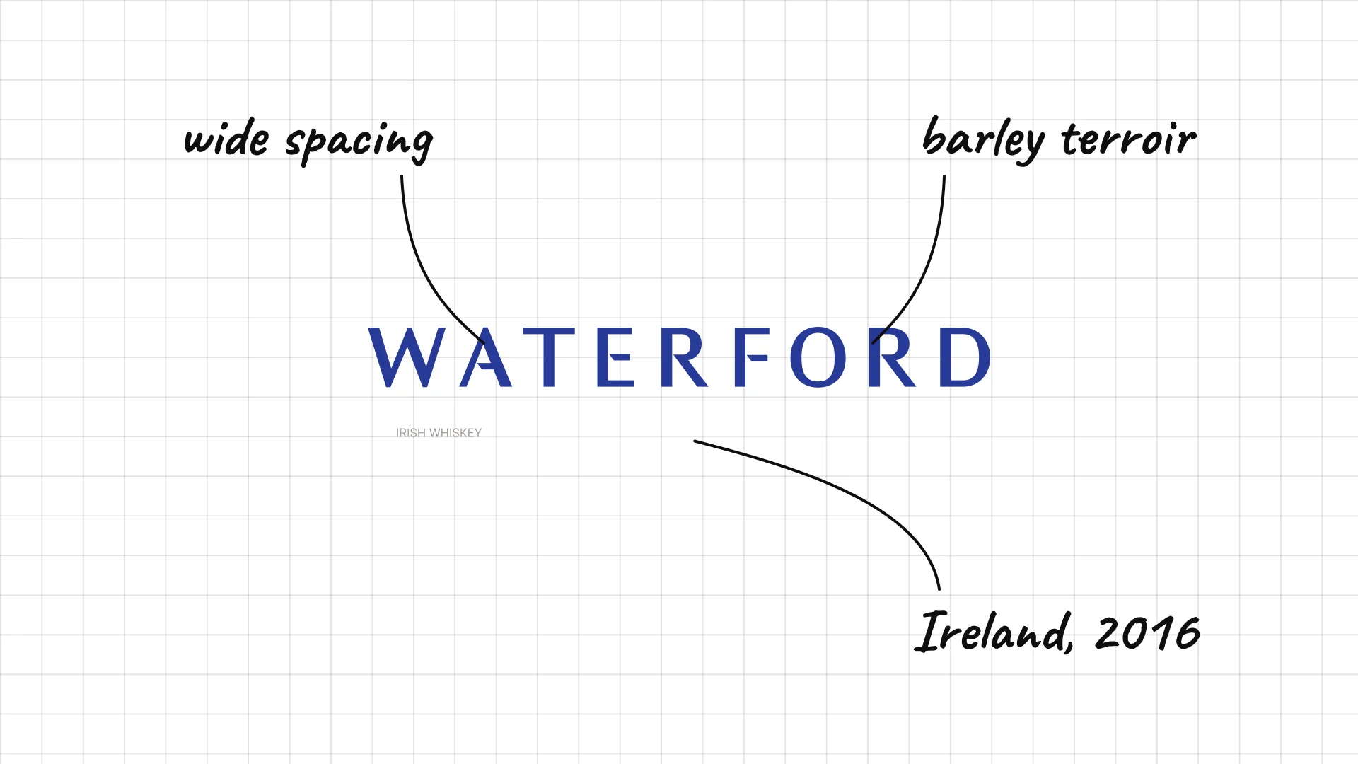
Waterford Mark Reynier founded Waterford Distillery in Ireland, which began distilling in 2016.
Widely spaced blue capitals feel calm and scientific, like the brand's focus on barley.
The simple wordmark lets the labels carry detailed farm information.
45 Cotswolds
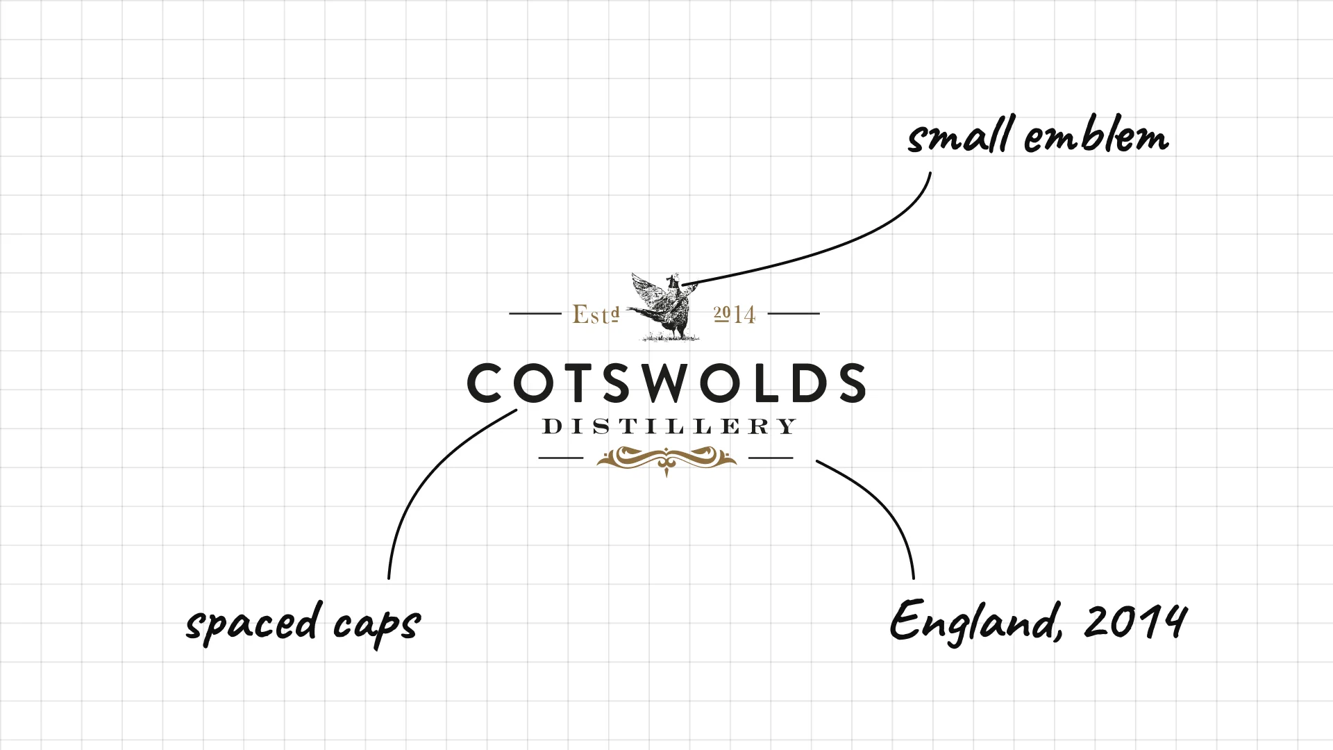
Cotswolds Daniel Szor founded Cotswolds Distillery in England in 2014.
A small emblem with the founding date sits above spaced capitals.
Thin lines and ornaments give a young distillery a traditional look.
What these 45 examples reveal
Dates and crests sell age
Dewar's, Powers, Cotswolds, Amrut and Bruichladdich put founding dates in the logo, and Chivas Regal, Nikka and The Glenlivet use crests, because heritage suggests quality.
Founders become brands
Johnnie Walker, Jack Daniel's, Jim Beam, Jameson and Paul John turn a person's name, signature or figure into the logo.
Place names carry the story
Glenfiddich, Laphroaig, Glenmorangie, Bruichladdich, Buffalo Trace and Knob Creek are named after valleys, islands and landmarks.
Craft brands keep it simpler
Starward, Mackmyra, Waterford and Kings County use clean modern type, setting themselves apart from ornate traditional labels.
A practical checklist for a whiskey logo
- Does the logo look premium on a bottle, a gift box and a cask?
- Is it readable from across a bar, on a crowded back-bar shelf?
- Is there a symbol, seal or monogram that can work alone on a cork, glass or wax seal?
- Does it tell a clear story of heritage, place or founder?
- Will it still work in one colour, embossed, engraved or printed on wood?
Launching or rebranding a whiskey or spirits brand?
I design brand identities for spirits, food and drink brands, from logos and labels to packaging, gift boxes and websites.
See my past work and schedule a call to discuss your project.
Cover photo: Johnnie Walker Blends Lineup by Aneil Lutchman, CC BY-SA 2.0, via Wikimedia Commons, used in a collage.
Frequently asked questions
What makes a good whiskey logo?
A good whiskey logo signals heritage, quality and place. It works on a label, a cask, a cork and a glass, and it often has a symbol that can stand alone, like the Johnnie Walker Striding Man or the Maker's Mark seal.
What are the most famous whiskey logos?
The most famous whiskey logos include Johnnie Walker, Jack Daniel's, Jameson, Jim Beam, Chivas Regal, Glenfiddich, The Macallan, Maker's Mark, Crown Royal and Wild Turkey.
Why do whiskey logos use dates and crests?
Whiskey takes years to age, so buyers value tradition. Founding dates, crests, seals and signatures tell the buyer that a brand has a long history and a recipe worth trusting.
What is the difference between whisky and whiskey?
Both spellings mean the same drink. Scotland, Japan and Canada usually write whisky, while Ireland and the United States usually write whiskey.
How much does a whiskey logo cost?
A professional whiskey logo and brand identity usually costs from a few thousand dollars for a small craft distillery to much more for a brand with a full label system, packaging, gift boxes and a website.
Ready to build a brand people remember?
Tell me what you’re launching, changing, or trying to make look better.