
Logo Design
When Logos Look Alike & Brands Sound the Same
Published on Sep 18, 2026
Logos look alike and brand names sound the same far more often than most founders expect, and in most cases nobody copied anybody.
The rule that matters is simple: similar is usually fine in a different category, and a real problem in the same one.
I know this one personally.
After I published the Ventur identity, someone accused me of stealing its script V from Vine, Twitter’s old six-second video app.
I didn’t, and further down I’ll put Ventur next to six other script Vs to show why that accusation doesn’t hold up.
This article collects 17 sets of famous logos that look alike and more than 20 brand names that sound the same, with who came first, whether anyone sued, and what each one teaches you about your own brand.
Here are the key takeaways.
- Verdict: nothing is fully original, so the useful question is never “is it unique?” but “is it too close in my category?”
- Why it happens: roughly 93 million active trademarks share a small vocabulary of circles, triangles, leaves, hearts and 26 letters.
- The legal test: examiners compare marks by sight, sound and meaning, then ask how related the goods and services are.
- When it gets expensive: same category (Path vs Pinterest), same phone screen (Pandora vs PayPal), or a famous name (Spotify vs Potify).
- What to do: search before you fall in love with a name or a mark, and say the name out loud.
Why do so many logos look alike?
Logos look alike because millions of brands draw from the same small set of simple shapes, letters and cultural symbols, so independent designers keep arriving at the same answer.
I see five causes, and none of them is theft.
- Volume: WIPO counted about 93.2 million active trademark registrations worldwide in 2024, with another 11.7 million applications filed that year.
- Simple shapes: a good logo is simple, and there are only so many simple shapes, which is why the USPTO treats common geometric shapes as not inherently distinctive.
- Letters: there are only so many ways to draw a P, a V or a lowercase b in a circle.
- Shared symbols: a maple leaf, a heart or the Korean taegeuk belongs to everyone, and national emblems are kept out of private ownership by Article 6ter of the Paris Convention.
- Trends and formats: every app icon starts as the same rounded square, and whole industries follow the same fashion, as I covered in why AI startup logos look alike.
There is also memory.
Michael Bierut once discovered that a poster he designed in 2005 echoed a 1975 piece by Willi Kunz, and wrote about it in an essay titled “I Am a Plagiarist”: he had seen the piece years earlier, filed it away and forgotten where the idea came from.
Psychologists call that cryptomnesia, and every designer who has looked at thousands of logos is exposed to it.
David Airey made the same argument in his collection of similar logos: whatever your idea is, someone has probably already drawn something close to it.
Sagi Haviv of Chermayeff & Geismar & Haviv has said that the simpler a mark is, the more likely it collides with someone else’s work, which is why his firm runs a preliminary trademark search before clients ever see the options.
That is the professional standard, and it is part of my own logo design process.
I was accused of copying Vine
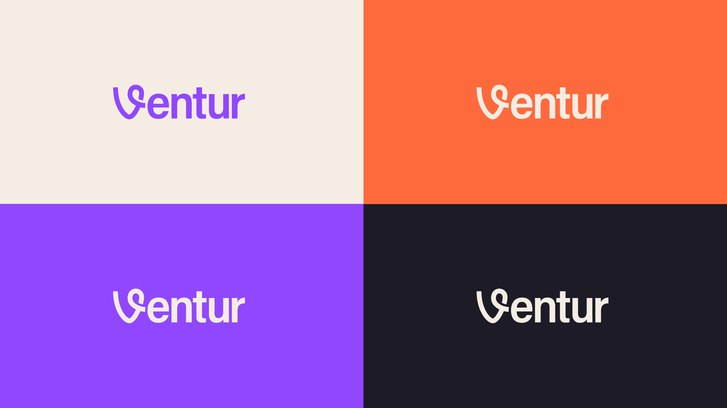
I was accused of copying Vine’s logo when I designed the identity for Ventur, an AI travel planner, and the accusation is a good example of how people misjudge similarity.
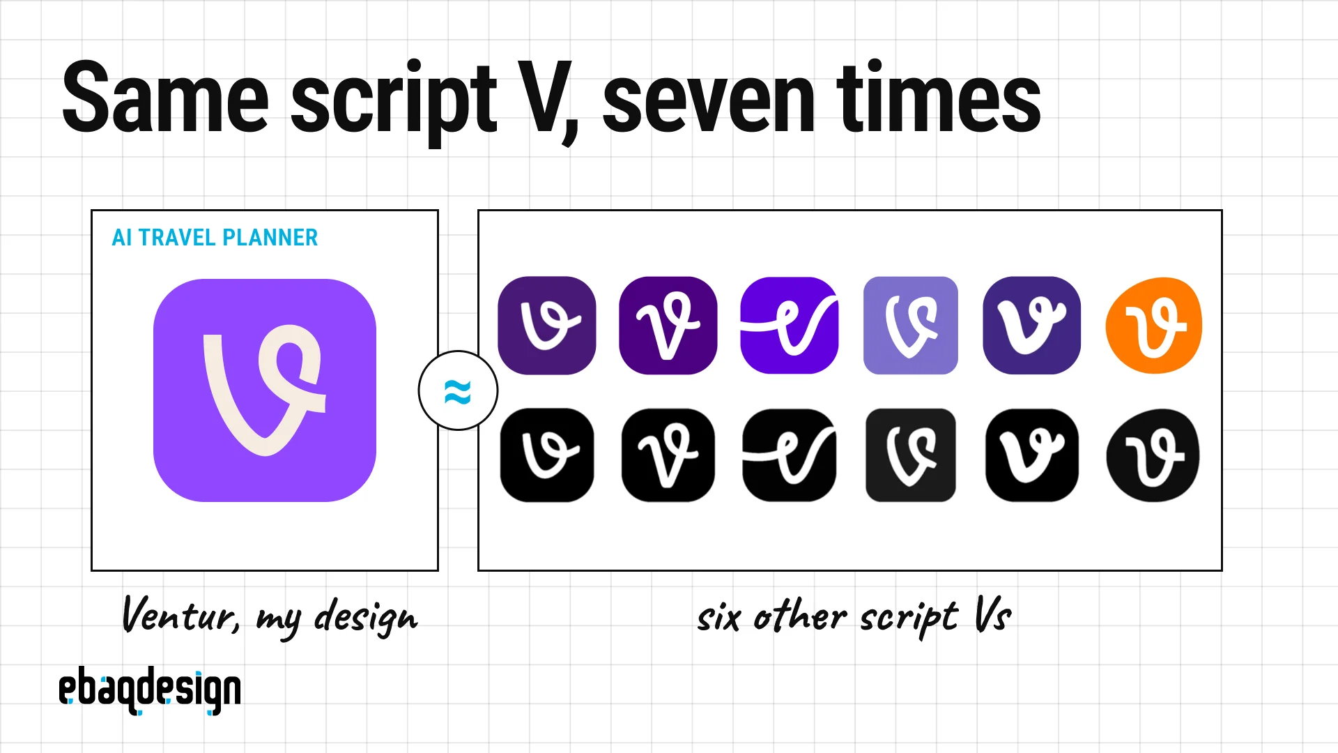
The Ventur V is drawn as one continuous route, because the product plans trips.
Vine’s V looped because the app played looping six-second videos, and its designers at Big Human set it on green.
Vine launched in January 2013 and Twitter shut it down in January 2017, eight years before Ventur existed.
A handwritten V with a loop is simply what happens when you write the letter V quickly, and plenty of brands have landed on it.
Strip the color out, as in the bottom row, and the seven marks become even harder to tell apart.
Nothing is original, and it doesn’t have to be.
What a logo cannot be is too close to another mark in the same category, in front of the same customers.
A travel planner and a defunct video app are not that.
17 famous logos that look alike
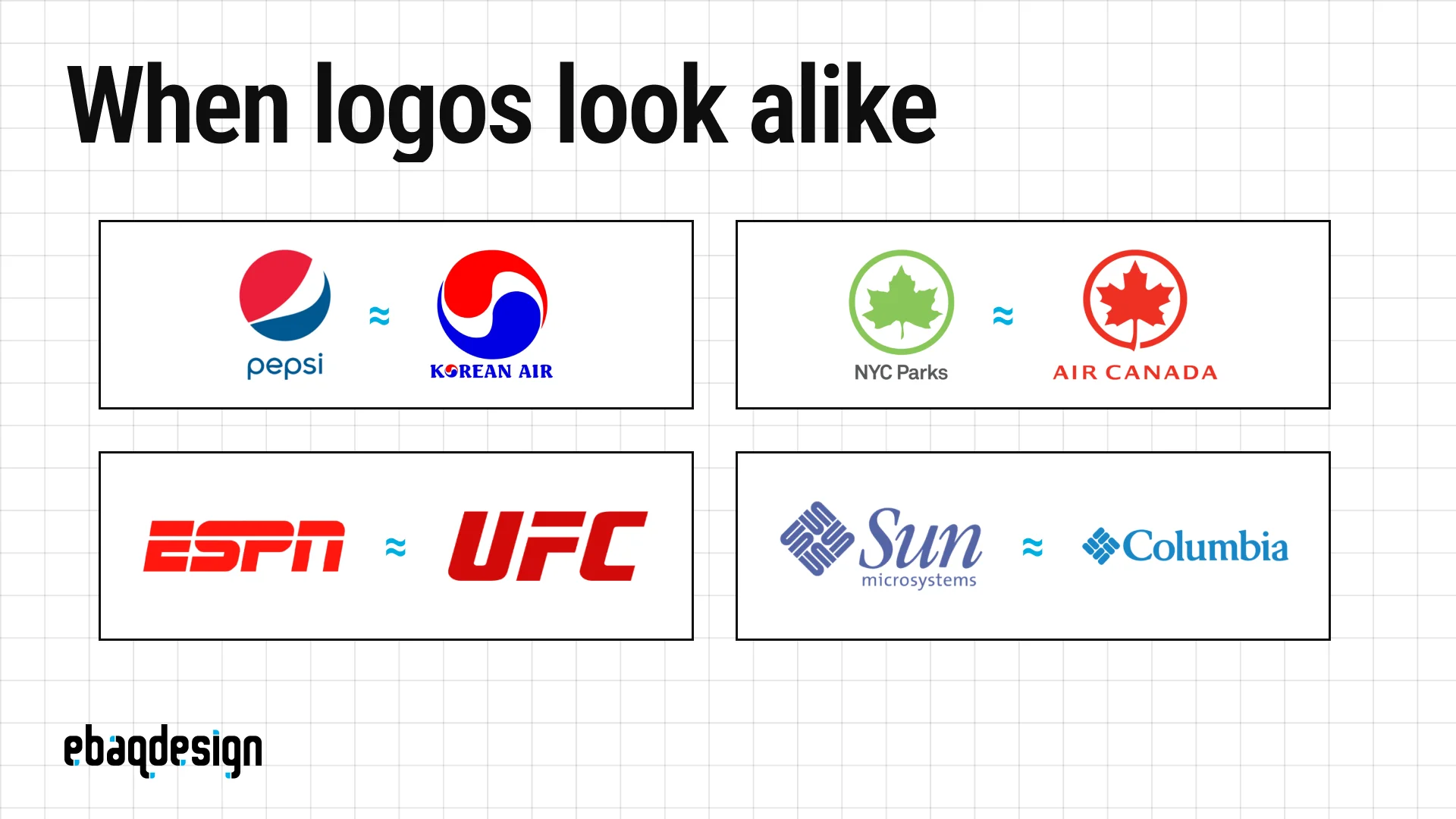
These are 17 pairs of well-known logos that look alike, with who came first, what each symbol was meant to mean, and whether anyone ever went to court over it.
Most of them have coexisted for decades without a serious fight.
The last three did not, and the difference between the two groups is the most useful thing in this article.
1. Pepsi and Korean Air
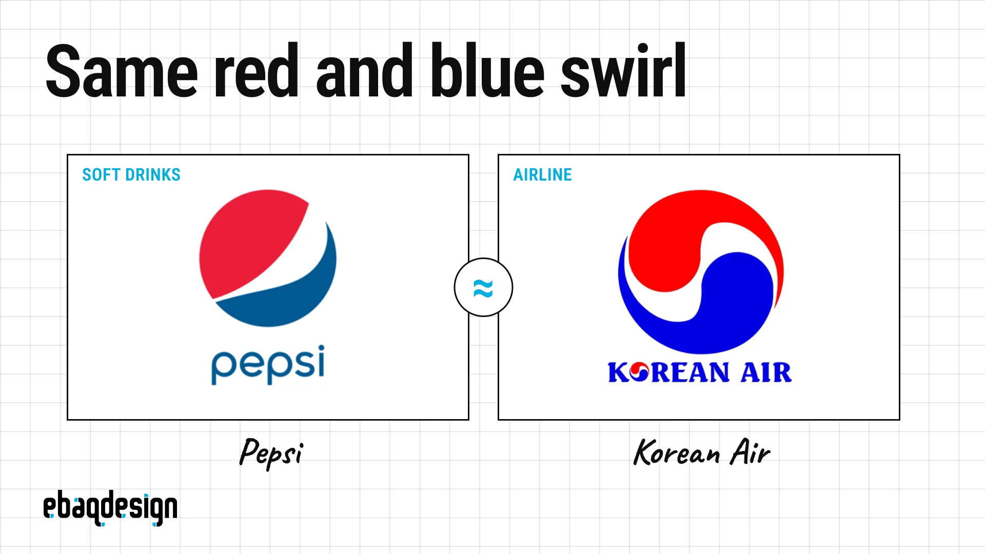
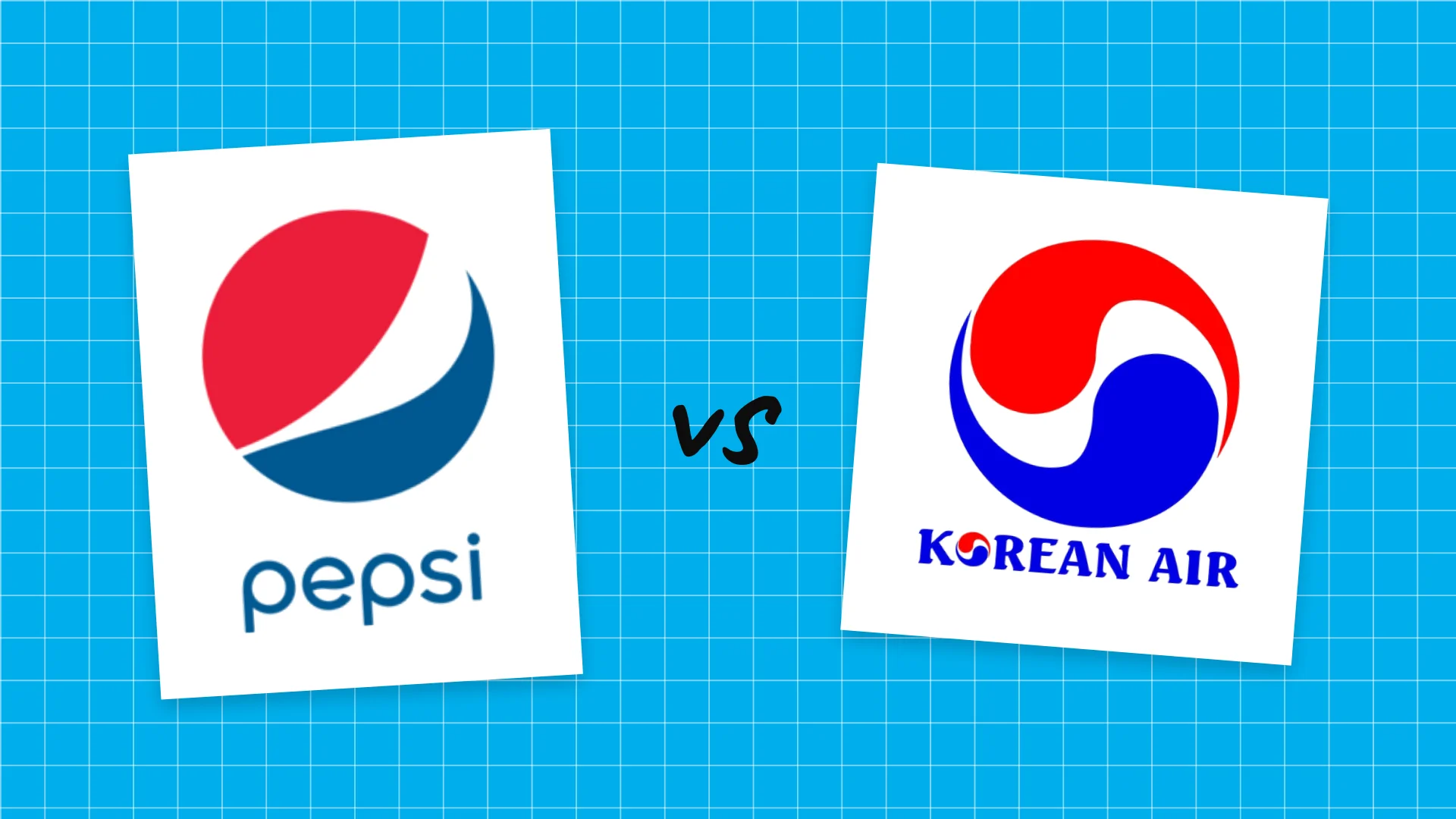
Pepsi and Korean Air both used a circle with red on top, blue below and a white wave between them.
Pepsi’s globe grew out of a red, white and blue bottle cap from the 1940s, and the version shown here is the 2008 “smile” by Arnell Group.
Korean Air’s mark, introduced on March 1, 1984, is a taegeuk, the red and blue symbol at the center of the South Korean flag.
Both marks come from national flag colors, which is why nobody ever sued, and soft drinks and air travel share no customers at the point of sale.
The resemblance was strong enough that Wikipedia’s article on the taegeuk carries a note not to confuse it with the Pepsi globe.
It ended in March 2025, when Lippincott redesigned Korean Air with a single dark blue taegeuk, the airline’s first identity change in 41 years.
Creative Bloq’s review noted that without the old roundel the airline no longer looks like Pepsi.
2. Citgo and Delta Air Lines
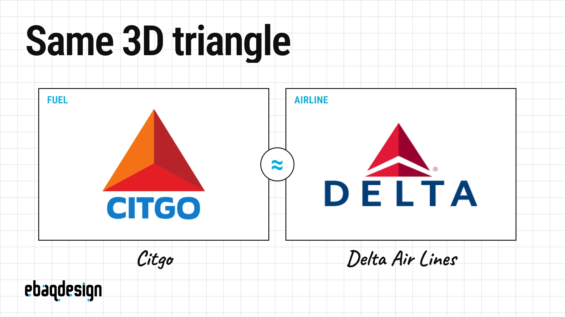
Citgo and Delta both use an upward red triangle faceted in lighter and darker reds so it reads as a pyramid.
Citgo’s “trimark” dates from 1965 and was designed by Lippincott & Margulies, in a rebrand the Boston Globe Magazine put at about $20 million at the time.
Delta’s triangle, the “widget”, is older: it arrived in 1959 with the airline’s first jets and stands for the Greek letter delta and a swept wing.
The look they share is newer, because Delta only adopted the all-red 3D widget on April 30, 2007, the day it left Chapter 11.
That version was designed by Lippincott, the same firm that drew Citgo’s triangle, and commenters on Brand New pointed out the resemblance within days.
Fuel and flights are unrelated markets and a triangle is about as basic as a shape gets, so both marks live on.
3. Ford and Carrier
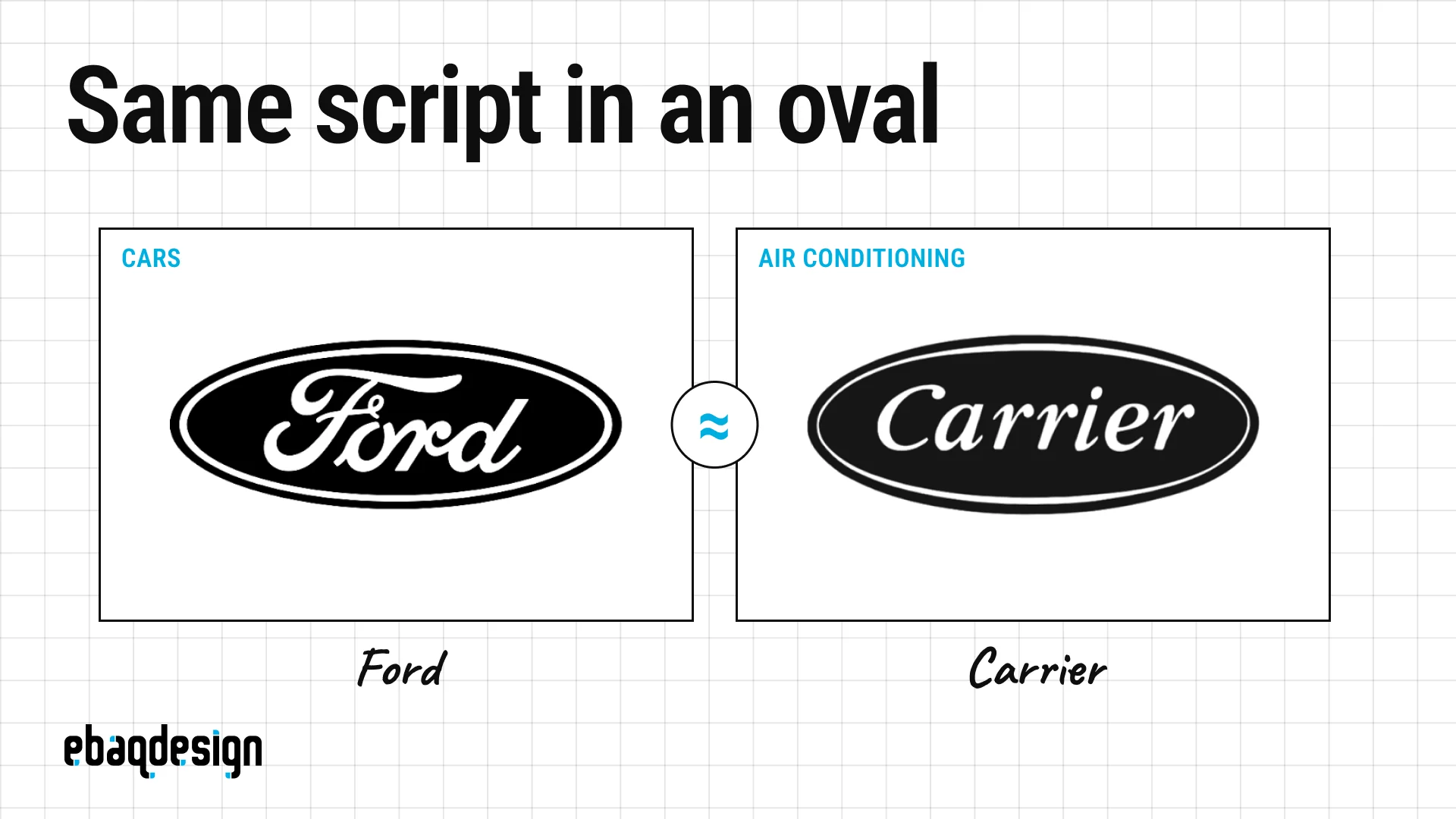
Ford and Carrier both set a founder’s surname in slanted white lettering inside a dark horizontal oval with a thin inner keyline.
Ford’s script is attributed to Childe Harold Wills, the company’s first chief engineer, around 1906 to 1909, and the FORD trademark registered in July 1909 is still live.
It is not Henry Ford’s signature, which The Henry Ford museum has shown looked quite different.
Carrier, the company founded on Willis Carrier’s invention of modern air conditioning, still specifies its oval, wordmark and keyline in its current brand guidelines.
Look closely and Ford is a connected script while Carrier is an italic serif, but from across a parking lot the badges match.
Cars and air conditioners sit in different trademark classes and the dominant element in each mark is a different surname, so there has never been a dispute.
4. NYC Parks and Air Canada
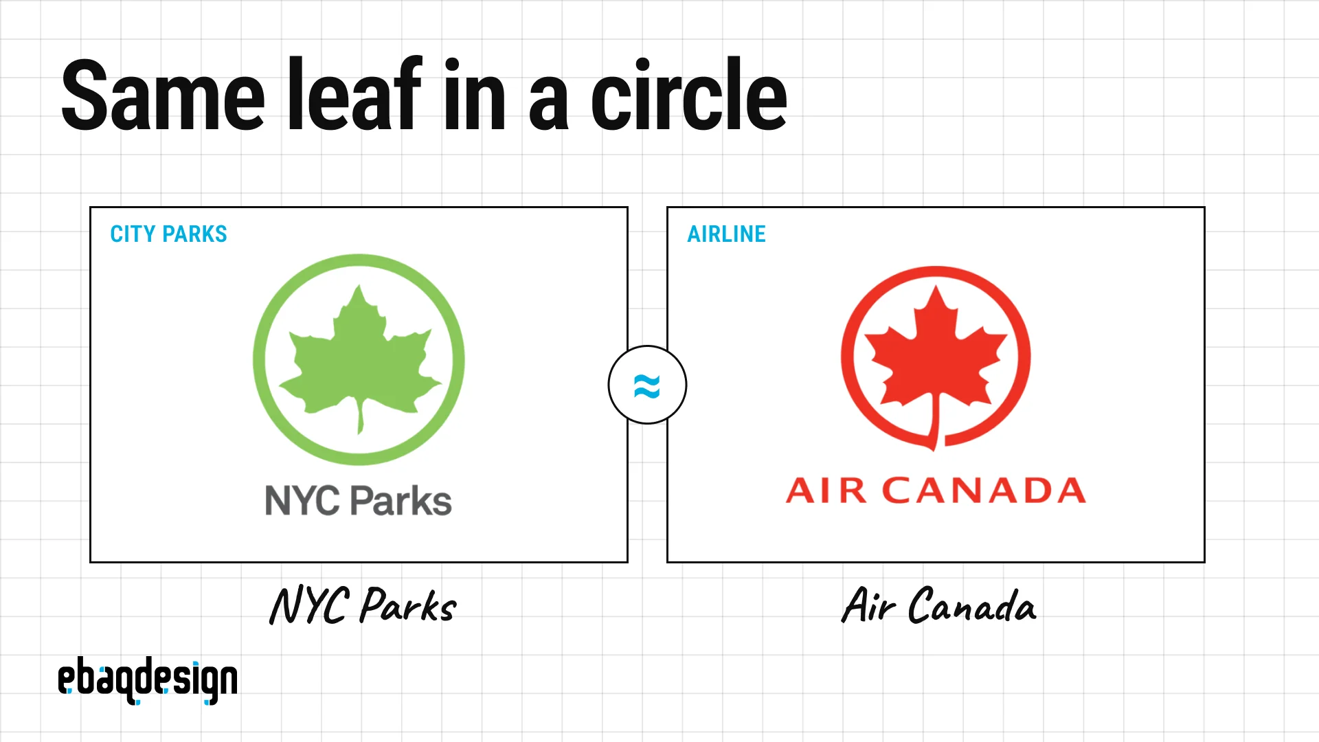
NYC Parks and Air Canada both place a single stylized leaf, stem down, inside a thin ring in one flat color.
Air Canada’s “rondelle” was designed under Hans Kleefeld at Stewart, Morrison and Roberts and unveiled in October 1964, which is months before Canada’s maple leaf flag first flew in February 1965.
The Parks leaf has been on department letterhead since 1934, the leaf-in-a-circle version dates to 1978, and Pentagram refined it in 2011.
Nobody knows which tree it is.
The department’s own newsletter once admitted the species was never specified and jokingly settled on “Maple Plane”.
A city agency and an airline will never be mistaken for each other, so the two leaves coexist.
5. Human Rights First and Ubuntu
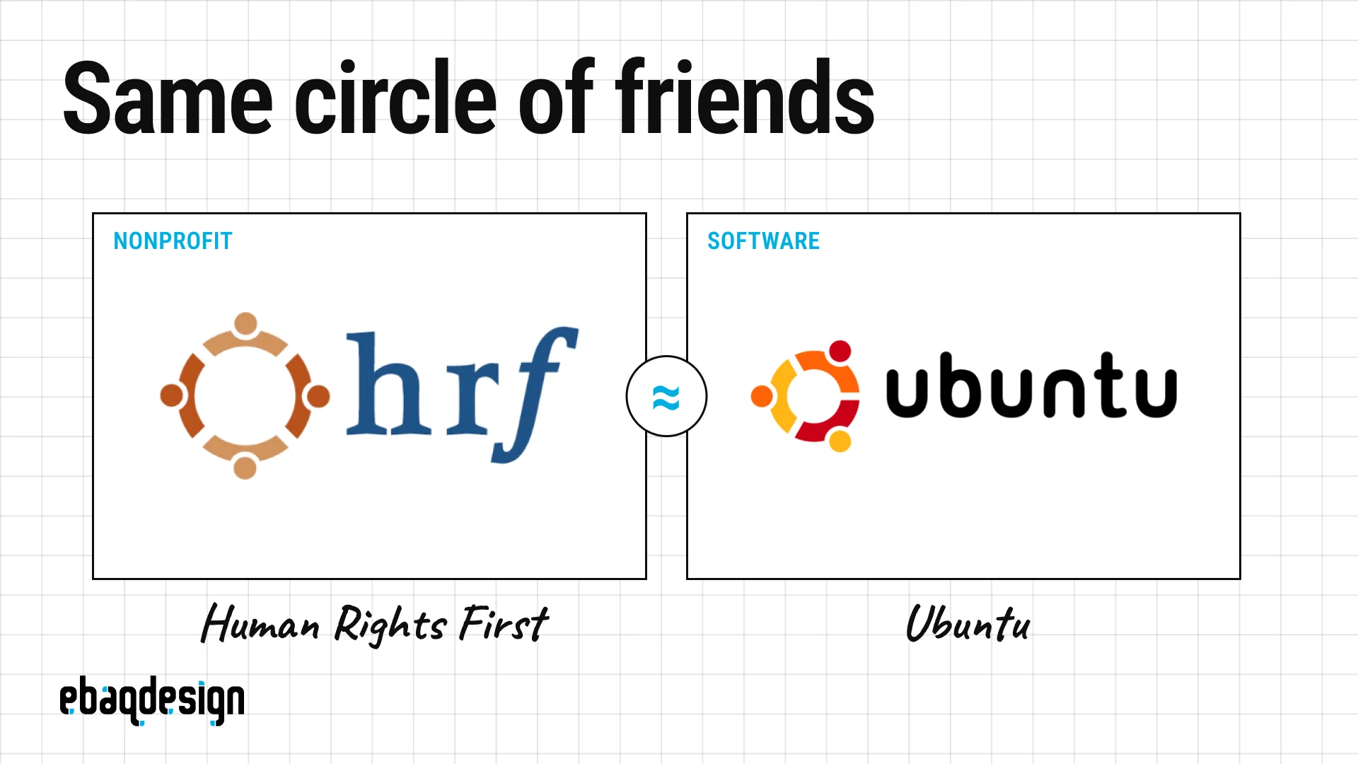
Human Rights First and Ubuntu both showed people seen from above, linking arms in a ring, in warm oranges.
Ubuntu’s mark is literally named the Circle of Friends and has three figures, while the nonprofit’s version had four.
Ubuntu’s ring arrived with its first release in October 2004, the nonprofit took its current name that same year, and I could not establish whose ring came first.
It hardly matters, because people in a circle is one of the most common metaphors for community, and an operating system and a human rights organization do not compete.
Neither mark survives unchanged: Human Rights First replaced its ring in 2022, the same year Ubuntu redrew its own.
6. Sun Microsystems and Columbia Sportswear
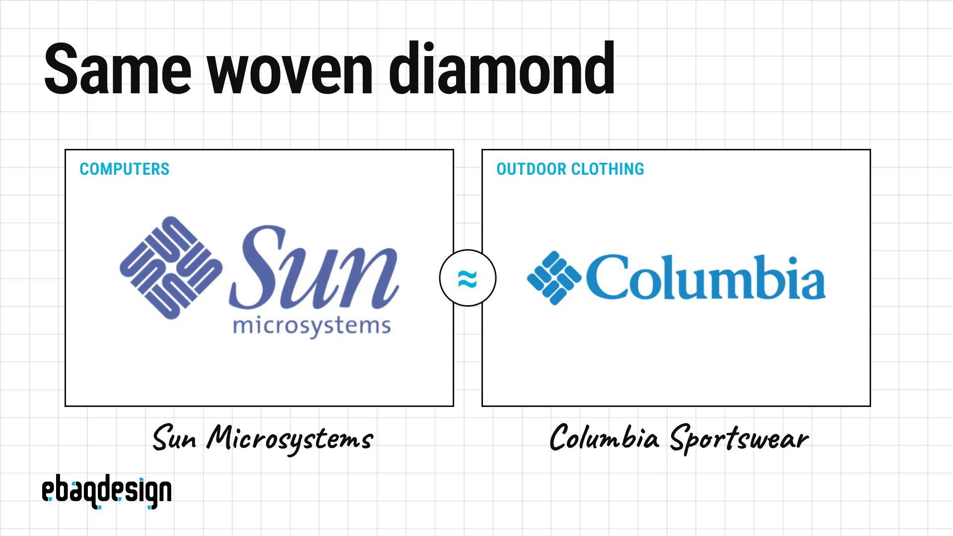
Sun Microsystems and Columbia Sportswear both use a square turned on its corner and built from interlocking bars.
Sun’s is the cleverer mark and one of my favorite logos ever made: it is an ambigram of four interlocking copies of the word “sun”, so it reads correctly at every 90-degree turn, and there is no actual letter S in it.
It was drawn in 1982 by Vaughan Pratt, a Stanford computer science professor rather than a graphic designer.
Columbia’s mark is called the Bug, and the company says it is a stylized textile weave adopted in 1978.
Most articles that pair these two imply the sportswear brand followed the tech company, and it is the other way around: Columbia came first by four years.
7. Xerox and Xbox
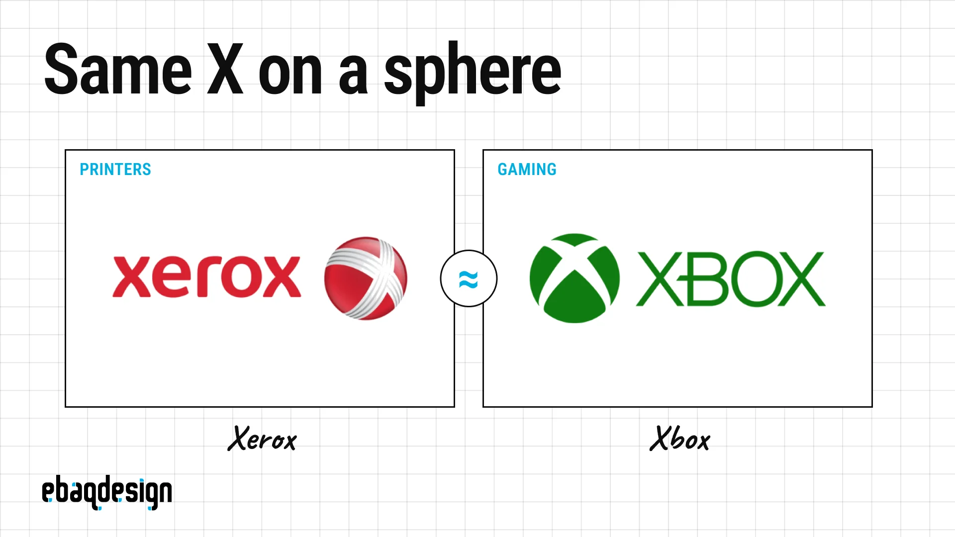
Xerox and Xbox both put an X on a glossy sphere next to a wordmark.
Xbox got there first: the sphere with a carved X arrived with the Xbox 360 in 2005, while Xerox’s red ball was launched by Interbrand in January 2008, where the crossing lines were meant to represent Xerox’s connections to its customers and partners.
When two brands whose names start with X both need a symbol, a ball with an X on it is close to inevitable, and the shiny 3D treatment was simply what every brand looked like in the mid-2000s.
Both have since moved on, which is the usual fate of a trend-driven logo.
8. InVision and LinkedIn
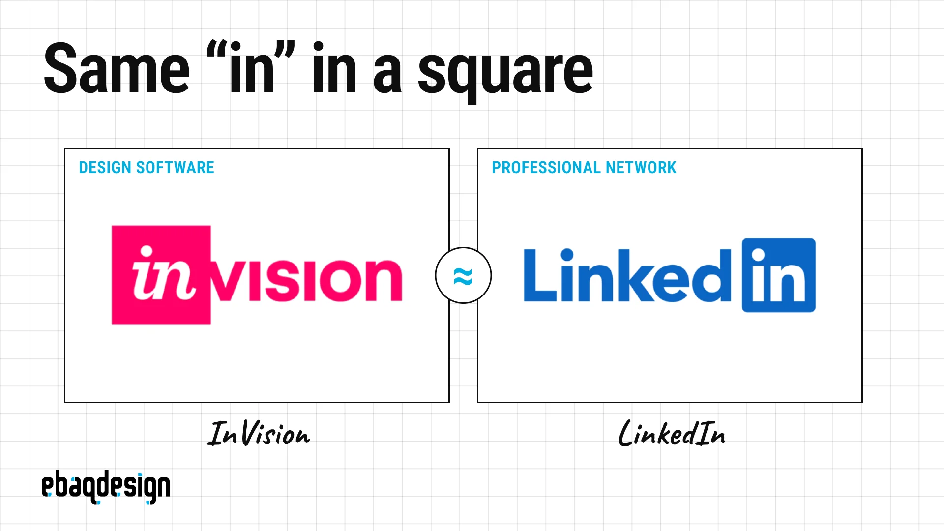
InVision and LinkedIn both boxed the letters “in” into a rounded square and used it as a syllable of the name.
LinkedIn has done it since 2003 and InVision since 2011, in pink rather than blue and with a script-like italic instead of an upright sans.
There was never a dispute, only years of designers pointing it out.
My favorite detail is that LinkedIn’s brand guidelines explicitly forbid building its “in” box into another word, and give “[in]vesting” as the example of what not to do, which is exactly the construction InVision’s logo used.
InVision shut down at the end of 2024, so this pair has resolved itself.
9. Audi and the Olympic rings
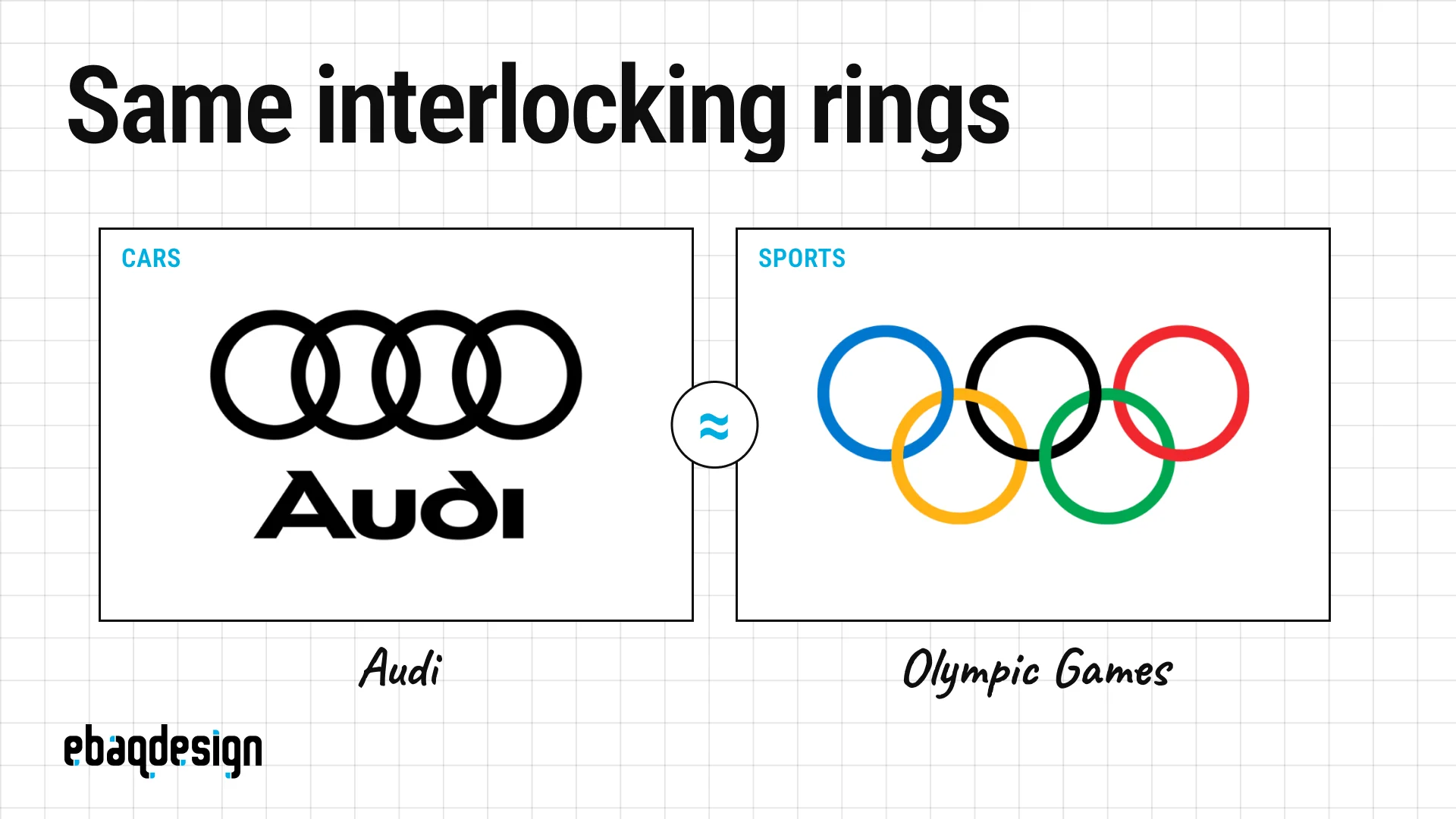
Audi’s four rings and the Olympic five are the most famous interlocking-ring marks in the world, and they mean completely different things.
Pierre de Coubertin designed the Olympic rings in 1913 for the five parts of the world, and their colors were chosen so that, with the white background, every national flag of the time could be reproduced.
Audi’s rings arrived in 1932, one for each of the four car makers that merged to form Auto Union.
You will find it repeated everywhere that the International Olympic Committee sued Audi in 1995 and lost.
That story appears to be false.
There is no such body as an “international trademark court”, no case number, no judgment and no contemporary reporting, and the claim traces back to an uncited edit of Audi’s Wikipedia page in 2009 which was later “sourced” to an article that had copied it from Wikipedia.
It is a good reminder that logo folklore spreads faster than logo facts.
10. Airbnb and Azuma Drive-In
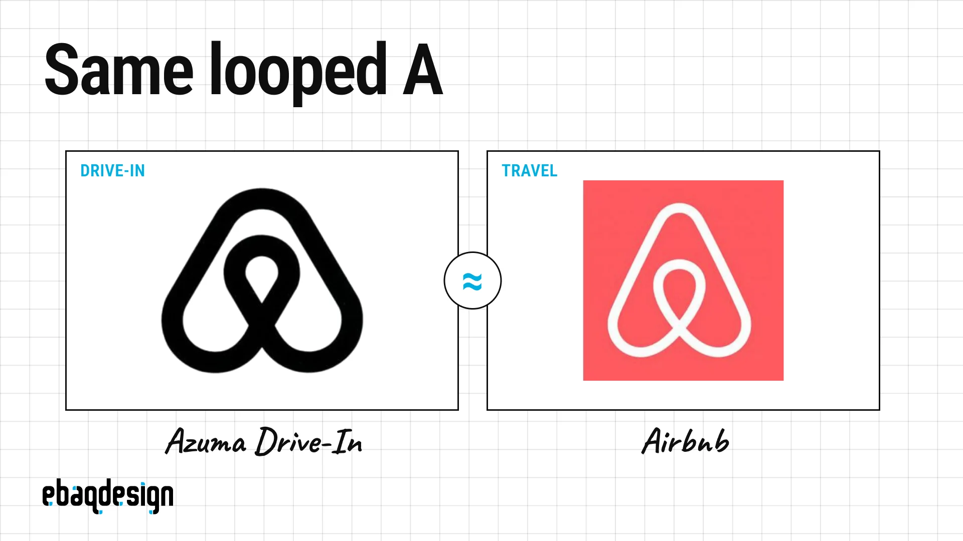
When Airbnb launched the Bélo in July 2014, designed by DesignStudio to combine a head, a location pin, a heart and an A, two other marks surfaced almost immediately.
The first was Automation Anywhere, a software company whose logo was strikingly close.
The two companies put out a joint statement within a day saying both had adopted their logos in early 2014 by coincidence, and that Automation Anywhere was moving to a new one.
The second surfaced in 2016, when a marketer tweeted pages from a 1980s Japanese trademark book showing the logo of Azuma Drive-In, drawn by Akisato Ueda in 1975, which is near-identical to the Bélo.
The same pages matched Beats to that Stankowski city logo.
Nobody has ever suggested Airbnb’s designers saw a 1975 Japanese roadside restaurant logo, and that is the point: a simple, good idea gets discovered repeatedly.
11. Futuro and Formula 1
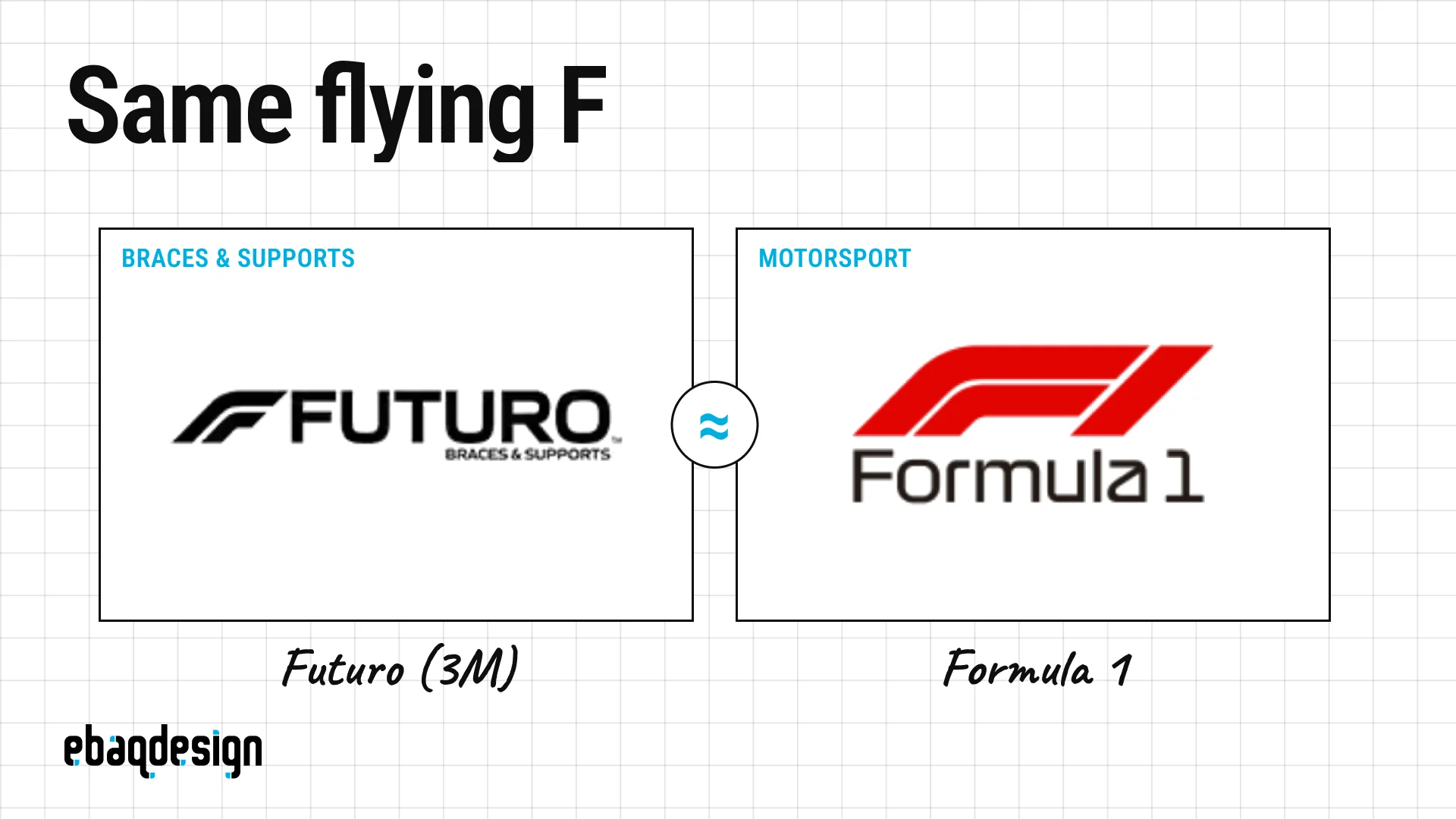
Formula 1 unveiled its logo in November 2017, designed by Wieden+Kennedy London to read as F1 in the shape of a car and a curve of track.
3M pointed out that its Futuro brand of braces and supports already used a very similar slanted F, and had filed for it earlier that year.
This one produced a real dispute, but not a lawsuit.
F1 had applied in 26 of the 45 trademark classes, including clothing, so 3M opposed the whole application in 2018.
The fix was surgical: in 2019 F1 narrowed its filing to exclude clothing and sporting goods made for orthopedic, therapeutic or compression use, and 3M withdrew.
The logo never changed, only the paperwork did, which is the cheapest possible ending to a conflict like this.
12. Beats by Dre and Stadt Brühl
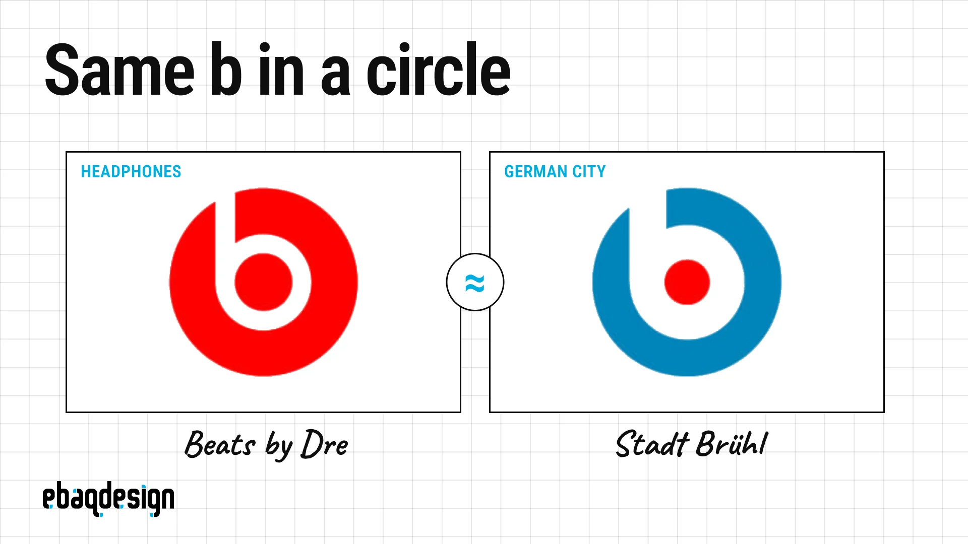
Beats by Dre and the German city of Brühl both use a geometric lowercase b set inside a circle.
The Brühl mark is attributed to Anton Stankowski, the designer of the Deutsche Bank logo, and dated 1971 in archives such as Logobook.
Beats was founded in 2006 by Dr. Dre and Jimmy Iovine, shipped its first headphones in 2008, and worked with Robert Brunner’s studio Ammunition on its brand identity.
The popular reading is that the circle is a head and the b is a headphone, although I found no confirmation of that from Beats.
Nobody has ever disputed the mark, and nobody could: a b in a circle is the first thing many designers would sketch, and a municipal emblem and a headphone brand share no market.
13. ESPN and UFC
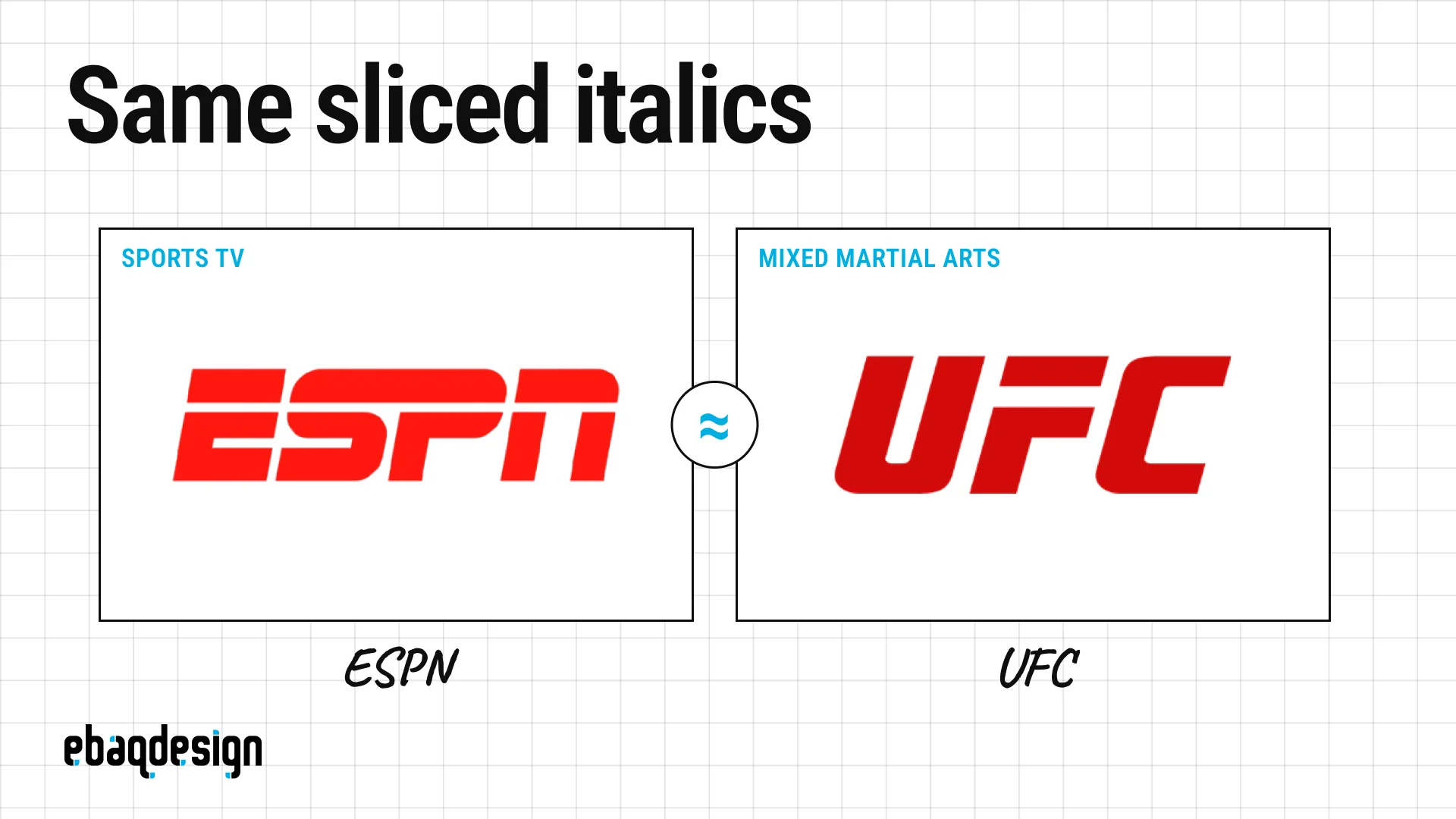
ESPN and UFC both use heavy red italic capitals with a horizontal slice through the letterforms.
ESPN has used its sliced wordmark since 1985.
UFC’s letterforms date from 2001, when Zuffa bought the company, and they only turned red in 2015 in a refresh by Troika.
This pair is unusual because the two brands spent years on the same screen.
ESPN became UFC’s US broadcaster in 2019 under a five-year, $1.5 billion deal, so the two red italic logos sat side by side on every “UFC on ESPN” broadcast until the rights moved to Paramount in 2026.
Speed, impact and aggression are the brief for every sports brand, and red italics are the obvious answer to it.
14. Devoted Health and Lovable
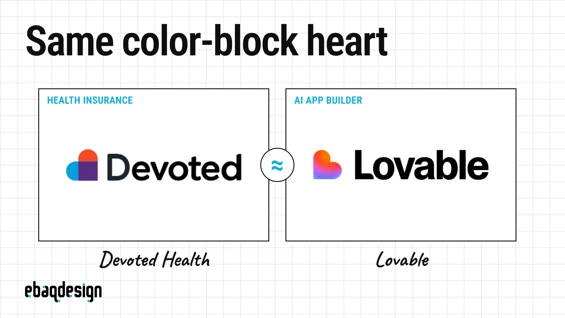
Devoted Health and Lovable both pair a heart in orange, blue and purple with a bold sans-serif wordmark.
Devoted Health is a US Medicare Advantage insurer founded in 2017, and its heart is built from three flat overlapping shapes.
Lovable is a Stockholm AI app builder that took its name in late 2024.
Its head of design has said the launch heart took about 30 minutes to make, and the January 2025 rebrand with the studio Primary tipped the heart on its side so that it reads as an L.
A heart is the most generic symbol there is for care, and health insurance for seniors and software for founders will never share a customer, so this pair is a non-issue.
It is also the newest pair here, which shows the pattern is not slowing down.
When look-alike logos end badly
Look-alike logos end badly when the two brands share a category, a customer or a screen, and the three pairs below show what that costs.
15. Path and Pinterest
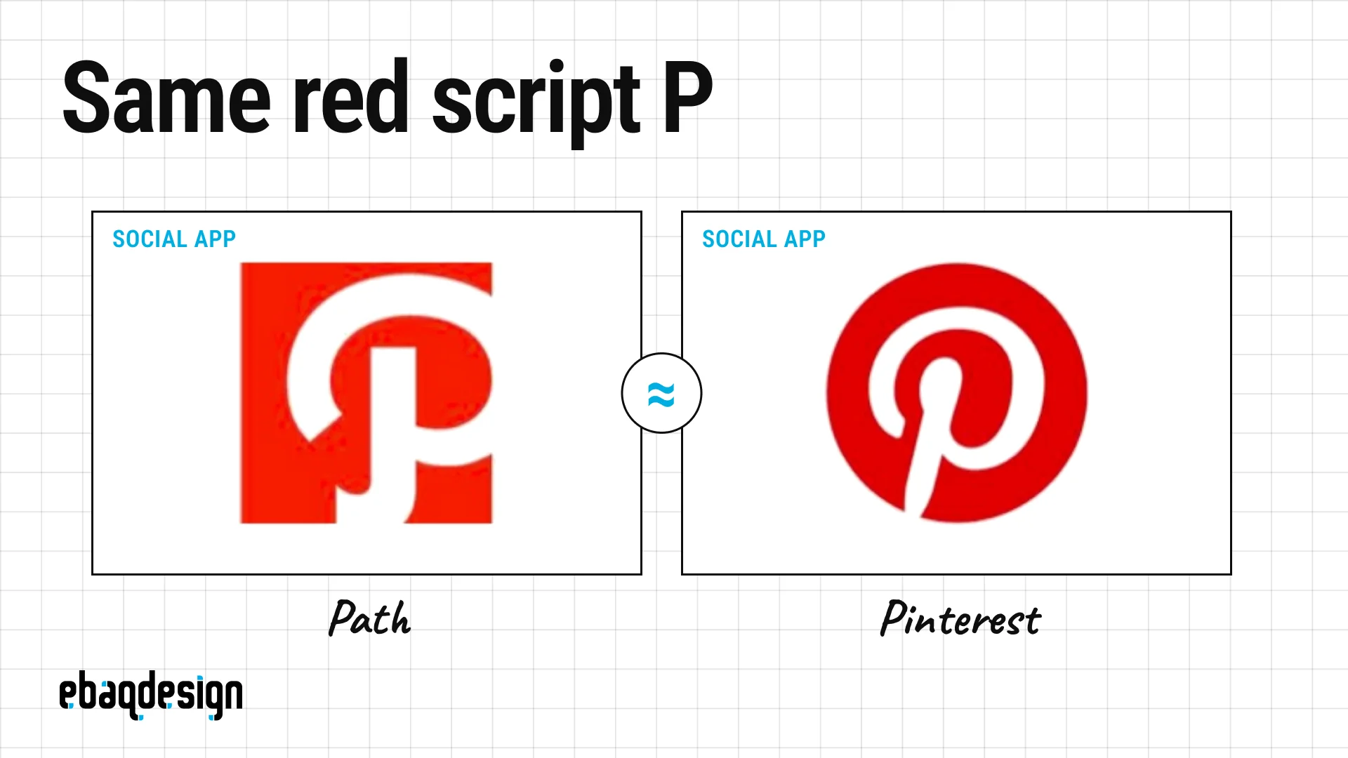
Path and Pinterest both used a white script P reversed out of flat red, and both were social apps sitting in the same app stores.
That is the difference between this pair and the ones above: same category, same customers.
Path launched in November 2010 with its red P, and Pinterest’s 2011 identity by Michael Deal and Juan Carlos Pagan shaped the P like a map pin.
When Pinterest applied to register its P, Path formally opposed it at the US Patent and Trademark Office in January 2014, and TechCrunch covered the build-up.
Pinterest counterclaimed, Path withdrew in September 2014, and the opposition was dismissed that October.
Pinterest’s P was registered in 2015, and Path shut down in 2018.
16. Pandora and PayPal
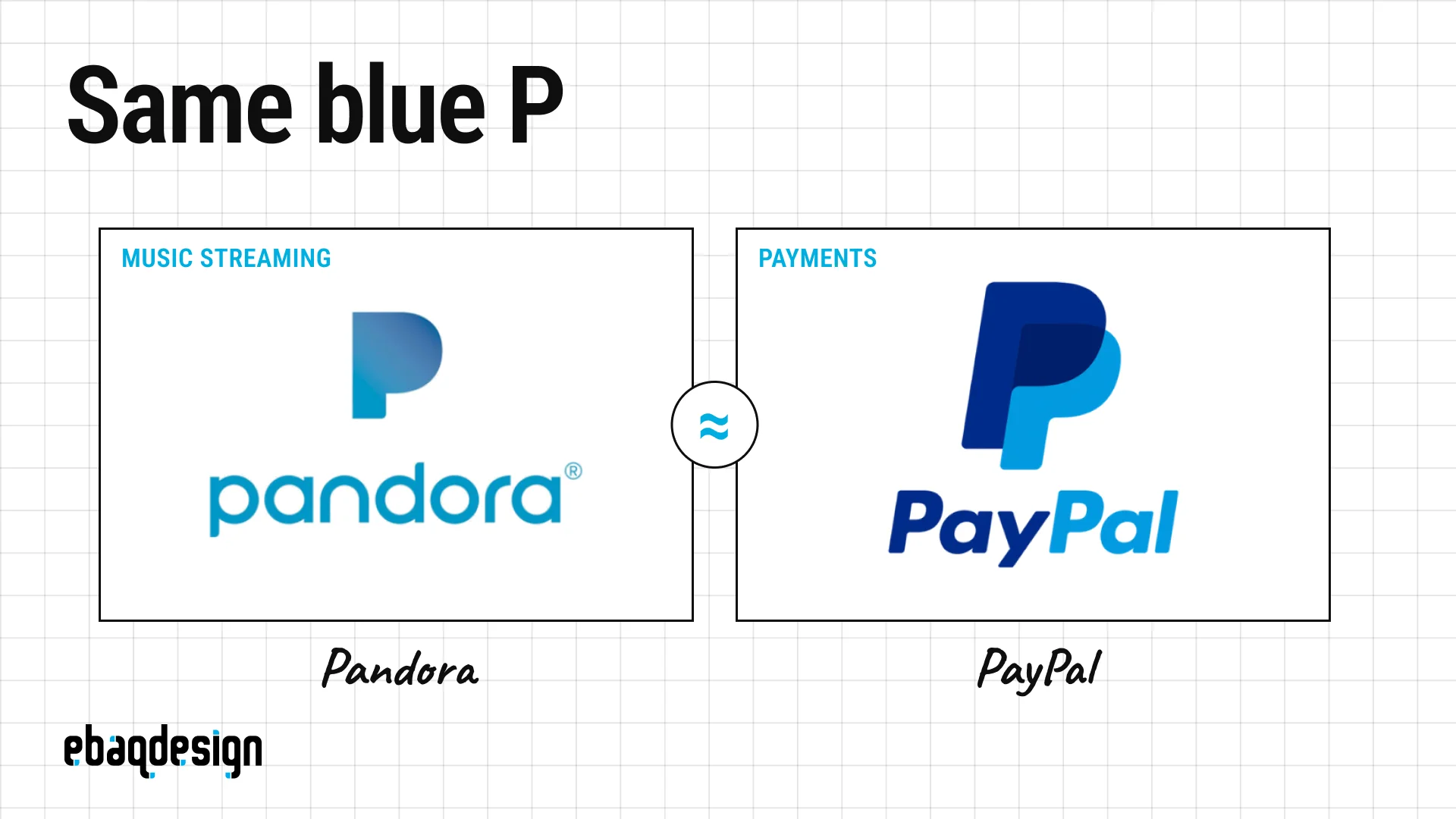
Pandora and PayPal both used a blue, minimalist capital P with no counter, as an app icon.
PayPal’s double P was designed by fuseproject in 2014, and Pandora’s single P arrived in October 2016.
PayPal sued in May 2017 in the Southern District of New York, arguing that Pandora’s logo openly mimicked its own.
Its evidence was screenshots of tweets from people who kept tapping the wrong app, and from one who asked whether PayPal had bought Pandora.
Music streaming and payments are unrelated businesses, which is why commentators thought the infringement claim was weak and the dilution claim was the real threat.
The lesson for anyone designing an app icon is that your category is no longer only your industry, it is also the home screen.
The companies settled confidentially in November 2017, and a few months later Pandora quietly replaced the icon.
17. Scottish Arts Council and Quark
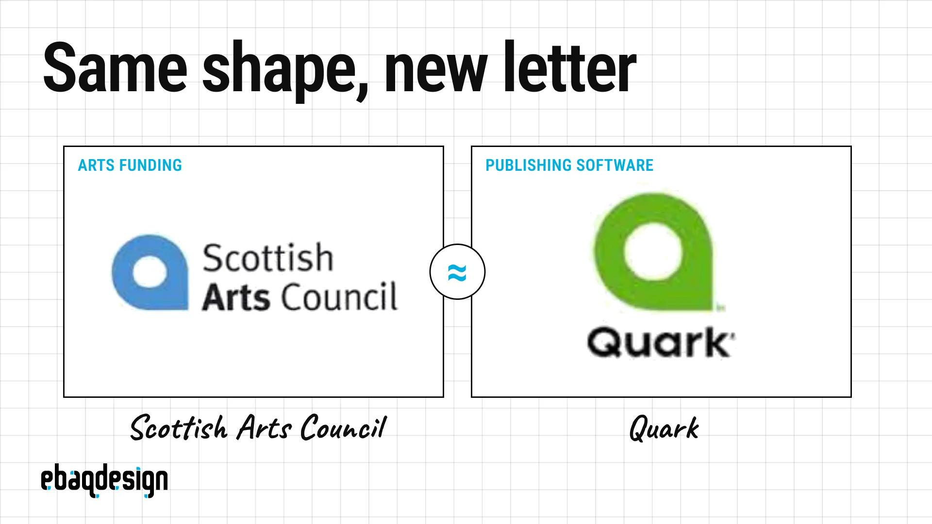
The Scottish Arts Council and Quark used the same shape, a circle merged with a small square, read as a lowercase a in one case and a capital Q in the other.
The arts council launched its mark in 2002.
Quark, the maker of QuarkXPress, unveiled its new green Q on September 9, 2005, and designers spotted the match within days.
The embarrassment was sharper because Quark’s customers are designers.
Quark said it had run trademark searches at home and abroad and that the similarity was unintentional, and I believe it, because other companies turned out to be using the same shape too.
Nobody sued, but the ridicule was enough, and Quark replaced the logo about six months later.
A trademark search protects you from lawsuits, and only a visual search protects you from looking careless.
How similar is too similar?
Two marks are too similar when an ordinary buyer, working from memory, is likely to think they come from the same company, and that depends as much on how related the products are as on how alike the marks look or sound.
I’m a designer, not a lawyer, so treat this as a map of the territory and hire a trademark attorney for the real thing.
US examiners compare marks, in the words of the USPTO’s examining manual, “in their entireties as to appearance, sound, connotation and commercial impression.”
Trademark lawyers shorten that to sight, sound and meaning, and the EU uses the same trio under the labels visual, aural and conceptual.
- Sight: logos are compared mainly on how they look, and the manual accepts that buyers remember them in a general way and not in detail.
- Sound: names that are spelled differently but spoken alike can conflict, and the examples the manual cites include SEYCOS and SEIKO, and XCEED and X-SEED.
- Meaning: a foreign word can conflict with its translation (LUPO and WOLF), and a picture of a lion can conflict with the word LION.
Similarity on just one of the three can be enough.
Then comes the second half of the test, which is the one that saves most of the pairs in this article: how related are the goods and services?
Pepsi and Korean Air could be identical twins and it would hardly matter, because nobody buys a plane ticket believing a soda company flies the plane.
Two details surprise founders.
First, the 45 trademark classes are an administrative filing system, and the USPTO says classification has no bearing on likelihood of confusion, so a different class number is not a safe harbor on its own.
Second, the comparison is not side by side.
The test assumes a buyer with an imperfect memory, which matches the research: when UCLA psychologists asked 85 students to draw the Apple logo from memory, exactly one got it right.
In the Branded in Memory experiment, 156 people drew ten famous logos, and about 80% got the colors right while only 16% of drawings were close to accurate.
People remember color and a rough shape, which is exactly what two look-alike logos share.
The exception: famous marks
Famous marks get extra protection called dilution, which applies even when the products are unrelated and nobody is confused.
Under US law the mark has to be widely recognized by the general public, which is a high bar that a brand known only inside its niche does not clear.
That is the theory PayPal leaned on against Pandora, and it is the reason a small business should stay well away from anything that echoes Nike, Apple, Starbucks or Coca-Cola, whatever it sells.
When brands sound the same
Brand names collide by sound even more often than logos collide by shape, because a name has to survive being spoken badly, heard wrongly and typed from memory.
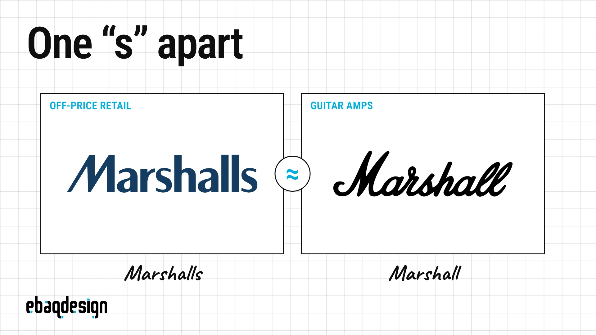
Start with the pair that made me want to write this section.
Marshalls is the American off-price retailer founded in 1956 and owned by TJX, the company behind T.J. Maxx.
Marshall is the British amplifier company founded in 1962 by drummer and shop owner Jim Marshall, whose JTM45 amp became the sound of rock music.
Spoken, the difference is a single “s”, and the possessive vanishes it completely: “a Marshall’s amp” and “Marshalls” are the same sound.
I looked for a fight between them and found none: no lawsuit, no opposition, not even a documented mix-up.
The reason is the same one that saves the logos above.
Nobody walks into a discount clothing store expecting a guitar amplifier, the two registered in different categories, and “Marshall” is a common surname that plenty of companies already share, including a British paving business and an aerospace firm.
It is worth noting where this could get interesting: Marshall now sells headphones and speakers, which is a lot closer to the shelves of a Marshalls store than amplifiers ever were.
That is the whole principle in one pair.
Names coexist until the two businesses start selling to the same person in the same place.
How trademark law hears a name
Examiners compare names by sound, not by spelling, which is why creative spelling is not a defense.
The USPTO’s own manual lists pairs it considers confusingly similar, and they read like a list of startup names: SEYCOS and SEIKO, XCEED and X-SEED, CRESCO and KRESSCO, ISHINE and ICE SHINE.
The manual is also blunt that there is no correct pronunciation of a trademark, because you cannot control how the public says it.
One of the tests US courts use to judge infringement came out of a sound-alike case itself: AMF v. Sleekcraft Boats in 1979, where two boat builders were called Slickcraft and Sleekcraft, and the court observed that the difference amounted to a small part of one syllable.
Europe weighs sound even more heavily when a product is ordered out loud, which is why drinks brands ordered in noisy bars get less room than products chosen off a shelf.
Names that sound the same and coexist
Names that sound the same coexist when the businesses sell unrelated things, and some of the most famous brands in the world share a name with a company most of their customers have never heard of.
Mitsubishi and Mitsubishi Pencil
The car and heavy-industry group and the maker of uni-ball pens share a name and the same three-diamond logo, and the two companies are not related in any way.
Both marks come from family crests, which is how two unconnected Japanese firms arrived at the same three diamonds.
The pencil company was founded in 1887 and says it registered its name and mark in 1903, roughly a decade before the conglomerate registered its own.
This is the strongest possible version of the argument in this article: identical name, identical symbol, no conflict, because one makes pens and the other makes cars.
Rolls-Royce and Rolls-Royce
The company that makes Rolls-Royce cars and the company that makes Rolls-Royce jet engines are entirely separate businesses, and have been since the original firm collapsed in 1971.
The aero-engine business kept the name and the trademarks.
So when the car business was sold in 1998, Volkswagen paid £430m for the factory and the assets, while BMW paid £40m to license the name and the logo from the engine company, and BMW is the one building Rolls-Royce cars today.
VW bought the plant; BMW bought the word.
The everyday collisions
Once you start listening for them, sound-alike brands are everywhere.
- Cisco and Sysco: identical when spoken, one sells networking hardware and the other distributes food, and no dispute is on record.
- Lloyds Bank and Lloyd’s of London: an apostrophe apart, with no shared history at all.
- Audi and Aldi: a linguist at the University of Kent has explained that in south-east England the two are genuine homophones, which is a problem for the carmaker only in conversation.
- Dove and Dove: Unilever’s soap and Mars’s chocolate, sold side by side in the same supermarket under the same word.
- Delta: an airline, a faucet maker and a dental insurer, the textbook example of peaceful coexistence.
Even Delta has a limit, though.
Delta Air Lines sued Marriott over its Delta Hotels brand, and the case went to trial in late 2025, because a hotel and an airline finally meet in the same place: travel.
That is the boundary of the whole doctrine, and it is worth remembering when you plan where your business is going, not just where it is.
Names that sound the same and ended in court
Sound-alike names end up in court when the businesses overlap, when one name is famous, or when the newcomer is so much louder that it drowns out the original.
Lexus and Lexis: the court that ruled on how a name sounds
When Toyota launched Lexus in 1989, Mead Data Central, the owner of the legal research service LEXIS, sued to stop it.
The trial court agreed that in ordinary speech the two names were effectively identical and blocked the launch.
The Second Circuit reversed, on two grounds worth remembering.
It said the right place to judge a name is advertising, where announcers speak more carefully than people in the street, and, more importantly, that LEXIS simply was not famous enough: about 1% of the general public associated it with Mead, against 76% of attorneys.
Fame inside your industry is not fame, and a niche reputation will not stop a consumer brand from taking a name that sounds like yours.
Sky and Skype: your name inside their name
Sky opposed Skype’s European trademarks, and in 2015 the EU General Court agreed that the two were confusingly similar.
The reasoning is almost comic: the court found that “sky” remains clearly identifiable inside “skype”, and that Skype’s cloud-shaped logo made things worse, because clouds are found in the sky.
Microsoft had already lost a parallel fight in the UK over SkyDrive, which is why that product is now called OneDrive.
If a famous short word sits at the front of your name, expect its owner to argue that your brand is their brand plus noise.
Mondo to Monzo: the fastest fix in fintech
The UK bank now called Monzo launched as Mondo, and in June 2016 it announced that an undisclosed company with a similar name had challenged the trademark.
Instead of fighting, it asked its own customers for a new name, with one rule: it had to start with an M so the logo could stay.
Thousands of suggestions later, Monzo was announced in August 2016.
The rebrand became a community event rather than a crisis, which is the best outcome available once you have already printed the cards.
WWF and WWF: the rename that cost a logo
The World Wildlife Fund and the World Wrestling Federation signed agreements in 1989 and 1994 to stay out of each other’s way, and the wrestling company broke them when it launched a new scratch logo and wwf.com.
The Fund won in the High Court in 2001 and again in the Court of Appeal in 2002.
In May 2002 the company became WWE, with a “Get the F Out” campaign, and for years it had to blur the old logo out of its own archive footage.
A coexistence agreement is only worth anything for as long as you actually keep to it.
Three times the small brand won
The most encouraging cases for founders are the ones where the giant lost.
- Bentley Clothing: a family firm in Manchester had sold Bentley clothing since 1962 and held the trademark for it, so when Bentley Motors expanded onto garments the High Court ruled against the carmaker in 2019, and the Court of Appeal agreed in 2020.
- House of Zana: Inditex opposed a Darlington boutique’s name, arguing people would mishear it as Zara, and the UK trademark office rejected the opposition in 2022.
- Katie Perry: an Australian designer whose birth name is Katie Perry registered her name for clothing in 2008 and spent 17 years defending it, until the High Court of Australia ruled in her favor in March 2026, holding that the singer’s fame in music was not a reputation in clothes.
The pattern is consistent: a registration in the right category beats fame in a different one.
The counter-example is Spotify, which in 2022 stopped a cannabis-dispensary app called Potify on dilution grounds alone, without having to prove anyone was confused, because Spotify is famous enough to qualify.
Compare that with Dr. Dre, who opposed a gynecologist trading as Dr. Drai and lost in 2018, because medicine and music are too far apart for confusion.
The AI era is making it worse
AI companies are colliding by name faster than any industry I have watched, because thousands of startups are naming themselves from the same short, techy, vowel-light word list at the same time.
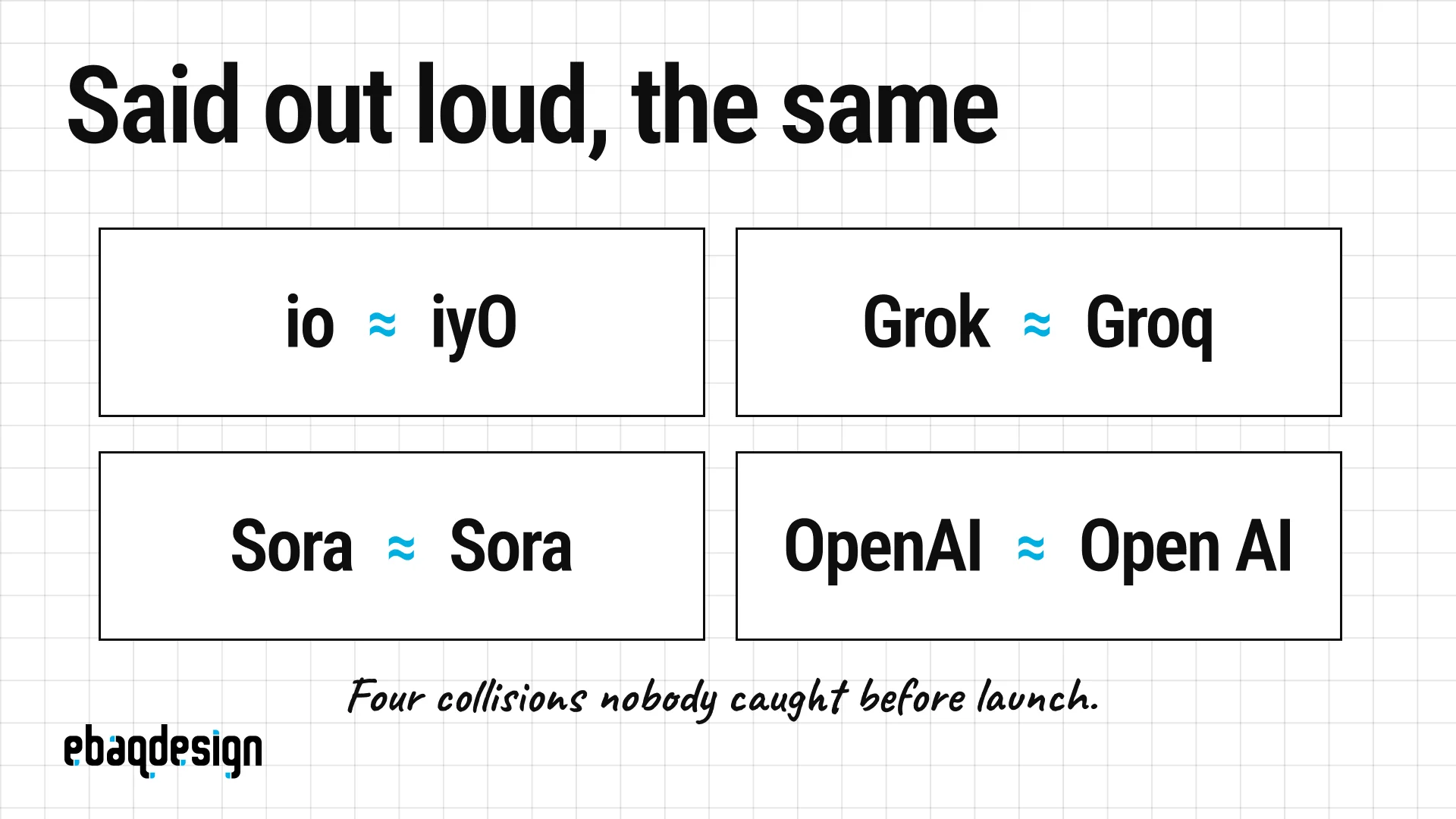
io and iyO
This is the most expensive name collision I know of.
In May 2025 OpenAI announced it was acquiring Jony Ive’s hardware startup io in a deal reported at around $6.5 billion.
iyO, a spin-out from Alphabet’s X lab making an AI audio device, sued, and a court ordered OpenAI to take the branding down within weeks.
The Ninth Circuit affirmed the injunction in December 2025, noting that the two marks differ by one letter and are pronounced identically.
OpenAI told the court it would stop using the name, and the parties reached a settlement in July 2026.
A multibillion-dollar acquisition lost its name to a company that had been quietly using the same sound first.
Grok and Groq
Groq, an AI chip company, has held its trademark filing since January 2017.
When xAI launched the Grok chatbot in November 2023, Groq published a good-humored open letter to Elon Musk asking him to pick another name.
No lawsuit followed, but the registration problem did not go away: in June 2025 the USPTO refused xAI’s applications again, citing 28 earlier filings including Groq’s.
You can ship a product under a crowded name, but you may never own it.
Names you cannot own at all
OpenAI has spent years trying to register GPT and has been refused repeatedly, with the USPTO calling the term descriptive and then likely generic.
In March 2026 the trademark board held that even ChatGPT is merely descriptive, and it survives only on the argument that the public now associates it with one company.
If your name plainly describes what your product does, it will be easy to explain and impossible to defend.
You do not need a lawsuit to lose a name
Shortcut, a project-management tool, was called Clubhouse until the audio app of the same name became famous in 2021.
There was no legal claim at all, but confused people review-bombed the wrong app, and the company renamed itself Shortcut that September.
A name can become unusable simply because someone louder picked it too.
Machines mishear names in predictable ways
Security researchers at the University of Illinois tested Amazon Alexa on thousands of spoken samples and found single-word accuracy of about 69%.
The important finding is that roughly an eighth of the errors were systematic, meaning the assistant made the same mistake repeatedly across different speakers, and a third of those were homophones.
They then built “squatted” skills with sound-alike names and captured the user more than nine times out of ten for the words that were reliably misheard.
Their scan of the skill store turned up hundreds of confusable pairs, including Cat Facts and Cat Fax, and Phish Geek and Fish Geek.
If a machine hears your name wrong the same way every time, so will your customers.
Where sound-alike names actually kill people
There is one industry where sound-alike names are treated as a safety problem rather than a legal one, and it is worth knowing about because it shows how seriously the question can be taken.
Drug names that look or sound alike cause real harm, so the US Food and Drug Administration reviews every proposed brand name before it can be used, checking how it looks handwritten and how it sounds spoken aloud.
An FDA article reported that it reviewed around 400 names a year and rejected about a third of them.
The agency runs proposed names through software that scores how similar they are in sound and spelling, and it maintains a practice called tall man lettering, writing confusable pairs as hydrALAZINE and hydrOXYzine so the difference is visible.
Names that failed this test in the real world have been changed: Losec became Prilosec after confusion with Lasix, and Brintellix became Trintellix in 2016 after dozens of mix-ups with a drug called Brilinta.
Your brand is not a medication, and nobody will be harmed if a customer says it wrong.
But the test the FDA applies is the same one you should apply to yourself: not how the name looks on your screen, but how it survives being said out loud by a stranger.
How do you check a logo and a name before launch?
Check a logo and a name before launch by searching trademark registers for look-alikes, sound-alikes and same-meaning marks in related categories, then searching by image, then saying the name out loud to real people.
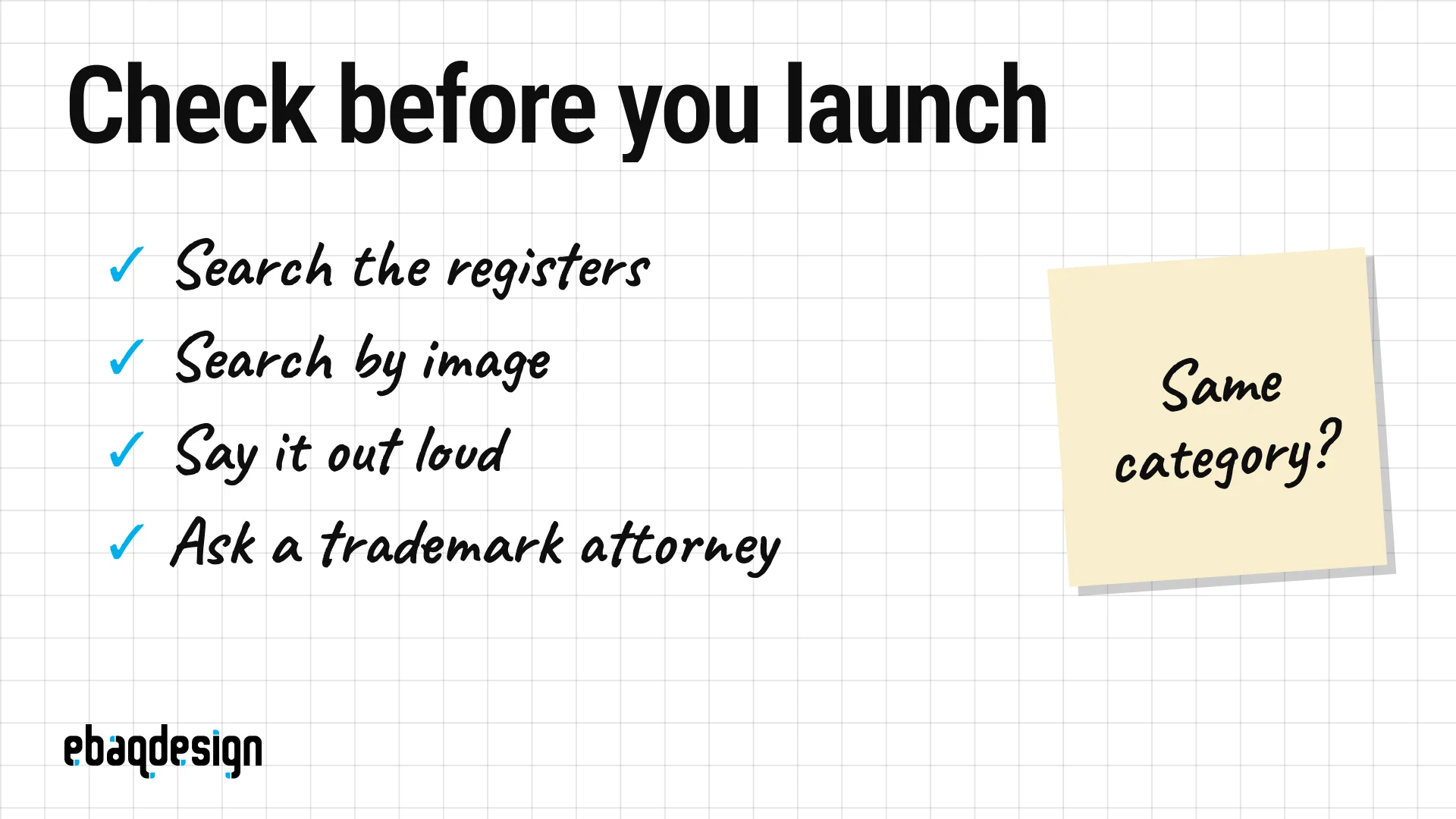
This is the sequence I follow, and the first five steps are free.
- Run a knockout search. Use the USPTO trademark search (it replaced TESS in November 2023) and TMview for Europe, and search phonetic spellings, not only the exact name.
- Search logos by description. The USPTO indexes every logo with design search codes, so you can pull up every registered leaf in a circle in your class.
- Search by image. Upload the mark to the WIPO Global Brand Database, Google Lens and TinEye, which is the step most likely to surface a twin like Quark’s.
- Look beyond the registers. Check app stores, domains, social handles and a plain web search, because unregistered brands still have rights where they trade.
- Say it out loud. Say the name on a phone call, to a voice assistant and to someone with a different accent, then ask them to spell it back.
- Compare customers, not class numbers. Ask whether the same buyer could meet both brands in the same place, including the same phone screen.
- Pay for a clearance search. The USPTO strongly encourages hiring a trademark attorney, and a full search costs far less than reprinting everything.
- Keep your sketches. Dated files show how you arrived at an idea, which is the best answer to an accusation of copying.
A US application currently costs $350 per class and the USPTO says registration usually takes 12 to 18 months, so file early.
I cover the filing itself in how to copyright and trademark a logo, and the naming side in how to create a brand name.
What should you do if you find a twin after launch?
If you find a twin after launch, work out who was first and whether you share customers before you do anything else, because those two facts decide whether you ignore it, negotiate or change.
- Different category, different customers: usually nothing to do, which is where most of the pairs in this article sit.
- Some overlap, both acting in good faith: a written coexistence agreement that spells out who uses the mark where, and hold to it as you grow (ask WWE).
- Same category and they were first: change early, while it is cheap, as Monzo and Quark did.
- They are famous: change, whatever you sell.
Public opinion can end an identity even when no court would.
Tokyo’s first 2020 Olympic emblem was withdrawn on September 1, 2015, five weeks after it was unveiled, because a Belgian designer said it resembled his logo for the Théâtre de Liège.
The organizers never conceded plagiarism, and said only that the emblem had lost public support.
A tweak is often enough, and I explain how far a tweak can go in how to redesign a logo.
Look-alike logos and sound-alike names: FAQ
Is it illegal to have a logo that looks like another company’s?
A logo that looks like another company’s is only a legal problem when buyers are likely to confuse the two businesses, which usually requires related products, overlapping customers or a famous mark.
That is why Pepsi and Korean Air coexisted for four decades while Path and Pinterest ended up at the trademark office.
Can two companies have the same name?
Two companies can have the same name when they sell unrelated things to different buyers, which is how Delta the airline, Delta the faucet maker and Delta Dental all exist at once.
The arrangement breaks down when one of them expands into the other’s market or when one of the names is famous.
Do sound-alike names count as trademark infringement?
Sound-alike names can conflict even when they are spelled differently, because trademark law compares marks by sound as well as by sight and meaning.
The USPTO’s position is that there is no correct pronunciation of a trademark, so “we say it differently” is not a defense.
How do I check whether my logo already exists?
Check whether a logo already exists by running it through an image search (WIPO Global Brand Database, Google Lens, TinEye) and by searching USPTO design codes for the same shapes in your class.
Do it before you present the logo to anyone, because it is much easier to drop a sketch than a launched brand.
Does a logo have to be 100% original?
A logo does not have to be 100% original, and with about 93 million trademarks in force it realistically cannot be.
It has to be distinctive in its own category, appropriate for the business and legally available, which is a standard you can actually meet.
What should I do if someone says I copied their logo?
If someone says you copied their logo, stay calm, check who used the mark first and in which market, and pull out your dated sketches.
Independent creation is common and, as the Ventur example shows, an accusation is not the same thing as a conflict, but take it to a trademark attorney if you share customers with the other brand.
The takeaway
Similarity is normal, and the pairs above prove that some of the most valuable brands in the world share their best idea with someone else.
What matters is distance inside your own category, in how the mark looks, how the name sounds and what both of them mean.
That distance comes from strategy first and drawing second, which is how I approach every identity project.
If you are naming a company or designing a logo and want it checked against its category before it ships, that is the work I do.
Book a call, or see the Ventur case study first.
Ready to build a brand people remember?
Tell me what you’re launching, changing, or trying to make look better.