


Arek Dvornechuck
Branding Expert


AI Startup Logos & Why They Look Alike
.webp)


.webp)


Open any tech publication, scroll through Product Hunt, or browse WellFound—you'll notice something striking: AI startup logos have become eerily identical.
Hexagons. Swirls. Gradients. Sans-serif wordmarks. Rinse and repeat.
What began as clever symbolism has morphed into a visual echo chamber where distinguishing one company from another requires reading the name, not recognizing the logo. In an industry built on innovation and disruption, why are brands converging on the same tired aesthetic?
This isn't just a design trend—it's a symptom of something deeper. Let's dissect why this is happening, what it costs these companies, and how to break free from the swirl.
Oftentimes it's a swirling, geometric symbol next to a clean sans-serif brand name.
It seems like every other company opts for a hexagon-shaped logo.
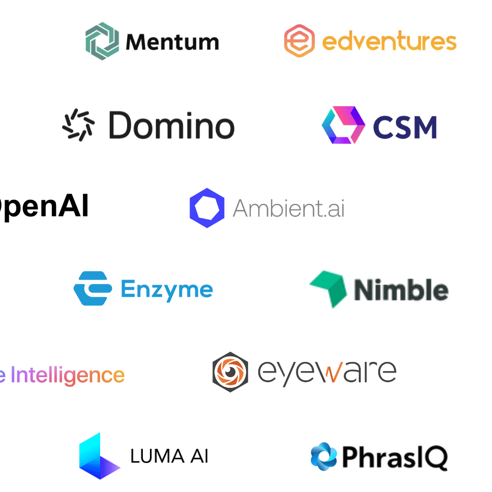
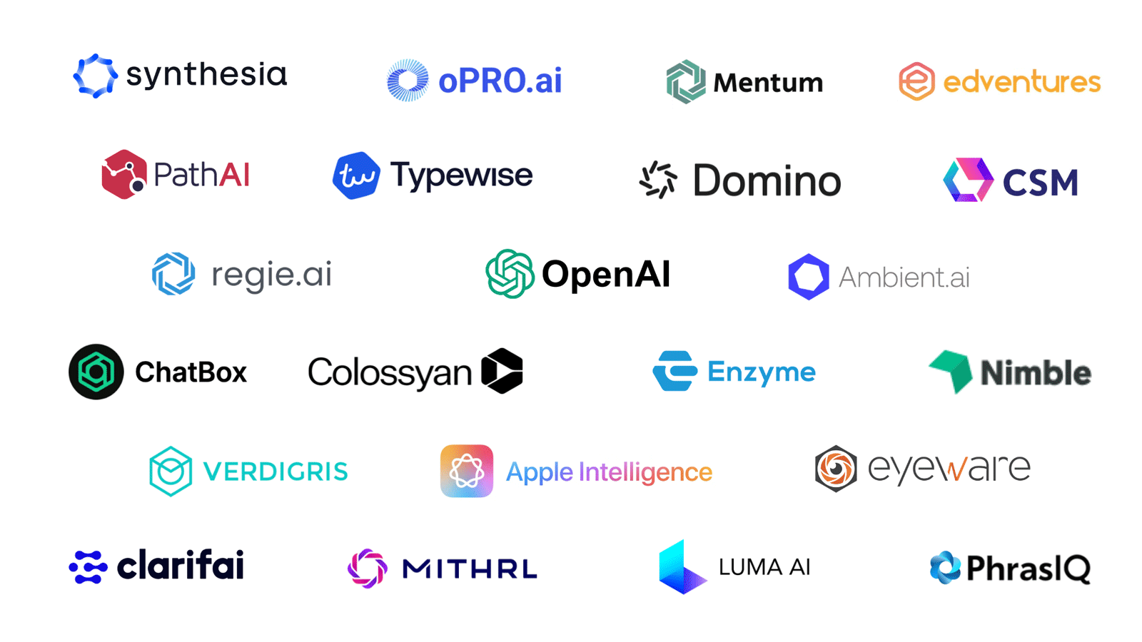
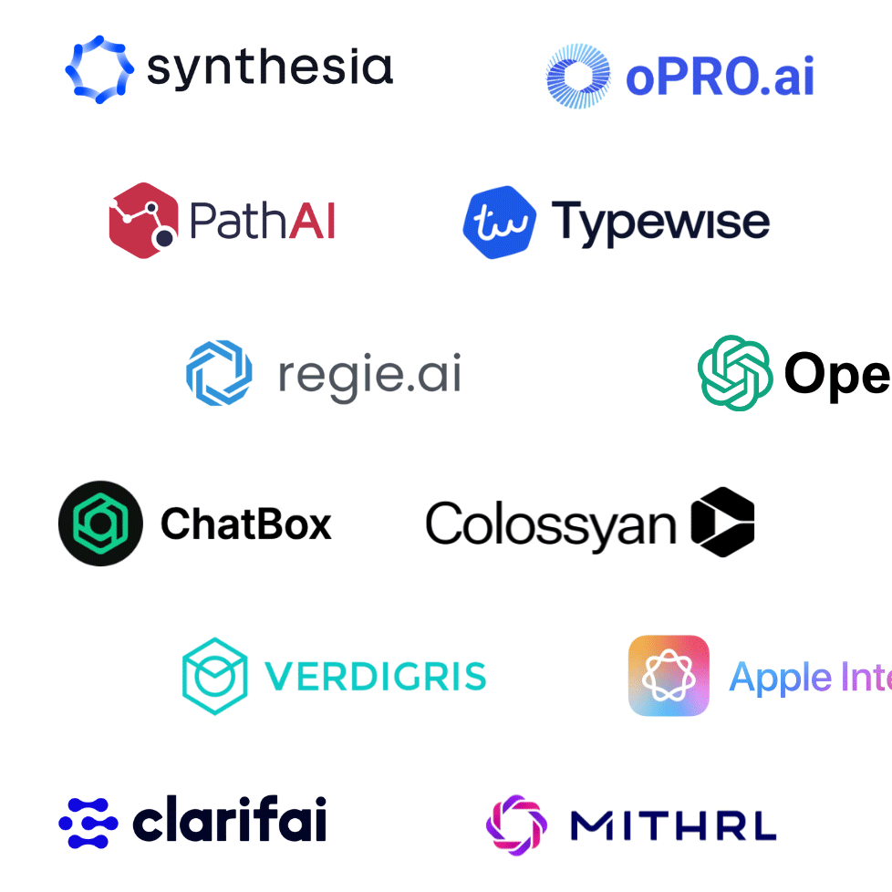
Here are 22 AI startups (from the thumbnail) that I just found in less than 10 min—and they all reflect this visual trend:
I'm pretty sure that if I spent another 15 min or so—I would probably make it to 50 at least.
The hexagon isn't just a trendy shape—it carries deep symbolic and visual meaning:
Found in honeycombs and molecular structures, hexagons are nature's way of packing strength and space efficiently.
With six equal sides and perfect rotational symmetry, the hexagon feels inherently logical and stable.
It's futuristic without being abstract.
Geometric but not rigid.
Clean but still dynamic.
These traits map well to what AI startups usually want to communicate:
We're seeing a clear visual convergence in the branding of AI startups:
This trend is especially rampant among:
These logos feel techy and some of them do look "smart."
However, here's the issue: when everyone uses the same design language, no one actually stands out.
The ChatGPT logo, introduced by OpenAI, seems to be a visual landmark in the AI space these days:
After ChatGPT exploded in popularity, a flood of AI startups adopted similar forms.
Likely hoping to ride the wave of visual trust and familiarity.
However, what started as a great design choice quickly spiraled (pun intended) into overuse.
Why do founders and designers keep making the same choices? The answer lies in psychological and market forces that push brands toward conformity:
When investors, customers, and competitors all recognize certain visual cues as "AI," deviating feels risky. Startups worry that an unconventional logo might confuse their market position or fail to signal credibility.
In a race to launch, many founders prioritize speed. Hiring a designer on Fiverr or using an AI logo generator produces "good enough" results fast—but these tools draw from the same reference pool, perpetuating sameness.
When a successful company like OpenAI uses a particular design approach, others assume it's a formula for success. This creates a halo effect where the visual style gets credited for business outcomes that actually stem from product quality, timing, or market fit.
Even skilled designers fall into this trap. Platforms like Dribbble and Behance showcase what's trending, and designers naturally absorb and replicate what gets attention and praise from their peers.
The result? A self-reinforcing cycle where looking like everyone else becomes the path of least resistance.
While logo trends can help signal "we're part of this wave," they carry serious risks:
When 50 other startups use a hexagon with a swirl, even great products can look like clones.
Founders often default to "what looks like AI" instead of asking questions like:
What does our product stand for?
What emotion do we want to evoke?
Remember, what works for them, doesn't necessarily works for you.
Do you remember the early 2010s "flat design" boom?
Or the 2020 crypto logos that all used hexagons and cube illusions?—Trends expire. Fast.
A logo should be distinctive, memorable, and aligned with your positioning—not just what's hot right now.
You're not the only one who noticed this.
They hilariously dissected how many AI logos resemble anatomical swirls instead of intelligent design.
They broke down how the AI logo trend mirrors what happened during the crypto boom—hexagons, grids, and abstract illusions that all end up looking the same.
Both articles point to one conclusion: good branding stands out.
Great branding reflects strategy.
If you're branding an AI startup today, consider these guidelines:
What makes your product unique? Who is it for?
Think beyond hexagons—can you use brainwaves, light, movement, or organic forms?
Slight asymmetry, custom glyphs, or raw forms can evoke emotion and personality.
Aim for timelessness, not trendiness.
Here's the uncomfortable truth: your logo is not your brand, but it's often the first thing people see. And if what they see looks exactly like 50 other companies, you've already lost a crucial opportunity to make an impression.
The hexagon-swirl aesthetic isn't inherently bad. For OpenAI and a handful of early adopters, it worked. But by 2026, it's become visual wallpaper—something people scroll past without registering.
Your brand deserves to be remembered, not mistaken for someone else.
Breaking the mold isn't about being different for difference's sake. It's about crafting a visual identity that genuinely reflects what makes your company unique—your values, your approach, your vision. That kind of authenticity can't be templated or trend-jacked. It requires thought, strategy, and the courage to stand apart.
The AI revolution isn't just about technology. It's about how we think, create, and communicate. Your brand should reflect that innovation—not recycle it.
PS. Also check out my newest article reviewing some of the best AI startup landing pages.
If you're building an AI startup and want a brand identity that breaks the mold, check out my portfolio and schedule a call.
Let's create a visual identity that people remember—for the right reasons.
As an Amazon Associate, I earn from qualifying purchases.


I'm a branding expert and graphic designer based in NY. I specialize in the development of brands: brand strategy, identity & web design. Need help with your project?—Get in touch