

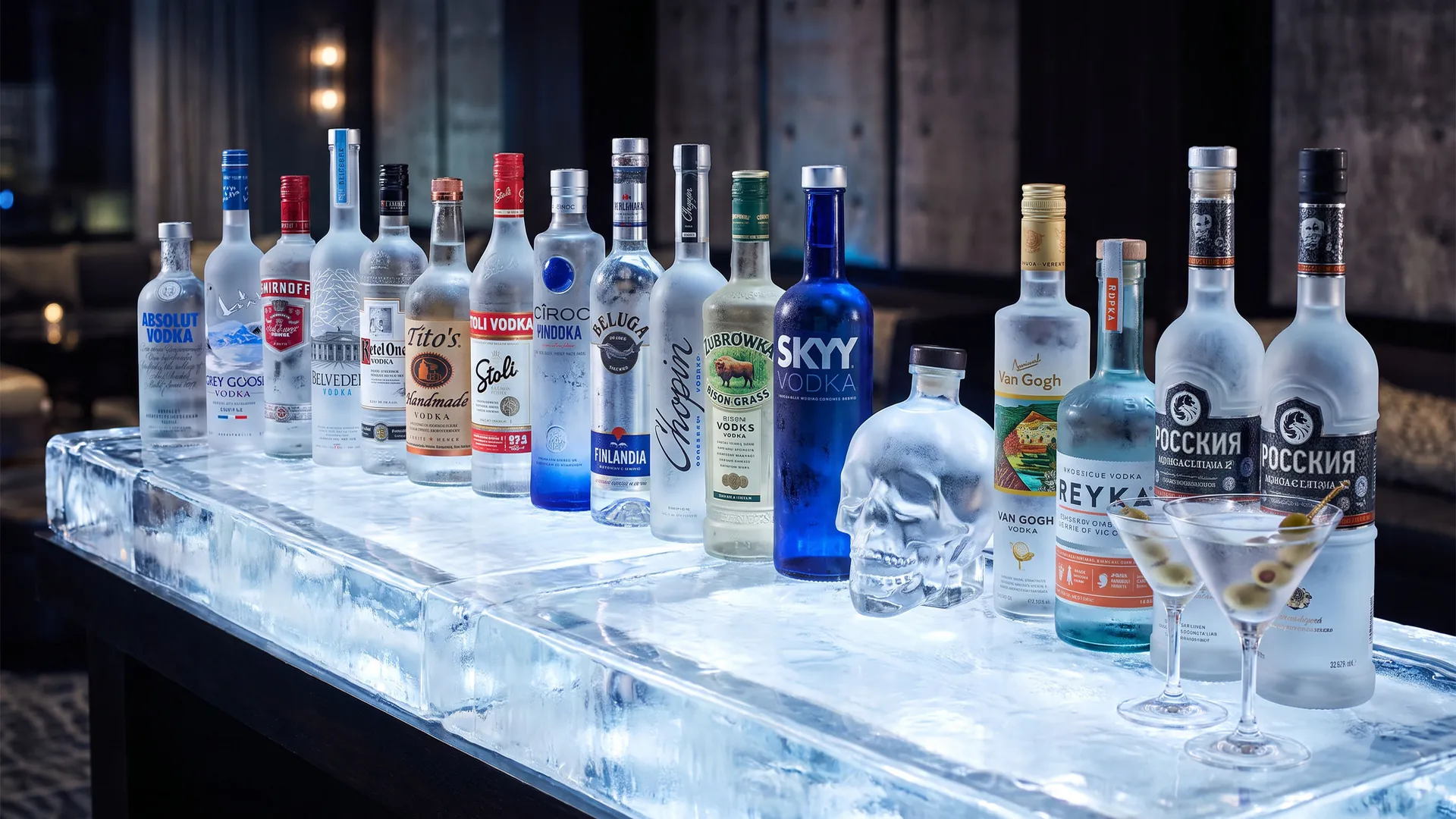
Vodka is a clear spirit that tastes much the same from brand to brand, so the logo and the bottle do a lot of the selling. The best vodka logos are clean, confident and instantly recognisable on a frosted bottle, and they tell a story about where the vodka comes from or how pure it is.
What makes a good vodka logo?
A clear origin story: Absolut writes "Country of Sweden", Grey Goose points to France, and Polish brands like Belvedere, Chopin and Żubrówka put national symbols at the centre.
A logo that works on clear glass: vodka bottles are often transparent or frosted, so the best logos use strong contrast, simple shapes and lots of white space.
Purity and cold: blue colours, spaced capitals, ice, mountains and water show up again and again, because they suggest a clean, smooth spirit.
Below are 45 vodka logos in five groups: global vodka icons, Polish, Ukrainian and Russian vodka, American vodka brands, luxury and design-led vodka, and Nordic, Dutch and world vodka. Each logo has a slide with my handwritten notes and a short explanation. If you are launching a spirits brand, see my branding checklist and my guides to logo colours and logo fonts. For more drinks brands, see my whiskey logos and beer logos.
45 vodka logos
The boards below show all 45 vodka logos in one consistent format, grouped into global icons, Polish, Ukrainian and Russian vodka, American brands, luxury vodka, and Nordic, Dutch and world vodka.
Each logo is reviewed for its design decisions, not for the taste, price or popularity of the vodka.
01 — Global vodka icons
The world's biggest vodka brands use simple, confident logos that work on every bar shelf, from Absolut's bold capitals to Grey Goose's goose in flight.
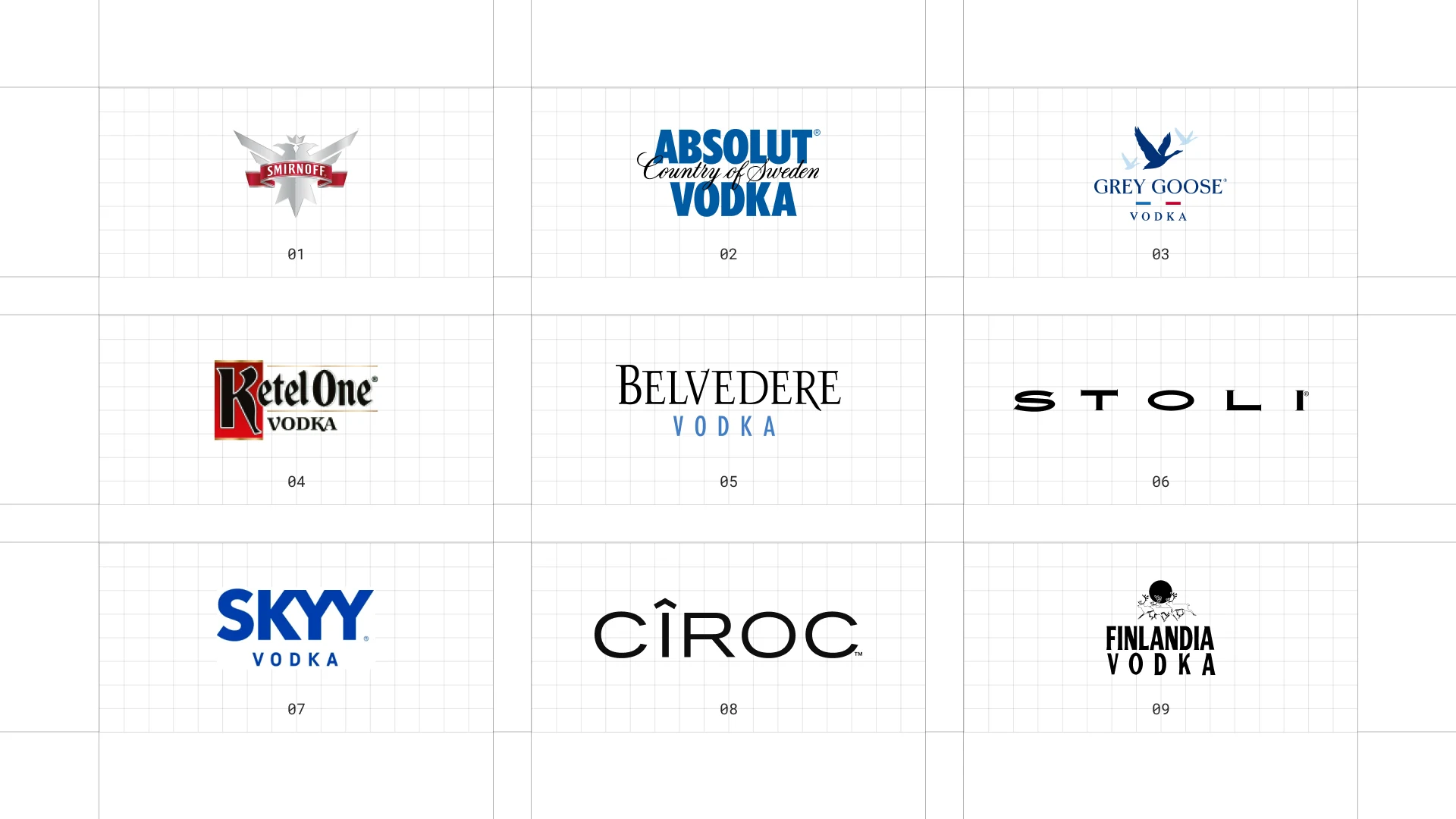
This is a visual comparison of vodka logos, not a ranking of vodkas.
Look at how each logo uses type, colour and one symbol to signal purity, origin or personality.
01 Smirnoff
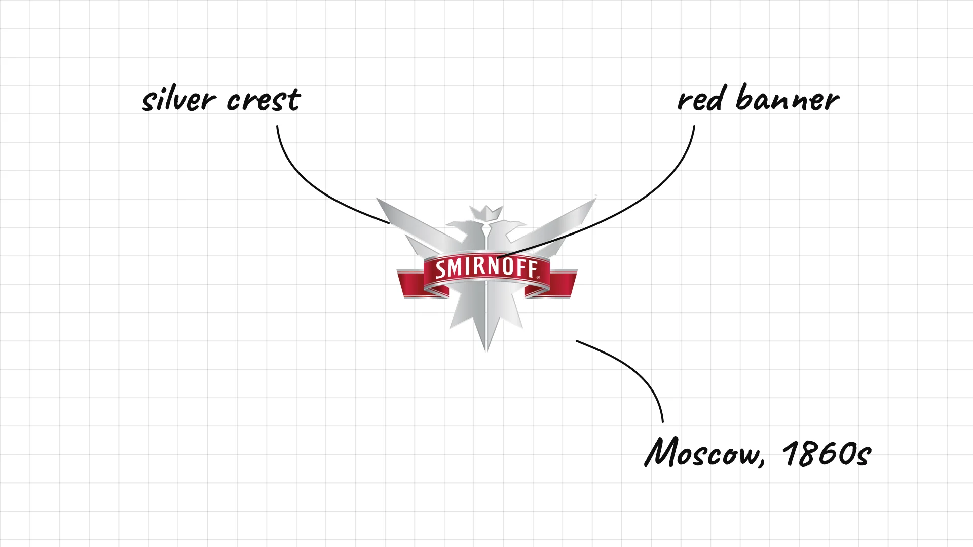
Smirnoff Pyotr Smirnov built his vodka business in Moscow in the 1860s, and the brand later grew into the world's best-selling vodka.
A red banner sits across a silver crest, like an imperial seal.
The heraldic shape is a reminder of the brand's 19th-century Russian roots.
02 Absolut
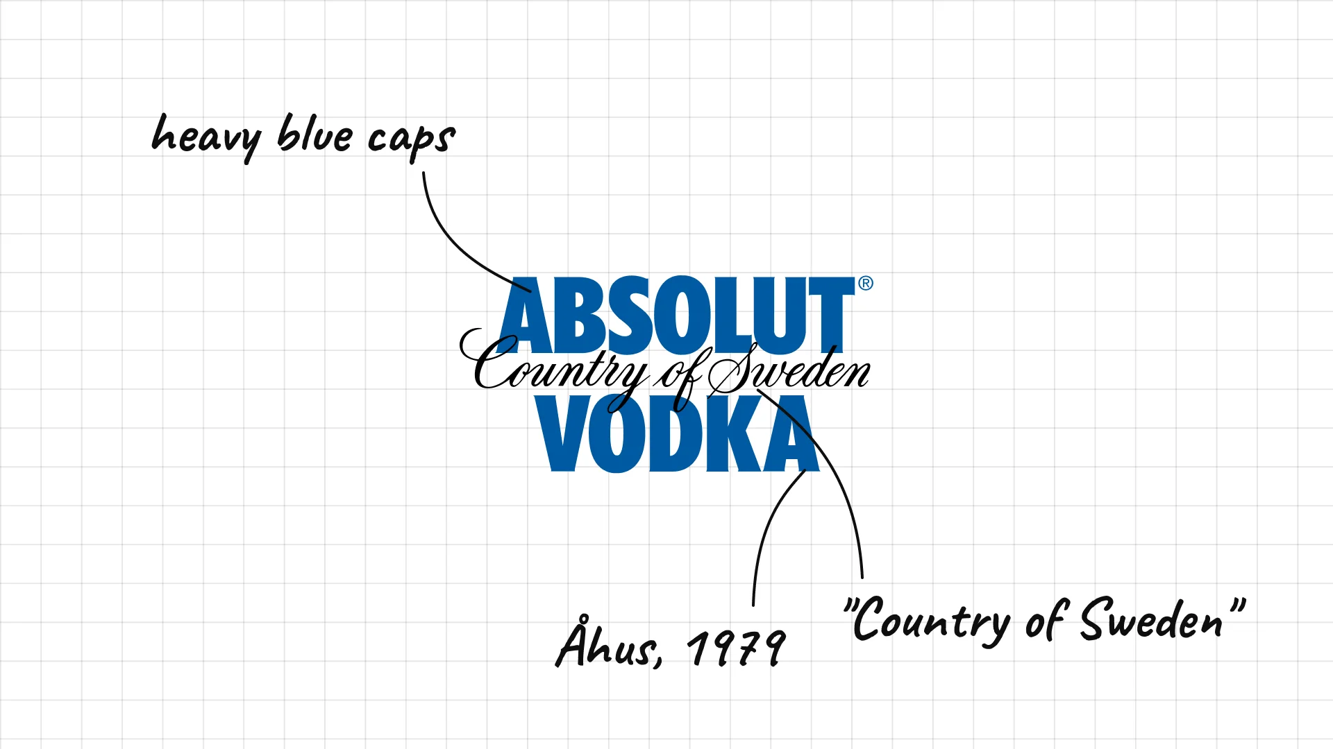
Absolut was launched in 1979 in Åhus, Sweden, building on a vodka first sold by Lars Olsson Smith in 1879.
Heavy blue capitals are paired with a handwritten "Country of Sweden" in the middle.
The logo is printed straight onto the famous bottle, which became the star of its advertising.
03 Grey Goose
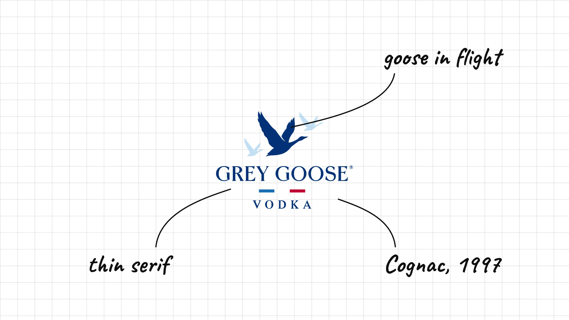
Grey Goose Sidney Frank created Grey Goose in 1997, and it is distilled in the Cognac region of France.
A goose in flight sits above thin, spaced capitals.
The quiet serif and pale blue feel French and premium rather than loud.
04 Ketel One
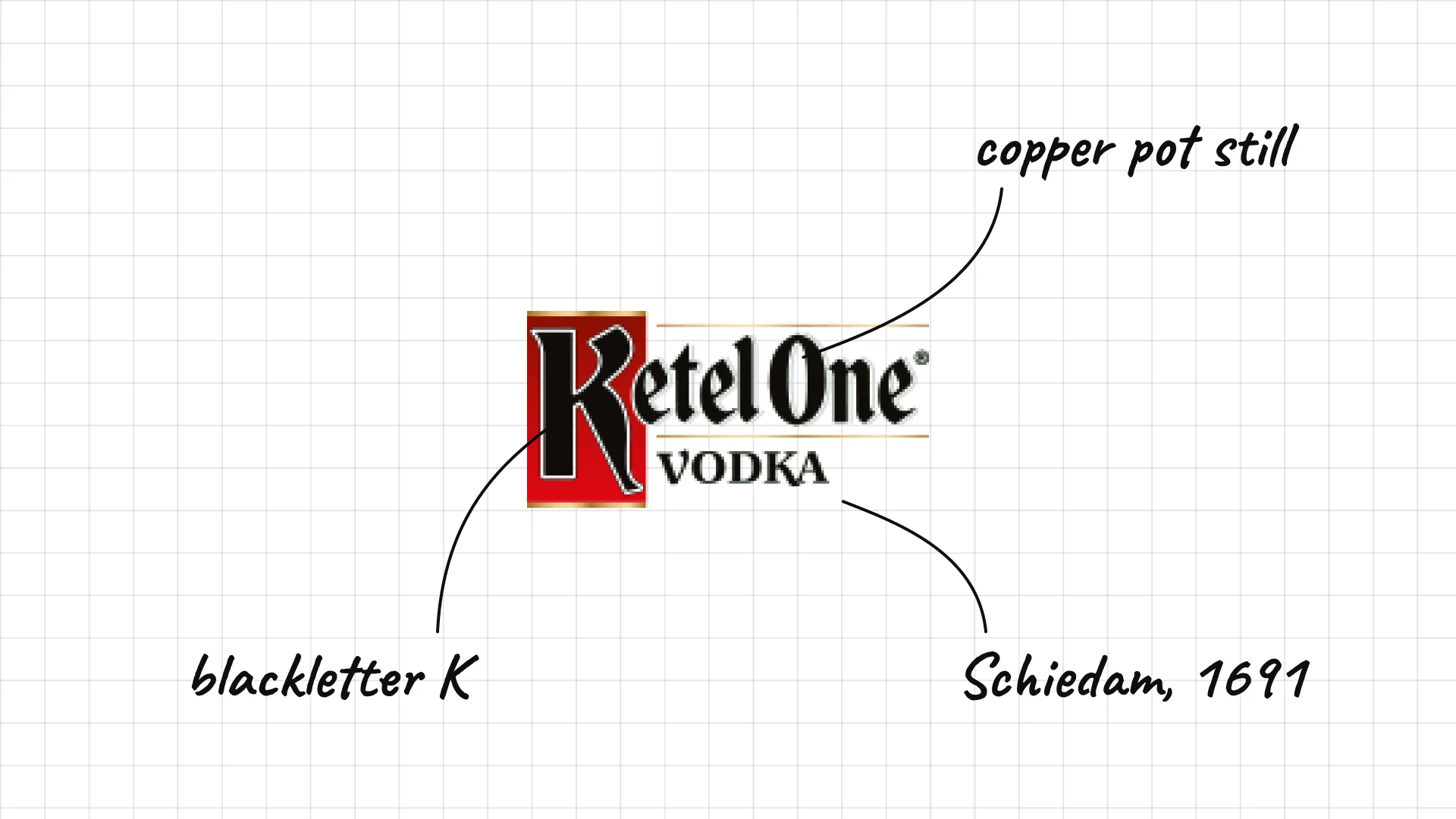
Ketel One The Nolet family has distilled in Schiedam, the Netherlands, since 1691, and Ketel One is named after their copper pot still.
A large blackletter K gives the name an old Dutch character.
Black, white and a touch of red keep the logo crisp on the bottle.
05 Belvedere
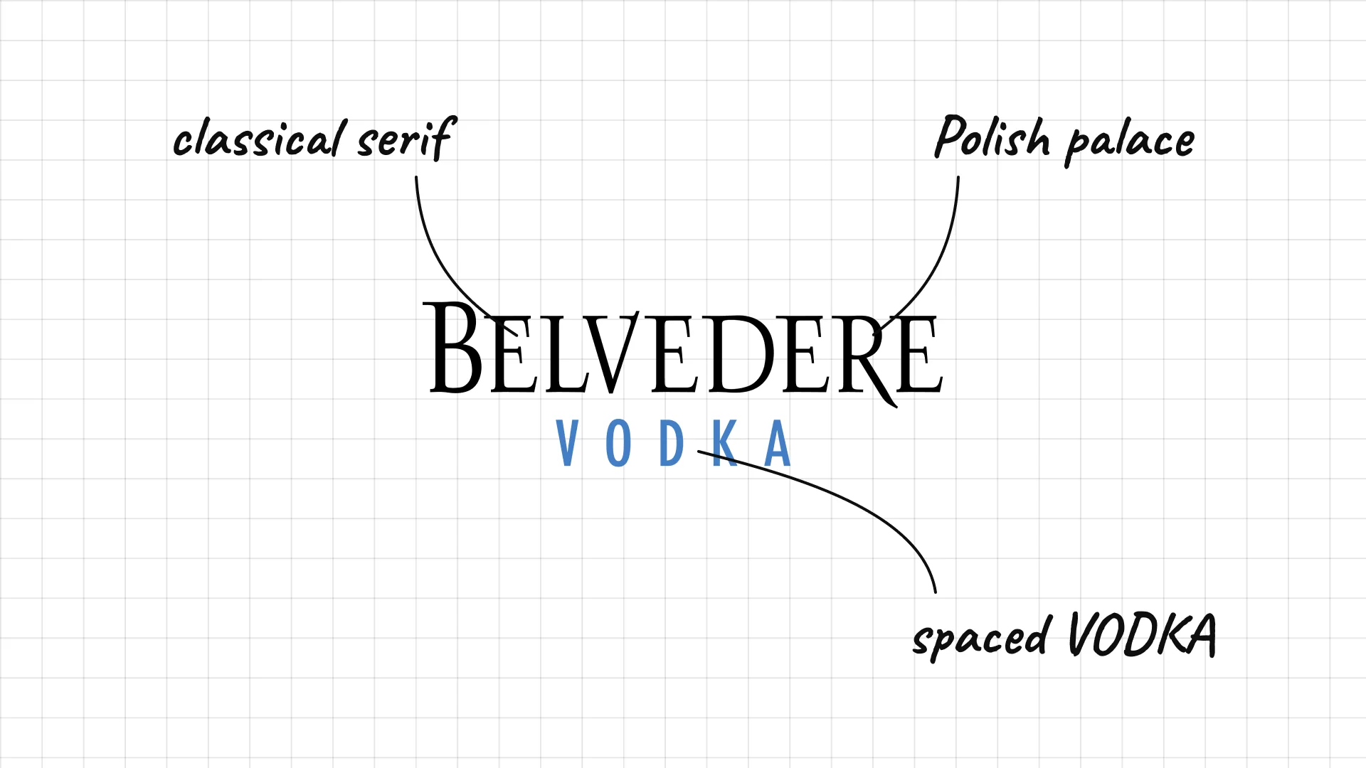
Belvedere was launched in 1993 in Żyrardów, Poland, and is named after the Belweder Palace in Warsaw.
Tall serif capitals feel classical, like the palace on the bottle.
Widely spaced blue VODKA underneath adds calm and balance.
06 Stolichnaya
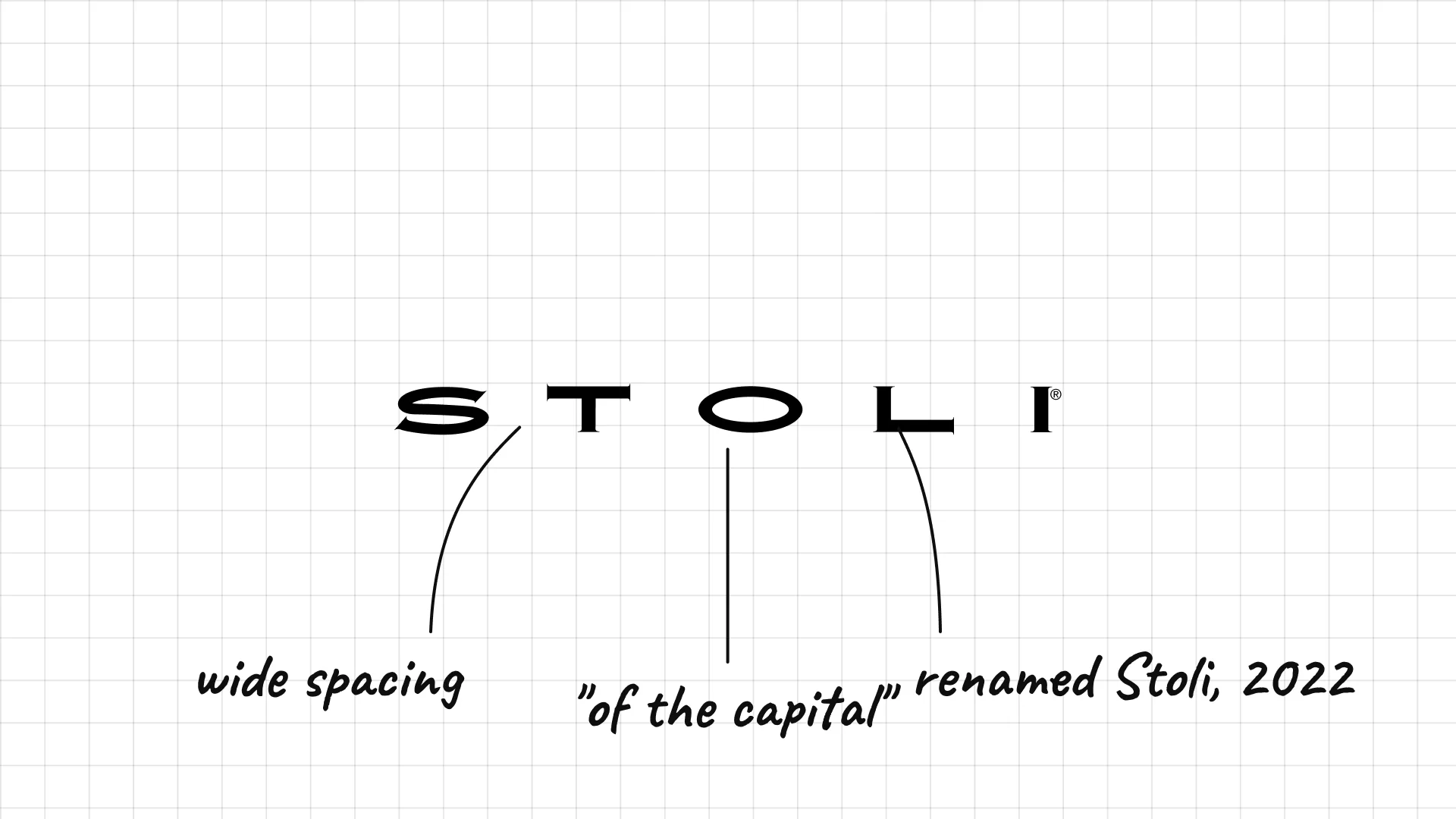
Stolichnaya means "of the capital", and in 2022 the brand shortened its name to Stoli.
Very widely spaced capitals make the short name feel modern and minimal.
Dropping the long Russian name was a branding decision as much as a design one.
07 Skyy
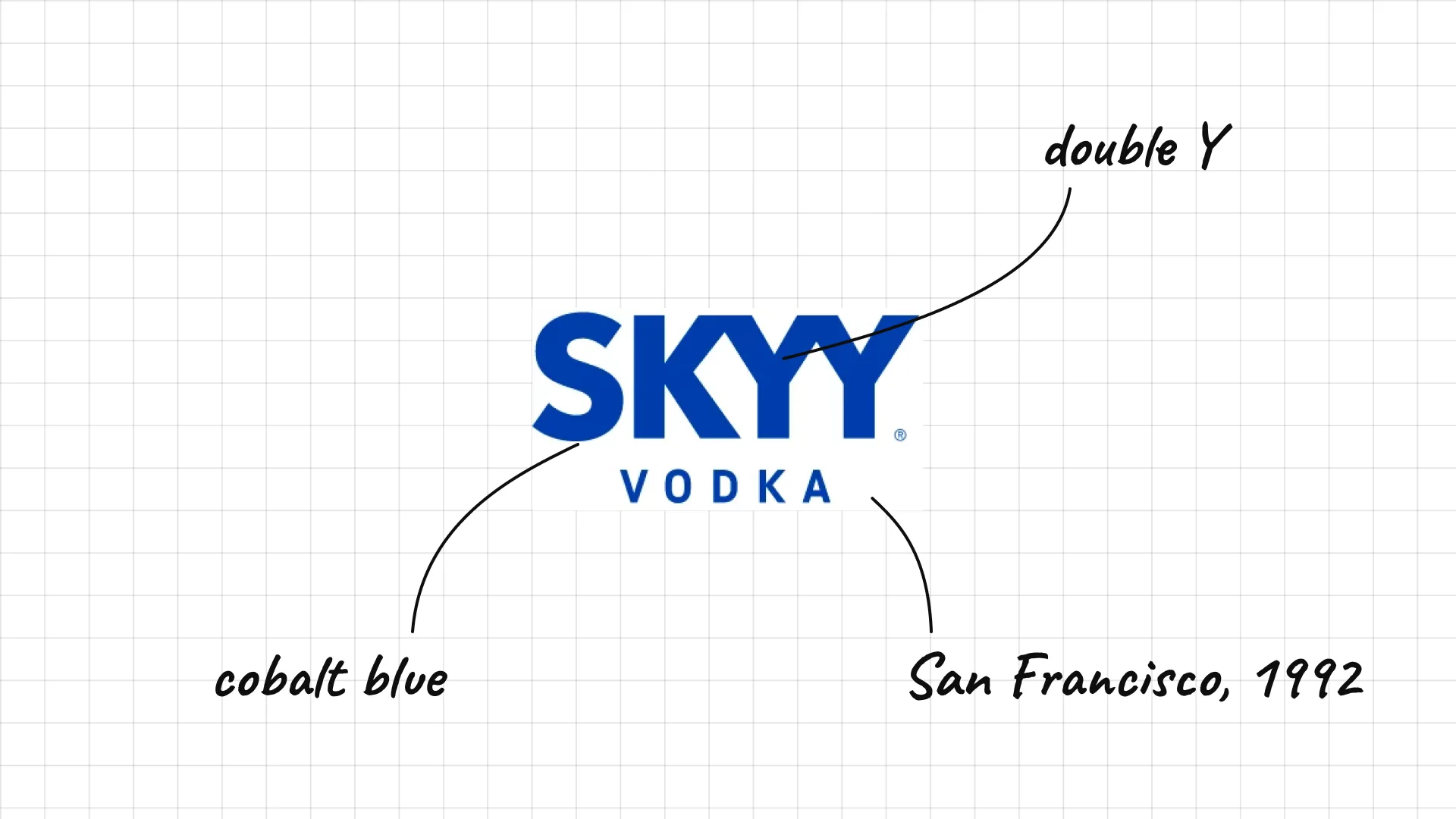
Skyy Maurice Kanbar launched Skyy in San Francisco in 1992.
Bold, tight capitals in cobalt blue match the brand's famous blue bottle.
The double Y makes the short name more memorable.
08 Cîroc
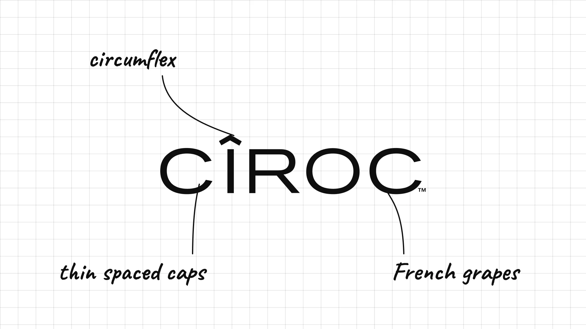
Cîroc was launched in 2003 and is made from French grapes rather than grain.
The circumflex over the I is a small French detail that makes the name distinctive.
Thin, spaced capitals feel like a luxury fashion brand.
09 Finlandia
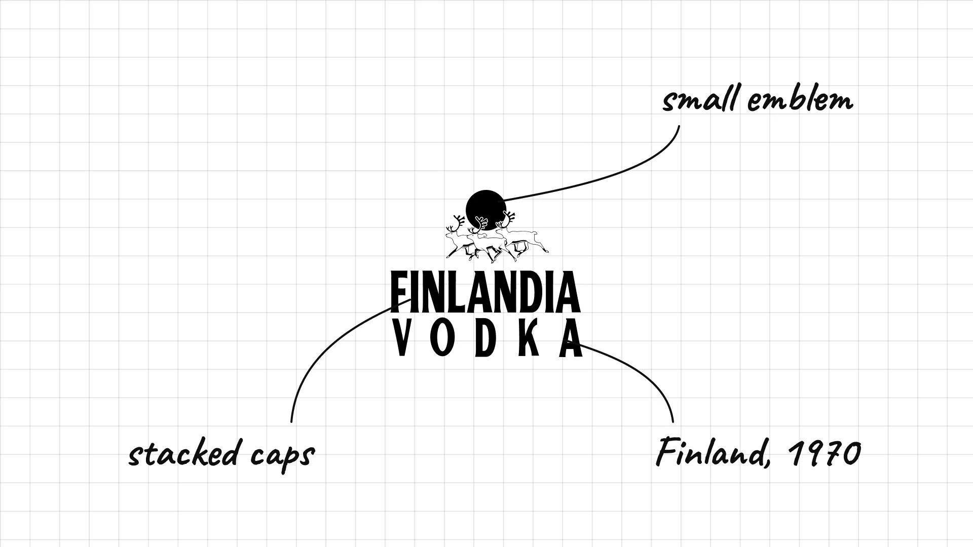
Finlandia was launched in 1970 and is made from Finnish barley and glacial spring water.
Condensed capitals stack the name over a spaced VODKA line.
A small emblem above the name adds a touch of nature and heritage.
02 — Polish, Ukrainian and Russian vodka
Vodka's home countries lean on crests, crowns, animals and composers, with type that feels traditional and national.
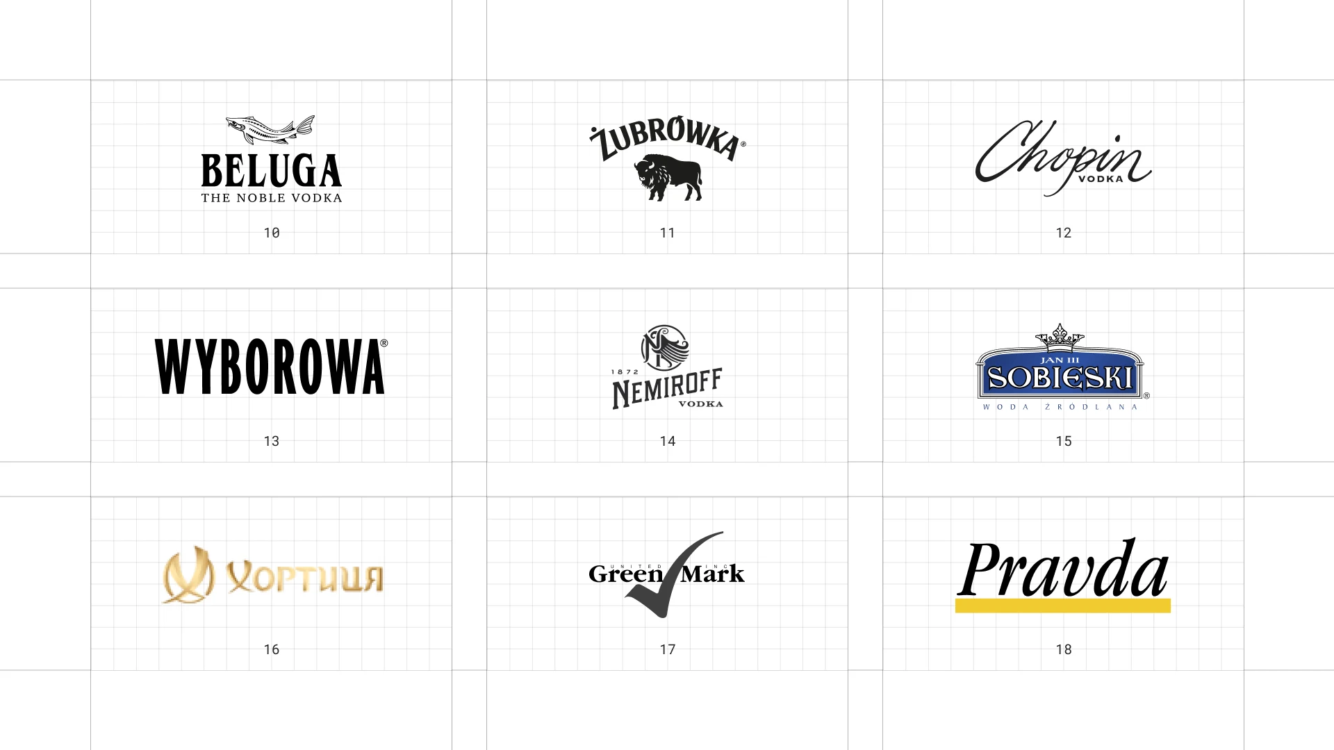
This is a visual comparison of vodka logos, not a ranking of vodkas.
Look at how each logo uses type, colour and one symbol to signal purity, origin or personality.
10 Beluga
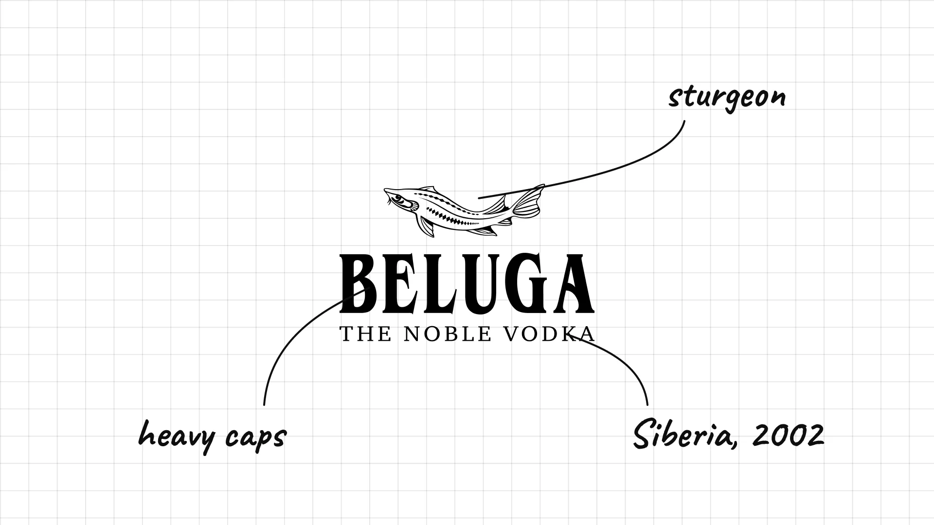
Beluga is made at the Mariinsk distillery in Siberia and was launched in 2002.
A sturgeon fish sits above the name, a direct link to the beluga sturgeon.
Heavy capitals and "The Noble Vodka" make the brand feel premium and Russian.
11 Żubrówka
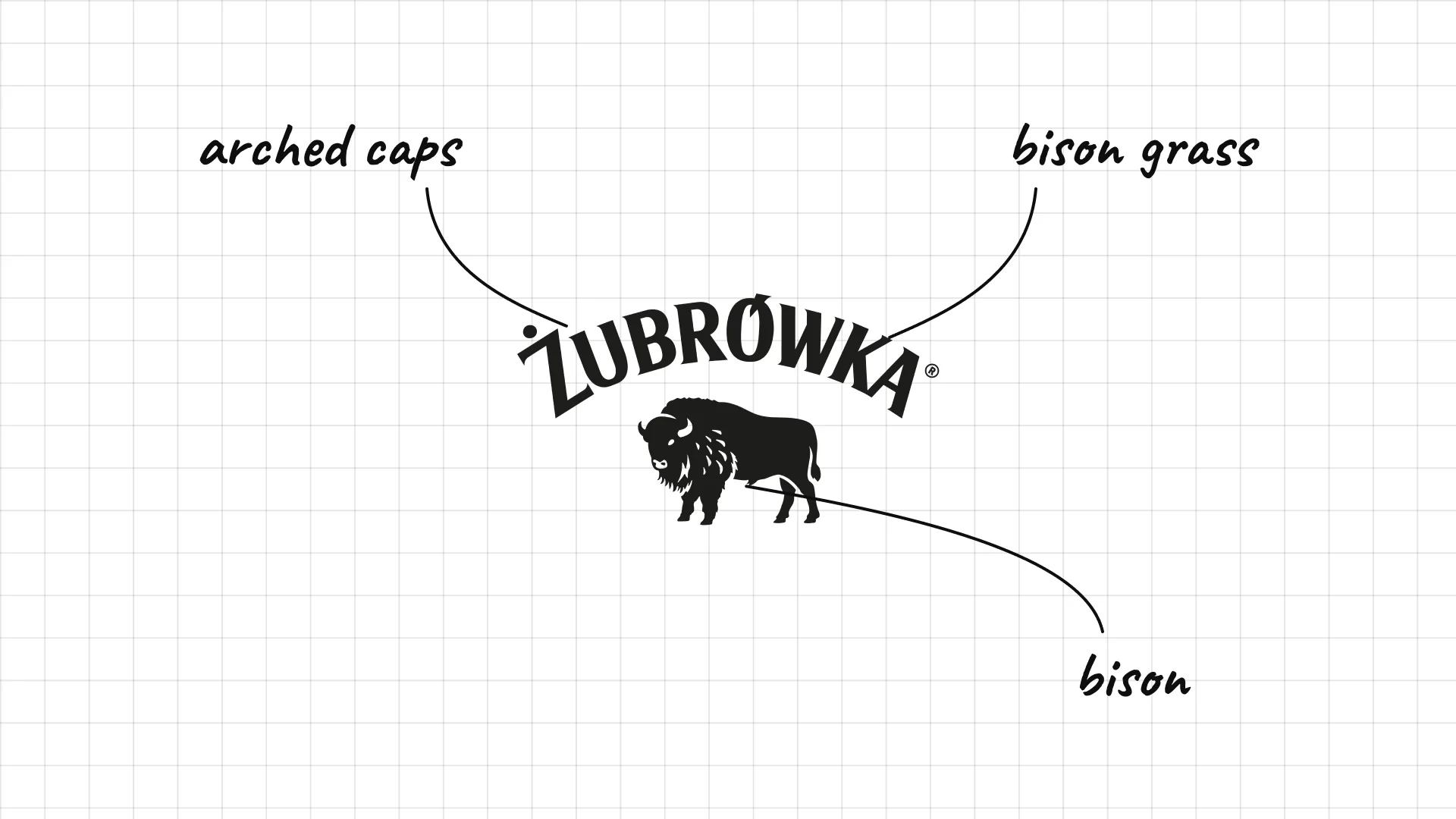
Żubrówka is a Polish vodka flavoured with bison grass, and every bottle has a blade of grass inside.
A bison stands under the name, the animal that grazes on the grass in the Białowieża Forest.
Arched, hand-drawn capitals feel folk-like and traditional.
12 Chopin
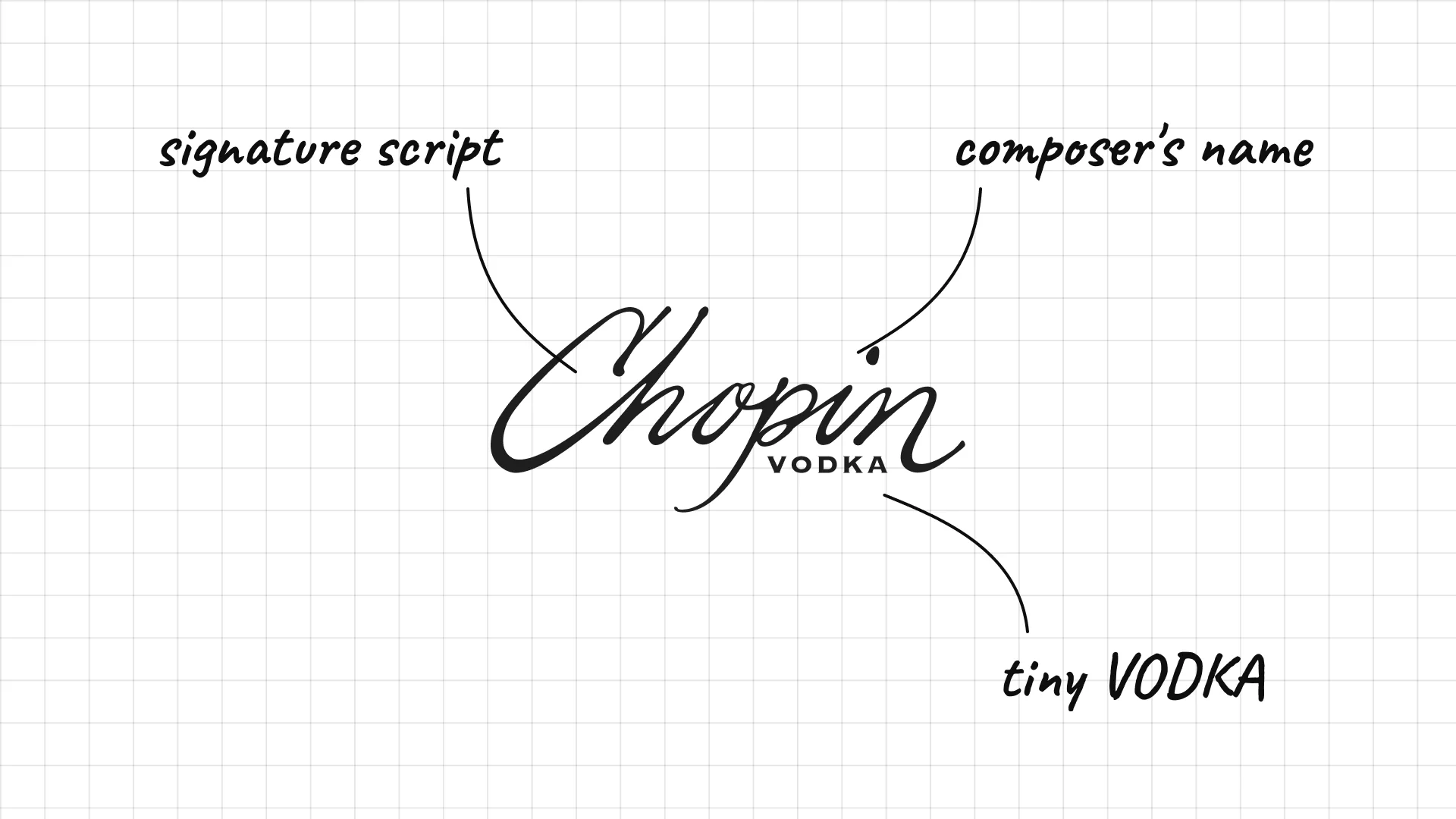
Chopin is a Polish potato vodka launched in 1993 and named after the composer Frédéric Chopin.
The flowing script looks like a composer's signature.
Small VODKA tucked into the script keeps the focus on the name.
13 Wyborowa
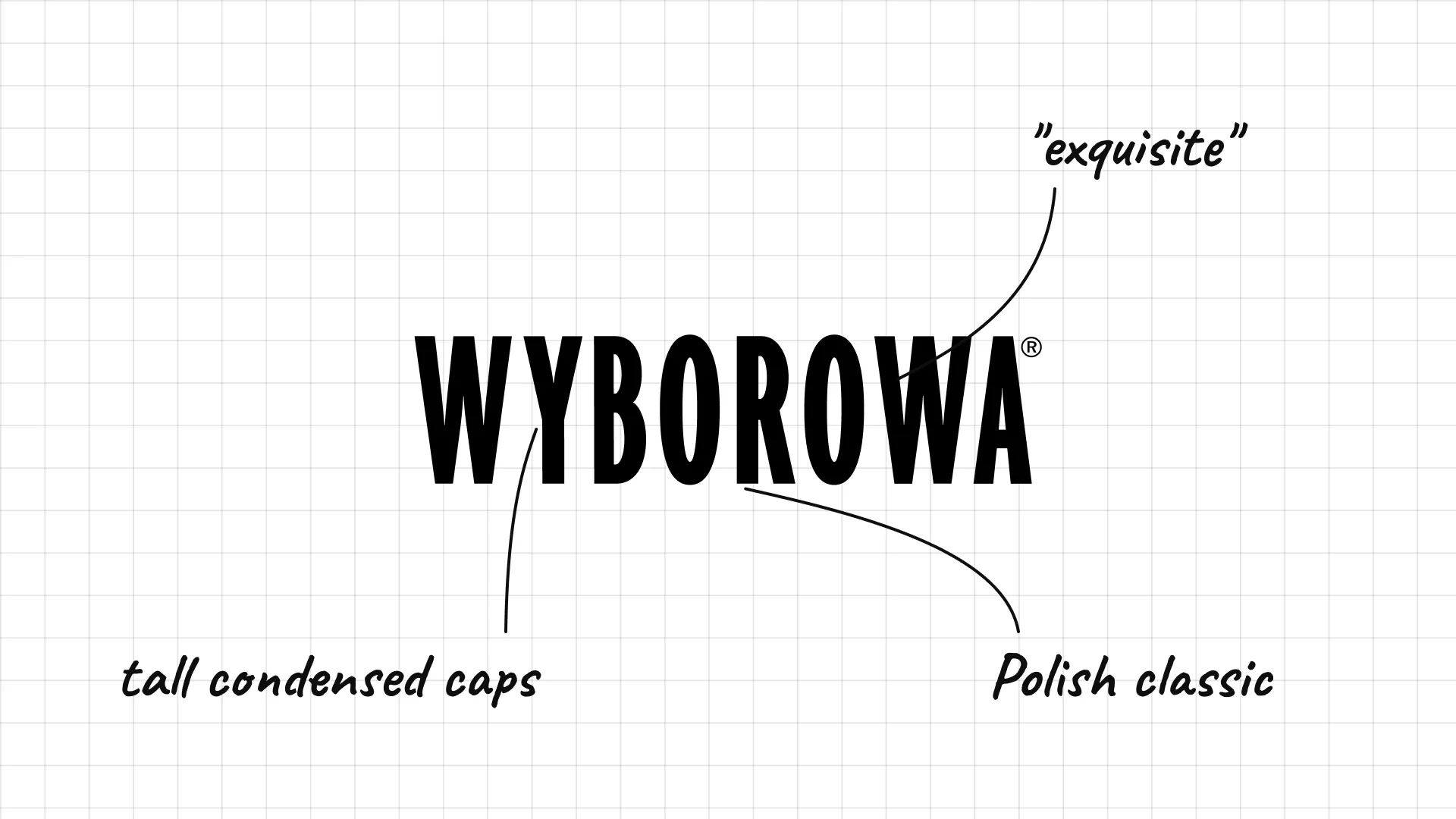
Wyborowa is one of Poland's oldest vodka brands, and its name means "exquisite" or "choice" in Polish.
Tall, heavy condensed capitals feel strong and confident.
The simple black wordmark works on clear glass and labels.
14 Nemiroff
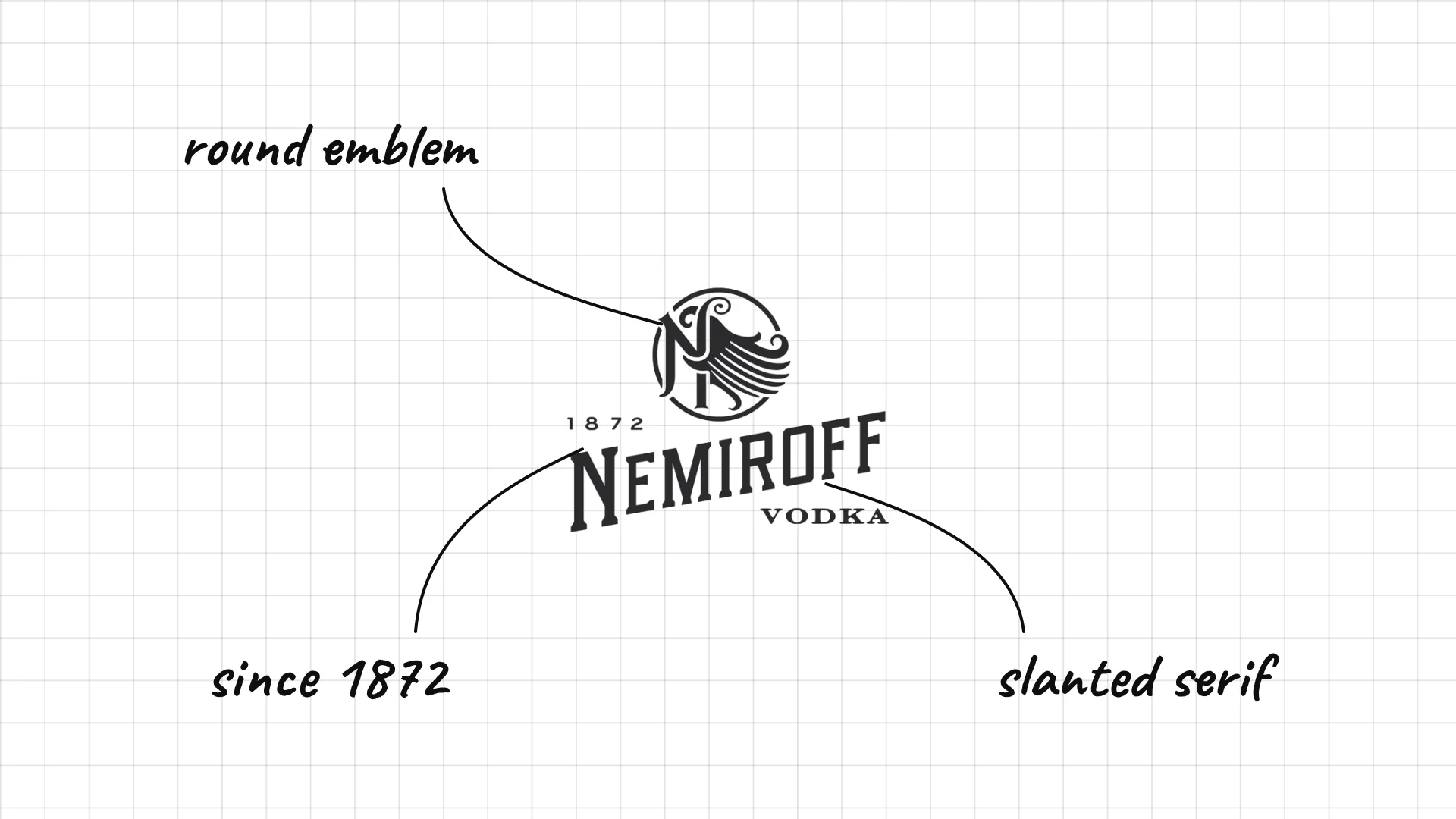
Nemiroff is a Ukrainian brand from the town of Nemyriv, with roots going back to 1872.
A small round emblem sits above the name with the founding year.
Slanted serif capitals give the wordmark a lively, classic feel.
15 Sobieski
Sobieski is a Polish vodka named after King John III Sobieski.
A royal crown above the name links the brand to the king.
Serif capitals in a dark blue band look like a royal seal.
16 Khortytsa
Khortytsa is a Ukrainian vodka named after Khortytsia, an island on the Dnipro river.
The name is written in Cyrillic, which keeps the brand rooted in Ukraine.
Gold lettering and a round emblem make it feel premium.
17 Green Mark
Green Mark launched in Russia in the early 2000s and became one of the country's best-selling vodkas.
A large check mark crosses the name like a stamp of approval.
Serif lettering keeps the brand feeling traditional.
18 Pravda
Pravda is a Polish vodka whose name means "truth".
The italic serif name sits on a yellow underline.
The single colour accent makes a simple wordmark easy to spot.
03 — American vodka brands
American vodka brands are more playful and local, with hand-drawn letters, mascots and badges that point to Texas, California and beyond.
This is a visual comparison of vodka logos, not a ranking of vodkas.
Look at how each logo uses type, colour and one symbol to signal purity, origin or personality.
19 Tito's
Tito's Bert "Tito" Beveridge started Tito's in Austin, Texas, in 1997, at the first legal distillery in the state.
Hand-drawn italic letters look like an old Texas sign.
The founder's nickname is the brand, which makes it feel personal.
20 Svedka
Svedka was launched in 1998 as a Swedish-made vodka sold mainly in the United States.
The A is drawn as an upside-down V, a small futuristic detail.
The glowing blue look matches the brand's sci-fi advertising.
21 Deep Eddy
Deep Eddy was founded in Austin, Texas, in 2010 and is named after Deep Eddy Pool, the oldest swimming pool in Texas.
A diver jumps between the two words.
The round badge looks like a vintage pool sign.
22 Pinnacle
Pinnacle vodka is made in France and is known for its many flavours.
A mountain peak sits above the name, a direct picture of "pinnacle".
White serif capitals on a deep blue box look like a classic label.
23 Hangar 1
Hangar 1 started in 2002 in a former Navy airplane hangar in Alameda, California.
A big script with a large number 1 feels like vintage aircraft lettering.
"Hand-crafted in California" underneath tells the craft story.
24 Wheatley
Wheatley was created at Buffalo Trace in Kentucky and is named after master distiller Harlen Wheatley.
Stacked western capitals look like an old frontier poster.
"American Vodka" in the middle makes the origin clear.
25 Western Son
Western Son is a Texas distillery known for its flavoured vodkas.
A bird in flight sits next to tall condensed capitals.
The western name and type give the brand a frontier feel.
26 UV
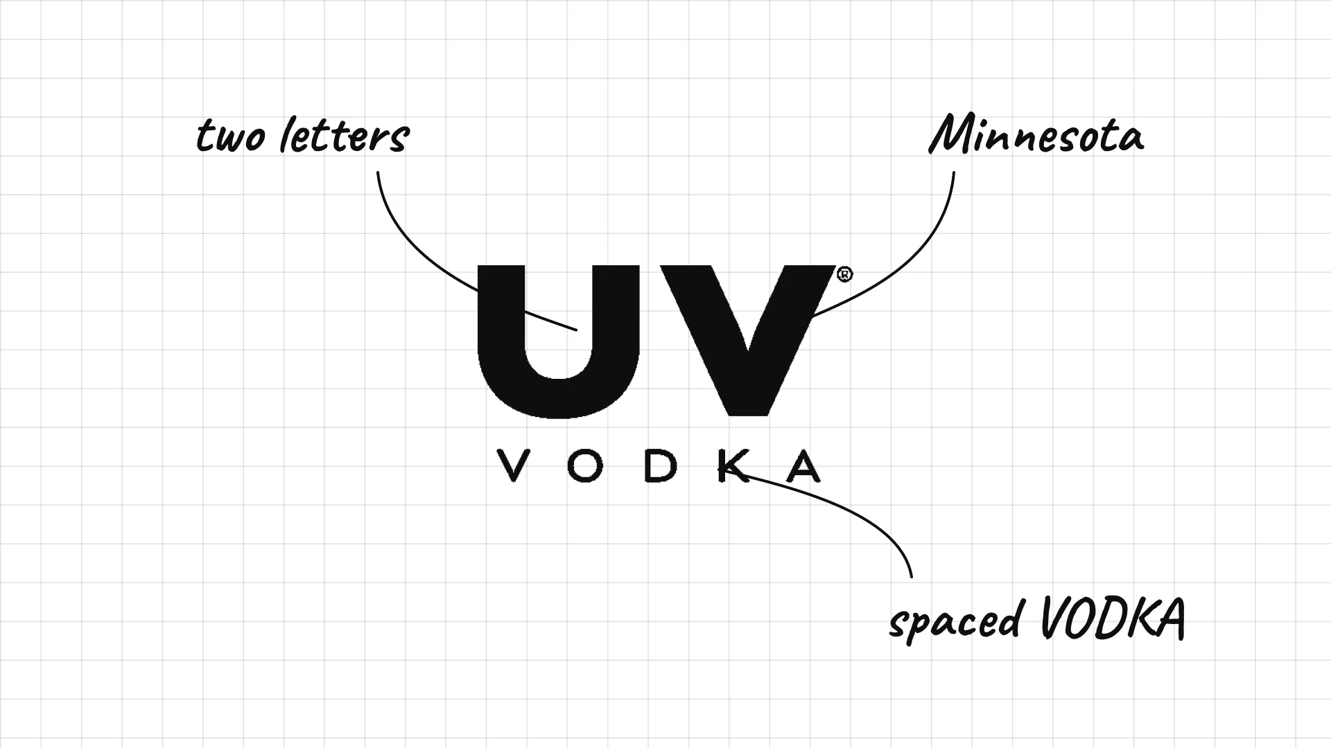
UV is made by Phillips Distilling in Minnesota and is known for its bright flavoured vodkas.
Two huge capitals make the shortest possible name.
Widely spaced VODKA underneath balances the heavy letters.
27 Three Olives
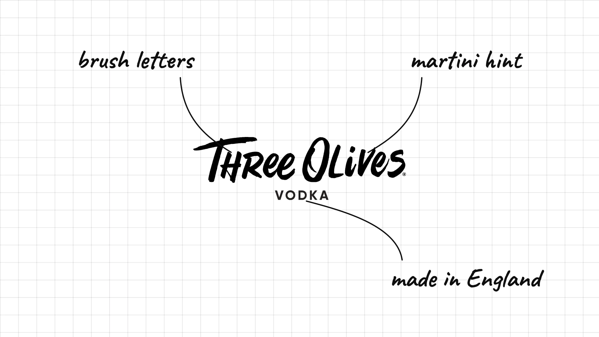
Three Olives is made in England and is known for its long range of flavoured vodkas.
Playful brush lettering makes the brand feel fun.
The name hints at a martini with three olives.
04 — Luxury and design-led vodka
Luxury vodkas use minimal type, unusual symbols and striking bottles to justify a higher price.
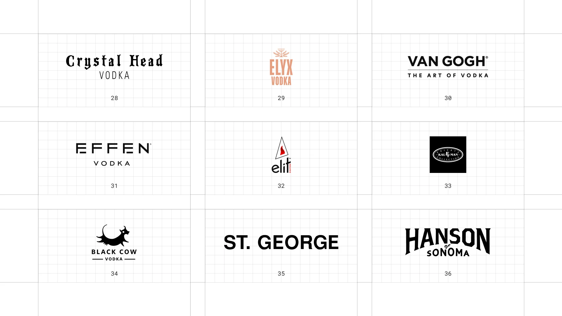
This is a visual comparison of vodka logos, not a ranking of vodkas.
Look at how each logo uses type, colour and one symbol to signal purity, origin or personality.
28 Crystal Head
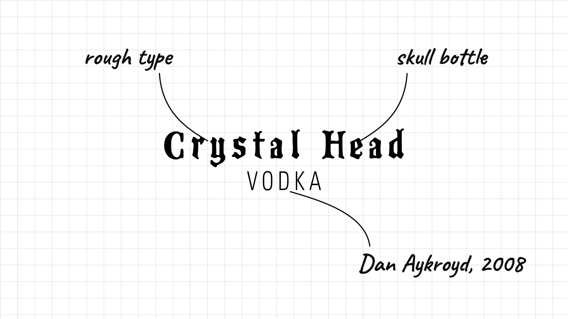
Crystal Head Actor Dan Aykroyd and artist John Alexander launched Crystal Head in 2008 in a skull-shaped bottle.
Rough, typewriter-like lettering feels mysterious.
The bottle is the real logo, and the wordmark stays simple.
29 Absolut Elyx
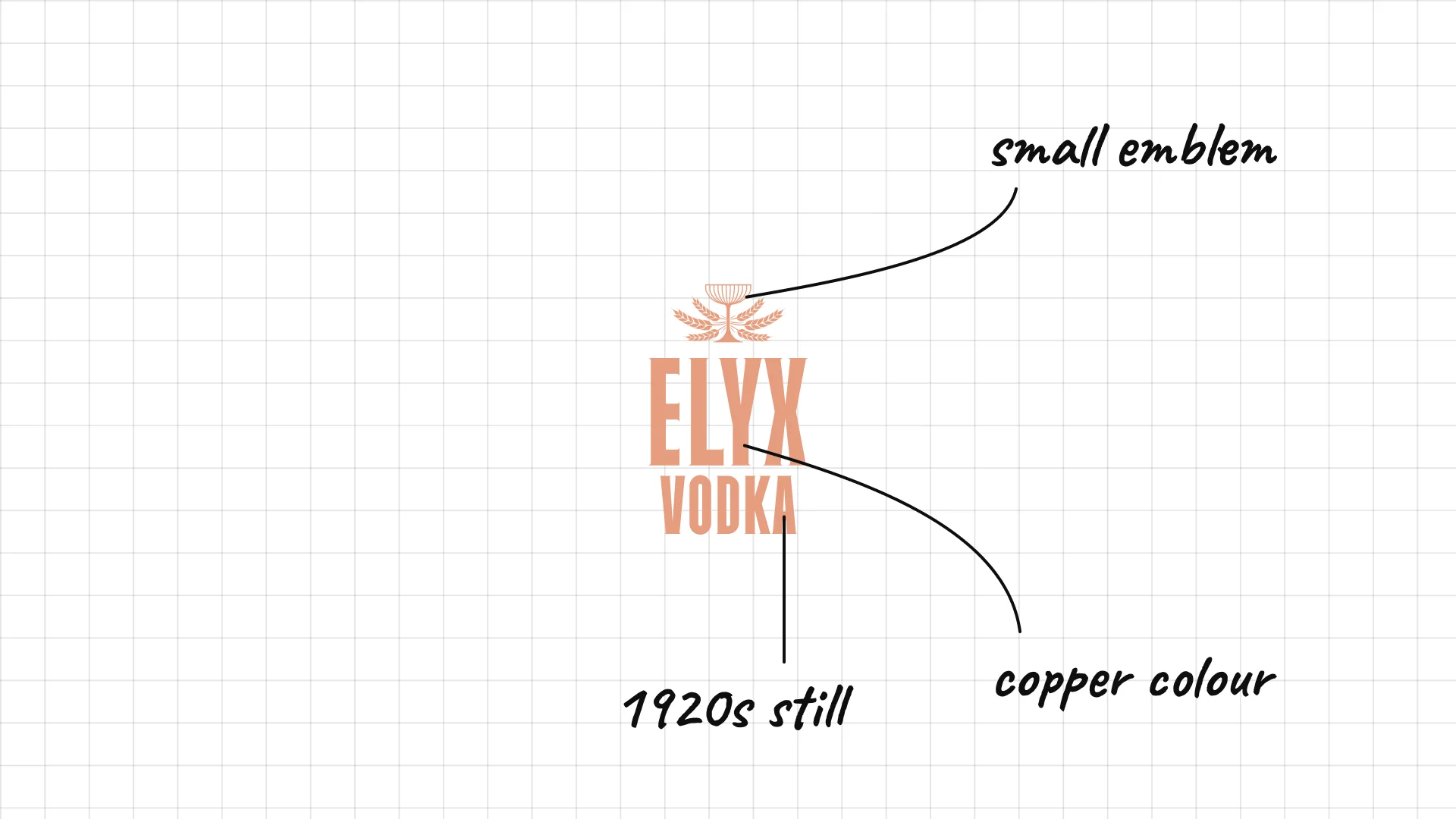
Absolut Elyx was launched in 2013 as a single estate vodka made in a 1920s copper still.
A copper colour links the logo to the copper still.
Condensed type and a small emblem feel like a vintage cocktail bar.
30 Van Gogh
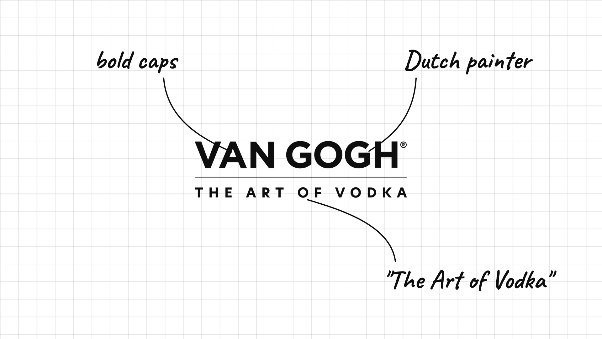
Van Gogh vodka is made in the Netherlands and named after the Dutch painter.
Bold capitals with a thin line feel modern and clean.
"The Art of Vodka" links the drink to the painter.
31 Effen
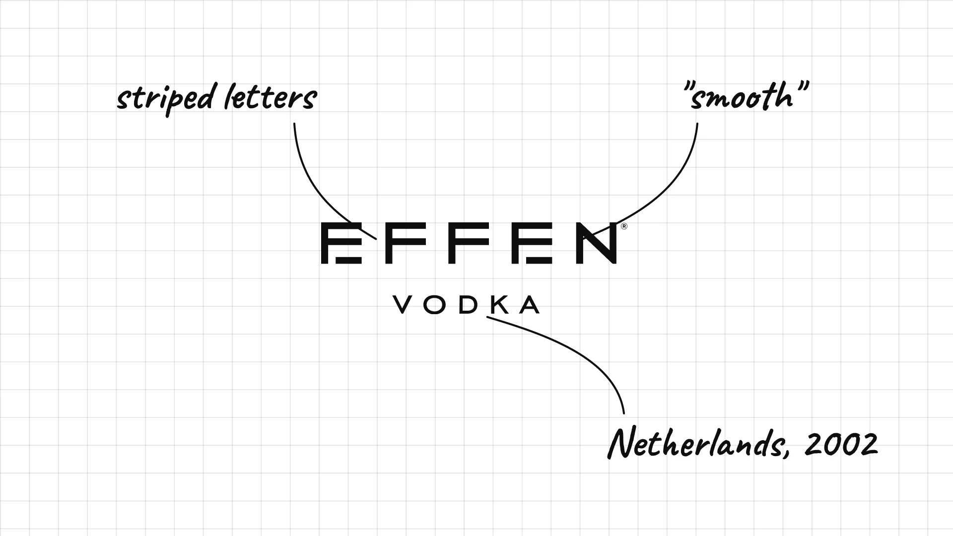
Effen is a Dutch vodka launched in 2002, and its name means "smooth" or "even" in Dutch.
The letters are built from thin horizontal lines, like a design experiment.
Very wide spacing makes the short word feel calm and premium.
32 Elit
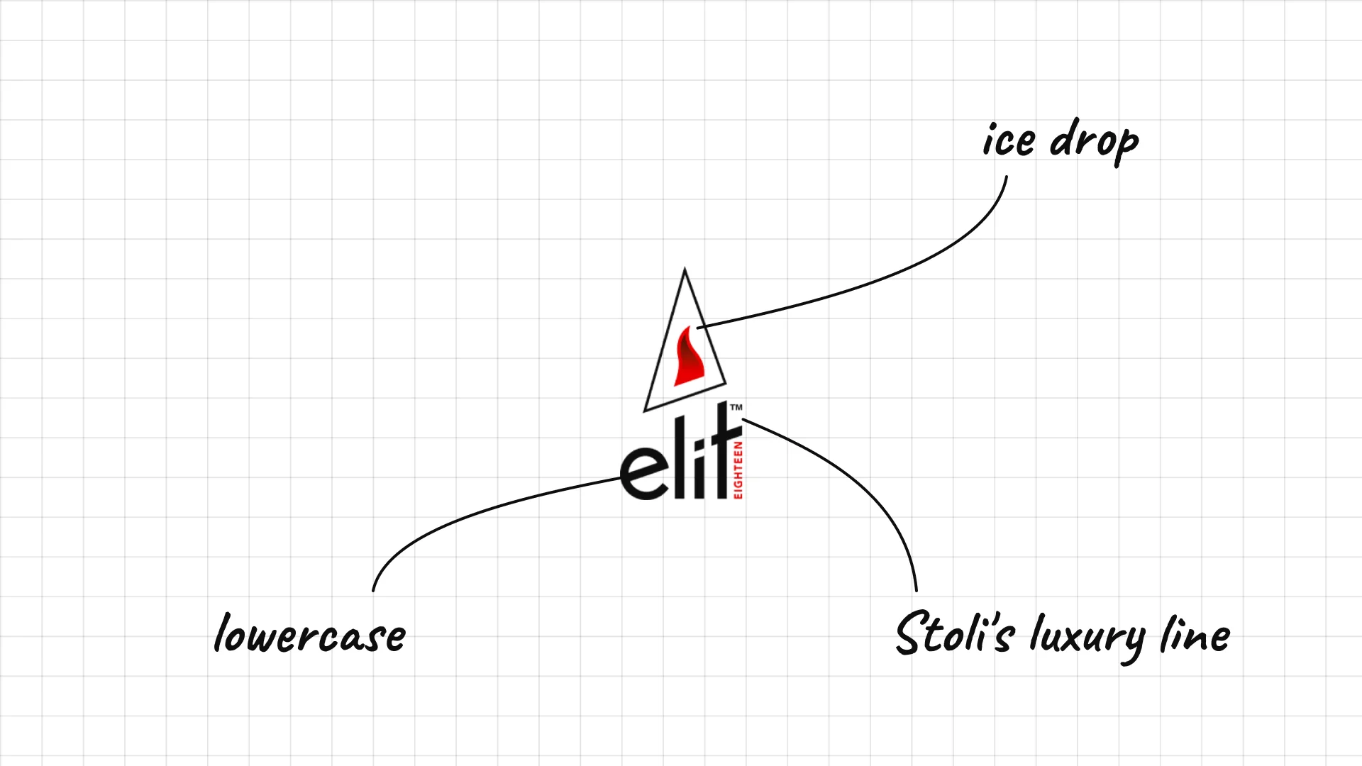
Elit is the luxury vodka from Stoli, launched in 2003 and filtered at freezing temperatures.
A tall, narrow mark looks like a drop of ice.
The lowercase name feels modern and light.
33 Kauffman
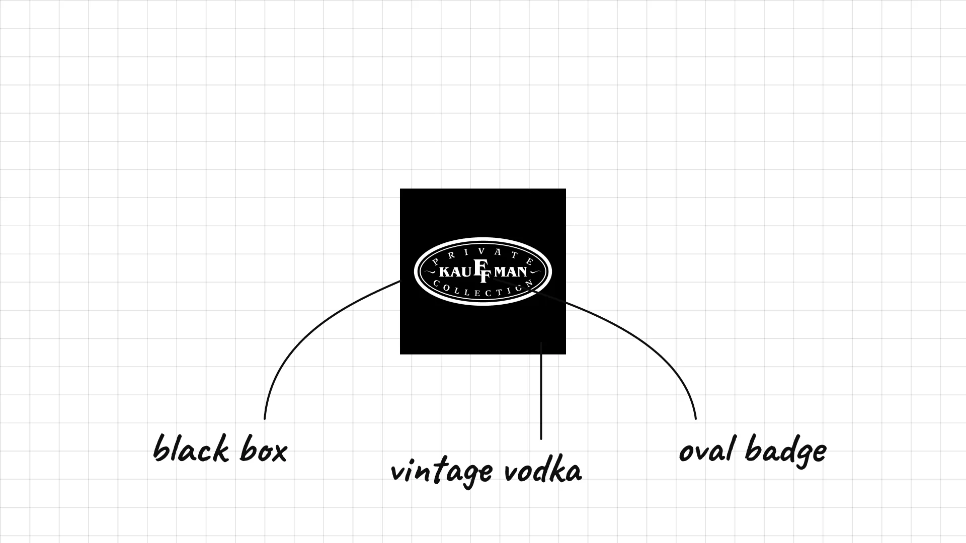
Kauffman is a luxury Russian vodka known for being sold as a vintage, with a year on every bottle.
The oval badge on black looks like a jewellery stamp.
Small serif type inside the oval feels exclusive.
34 Black Cow
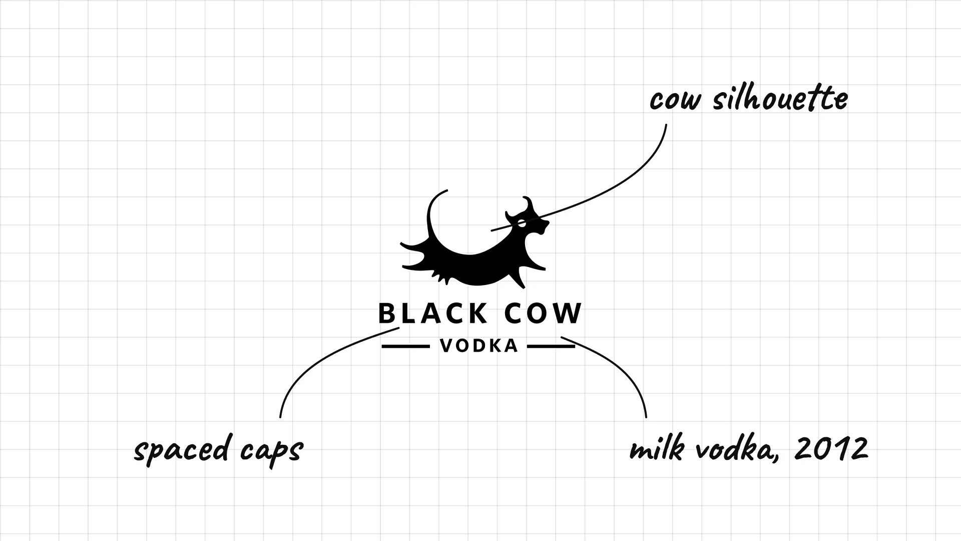
Black Cow Dorset dairy farmer Jason Barber created Black Cow in 2012, a vodka made from the whey of cows' milk.
A cow silhouette sits above clean spaced capitals.
The animal is a direct and funny picture of the milk vodka.
35 St. George
St. George Spirits was founded in Alameda, California, in 1982 and is one of America's first craft distilleries.
Simple capitals keep the name plain and honest.
The quiet logo lets the bottles and spirits do the talking.
36 Hanson of Sonoma
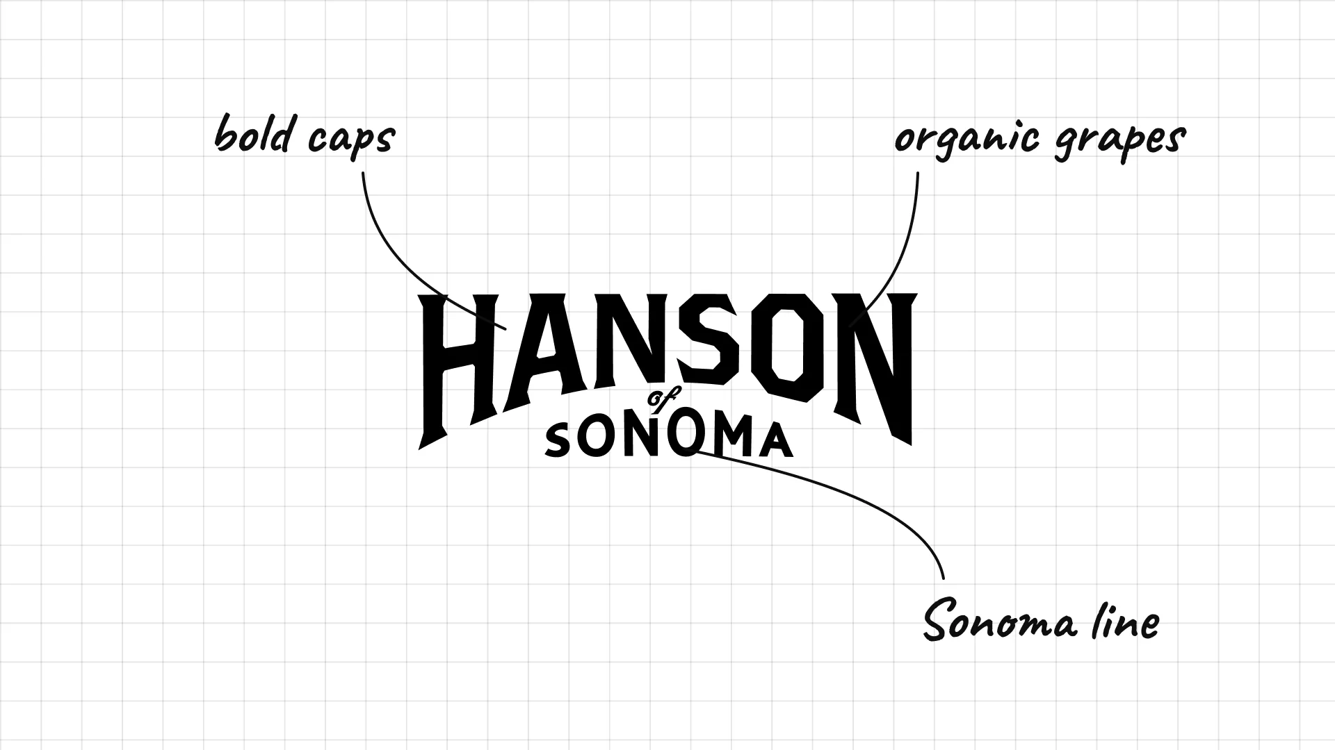
Hanson of Sonoma is a family distillery in Sonoma, California, that makes vodka from organic grapes.
Bold capitals stack over a small "Sonoma" line.
The wine-country name links the vodka to the grapes it is made from.
05 — Nordic, Dutch and world vodka
Nordic and world vodkas sell cold, clean water and nature, with spaced capitals, ice, ships and wolves.
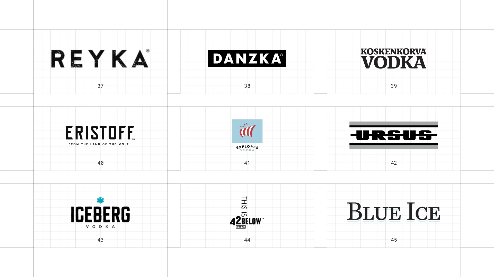
This is a visual comparison of vodka logos, not a ranking of vodkas.
Look at how each logo uses type, colour and one symbol to signal purity, origin or personality.
37 Reyka
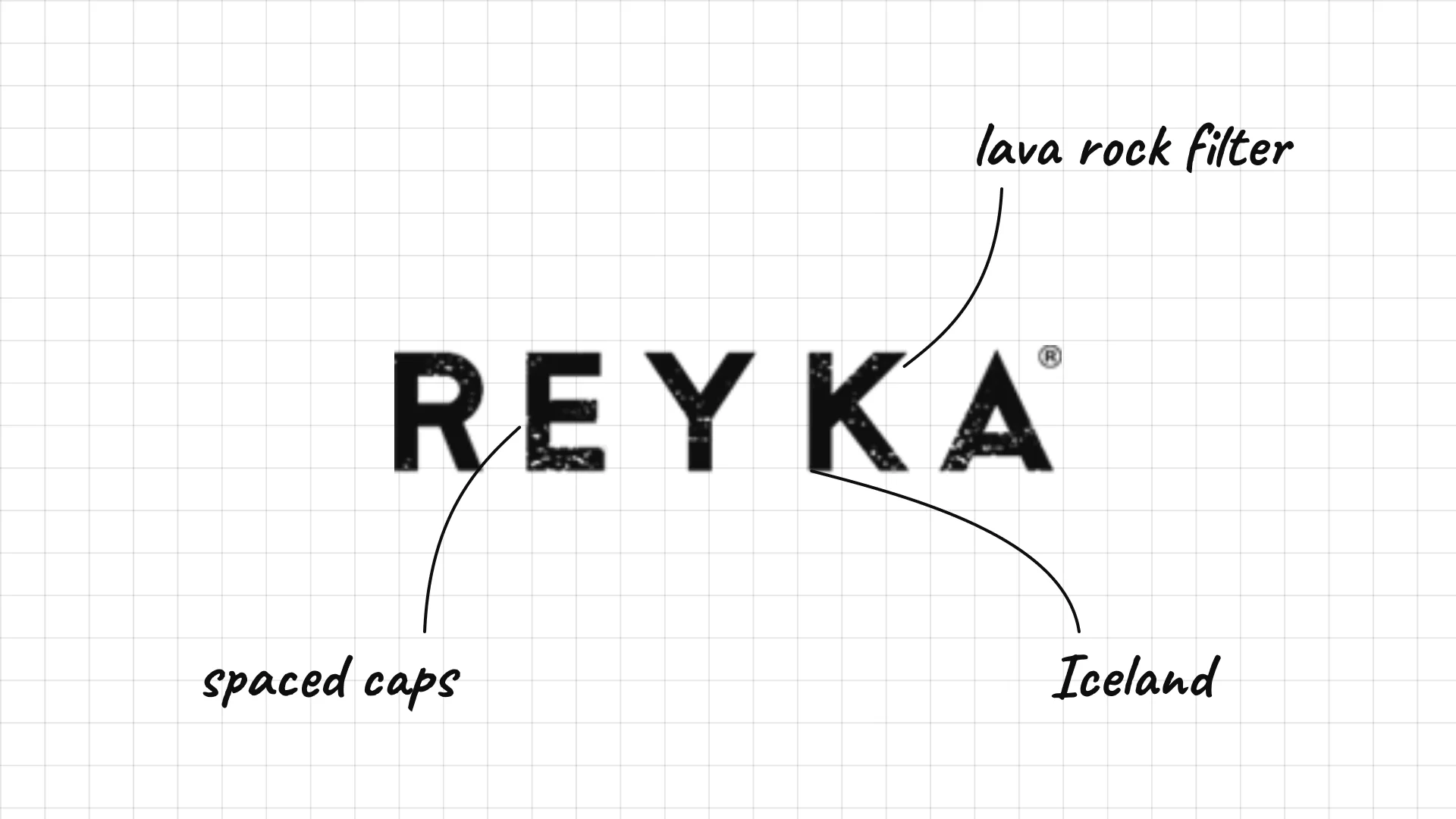
Reyka is made in Borgarnes, Iceland, using Icelandic water filtered through lava rock.
Widely spaced capitals feel cold, clean and Nordic.
The simple wordmark matches the brand's focus on pure water.
38 Danzka
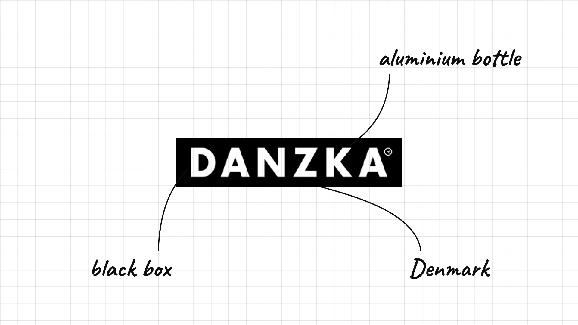
Danzka is a Danish vodka known for its aluminium bottle.
Bold, spaced capitals inside a black box look like a stamp.
The metal bottle and the boxed logo feel industrial and modern.
39 Koskenkorva
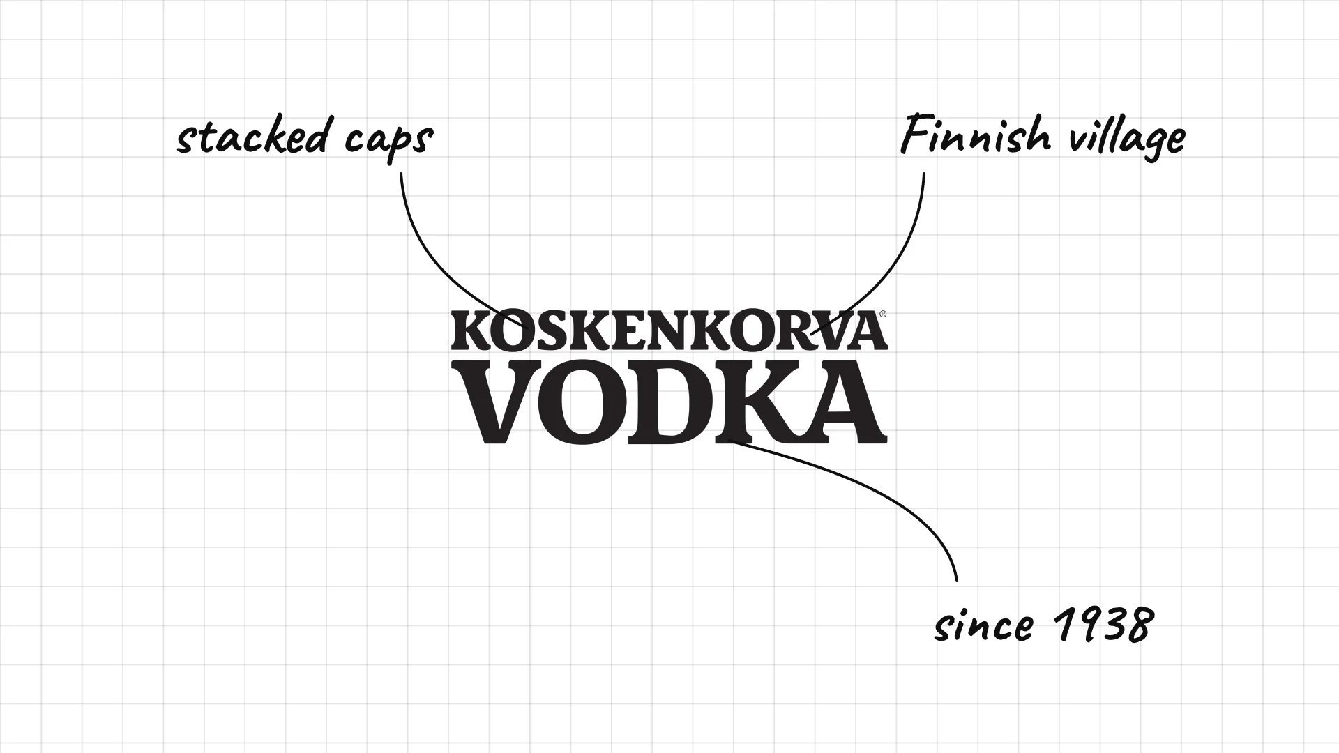
Koskenkorva comes from the village of Koskenkorva in Finland, where its distillery opened in 1938.
Heavy condensed capitals stack the long Finnish name over VODKA.
The bold type makes the brand feel strong and simple.
40 Eristoff
Eristoff dates its recipe to 1806 and the Georgian prince Eristavi.
Tall, heavy capitals feel strong and Eastern European.
"From the land of the wolf" adds a story to a simple wordmark.
41 Explorer
Explorer is a Swedish vodka brand that uses a Viking ship as its symbol.
A Viking ship sits inside a pale blue square like a stamp.
The small type below keeps the ship as the main symbol.
42 Ursus
Ursus is a Dutch vodka, and its name means "bear" in Latin.
Heavy capitals between two thick lines look like a label band.
The simple black mark is easy to recognise on a bar shelf.
43 Iceberg
Iceberg vodka is made in Canada with water from icebergs off Newfoundland.
Bold condensed capitals feel cold and strong.
A small maple leaf above the name shows it is Canadian.
44 42 Below
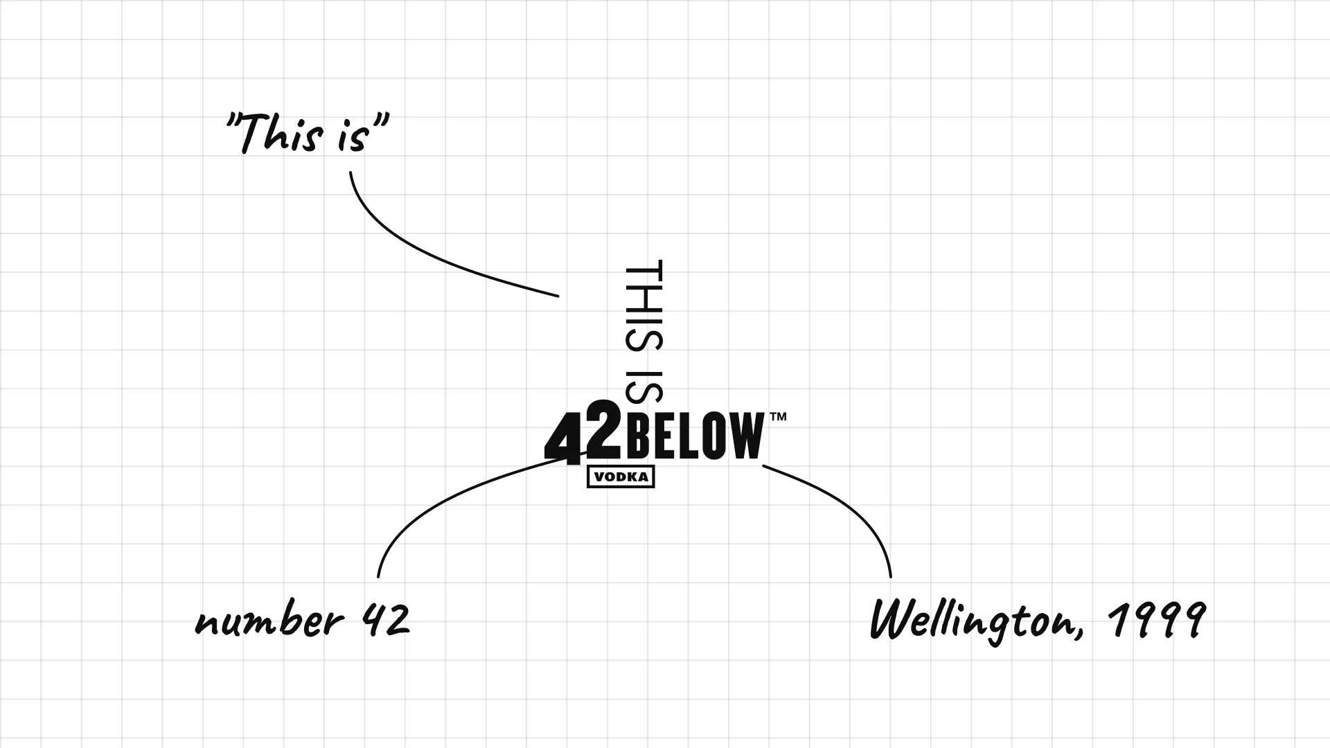
42 Below was founded in Wellington, New Zealand, in 1999 and is named after the city's latitude.
The number 42 makes the name easy to remember.
A vertical "This is" adds a playful, cheeky tone.
45 Blue Ice
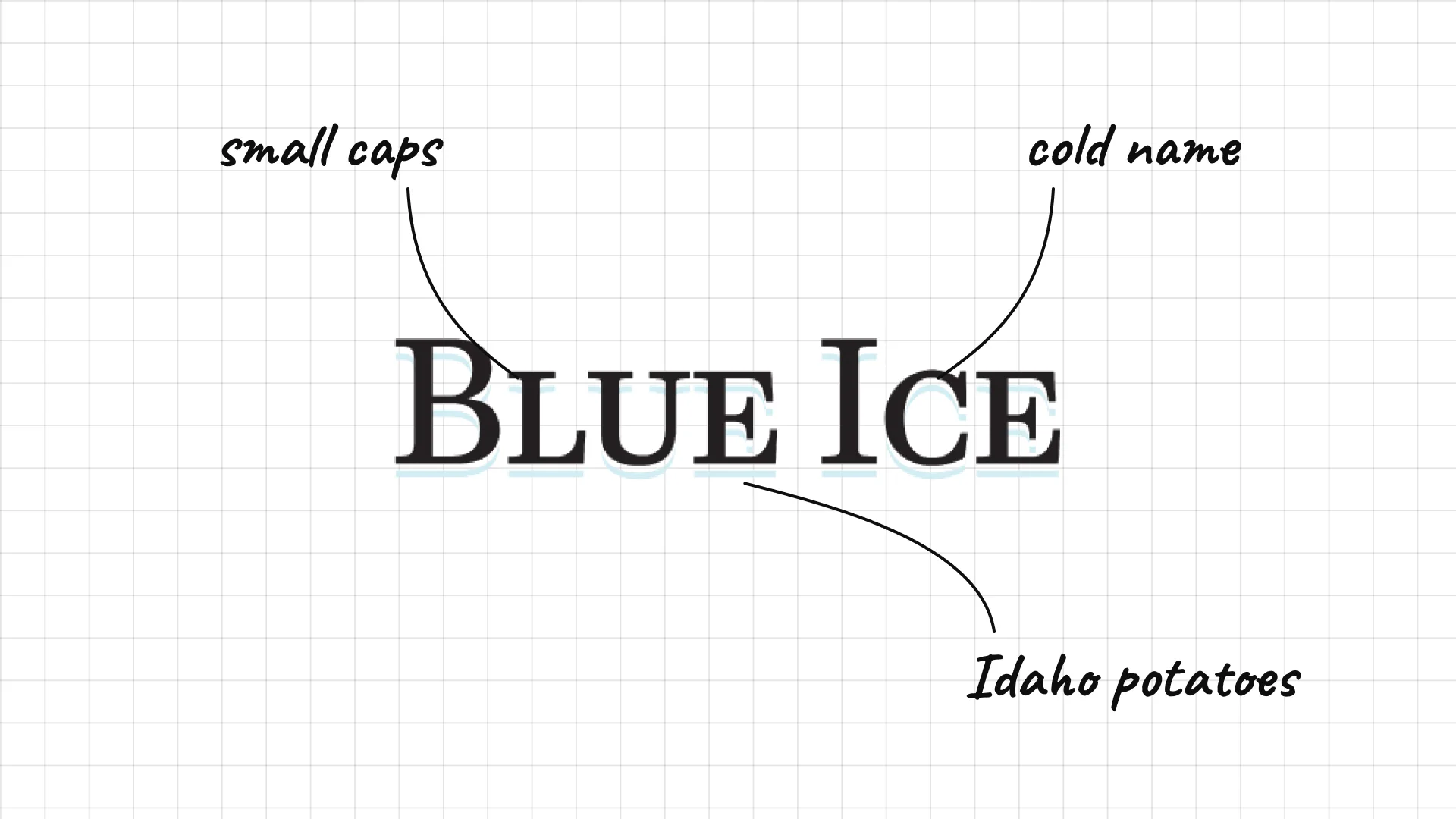
Blue Ice is an American vodka made from Idaho potatoes.
Classic small capitals feel traditional and simple.
The name and logo suggest something cold and clean.
What these 45 examples reveal
Origin is the main message
Absolut says "Country of Sweden", Grey Goose is made in France, Belvedere and Chopin are proudly Polish, and Reyka, Koskenkorva and Finlandia lean on Nordic water.
Animals and symbols carry the brand
The Grey Goose goose, the Żubrówka bison, the Beluga sturgeon, the Black Cow and the Eristoff wolf make clear spirits easy to remember.
Spaced capitals mean purity
Stoli, Effen, Reyka, Belvedere and Cîroc use wide letter spacing to feel clean, light and premium.
The bottle is part of the logo
Crystal Head's skull, Danzka's aluminium bottle and Absolut's famous bottle shape show that for vodka, packaging and logo work as one.
A practical checklist for a vodka logo
- Is the logo readable on clear and frosted glass?
- Does it signal a clear origin, from Poland to Texas?
- Is there a symbol that can work alone on a cap, a glass or a cocktail menu?
- Does the colour suggest cold, clean and pure?
- Will it still work in one colour, etched, embossed or printed on a sleeve?
Launching or rebranding a vodka or spirits brand?
I design brand identities for spirits, food and drink brands, from logos and labels to bottles, packaging and websites.
See my past work and schedule a call to discuss your project.
Cover photo: Absolut Vodka (3 Bottles) by Stefan-Xp, CC BY-SA 3.0, via Wikimedia Commons, used in a collage.
Frequently asked questions
What makes a good vodka logo?
A good vodka logo is clean, simple and readable on clear or frosted glass. It usually signals purity and origin, and it often has a symbol that works alone, like the Grey Goose goose or the Żubrówka bison.
What are the most famous vodka logos?
The most famous vodka logos include Smirnoff, Absolut, Grey Goose, Ketel One, Belvedere, Tito's, Stoli, Cîroc, Skyy and Finlandia.
Why do so many vodka logos use blue?
Blue suggests cold, clean water and ice, which supports the idea of a pure, smooth spirit. Absolut, Skyy, Grey Goose, Belvedere and Sobieski all use blue in their branding.
Why is the bottle so important for vodka brands?
Because vodka is clear and tastes similar across brands, the bottle and logo do most of the work on the shelf. Absolut, Crystal Head, Belvedere and Danzka are known as much for their bottles as for their logos.
How much does a vodka logo cost?
A professional vodka logo and brand identity usually costs from a few thousand dollars for a small craft distillery to much more for a brand with a full bottle design, labels, packaging and a website.
Ready to build a brand people remember?
Tell me what you’re launching, changing, or trying to make look better.