


Arek Dvornechuck
Branding Expert


Best Biotech Startup Branding Examples in 2026
.webp)


.webp)


In the world of biotechnology, science isn’t the only factor that determines success. While groundbreaking research and innovation drive the core of every biotech startup, branding plays a critical role in raising capital, attracting investors, and gaining customer trust.
Investors are bombarded with pitches, and customers are faced with countless options. What often sets a startup apart isn’t just its science, but how clearly and confidently it communicates its vision through branding. A strong biotech brand identity conveys credibility, sophistication, and innovation — helping potential backers quickly understand the value and potential of the company.
For biotech startups, a well-designed logo, color palette, and visual system can make the difference between looking like a risky experiment or a future industry leader. Branding helps distill complex scientific ideas into something accessible, memorable, and trustworthy. It’s not just about aesthetics — it’s about shaping perception, building confidence, and opening doors to funding opportunities and partnerships.
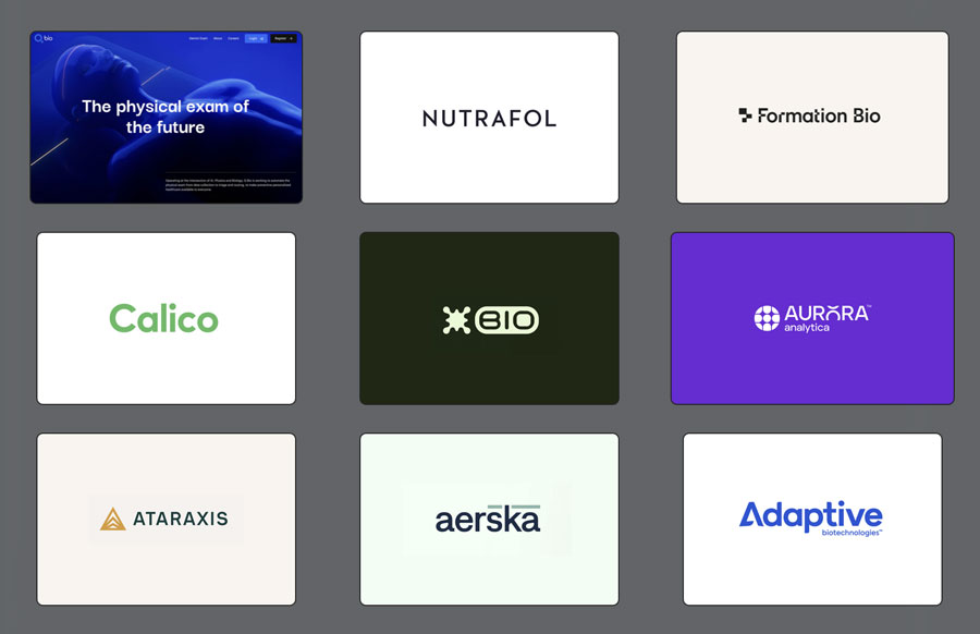
In this article, I’ll break down some of the best biotech startup branding examples I’ve come across while researching companies on Crunchbase and WellFound. Each case study shows how strategic design choices — from typography to color psychology — can strengthen a biotech startup’s positioning in a highly competitive space.

BIO Protocol sits at the intersection of biotech and decentralized science (DeSci), with branding that feels rebellious and experimental.
Logo Design: Abstract splat-like symbol and rounded rectangular “BIO” wordmark signal disruption and biological rawness.
Color Palette: Neon green on dark backgrounds — a crypto-inspired aesthetic, unconventional for biotech.
Typography: Bold sans-serif fonts that feel urgent and radical.

Brand Experience: Immersive visuals of 3D biological forms create a futuristic, disruptive biotech-crypto crossover identity.
See website →
See startup on Crunchbase →
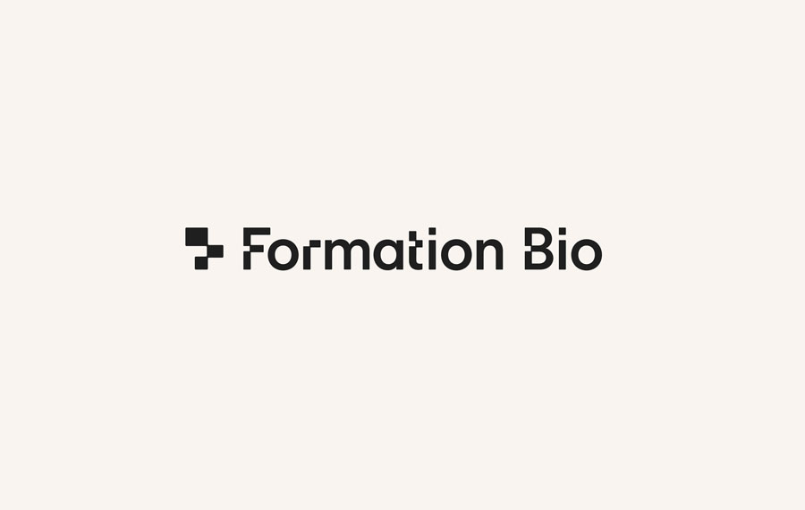
Formation Bio describes itself as “the pharma company of the future,” using AI to accelerate drug development. Its branding is clinical yet modern.
Logo Design: A geometric cross-like symbol nods to both pharma and modular design, paired with a clean sans-serif wordmark.
Color Palette: Neutral beige backgrounds with black typography feel professional and editorial, setting them apart from the typical biotech blues.
Typography: Minimal, bold, and highly legible — balancing professionalism with approachability.
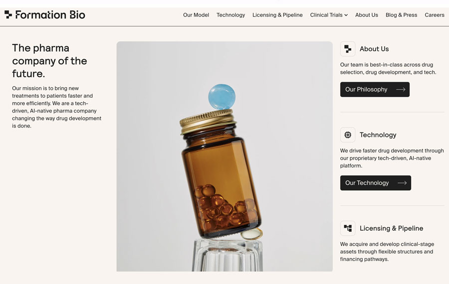
Brand Experience: Structured layouts and clean medical imagery reinforce efficiency and transparency in drug development.
See website →
See startup on WellFound →
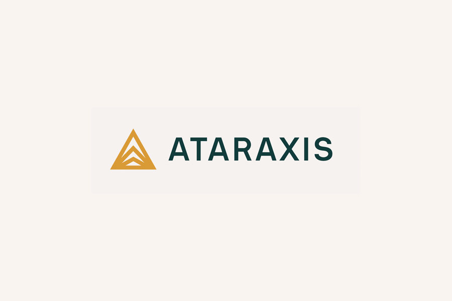
Ataraxis focuses on AI precision medicine for cancer care, combining scientific credibility with calm authority.
Logo Design: A triangular icon with layered chevrons symbolizes data, progress, and stability. The all-caps wordmark conveys confidence.
Color Palette: Warm ochre-gold paired with deep green. Gold signals innovation; green represents health and balance.
Typography: Geometric sans-serif, condensed for a modern, data-driven look.
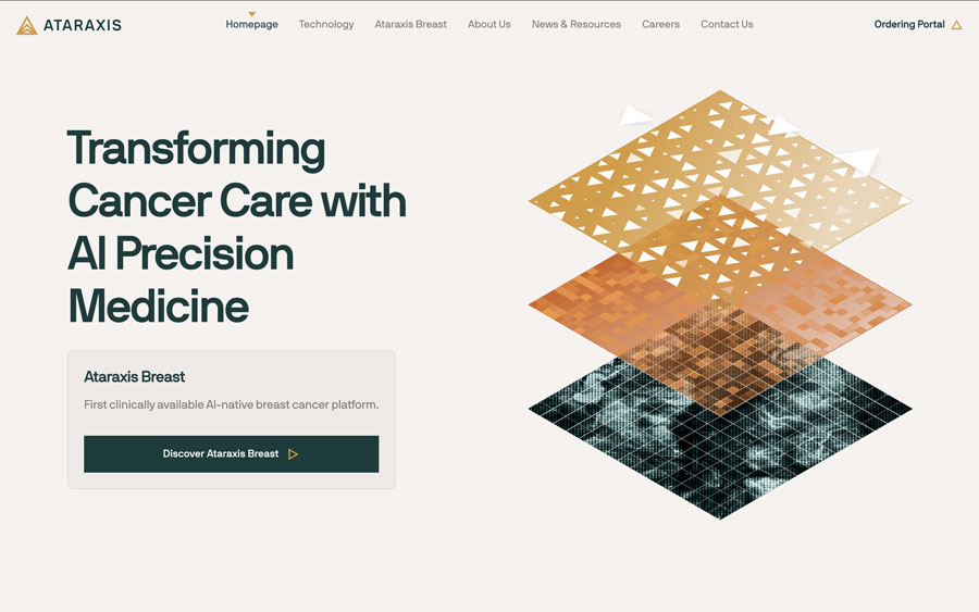
Brand Experience: Layered data visuals symbolize precision. Editorial layouts feel scientific yet approachable.
See website →
See startup on WellFound →

Nutrafol merges biotech credibility with consumer wellness aesthetics, positioning itself as the leading dermatologist-recommended hair growth supplement brand.
Logo Design: A minimal sans-serif wordmark that emphasizes clarity and recognition.
Color Palette: Deep green for growth and renewal, with black and white for balance. Gold accents elevate its premium positioning.
Typography: Combination of clean sans-serif (logo) and elegant serif (editorial headlines) to reflect both science and lifestyle appeal.
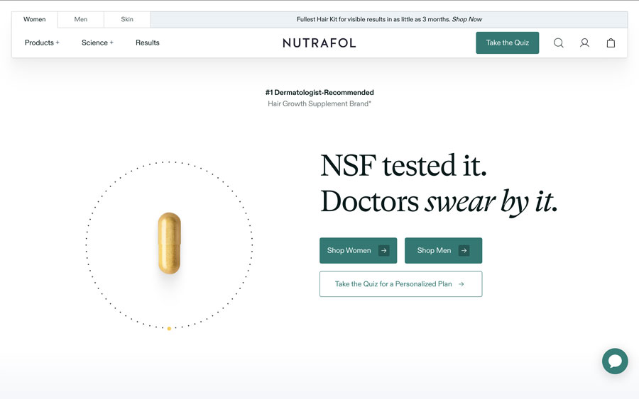
Brand Experience: Certification badges and doctor endorsements reinforce credibility, while lifestyle visuals broaden consumer appeal.
See website →
See startup on WellFound →
Adaptive leads in immune medicine, decoding the human immune system with a modern, tech-forward identity.
Logo Design: A bold sans-serif wordmark with an angular “A,” symbolizing adaptability and scientific precision.
Color Palette: Classic biotech blue for trust and intelligence, supported by clean white backgrounds.
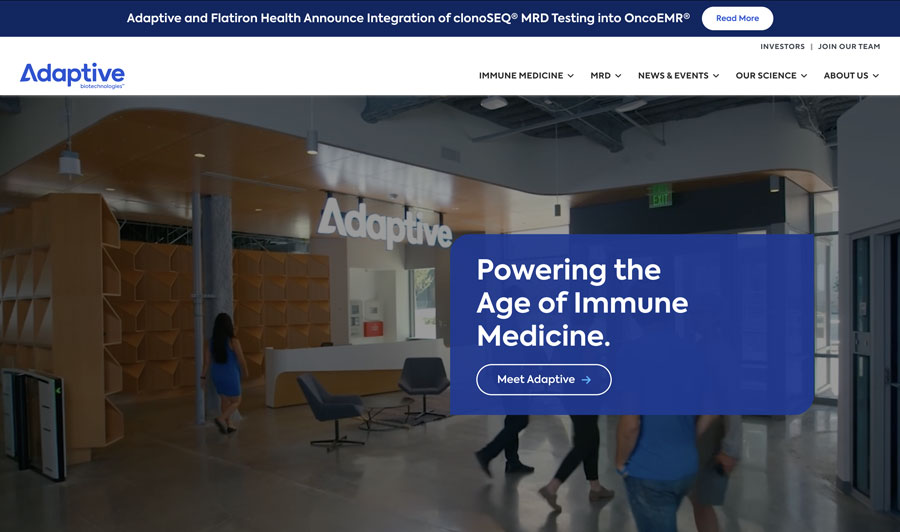
Typography: Geometric sans-serif fonts across brand materials for clarity and consistency.
Brand Experience: Professional photography, bold statements like “Powering the Age of Immune Medicine,” and transparent messaging create credibility.
See website →
See startup on WellFound →

Aurora specializes in AI-driven decision engines for clinical trials, leaning into a futuristic digital identity.
Logo Design: A circular grid icon suggests data and networks, while the custom “R” adds memorability and innovation.
Color Palette: Vivid purple gradients symbolize creativity, digital flow, and forward-thinking.
Typography: Clean sans-serif type optimized for digital platforms.
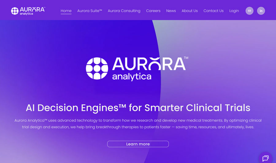
Brand Experience: Bold, gradient-heavy visuals emphasize speed and AI innovation in clinical trials.
See website →
See startup on Crunchbase →

Aerska develops RNA medicines for brain diseases, with branding that feels precise yet approachable.
Logo Design: Lowercase wordmark with accented bars over the “s” and “k,” signaling innovation and scientific notation.
Color Palette: Muted green with navy typography — conveying renewal, trust, and focus.
Typography: Modern sans-serif, lowercase for accessibility.
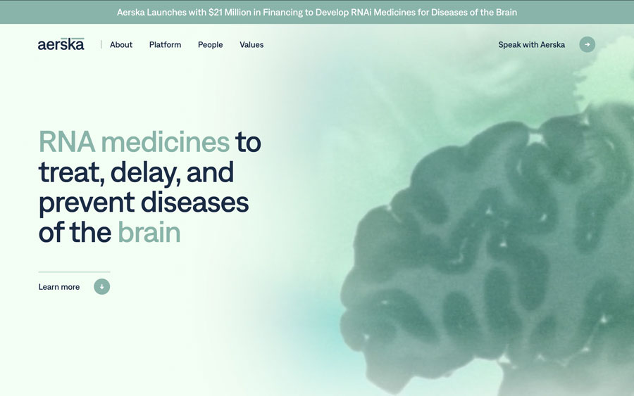
Brand Experience: Scientific brain imagery combined with soft gradients position Aerska as empathetic and rigorous.
See website →
See startup on Crunchbase →
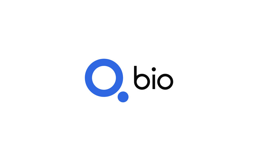
Q Bio positions itself as “the physical exam of the future,” operating at the intersection of AI, physics, and biology. The branding reflects this futuristic and clinical positioning with a minimal, tech-driven identity.
Logo Design: A circular "Q" mark paired with a dot resembles both a magnifying glass and a molecular structure. It’s clever, simple, and memorable.
Color Palette: Electric blue signals technology, innovation, and trust.
Typography: A clean sans-serif with rounded forms balances accessibility and efficiency.
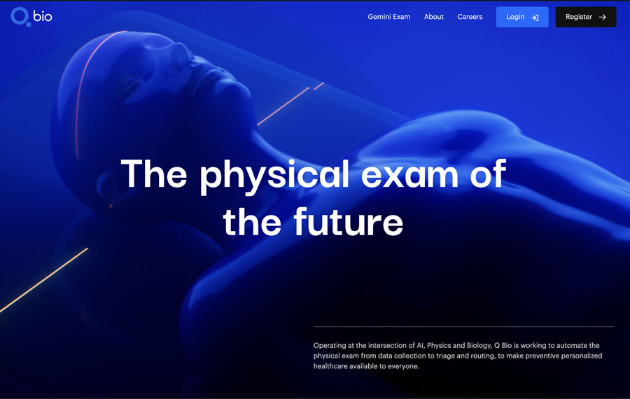
Brand Experience: Futuristic visuals and glowing blue imagery reinforce their identity as a biotech brand merging advanced science with accessibility.
See website →
See startup on WellFound →
From Q Bio’s futuristic simplicity to BIO Protocol’s rebellious DeSci identity, these examples show how diverse biotech branding can be. Some brands lean into trust and clinical clarity (Formation Bio, Aerska), while others differentiate with bold, digital-first aesthetics (Aurora, BIO Protocol).
Across all examples, one trend is clear: effective biotech branding builds investor confidence and attracts customer trust. Logos, colors, and typography are not just design elements — they are tools for storytelling and positioning in a competitive market.
If you’re launching or rebranding a biotech startup, remember that investors don’t just invest in science — they invest in perception. A strong brand identity signals credibility, innovation, and readiness to lead.
👉 If you’re building a biotech company and want a brand identity that inspires investors, partners, and customers, schedule a call with me.
Let’s design a biotech brand that’s as groundbreaking as your science.
As an Amazon Associate, I earn from qualifying purchases.


I'm a branding expert and graphic designer based in NY. I specialize in the development of brands: brand strategy, identity & web design. Need help with your project?—Get in touch