
Branding
Brand Refresh: Improve Your Logo, Colors & Typography
Published on Oct 28, 2026
A brand refresh improves an existing identity while keeping the elements people already recognize.
That can mean refining the logo, adjusting the palette and choosing typography that makes your website, proposals and printed materials feel like the same business.
This guide explains what the work changes, what you receive and how to brief a designer, with real before-and-after examples from my work.
If you already know you need help, see my logo and brand refinement service: a scoped one-week Brand Sprint for $3,000 total.
What is a brand refresh?
A refresh updates the execution of your identity without automatically replacing its central idea.
Your name, recognizable symbol or core color may stay while the drawing, spacing, proportions, palette and type hierarchy become more consistent.
A broader rebrand may revisit positioning, naming or the whole identity, so first establish whether the problem is visual execution or a change in the business.
A new logo will not resolve an unclear offer or a poor customer experience on its own.
Why refresh an existing brand?
The practical reason is to fix specific problems that make the identity difficult to use.
- Typography: the wordmark feels unbalanced or the website and sales deck use unrelated fonts.
- Color: the same brand appears in different shades across print, screen and social assets.
- Small sizes: the logo loses detail in a profile image or browser tab.
- Applications: each supplier invents a different layout because there are no shared rules.
- Files: the only available logo is a small image that cannot be reproduced cleanly.
Write down the actual failures before asking for a different style.
When is a refresh the right scope?
A refresh makes sense when the business direction still fits and useful recognition is worth preserving.
If the audience, offer or positioning has changed, agree those decisions before commissioning visual changes.
For a practical starting point, gather the current website, a proposal, a social profile and one printed item, then identify where the identity stops working consistently.
Separate must-keep elements from preferences you are open to testing.
How to plan a brand refresh
A useful brief gives the designer a concrete problem and a manageable set of applications.
1. Audit the existing identity
Gather editable logo files, current color values, font names and licenses, guidelines and examples of the identity in use.
Explain what customers recognize and what the team finds difficult, using feedback or usage examples where available.
2. Agree what stays and what changes
Define whether the job is optical correction, a clearer logo system, a new palette, typography selection or a combination.
Decide who approves the work and consolidate feedback so revisions address the same brief.
3. Test the design in real use
Review the proposed identity in the applications that matter: a website header, social avatar, proposal cover or business card.
Check small sizes, one-color reproduction, light and dark backgrounds and the readability of the type.
4. Prepare the rollout
Replace the files and templates people actually use, then explain the new rules to your team and suppliers.
Use a short launch checklist to avoid leaving the previous identity in email signatures, social profiles or downloadable documents.
What familiar brand updates can teach us
Large-company examples illustrate different degrees of change, rather than a scope or budget to copy.
Starbucks simplified its identity in 2011, Google introduced its sans-serif wordmark in 2015, and Mastercard removed its name from the main symbol in 2019.
Burger King's 2021 identity returned to a historical visual direction, while Pfizer's 2021 update introduced a different symbol.
These are not interchangeable projects: the useful question is which recognizable elements survived and why, rather than whether every change should be called a refresh.
Brand refresh examples from my work
The following examples show visible changes to existing identities; they are not claims about measured sales results or the historic cost and duration of each project.
Focal Project Managers: preserve the structural idea
Focal retained its blue, architectural letter construction while improving the proportions and descriptor.
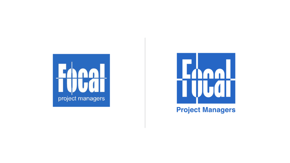
The changes bring more balance to the letterforms and make the supporting name easier to read.
The lesson: a recognizable concept can remain while its execution becomes more usable.
AMI: keep recognition, improve the hierarchy
AMI retained its striped symbol and core burgundy color while the wordmark and supporting text were refined.
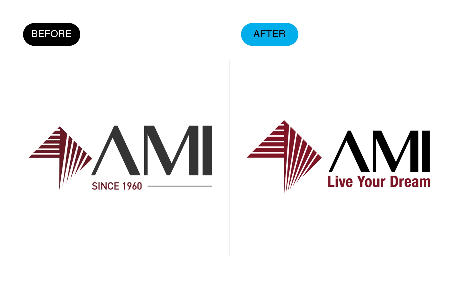
The relationship between the name, symbol and descriptor matters as much as the individual pieces.
The lesson: define what must survive before exploring changes to the system around it.
Lyntics: refine balance and color
Lyntics kept its four-part symbol while refining its symmetry, wordmark spacing and color relationship.
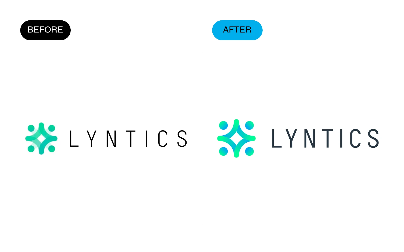
Small adjustments can change the overall finish without requiring an entirely new concept.
See more logo redesigns and before-and-after examples, including projects that required a more substantial change.
What should a brand refresh include?
Agree the handoff before starting so your team receives a usable identity rather than a presentation alone.
- Agreed logo refinements and responsive variations.
- Final files for print and screen, including SVG, PNG and PDF.
- Color values and rules for using the palette.
- Typography selection and hierarchy.
- Practical brand guidelines and examples.
- The agreed launch applications and editable source files.
Website implementation, extensive templates, print production and third-party licenses should be identified separately when they are required.
How much does a brand refresh cost?
At Ebaq Design, a scoped identity refresh or rebrand is delivered in one week for $3,000 total, with revisions included.
The Brand Sprint includes the logo system, logo animation, colors, typography, guidelines, business cards, social launch assets and an email signature.
We agree the scope at kickoff, including which existing elements to preserve and which applications need to be ready first.
Website design, development and larger rollout work add separately agreed weeks at $3,000 per week, with the total fixed before work begins.
Identify any premium font or other third-party licensing requirements before choosing assets, so those costs and responsibilities are clear.
See current pricing and the complete Brand Sprint scope.
What can you expect from the finished work?
Evaluate the refresh against the problems in the brief: clearer small-size use, consistent colors, a coherent type hierarchy and files the team can find and use.
These are design and handoff outcomes you can inspect.
Increased sales, recognition or loyalty require separate measurement and cannot be promised from an identity change alone.
Keep the useful recognition, fix the friction
A successful refresh starts with a clear boundary between what works and what needs attention.
Preserve the useful parts, test changes in real applications and document the final system so the identity stays consistent after handoff.
Need help refining your existing identity?
Work directly with me, Arek Dvornechuck, in Brooklyn, New York City, on your logo, colors and typography.
Explore logo and brand refinement, or book a call with your current logo, website and priority applications.
Ready to build a brand people remember?
Tell me what you’re launching, changing, or trying to make look better.