


Arek Dvornechuck
Branding Expert


Circle Logos: Why Brands Use Them in 2026
.webp)


.webp)


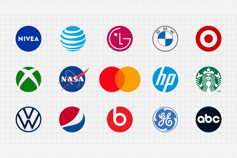
Circle logos are everywhere — tech, automotive, aerospace, payments, entertainment, consumer goods.
And that’s not an accident.
The circle is the most universal form in visual communication: smooth, inclusive, endlessly scalable, and psychologically comforting.
The brand examples below demonstrate exactly how powerful this shape can be—each one uses the circle for a clear strategic reason.
Below is an analysis of the well-known brands why they chose a circle for their identity.
A solid blue circle is the perfect shape for a personal-care brand.
It feels clean, dependable, and reassuring.
The circle acts as a “seal of quality,” and the deep blue reinforces calmness and care — ideal for skincare products that sit on shelves next to competitors.
The logo looks like a stamp, a badge, and a container lid all at once — a perfect match for a brand that literally sells jars, tins, and round packaging.
The striped spherical mark represents: wireless signals, data wave and global coverage.
Instead of a flat circle, it’s a 3D sphere, symbolizing a worldwide network.
The circle here is all about scalability: it miniaturizes beautifully in mobile interfaces while still communicating “globe,” “signal,” and “technology.”
LG’s circular mark contains: a stylized face + the initials of the company at the same time.
The circle softens the technology brand and makes it more personal.
It feels friendly, approachable, and consumer-focused.
The circle also supports symmetrical balance, which helps the logo read clearly at small sizes.
A circle makes perfect sense for an automotive symbol: wheels are circular and most badges on cars are circular.
Also if you think about it—gauges, speedometers, and dials are circular as well.
BMW’s circular emblem communicates engineering precision and heritage.
The internal quadrants add a sense of structure, while the ring creates a strong boundary that works on anything from a hood ornament to a digital app icon.
A bullseye is naturally circular.
The brand uses two concentric rings to communicate: accuracy, focus and simplicity.
Few marks are as instantly recognizable from a distance.
The circular form gives the brand unmatched visibility in retail signage.
The Xbox symbol uses a spherical shape split by an angular “X.”
Why a circle?—Well... because:
The combination of hard lines + a soft circle creates tension and energy.
We've got the space, planets, and orbits.
The circle is the most natural shape for an aerospace emblem.
The circular badge format communicates:
It looks like mission patches worn by astronauts — the circle format makes it feel timeless and instantly “institutional.”
Mastercard is one of the most simplistic circular logos of all time.
Just two overlapping circles:
The logo is a masterclass in minimalism.
It takes the core idea of “two sides connecting” and represents it through geometry alone.
The circles make the brand feel inclusive, open, and universally friendly across cultures.
HP’s circular enclosure gives a compact, efficient look to the monogram.
The circle:
The round shape softens the sharp diagonal strokes inside it, balancing tech with accessibility.
Starbucks uses an intricate illustrative symbol—which, you guessed, it's enclosed in a circle.
The ring format:
The circle lets a complex illustration remain organized and readable.
VW’s monogram sits inside a clean circle, creatin perfect symmetry, great balance and harmony.
As with other automotive brands, the round badge relates directly to the product (the car’s hubcaps, steering wheel, and hood emblem).
The circle reinforces reliability and mechanical confidence.
Pepsi has chnages the logo over time, but circlular forms remain unchanged.
The tilted now circle symbol represents:
The circular form mirrors a bottle cap, a soda can top, and the idea of a planet.
Its internal wave shape creates movement, making the mark feel alive and energetic.
A simple circle containing a lowercase “b” forms a stylized headphone shape.
The circle:
This is a logo designed to be seen at micro scale — and the circle makes it incredibly readable.
GE’s script monogram sits inside a decorative circle with swirling elements.
The circle gives the old-fashioned typography:
It’s a timeless industrial symbol that blends engineering with elegance.
ABC’s circular black-and-white symbol is a masterclass in minimalist identity.
The circle:
The simplicity of the circle makes the logo incredibly durable across decades of broadcast evolution.
Across all your examples, the circle serves key functions:
Even without color, every one of these marks is recognizable by shape alone.
Most of these brands have heavy digital footprints — circles dominate app icons and social avatars.
Circles signal trust, harmony, unity, global presence, and approachability.
Works on everything from tiny earbuds to giant signage.
Circle is one of themost basic geametric symbols.
It can be used as a base for basically any category.
Automotive: wheel
Beverage: cap
Audio: earcup
Aerospace: planet
Telecom: globe
The shape often reflects the industry’s core idea.
The brands in your examples show just how flexible and powerful circle logos can be.
Some use circles for friendliness, others for authority, others for motion or global connectivity. But they all share the same benefit:
The circle is the simplest shape with the highest emotional impact.
Get a senior designer who actually knows what the f*ck he’s doing.
Book a call today:ebaqdesign.com/start
As an Amazon Associate, I earn from qualifying purchases.


I'm a branding expert and graphic designer based in NY. I specialize in the development of brands: brand strategy, identity & web design. Need help with your project?—Get in touch