


Arek Dvornechuck
Branding Expert


Top 9 Drone Company Logos in 2026: Analysis
.webp)


.webp)


Drones are changing the way we see the world — literally.
From aerial filmmaking and mapping to defense and delivery, the drone industry has become one of the most innovative and fast-moving fields in tech.
But beyond engineering, what truly sets these companies apart is design — the way they express innovation, precision, and trust through their visual identity.
As a branding expert, I’ve analyzed the top 9 drone companies and their logos to uncover how design helps these brands take flight — or, in some cases, fall short.

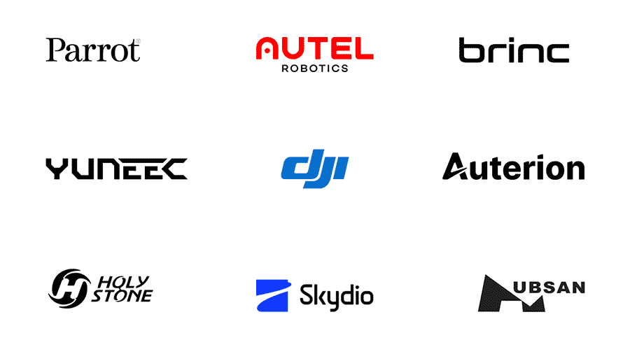
DJI (Da-Jiang Innovations) is the global leader in consumer and professional drone technology, based in Shenzhen, China.
The company dominates the aerial photography market with its Phantom, Mavic, and Inspire series.
The DJI logo is one of the strongest in this lineup. Its bold, italicized letterforms feel aerodynamic and connected — almost like propeller blades in motion.
The lowercase treatment makes the brand approachable, while the blue color communicates trust, stability, and innovation.
It’s clean, modern, and instantly recognizable — a perfect blend of engineering precision and simplicity.
Autel Robotics, a U.S.-based company, competes directly with DJI, offering high-performance drones for both professionals and enthusiasts.
The Autel logo uses a rounded geometric typeface with an open “A,” symbolizing openness, creativity, and flight.
Its bright red color conveys energy and determination — a visual cue for speed and excitement.
It’s not particularly elegant, but it’s strong and energetic, which suits a brand built on performance and competition.

Parrot is a French drone pioneer known for its design-driven approach and focus on both consumer and defense technology.
The Parrot logo stands apart with its elegant serif typography — rare in the tech world.
It’s incredibly simple, yet distinct.
The choice of a classic serif conveys sophistication and heritage, giving the brand a timeless European feel.
It’s not trying too hard, and that’s exactly why it works — clean, confident, and effortless.
Skydio is an American company that builds fully autonomous drones powered by AI — capable of navigating and filming on their own.
The Skydio logo is fine but somewhat generic.
It combines a dynamic blue symbol with lowercase type, but the composition feels predictable — the icon looks like many tech startups’ logos from the past decade.
The color is solid and conveys trust, but the design lacks a distinctive element that would make it truly memorable.
Brinc is a U.S. drone manufacturer focused on public safety and humanitarian missions — their drones help first responders save lives in dangerous environments.
The Brinc logo is minimalist and smooth, using a soft, rounded sans-serif font.
Its simplicity mirrors the brand’s mission: technology made for people, not profit.
While it’s not groundbreaking, it’s clean, clear, and has a nice friendly tone.
The black color gives it authority and contrasts nicely with the brand’s humanitarian focus.
Yuneec, based in China, started in electric aviation and evolved into one of the top drone manufacturers, known for advanced aerial systems and engineering excellence.
The Yuneec logo looks dated and overworked.
The angular shapes try to feel futuristic, but the proportions and letter spacing make it awkward and heavy.
The stylized “E” is interesting but feels forced. It’s one of those marks that tries too hard to look techy — and as a result, loses elegance and timelessness.

Auterion is a Swiss-American company developing an open-source operating system for drones, used by enterprises and government clients around the world.
The Auterion logo features a clever “A” that resembles a takeoff trajectory — simple, bold, and full of motion.
The clean sans-serif typography is well balanced, and the black color emphasizes professionalism.
It’s not particularly exciting, but it’s solid — clear, scalable, and easy to apply across digital platforms.
Hubsan is one of the earliest consumer drone makers, offering affordable drones for beginners and hobbyists.
The Hubsan logo merges the letter “H” with abstract wing-like shapes — but the execution feels strange (kinda reads like Mubsan IMO).
The uneven geometry makes it look like a mountain silhouette more than an aerial mark.
It’s unique, but not necessarily in a good way.
The brand could benefit from cleaner proportions and a more cohesive visual system.
Holy Stone specializes in affordable drones for beginners and recreational users, focusing on accessibility and fun.
The Holy Stone logo is definitely overdesigned.
The circular “H” emblem, italicized wordmark, and multiple layers of visual motion make it feel busy and dated.
It tries to suggest energy and rotation but ends up cluttered.
A simpler, flatter approach would better convey flight and agility.
The drone industry represents the perfect intersection of technology and design — and these logos show both the good and the bad.
Some, like DJI and Parrot, strike the perfect balance between simplicity and memorability.
Others, like Yuneec, Hubsan, and Holy Stone, remind us that more complexity doesn’t always equal better design.
If you’re building a drone company, AI startup, or tech brand, your logo isn’t just decoration — it’s the first impression of your innovation.
And that’s where I come in.
I’m Arek Dvornechuck, a logo designer and branding expert.
I help brands like yours communicate complex technology through simple, powerful visuals — designs that look good today and still hold up years from now.
If you want a logo and identity that truly helps your company take off — let’s talk.
As an Amazon Associate, I earn from qualifying purchases.


I'm a branding expert and graphic designer based in NY. I specialize in the development of brands: brand strategy, identity & web design. Need help with your project?—Get in touch