
Logo Design
9 Best Eagle Logo Examples in 2026
Published on Jan 27, 2026
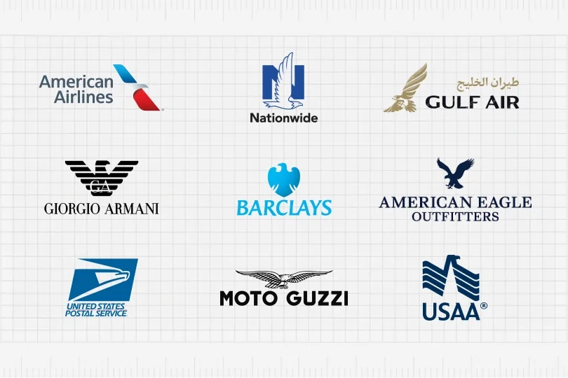
The eagle is one of the most powerful symbols in branding.
Across industries—finance, fashion, airlines, government services, sports—the eagle represents strength, leadership, freedom, trust, speed, excellence, and confidence.
Because of this emotional weight, eagle logos continue to appear in some of the world’s most recognizable brands.
Below is a comprehensive breakdown of the best eagle logo examples, what makes each one effective, and what designers can learn from them.
1. American Airlines
The American Airlines eagle is one of the most recognizable symbols in aviation.
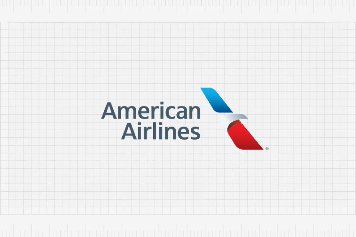
The modern version—designed by FutureBrand—uses abstract wings formed by red, white, and blue shapes. It’s clean, modern, and fast, without depicting a literal eagle.
Why it works
- Sleek, aerodynamic shapes communicate motion
- Strategic use of national colors
- Minimalism makes it scalable and timeless
Designer takeaway
Abstracting an eagle into geometric forms creates a future-proof logo.
2. Nationwide
Nationwide has used the eagle for decades as a symbol of protection, oversight, and security—perfect for an insurance company.
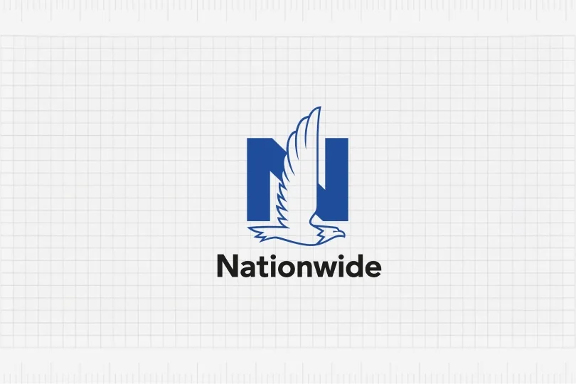
In 2014 I had the opportunity to work on the Nationwide rebrand when I was a full-time designer at Chermayeff & Geismar & Haviv in New York.
Being inside that process gave me a close look at how the eagle was refined to feel both modern and reassuring, while staying true to the brand’s heritage.
Why it works
- The large “N” creates a stable frame
- The realistic eagle silhouette reinforces trust and protection
- Blue color palette communicates reliability and calm
Designer takeaway
Pairing a bold initial with an animal mascot creates strong, ownable brand recognition—and small refinements in proportion, angle, and detail can dramatically change the personality of the symbol.
3. Gulf Air
Gulf Air incorporates a beautifully stylized golden falcon (visually and symbolically close to an eagle).
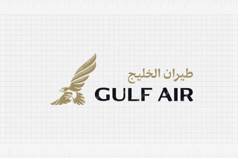
It feels premium, elegant, and culturally authentic.
Why it works
- Luxury aesthetic with gold tones
- Organic lines create movement and grace
- Balanced combination of Arabic + Latin typography
Designer takeaway
Stylization plus cultural relevance creates a memorable luxury identity.
4. Giorgio Armani
The iconic Armani eagle—bold, geometric, and symmetrical—is a masterclass in fashion branding.
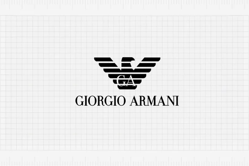
It functions almost like a crest or emblem.
Why it works
- Strong symmetry and black-and-white contrast
- Horizontal stripes mimic high-fashion aesthetics
- Works beautifully as a standalone symbol on apparel and accessories
Designer takeaway
A monogram combined with a stylized eagle can become a status symbol.
5. Barclays
Barclays uses an eagle derived from its historical coat of arms.
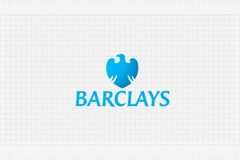
It’s soft, friendly, and approachable—unusual for a bank.
Why it works
- Unique, rounded silhouette (less aggressive than most eagles)
- Bright blue conveys openness and trust
- Combines heritage with modern simplicity
Designer takeaway
Simplifying legacy symbols can create a modern yet meaningful brand.
6. American Eagle Outfitters
This eagle is all about energy.
AEO uses a dynamic, slightly rough silhouette—symbolic of youth, freedom, and individuality.
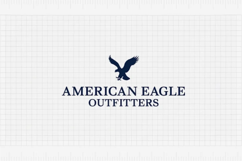
Why it works
- Bold silhouette appeals to younger audiences
- Works equally well on tags, labels, and signage
- Represents lifestyle and attitude, not just a logo
Designer takeaway
A raw, expressive eagle silhouette works well for lifestyle and fashion brands.
7. United States Postal Service (USPS)
The USPS eagle is sharp, angular, and forward-leaning—perfect for a service built on speed and reliability.
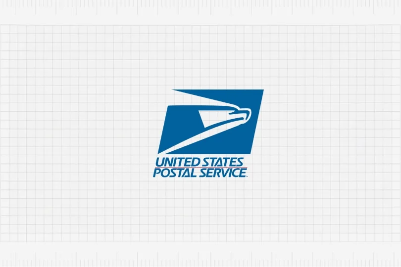
Why it works
- Angular geometry suggests speed and precision
- Blue emphasizes authority and trust
- Instantly recognizable even at very small sizes
Designer takeaway
Directional angles can reinforce a brand’s promise (speed, progress, delivery).
8. Moto Guzzi
One of the most legendary motorcycle brands uses a wide-winged eagle as its primary symbol.
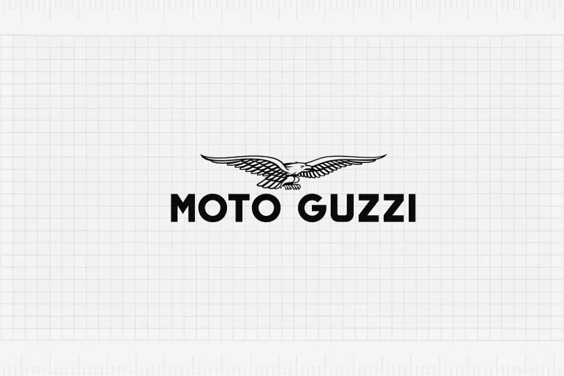
Why it works
- Long wingspan creates visual balance over the wordmark
- Fine line work feels classic and mechanical
- Evokes freedom, travel, and open roads—perfect for a motorcycle brand
Designer takeaway
Hand-drawn detailing gives heritage brands authenticity and character.
9. USAA
The USAA eagle cleverly merges military symbolism with a geometric, structured design.
It’s modern yet authoritative.
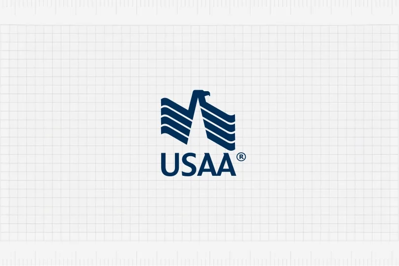
Why it works
- Vertical bars reference both architecture and military stripes
- Eagle silhouette is revealed through negative space
- Strong, compact, and highly scalable
Designer takeaway
Negative space is a powerful way to integrate symbolism without clutter.
Why Designers Use Eagles in Logos
The eagle is one of the strongest universal symbols. Brands choose it because it communicates:
- Power & leadership
- Freedom & independence
- Speed & agility
- Excellence & prestige
- Protection & trustworthiness
From airlines to fashion, from finance to government—an eagle can elevate a brand instantly.
What Makes a Great Eagle Logo?
Looking across these examples, the strongest eagle logos tend to share a few key traits:
1. Strong silhouette
Even when scaled to 16–20 px, the shape stays recognizable.
If you squint and still see the bird, you’re on the right track.
2. Appropriate style
- Fashion → elegant, symmetrical, high-contrast
- Aviation → dynamic, streamlined, forward-leaning
- Finance → stable, trustworthy, more conservative
- Youth brands → edgy, energetic, less polished
3. Minimal detail
Too many feathers and micro-details make the logo noisy and hard to reproduce across mediums.
4. Clear symbolism
Some brands use only the wings, others a full body, others an abstract suggestion of a bird.
The important part is that the symbol reinforces the brand story.
5. Balanced composition
Most successful eagle logos either maintain symmetry or have a strong, intentional directionality (usually moving forward or upward).
Conclusion: Need an Eagle Logo for Your Brand?
Eagle logos are timeless because the meaning behind them never goes out of style.
They signal strength, vision, freedom, and trust—exactly what many modern brands want to communicate.
I’ve personally worked on one of the most recognizable eagle marks in the world—the Nationwide rebrand (2014)—during my time as a full-time designer at Chermayeff & Geismar & Haviv in New York.
That experience, combined with years of branding work for startups and established companies, helps me design eagle logos that are not just pretty icons, but strategic assets for your business.
If you’re considering an eagle logo—or rethinking your current one—I can help you:
- Clarify what your eagle should stand for (strength, protection, prestige, speed, etc.)
- Design a symbol that works across digital, print, and product applications
- Build a full visual identity around the mark: colors, typography, brand system, and guidelines
👉 Want an iconic eagle logo for your brand?—Schedule a call
Ready to build a brand people remember?
Tell me what you’re launching, changing, or trying to make look better.