


Arek Dvornechuck
Branding Expert


Lettermark Logo Design: Best Examples & Tips for 2026
.webp)


.webp)


Lettermark logos remain one of the most powerful and adaptable types of logos in modern branding.
But what exactly defines a lettermark logo, and when is it the right choice for your brand?
Let's dive in.
Watch the video version of this guide on my YouTube channel.
A lettermark is a logo built from a single letter—typically the first letter of a brand name—designed distinctively to become the company's visual identity.
Don't confuse lettermarks with acronym logos (like IBM or HBO), which combine multiple letters.
A lettermark distills a brand into a single, memorable mark.
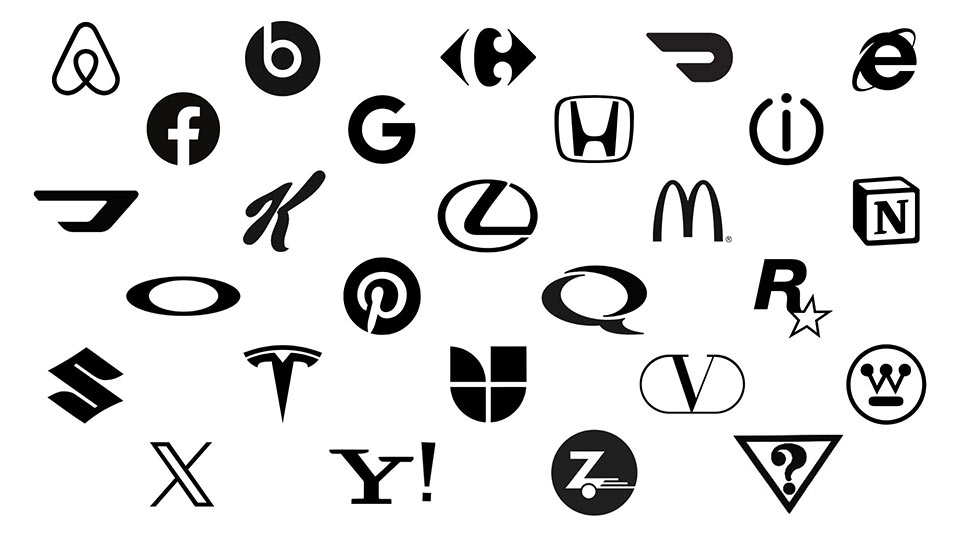
Classic lettermark logo examples include:
Each brand transformed one letter into a globally recognized symbol.
When does a lettermark outperform a full wordmark or abstract symbol?
Here are 5 compelling scenarios:
Certain letters naturally create visual impact:
Lettermarks scale flawlessly across:
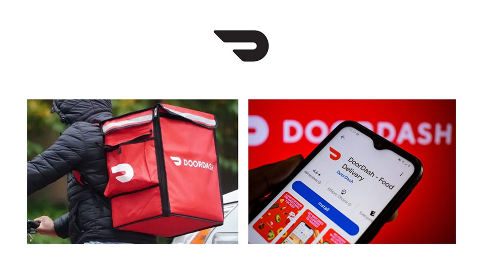
DoorDash exemplifies this—their stylized "D" works seamlessly on delivery bags, mobile apps, and outdoor advertising.
Lettermarks transcend language barriers. A single letter needs no translation.
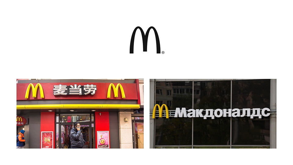
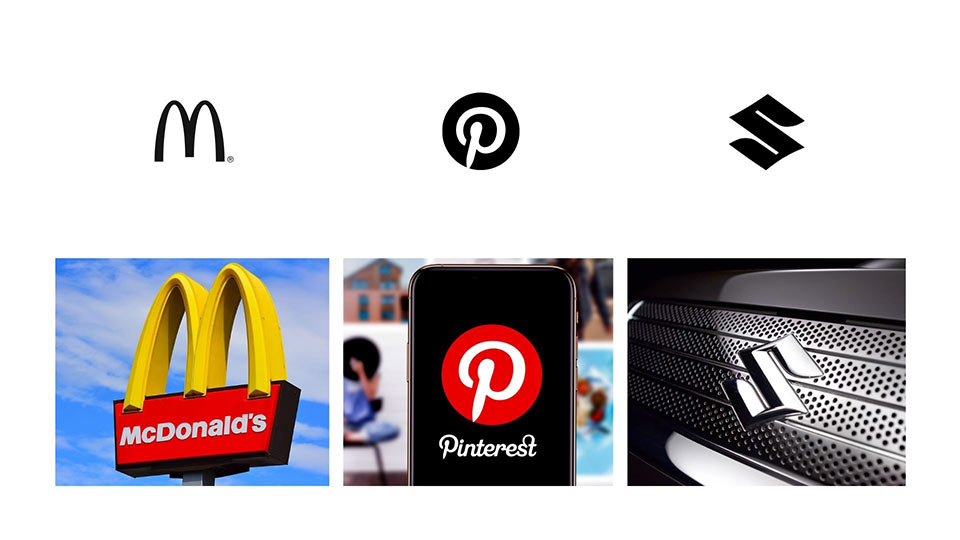
McDonald's proves this—their "M" is instantly recognizable from Tokyo to Sao Paulo.
A thoughtfully designed lettermark is inherently memorable and more economical to market than abstract symbols.
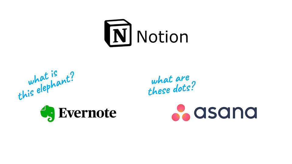
Consider these comparisons:
Generic icons face trademark challenges. A custom letterform, however, is uniquely ownable.
Pinterest's P enjoys stronger legal protection than a generic pushpin icon because it's a distinctive typographic creation.
Creating a standout lettermark requires strategic design choices. Here are proven techniques:
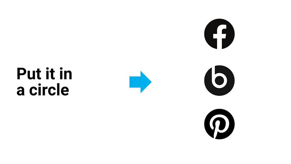
Placing a letter within a circle creates visual balance and app-ready formats (Pinterest, Facebook, Beats demonstrate this perfectly).
Create hidden meanings and visual intrigue by manipulating positive and negative shapes.
Stroke effects can define your letter in unexpected ways.
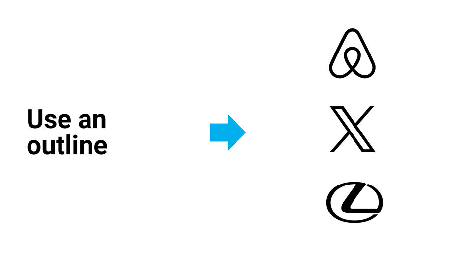
Apply this to the complete letter or strategic portions.
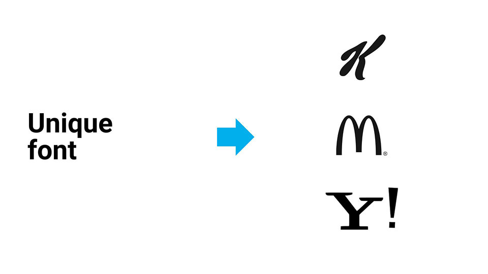
Typography sets the tone—choose a font with character, whether it's a contemporary sans-serif or custom script.
Enhance your letter with lines, stars, or geometric shapes that suggest movement, energy, or industry relevance.
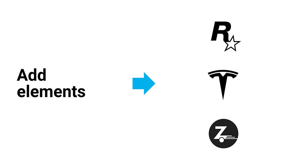
Examples:
Your lettermark can serve dual purposes—like Ventur, whose stylized "V" functions independently as an icon.
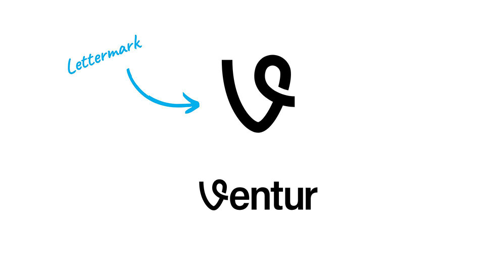
The design even symbolizes a journey with a path woven through it.
Lettermark logos are ideal when:
Executed well, a single letter carries enormous brand recognition—potentially becoming your entire visual identity.
Ready to create your own lettermark logo? Explore my portfolio and book a call.
As an Amazon Associate, I earn from qualifying purchases.


I'm a branding expert and graphic designer based in NY. I specialize in the development of brands: brand strategy, identity & web design. Need help with your project?—Get in touch