![All 30 MLB Team Logos Ranked & Explained [2026 Edition]](https://cdn.prod.website-files.com/5de2db6d3719a1e2f3e4454c/6882dac6da737038c069fbf3_best-mlb-logos.jpg)


Arek Dvornechuck
Branding Expert


All 30 MLB Team Logos Ranked & Explained [2026 Edition]
.webp)


.webp)


As a graphic designer and a fan of great sports branding, I love looking into the design of pro sports logos.
Especially when it comes to baseball, which has some of the most classic, iconic logos in all of American sports history.
The MLB logos are a unique blend of tradition and evolution.
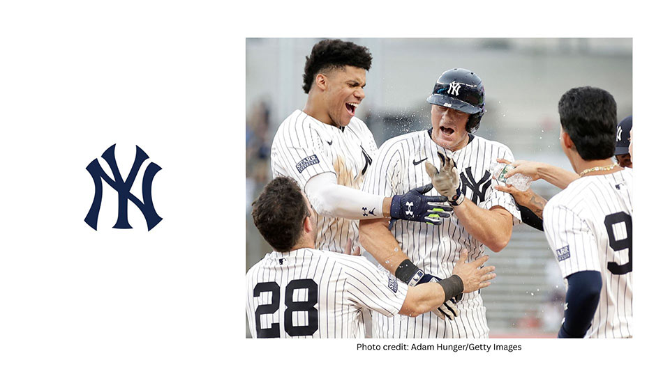
Especially the iconic interlocking NY logo of Yankees—BTW here's a photo of me attending of their games in the Bronx.

Some teams stay loyal to their century-old look, while others go through multiple redesigns trying to modernize or rebrand.
In this article, I’ll break down my favorite MLB logos from a design perspective—looking at what makes them iconic, balanced, and timeless.
Just like I did for NHL logos, I’ll be judging these based on visual impact, uniqueness, balance, and branding consistency.
I’m not ranking them based on team success or popularity.
This is just about the logos themselves—how they look, how they’ve aged, and how they work as design marks.
Let’s get into it.
Founded in 1901, the Yankees originally began as the Baltimore Orioles, before moving to New York in 1903 and becoming the Highlanders.
By 1913, the team adopted the name Yankees, and over time, their identity would become one of the most recognizable brands in all of sports.
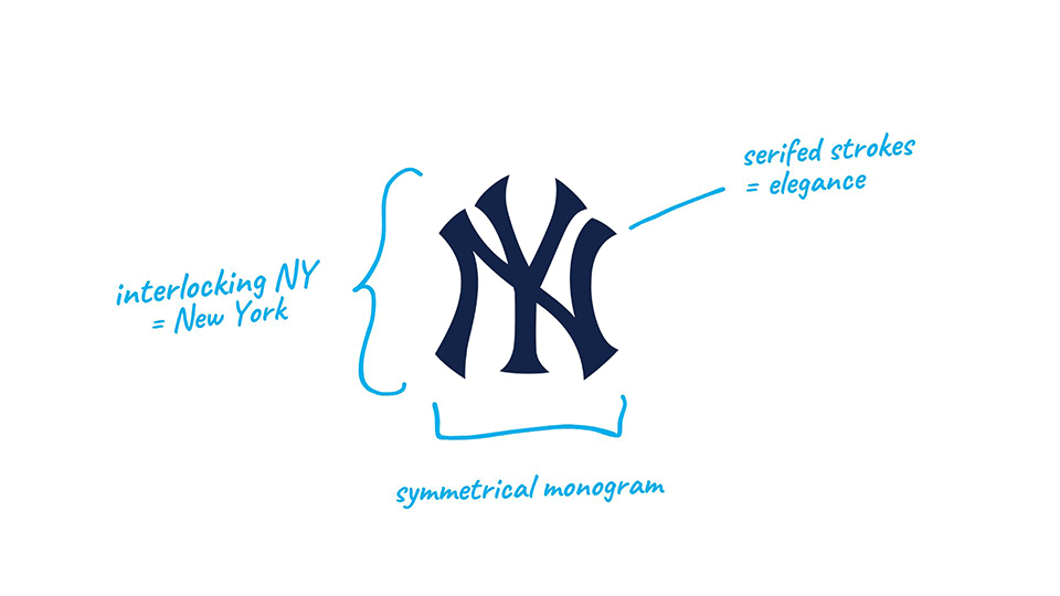
Unlike most modern sports logos, the Yankees’ iconic interlocking NY mark wasn’t originally designed for a baseball team—it was first created in 1877 as part of a medal for bravery by the NYPD.
The team adopted the mark in the early 1900s, and aside from minor refinements, it has stayed virtually untouched ever since.
Today, it’s more than just a baseball logo—it’s a cultural icon, seen on everyone from athletes to rappers to global tourists.
This kind of widespread appeal comes down to one thing: great design.
Founded in 1962, the New York Mets were created to bring National League baseball back to New York after the departure of the Giants and Dodgers in the 1950s.
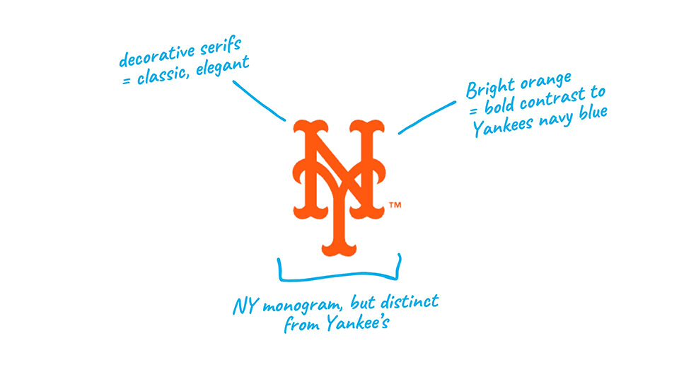
The team’s identity was built to honor both former clubs—borrowing the orange from the Giants and the blue from the Dodgers—while creating a brand of their own.
The Mets’ primary logo is a clean, interlocking "NY" monogram, much like their crosstown rivals, the Yankees, although with a totally different aesthetic to it.
Instead of navy blue, the mark uses bright orange, giving it a completely different energy—more modern, more energetic, and unmistakably Mets.
The letterforms are custom drawn with tall verticals, slab-style serifs, and a playful, upright structure that feels rooted in tradition yet friendly and accessible.
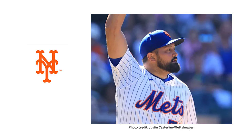
Despite being overshadowed by the Yankees in terms of history, the Mets have managed to carve out a strong visual identity—and this monogram plays a big role in that.
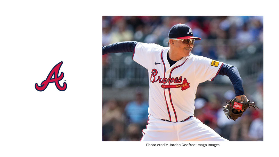
Founded in 1871, the Braves are the oldest continuously operating franchise in Major League Baseball.
They’ve played in Boston, Milwaukee, and now Atlanta—carrying a strong, consistent identity across cities and generations.
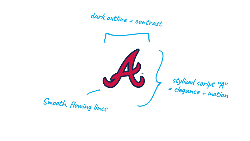
The current logo features a bold, script-style “A”, introduced in 1987 and refined over time to reflect the team’s Southern heritage and confident tone.
Unlike many monograms in MLB, this one uses a stylized cursive letter with exaggerated terminals and smooth curves, giving it a distinctive, almost handwritten feel.
The color palette—rich navy with a red outline—adds structure and contrast, making the letterform pop on caps, jerseys, and other merch.
Simple at first glance, but full of character, this mark is instantly associated with Braves baseball.
Founded in 1901, the Boston Red Sox are one of the most legendary franchises in baseball.
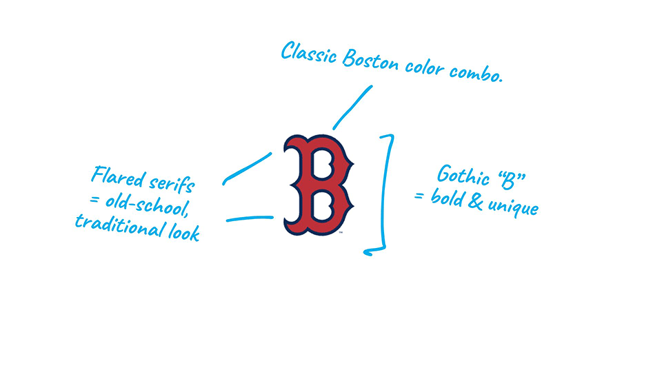
While the team is named after a pair of socks, the logo most associated with the brand—especially on caps—is a bold, stylized red “B.”
This version of the “B” has been in use since the 1930s and is built from a unique, decorative type style with flared serifs and sharp inner counters, giving it both vintage character and modern clarity.
The red letter is outlined in navy blue, which gives the logo definition and helps it stand out on navy caps, although a bit too close to the Brave's colors, if you ask me.
Unlike many MLB teams that use interlocking initials, the Sox keep it simple with a single, iconic character that speaks volumes.
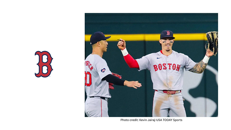
It’s classic Boston—loud, proud, and instantly recognizable.
Originally founded in 1993 as the Florida Marlins, the team rebranded in 2012 when they moved to their new stadium and officially became the Miami Marlins.
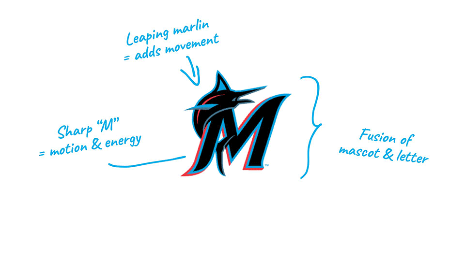
Their current logo, introduced in 2018, is a vibrant, angular “M” shaped like a leaping marlin, combining typography with motion and marine symbolism.
The logo uses a sleek, modern typeface that integrates sharp cuts and curves, giving the "M" both energy and structure.
A stylized swordfish arcs around the left side, guiding the eye and adding movement to what would otherwise be a static monogram.
The color palette is bold and unmistakable—electric blue, black, red, and silver—evoking Miami’s neon nightlife, ocean setting, and Latin influence.
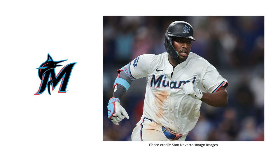
It’s flashy, fast, and full of personality—everything you'd expect from a Miami sports brand.
In addition, it's quite unique—unlike any other MLB team logo.
Originally founded in 1883 as the New York Gothams, the franchise became the New York Giants before making the iconic move west in 1958, becoming the first Major League team on the West Coast.
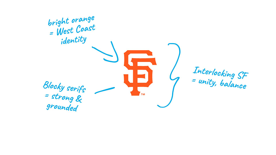
Since then, the San Francisco Giants have built a legacy of excellence, with World Series titles, Hall of Fame players, and a deep cultural connection to the Bay Area.
Their logo—a bold, interlocking “SF”—has become one of the most enduring marks in baseball.
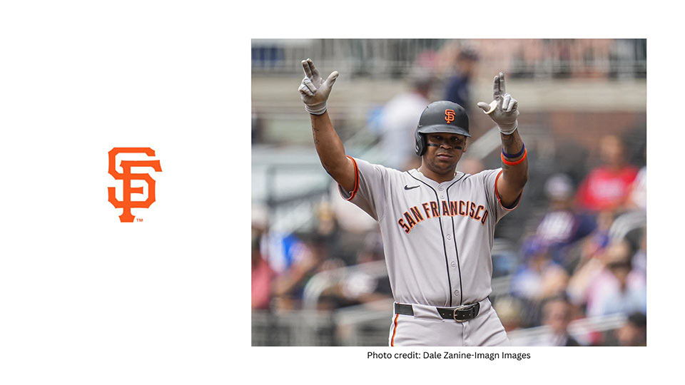
The stacked monogram is compact yet commanding, perfectly capturing the team’s heritage and identity in a single letterform.
The only problem with this logo I have is that the orange color is quite similar to Met's logo, or perhaps the other way around (?)
Founded in 1901, the Detroit Tigers are one of the American League’s eight charter franchises, and the only one that has remained in the same city under the same name.
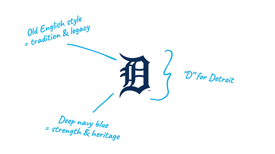
They’ve had their share of baseball legends—Ty Cobb, Al Kaline, and Miguel Cabrera—cementing their place in MLB history.
But perhaps just as iconic as their players is their logo: the bold, gothic-style Old English “D” that has come to symbolize the city of Detroit itself.
This letterform has evolved subtly over the years, but its ornate, historic character has always remained.
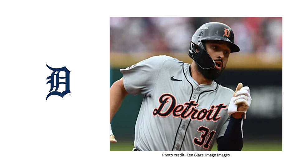
It’s more than a logo—it’s a symbol of the team’s tradition, grit, and pride.
I like the ornate "D"—pretty different from any other font choice amondg MLB logos.
The Philadelphia Phillies are the oldest continuous, one-name, one-city franchise in American professional sports—established in 1883.
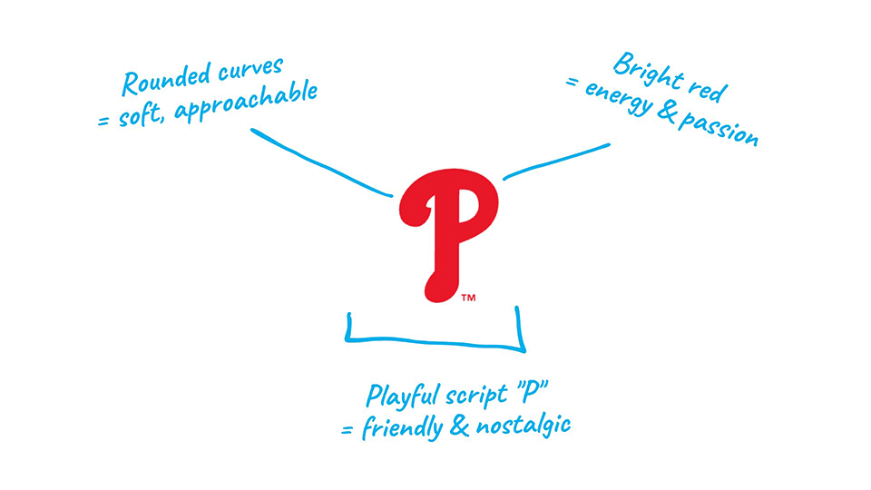
Their logo has gone through many changes, but the current script “P” is a callback to the city’s retro baseball heritage.
Unlike many other MLB logos, the Phillies opt for a soft, rounded letterform that’s almost playful—yet still proudly bold in its red color.
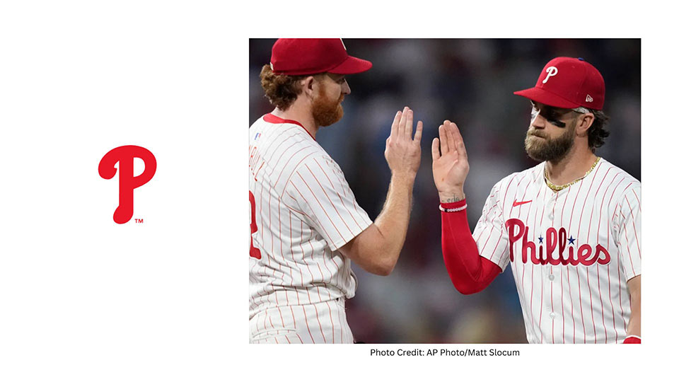
This distinctive “P” is both classic and casual, giving the brand a timeless, friendly feel that stands out in the league.
Introduced in 1993, the Colorado Rockies’ logo features a crisp, interlocking “CR” monogram that stands out with its simplicity and boldness.
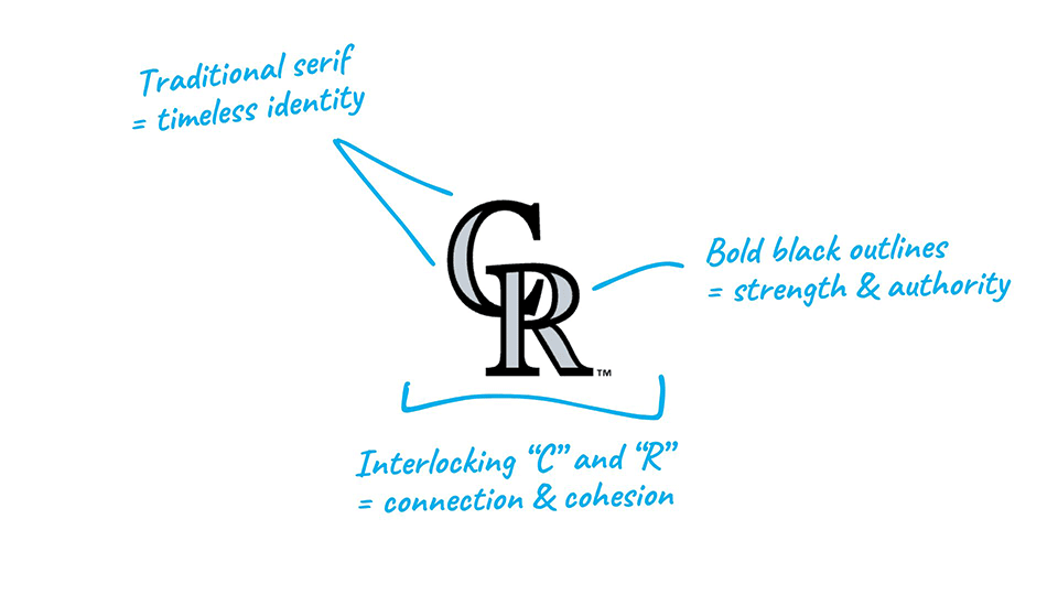
The design uses sharp serifs and tight letter spacing, giving it a classic, professional feel.
The interlock between the “C” and the “R” creates a sense of unity—visually tying together the team and its home state.
The silver and black color palette reinforces themes of elevation, strength, and ruggedness, referencing the towering Rocky Mountains that give the team its name.
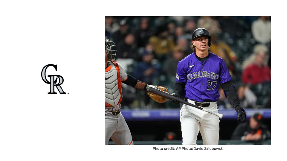
Unlike more decorative or illustrative logos, the Rockies’ identity relies on strong typography, giving it a timeless, minimal presence in the league.
Unveiled in 1993, the Seattle Mariners’ current logo is a standout among MLB teams, blending local culture with baseball iconography in a fresh and modern way.
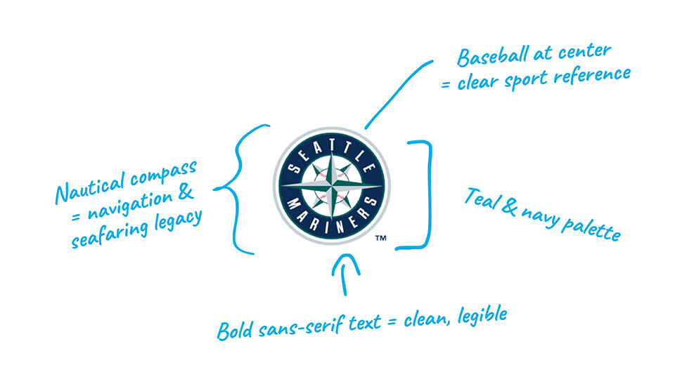
Seattle, a city deeply connected to maritime history, is represented through a compass rose, echoing the city’s identity as a seaport.
At the core of the logo sits a baseball, grounding the design in the sport.
The circular badge is clean and balanced, with sans-serif lettering that feels crisp and contemporary.
The team’s unique teal and navy color palette further reinforces its Pacific Northwest roots—cool, coastal, and distinct.
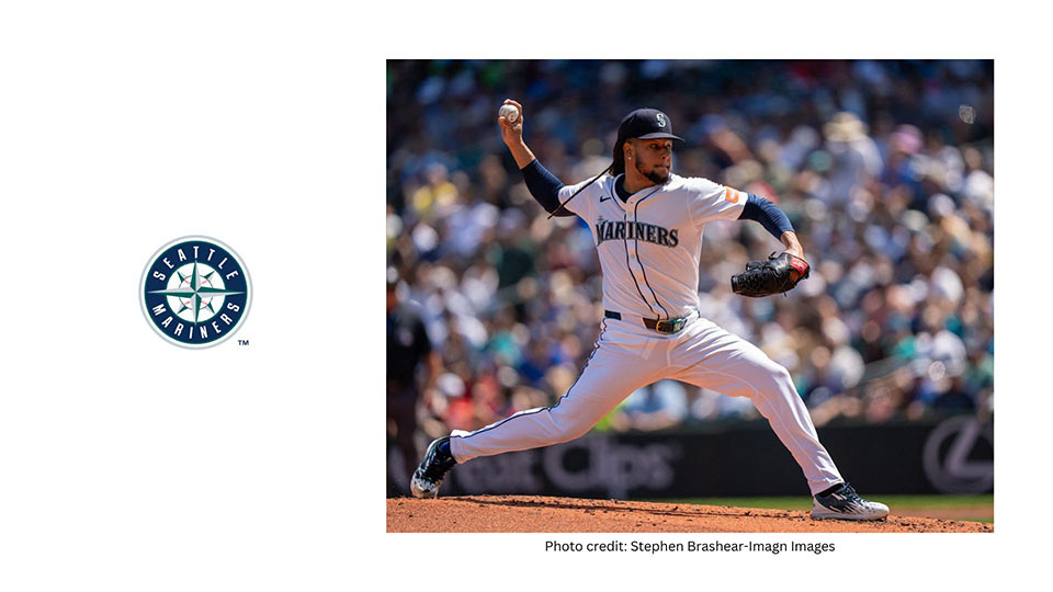
Few logos in the league tie geography, sport, and aesthetics together so well as this one.
Founded in 1876, the Chicago Cubs are one of the oldest and most storied franchises in Major League Baseball.
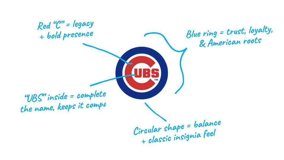
Known for their loyal fanbase and historic home at Wrigley Field, the Cubs represent a deep connection to America’s baseball legacy.
Their iconic “C” logo has become a timeless symbol in the world of sports, instantly recognizable both on and off the field.
The team finally ended their infamous championship drought in 2016, bringing home their first World Series title in over a century.
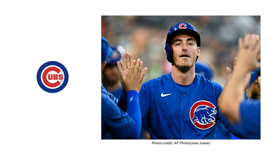
With generations of fans and a classic identity, the Cubs remain a staple of Chicago sports culture and one of the most beloved teams in baseball.
Founded in 1882, the St. Louis Cardinals are one of the most storied franchises in Major League Baseball.
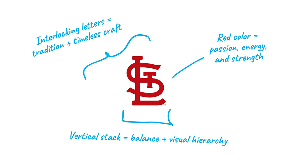
With 11 World Series titles, they’re second only to the Yankees in championships — a true powerhouse from the heart of the Midwest.
Their iconic “STL” monogram logo has stood the test of time, worn proudly across generations.
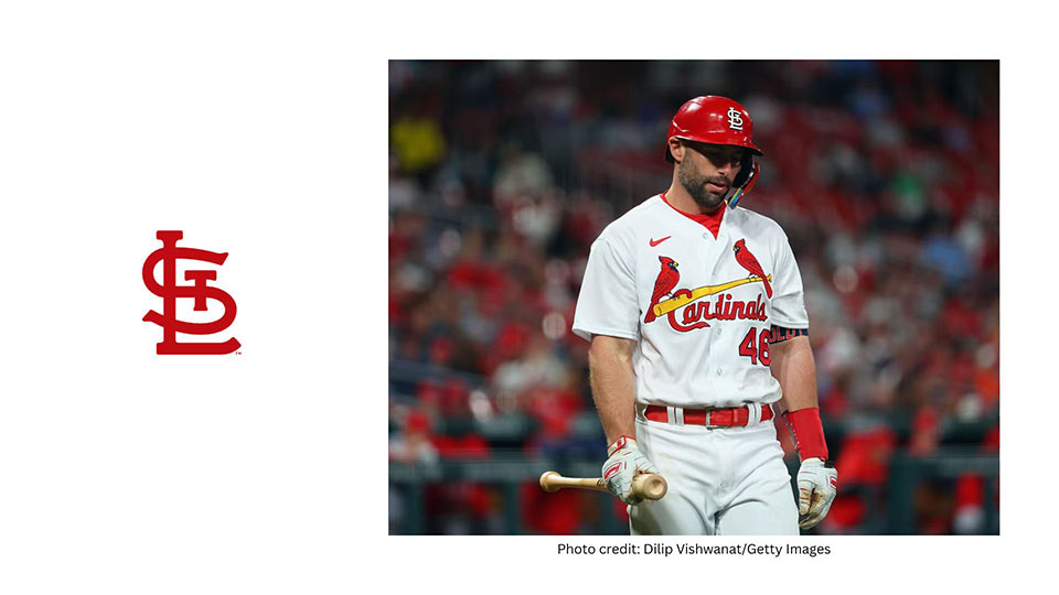
Whether it's on a crisp white jersey or a classic red cap, this logo is as much a part of baseball tradition as the game itself.
Pretty clever how they interlocked the S, L and T if you ask me.
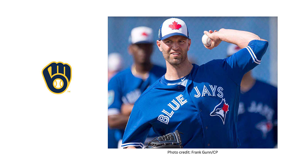
The Toronto Blue Jays are Canada’s only Major League Baseball team, and their logo proudly reflects that.
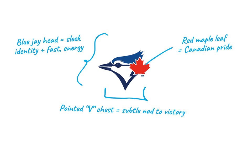
First introduced in 1977, the Blue Jays’ identity has always centered around their national pride and unique species mascot.
The current mark features a sleek blue jay head, stylized with clean, modern lines and accented by a bold red maple leaf — a direct nod to their Canadian roots.
The sharp lines give the bird an assertive, athletic presence, while the contrast of red and blue adds energy and distinction.
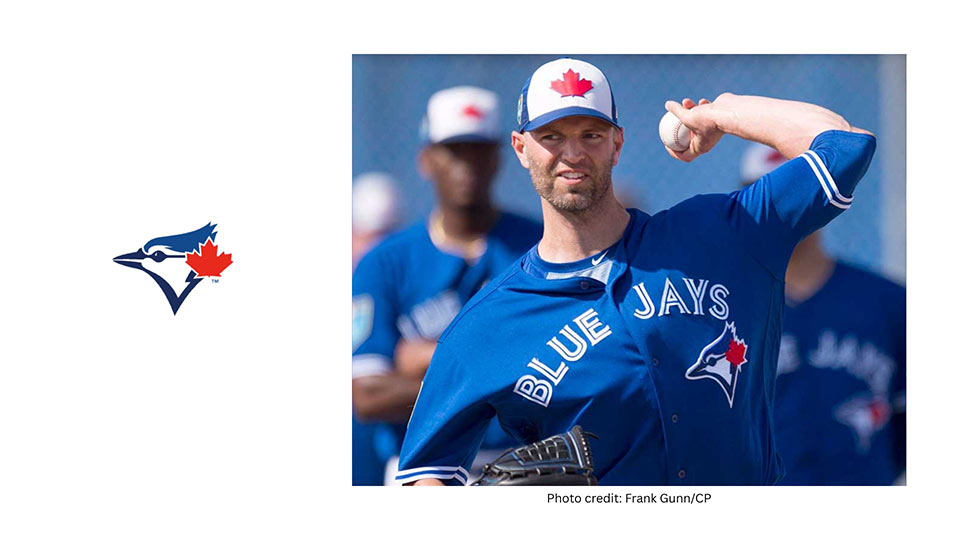
This is a logo that’s both fierce and patriotic — standing out in a league full of lettermarks and circular crests by embracing minimalism, movement, and national symbolism.
The Milwaukee Brewers’ logo is a stroke of design genius.
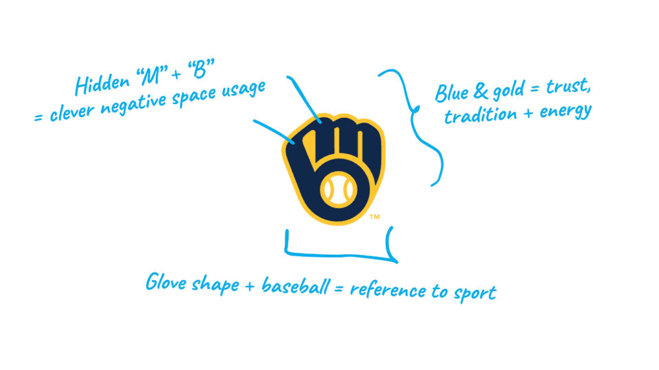
First introduced in 1978 and revived in 2020, this mark is a perfect blend of cleverness and clarity.
At first glance, it’s a baseball glove catching a ball—but look closer and you’ll see the letters “M” and “B” cleverly hidden in the negative space.
It’s one of the most iconic examples of visual wit in sports branding, beloved by fans and designers alike.
As a designer, there’s something deeply satisfying about dissecting these logos—not just for how they look, but for how well they communicate identity, tradition, and emotion in such compact, refined forms.
The best MLB logos don’t just represent teams—they represent cities, histories, and fan cultures.
Keep in mind that most teams also use secondary or even terciary logos along the ones I described above.
Whether it’s the timeless interlock of the Yankees NY logo, the clever wit of the Brewers’ glove, or the bold symbolism of the Blue Jays’ mark, each logo tells a different story.
Some are elegant and minimalist, others are packed with personality or hidden meaning—but the common thread is smart, intentional design.
In a league full of heritage and passion, these marks stand out not just for what they represent on the field, but for how well they work off it.
I'm a branding expert with nearly 20 years of experience.
While I don't necessarily specialize in sports logos, I do love designing for the corporate world.
Check out my work and schedule a call to discuss your project today.
As an Amazon Associate, I earn from qualifying purchases.


I'm a branding expert and graphic designer based in NY. I specialize in the development of brands: brand strategy, identity & web design. Need help with your project?—Get in touch