


Arek Dvornechuck
Branding Expert


Real Estate Branding in 2026: Complete Strategy Guide
.webp)


.webp)


In luxury real estate, branding isn't just about properties; it's about curating an entire lifestyle.
Successful branding and powerful logo transforms high-end residences into exclusive experiences that meet the needs of particular buyers.
sentence here
In this piece, I’ll show the best examples in luxury real estate branding.
This will give you insights on how the strategic blend of location, architectural excellence, and a compelling narrative can elevate a property from a transaction to a symbol of opulence and prestige.
I’ll also include jaw-dropping featured luxury properties of each brand.
Sotheby's International Realty is a leading luxury real estate name known for its high-end properties, global reach, and exceptional customer service.

The sleek and elegant design of the logo and the use of classic black and white colors convey a sense of sophistication and timelessness.
This style choice fits Sotheby's International Realty's image as a high-end and luxurious real estate company.
The typography in the Sotheby's International Realty logo is carefully chosen to enhance the overall visual appeal. The brand name is rendered in a clean font, bringing a sense of authority and professionalism.
Hilton & Hyland is the best luxury real estate company in Los Angeles.
It’s known for its excellent service, integrity, and ability to sell some of the most exclusive properties in Southern California.

The Hilton & Hyland mark is a classy design that brings to mind luxury and excellence.
The brand name is written in a sleek and modern font, but the "H" and "H" are placed beside each other to make a beautiful monogram make the logo stand out.
The clever design of the monogram not only reinforces the brand's identity but creates a sense of unity and easy collaboration.
This is similar to how Hilton & Hyland works with customers in the high-end real estate market.
Ann Dang, the designer, says that the logo is based on gates and refers to the high-end homes they focus on.
With a portfolio that includes everything from high-end homes in cities to luxurious vacation homes, Nest Seekers International prides itself on connecting clients with one-of-a-kind real estate opportunities.

The logo of Nest Seekers International symbolizes the forward-thinking and contemporary approach to real estate that the firm takes.
Elegantly representing the brand's commitment to nurturing and bringing clients together with their perfect homes, the logo showcases a stylized, abstract bird's nest.
Keller Williams Luxury International provides customers with access to some of the most prestigious homes globally through its extensive portfolio of unique properties and staff of skilled agents.
The company seamlessly blends local expertise with global reach, guaranteeing top-tier service.

Its sleek and elegant appearance reflects the brand's commitment to professionalism and unparalleled service.
The logo is more than a sign; it is an icon of distinction within the luxury real estate market, thanks to the combination of a recognizable monogram and an elegant color scheme.
By fusing the illustrious history of Christie's auction house with an unmatched dedication to marketing luxurious homes across the globe, Christie's International Real Estate has become the gold standard in luxury real estate representation.

Christie's International Real Estate logo is a sophisticated symbol that captures the brand's affinity with opulence and refinement.
The emblem, which features the illustrious name Christie's in sophisticated serif typography, represents the prestigious Christie's auction business's long history and illustrious reputation.
Adding "International Real Estate" beneath the primary logo emphasizes the firm's extensive worldwide presence in the high-end real estate industry.
The commitment to excellence is reflected in the entire design, which is clean, timeless, and easily recognizable.
In the Atlanta metropolitan region, Beacham & Company, Realtors stands out as a respected real estate firm known for its dedication to excellence and outstanding service.
They are renowned for their individualized approach, market expertise, and an excellent grasp of the diverse districts within Atlanta.
They specialize in representing luxury estates, including historic homes and high-end mansions.

In keeping with the firm's mission to represent Atlanta's most prestigious real estate properties, the logo for Beacham & Company, Realtors exudes an air of classic refinement.
Using a sophisticated and timeless font, the company's name highlights the brand's ties to heritage and superiority. The color scheme's use of deep blues and navy conveys professionalism and trustworthiness.
They have shown their commitment to creating a high-quality and visually appealing representation of their brand in the overall design, which is balanced and attractive.
Among Santa Barbara, California's leading real estate agencies, Village Properties is well-known for its commitment to building lasting relationships within the community and offering first-rate real estate services to its clients, specializing in residential, commercial, and luxury properties.

The Village Properties logo represents the firm's dedication to providing real estate services focused on the beautiful Santa Barbara community.
An elegant blend of contemporary and historical characteristics is achieved by placing the company name in a serifed, uppercase typeface, which lends an air of timeless refinement.
Corcoran is a legendary real estate company that has become a byword for opulent living in select areas thanks to its long and distinguished history.

The distinctive design features the company's name, "Corcoran," rendered in a sophisticated lowercase font.
The color palette is typically a combination of black and a color gradient of blue, yellow, and red that aligns seamlessly with the firm's creative and colorful mission.
RE/MAX, an abbreviation for "Real Estate Maximums," is a world-famous real estate business that has made a name for itself by empowering its agents and brokers.

With the firm name in a simple uppercase font, the logo conveys professionalism and reliability while being instantly recognized.
The RE/MAX logo has grown into a symbol of success over the years, reflecting the worldwide reach of the business and its dedication to equipping agents to succeed in the real estate industry.
Dedicated to providing exceptional service and high-end properties, The Agency has become the industry's leading real estate firm.
The firm has opened offices in important regions worldwide, supporting its headquarters in Beverly Hills, California.

The logo features a sleek, uppercase rendering of the company's name, "The Agency," in a clean and contemporary font.
Accompanying the text is a unique geometric icon of the letters “T” and “A,” often resembling an abstract roofline or building structure, which adds a visual element to the brand's identity.
The esteemed realty firm Slifer, Smith & Frampton (SSF) has made an everlasting impression on the realty scene in Colorado mountain resorts.
As an industry leader, SSF has become a byword for luxury real estate in highly desirable mountain areas like Vail, Breckenridge, and Beaver Creek.
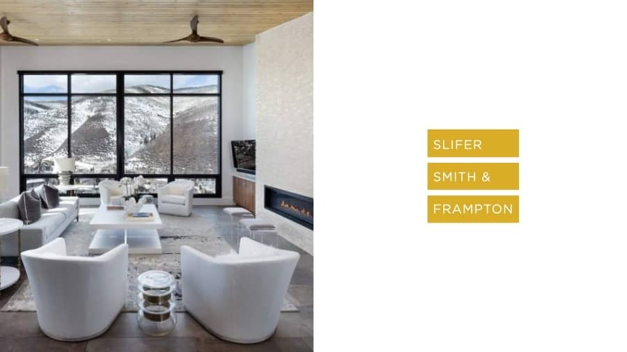
The distinctive logo of Slifer, Smith & Frampton (SSF) symbolizes the firm's dedication to the beautiful landscapes it serves.
The clean lines and simplicity of the design give a sense of timelessness. The color palette often includes a golden yellow hue with earthy tones to incorporate the natural beauty of the landscape they represent.
Legendary real estate agent Ebby Halliday started Ebby Halliday, Realtors in 1945 to serve clients in the Dallas–Fort Worth area with unmatched knowledge and service.
The Dallas, Texas-based company has expanded into a major player in the US independent real estate market.

The logo features a scripted letter "E," often with a classic red background.
The signature-style script adds a personal touch, evoking a sense of trust and familiarity.
Design choices that are both classic and sophisticated demonstrate an adherence to tradition.
To sum up, the world of high-end real estate is defined by brands that represent more than just deals; they embody lifestyle and a commitment to excellence.
Logos, unique visual identities, and dedication to service excellence generate an impression that clients remember, appealing to those looking for more than a place to live.
Also, take a look at the branding I did for AMI Corp, a real estate company in India.

AMI Corporation is an Indian company based in Ahmedabad that builds homes.
To help them grow and expand even more, I helped them update their identity system, organize their sub-brands, and develop a tagline and brand story.
Thanks to this article, I was able to land AMI Corp as a client and design their new logo, brand identity, and website.
As a branding expert based in Brooklyn, I create unique, memorable identities that connect with your target audience.
Let's elevate your real estate brand to new heights—email me today!
As an Amazon Associate, I earn from qualifying purchases.


I'm a branding expert and graphic designer based in NY. I specialize in the development of brands: brand strategy, identity & web design. Need help with your project?—Get in touch