

Blog
Logo Design
45 Best Venture Capital Logos Explained by a Brand Designer [2026]
Published on Nov 22, 2026
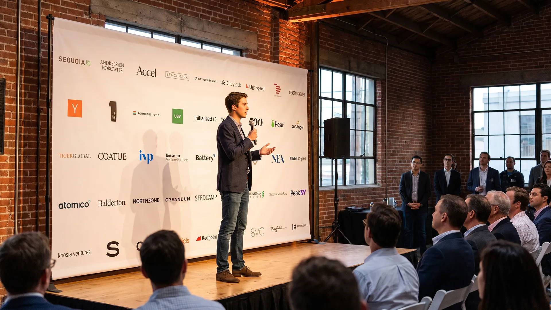
A venture capital logo has a strange job. It has to win the trust of pension funds and university endowments that give the firm money, and at the same time feel exciting to young founders choosing who to take money from. It shows up on term sheets, demo day banners, podcasts, founder hoodies and the "backed by" section of every startup website. The best venture capital logos are simple, confident and founder-friendly.
What makes a good venture capital logo?
It looks like the startups it backs: many VC firms now look more like tech brands than banks, with modern sans serifs, bright colour and app-like icons, from Y Combinator's orange square to Union Square Ventures' green tile.
It works small: a VC logo often appears in a row of investor logos on a startup's website, so it has to stay readable at a tiny size next to its competitors.
It tells a short story: trees, mountains, numbers and Latin words, like Sequoia, Greylock, First Round, Point Nine and Felicis, give a firm something to talk about.
Below are 45 venture capital logos in five groups: Silicon Valley legends, seed funds and accelerators, growth and multistage investors, European and global firms, and specialist VCs. Each logo has a slide with my handwritten notes and a short explanation. For more finance brands, see my private equity logos, investment firm logos and fintech logos, and for founders, my tech startup logos and SaaS logos.
45 venture capital logos
The boards below show all 45 venture capital logos in one consistent format, grouped into Silicon Valley legends, seed funds and accelerators, growth investors, European and global firms, and specialist VCs.
Each logo is reviewed for its design decisions, not for the returns, size or reputation of the firm.
01 — Silicon Valley legends
The firms that built Silicon Valley mostly use confident wordmarks, often with a small symbol tied to their name, like Sequoia's tree or Greylock's mountain.
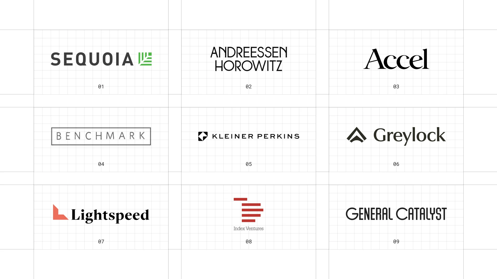
This is a visual comparison of venture capital logos, not a ranking of firms.
Look at how each logo uses type, colour and one symbol to speak to both investors and founders.
01 Sequoia Capital
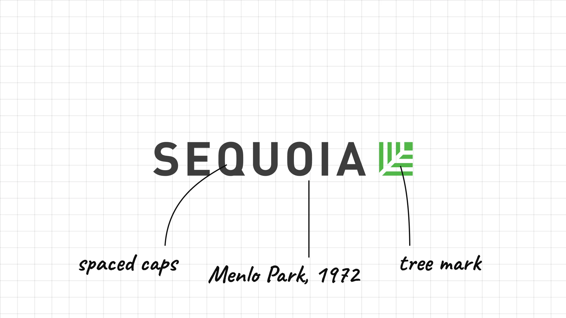
Sequoia Capital Don Valentine founded Sequoia Capital in Menlo Park, California, in 1972.
Spaced, heavy capitals sit next to a small green mark inspired by the sequoia tree.
Naming the firm after a tree that grows for thousands of years is a statement about long-term thinking.
02 Andreessen Horowitz
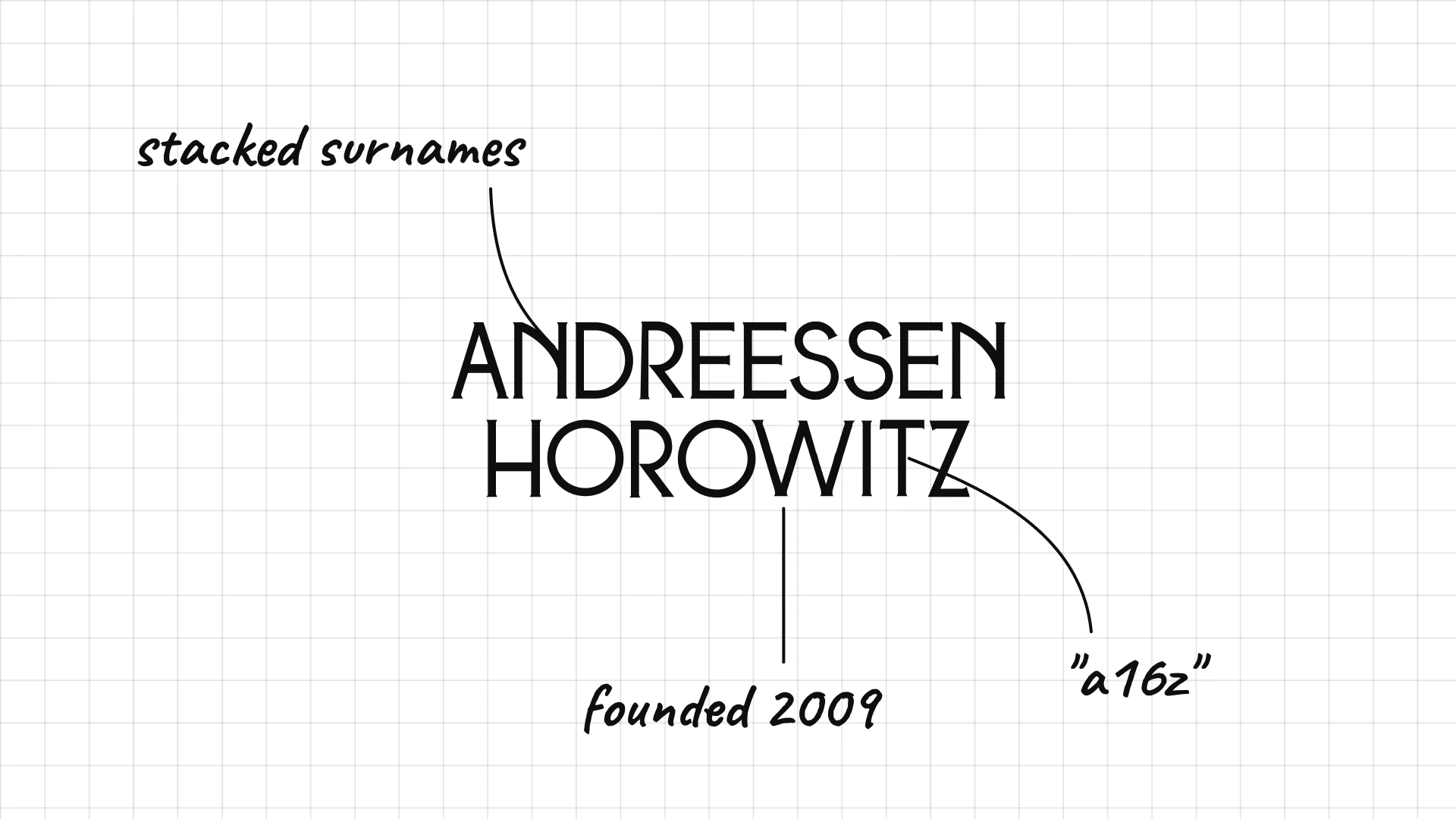
Andreessen Horowitz Marc Andreessen and Ben Horowitz founded the firm in 2009.
Two tall stacked surnames turn a long name into a block of type.
The firm is better known as a16z, short for the 16 letters between the a and the z.
03 Accel
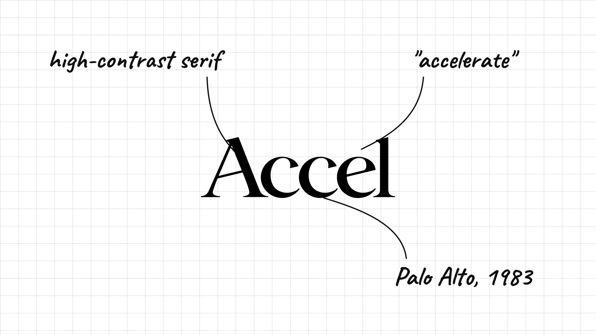
Accel Arthur Patterson and Jim Swartz founded Accel in Palo Alto in 1983.
A heavy, high-contrast serif makes a short name look bold and editorial.
The name is a shortened form of accelerate, which suits a firm that funds fast-growing companies.
04 Benchmark
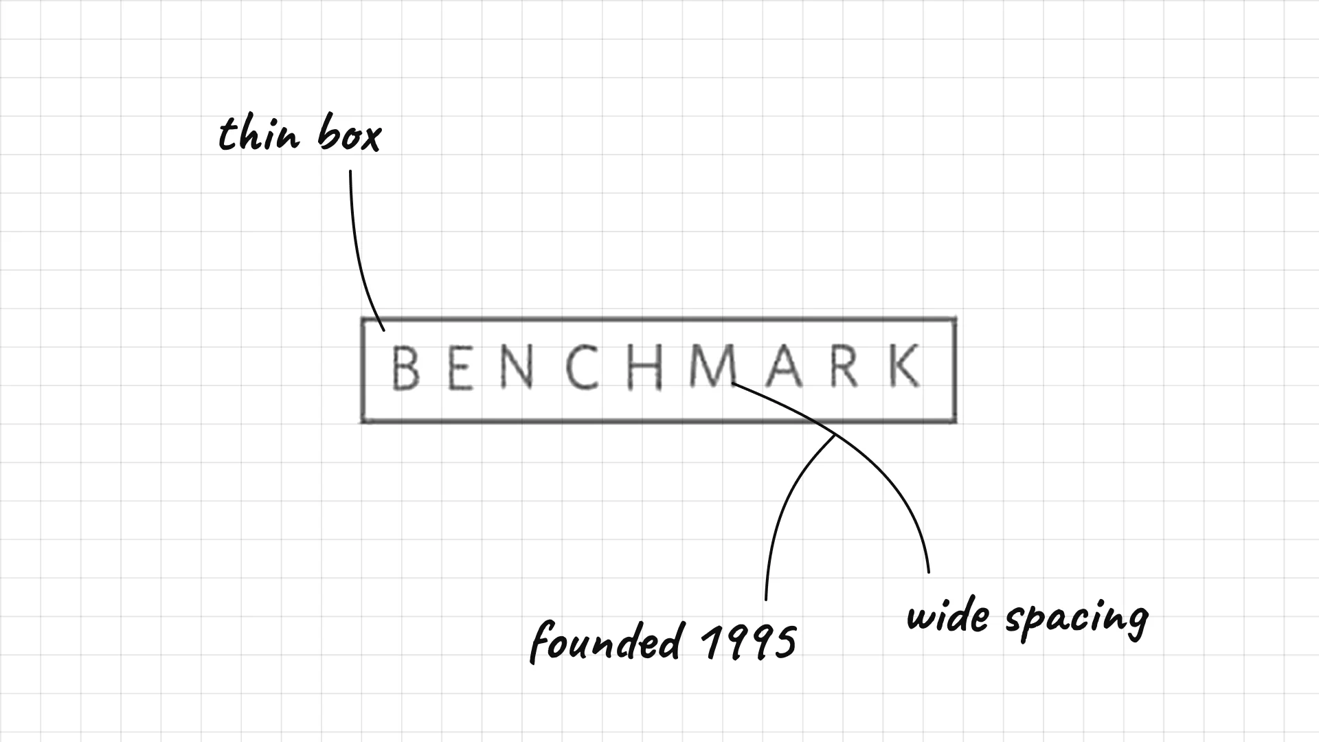
Benchmark was founded in 1995 and is known for backing eBay, Uber and Twitter early.
Very widely spaced capitals sit inside a thin box.
The quiet logo suits a small partnership that avoids publicity.
05 Kleiner Perkins
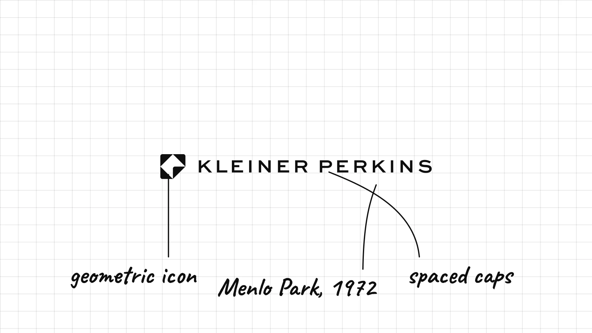
Kleiner Perkins Eugene Kleiner and Tom Perkins founded the firm in Menlo Park in 1972.
A small geometric icon sits next to widely spaced capitals.
The two founders' names became one of the most famous brands in Silicon Valley.
06 Greylock
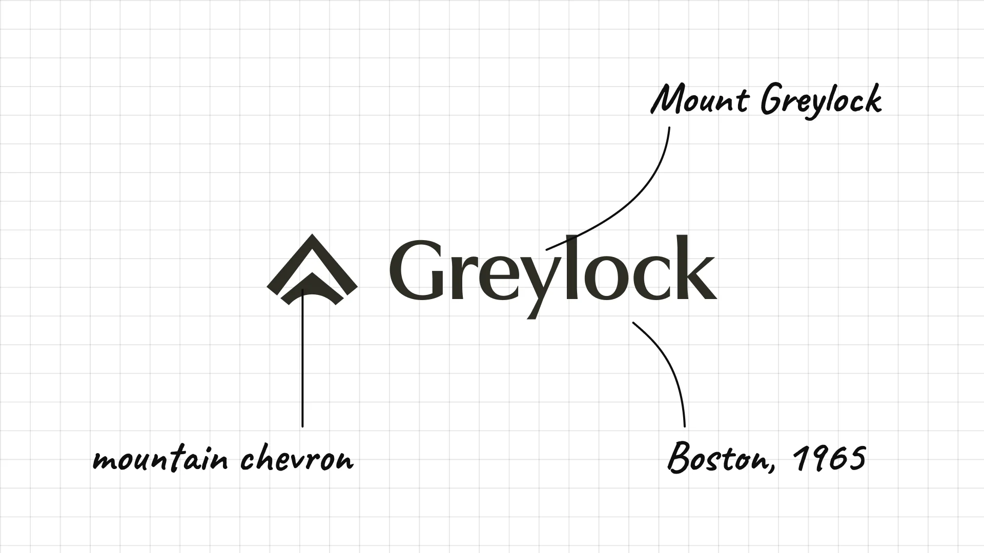
Greylock was founded in Boston in 1965, making it one of the oldest venture capital firms.
A chevron icon looks like a mountain peak.
The name comes from Mount Greylock, the highest point in Massachusetts.
07 Lightspeed
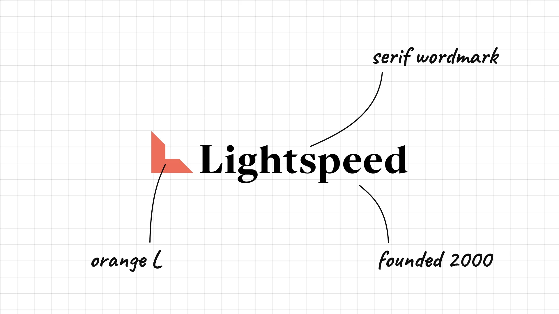
Lightspeed Venture Partners was founded in 2000.
An orange L-shaped mark looks like a corner or a step.
The serif wordmark balances a fast name with a traditional feel.
08 Index Ventures
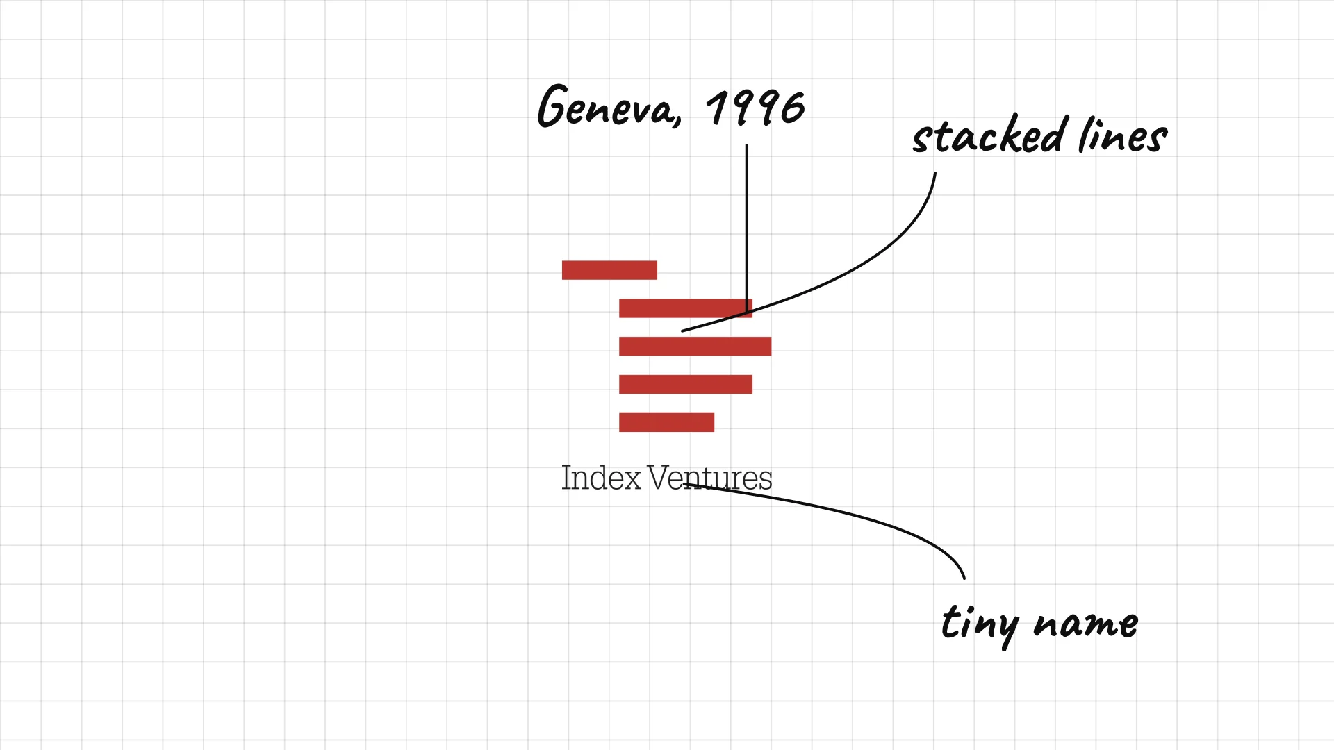
Index Ventures was founded in Geneva in 1996 and now invests from London and San Francisco.
Red stacked lines look like an index or a list.
The tiny wordmark under the mark keeps the symbol in charge.
09 General Catalyst
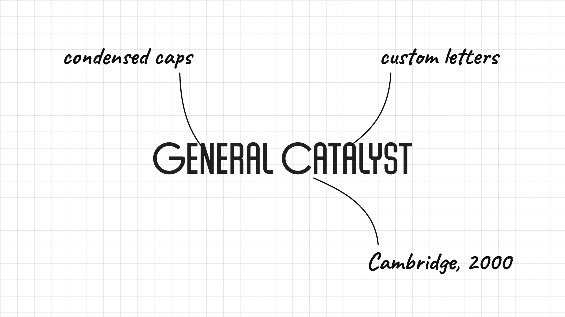
General Catalyst was founded in Cambridge, Massachusetts, in 2000.
Tall, condensed capitals with special letter shapes feel engineered.
The custom lettering looks more like a tech brand than a finance firm.
02 — Seed funds and accelerators
Seed investors and accelerators speak directly to founders, so their logos are the most playful, with app icons, cursors, pears and halos.
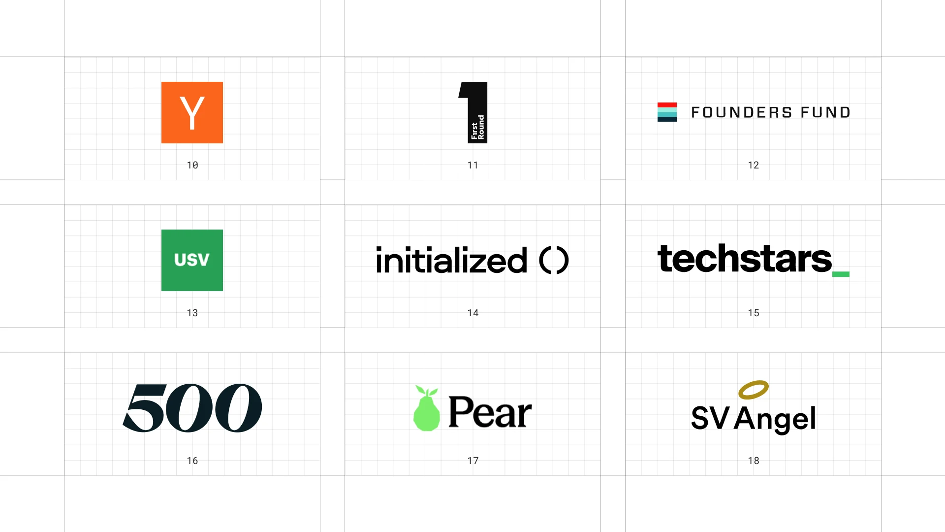
This is a visual comparison of venture capital logos, not a ranking of firms.
Look at how each logo uses type, colour and one symbol to speak to both investors and founders.
10 Y Combinator
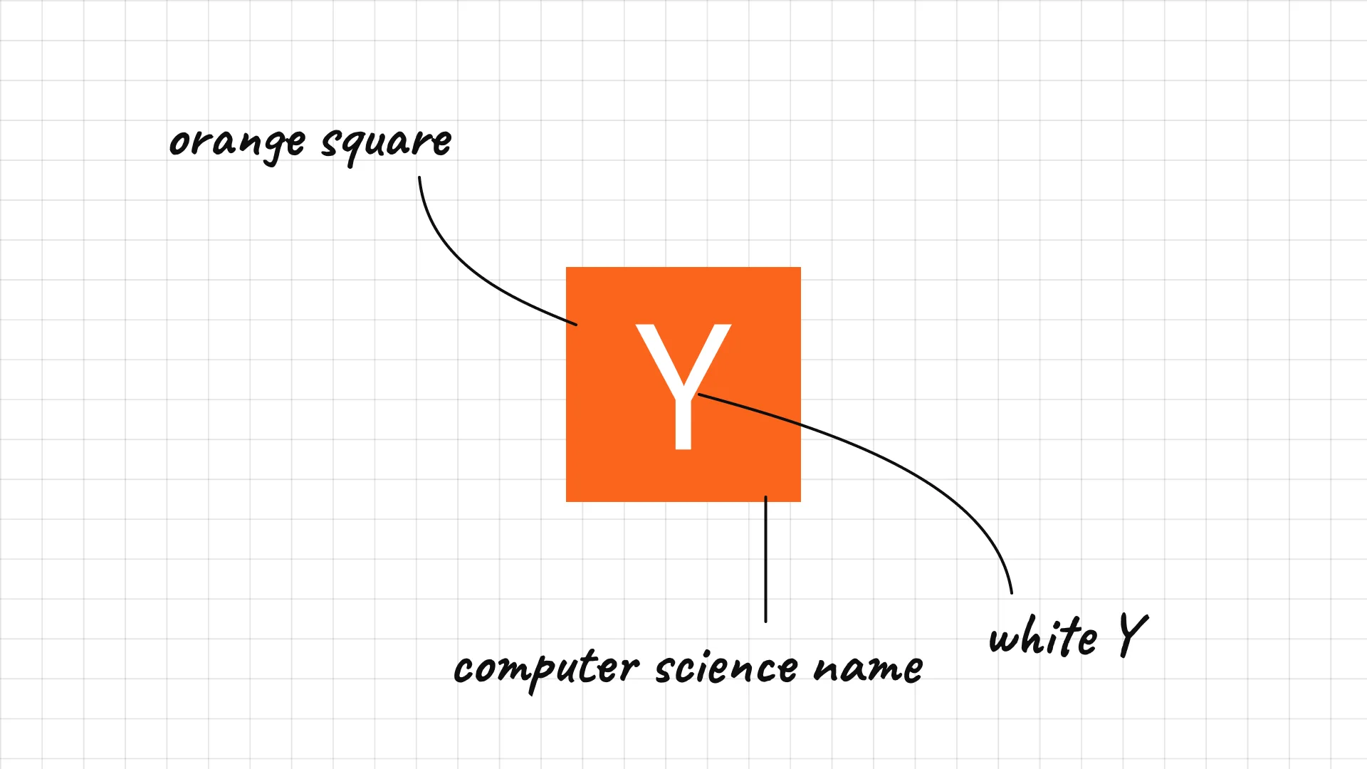
Y Combinator Paul Graham, Jessica Livingston, Robert Morris and Trevor Blackwell founded Y Combinator in 2005.
A white Y in an orange square is one of the most recognisable startup symbols.
The name comes from a function in computer science, a nod to its programmer founders.
11 First Round Capital
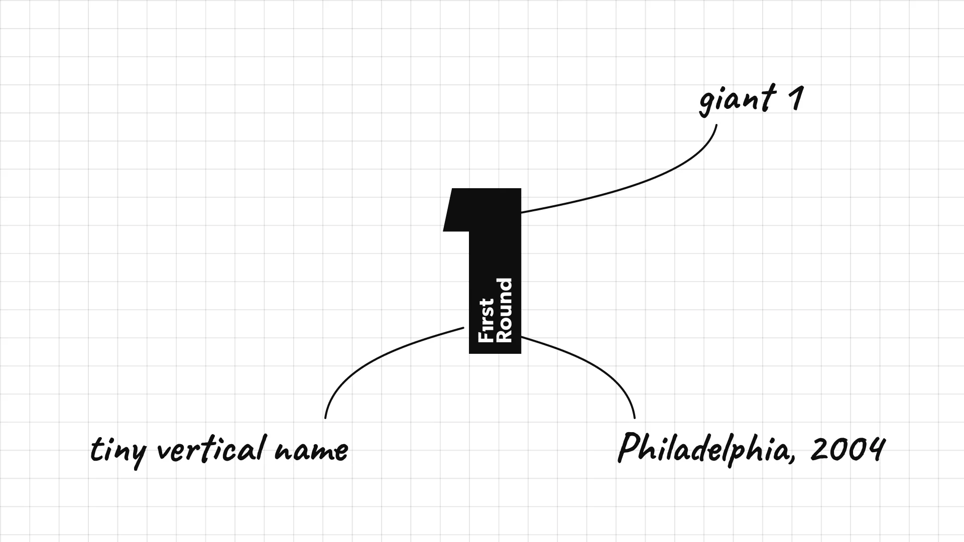
First Round Capital Josh Kopelman founded First Round Capital in Philadelphia in 2004.
A giant number 1 is the whole logo.
Tiny vertical text inside the 1 spells out the name.
12 Founders Fund
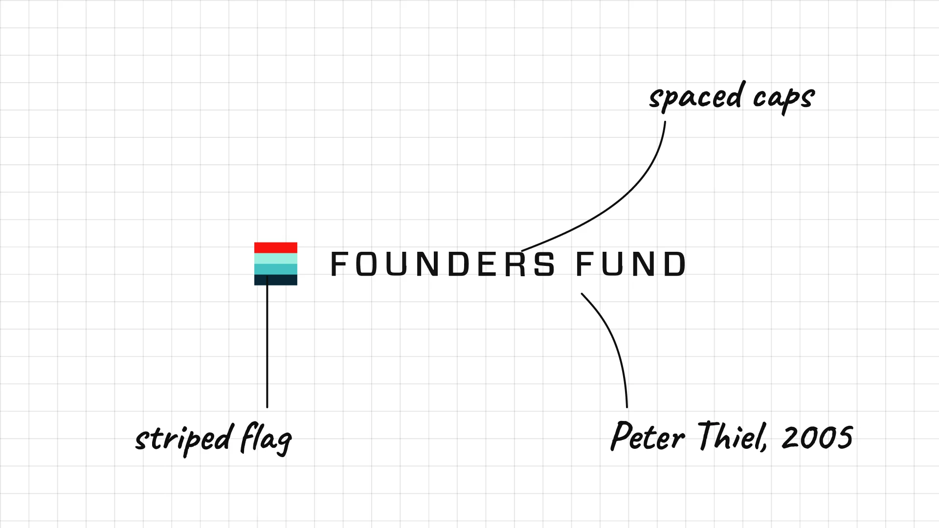
Founders Fund Peter Thiel, Ken Howery and Luke Nosek founded Founders Fund in San Francisco in 2005.
A small striped flag sits next to spaced capitals.
The colourful stripes add a playful touch to a very confident firm.
13 Union Square Ventures
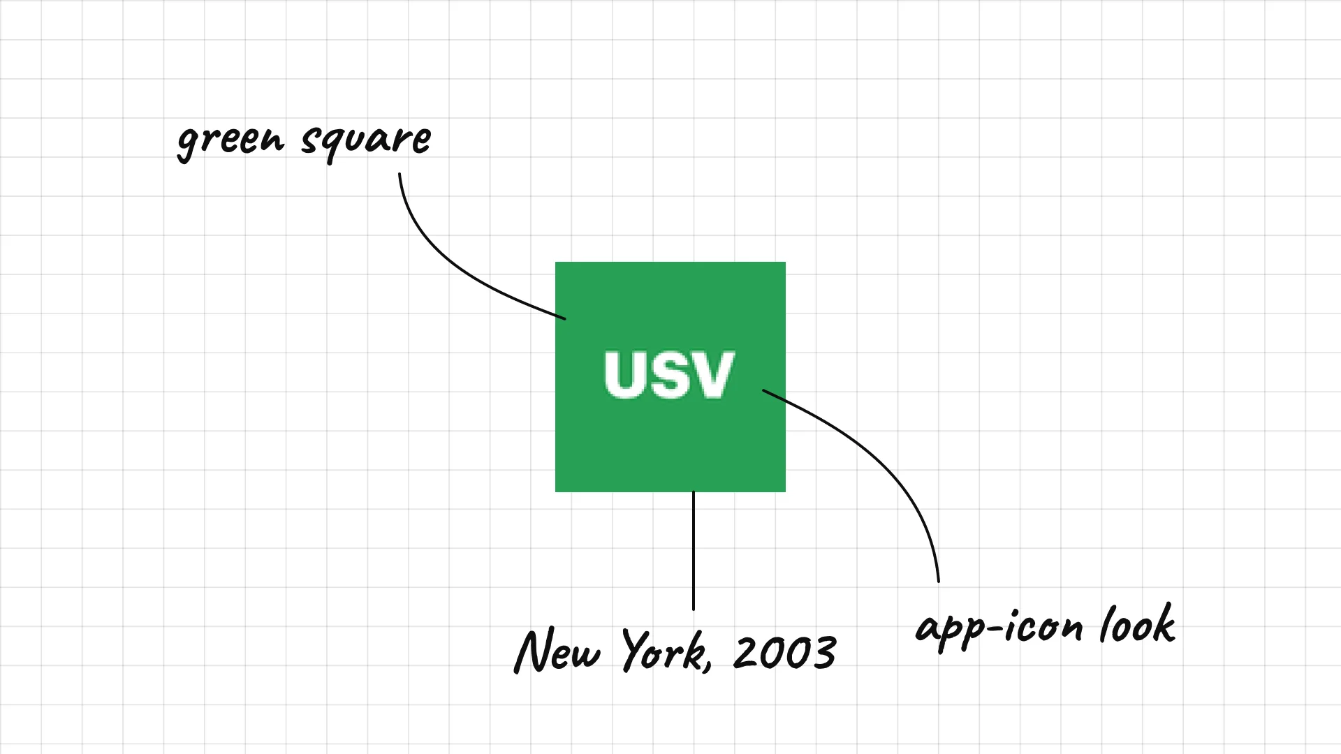
Union Square Ventures Fred Wilson and Brad Burnham founded Union Square Ventures in New York in 2003.
USV in white on a green square looks like an app icon.
The firm is named after the Manhattan square near its office.
14 Initialized Capital
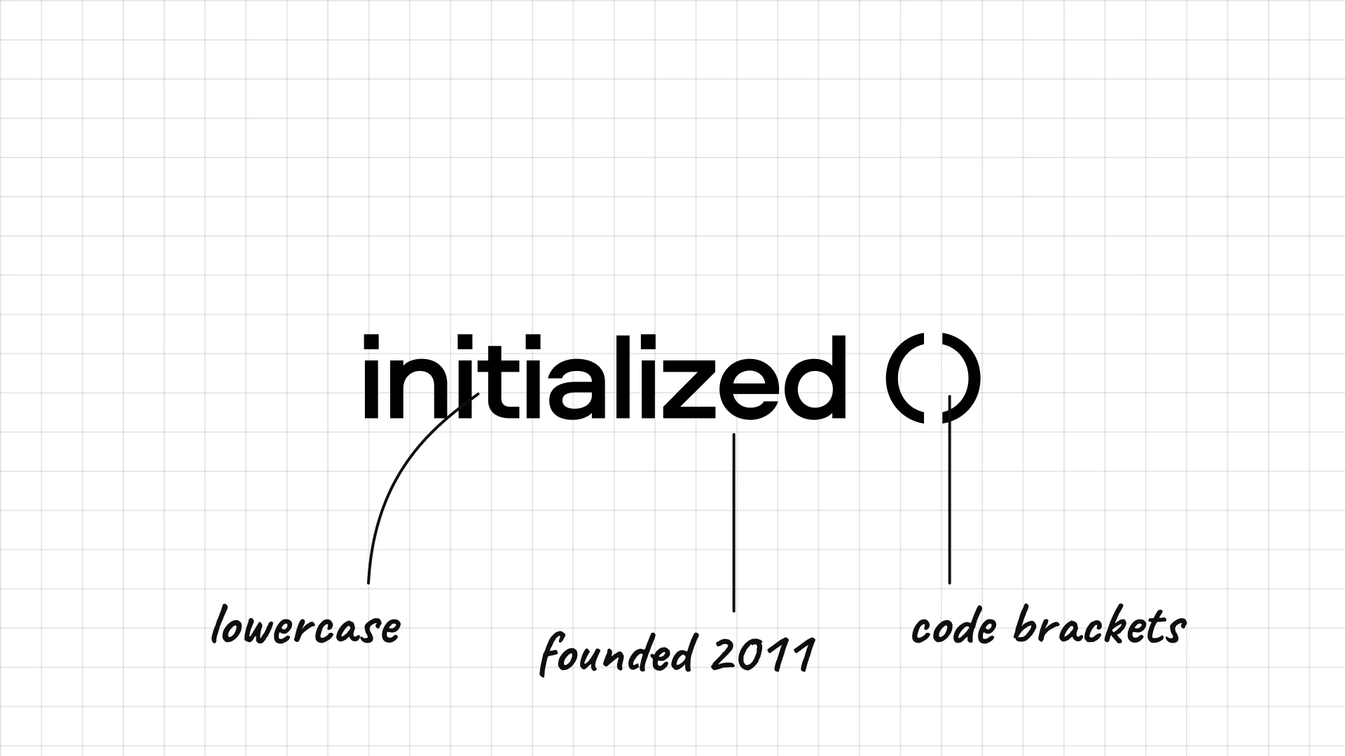
Initialized Capital Garry Tan and Alexis Ohanian founded Initialized Capital in 2011.
Lowercase type with round brackets looks like a line of code.
The name is a programming term, which suits a firm founded by engineers.
15 Techstars
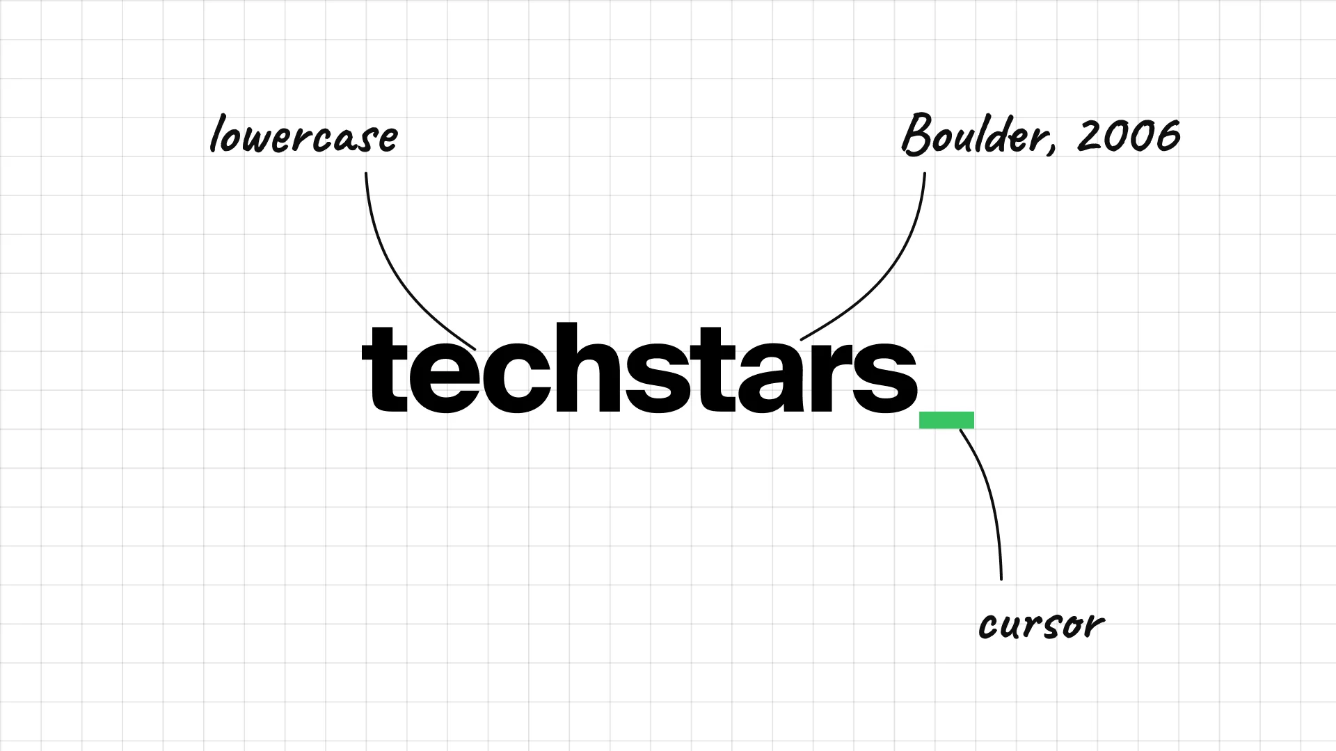
Techstars was founded in Boulder, Colorado, in 2006.
Lowercase letters end in a green underscore, like a blinking cursor.
The cursor detail turns a simple wordmark into a tech reference.
16 500 Global
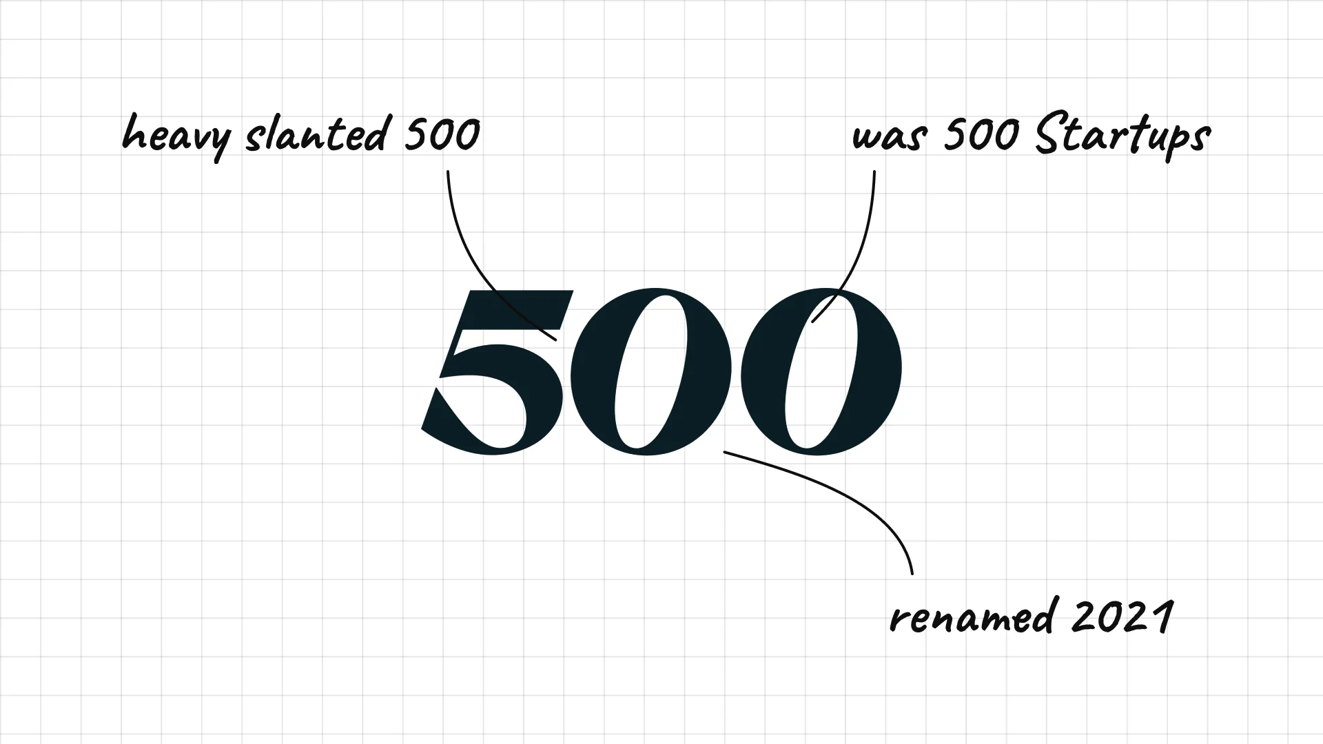
500 Global Dave McClure and Christine Tsai founded the firm as 500 Startups in 2010, and it was renamed 500 Global in 2021.
A heavy, slanted 500 is the whole logo.
Dropping "Startups" from the name let the number stand on its own.
17 Pear VC
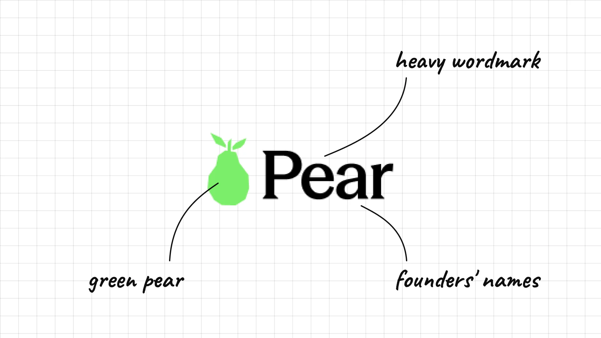
Pear VC Pejman Nozad and Mar Hershenson founded Pear VC in 2013.
A green pear sits next to a heavy wordmark.
The name blends the founders' first names into a simple fruit.
18 SV Angel
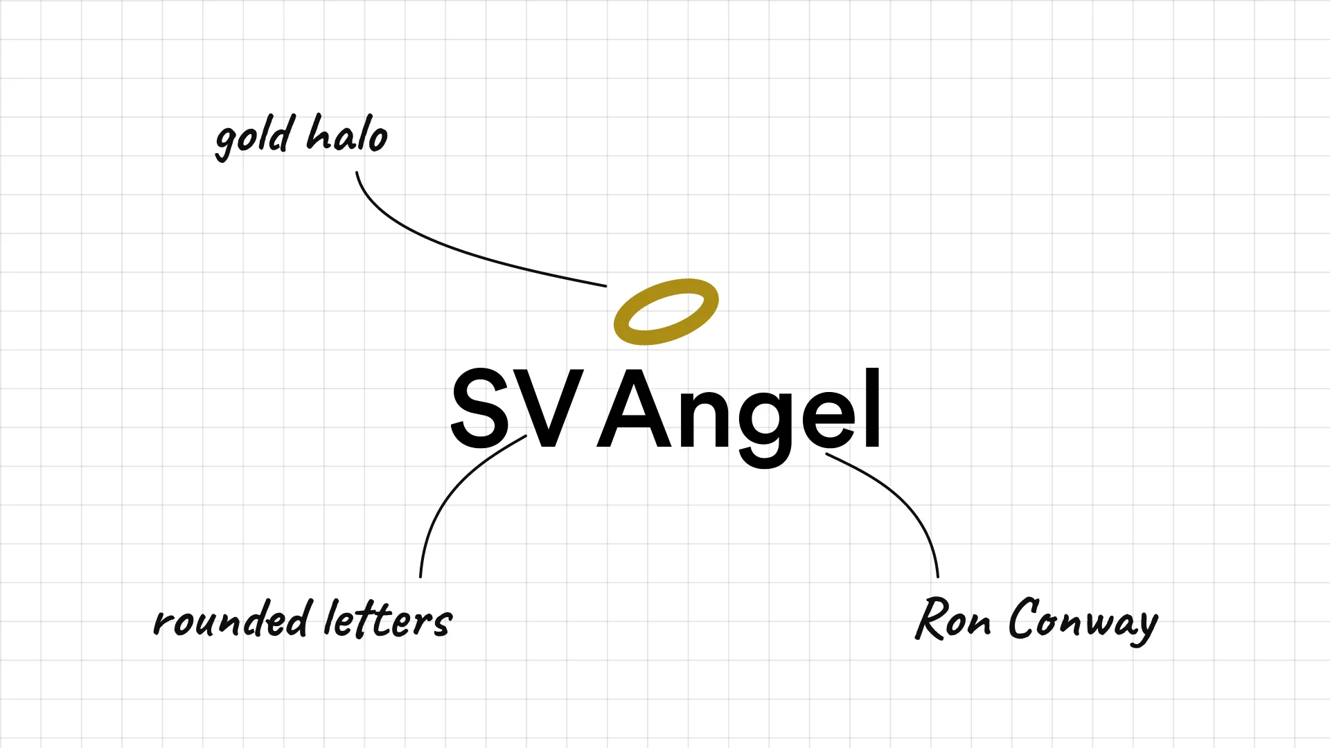
SV Angel Ron Conway founded SV Angel, one of Silicon Valley's best-known seed investors.
A gold halo floats above the name, a picture of the word angel.
Rounded, friendly letters make the firm feel approachable.
03 — Growth and multistage investors
Growth investors sit closer to Wall Street, mixing serif type and initials with a few bold, modern marks.
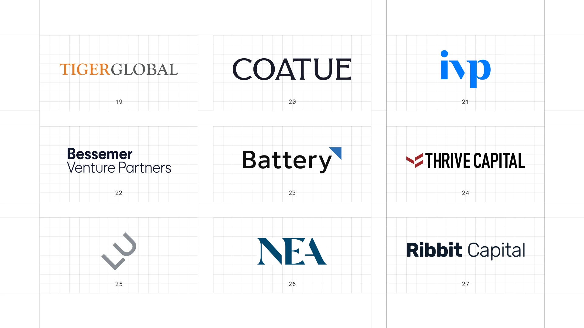
This is a visual comparison of venture capital logos, not a ranking of firms.
Look at how each logo uses type, colour and one symbol to speak to both investors and founders.
19 Tiger Global
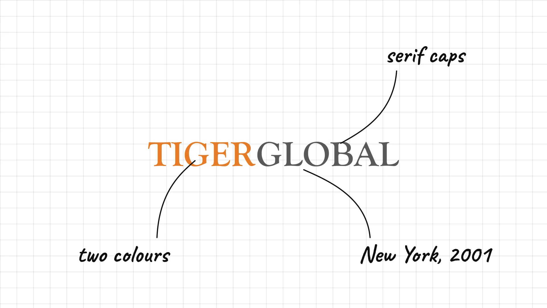
Tiger Global Chase Coleman founded Tiger Global in New York in 2001.
Two words in contrasting colours split tiger and global.
The serif capitals feel more like a hedge fund than a startup brand.
20 Coatue
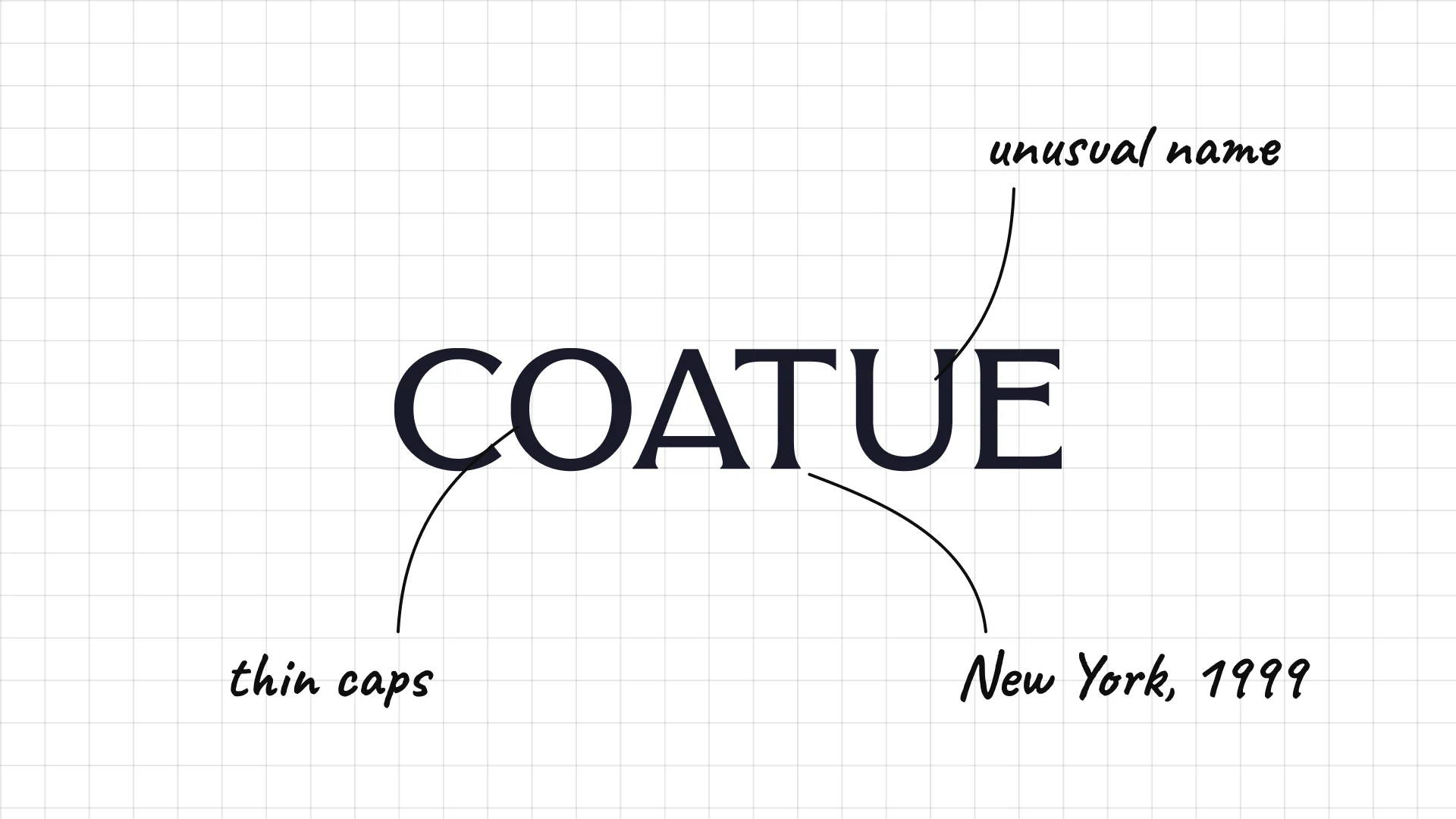
Coatue Philippe Laffont founded Coatue in New York in 1999.
Thin, spaced capitals keep the logo very quiet.
The unusual name is easy to remember even without a symbol.
21 IVP
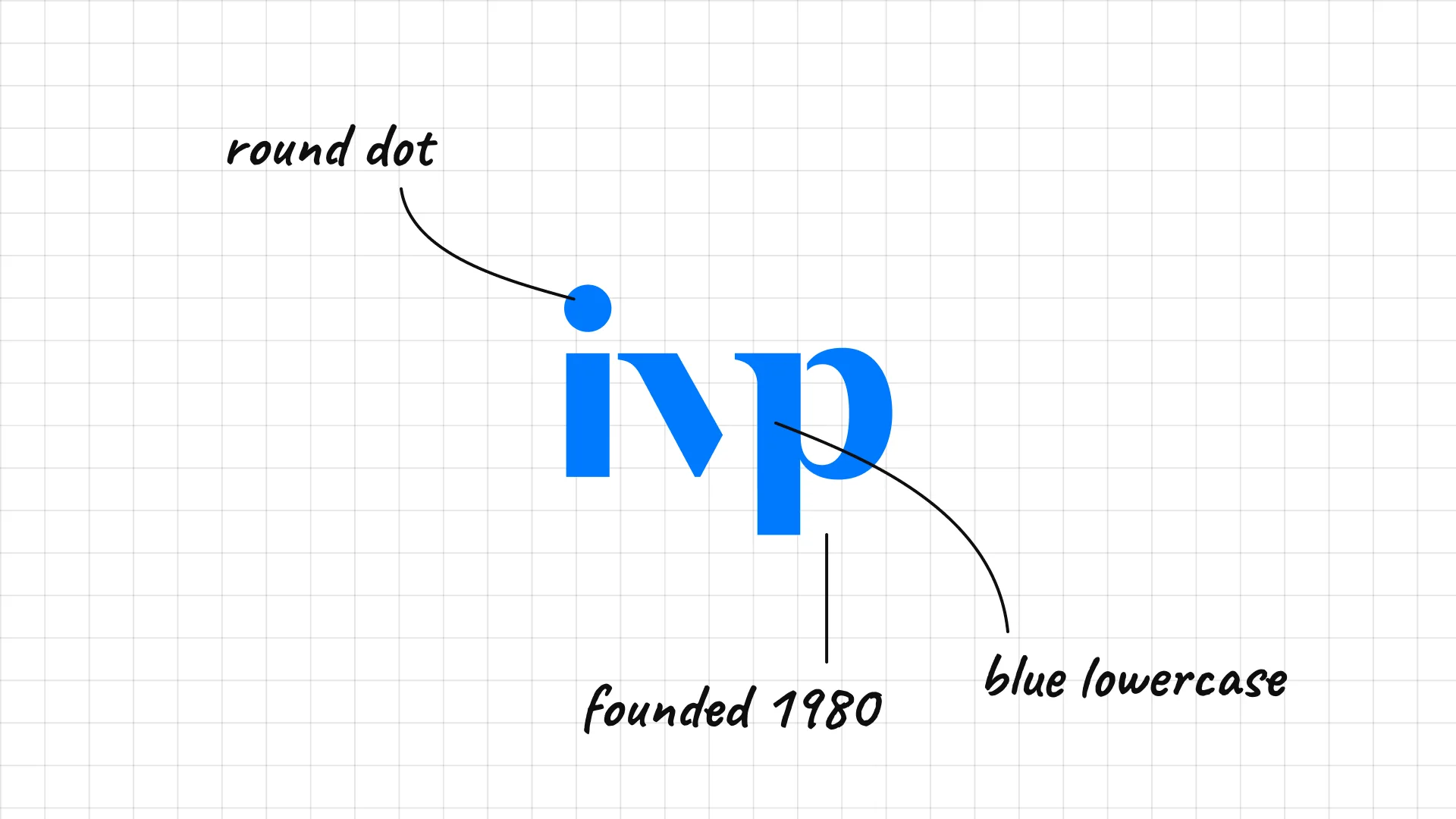
IVP was founded in 1980 as Institutional Venture Partners.
Bold blue lowercase letters feel friendly and modern.
The dot over the i is a full circle, like a period.
22 Bessemer Venture Partners
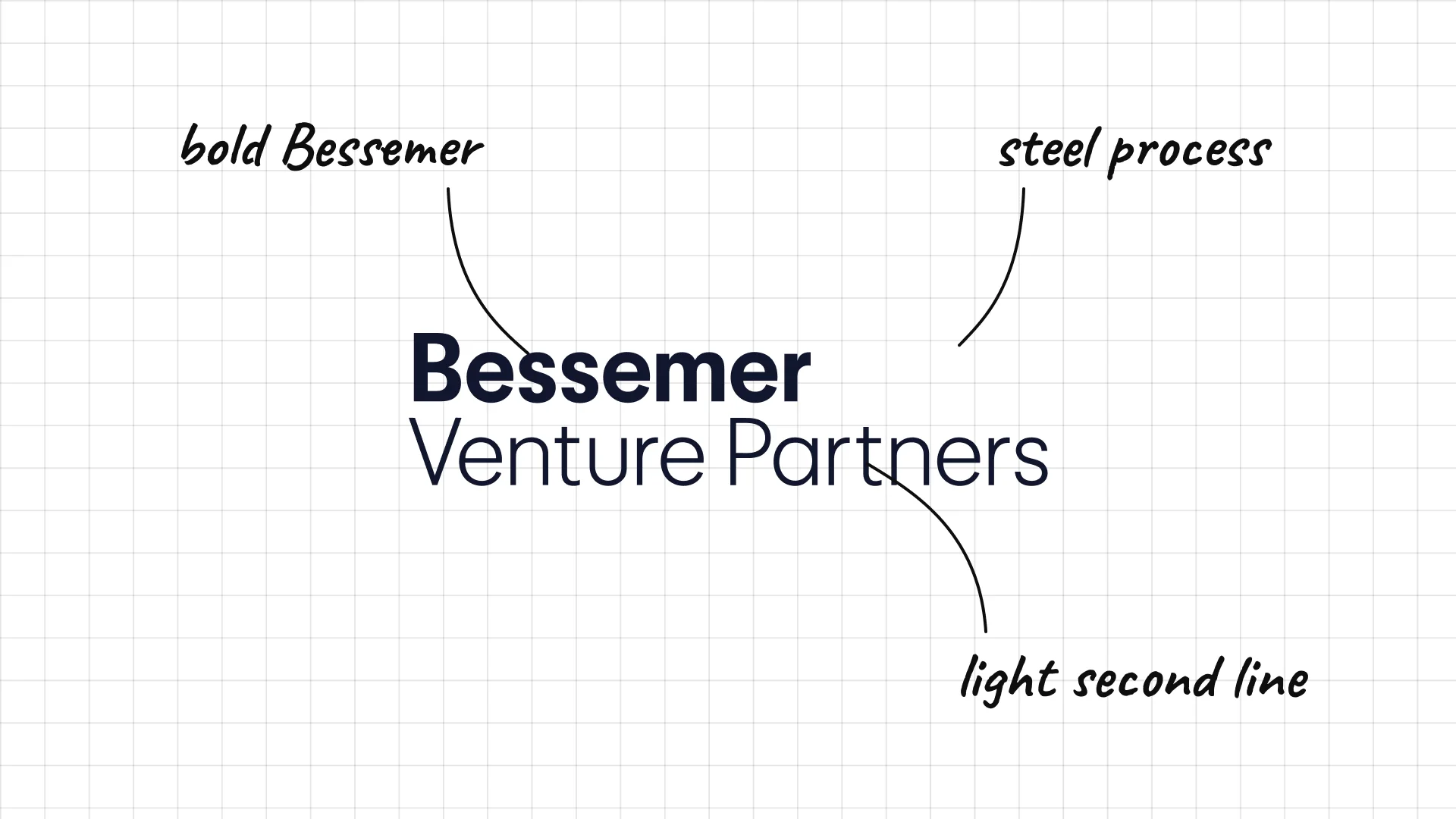
Bessemer Venture Partners Bessemer traces its roots to 1911 and the fortune of Henry Phipps, who made his money in steel.
Bessemer in bold over Venture Partners in light type splits the name clearly.
The name comes from the Bessemer steel-making process.
23 Battery Ventures
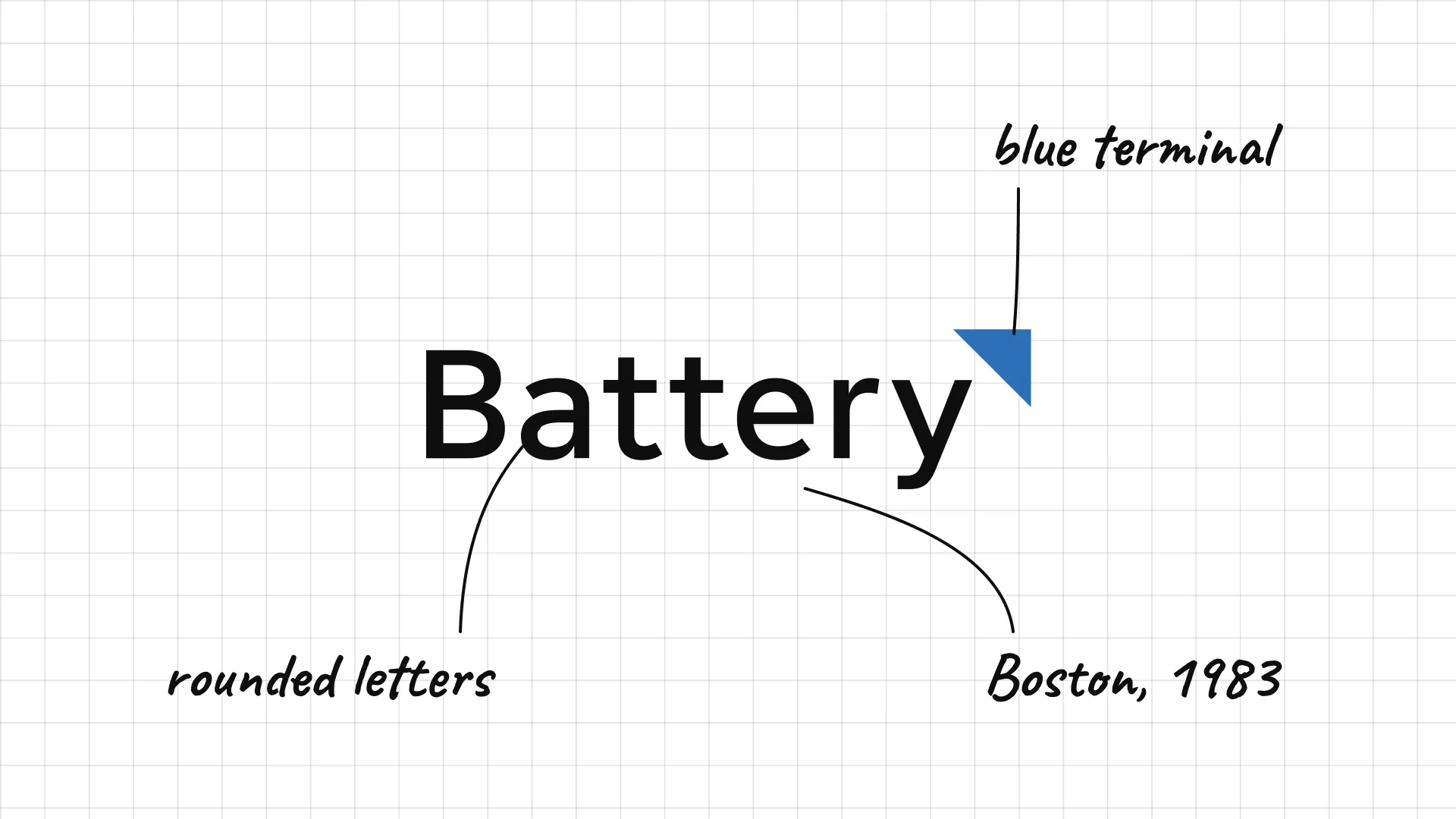
Battery Ventures was founded in Boston in 1983.
A blue triangle in the corner of the y looks like a battery terminal.
Rounded letters feel friendly and energetic.
24 Thrive Capital
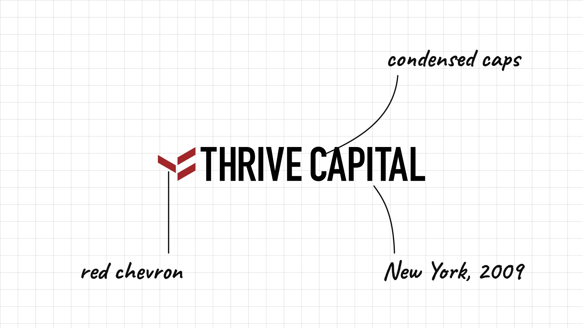
Thrive Capital Joshua Kushner founded Thrive Capital in New York in 2009.
A red chevron points forward like an arrow.
Condensed capitals give the long name a compact, confident shape.
25 Lux Capital
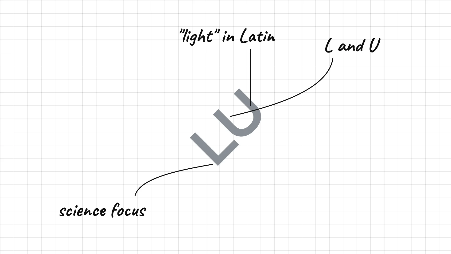
Lux Capital Josh Wolfe and Peter Hébert founded Lux Capital in New York in 2000.
An angular mark combines the letters L and U.
Lux means light in Latin, a hint at the firm's focus on science.
26 NEA
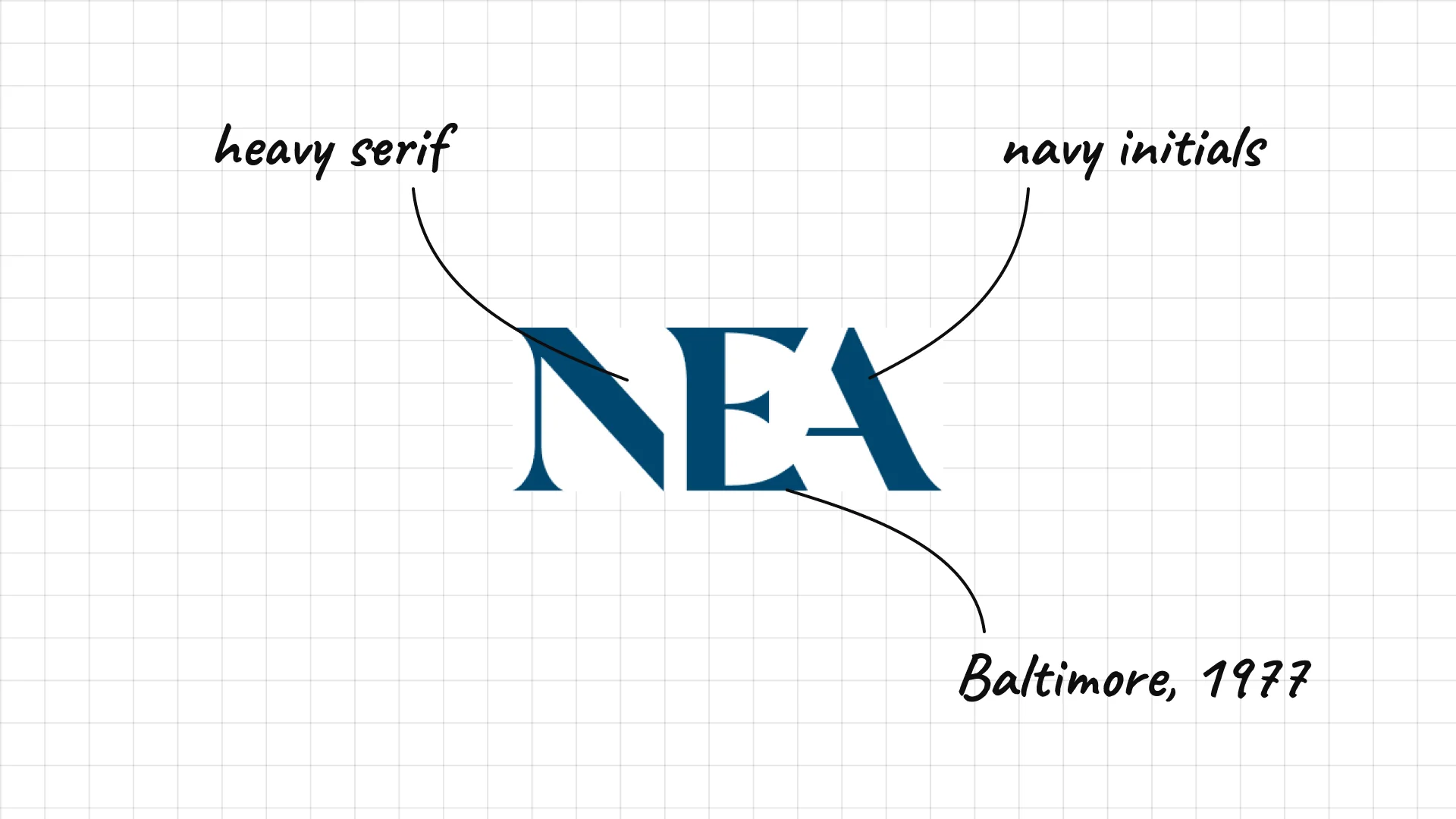
NEA was founded in Baltimore in 1977 as New Enterprise Associates.
Huge, heavy serif capitals feel bold and established.
Navy and white make the initials feel like a classic institution.
27 Ribbit Capital
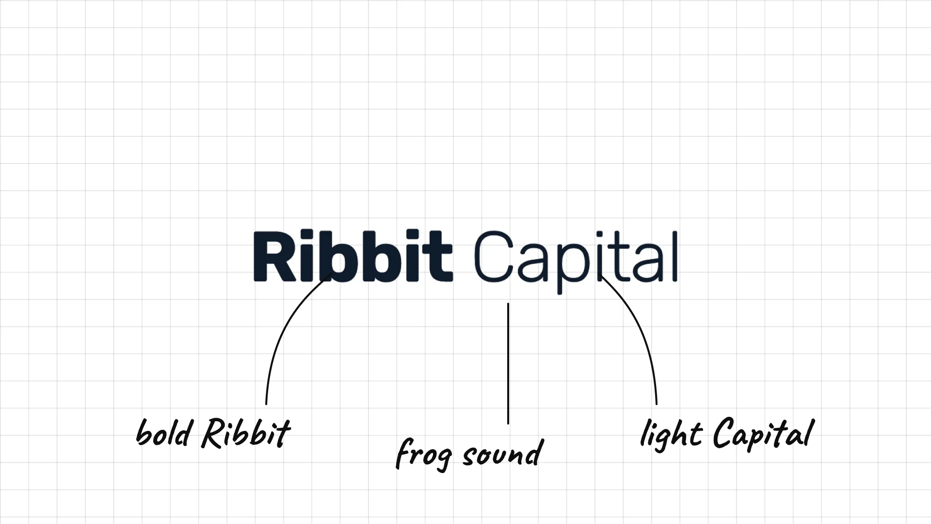
Ribbit Capital Micky Malka founded Ribbit Capital in Palo Alto in 2012 to invest in fintech.
A bold Ribbit next to a light Capital splits the name in two.
The name is the sound a frog makes, an unusual choice for an investor.
04 — European and global venture firms
European and global firms often look calmer and more design-led, with lowercase type, careful spacing and small colour accents.
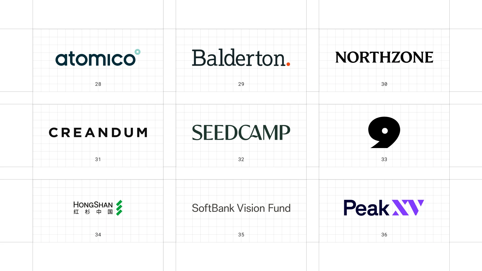
This is a visual comparison of venture capital logos, not a ranking of firms.
Look at how each logo uses type, colour and one symbol to speak to both investors and founders.
28 Atomico
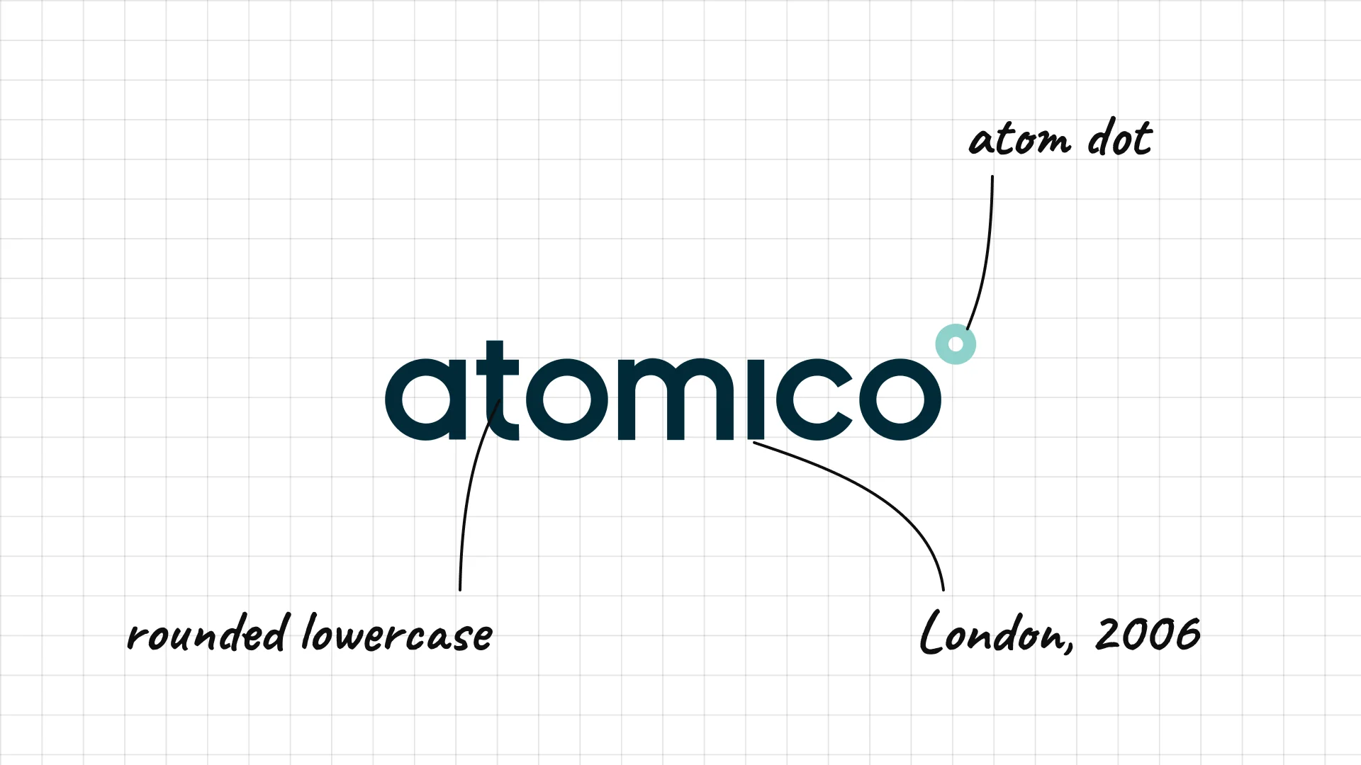
Atomico Niklas Zennström, a co-founder of Skype, founded Atomico in London in 2006.
Rounded lowercase letters feel modern and friendly.
A small teal circle after the name looks like an atom.
29 Balderton Capital
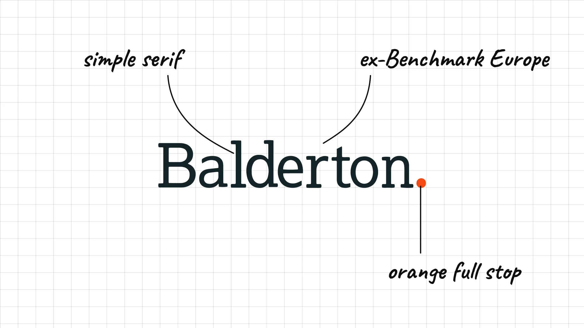
Balderton Capital Balderton started as Benchmark Capital Europe in 2000 and became independent in 2007.
A simple serif name ends with an orange full stop.
The dot is the only colour, which makes it memorable.
30 Northzone
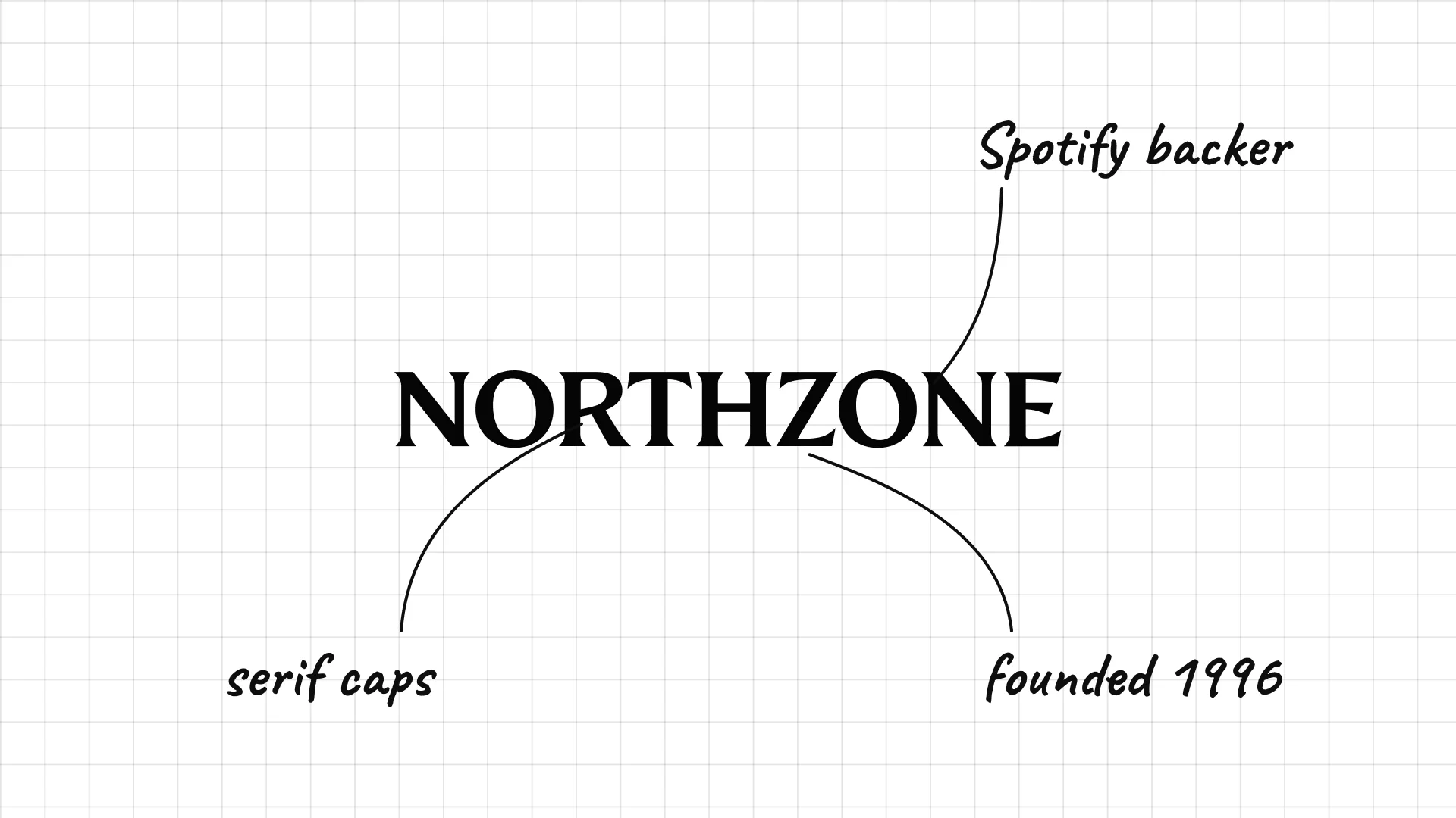
Northzone was founded in 1996 in Scandinavia and was an early investor in Spotify.
Serif capitals feel solid and Nordic.
The name points to the firm's northern European roots.
31 Creandum
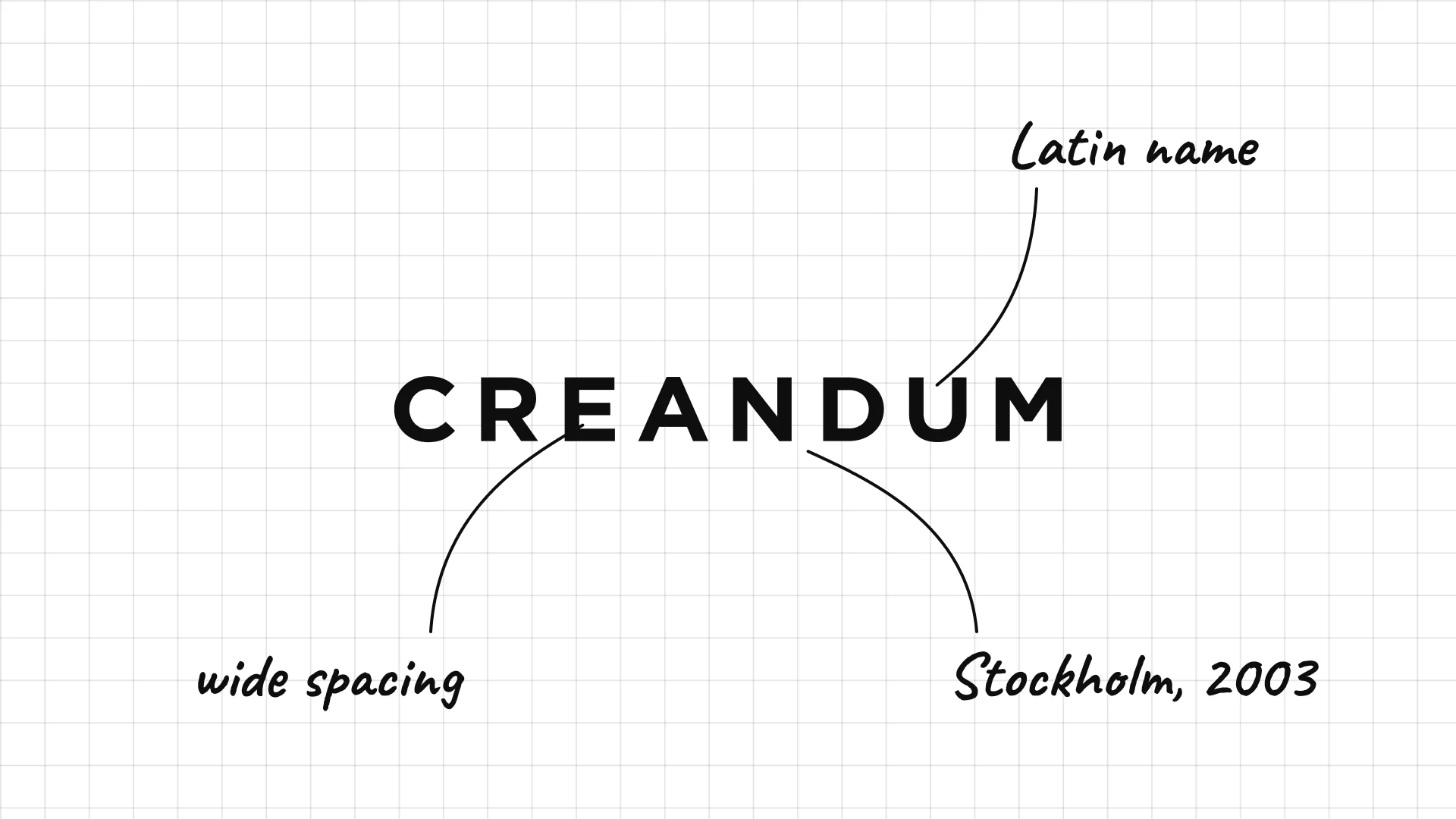
Creandum was founded in Stockholm in 2003 and was also an early Spotify investor.
Very widely spaced capitals feel clean and modern.
The name comes from Latin and means something like "to be created".
32 Seedcamp
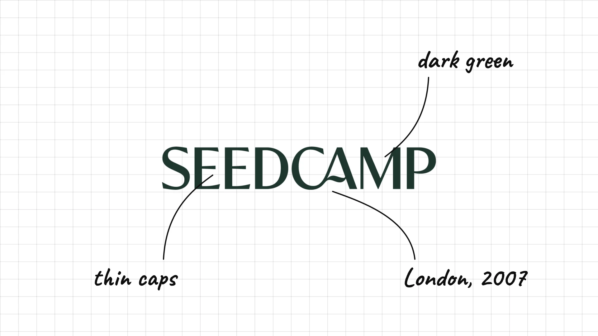
Seedcamp was founded in London in 2007 and is one of Europe's best-known seed funds.
Thin capitals in dark green feel calm and confident.
The name is a simple mix of seed and camp.
33 Point Nine
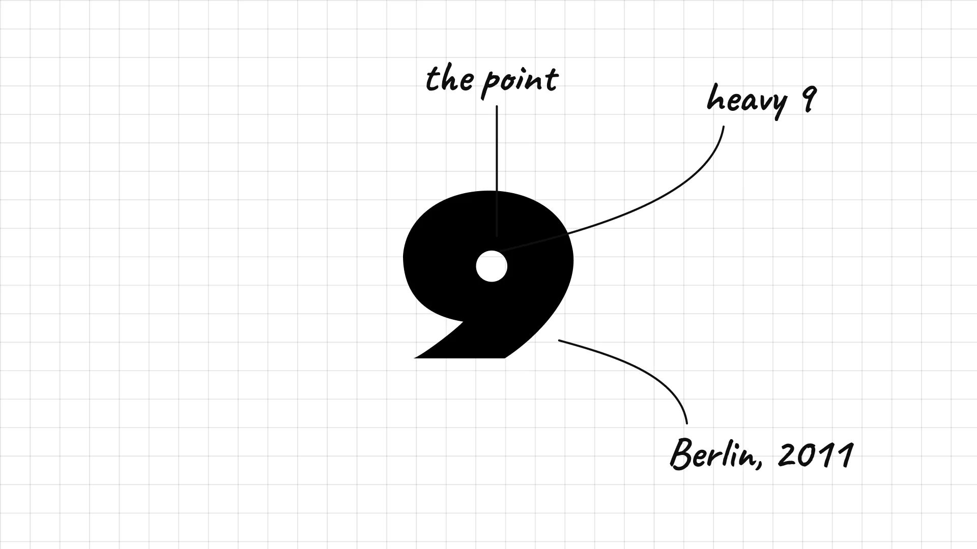
Point Nine was founded in Berlin in 2011 and focuses on SaaS and marketplaces.
A heavy number 9 with a dot is the whole logo.
The mark is a literal picture of the name, point nine.
34 HongShan
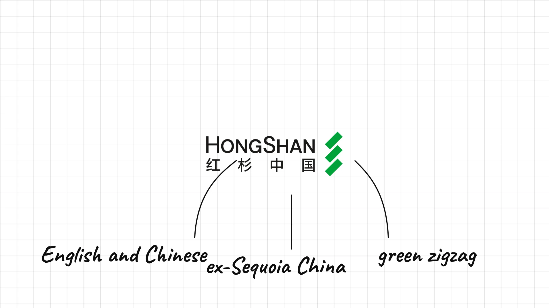
HongShan was formerly Sequoia Capital China and became an independent firm in 2023.
Small capitals in English sit over the Chinese name.
A green zigzag mark looks like a tree or a mountain path.
35 SoftBank Vision Fund
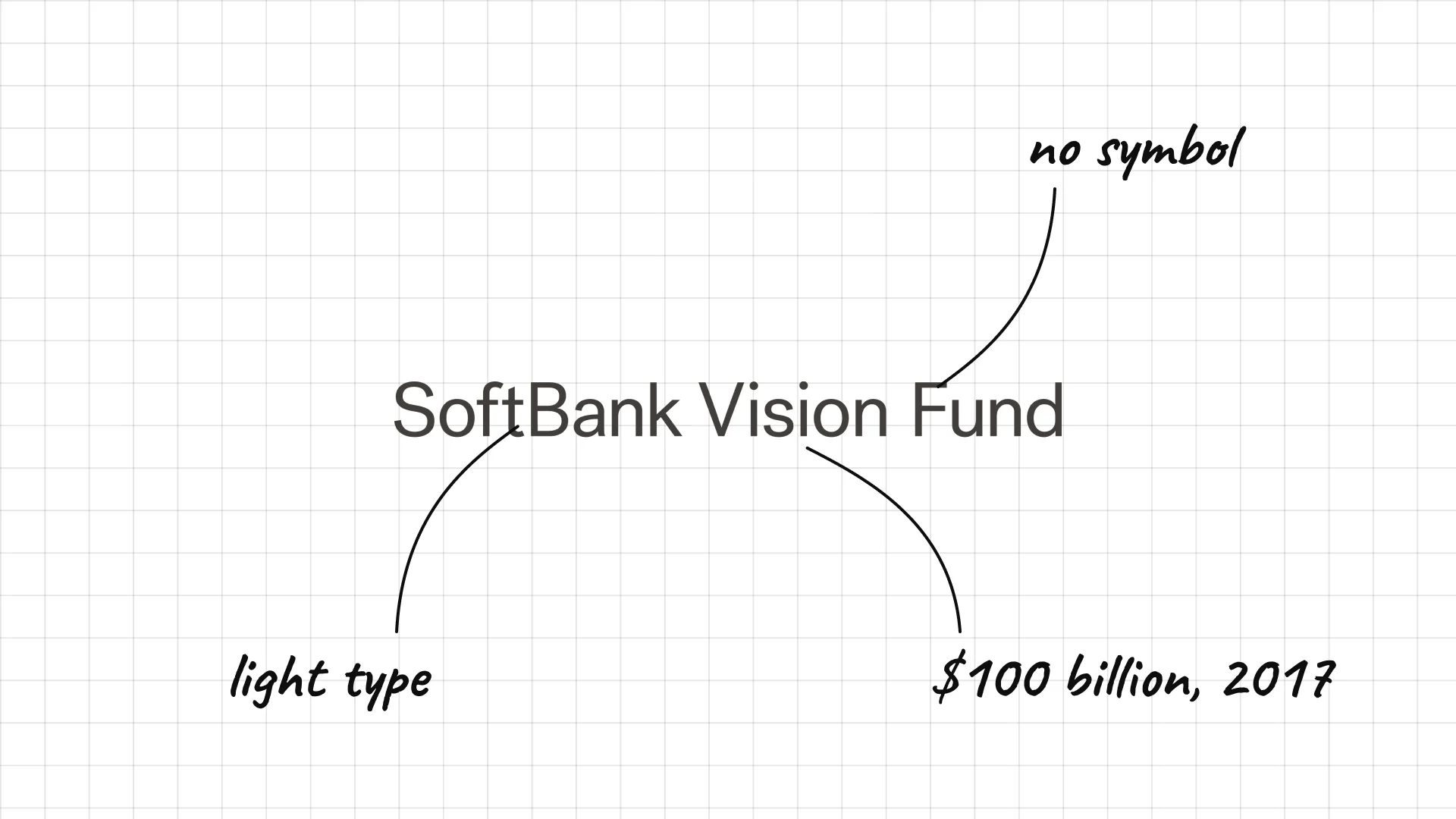
SoftBank Vision Fund Masayoshi Son launched the SoftBank Vision Fund in 2017 with around $100 billion.
Light, simple type keeps the giant fund's name calm.
The lack of a symbol puts the SoftBank name in front.
36 Peak XV Partners
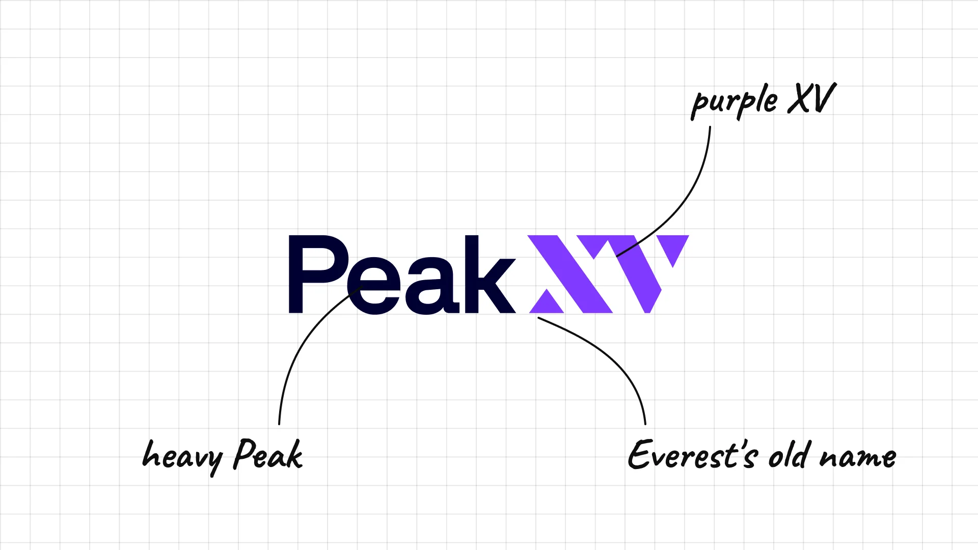
Peak XV Partners Peak XV was formerly Sequoia Capital India and Southeast Asia and took its new name in 2023.
Heavy Peak and a purple XV make a bold, modern logo.
Peak XV was the early survey name for Mount Everest.
05 — Specialist and design-led VCs
Specialist VCs use the simplest marks of all: single letters, numbers and short initials that work as icons.
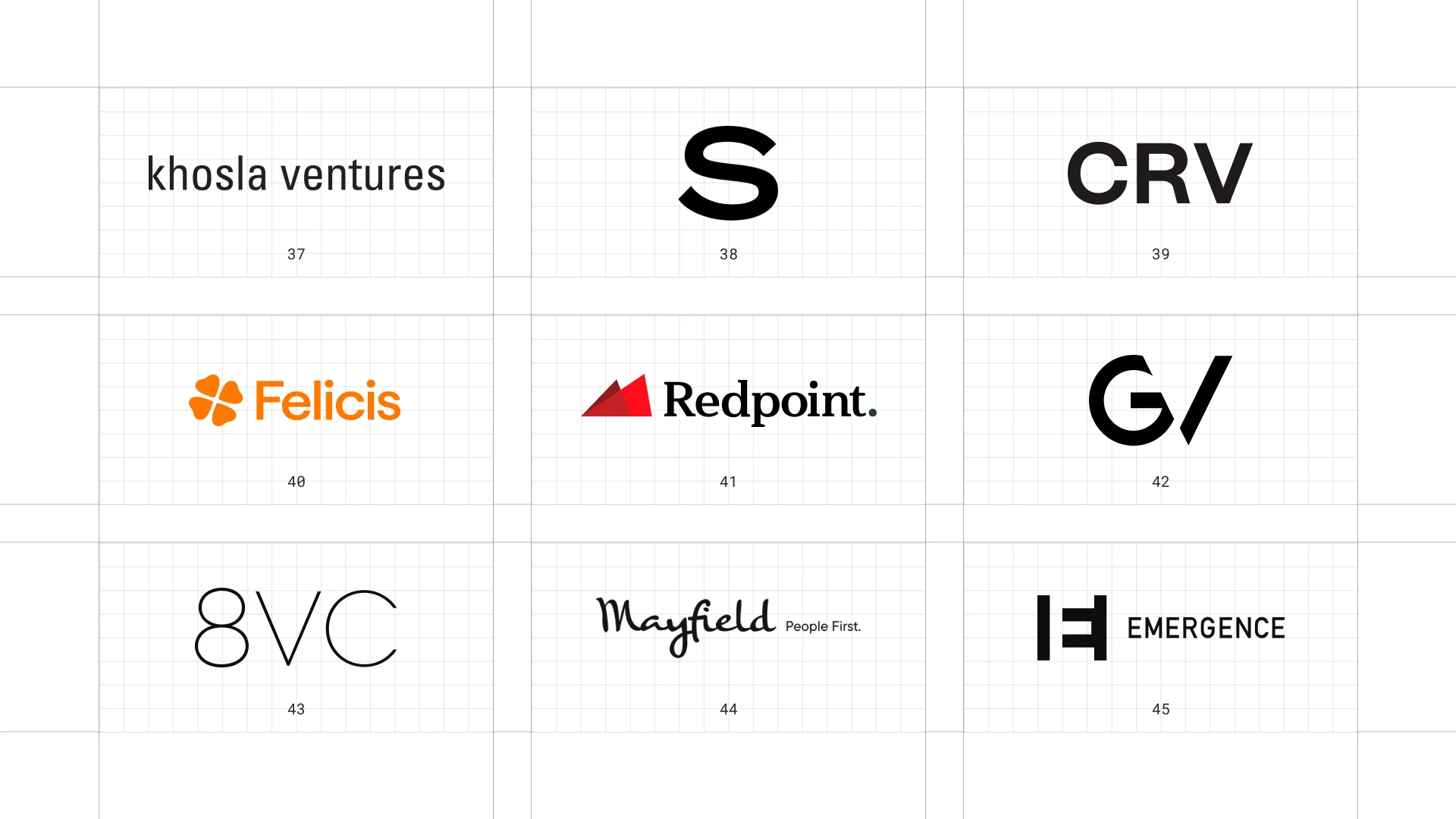
This is a visual comparison of venture capital logos, not a ranking of firms.
Look at how each logo uses type, colour and one symbol to speak to both investors and founders.
37 Khosla Ventures
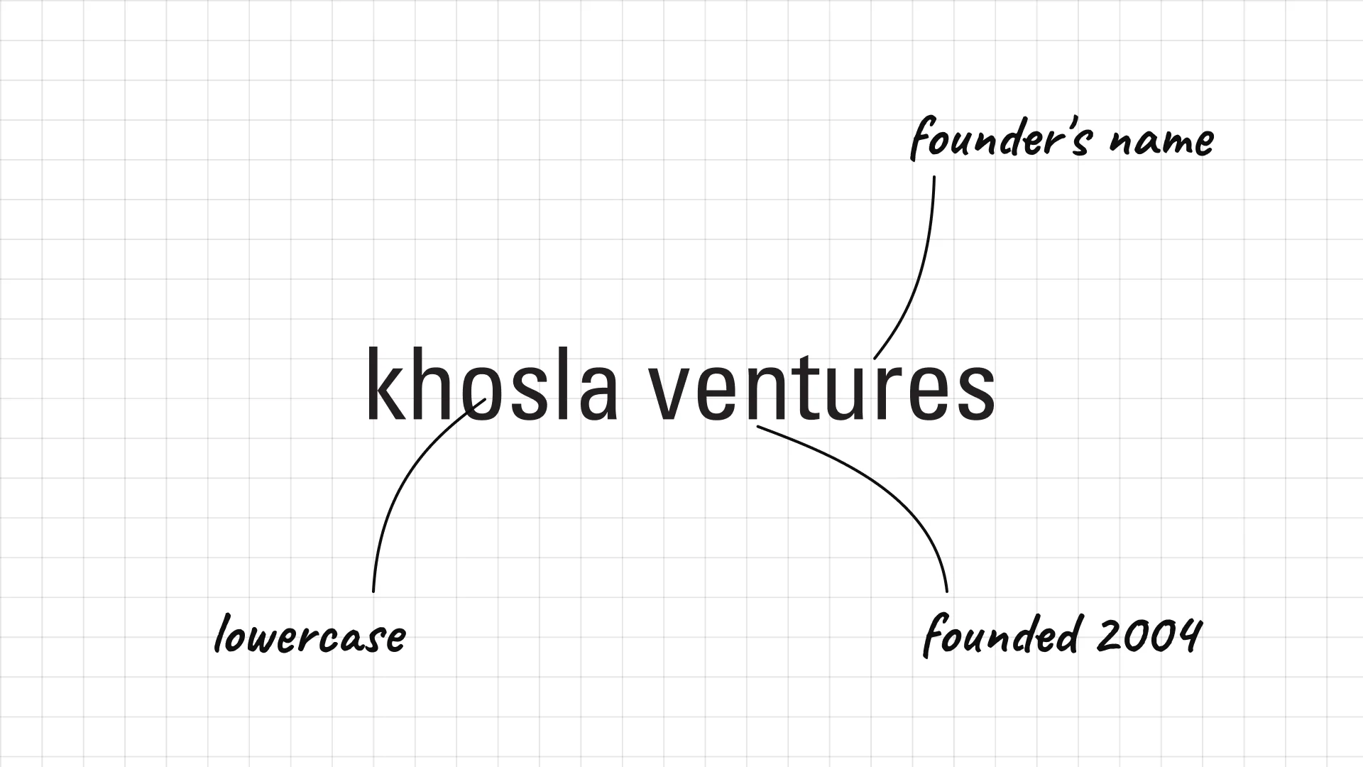
Khosla Ventures Vinod Khosla, a co-founder of Sun Microsystems, founded Khosla Ventures in 2004.
Simple lowercase letters feel modest and modern.
The founder's name is the brand, with no symbol needed.
38 Spark Capital
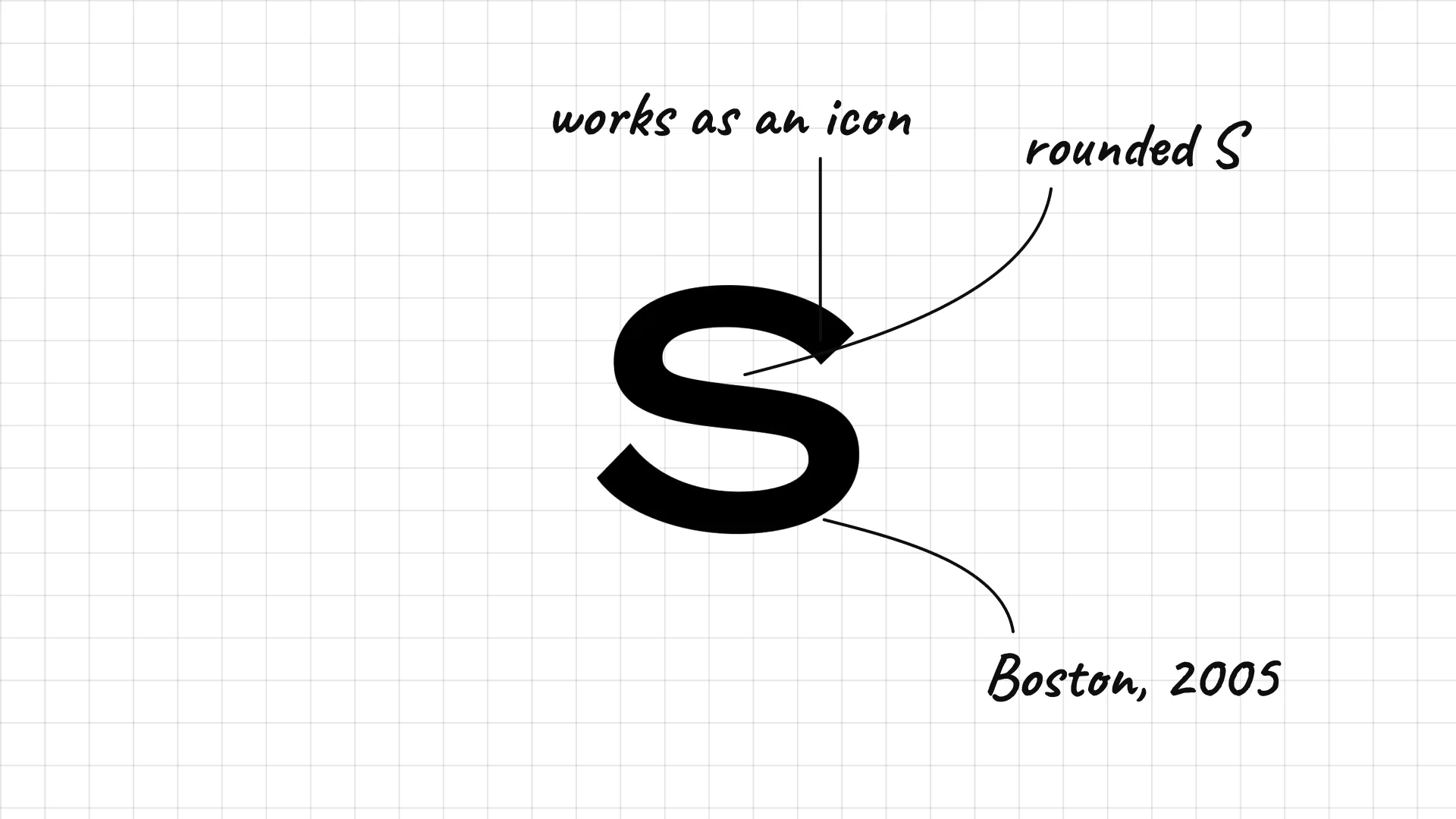
Spark Capital was founded in Boston in 2005.
A heavy, rounded S is the whole mark.
The simple letter works as an icon on any background.
39 CRV
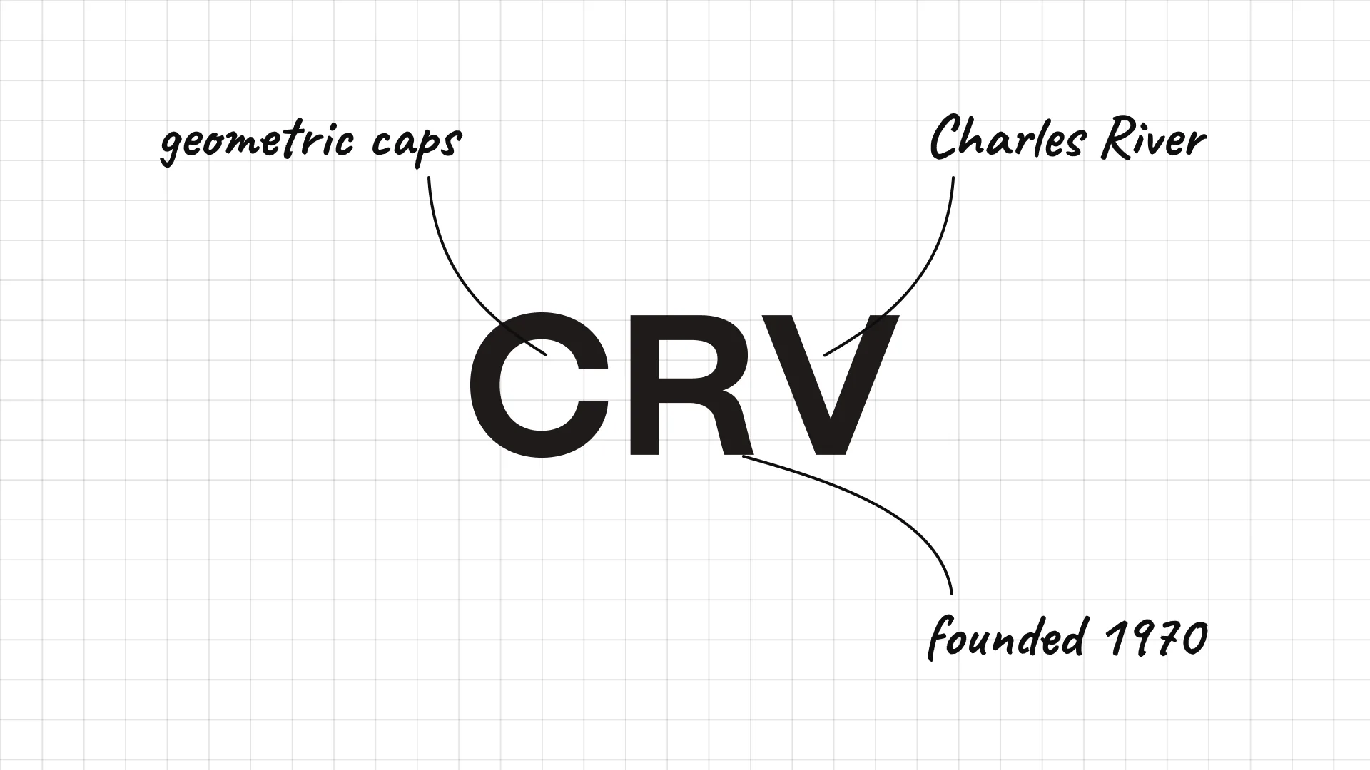
CRV was founded in 1970 as Charles River Ventures in Boston.
Three heavy geometric capitals feel strong and modern.
Shortening the name to initials made an old firm feel new.
40 Felicis
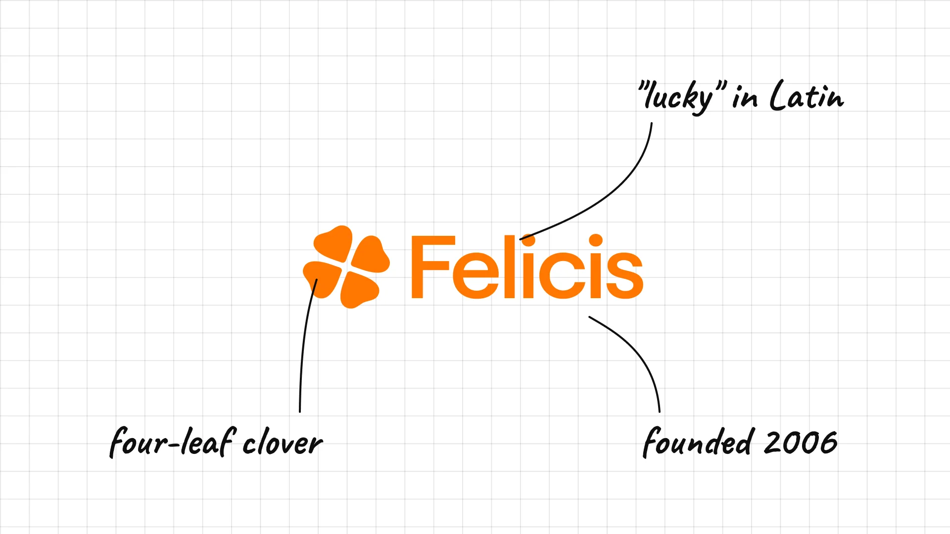
Felicis Aydin Senkut founded Felicis in 2006.
An orange four-leaf clover sits next to the name.
Felicis comes from Latin and means lucky.
41 Redpoint
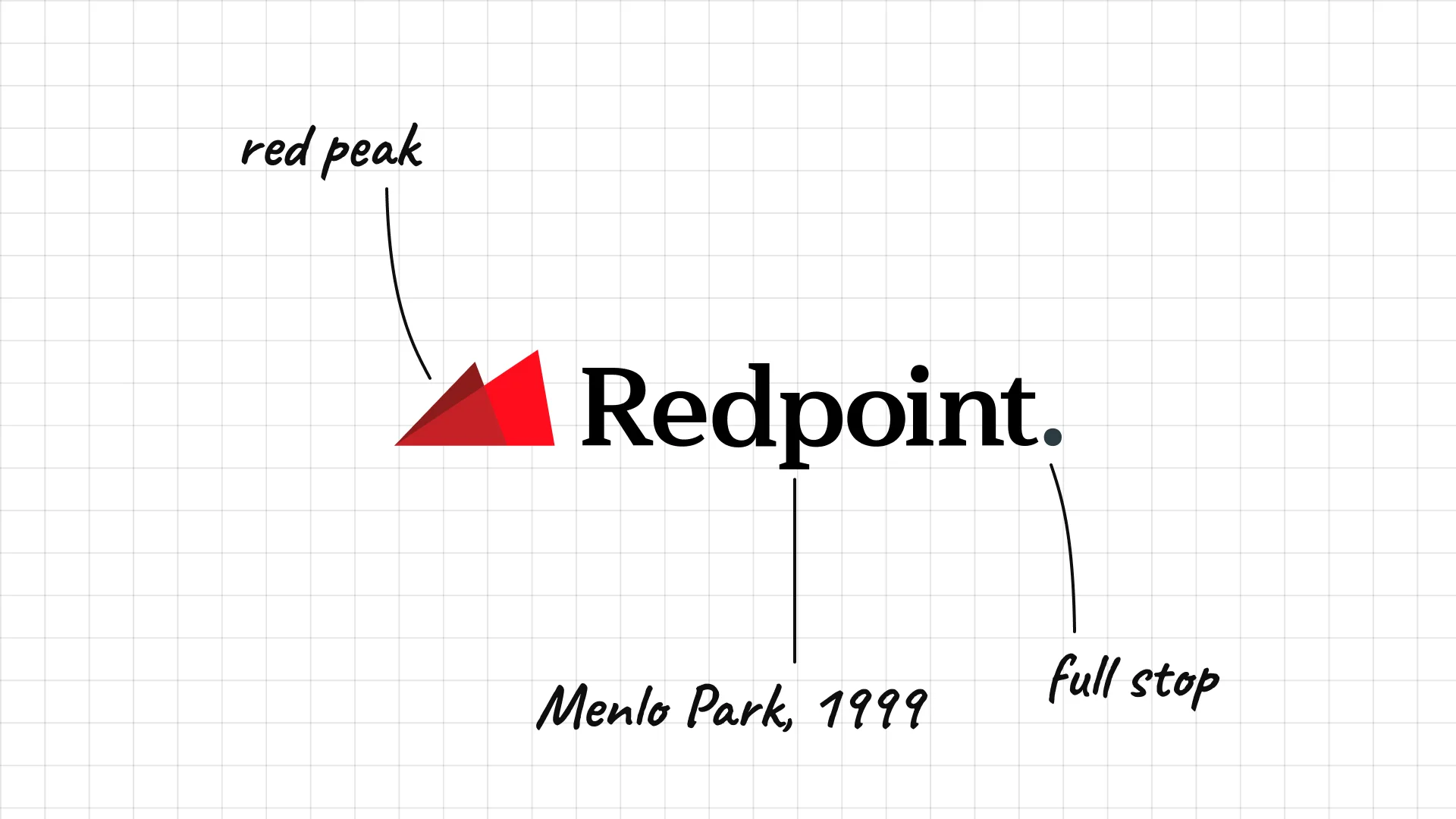
Redpoint was founded in Menlo Park in 1999.
A red peak icon sits next to the name.
The full stop after the name adds confidence.
42 GV
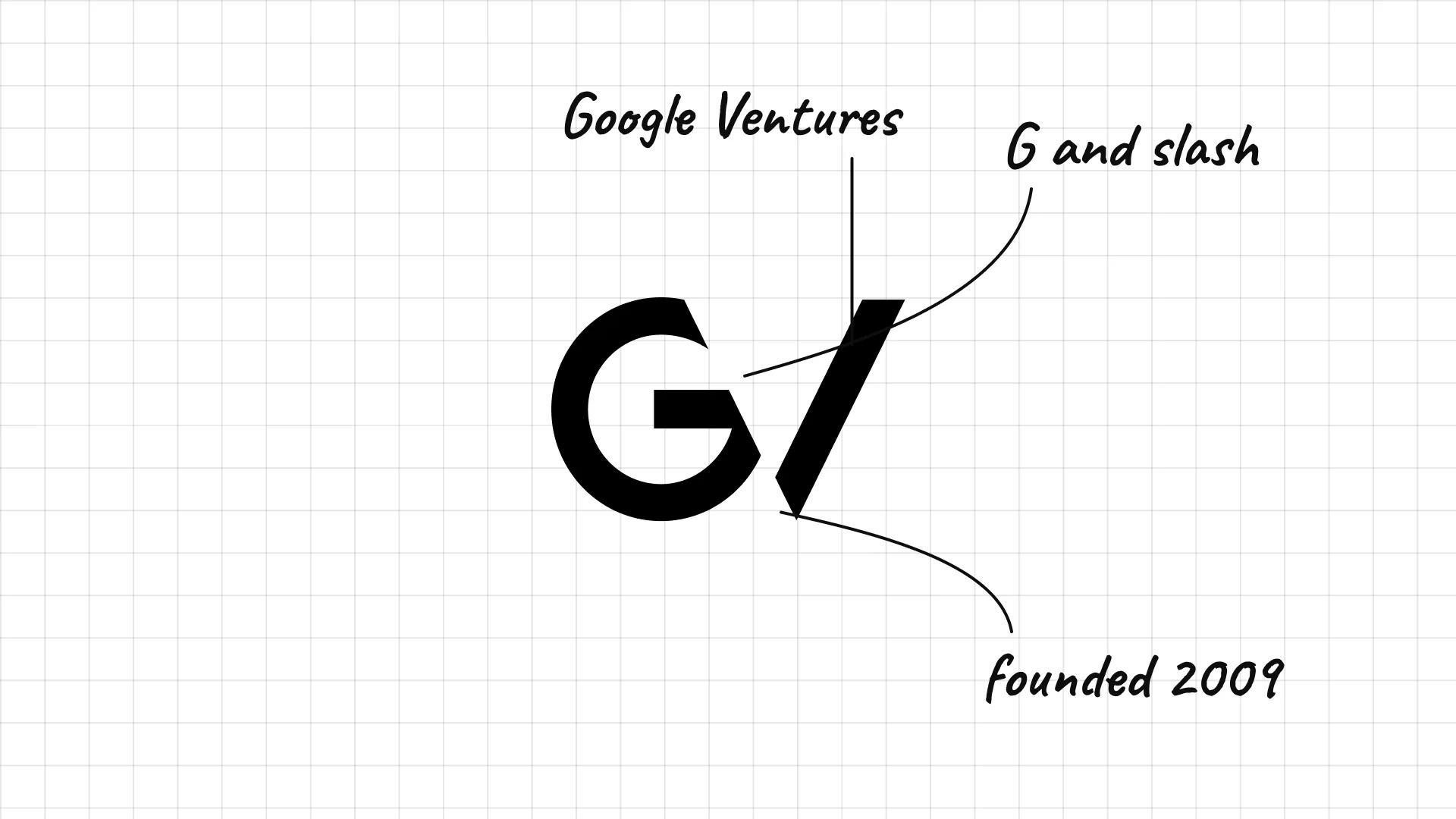
GV launched in 2009 as Google Ventures, the venture arm of Google, now Alphabet.
A G and a slash form a very short mark.
Dropping the Google name gave the fund its own identity.
43 8VC
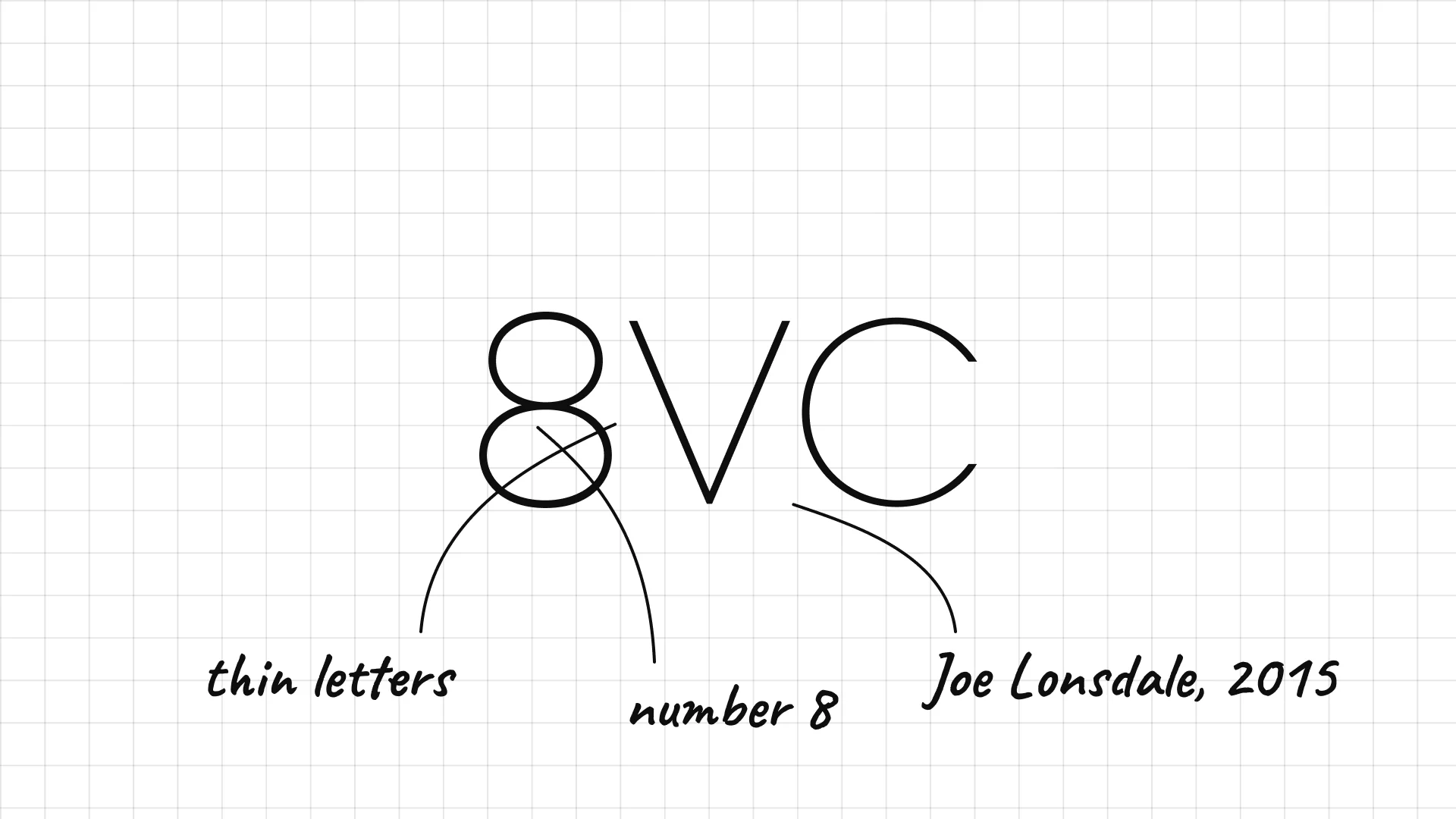
8VC Joe Lonsdale founded 8VC in 2015.
Very thin, light letters make the short name feel technical.
The number 8 is easy to remember and works as a symbol.
44 Mayfield
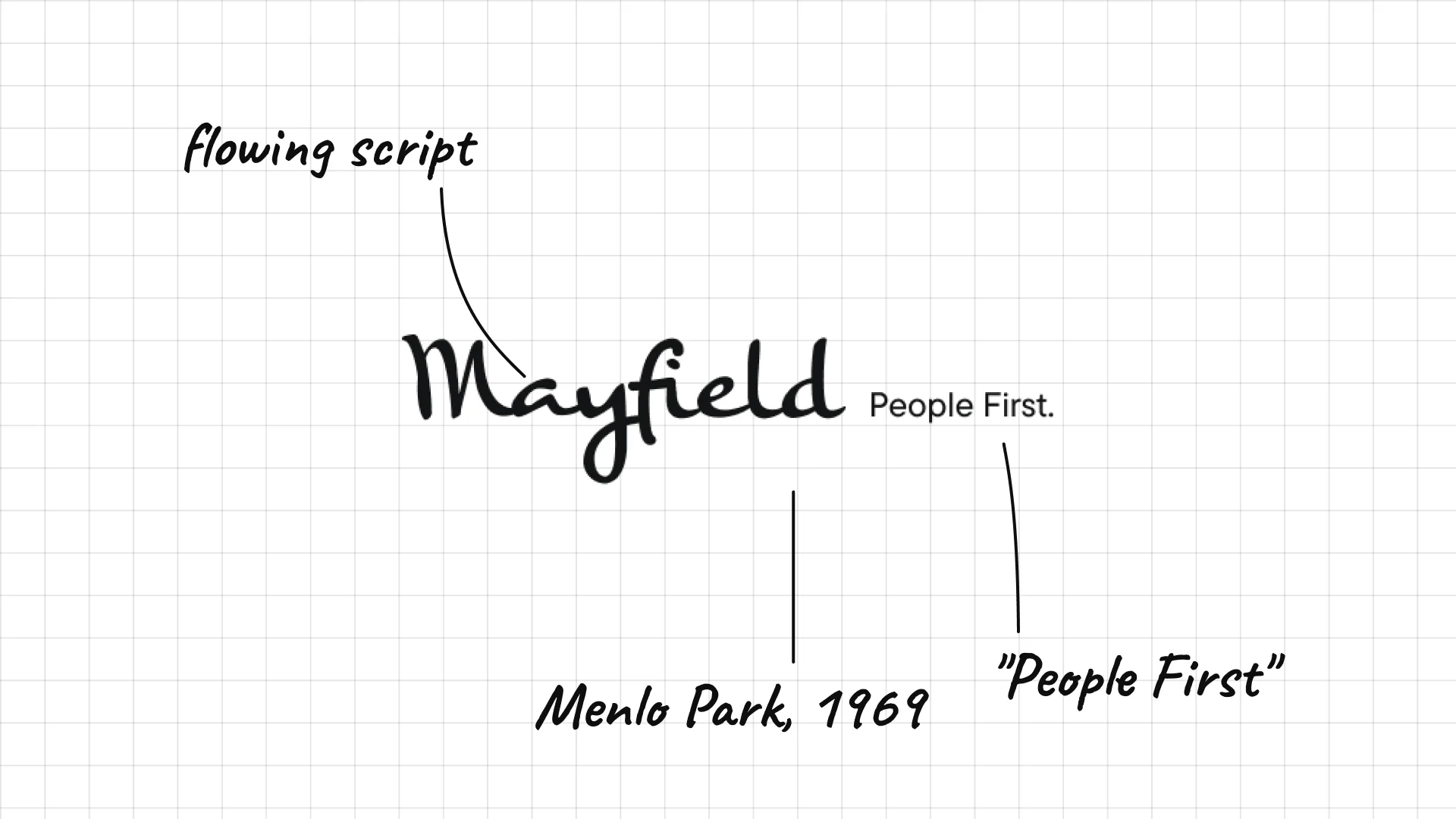
Mayfield was founded in Menlo Park in 1969 and is one of the oldest venture firms.
A flowing script makes the firm feel personal.
"People First" next to the name sums up its message.
45 Emergence Capital
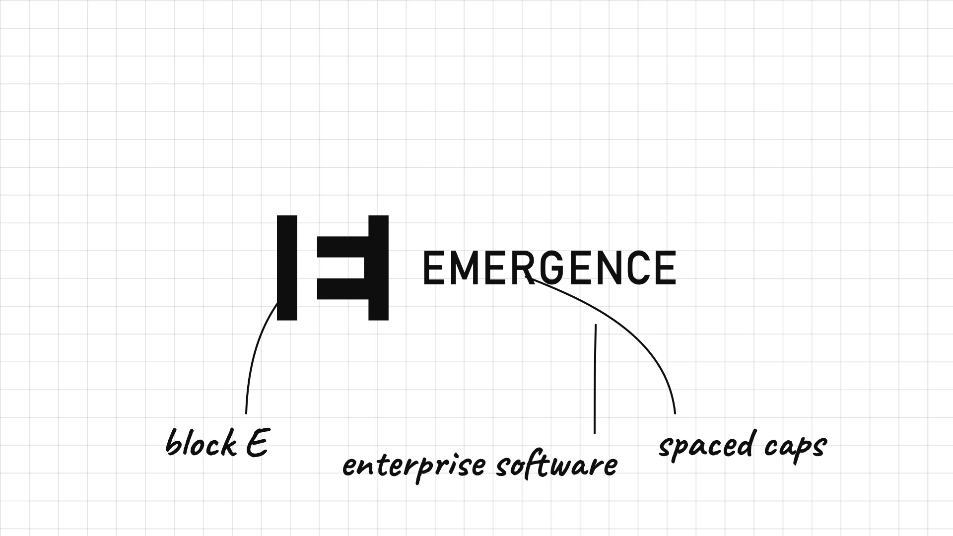
Emergence Capital was founded in 2003 and focuses on enterprise software.
A blocky E mark looks like a building block.
Spaced capitals keep the long name clean.
What these 45 examples reveal
VCs look like tech brands
Y Combinator, Union Square Ventures, Techstars, Initialized and Felicis use app-like icons, bright colour and modern type to feel like the startups they fund.
Names tell a story
Sequoia, Greylock, Peak XV, Point Nine, Felicis and Lux turn trees, mountains, numbers and Latin words into memorable brands.
Initials and numbers work small
NEA, CRV, GV, IVP, 8VC and 500 Global use short marks that stay readable in a tiny row of investor logos.
Old firms keep it quiet
Benchmark, Kleiner Perkins, Coatue and Northzone rely on spaced capitals and almost no symbol, which signals experience and confidence.
A practical checklist for a venture capital logo
- Does it appeal to founders as well as to the investors in your fund?
- Is it readable in a row of investor logos on a startup website?
- Is there a short mark or icon that works on social media and podcasts?
- Does the name or symbol give you a story to tell?
- Will it still work in one colour, on a hoodie, a sticker or a term sheet?
Launching or rebranding a venture capital fund?
I design brand identities for investment firms and startups, from logos and websites to pitch decks and fund materials.
See my past work and schedule a call to discuss your project.
Cover photo: Sand Hill Road sign by Steven Damron, CC BY 2.0, via Wikimedia Commons, cropped and used in a collage.
Frequently asked questions
What makes a good venture capital logo?
A good venture capital logo is simple, confident and founder-friendly. It stays readable at small sizes in a row of investor logos, and it often has a short story behind it, like Sequoia's tree or Greylock's mountain.
What are the most famous venture capital logos?
The most recognised venture capital logos include Sequoia Capital, Andreessen Horowitz, Accel, Benchmark, Kleiner Perkins, Greylock, Lightspeed, Index Ventures, Y Combinator and Founders Fund.
How are VC logos different from private equity logos?
Private equity logos usually look like banks or law firms, with serif type and navy colour. Venture capital logos are more playful and modern, because VC firms compete to win founders as well as investors.
Should a new VC fund use a symbol in its logo?
A simple symbol or short mark helps a new fund stand out on startup websites, social media and podcasts. Many successful newer firms, like Y Combinator, Felicis and Point Nine, rely on one clear icon.
How much does a venture capital logo cost?
A professional VC brand identity usually costs from several thousand dollars for a new fund to much more for a firm that needs a full identity, website, portfolio pages and fund materials.
Ready to build a brand people remember?
Tell me what you’re launching, changing, or trying to make look better.