Arek Dvornechuck
Branding Expert


The Art of Negative Space in Logo Design: A Guide for 2026
.webp)


.webp)


In the world of branding, logos are more than just visual representations of a brand.
They are intricate pieces of art that can convey multiple layers of meaning through clever use of design elements.
One such element that has captivated designers and audiences alike is the use of negative space.
This article delves into the concept of negative space in logo design, exploring its definition, benefits, and some of the best examples in the industry.
Negative space, also known as white space, is the area surrounding the main subject of an image.
In logo design, it's the space around and between the primary elements of a logo.
When used creatively, negative space can add depth, create visual interest, and even convey additional meanings.
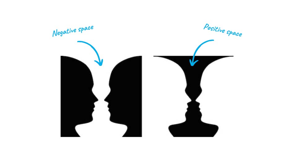
A classic example of negative space is the figure-ground principle, illustrated perfectly by the famous faces-vase illusion.
Depending on how you look at the image, you can either see two faces or a vase.
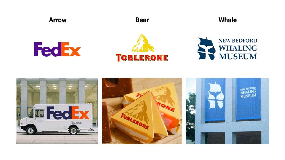
Perhaps the most renowned example of negative space in logo design is the FedEx logo.
At first glance, it appears to be a simple wordmark.
However, a closer look reveals an arrow cleverly hidden between the 'E' and 'x'.
This arrow symbolizes speed and precision, core values of the delivery company.
The Toblerone logo is another excellent example.
While the text and mountain are apparent, many miss the hidden bear in the mountain's negative space.
However, once you see it—it cannot be unseen.
It's a nod to the company's origins in Bern, Switzerland, known as the "City of Bears".
The NBC logo demonstrates how negative space can be used for balance and harmony.
The current logo, a simplified version of its predecessor, uses the same shape rotated to create a balanced and harmonious design.
Negative space can be used in logo design in several ways:
Incorporating negative space in logo design offers several advantages:
To illustrate the process of creating a negative space logo, let's look at the logo designed for Airport Executive. The designer created a monogram that cleverly uses negative space to depict the trail left behind by jets, perfectly encapsulating the essence of the business.
The design process involved:
Negative space is a powerful tool in the logo designer's arsenal. When used effectively, it can transform a simple logo into a multi-layered piece of art that engages viewers and communicates brand values subtly yet effectively. As we've seen from the examples discussed, from global brands to local businesses, negative space logos have the power to captivate and leave a lasting impression.
Whether you're a professional graphic designer or a business owner looking to create a memorable brand identity, consider the potential of negative space in your logo design. It might just be the element that elevates your logo from good to unforgettable.

Master the art of using negative space in logo design, explor its history, psychology, and practical applications.
Negative space, when used skillfully, can add layers of meaning to a logo, create visual interest, and leave a lasting impression on viewers.
It's a technique that has been employed by some of the world's most recognizable brands, and its effectiveness in logo design is well-documented.
Throughout this article, we'll explore the concept of negative space, analyze famous examples, discuss its benefits, and provide a step-by-step guide to creating your own negative space logo.
Whether you're a seasoned graphic designer or a business owner looking to create a unique brand identity, this guide will equip you with the knowledge and inspiration to leverage negative space in your logo designs.
Negative space, also known as white space or blank space, refers to the areas around and between the main subject of an image. In logo design, it's the space that surrounds the primary elements of the logo. While it might seem counterintuitive, this "empty" space can be just as important as the positive space (the main elements) in creating a successful design.
The concept of negative space is rooted in the idea that our brains naturally fill in gaps and make connections between shapes. Designers can use this tendency to create logos that engage viewers and communicate multiple messages simultaneously.
At the heart of negative space design is the figure-ground relationship.
This principle of visual perception describes how our brains distinguish an object (the figure) from its surrounding area (the ground). In logo design, manipulating this relationship can create fascinating optical illusions and dual meanings.
A classic example of the figure-ground relationship is the face-vase illusion. In this image, depending on which part you focus on, you can see either two faces in profile or a central vase. This ambiguity is what makes negative space designs so captivating – they engage the viewer's mind and encourage active participation in interpreting the image.
The use of negative space in art and design is not a new concept. It has roots in ancient Eastern art, particularly in Chinese and Japanese paintings, where empty space was valued as much as the painted elements. In Western art, the concept gained prominence in the early 20th century with the rise of modernist movements like Cubism and De Stijl.
In logo design, the deliberate use of negative space began to gain traction in the mid-20th century. As brands sought to create more memorable and versatile logos, designers discovered the power of negative space to add depth and meaning to simple designs.
Perhaps the most famous example of negative space in logo design is the FedEx logo. Created by Lindon Leader in 1994, this logo has won numerous design awards and is consistently ranked as one of the best logos of all time.
At first glance, the FedEx logo appears to be a simple wordmark. However, a closer look reveals an arrow cleverly hidden between the 'E' and 'x'. This arrow, formed by the negative space, symbolizes speed, accuracy, and forward motion – all key attributes of the FedEx brand.
The genius of this design lies in its subtlety. Many people don't notice the arrow at first, but once they do, it becomes impossible to unsee. This "aha" moment creates a strong connection between the viewer and the brand, making the logo highly memorable.
The Toblerone logo is another excellent example of negative space usage. The logo features the Matterhorn mountain, a nod to the chocolate's Swiss origins. However, hidden within the mountain's outline is the silhouette of a bear standing on its hind legs.
The bear is a reference to Bern, the Swiss city where Toblerone was first created (Bern is known as the "City of Bears"). This clever use of negative space adds an extra layer of meaning to the logo, connecting the product to its heritage in a subtle yet engaging way.
The NBC peacock logo, while not as subtle as the previous examples, is a masterclass in using negative space for visual harmony. The logo consists of a stylized peacock with six feathers, each represented by a different color.
The negative space between the feathers creates a central white shape that balances the design and draws the eye to the center. This use of negative space helps to unify the various colorful elements and creates a logo that is both visually striking and harmonious.
The WWF logo, designed by Sir Peter Scott in 1961, is a prime example of how negative space can be used to create a powerful and emotive symbol. The logo depicts a panda, the organization's iconic mascot, using simple black shapes on a white background.
The panda's form is created entirely through the interplay of positive and negative space. This simplicity not only makes the logo highly recognizable and versatile, but it also resonates with the organization's mission of wildlife conservation. The use of negative space here creates a sense of the panda emerging from or blending with its environment, subtly reinforcing the WWF's focus on habitat preservation.
The logo for the Guild of Food Writers is a brilliant example of how negative space can be used to combine two distinct elements into a single, coherent design. At first glance, the logo appears to be a simple ink pot. However, the negative space within the pot forms the shape of a spoon.
This clever combination of writing (represented by the ink pot) and food (represented by the spoon) perfectly encapsulates the organization's focus. The simplicity of the design, achieved through the skillful use of negative space, makes it instantly recognizable and memorable.
One of the most powerful ways to use negative space in logo design is to embed relevant symbols or shapes within the main design. This technique can add layers of meaning to a logo and create a sense of discovery for the viewer.
For example, the Hershey's Kisses logo cleverly hides the shape of a chocolate kiss between the 'K' and the 'I'. This subtle inclusion reinforces the product's identity and creates a visual connection to the actual product.
Negative space can be used to incorporate additional meanings or messages into a logo design. This can be particularly effective for brands that want to communicate multiple aspects of their identity or values.
The Spartan Golf Club logo is an excellent example of this. The logo simultaneously depicts a Spartan warrior's profile and a golfer mid-swing. This dual imagery cleverly combines the club's name with its primary activity, creating a rich and meaningful logo.
Negative space plays a crucial role in creating balance and harmony in logo designs. By carefully considering the relationship between positive and negative space, designers can create logos that are visually pleasing and well-proportioned.
The old NBC logo, with its stylized peacock, used negative space to create a balanced and harmonious design. The spaces between the colorful "feathers" were as important as the feathers themselves in creating the overall shape and feel of the logo.
In a world saturated with visual information, a well-designed negative space logo can help a brand stand out. These logos often have a unique, clever quality that captures attention and sticks in the memory. The "hidden" elements in negative space logos can create a sense of discovery, making viewers feel clever for spotting them and fostering a positive association with the brand.
Negative space is a powerful tool for creating clean, minimalist designs. By using the space around and between elements to convey information, designers can avoid cluttering the logo with unnecessary details. This results in logos that are not only aesthetically pleasing but also highly versatile, working well across various mediums and sizes.
Logos that effectively use negative space often have a strong visual impact. The clever interplay between positive and negative space can create striking designs that leave a lasting impression. Moreover, the "a-ha" moment when a viewer discovers a hidden element in a negative space logo can significantly enhance its memorability.
Negative space logos often function like visual puzzles, encouraging viewers to engage more deeply with the design. This increased engagement can lead to a stronger emotional connection with the brand. When people feel they've "solved" the logo by spotting the hidden element, they're likely to share this discovery with others, potentially increasing brand awareness.
The use of negative space in logo design isn't just about aesthetics – it also has a significant psychological impact on viewers. Understanding these psychological principles can help designers create more effective logos.
Before starting your design, it's crucial to gather inspiration and understand the principles of effective negative space usage. Here are some resources to consider:
With inspiration in hand, it's time to start generating ideas:
Remember, the goal at this stage is quantity over quality. Generate as many ideas as possible without judging them too harshly.
Select your most promising sketches and begin translating them into digital form:
Once you have a basic digital version, it's time to refine your design:
Before finalizing your logo, it's important to test it and gather feedback:
Let's examine a real-world example of creating a logo using negative space:
The Airport Executive logo is a monogram that incorporates negative space to create the trail that jets leave behind. Here's how it was developed:
This case study demonstrates how negative space can be used to add an extra layer of meaning to a relatively simple monogram design.
Creating effective negative space logos can be challenging. Here are some common issues and strategies to address them:
As an Amazon Associate, I earn from qualifying purchases.


I'm a branding expert and graphic designer based in NY. I specialize in the development of brands: brand strategy, identity & web design. Need help with your project?—Get in touch