Arek Dvornechuck
Branding Expert


14 Best NBA Logos of All Time in 2026
.webp)


.webp)


I recently attended a Brooklyn Nets vs. Miami Heat game, and it sparked a fresh appreciation for NBA team branding.
As a professional logo designer, I’m always on the lookout for how visual identities capture a team’s spirit and history.
This journey through the arena—surrounded by Nets’ black-and-white gear and Heat’s fiery colors—led me to reflect on NBA team logos.

In this article, I’ll be breaking down what I consider the 14 best NBA logos of all time.
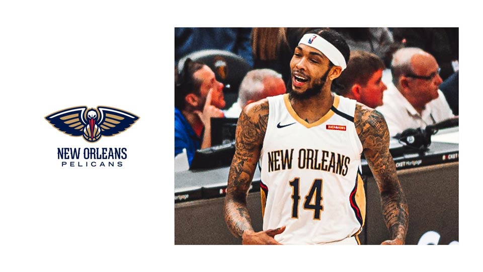
Out of the 35 teams in the league, these fourteen stand out for their aesthetics (color, typography, overall composition), emotional resonance, historical context, and fan recognition.
Whether you’re a design enthusiast or a hardcore basketball fan, join me as we celebrate the logos that perfectly blend style, culture, and sports tradition.


Branding in sports isn’t just about eye-catching visuals—it’s about honoring local heritage, uniting fans, and embodying a team’s spirit.
From the iconic bull’s head of Chicago to the sleek minimalism of Brooklyn, each NBA logo tells a story of resilience, pride, and evolution.
By examining their elements and backstories, we gain a deeper appreciation for the way design can capture all these things in just a simple brandmark.
As an Amazon Associate, I earn from qualifying purchases.


I'm a branding expert and graphic designer based in NY. I specialize in the development of brands: brand strategy, identity & web design. Need help with your project?—Get in touch