Top 9 Most Iconic NFL Team Logos in 2026

As a passionate branding expert with a keen eye for design who provides logo design services...
I'm always intrigued by the power of logos to encapsulate the essence of a brand or organization.
Today, I'm excited to embark on a journey through the realm of NFL logos.
Those iconic symbols that proudly represent the heart and soul of each National Football League (NFL) team.
BTW. Here's a photo of me shopping for some hats at the NFL store in New York.

Join me as we explore the evolution, significance, and design elements that make these NFL teams' logos truly exceptional.
In the competitive world of American football, team logos play a vital role in conveying the identity and values of each franchise.
These symbols go beyond mere visuals; they evoke emotions, foster a sense of belonging, and ignite the passion of fans.

A well-crafted NFL logo has the power to unite a diverse fan base under a single sports banner, fostering camaraderie and loyalty that extend far beyond the field of play.
The Dallas Cowboys became a part of the league back in the year 1960, and they unveiled their official logo in 1964, featuring a simple yet iconic blue star.
This five-point star dazzles in a navy blue and white color palette, making it look clean, bold, and instantly recognizable.

Blue represents strength, confidence, and loyalty, while white represents purity and integrity.
It pays tribute to Texas' nickname - The Lone Star State.
This star has also become a symbol of "America's Team," representing the Cowboys' widespread fan base and their status as a cultural and sports sensation.

The symmetry and straightforward form of the star convey a sense of stability and determination that resonates with fans and players alike.
With five Super Bowl triumphs, three of them during the 90s, this logo has become a symbol of American sports that's hard to miss.
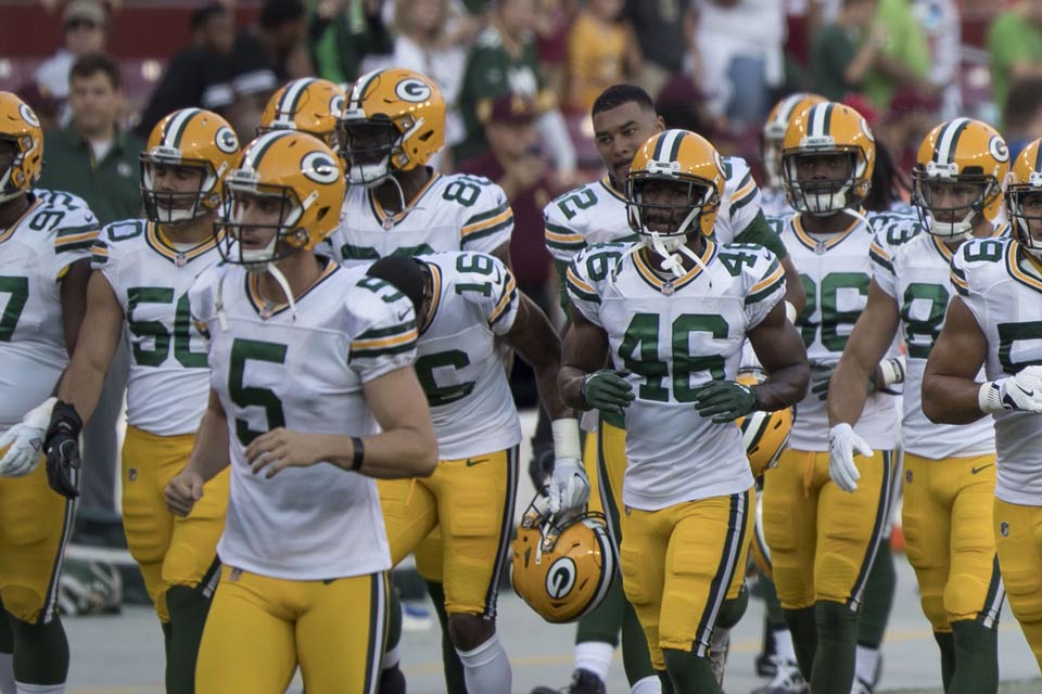
The Green Bay Packers' stylized "G" enclosed within a green oval, is designed in 1961 by equipment manager Gerald Brashier and art student John Gordon.
The "G" represents the "Green Bay" with simplicity and nothing more.

This logo is a testament to the Packers' rich history and commitment to tradition.
It is rendered in the team's official colors: green and gold.
Green symbolizes the football team's name and its association with the natural environment of Wisconsin, while gold represents excellence and success.

The bold and classic design reflects the team's enduring legacy and the values of hard work and perseverance.
Its modern, simple, and sleek design allows it to stand the test of time, making it one of the most recognizable and beloved logos in the NFL.
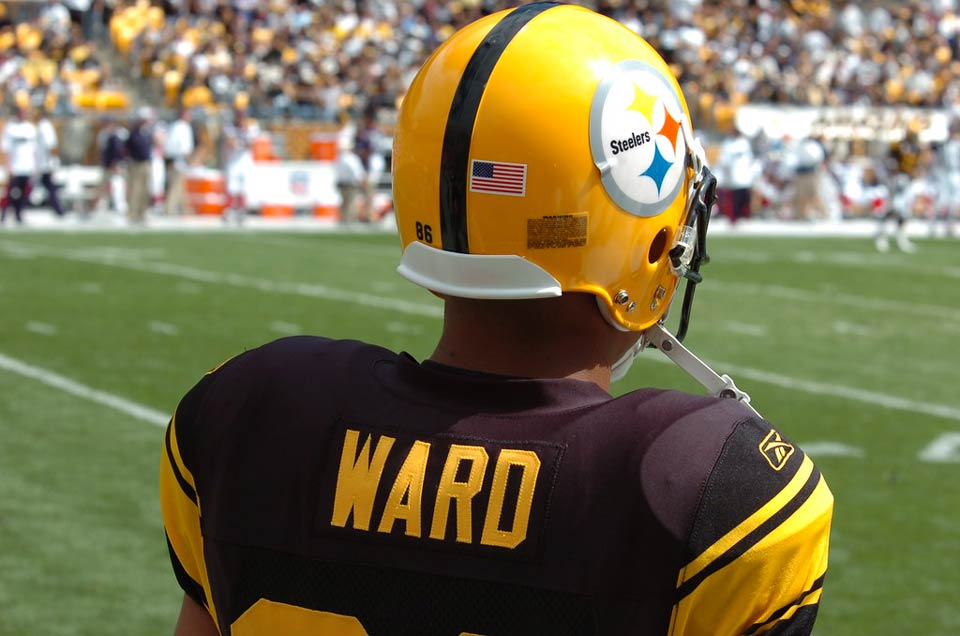
The Pittsburgh Steelers' logo made its debut in 1969, with only slight modifications since then.
It showcases three diamonds, which represent materials vital to the city's industrial prowess: Yellow for Coal, Red for Iron, and Blue for Steel Crap.

The logo's three starburst-shaped symbols manage to harmonize even though they differ from the team's usual color palette.
The logo's meaning goes beyond the football field; it proudly represents Pittsburgh's identity as a blue-collar city with a rich history of industrial innovation.
The bold and distinctive design has become an enduring symbol of the team's connection to its hometown.

The logo's rich history and clever design come together seamlessly to create one of the most instantly recognizable and finest emblems in the realm of sports.
The Chicago Bears' present logo was crafted in 1974, featuring an interlocking "C" in a wishbone shape with a distinct and powerful design.
The main body of the letter "C" is orange, while the double outline features white on the inner side and navy blue on the outer side.

Its strong and balanced form is a nod to classic design principles, while its modern execution keeps it relevant and appealing to audiences of all ages.
Navy blue signifies strength and stability, while orange adds energy and vibrancy to the logo.
White is a shade often used for highlights and to enhance the overall design.

The Chicago Bears occasionally explore different variations of their logo, but nothing surpasses the timeless appeal of this stylized "C."
This consistency helps to build a strong brand identity and connect fans with the team's history and tradition.
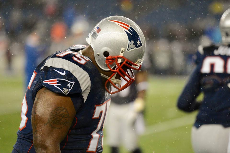
The New England Patriots' current logo was created by a famous graphic designer Ken Loh in 1978, and named by the fans "Flying Elvis."
It features a blue and gray profile of a man in a tricorne hat with a white star on it, and two red stripes coming out of the hat to the left and weaving as a flag.

Facial features are not detailed: broad, rough lines are used for the mouth, nose, and eyes.
The five-pointed star in front represents one of the main elements of the American flag, while the overall color scheme also embodies the flag.

The Patriot's logo is one of the NFL's most famous symbols because of the important meaning it represents
It is a visual embodiment of the team's journey from its historical roots to its present-day ambitions.
The San Francisco 49ers' logo integrates a basic red background housing the team's initials, "SF" in bold white, which stands for "San Francisco," within a football-shaped design with gold accents at the edges.
It is a great example of the concept "less is more."

Just another interesting fact about this logo, it didn't include gold until 1996.
The 49ers made a clever choice to incorporate gold to pay homage to San Francisco's Gold Rush heritage, representing the spirit of ambition, exploration, and pursuit of dreams.
.jpg)
This logo's uncomplicated design and imagery tell a compelling story of the team's connection to its city's history and values.
The Denver Broncos were founded in 1959 in Colorado, and have kept their logo unchanged for 26 years since redesigning it in 1997.
The logo presents a dynamic depiction of a bucking horse profile, with a white head facing right, outlined and accented in dark blue, while coloring the mane and eye in orange.

The logo's movement captures the spirit of competition and the team's relentless drive to succeed.
The orange mane represents the tongue of flames and an orange iris signifies a fire that flares up the soul of a beast.

Its bold and fierce design not only inspires players but also energizes fans, creating a strong emotional connection between the team and its supporters.
The Miami Dolphins football club started in 1966, making it the oldest professional sports team in Florida.
From its founding in 1966 until 2018, the Dolphins continually updated their logo, yet it stayed one of the most famous in NFL history.
Their latest logo showcases a playful and friendly dolphin in an upward direction, leaping through a sunburst.

In addition, the 2018 redesign focuses on the emblem's color palette, specifically making a change to the shade of orange.
It became darker and shifted closer to red, resulting in a more intense and commanding appearance.
According to an article, the logo's slight changes in the color palette were made to strengthen it and make it look more confident and progressive.
.jpg)
This logo seizes the lively vitality and relaxed essence of Miami, connecting deeply with fans who link the team to the sun-filled beaches of Miami and its vibrant ambiance.
The Oakland/Las Vegas Raiders' present logo was introduced in 1995.
It features a fierce and defiant pirate wearing a silver helmet with crossed swords on his back, representing the team's iconic imagery.

This logo embodies the team's renegade spirit, reflecting an unapologetic, fierce, unyielding, and rebellious attitude in the game.
Its color scheme of black and silver also showcases the strength and aggressiveness of the team.

The logo's rugged design and bold character capture the essence of the Raiders' identity as a team that embraces its unique and unconventional nature, resonating with fans who admire their fearless approach.
As we end our journey through these iconic symbols, I'd like to share some valuable tips for creating an NFL-worthy logo that resonates with fans and stands the test of time.
Just as the NFL logos we explored have captivated hearts and minds, your logo can become a rallying point for your brand. Here are some key takeaways to consider when crafting your own emblem:
Embrace simplicity in your logo concept to make sure it stays clear and impactful, easily recognized and remembered, like the enduring NFL logos.
Create a logo that goes beyond just looking nice by including elements that show your brand's history, values, and identity; a logo with an interesting backstory can help you connect better with your audience.
NFL teams' logos decorate different surfaces, such as uniforms, merchandise, and digital platforms, so make sure your logo looks fantastic on all types of media and stays visually strong when scaled to different sizes.
Colors stir up feelings and connections, so choose the shades that match your brand's character and message, drawing inspiration from NFL logos that effectively use color to enhance their influence.
Let's create a logo that goes beyond current trends, so it stays attractive and meaningful for years.
NFL logos do more than symbolize – they bring together the league and fans, creating a sense of community and togetherness, so get your audience involved in the logo creation to build excitement, anticipation, and a feeling of ownership.
As NFL logos evolve over time, feel free to experiment with various versions of your logo, and gather input from friends, mentors, design teams, or focus groups to perfect your design.
Think about getting a skilled designer who knows logo design well – they can take your logo from good to amazing!
In your quest to create a remarkable logo that captures the essence of your brand, remember that every element – from shapes and colors to symbolism and storytelling – contributes to the larger narrative.
Just as an NFL logo proudly represents a team, your logo has the potential to become a dynamic and enduring emblem of your brand's identity, values, and aspirations.
So, take these insights to heart, embark on your design journey, and watch as your logo becomes a powerful symbol that resonates with your audience, just like the NFL logos we've explored today.
Interested in a personalized logo? Feel free to drop me an email.
You can also check my article about the process of logo design - to help you in designing an amazing logo.
As an Amazon Associate, I earn from qualifying purchases.

